Designing Inkwise – An AI Writing Tool
asif aninda
Designing Inkwise – An AI Writing Tool That Actually Gets Writers
I’ve been working on a personal project lately — a landing page for an AI writing tool called Inkwise. It’s not for a client, just something I wanted to build to explore how good design and honest copy can actually do the selling without sounding salesy.
While working on it, I focused on keeping things clear, straightforward, and genuinely helpful. Here's what I learned along the way:
Outcomes: How the Design Helped Users and Encouraged Signups
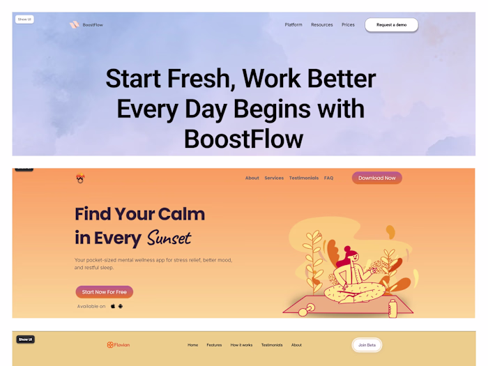
The layout was intentionally crafted to guide users step-by-step without overwhelming them. By breaking the content into digestible sections — problem, solution, benefits, and social proof — users could quickly understand what Inkwise does, why it’s different, and whether it fits their needs.
The hero section gave users immediate visual context and a clear headline that didn’t try too hard — just enough to spark curiosity.
The problem-solution format built trust by making users feel understood. It didn’t try to sell — it acknowledged frustrations and showed how Inkwise answers them.
The benefit blocks were tailored to different user types (freelancers, students, researchers), which helped people see themselves in the product without needing a sales pitch.
Micro-interactions and 3D visuals added clarity and movement, subtly drawing users deeper into the content.
The CTA was placed after value was delivered, not pushed early — making it feel like a natural next step rather than a forced action.

What Most AI Writing Tools Get Wrong
When I started exploring this idea, I noticed something about AI writing tools:
They’re fast, but they often feel artificial.
They hijack your voice
They write things you didn’t mean
They sound robotic
They bury you in pricing traps
And they leave you alone with a blank page
So I asked: What would a writing assistant that respects writers actually look like?
My Role
I did the design, copywriting, and Framer development myself. Also added custom 3D visuals with Spline to keep things interesting.
The Plan
I didn’t want to overthink.
The plan was simple: make something clear, honest, and focused on fixing real problems.
A strong hero section with 3D visuals to catch attention
A clear problem-solution breakdown
A benefits section that speaks directly to different user types (freelancers, students, researchers)
Social proof, FAQs, and a closing CTA to tie it all up
I used Figma for layout and planned a visual flow that gently guides you from start to CTA.
The tone? No buzzwords. No fluff. Just “here’s the problem, here’s how we fix it.”
Things That Worked
Problem-solution section — felt very real and relatable
Custom 3D elements — gave the page some personality
Micro-interactions — not too much, just enough
Straightforward copy — no trendspeak, no fake urgency
Things I’d Do Differently
Plan out micro-interactions in the wireframe phase
Spend more time on UX mapping before jumping in
Validate more layout decisions with actual users
Random Insight
To make this page feel right, I had to dig deep into what makes writing feel wrong.
And along the way, I ended up learning a lot more about UX than I expected.
It was also a fun excuse to blend some 3D design into my usual workflow.
Thanks for reading!
Like this project
Posted Jun 7, 2025
Designed a landing page for Inkwise, focusing on clear, honest presentation to encourage user signups.
Likes
1
Views
6
Timeline
Jun 1, 2025 - Jun 6, 2025