UBS — Showing users what needs action first

Marian Cozma


UBS - Showing users what needs action first
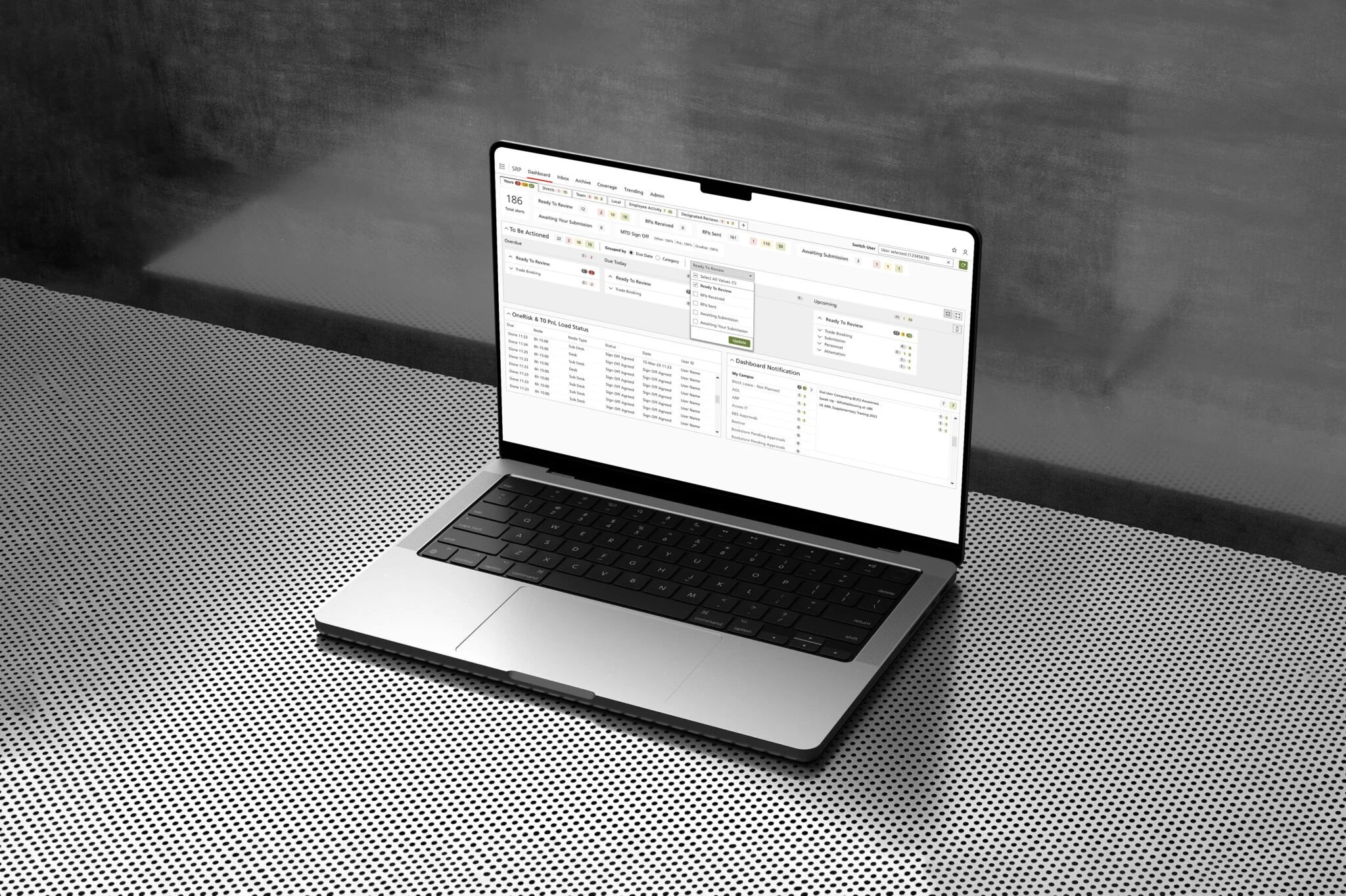
An internal operations tool where people had to search for the work that mattered. I redesigned how work is organised so users can see what's urgent, who owns it and what to do next. The design was tested with users before delivery.
The problem
Reviewers handled alerts, requests and approvals in a dense dashboard. Overlapping routes and colour-coded alerts made it hard to see what needed attention, so finding the work had become part of the work.
What I did
Ran stakeholder interviews and a questionnaire, then separated design problems from performance and technical ones, so the redesign didn't promise fixes that design alone can't deliver.
Ran prioritisation workshops with product, business and technology teams to agree what to tackle first.
Mapped the end-to-end workflow for each role: the decisions, dependencies and actions involved.
Designed alternative dashboard directions and tested them with users.
Key decisions
Time first: work is grouped by when it's due (overdue, today, tomorrow, upcoming), so users get their bearings before opening any detail.
Mine vs team: separate personal and team views keep individual tasks apart from wider oversight.
Action in context: each item opens with the information and actions needed to move it forward, in one workspace.
What testing changed
Users preferred to start from a collapsed overview and open detail when needed, so that became the default. Testing also surfaced performance and process issues that layout alone couldn't solve, and these were passed to the wider team.
Outcome
A tested design, delivered to the client team and built on their existing component library. Launch results aren't covered here.
My role: Senior UX Designer (contract). Research, workshop facilitation, workflow and interface design, and user testing.
Relevant if your users work from a dashboard full of alerts, tasks or approvals and can't tell what to do first.
See my Complex Workflow Design service, or start with a UX Audit.
Like this project
Posted Oct 3, 2026
Research, workflow design and user testing to help users prioritise operational work and move from overview into detail. Tested design delivered.
Likes
0
Views
0
Clients
UBS