Product Design & Branding for a Travel Planning App

Website homepage
"Ljubomir is one of the most professional people I've worked with so far - responsive, creative, punctual and with structured approach. He has fulfilled all the agreed assignments on time and he's work always brought added value. He's put extra effort to study the project and industry before starting with work and at the end we've received interactive designs with outputs in various formats. For developers it was simple to build on further from Ljubomir's designs. If you would need more information, please feel free to contact me."
-Aleksa Mitrović, CEO & Co-founder
Project overview
The goal of the project was to design an one-stop-shop travel planning platform. Aside from trip planning the platform also has a social aspect and it allows the users to engage with other users to share your plans and experiences.
My contributions
I was the only designer on the project so I was involved in everything from defining the brand and personas, creating flows and wireframes, all the way to creating final UI designs as well as designing the logo.
Table of contents:
The Design Proces
Defining a user centered brand
We started with strategy and defined the brand and it’s target audience. Since we were talking about a new company we started by defining the brand attributes and created a brand statement.
Regarding the users I was happy to find out that the team has already been talking to their target audience and had a lot of insight so it was only a matter of consolidating the findings to form a user persona.
Both of these documents guided our decisions during the rest of the project.
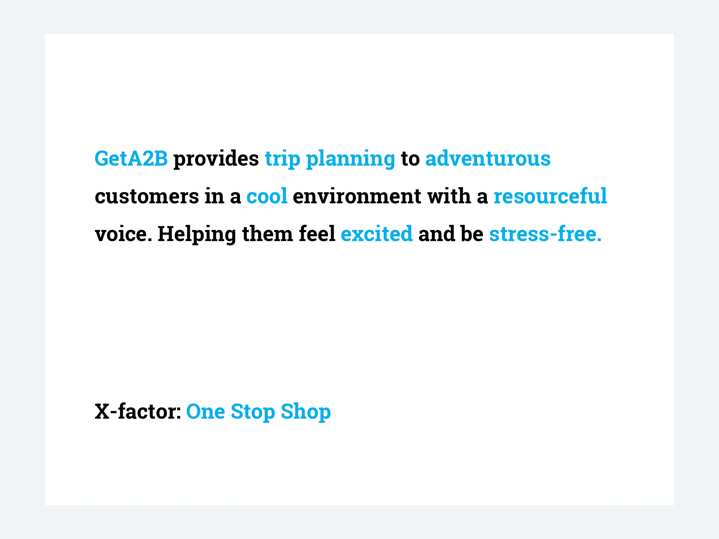
Brand Statemnet
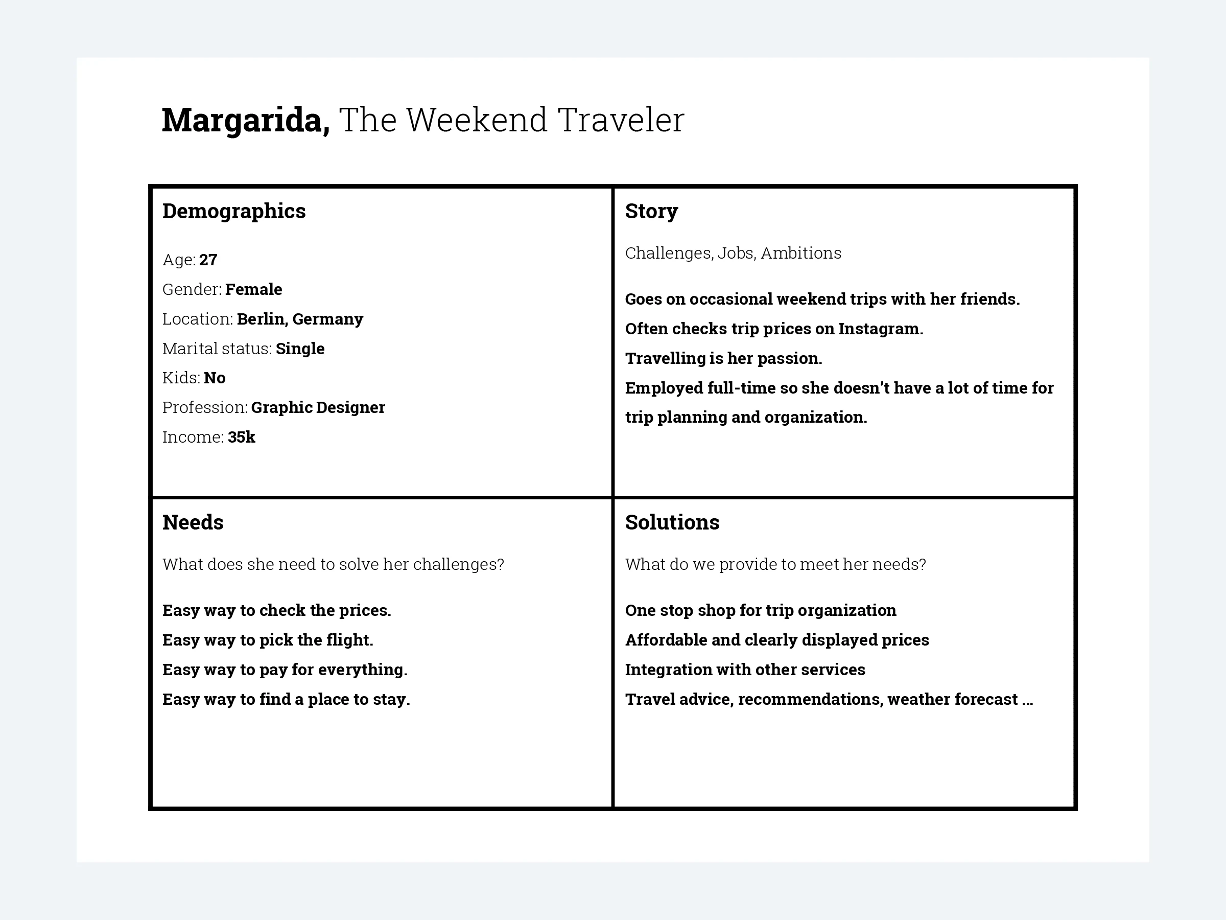
User persona
Defining the user flow
After that I proceeded with creating a flowchart showing how the platform would be organized. The client had some features in mind so I made sure to discuss them and include them in the plan.
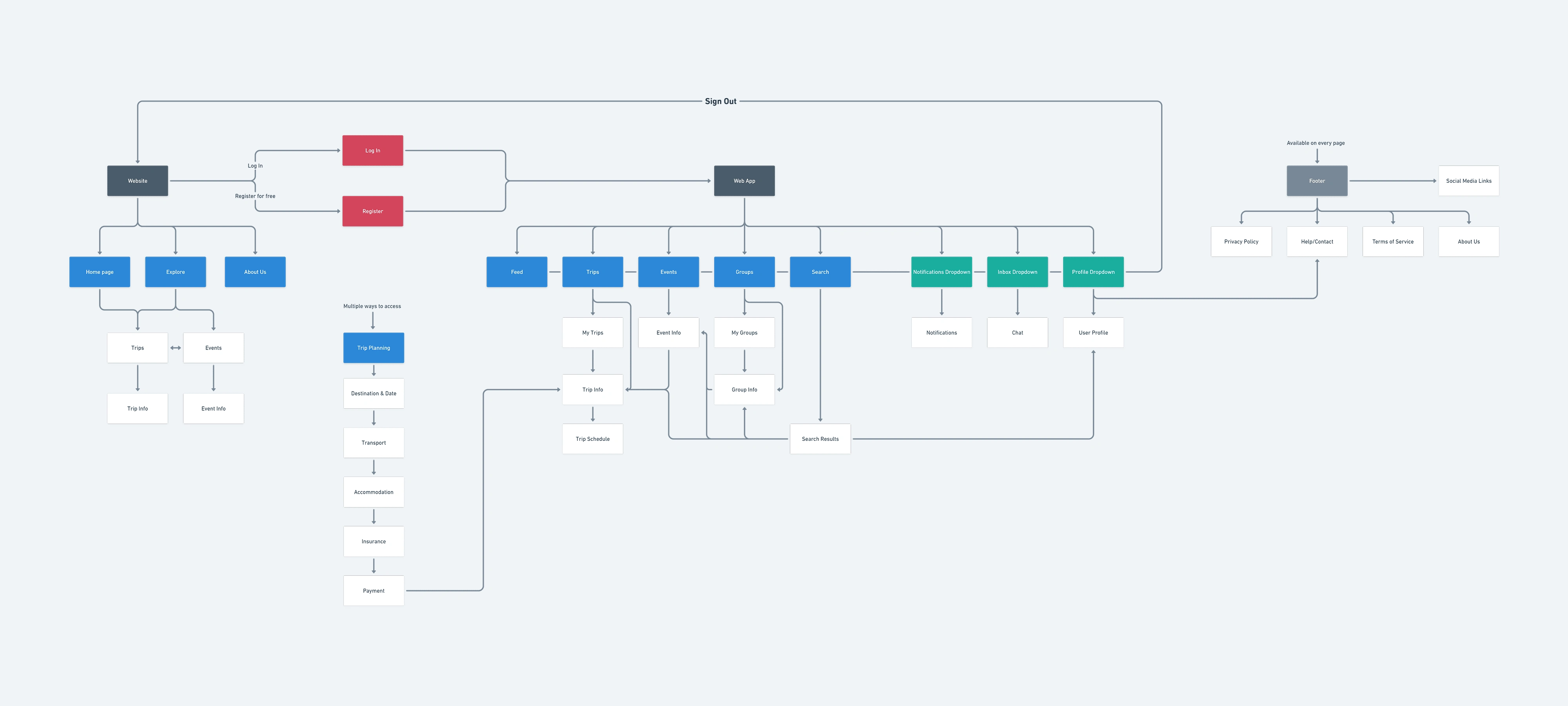
User flow
Wireframing
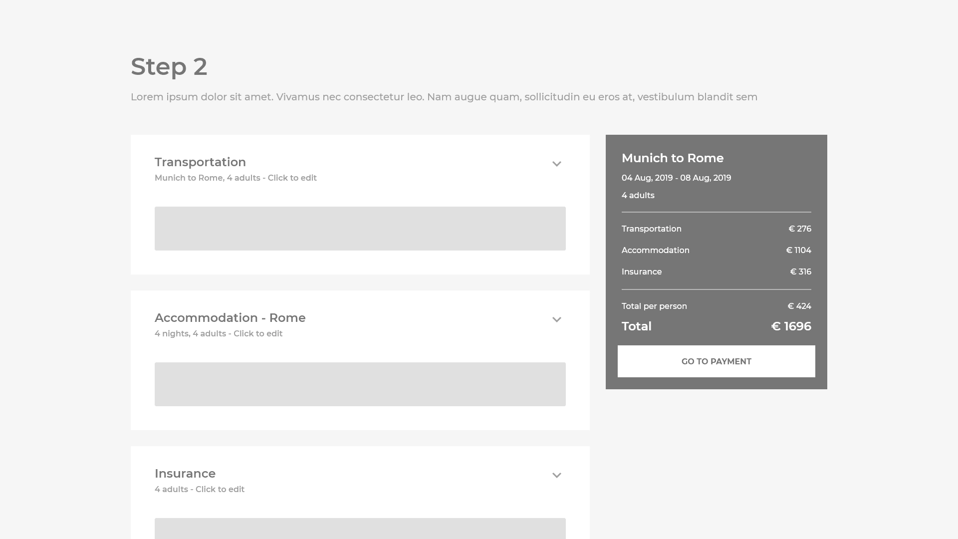
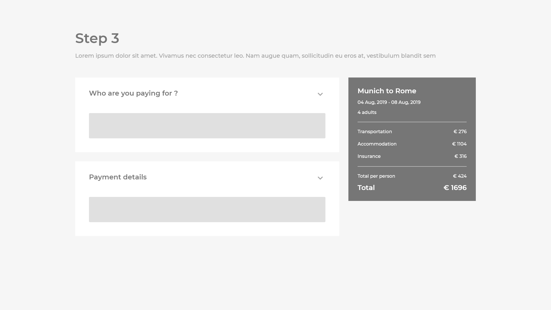
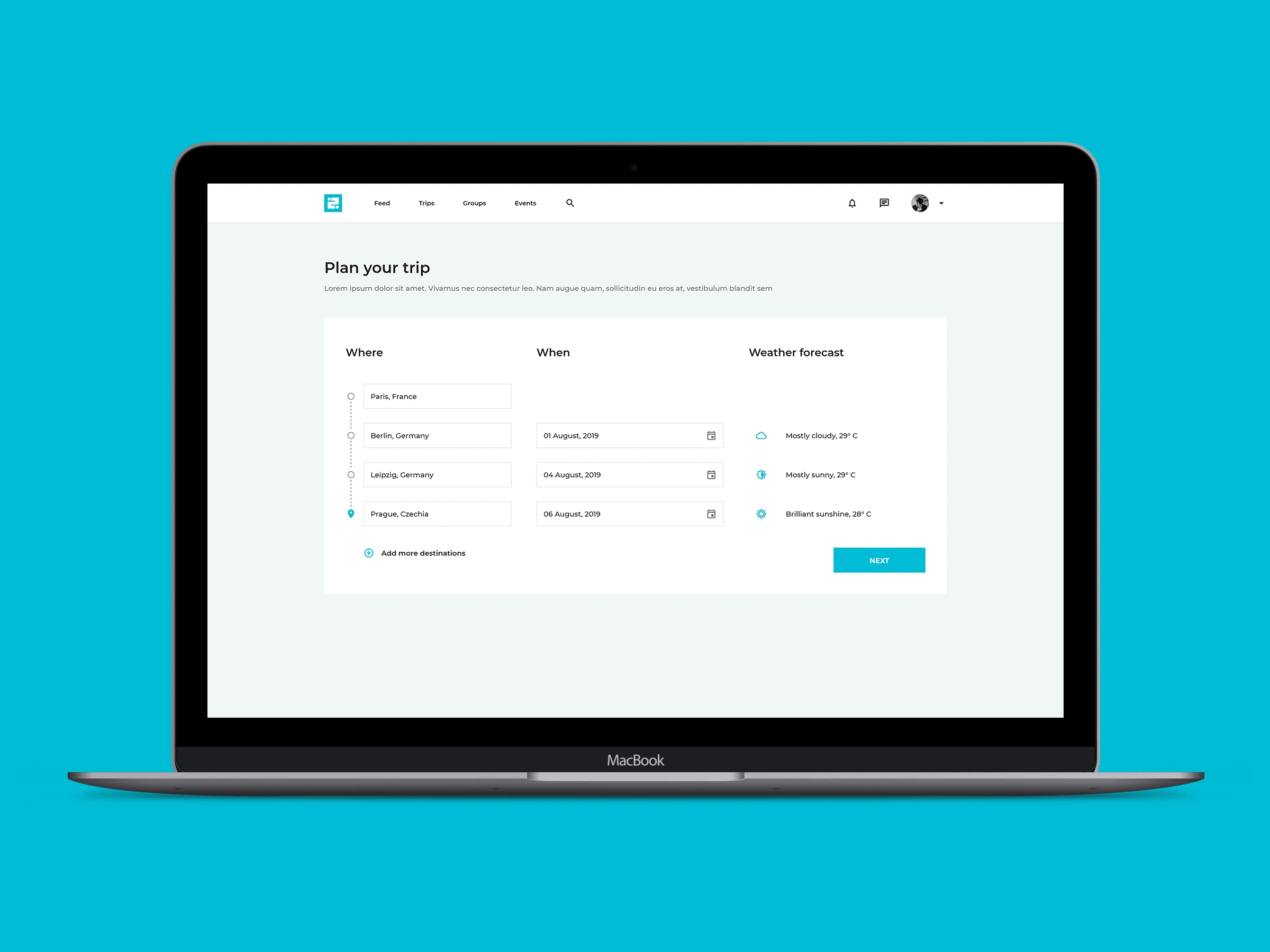
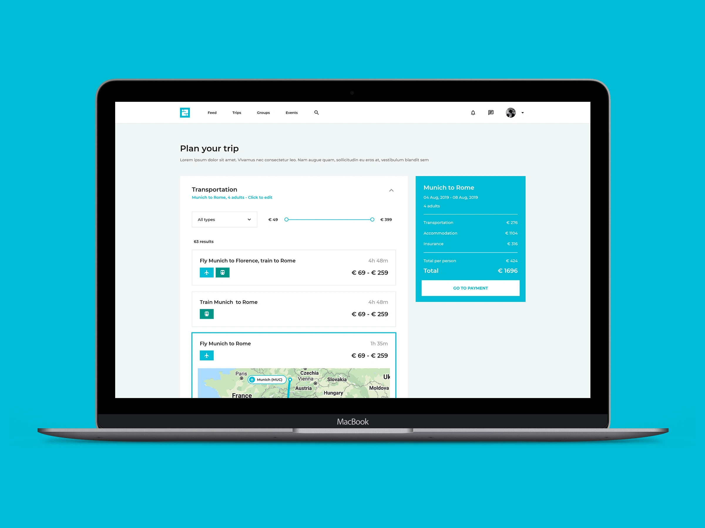
After we defined the flow and thus what screens we needed I proceeded with creating the wireframes to explore the experience in more detail on a screen-by-screen level. The main focus was the trip planning flow which sits at the heart of the app.
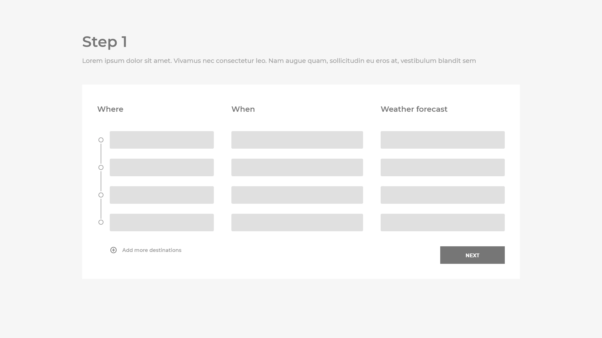
Visual design exploration
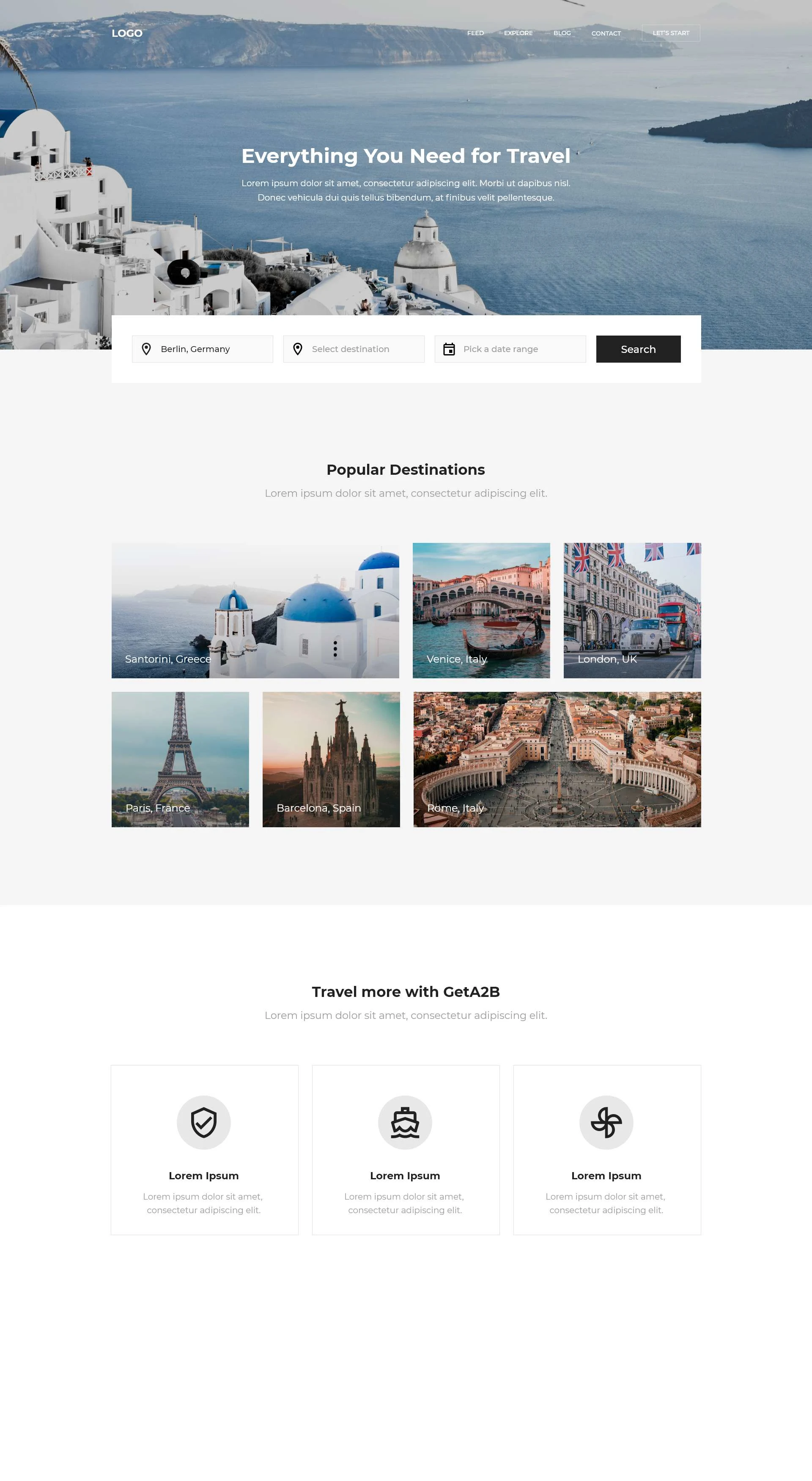
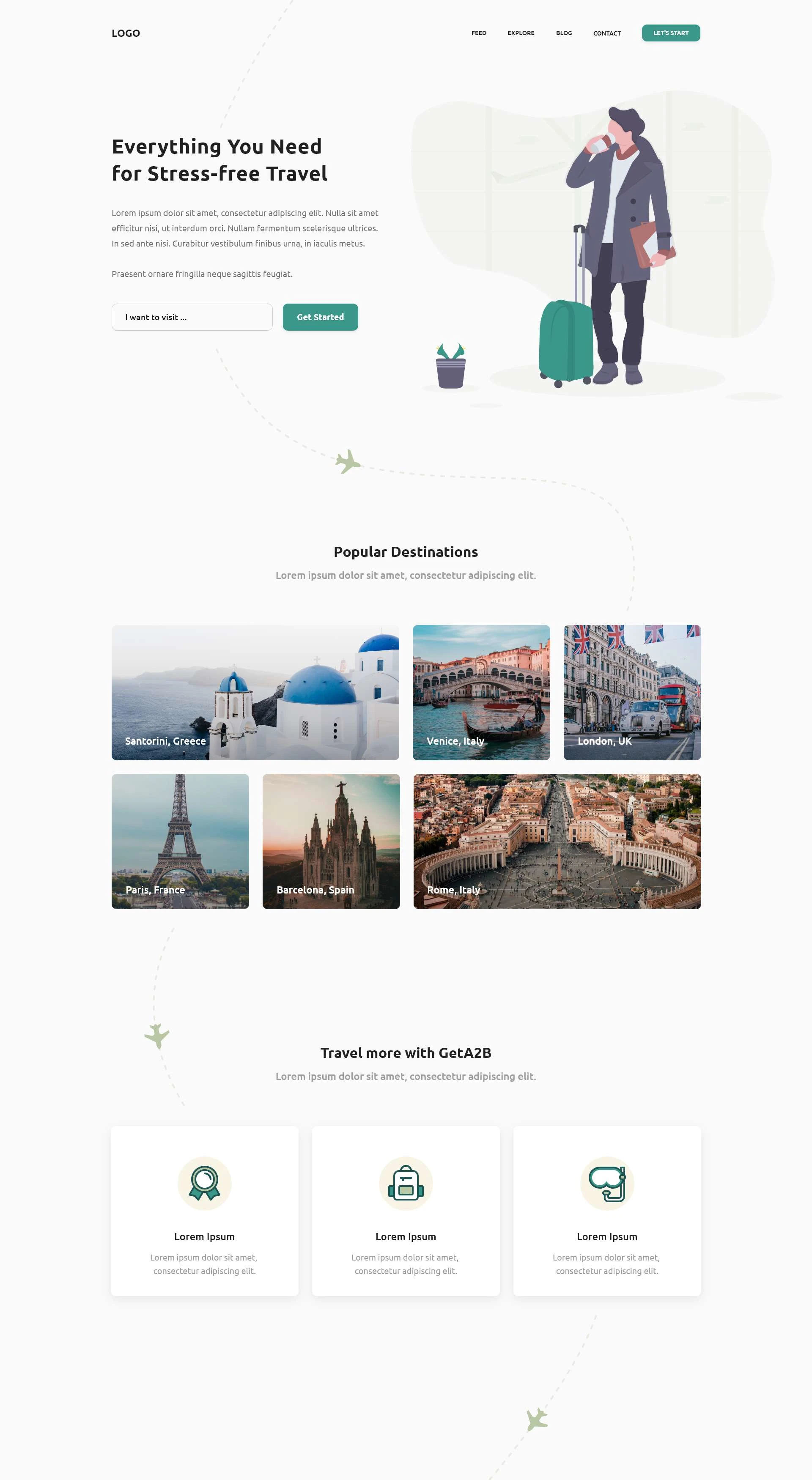
Next I moved to exploring the overall look of the app. I did this by creating 3 landing page mock-ups using the same layout but different styles. Taking this route instead of creating mood boards helped communicate different directions we can take more vividly as the client could clearly see the impact each direction would have.
Option 1
Option 2
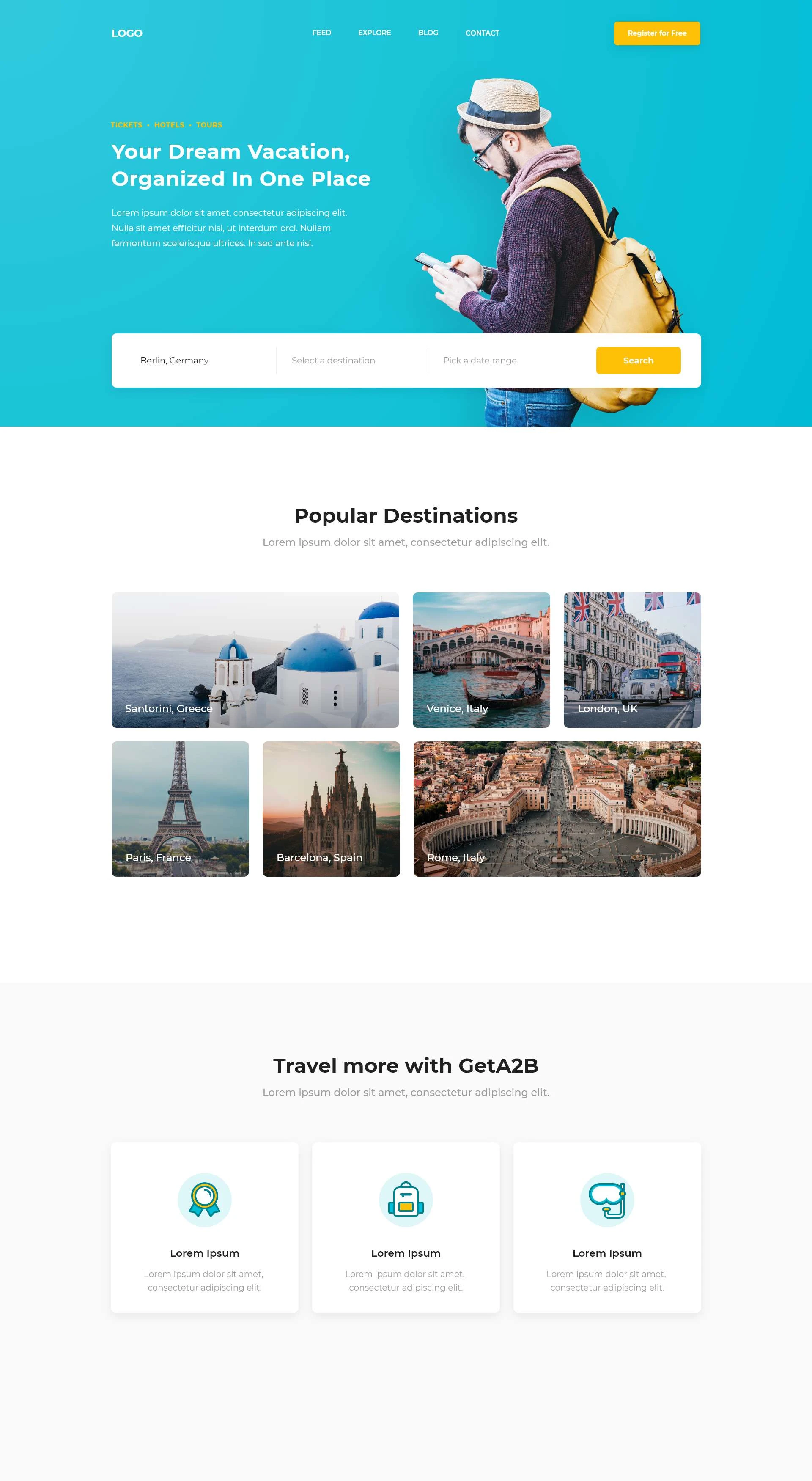
Option 3
Logo exploration
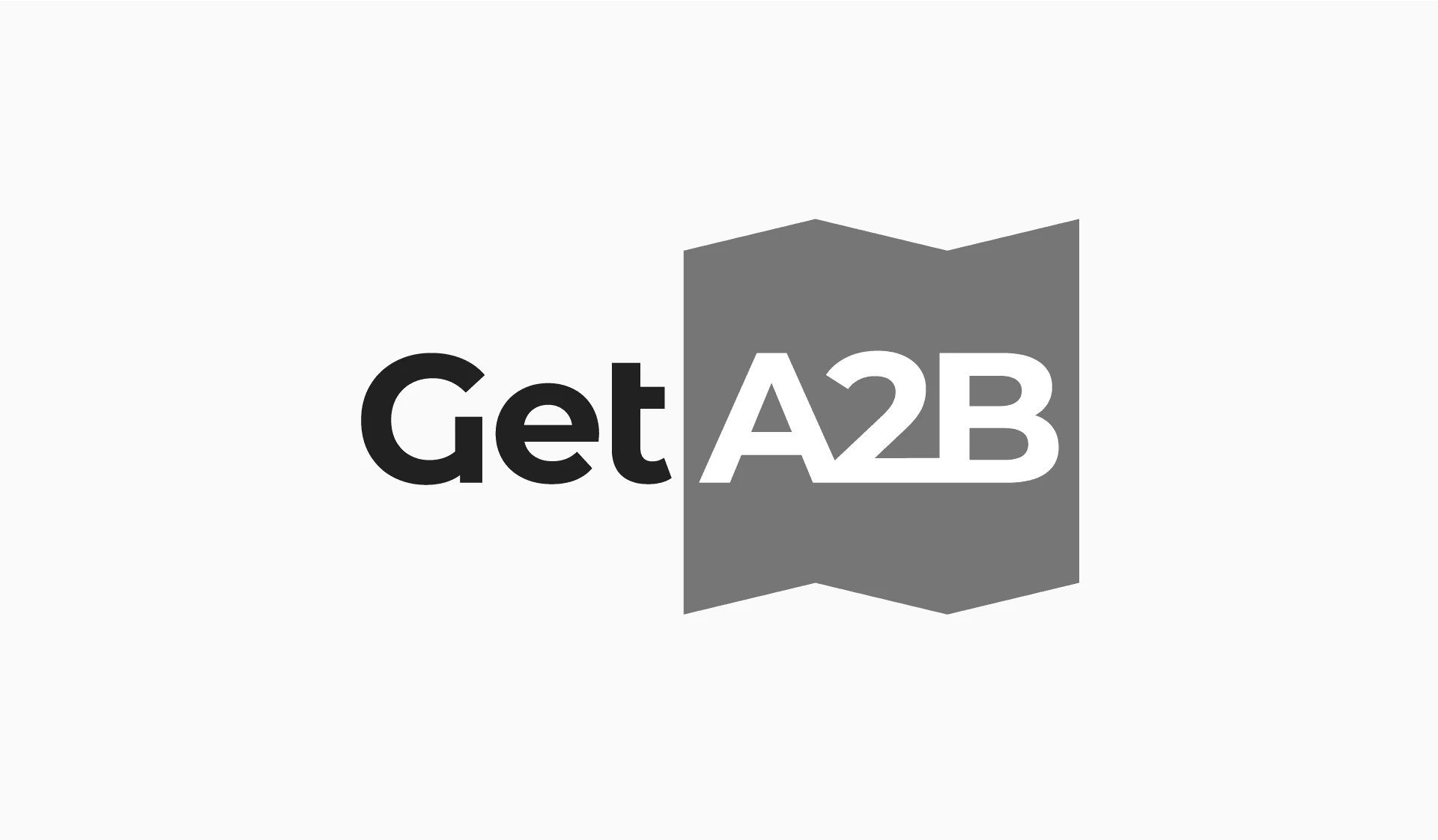
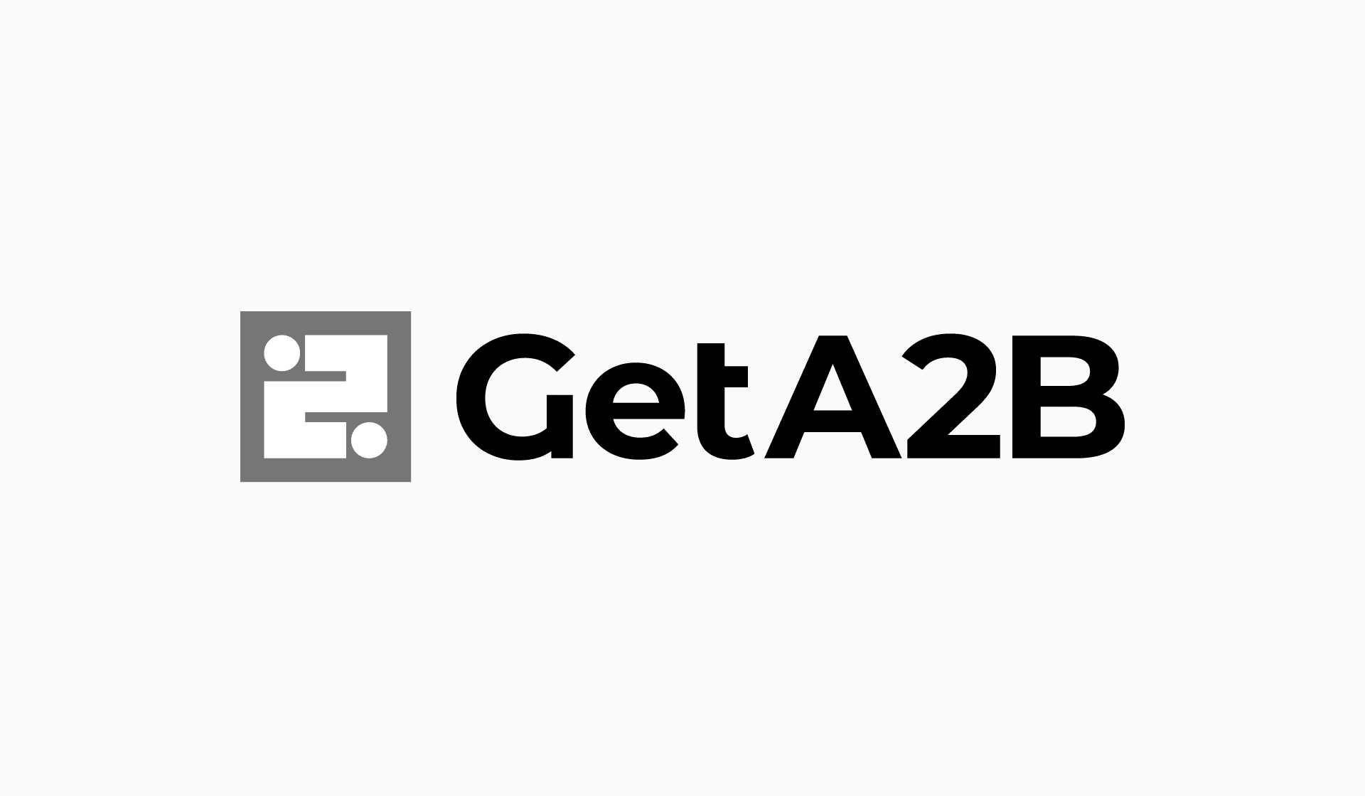
Out of the 3 landing page concepts I presented, #1 was chosen as the way forward. It was time to develop it further through UI and logo exploration. For the logo I explored a bunch of different options and once again narrowed it down and presented 3 options, all 3 inspired by the landing page concept.
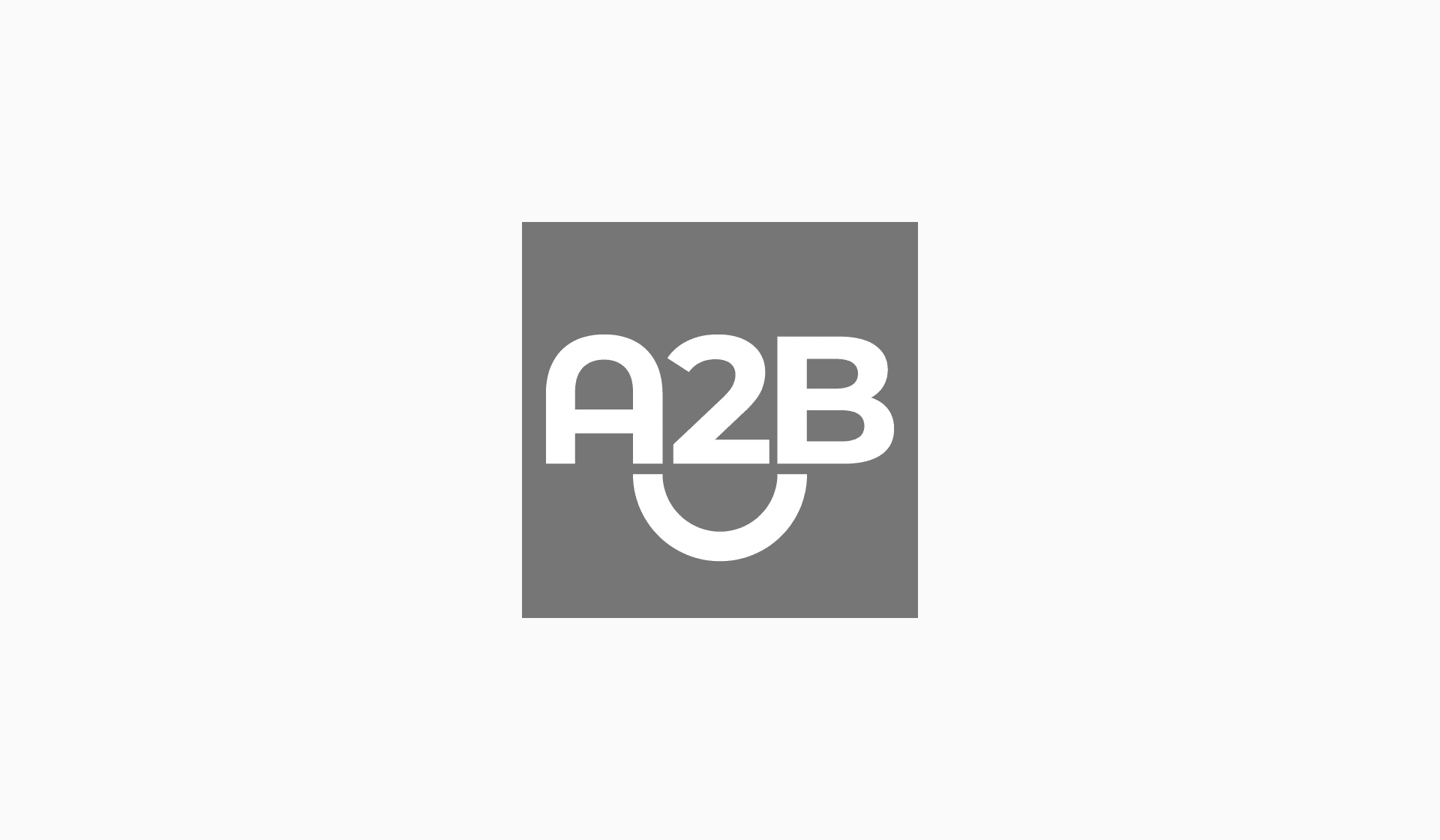
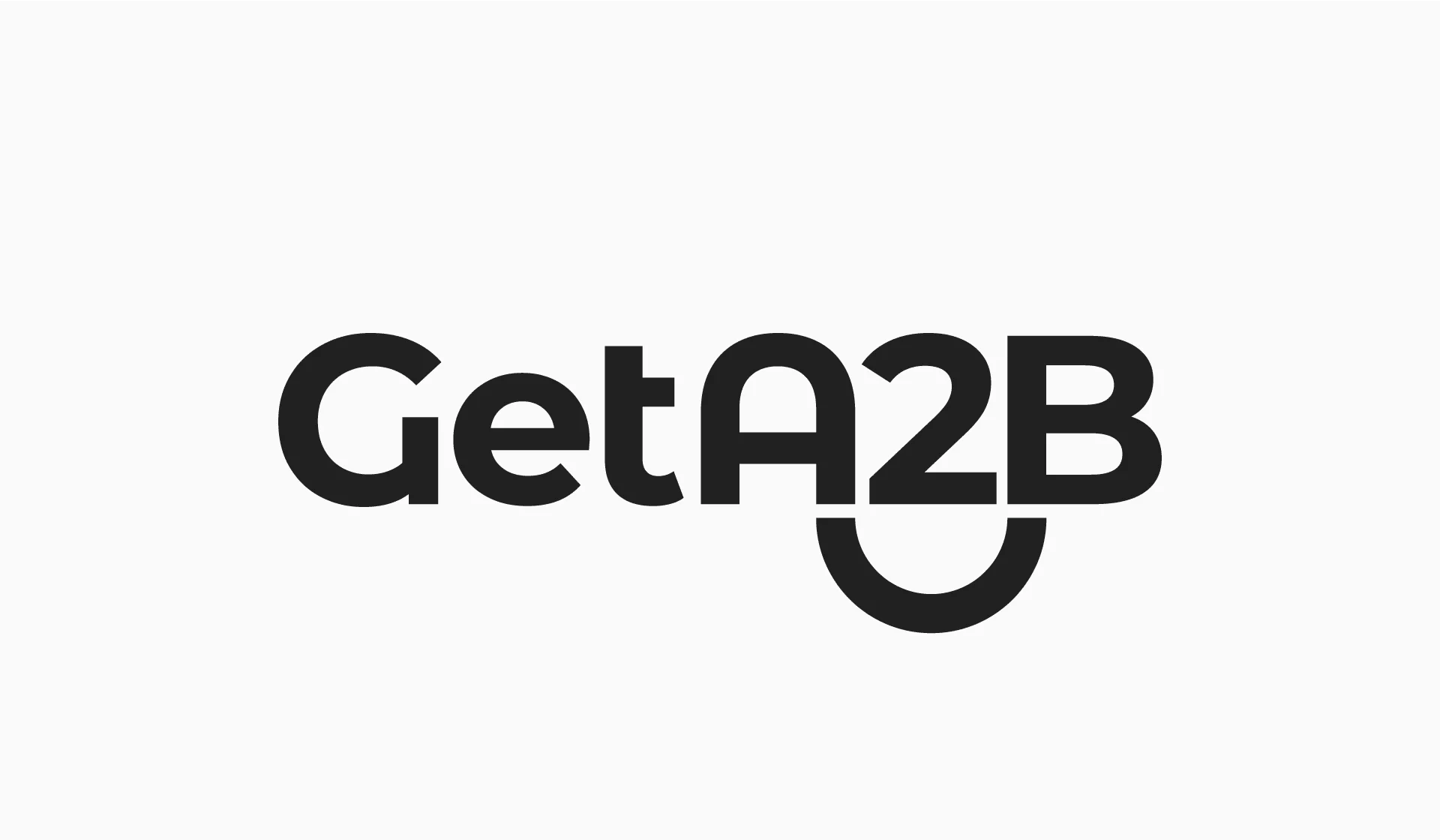
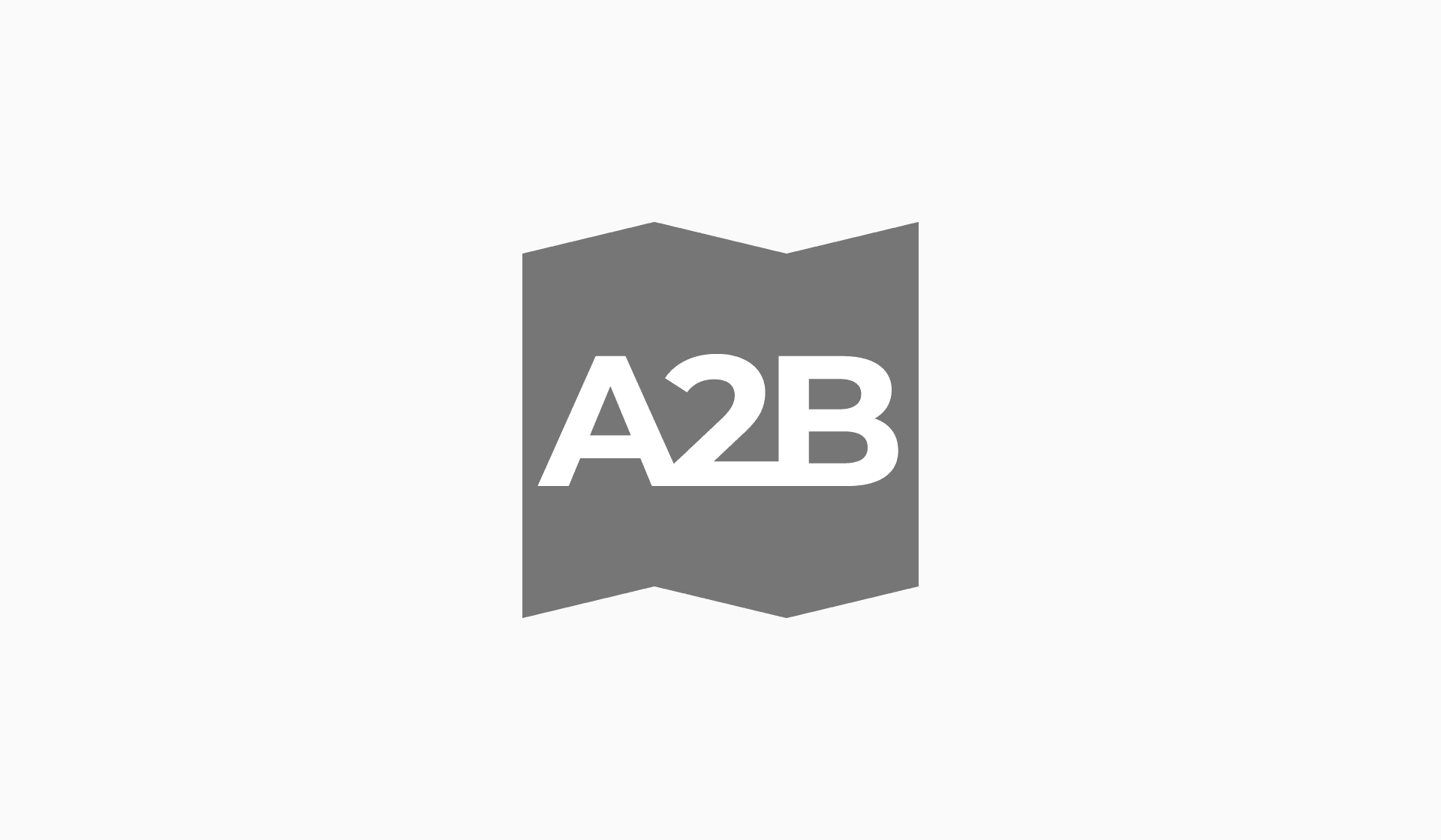
Final Logo
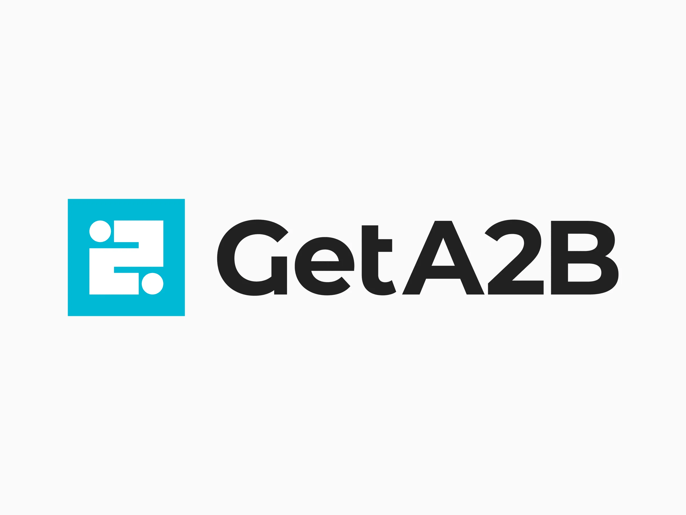
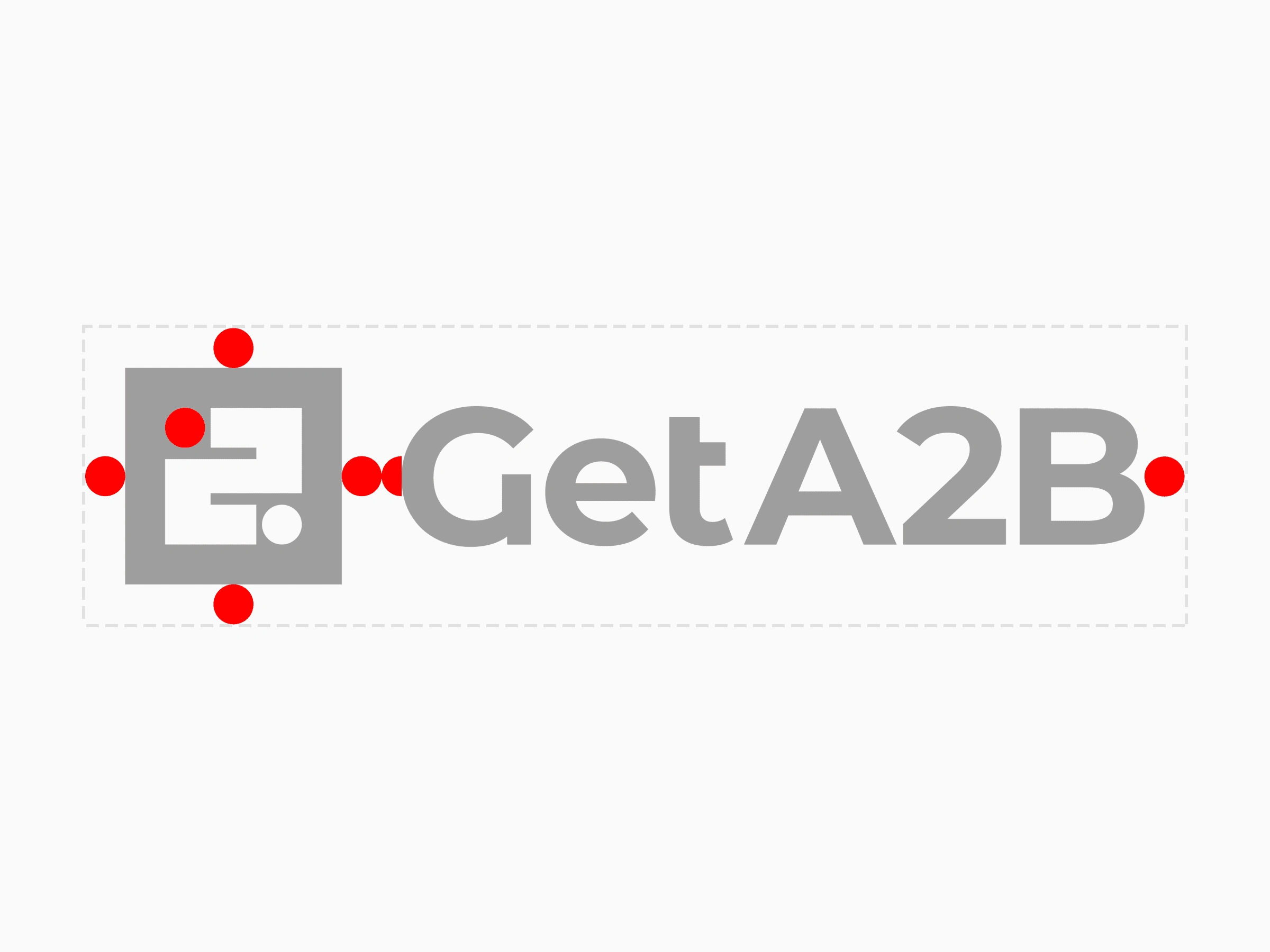
In the end option #3 was chosen so I proceeded with refining it. The main change was spacing - I used one circle as a measurement unit adjusted the spacing all around the logo. This step also included picking the colors and for the I proposed a few different options based on our target audience and the clients ended up picking the Cyan you see below.
Final UI
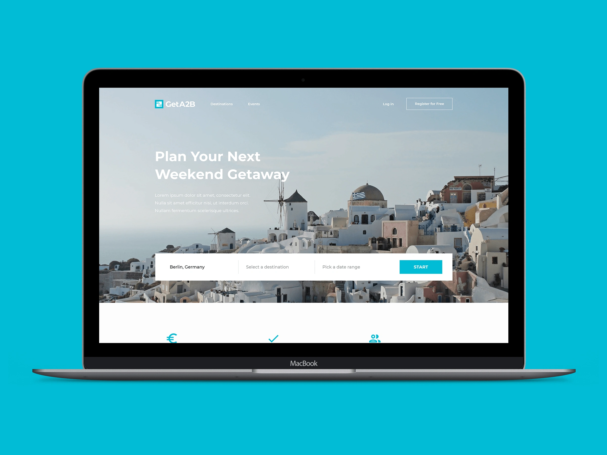
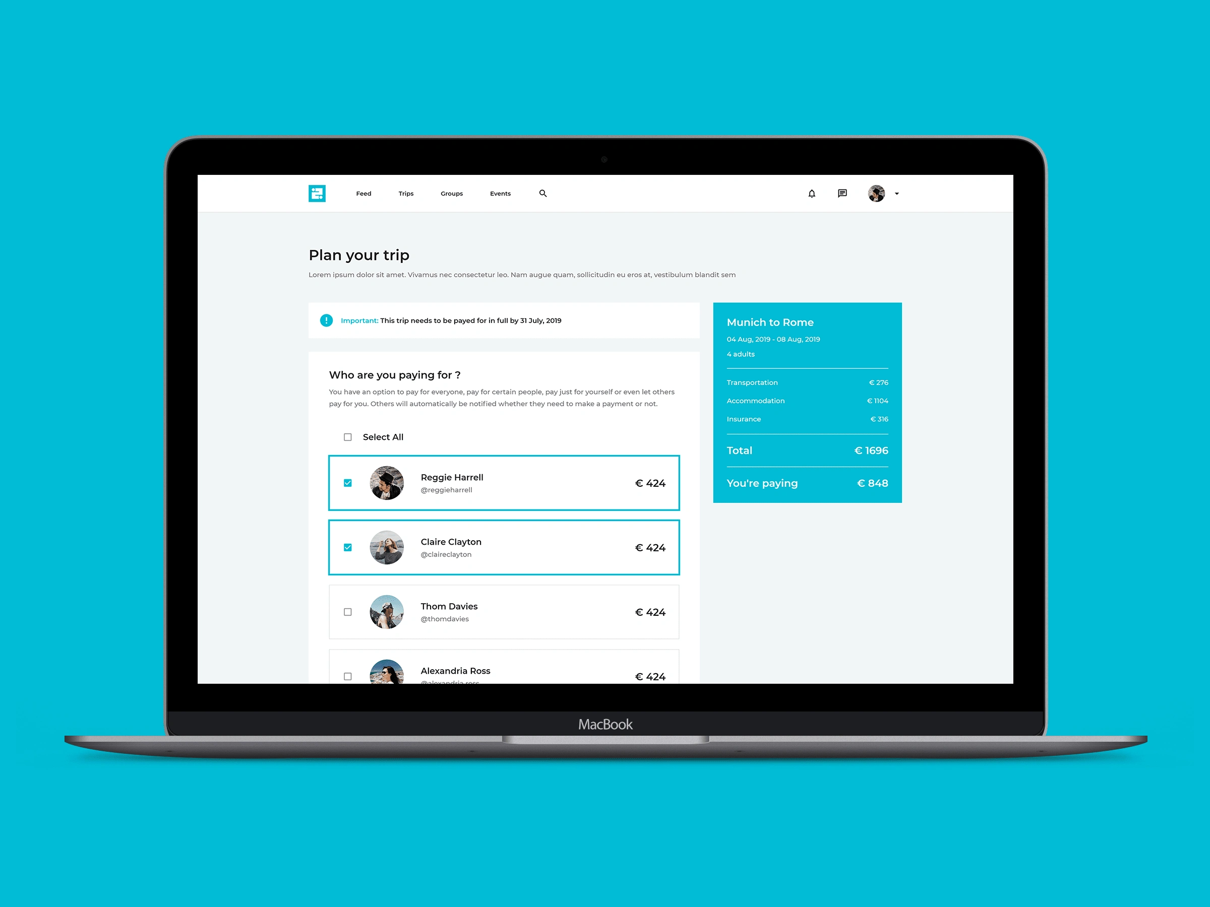
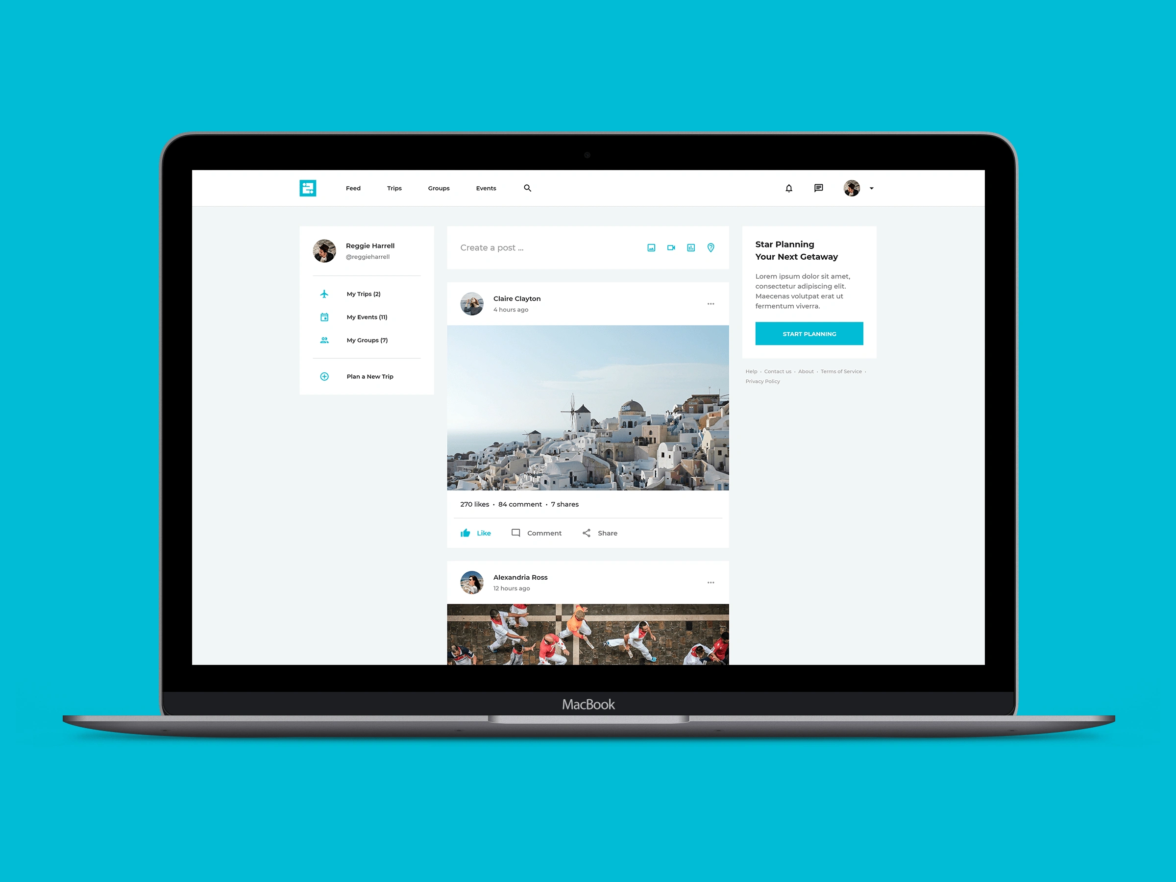
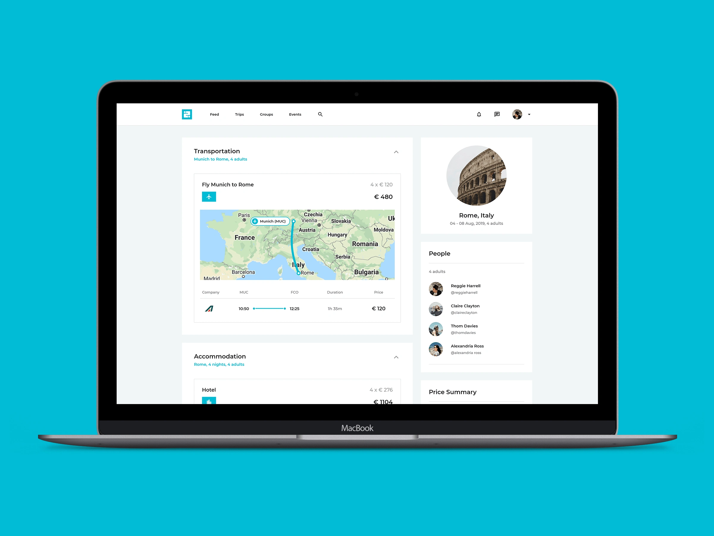
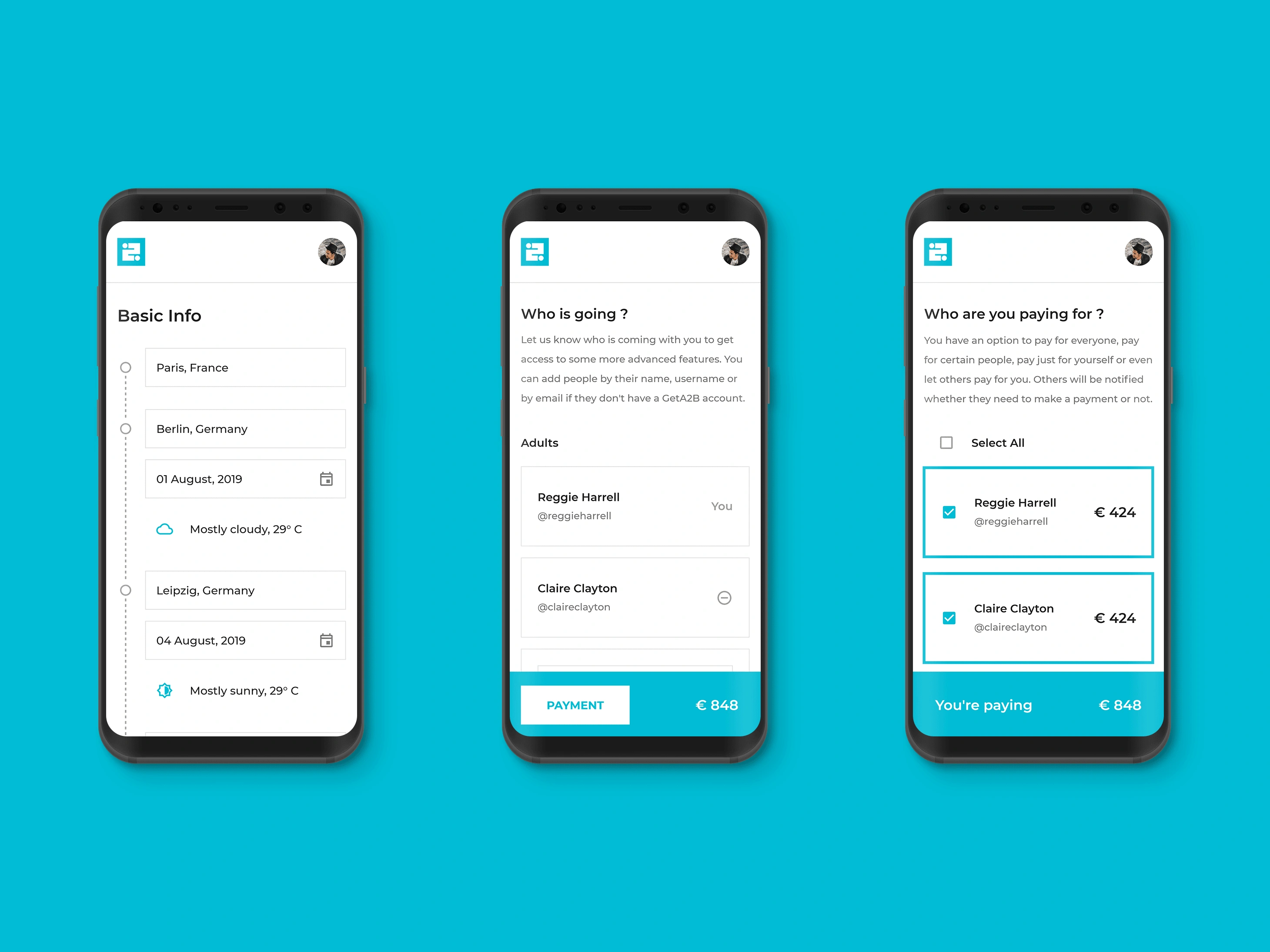
After the logo was complete I proceeded with designing the final landing page and user interface for desktop, tablet and mobile.
Full case study
Like this project
Posted Oct 21, 2021
The goal of the project was to design an one-stop-shop travel planning platform. I was involved in everything from defining the brand to final UI designs.

