Port Side Website Redesign
Nathan Lindahl
Reimagining the visual identity of a maturing creative business.
Having worked alongside Port Side since its early days, I was stoked to see them outgrowing their branding. As the business began shifting from a production company to a strategic media partner, the brand needed to mature to match the scope and quality of their services.
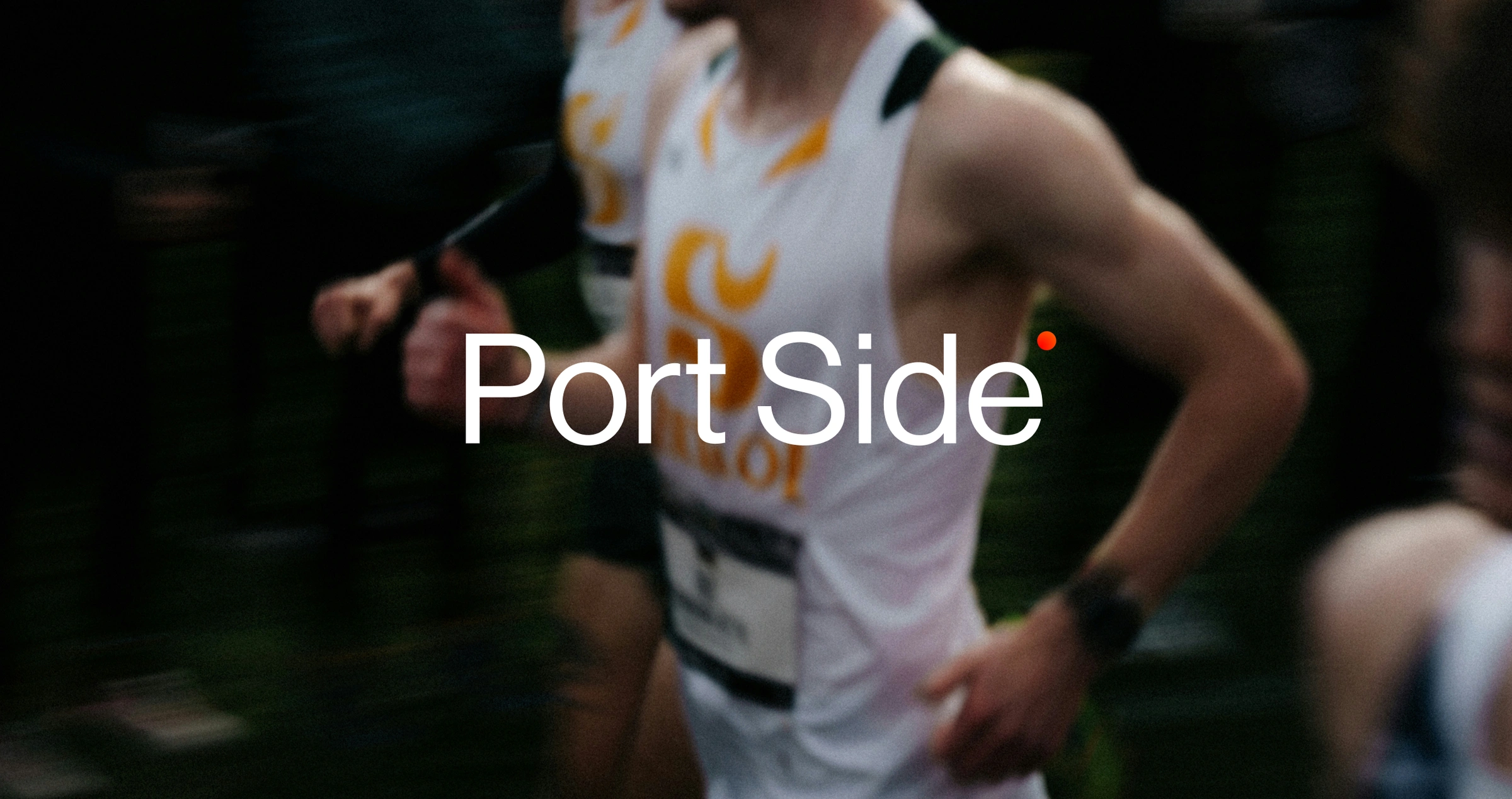
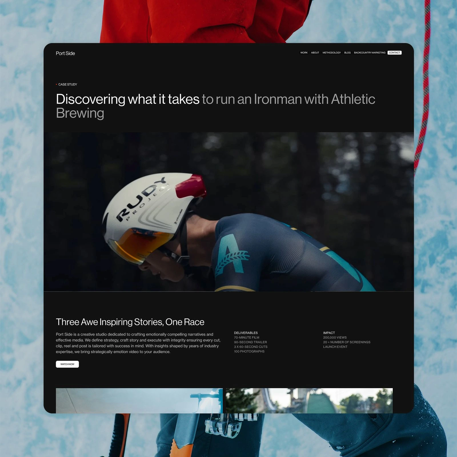
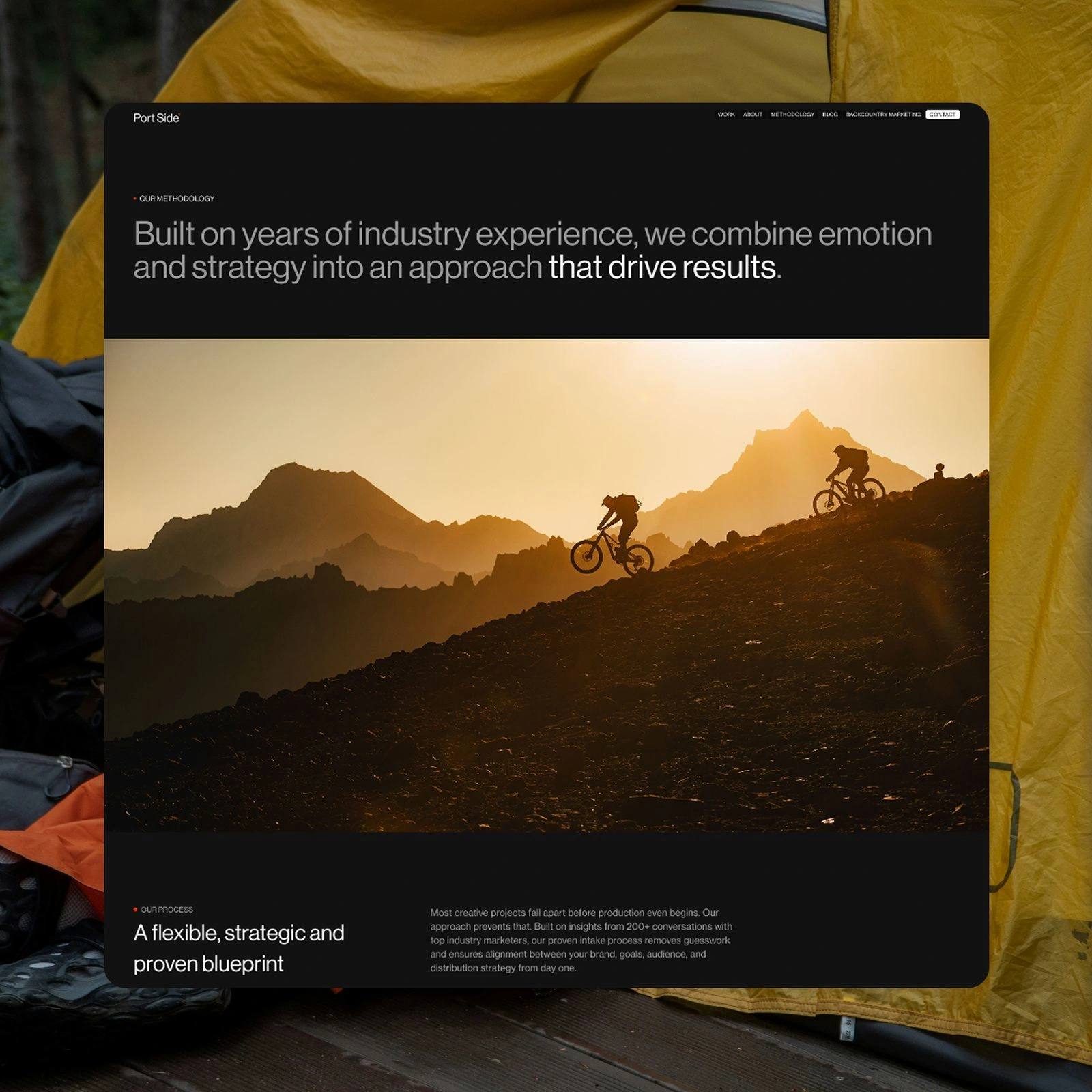
The simple red dot
All brands that work in creative services struggle in the tension between highlighting work for other companies and establishing their own brand. Side by side, the two goals often compete with each other. In the video space, most brands (including Port Side) opt for a minimal visual identity that allows the work to shine first and foremost.
So the challenge was to create a memorable and meaningful moment without being obstructive or distracting to case studies and messaging. The challenge was met with a small red dot. Pulled from the side of a camera (or your phone) the red dot indicates recording in progress. The simple light that reveals the operating state of a camera can also be used here.
The obvious tie in to video as genre aside, the dot metaphor can be extended to the concept of recording itself. Port Side is a brand that, before all else, listens. There’s over 200 podcast episodes dedicated to this fact. Though they are already experts in the outdoor/active space, they filter down even further, targeting hyper-specific markets such as Ironman athletes. Accomplishing this requires research, interviews, listening and the dot signifies their remarkable ability to take in and understand these sub-cultures.
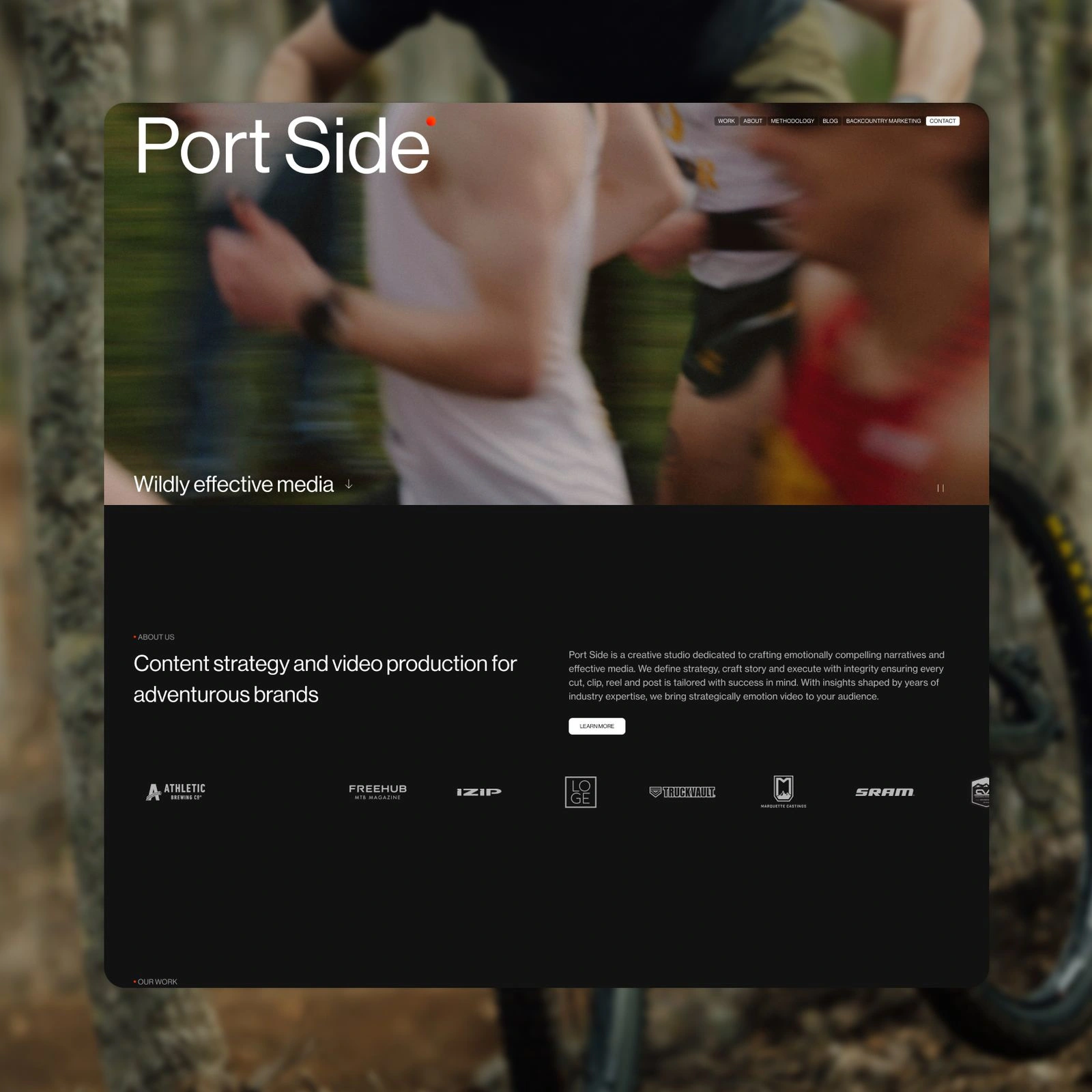
The web design
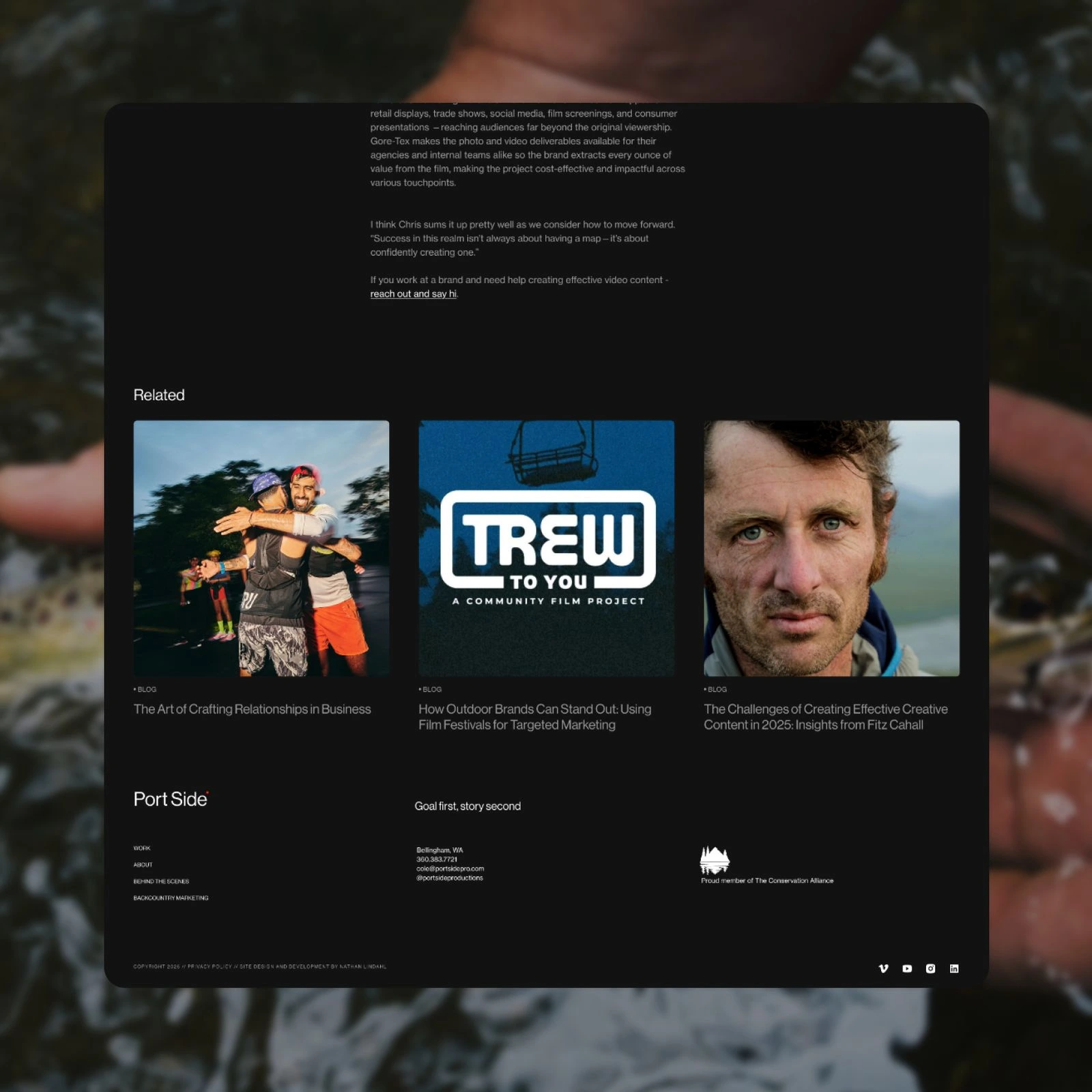
The design itself leans into the video production aesthetic. Dark backgrounds illuminate imagery and allow typography to stand out… kinda like scroll credits amiright? The intention here is for the the work itself to be the primary driver of visuals. As professionals in a creative field, their capacity to create high quality assets is a natural boon to the site.
Narratively, however, a high degree of flexibility is required. Each case study, each blog exists on its own following no strict template or outline. Typography and componentry therefore needed to be thoroughly stress tested to ensure elements could be reordered at will.
The build
The site was completed in Webflow, making use of its component system and recently added page slot containers. This functionality allows content authors to remix and rearrange content at will while maintaining the structural integrity of the design. It’s a perfect blend of freedom and and constraints.
While Webflow has come a long way in authorship, development is still a tedious process. To speed up the work, a homespun css “framework” (if a super light series of grid and type classes can be so called) was applied and styles were kept to a minimum within the Webflow editor. This further enhances the reusability of each component without creating the prototypical Div 254 class that so often appears within Webflow.
Once structure is in place it’s fairly straight forward to finesse the details. A seasoning of GSAP was applied for motion and fluid typography introduced creating a refined responsive design that works at any breakpoint.
More work
Like this project
Posted Mar 9, 2026
Redesigned Port Side's visual identity and website for enhanced branding.