BECA Website Redesign
Nathan Lindahl
Our approach
We rebuilt from the ground up—but kept BECA at the center. Information architecture built around clarity and scale, reorganizing and future-proofing the global navigation all while being fully-optimized for mobile. We introduced a concise system of modular components for easy updates and helped support clean storytelling. We included guardrails to the components that gave their team guidance with structure so they could focus on the goals… Because chaos is not a CMS feature.
BECA needed a site that could keep up with their growth, and was designed for the future. A content system they could manage themselves—without breaking it or needing to call in the cavalry for regular updates.
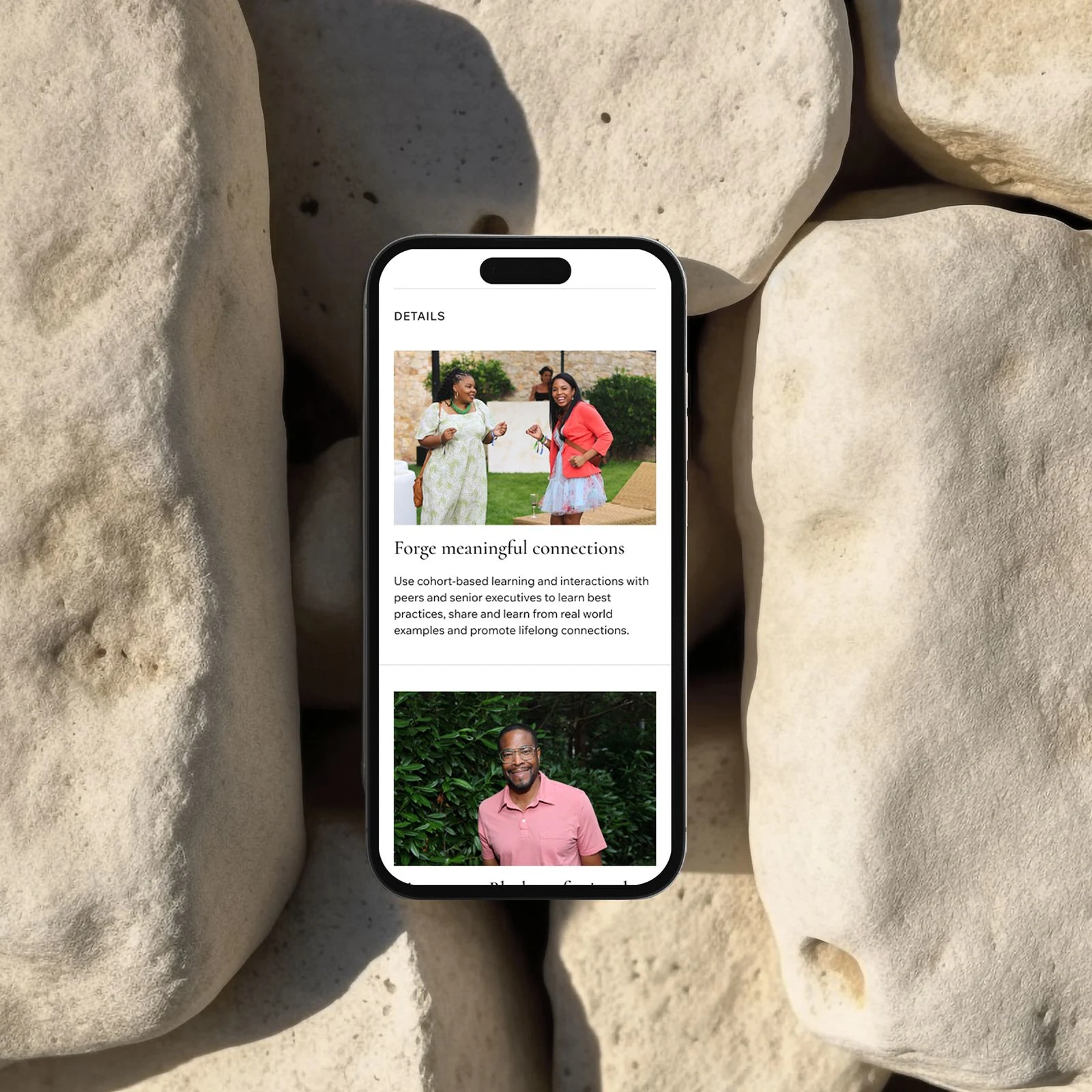
Clear structure to support growth (content, events, media, milestones, programs, etc).
Component-based design, with built-in boundaries (the good kind).
Structured Galleries and Event listings that didn’t feel like a photo dump.
Upleveling the visual identity
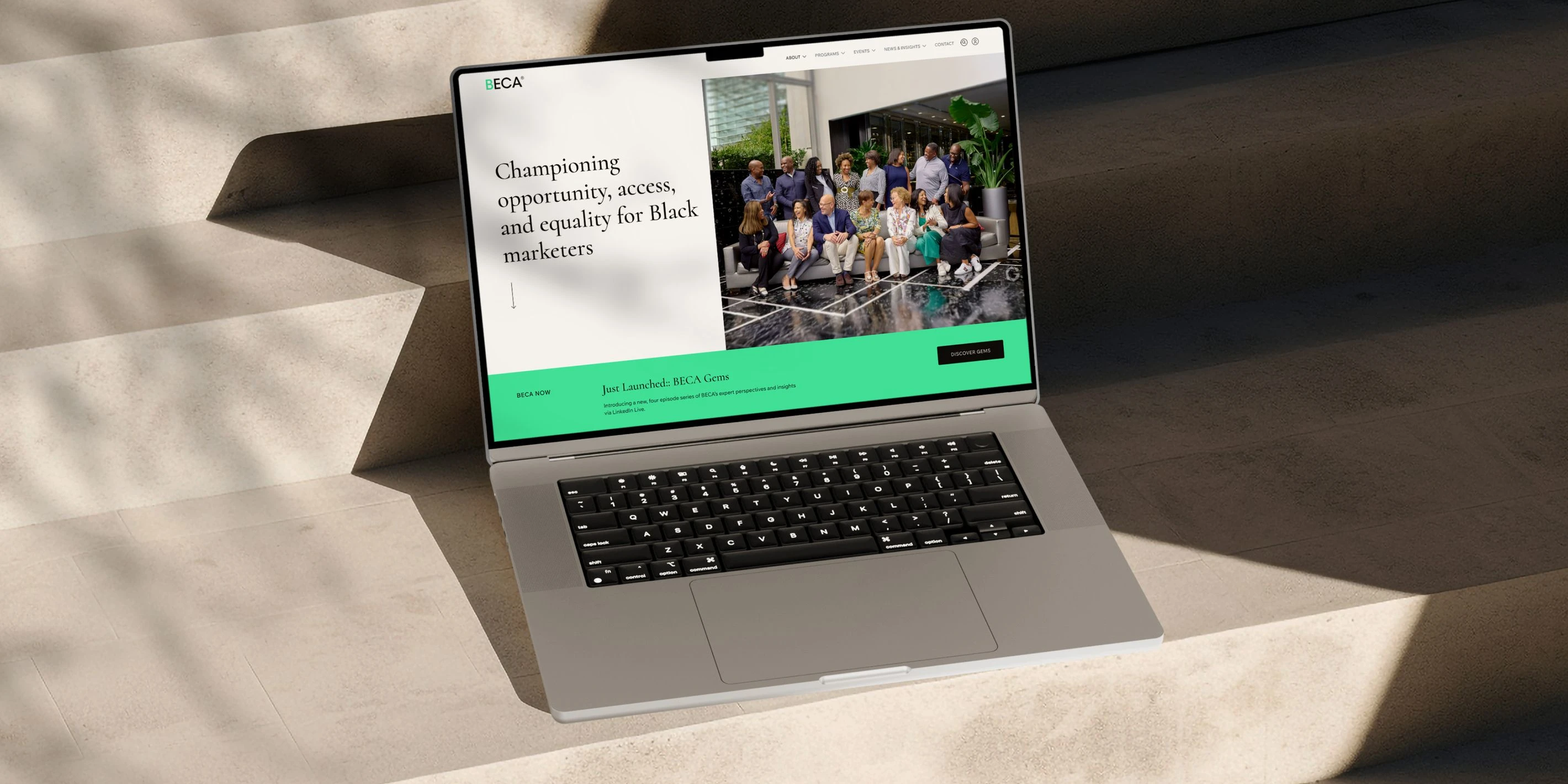
The core of the BECA brand remained the same. The original themes and ideas were carried through, but evolved to bring a more refined and elegant aesthetic to the site.
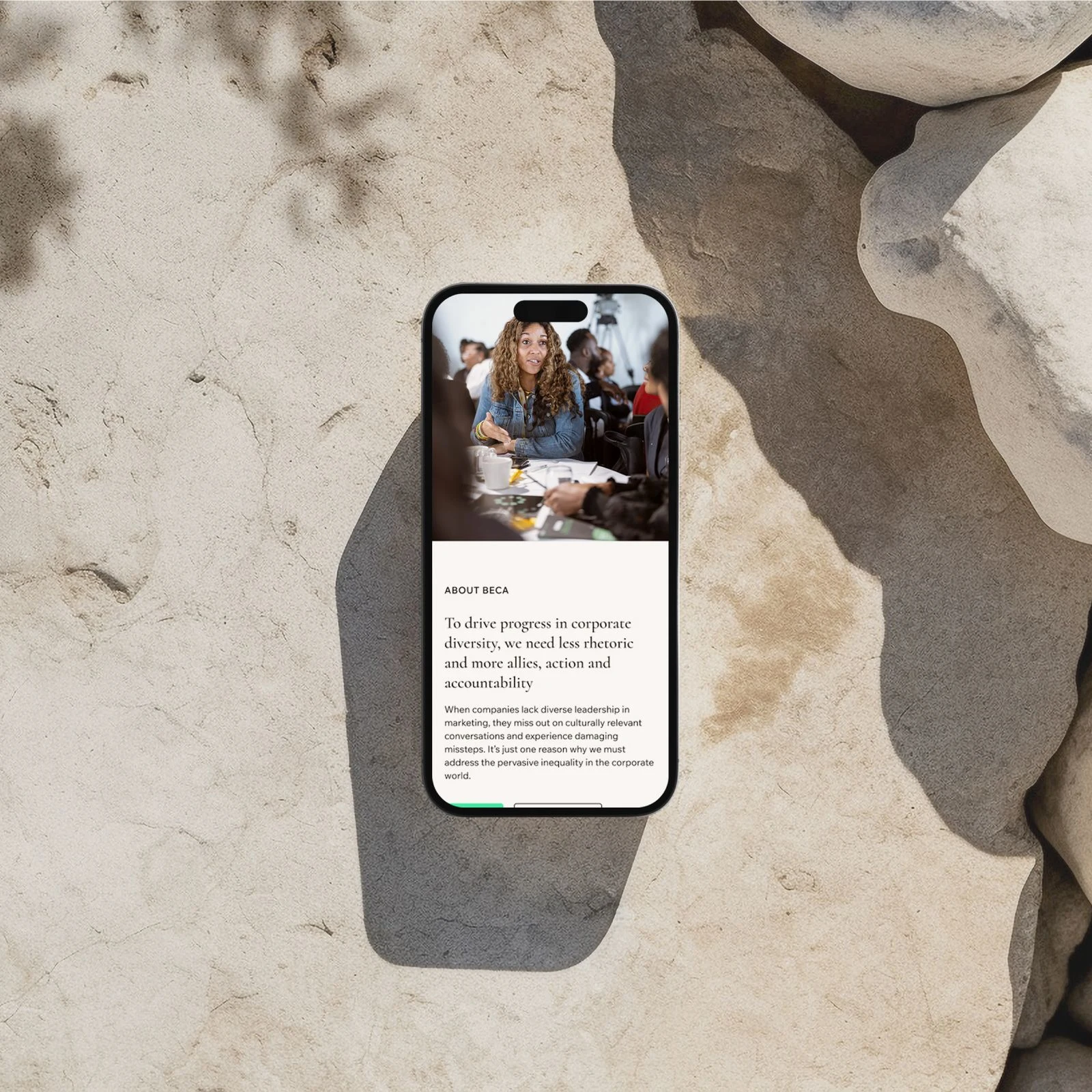
From the outset, our creative direction emphasized one core principle: people are at the heart of BECA. The organization’s identity has always been deeply rooted in its members, so it was essential that this human-centered ethos be reflected prominently throughout the site’s design.
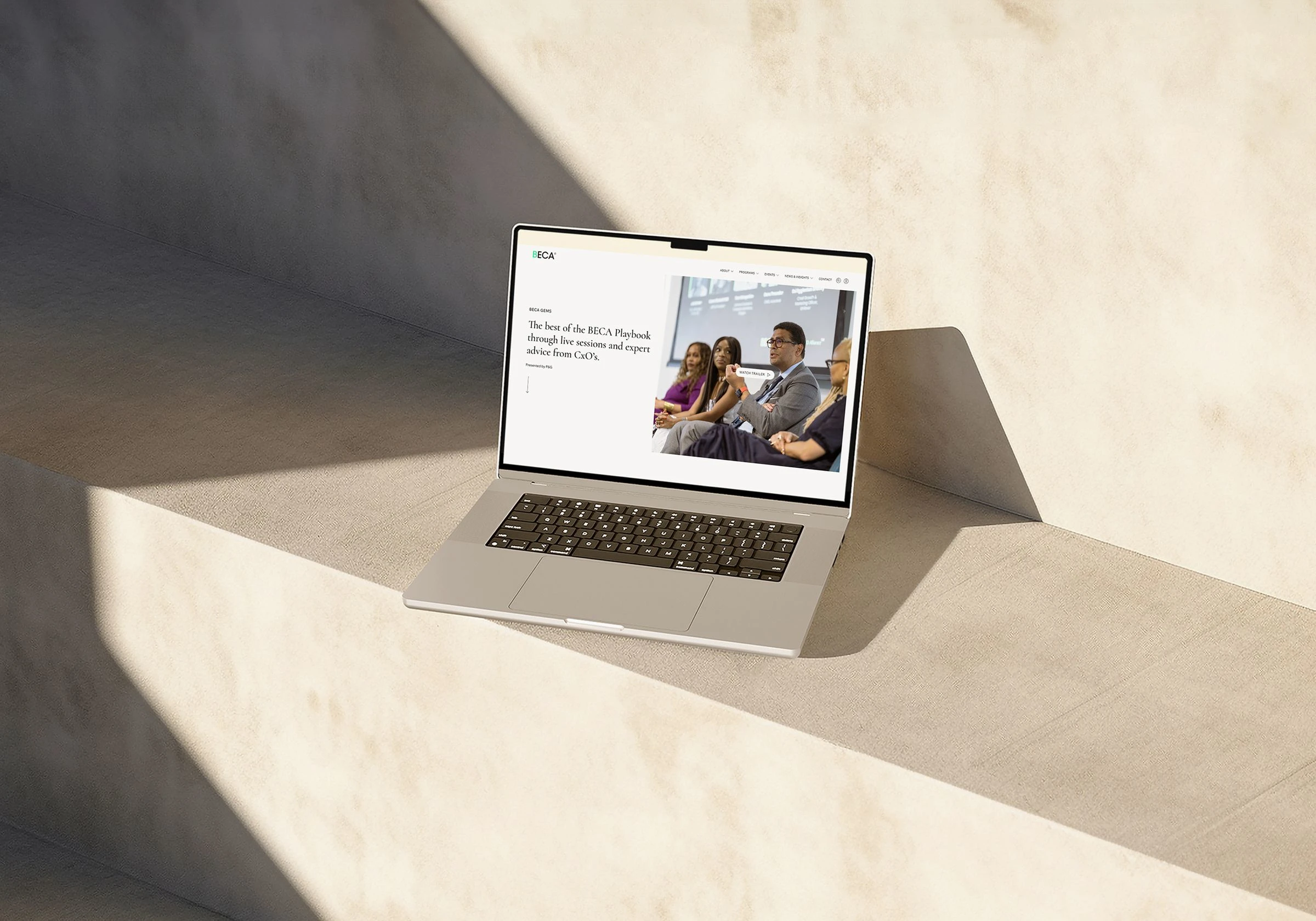
Photography became our primary storytelling tool. We minimized visual obstructions—removing overlays and unnecessary filters—to allow vibrant, high-quality imagery to shine. These photographs take center stage, commanding a significant portion of the screen and immediately communicating BECA’s spirit. For new visitors seeking to understand who BECA is, there’s no more authentic introduction than the genuine moments captured: people smiling, engaging, and in action. The result is a visual experience that feels open, welcoming, and inherently personal—an invitation to join the conversation.
In reimagining BECA’s digital presence, one of the most impactful changes was the transition from a dark-themed interface to a clean, light-mode design. The previous dark backgrounds, while bold, contributed to a visual weight that felt heavy and somewhat outdated. Shifting to light mode introduced a fresh sense of openness and clarity—an aesthetic better aligned with BECA’s forward-looking energy and optimistic spirit.
Color usage was another area where we applied deliberate design restraint. Where the original palette included upwards of ten shades each of green and gray, we streamlined the system to just one green and three carefully chosen grays. This reduction not only enhances visual consistency but also reinforces a more polished, professional tone across the site. The result is a cohesive and modern interface that supports both usability and brand alignment.
Typography and Iconography
To further elevate BECA’s visual language, we made strategic updates to the typographic system. The classic serif Baskerville was replaced with Cormorant—a refined Roman typeface rooted in tradition and often seen in academic and luxury contexts. Its elegance and subtle authority bring a quiet confidence to the brand, reinforcing BECA’s credibility and expertise.
Complementing this is the introduction of Wix Madefor as the primary sans-serif. This modern, geometric font enhances legibility while maintaining a clean, contemporary look. Generous internal spacing softens its appearance, contributing to an overall sense of lightness and balance across the site.
In tandem with the typographic refresh, we developed a bespoke icon set. Minimal, geometric, and precisely crafted, the icons are designed to align seamlessly with the broader visual system. They add a layer of cohesion and finesse, reinforcing BECA’s identity as a forward-thinking, detail-oriented organization.
Together, these elements strike a thoughtful balance—Cormorant brings a sense of professionalism and gravitas, while Wix Madefor introduces energy and approachability. The result is a typographic and visual system that feels both sophisticated and inviting.

Design system
All of this work is encapsulated in a bespoke design system. Built on a fluid grid foundation, it offers a responsive and scalable framework that adapts seamlessly across devices and screen sizes. By using percentage-based columns and flexible breakpoints, it enables consistent alignment and spatial rhythm while maintaining content flexibility.
The system includes a cohesive set of Wordpress blocks, patterns and spacing tokens—all designed to enhance the brand’s identity while maintaining usability and accessibility. With its modular structure and fluid layout principles, the system empowers BECA to build and maintain a site that feels modern, intuitive, and highly adaptable.
Like this project
Posted Mar 9, 2026
Redesigned BECA's website with a modern, cohesive, and user-friendly approach.