Extol Brand and Website Design
Nathan Lindahl
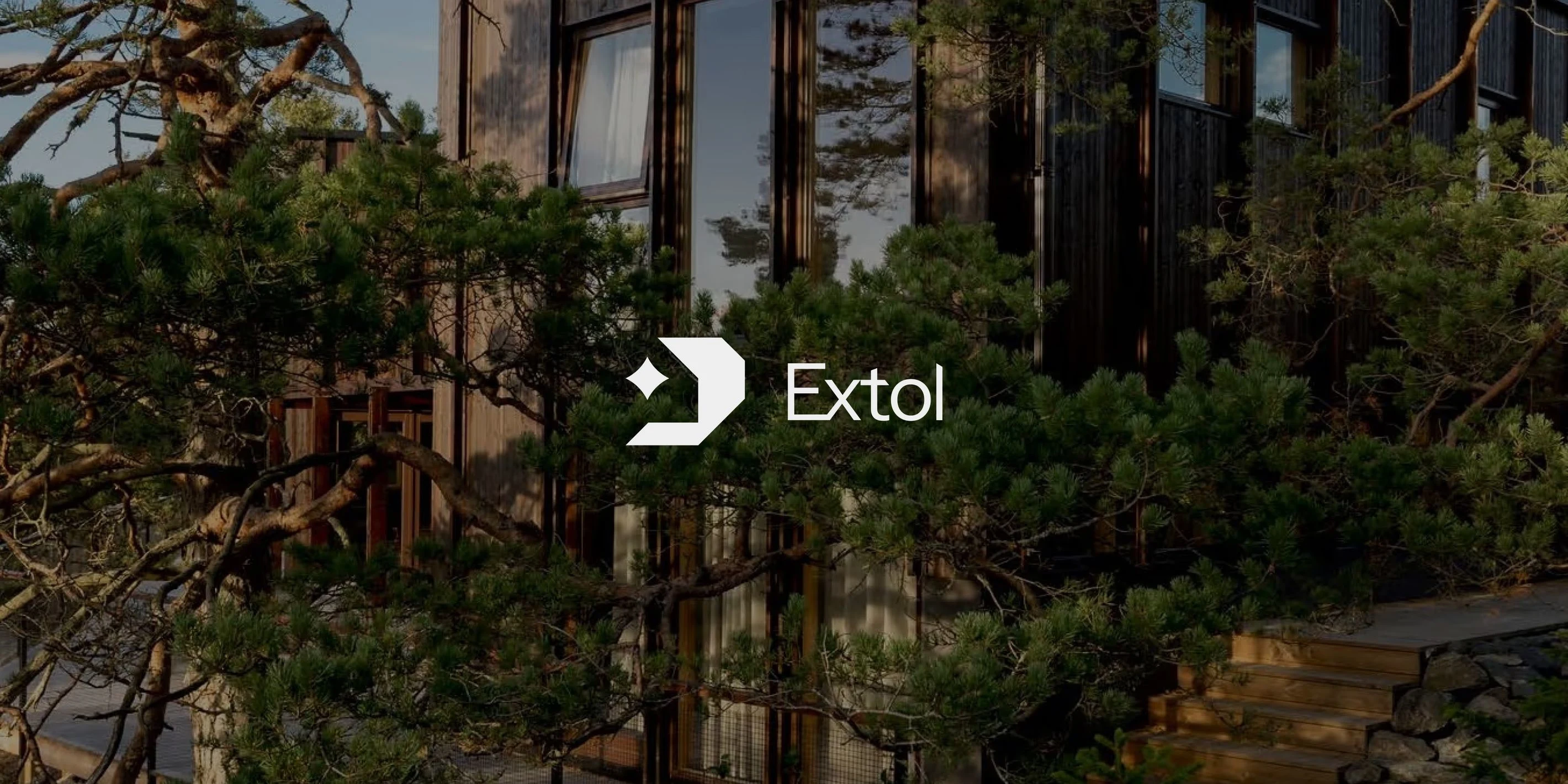
Launching a premium European window brand in the PNW
Extol launched in early 2025, supplying and installing the best-in-class windows of European make. Their passion for quality and service is truly core to who they are, it’s not just lip service. It permeates everything they do, it’s why they’re in the business. Working with such a passionate organization was a truly enjoyable ride.
A brand apart
Brands are often defined by their juxtapositions and Extol follows suit. They are premium but not elitist, industrial but personable, driven but willing to compromise. Above all, they are a truly earnest company with a genuine passion for windows and care to serve. Within the sphere of their competitors this is a breath of fresh air… Whereas the prototypical window company indexes on volume and value, Extol indexes on quality and service.
So what we had was a huge opportunity from a brand perspective. This is not the cheap, call 1 800 today generic window service. The brand and visual identity needs to communicate the premium nature of their offering as well as their bespoke white glove service.
To accomplish this, we created a logo: Abstract and geometric in form yet immediately recognizable as a house. Within the logo there’s a ‘spark’ (visually representing a window) that serves to emphasize the unique and tailored nature of their service.
Outside of the brand mark, we utilize a blend of sans and serif fonts to create something that is simultaneously professional yet approachable. This combination also allows us to level up the brand voice through typography and words, emphasizing key phrases within headlines. The color palette is muted, leaning largely on white to convey a clean professional nature counterbalanced with a dark and broody green and the occasional tan to soften the intensity of the brand.
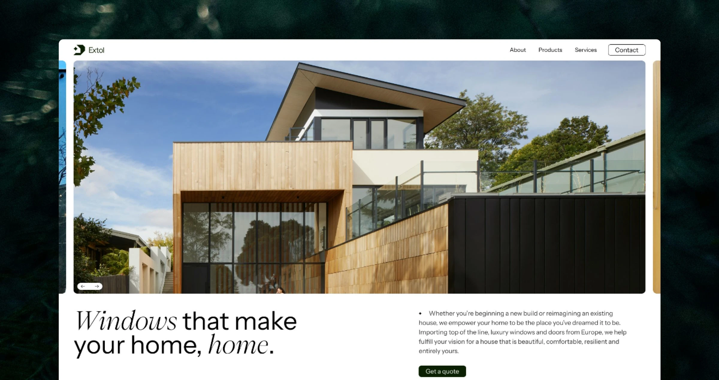
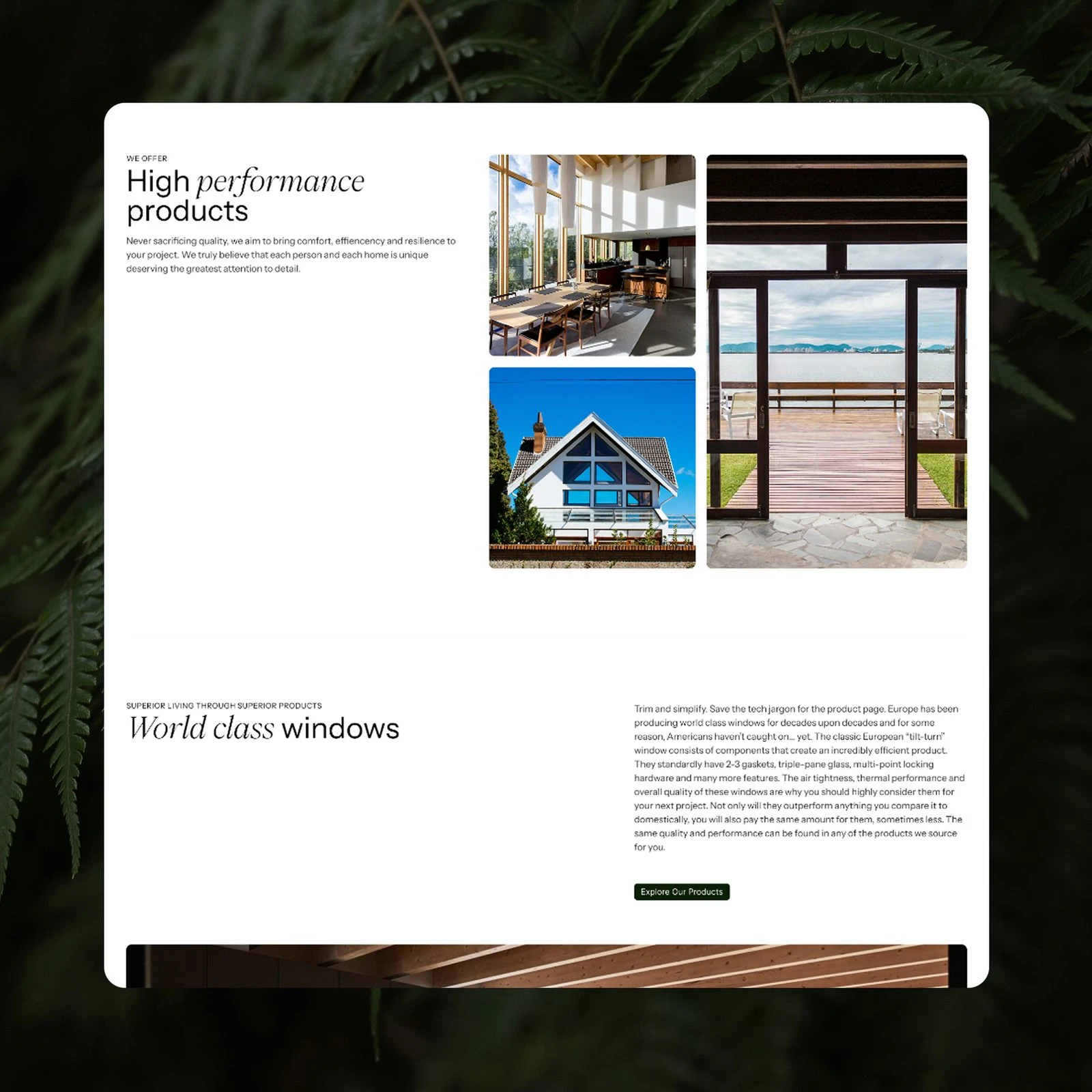
The web design
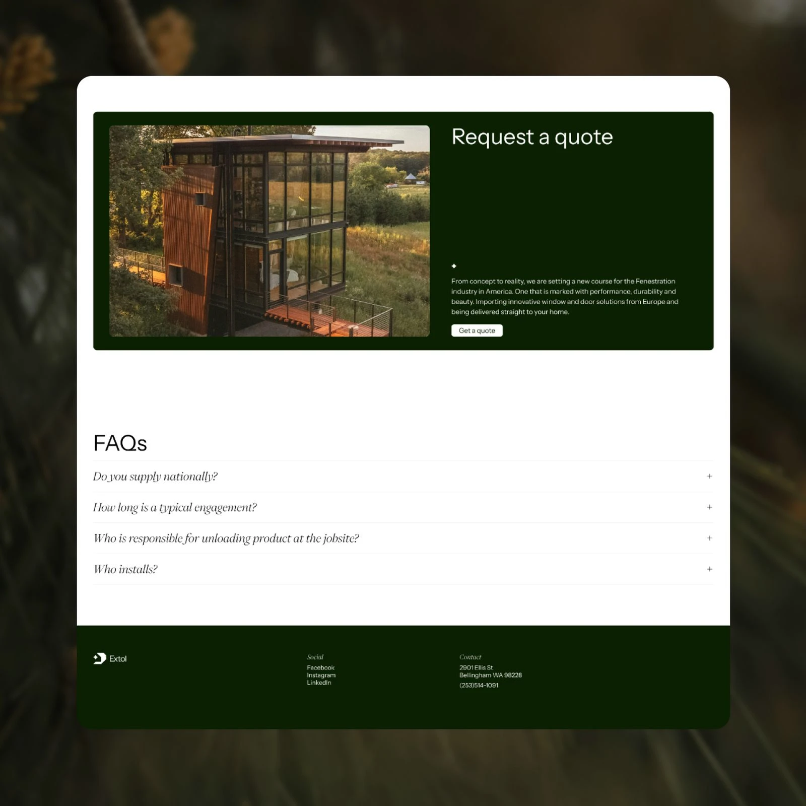
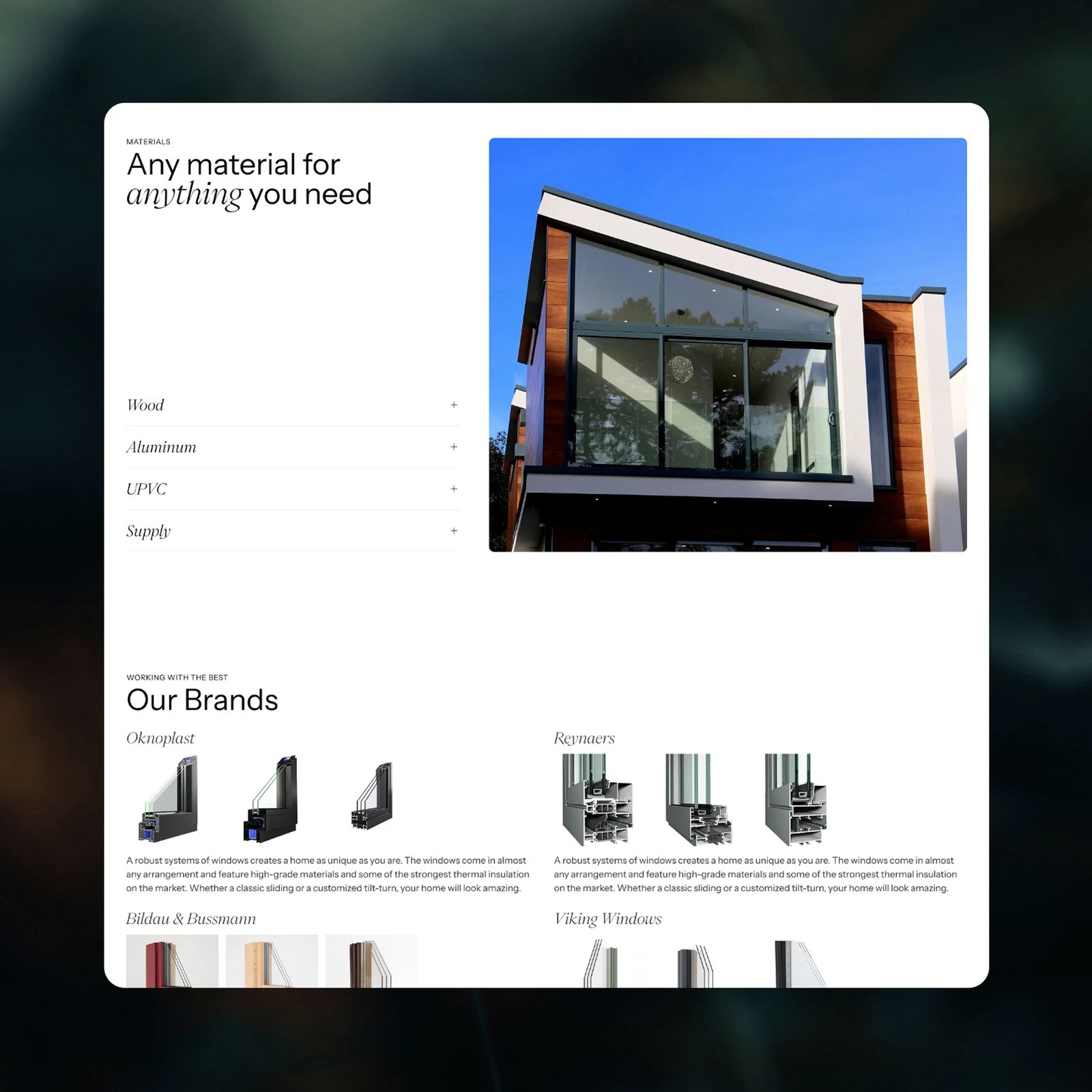
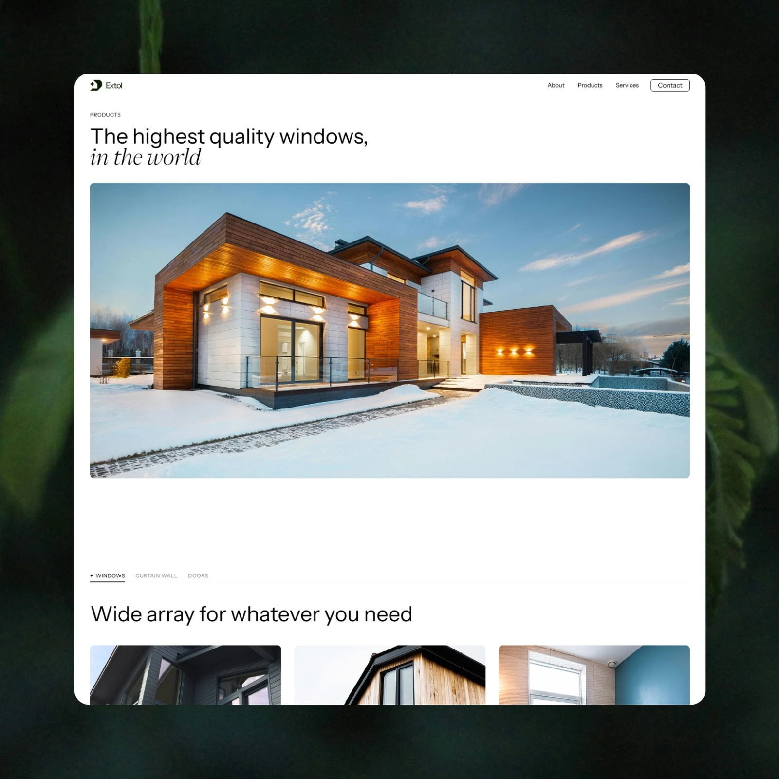
Digitally the brand presents as professional and confident. Large sweeping areas of white space are interrupted by equally sized photographs representing the peak of premium windows. Type is also slightly upscaled creating space for strong headlines that efficiently communicate value props and brand ethos. To account for such sweeping sizes, fluid grids and typography are used to minimize page margins and make use of the full screen. Meanwhile, special attention was given to motion, ensuring a smooth unhurried experience to match brand’s care and attention towards patrons. The goal of the site is to (naturally) drive leads. ‘Get a quote’ buttons frequent the scroll and large CTAs are placed strategically at the bottom of most pages ensuring next steps are always within reach.
The build
To get a CMS up and running quickly the site was completed in Webflow, giving Extol a convenient and maintainable method of authorship. To circumnavigate some of Webflow’s clunky style management a core SCSS file is used allowing the site to function as a cohesive system instead of many disparate blocks.
More work
Like this project
Posted Mar 9, 2026
Designed and launched Extol's brand identity and website.