Design Systems: The Key to Cohesive and Efficient UI Development
In my HP project, I developed a fully functionally rich design system that amplifies the user experience of the control panel interface.
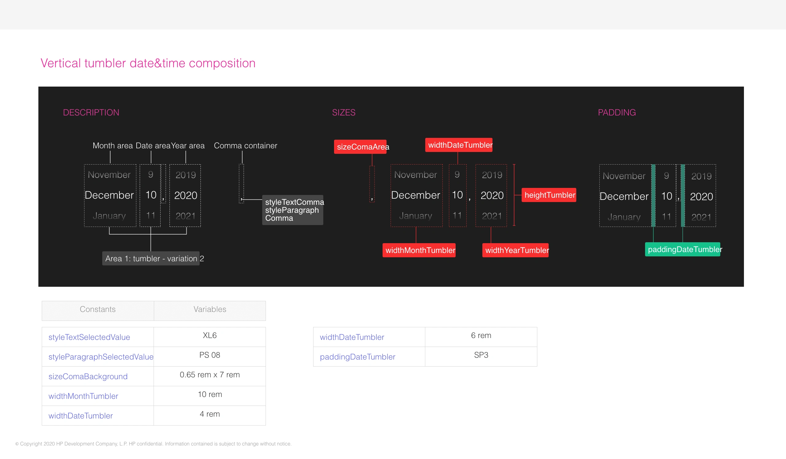
This design system includes well-defined design principles and a detailed style guide from scratch, integrating reusable UI components tailor-made for industrial and domestic users. I worked on accessibility and responsiveness in such a manner that everything not only aligned with the identity of HP but also performed seamlessly on devices. Through robust QA and testing documentation, I ensured the design system's usability and performance; thus, equipping HP with what they needed to extend their product development coherently and efficiently. This project testifies to my commitment in crafting customized solutions meeting particular client needs while improving the overall user experience.
Goal
Create and implement a unified design system that offers a seamless user experience across HP products ensured a consistent learning curve for users but also delivered substantial efficiency gains for the business.
Role
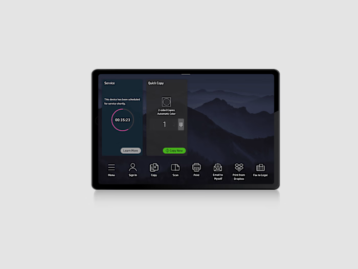
As a key member of the UX/UI Design team, I contributed to the user interface design for the physical printer's control panel, incorporating both dark and white modes.
My main task included:
Defining Design Principles: Establishing core principles to guide the overall design strategy and ensure alignment with user needs and brand values.
Creating a Style Guide: Developing a comprehensive style guide that outlines typography, color palettes, iconography, and other visual elements.
Building a UI Components Library: Designing and documenting reusable UI components that promote consistency and efficiency across the application.
Developing Design Tokens: Creating a set of design tokens to standardize styles (such as colors and spacing) for easier implementation and maintenance.
Establishing Accessibility Standards: Ensuring all components adhere to accessibility guidelines, making the design usable for all users.
Documenting Usage Guidelines: Providing clear instructions on how to implement and use the design system for both designers and developers.
Conducting QA and Testing: Performing thorough quality assurance and usability testing to verify that components function correctly and meet user expectations.
Collaborating with Stakeholders: Working closely with cross-functional teams, including designers and developers, to ensure the design system aligns with project goals.
Iterating and Updating: Continuously refining the design system based on feedback and evolving project requirements.
HP Ecosystem Integration: Supports cloud printing and remote monitoring, connecting seamlessly with other HP products.
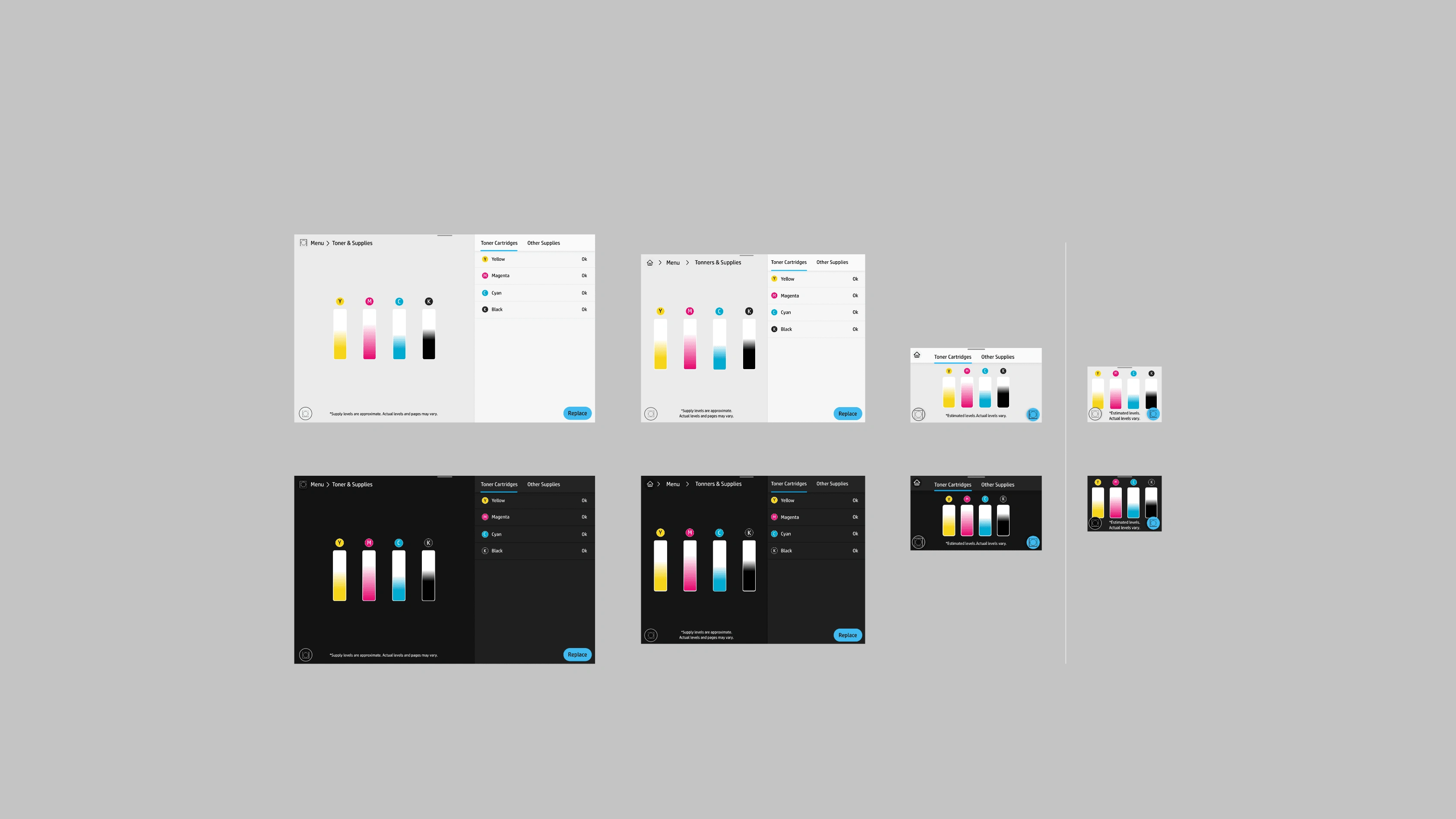
Some examples of the use of the components in different screen sizes.
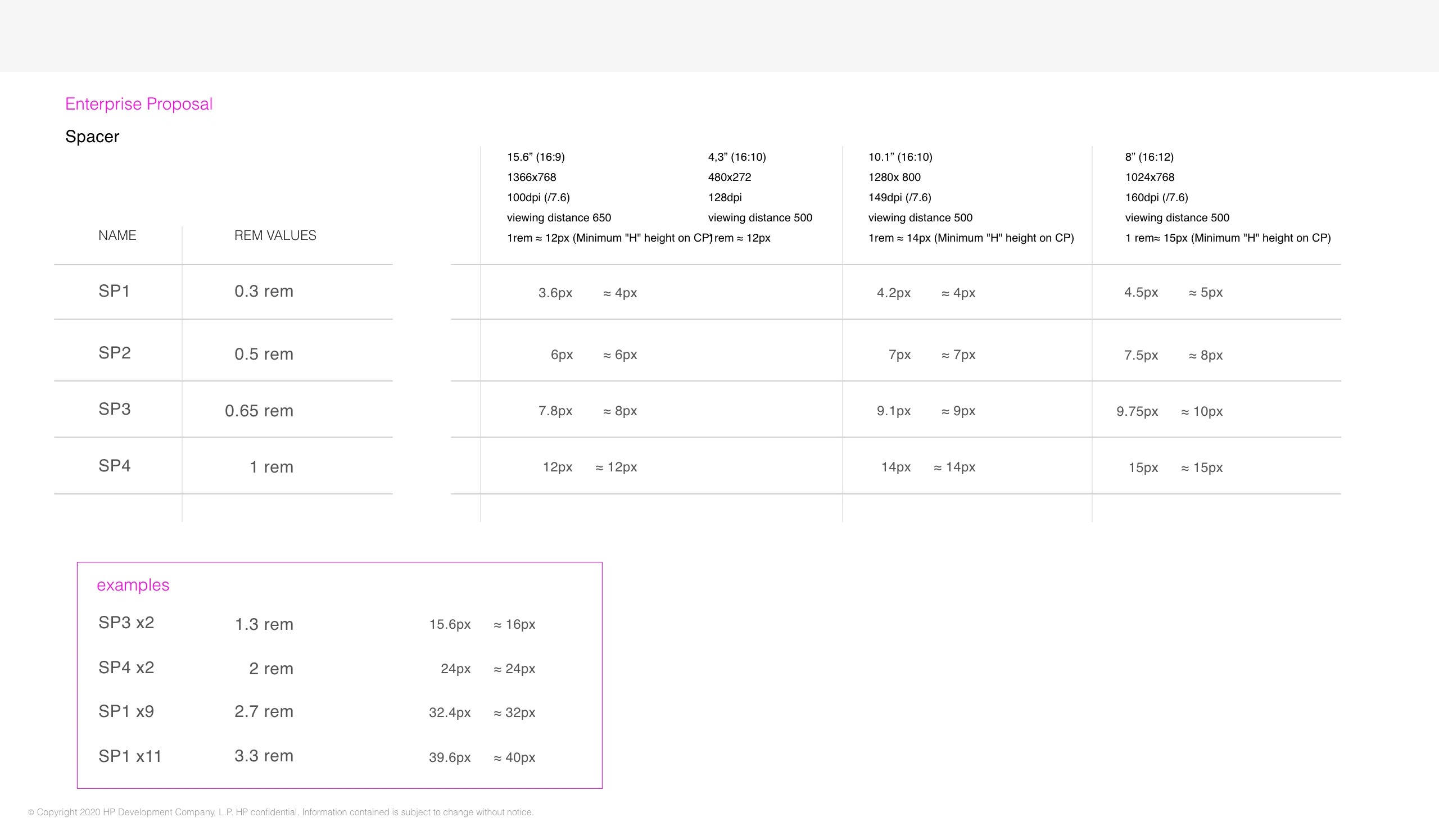
Spacers Specification document
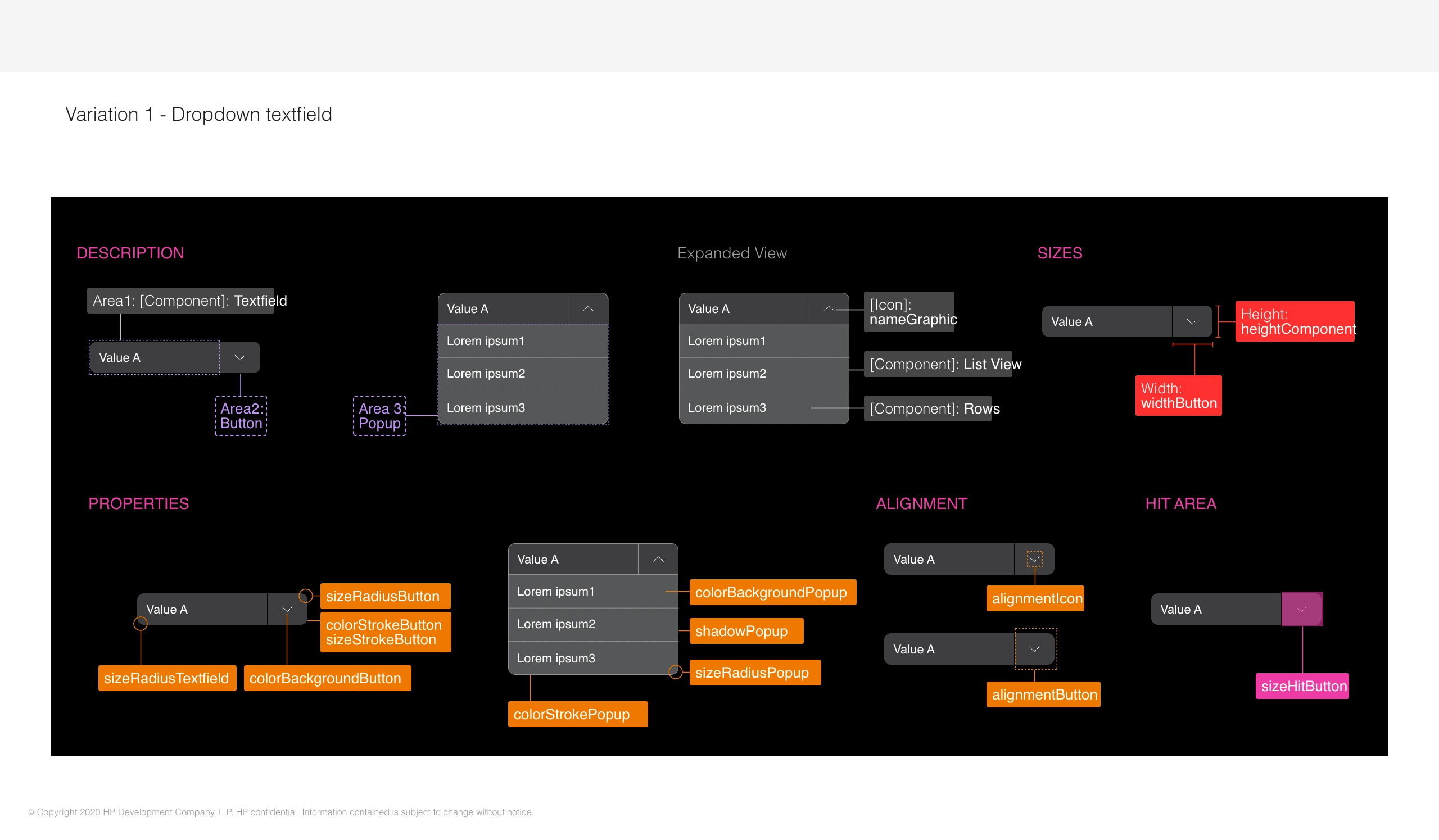
Example of a Component Specification Document
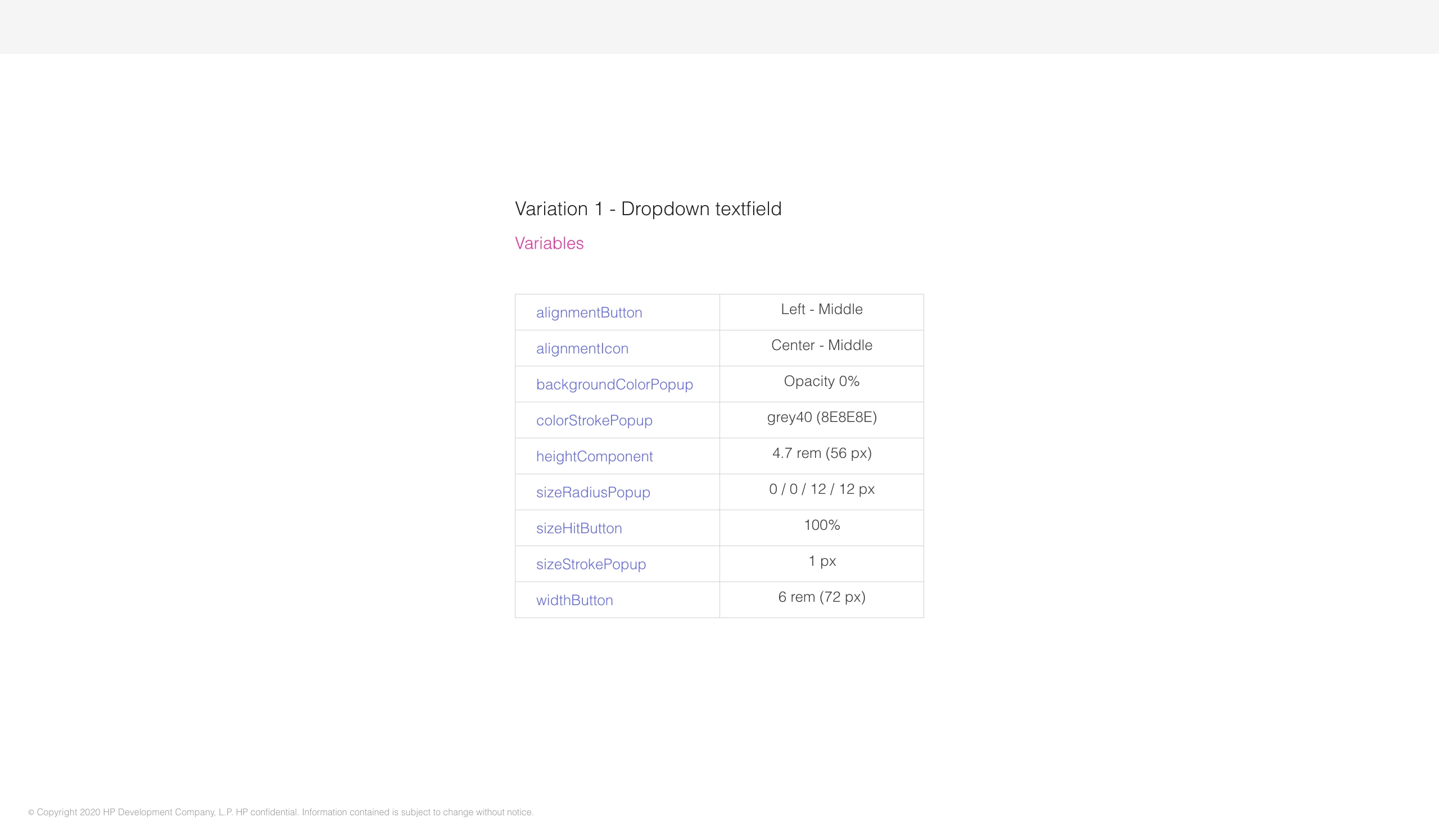
Variatons/tokens specification
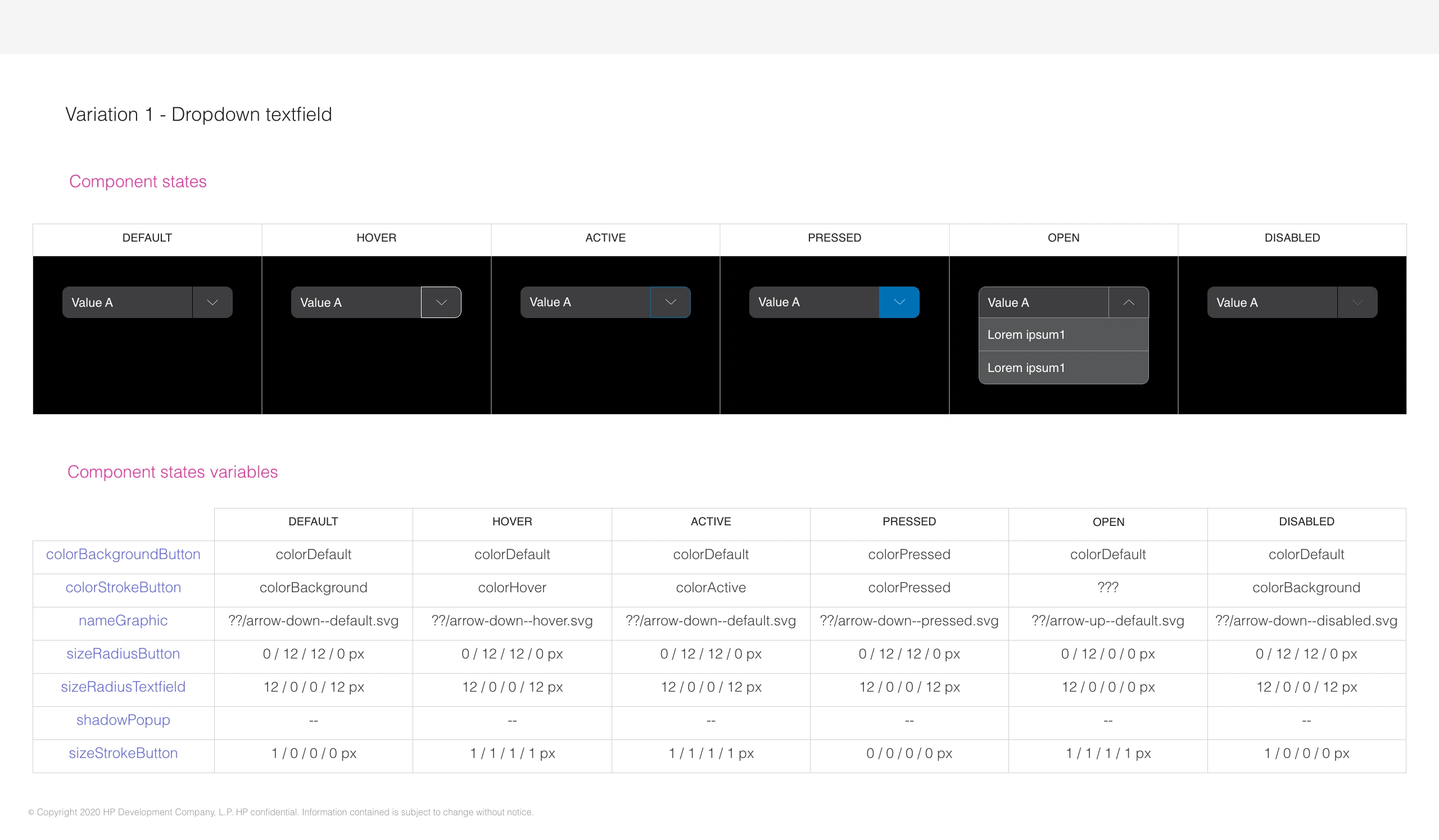
Several status of the component
Like this project
Posted Oct 7, 2024
For HP, I developed a design system enhancing user experience with reusable components, focusing on accessibility, responsiveness, and QA documentation

