Payout Dashboard Design for Dodo Payments
Harish P
Domain: Fintech · B2B SaaS · Merchant of Record
Role : End-to-end Product Designer
Tools. : Figma, Claude
Problem
Merchants using Dodo Payments were contacting support to ask "Why was my payout this amount?" and "When is my next payout?" — two questions that should never require a human to answer.
What I Was Hired to Solve
Dodo operates as a Merchant of Record. it collects revenue from
customers globally, then remits it back to merchants after deducting
platform fees, taxes, refunds, and rolling reserves.
The gap: merchants saw a lump-sum deposit in their bank account
with no explanation of how it was calculated, when the next one
was coming, or what to do when something went wrong.
This isn't a UI problem. It's a trust problem.
Every design decision I made is an information intervention
putting the right data in the right place so merchants never
have to guess about their own money.
The Two Users I Designed For
Rajan — Solo SaaS founder, Bangalore
Earns $3K–$15K/month. Checks payouts once a month when his bank
balance looks off. Needs a 5-second answer. Hates tables.
Priya — Finance manager, 40-person SaaS company
Processes $200K–$800K/month. Logs in weekly. Needs full
transaction-level reconciliation, CSV exports, and rolling
reserve visibility. Accountable to a CFO.
The design tension:
Build for Rajan → Priya can't do her job.
Build for Priya → Rajan is overwhelmed.
My solution: progressive disclosure.
The Overview is optimised for Rajan's 5-second scan.
The Detail page is optimised for Priya's reconciliation.
The Recent Payouts table bridges both — simple by default,
full detail one click away.
Solution
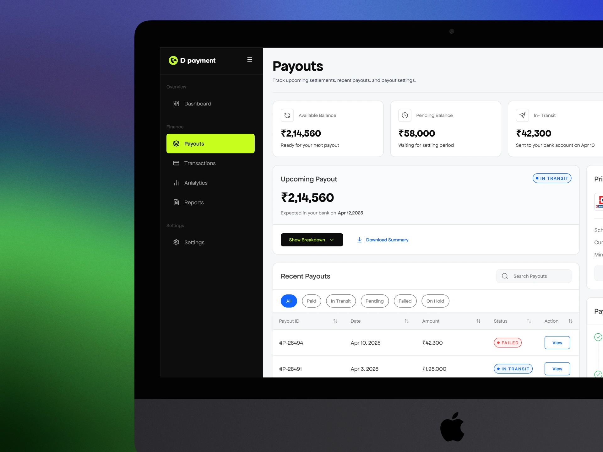
1. Payout Dashboard
Five components. Every question a merchant has about
their money, answered before they think to ask it.
A merchant lands here and within 5 seconds knows:
How much money they have ready ?
What's still processing ?
When the next payout arrives ?
Whether there's anything that needs their attention ?
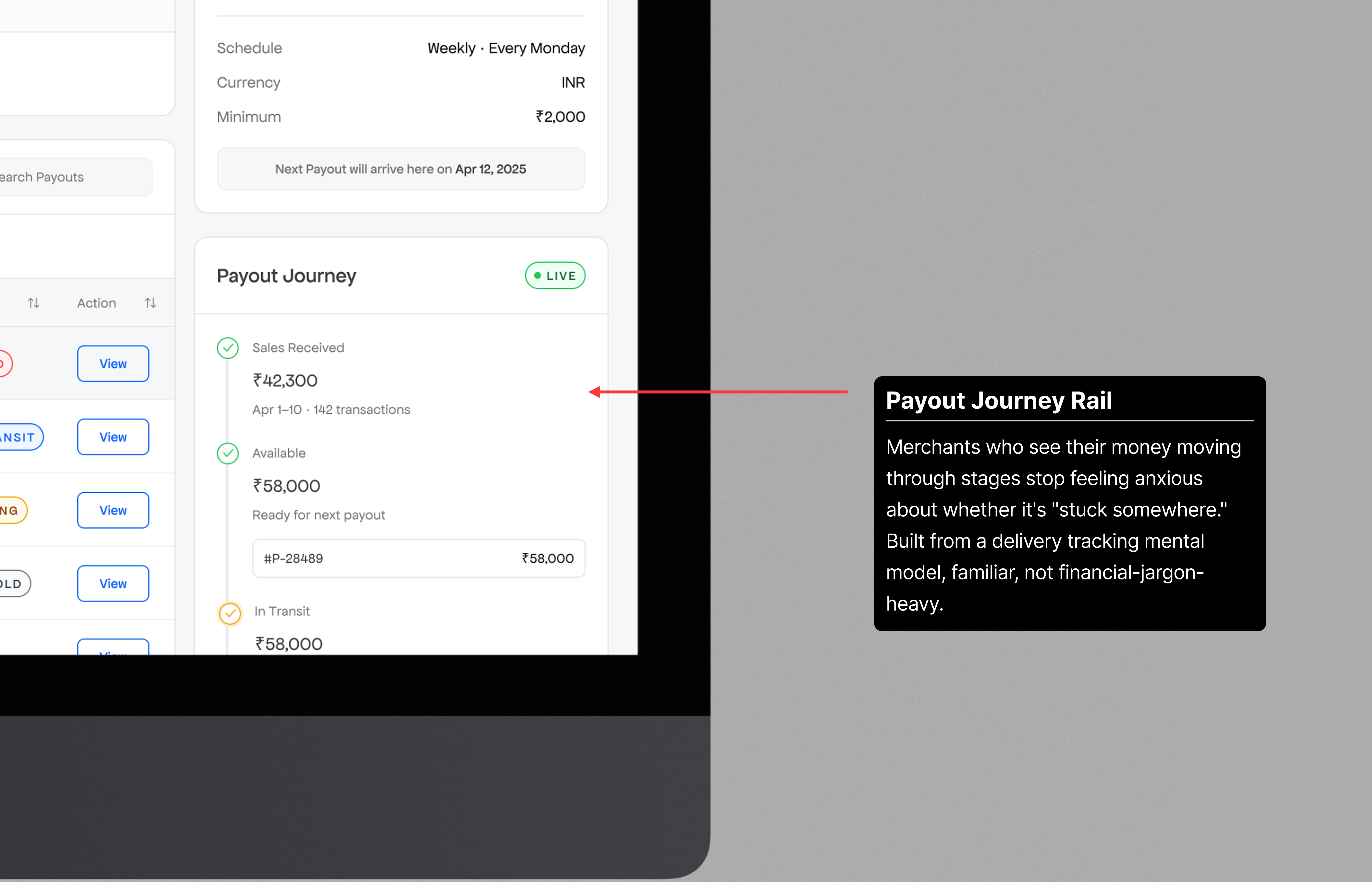
Money movement into a trackable process.
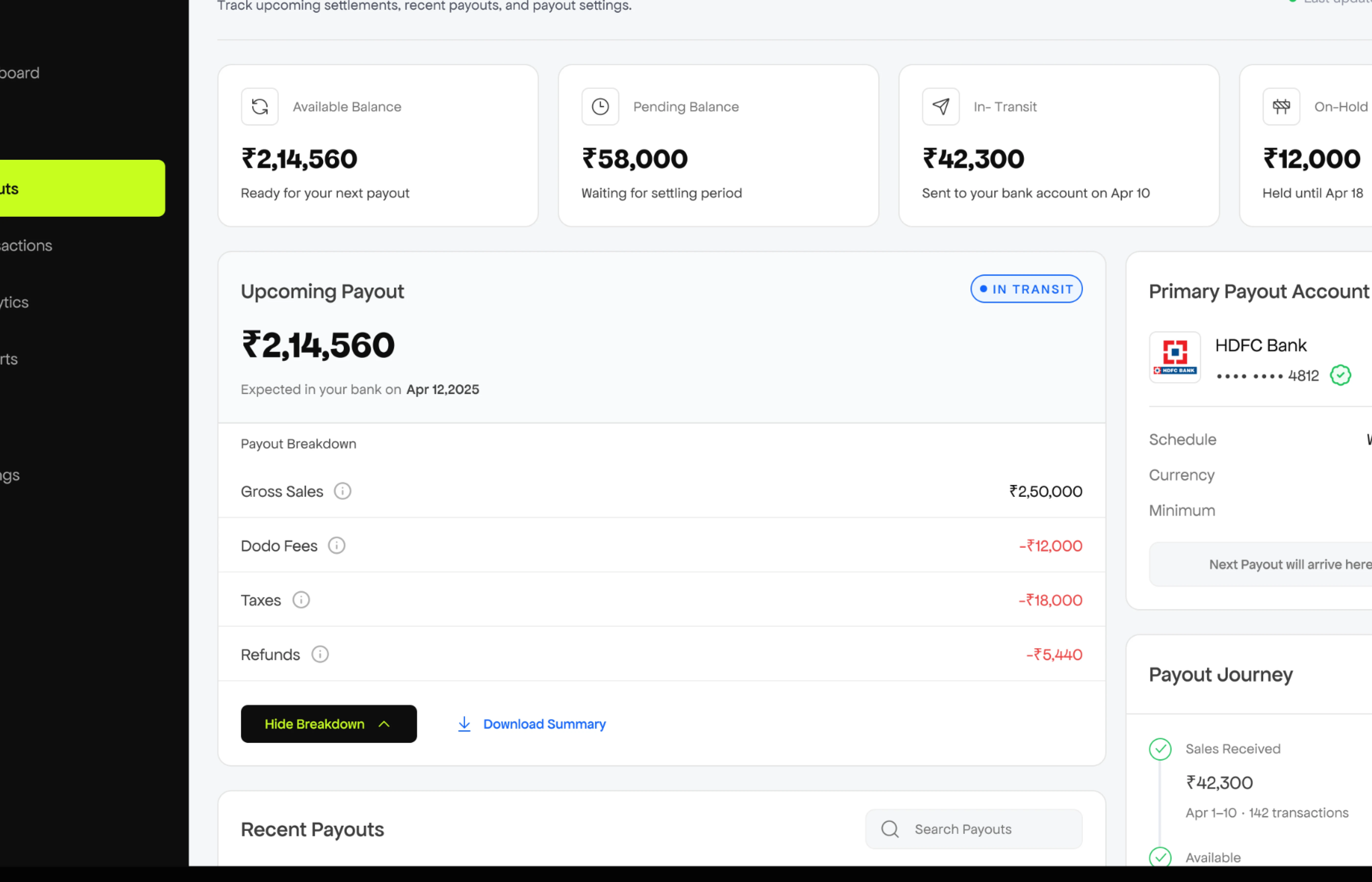
The moment a merchant stops wondering where their money went.
Showing this waterfall upfront creates visual overload and unnecessary anxiety for casual users like Rajan who just want to know their payout is coming. Hidden by default → accessible on demand. The "Show Breakdown" / "Hide Breakdown" toggle makes the interaction feel intentional, not buried.
2. Payout Detail
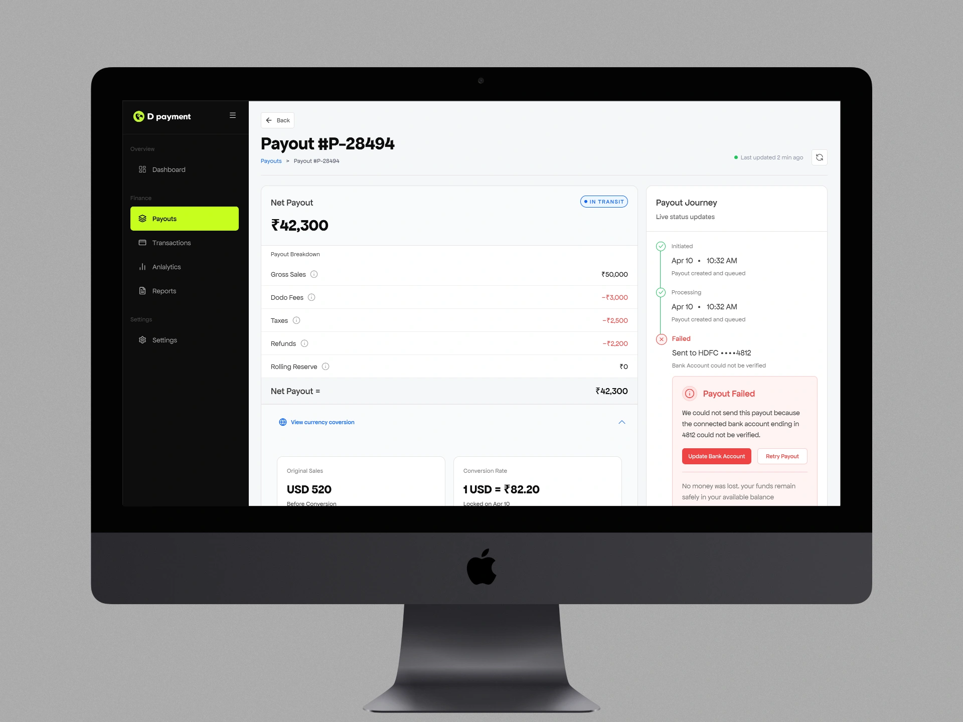
Every failure is explained, actionable, and time-bounded.
No silent failures.
Handles the hardest UX problem in the product: a payout failed with no explanation and no next step. Silent failures cause the worst kind of merchant anxiety, the kind where you don't know if it's a problem or just slow.
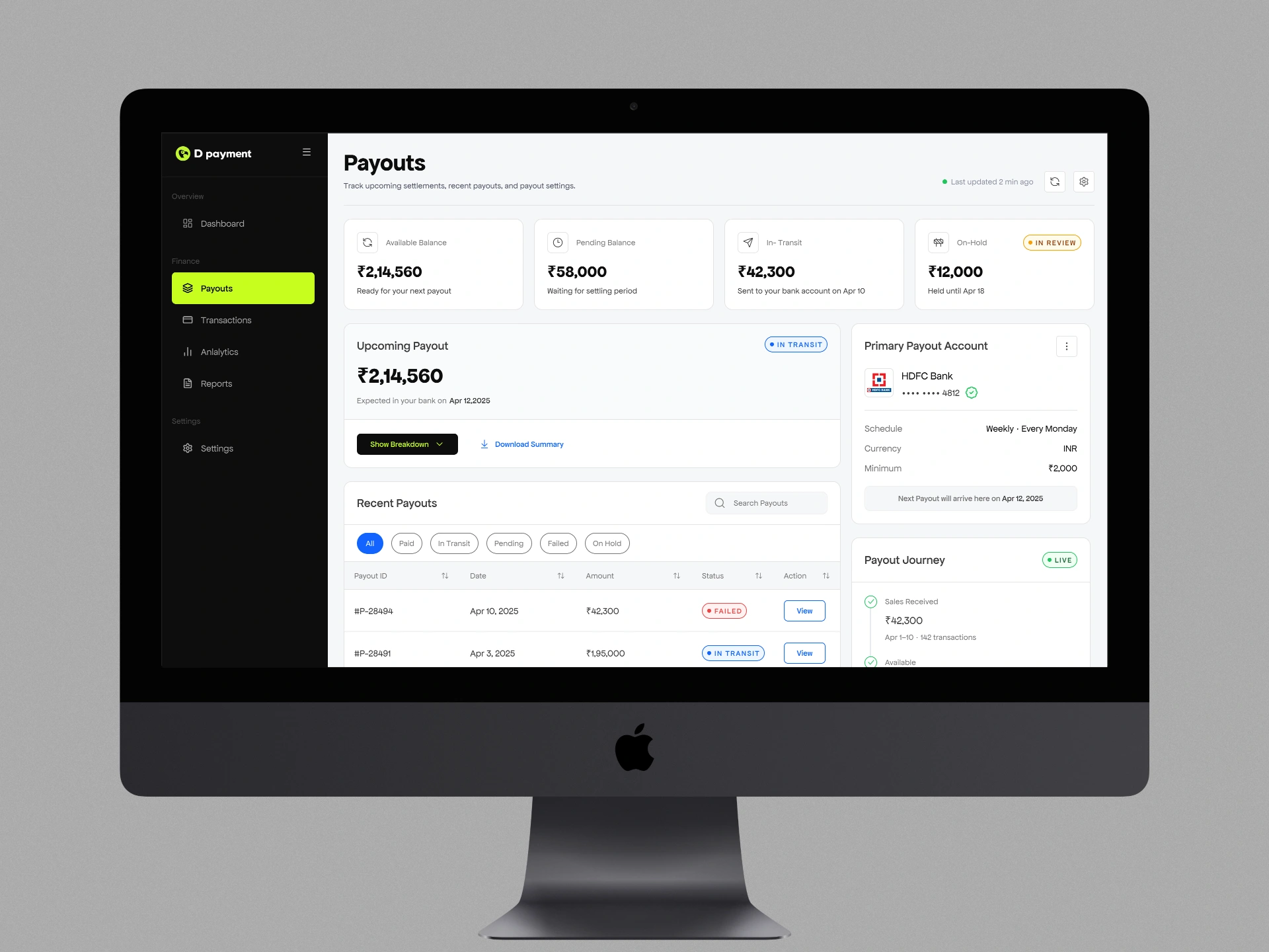
3. Payout Settings
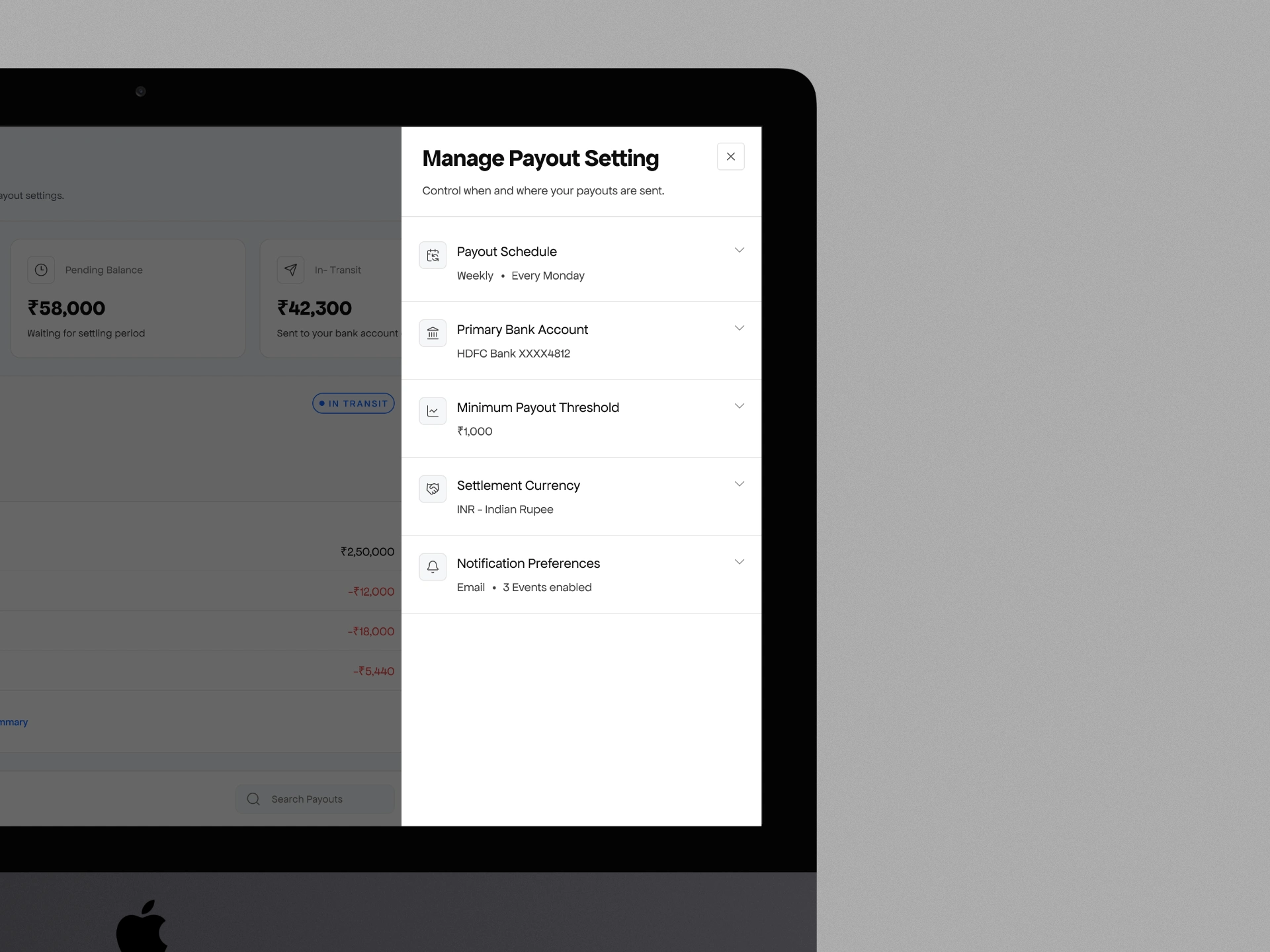
contextual drawer appears over the
payout page
The contextual drawer appears over the payout page, keeping the user in mental context. Expand/collapse per section means Priya can see everything while Rajan only touches what he needs.
Success metrics I defined
40%+ reduction in payout support tickets within 90 days
CSAT > 4.2/5 on post-payout survey
Self-service rate for bank and schedule changes
Time-to-action on failed payouts reduced by 50%
CSV export usage rate (Priya-type user activation)
Screens in action
Like this project
Posted Apr 29, 2026
Designed payout dashboard for D Payments enhancing clarity for merchants.
Likes
0
Views
7
Clients
Dodo Payments