Arata — Skincare Landing Page Redesign · Concept Project
Harish P
Overview
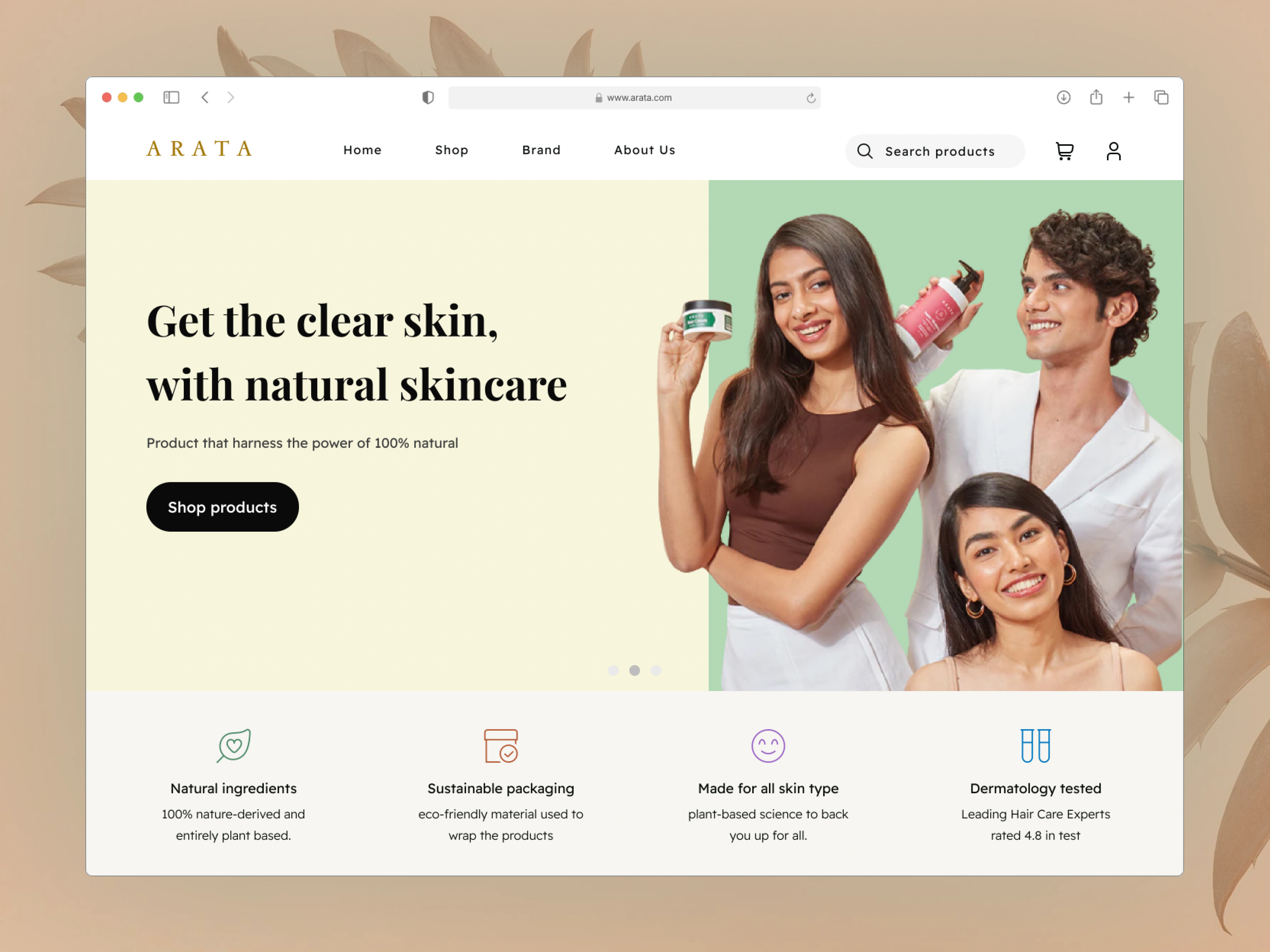
Arata is an Indian D2C skincare brand built on natural, plant-based ingredients. Despite strong products and a loyal customer base, their landing page was cluttered, visually inconsistent, and failing to communicate the brand's clean, premium identity, resulting in a confusing first impression for new visitors.
My process
I started with user research, analysing real customer reviews from Amazon and YouTube to identify who actually buys Arata and what they care about. This surfaced a clear insight: users are ingredient-aware, health-conscious, and respond to transparency over promotion. I then ran a visual audit on the existing site, annotating specific UX failures, attention-competing hero elements, a low-contrast primary CTA, carousel patterns burying product info, and visual language misaligned with the brand's natural positioning. I built a moodboard drawing from clean, editorial skincare references to establish the design direction.
Design decisions
Replaced the high-contrast promotional aesthetic with a calm, brand-aligned palette. Simplified the hero to one message and one CTA. Gave product sections visible, benefit-led descriptions. Used generous whitespace and restrained typography to let the product imagery breathe.
Outcome
A redesigned landing page aligned with Arata's natural brand identity — built to reduce bounce on first visit, improve product clarity, and guide intent-driven visitors toward conversion.
Full page walkthrough — redesigned landing page experience
Visual audit — UX issues identified on the original Arata site before redesign
Before → After: hero section redesigned for clarity and brand alignment
Color & Typography used in redesign
Moodboard — visual direction and brand references.
Redesigned landing page — full desktop view.
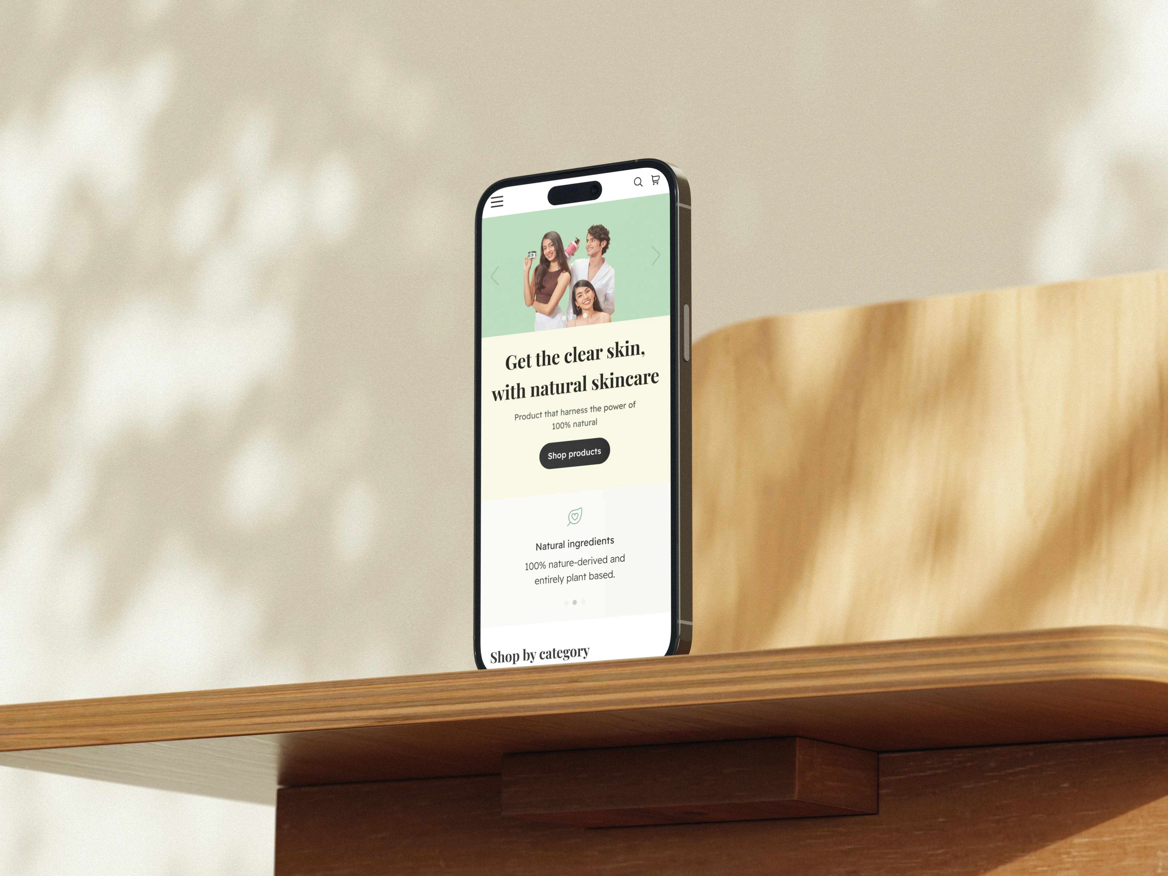
Mobile responsive design
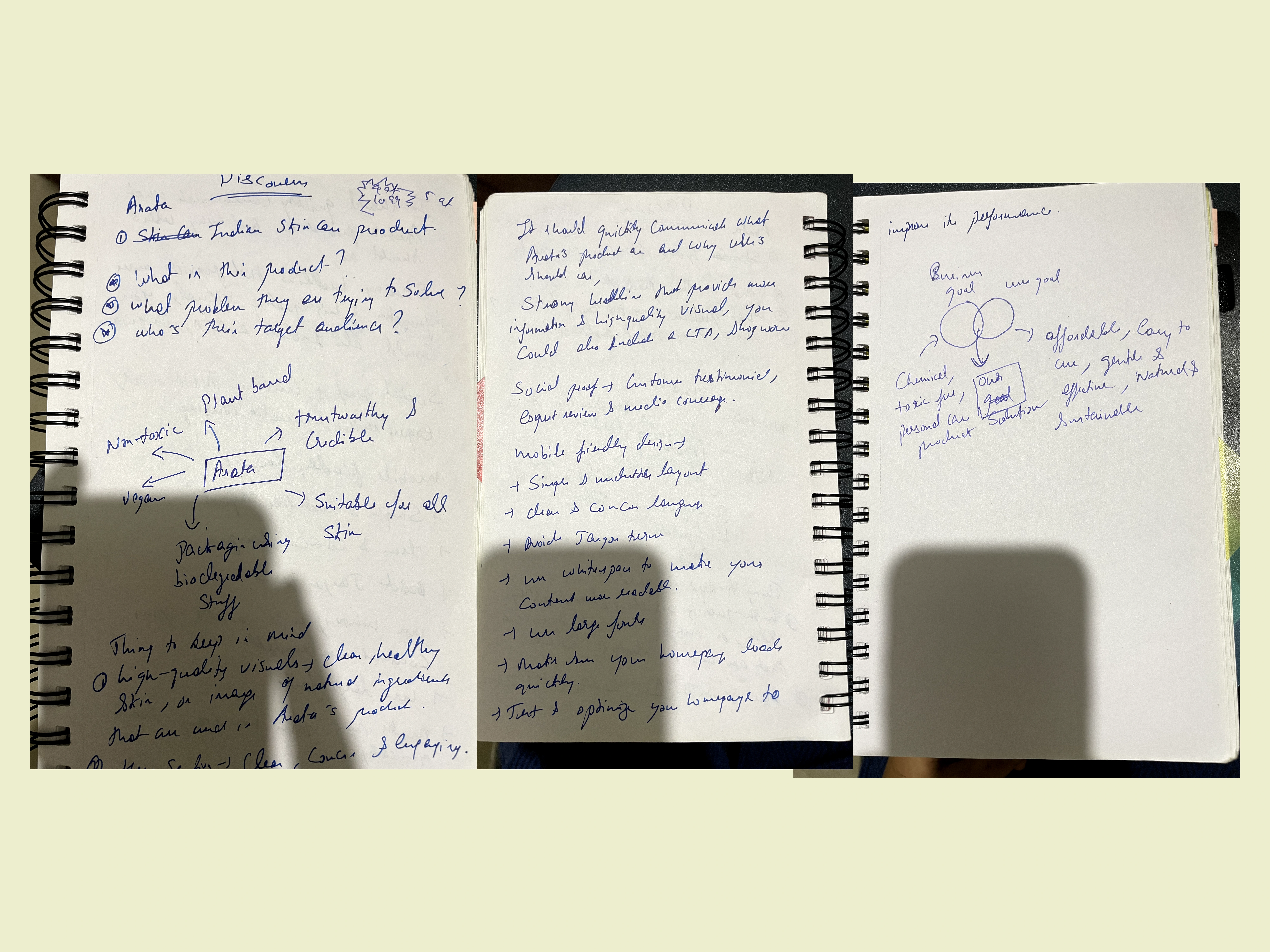
Early brainstorming — understanding brand, users, and goals.
Like this project
Posted Apr 9, 2026
Concept redesign of Arata's landing page. Fixed cluttered hero, weak CTAs, and off-brand visuals to create a clean, conversion-focused experience.
Likes
0
Views
12