Bodylabs
Bodylabs is a German Company that provides workplace health check-ups. With a mobile lab and in-depth reports of the user's health on their app, they help employers and employees stay on top of their health, with tips and challenges to enhance bad results while keeping the good ones in check.
Challenge
The main problem was that their conversion rate needed to be higher (around 30%) for the very first step of the process. Their potential users (the client's employees) weren't showing any interest in signing up for the service they were providing, and because of it, they were afraid that the client wouldn't see the benefits of their product and wouldn't buy new check-ups in the future.
First steps
To come up with a solution, I needed to understand the current process they had for promoting the service inside the client's company. Bodylabs is very concerned about user privacy, so I could only receive an overview of the process with very few details about any accurate client data or information.
The process was pretty straightforward: after the client bought a check-up package, someone would prepare an e-mail containing a link to the Bodylabs' signing-up page and send it to all their employees.
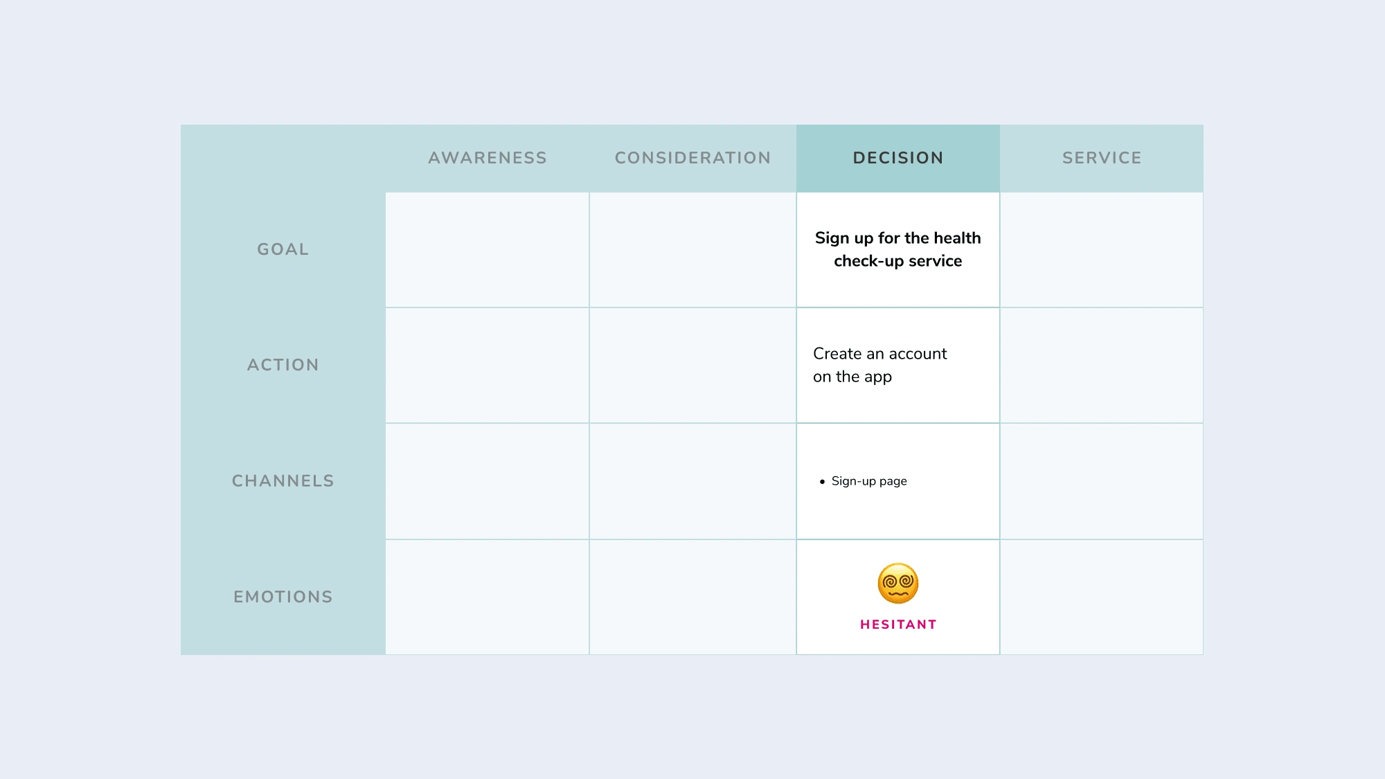
Thinking about a standard user journey for a service, this is what they have had so far.
The registration page was, in fact, a web version of the app's onboarding phase, with 11 steps to complete it (approximately), and the page layout didn't match the style and/or design we had on the app.
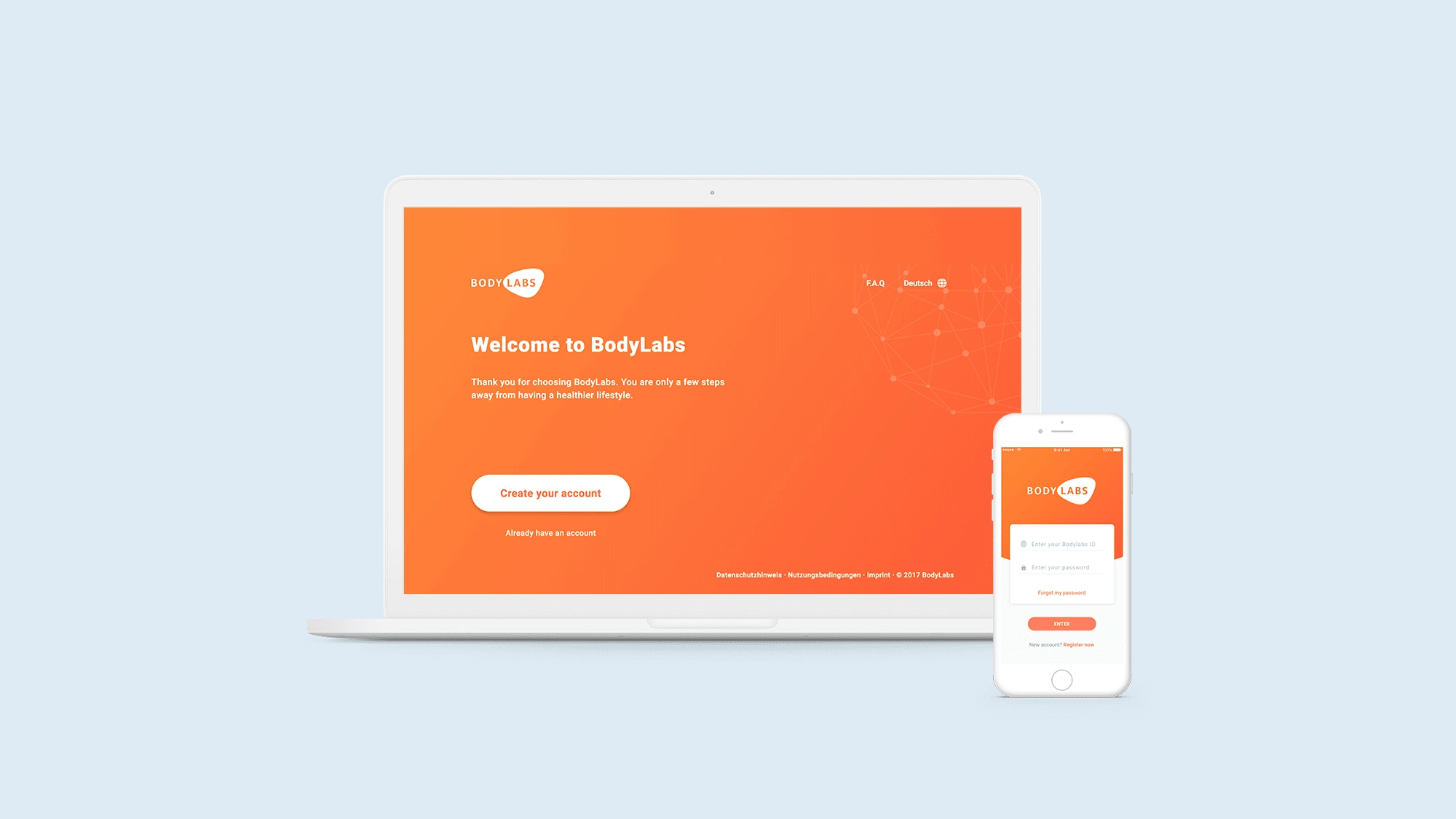
Sign up page on the left, and first screen of the app on the right. Styles don’t match.
So, as the potential users didn't even know who Bodylabs was, what it does, or how it could benefit them before this first e-mail was sent, it's safe to assume that they didn't show interest because they didn't know what was going on, on the first place.
As the main pain point was a lack of information to the end user, I would have to develop a marketing strategy campaign in a way that we could deliver it along with the check-up documents to the client.
Since we only had one touch point so far, now we would have to branch out the communication points, so everyone could have the chance to be informed about the service.
Design process
Considering that I was working remotely and couldn't visit the clients or even receive more in-depth info about them, this journey map helped me figure out what else we could do to broaden Bodylabs' communication efforts.
In all my prior years working with marketing in-house, I was used to seeing a typical pattern of action regarding internal communication: posters pinned on boards for each team room, informative folders, e-mail marketing, and coffee breaks with informational lectures for managers (but this last one we couldn't offer because of time/budget issues).
With those basic materials, the new journey map looked like a complete cycle and would give enough reassurance to the client's employees about how Bodylabs' service could help them.
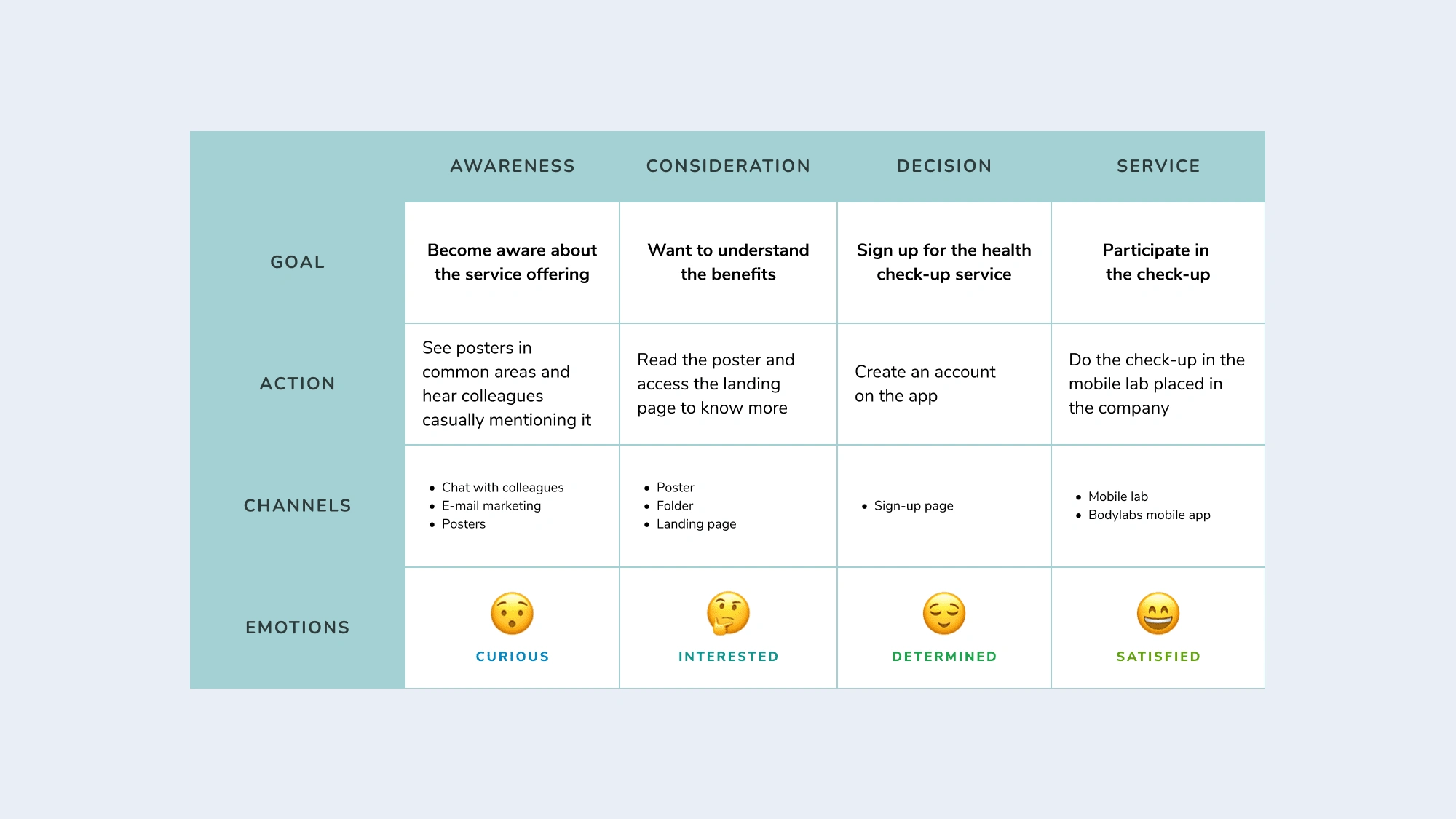
New journey map showing how each new material could impact the user's decision-making and how they feel along the process
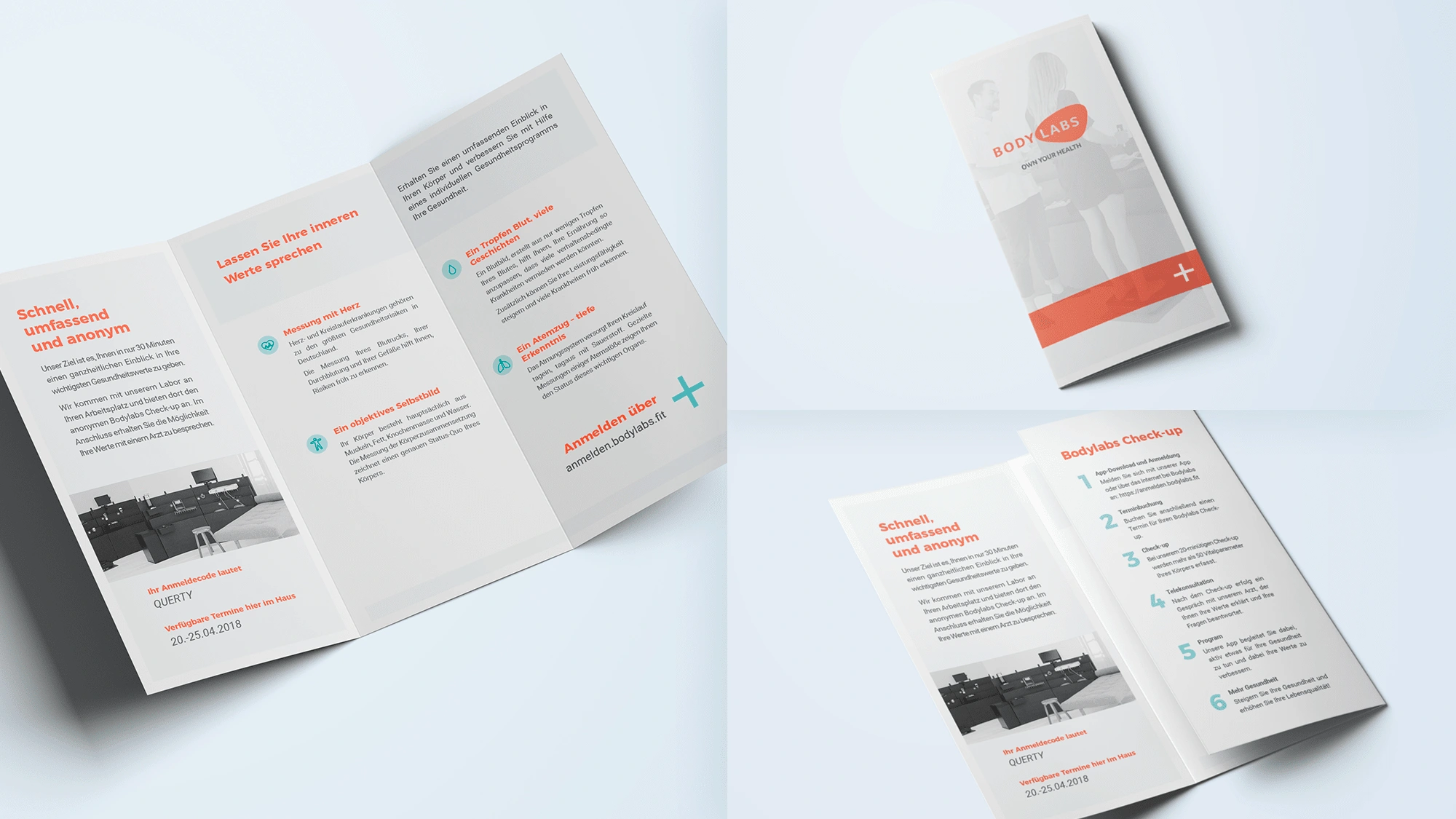
Folder explaining the benefits of Bodylabs and how it works
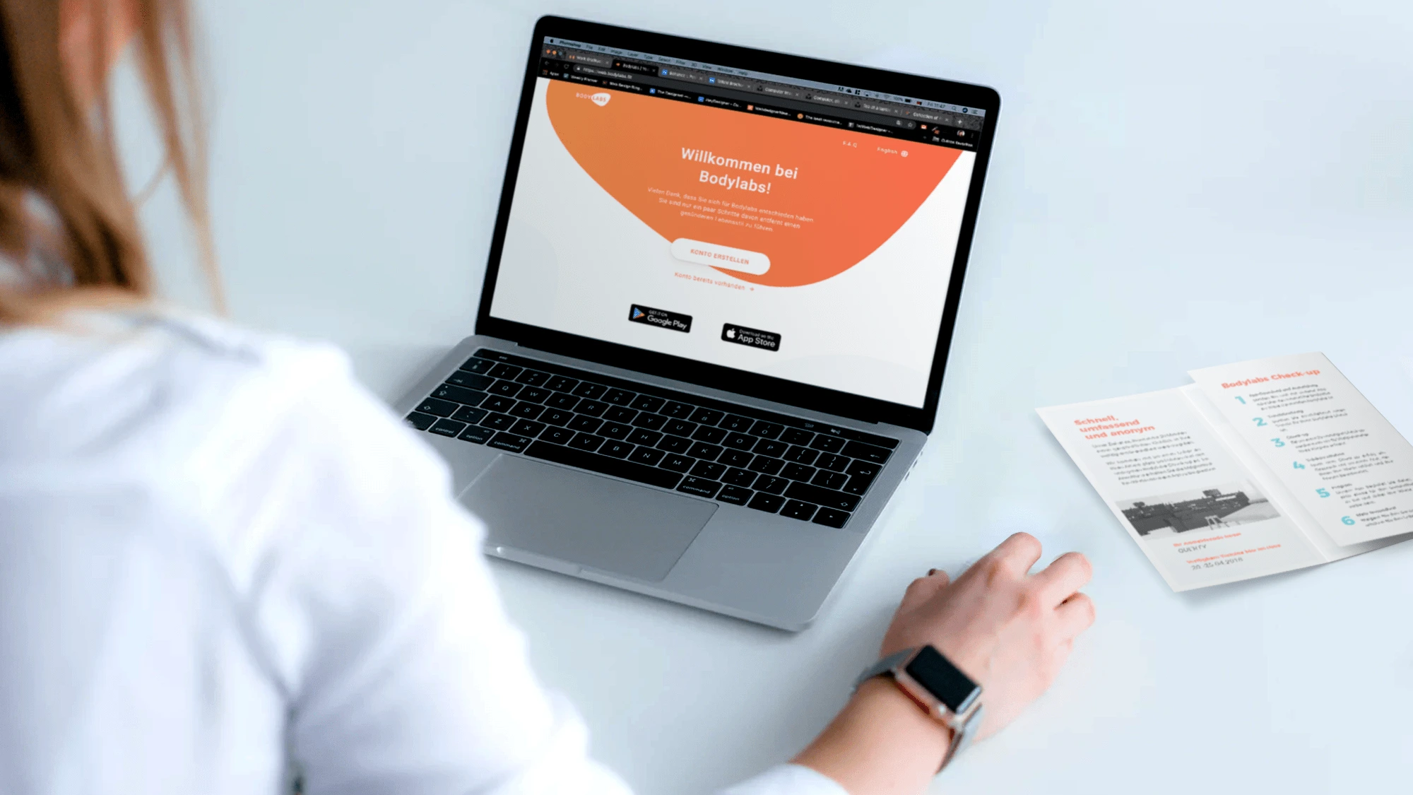
New sign up page, matching the app's style which makes the experience more cohesive throughout
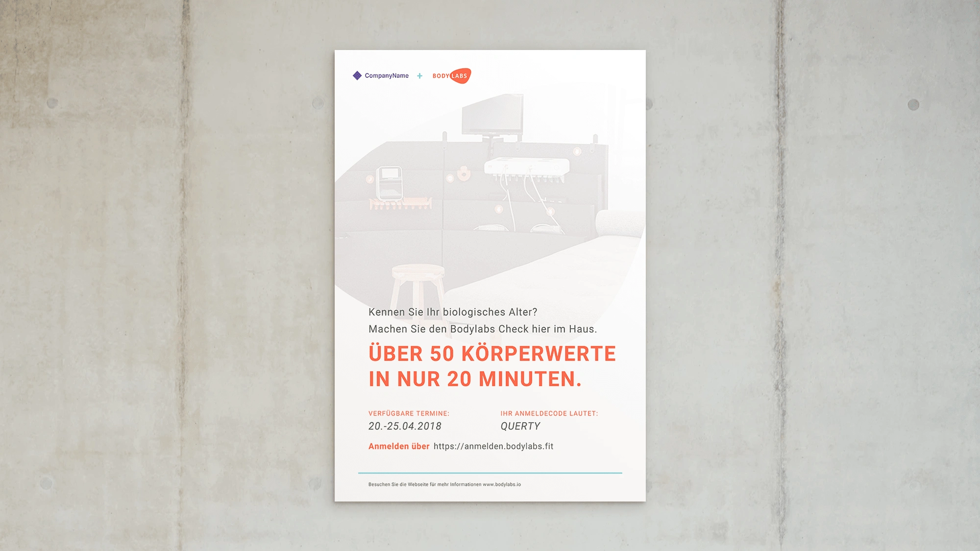
Poster talking about the Bodylabs benefits, along with infos for signing up and a call to action

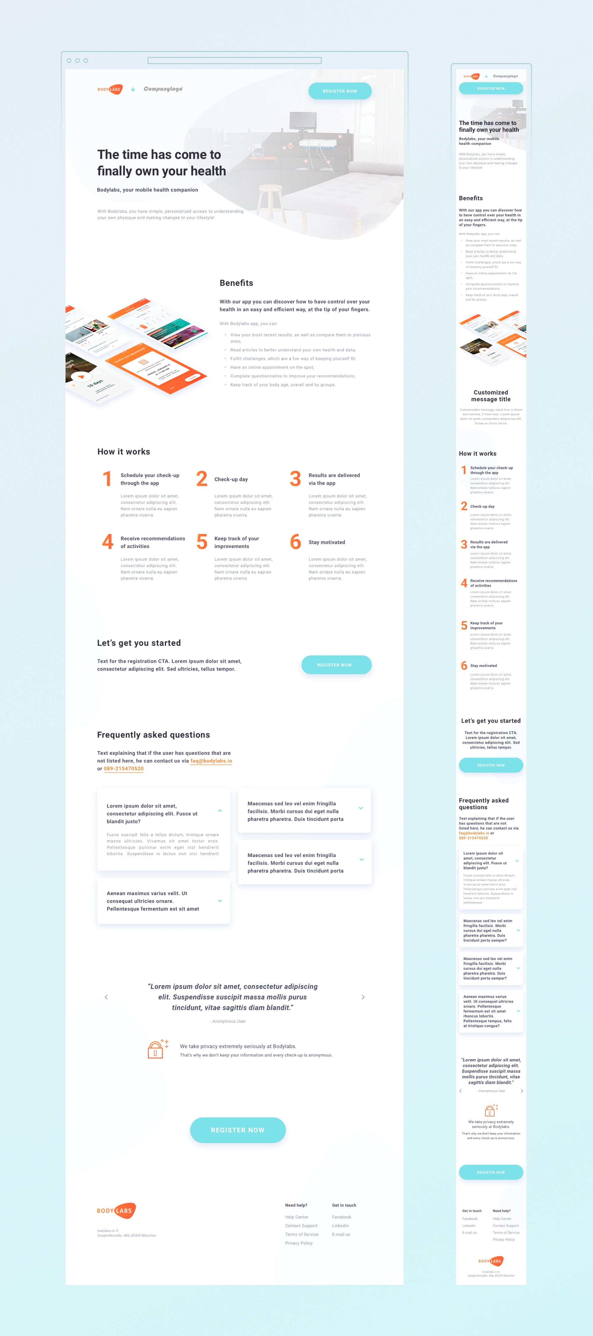
As the link that was sent didn't have any content or proper presentation before asking the user to sign up, I thought it could also be a good addition to the marketing package if we had a landing page showing the benefits of the check-ups to the users, instead of the onboarding flow right away.
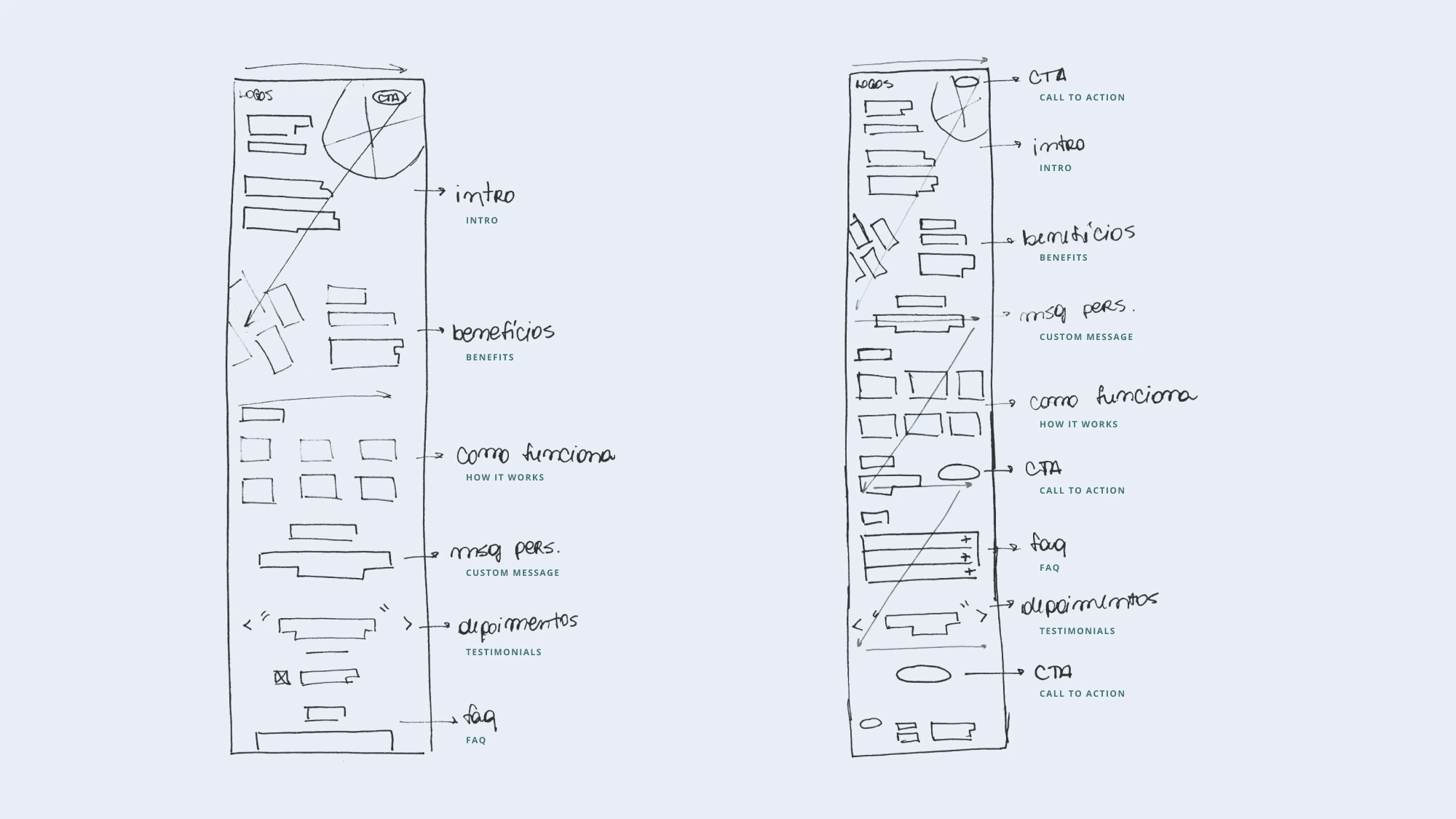
Wireframes exploration both following a Z reading pattern, making sure that we have a CTA at each point of attention.
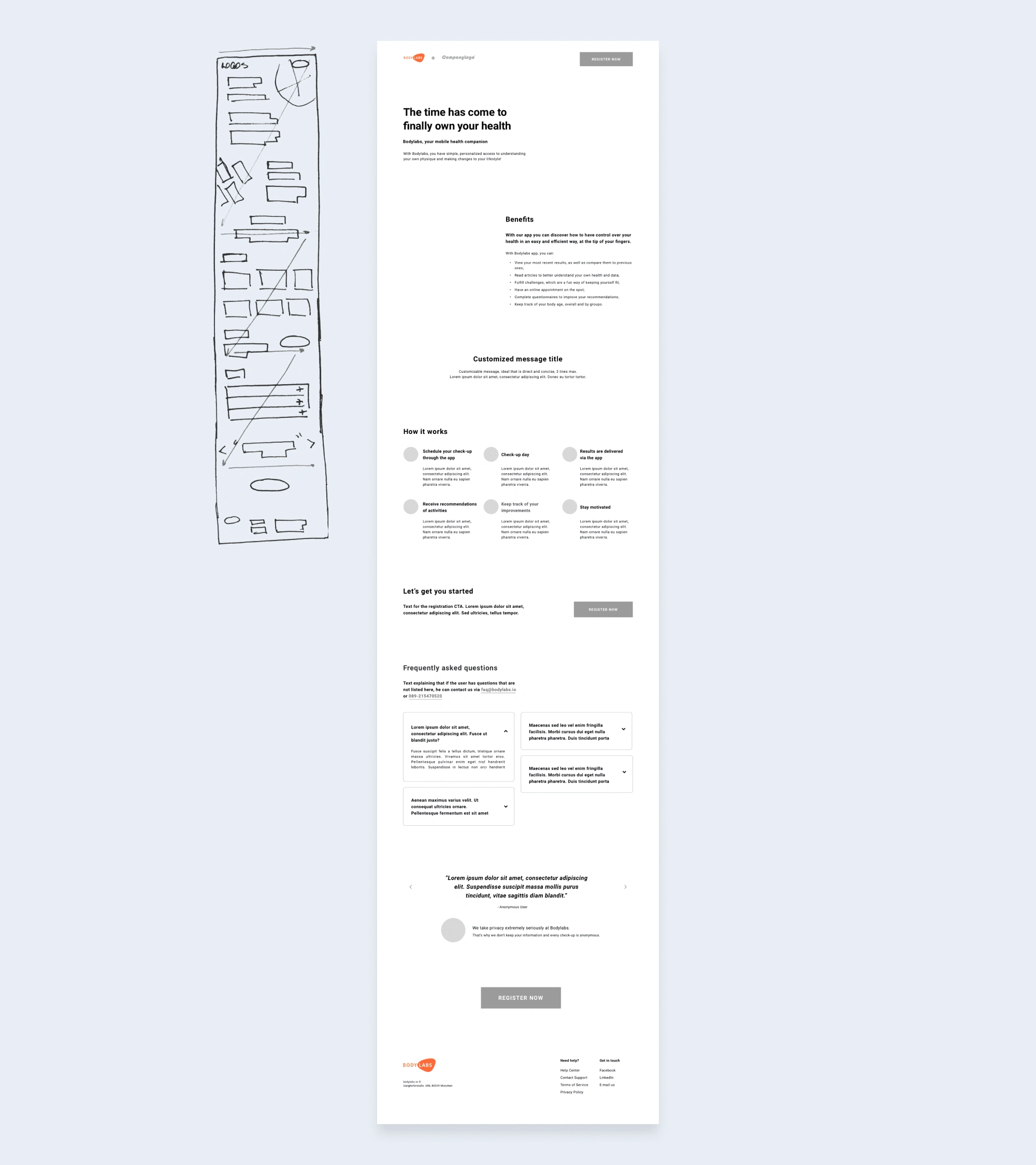
Chosen wireframe and page structure
Outcome
🔥 After full implementation, on the day we released the new campaign (and in less than 3 hours online), the conversion rate increased by more than 80%.
Like this project
Posted Sep 8, 2023
Increasing Conversion Rates on Registration Flow of a health app.

