*Brand New* Identity for Jill Bruton Copywriting
Deliverables
The deliverables for this project included a logo to capture what Jill's passion is, a business card that fit her overall brand identity, and a document complete with the brand guidelines for Jill to follow.
Logo
Jill and I began her brand project by having a discussion about her business and who she wanted to reach. We chose this gentle green and mellow blue as a soft and approachable, yet professional way to reach her audience. We also chose the fonts – Josefin Slab because it resembles a thicker version of a typewriter font & Open Sans Condensed – a trendy, easy to read light font that compliments Josefin Slab nicely.
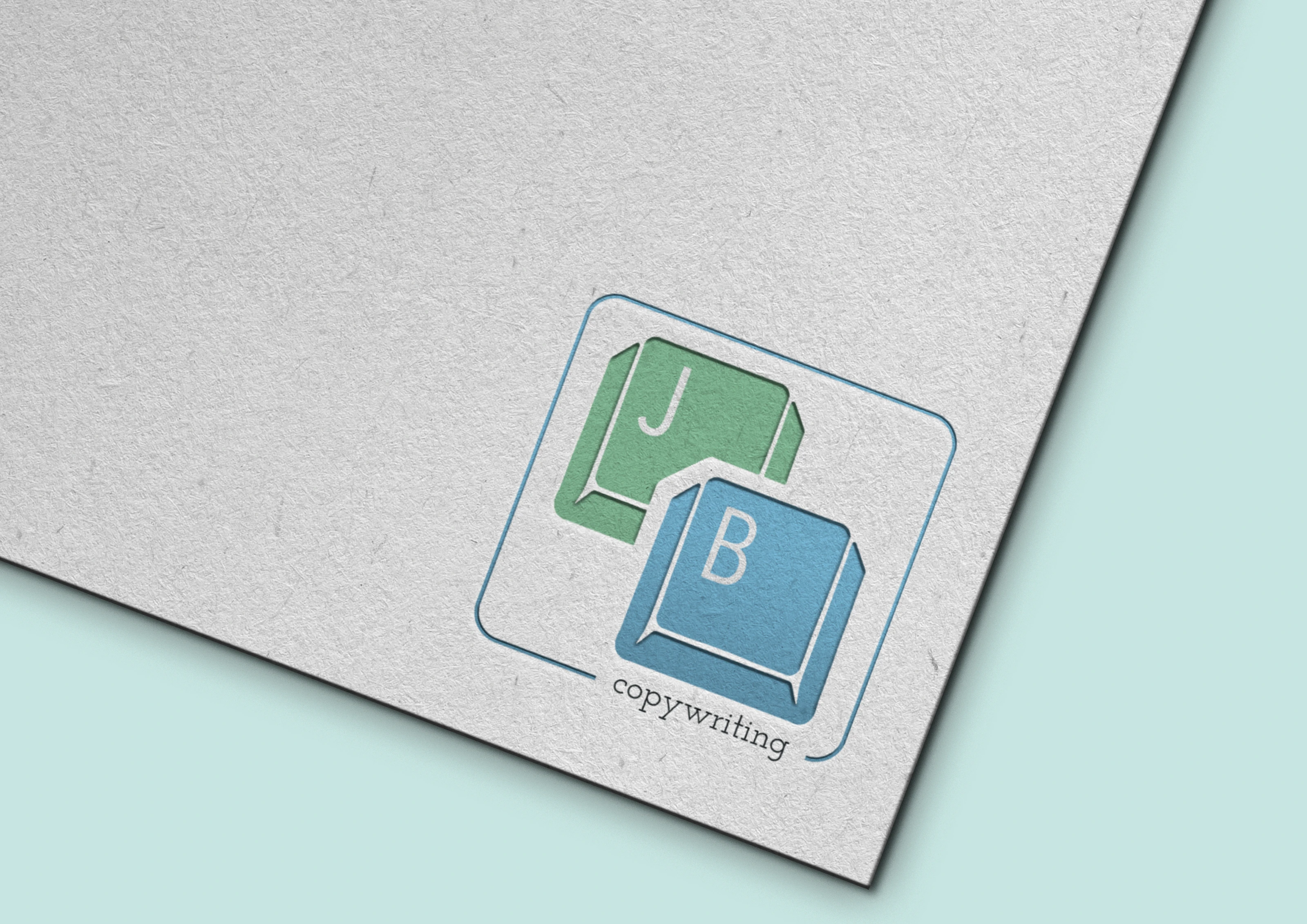
Copywriters these days are typing away on keyboards to entice their readers and make them feel through the writing. That is where the idea for this simplified keyboard logo came into action. We had a series of revisions that took place to get the logo to what you see here.
Kaylie is incredible! She made my logo and website even more brilliant than I had imagined. My business would not be where it is today if I hadn't found Out of Site Designs!
Business Card
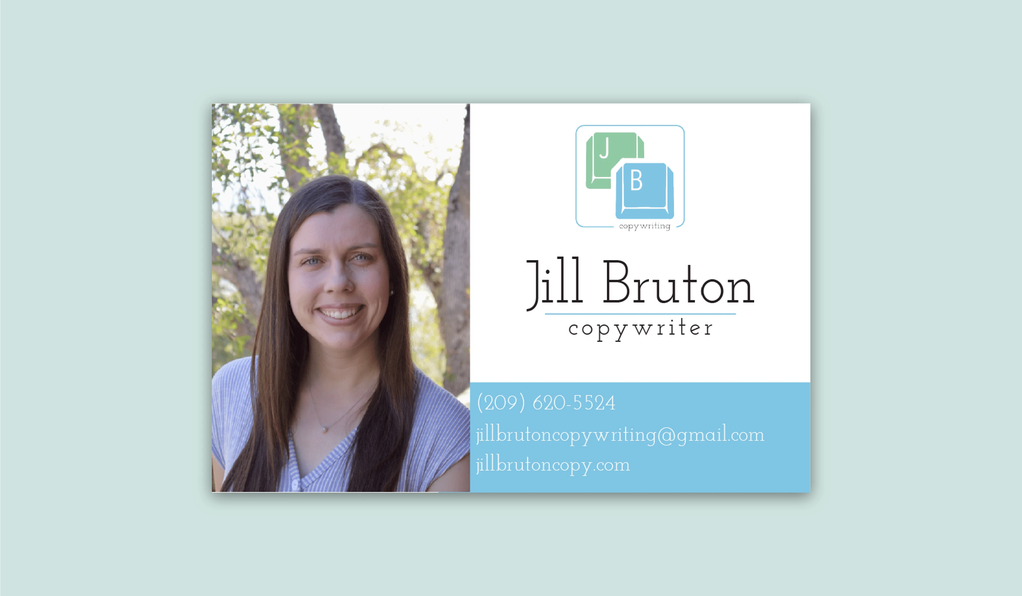
Jill had come to me unhappy about the business card she was trying to design on her own. She was very communicative in telling me what elements she liked and which she did not. Because of her excellent communication, I took this information and made a draft that she fell in love with. We made some slight edits to the design and turned it into what is displayed below.
Check out my website!
Like this project
Posted Sep 18, 2024
Elevate your brand with Out of Site Designs – where creativity meets strategy. Let’s make your brand story come to life!

