Crafting Timeless Elegance: The Fransofol Interior Experience

Ojo Oyewole


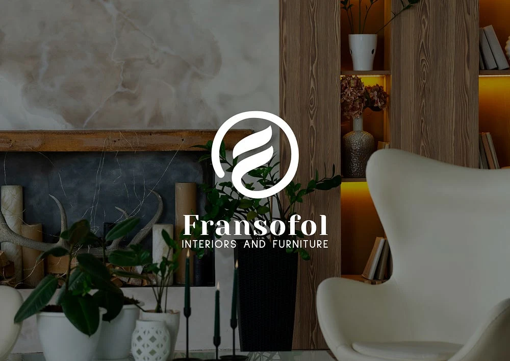
Case Study: Crafting Timeless Elegance — The Fransofol Interior Experience
4 min read
·
Just now
Client: Fransofol
Scope: Brand Identity Design
Services: Visual Identity, Logo Design, Color System, Typography, Tone & Voice, Brand Guidelines, Mockups
Brand Overview
Fransofol is an interiors and furniture brand that merges modern aesthetics with timeless craftsmanship. Their offerings — from bespoke furniture to full interior solutions — promote intentional, elegant living. The brand needed an identity that conveyed warmth, quality, and emotional depth.
The Challenge
Design a brand identity that:
Reflects high-end craftsmanship without being overly traditional
Appeals to design-conscious professionals and homeowners
Functions across digital, print, and physical environments
Evokes calm, trust, and sophistication
The goal: a system that feels grounded yet aspirational — tactile, human, and refined.
Audience
Fransofol speaks to architects, interior designers, and discerning consumers who view furniture as an extension of personal or professional values — investing not just in objects, but in meaningful spaces.
Design System
Typography
Primary Typeface: Yeseva One — a refined serif blending traditional charm and modern grace
Used prominently in the logo and headers for a confident, human tone
Scales effectively across signage, packaging, and digital platforms
Color System
Fransofol’s refined palette is inspired by natural textures and tones — echoing the brand’s focus on quality materials and timeless style.
Primary Brand Color
Deep Slate Blue —
#192939
A grounded navy tone that expresses stability, elegance, and trust. Used for logotypes, key messaging, and foundational backgrounds.Accent & Supporting Tones
Warm Sand —
#D6A26E
A golden neutral that adds warmth and sophistication, ideal for highlights, logo fills, and printed elements.Soft Clay —
#9F8466
A muted earth tone used to bring depth and richness to secondary elements like icons, borders, and textured backgrounds.These colors bring a modern yet organic quality to the brand — suitable for interiors that emphasize materials, calm, and timeless comfort.
Tone & Voice
Fransofol’s voice is:
Elegant, not extravagant
Confident, not commanding
Warm, not overly casual
Before: “Custom furniture for every space.”
After: “Designed to belong.”
This refined tone aligns with the brand’s visuals, ensuring consistency across all touchpoints.
Impact & Applications
Results:
+42% engagement on branded social posts
Stronger brand recognition among design professionals
Customer feedback highlighted the brand as “calm,” “sophisticated,” and “welcoming”
Conclusion
Fransofol’s new identity expresses its core promise: to create beautiful, livable spaces. With a tactile visual language, refined typography, and a resonant voice, the brand now connects more deeply — both emotionally and visually — with its audience.
Like this project
Posted May 14, 2025
Designed a brand identity for Fransofol, enhancing engagement and recognition.
Likes
0
Views
0
Timeline
Mar 14, 2025 - Mar 25, 2025