Proxima App: Designing a Seamless Crypto & Gift Card Experience
Ojo Oyewole
Proxima App: Designing a Seamless Crypto & Gift Card Experience
·
4 min read
·
Feb 20, 2022
A step-by-step case study on crafting Proxima’s UI/UX and brand identity.

Contributions: Product Design, Brand Design, Marketing Design, Product Strategy, Interaction Design.
Duration: Sep 2021 — Oct 2021
Collaborators: Hammed Oyedele (Flutter Developer), Sofwan Lawal (Backend Developer)
Overview
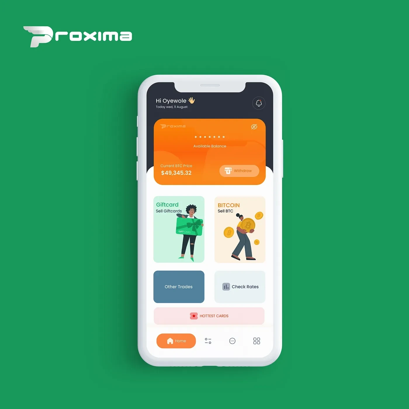
This app is designed to simplify crypto and gift card trading, providing users with a seamless platform to sell crypto and exchange various gift cards. A built-in wallet system allows users to store the monetary value of their trades, ensuring easy access to their funds. Additionally, an admin portal is included to oversee and manage app activities efficiently.
Strategy
A successful project starts with a solid plan. To align with the company’s vision and goals, I followed a structured process, beginning with in-depth research and progressing through iterative design improvements. My approach included:
Research — Understanding user needs and market trends
Sketching — Mapping out initial ideas and concepts
Wireframing — Structuring the user flow and layout
Identifying UX Issues — Finding and addressing pain points
Designing — Creating a refined and user-friendly interface
Research
I started by exploring existing crypto and gift card trading apps, analyzing their strengths and pain points. Google searches and competitive analysis helped me gather insights, while apps like Proxima stood out for their clean design, simple wallet integration, and intuitive transaction flow. These insights guided my design decisions, ensuring a user-friendly and efficient experience.
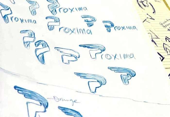
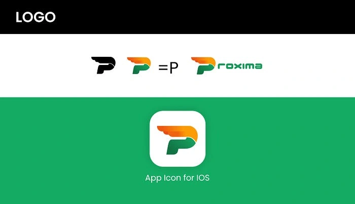
Branding Design
A logo is more than just a symbol or a visual element — it shapes perception and communicates meaning. For Proxima, I designed a logo that incorporates the letter “P” as an icon, ensuring a strong connection to the brand name.
Design System: Logo, Branding, Colors & Typography
Every element of the design system — logo, color palette, and typography — was carefully chosen to create a cohesive and recognizable brand identity.
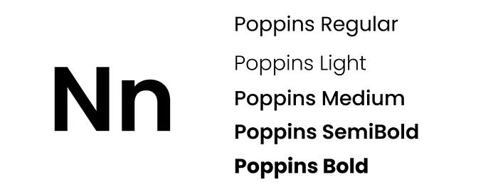
Typography
I choose the Poppins font, designed by Alisa Nowak, for its clean, modern aesthetic and simplicity.
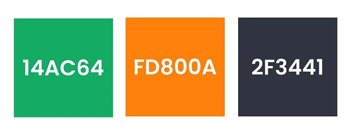
Color Palette
I chose orange and green as the primary colors for this project. Orange conveys friendliness and positivity, creating an inviting experience, while green represents sustainability and financial trust — ideal for a fintech brand, as it naturally reminds consumers of money.
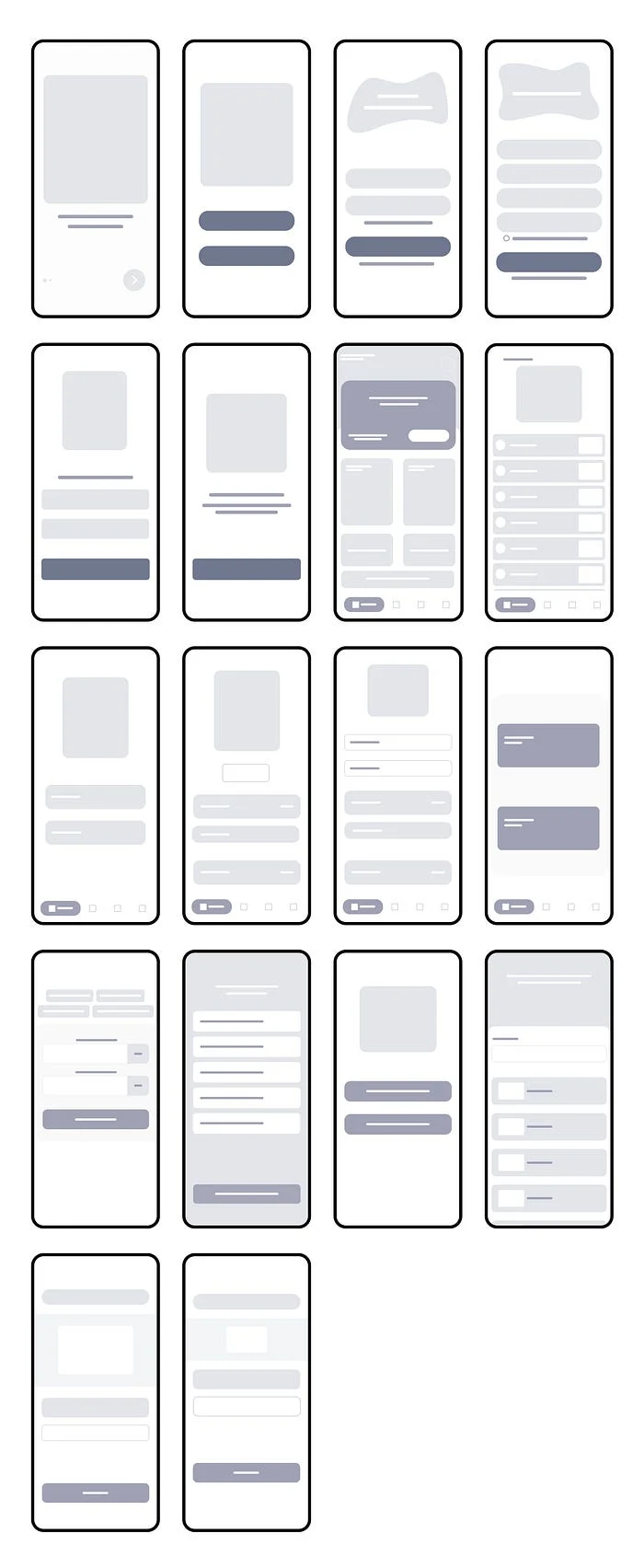
Userflow and Wireframes
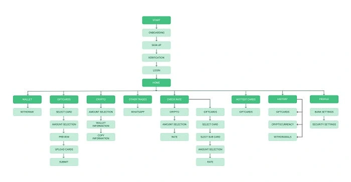
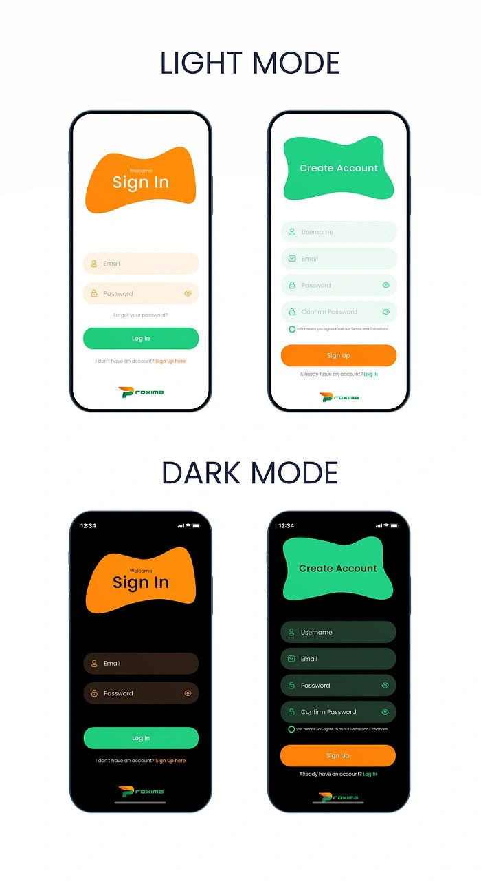
Sign Up / Sign In
I designed the signup process to be fast and effortless, ensuring users can get started without frustration or drop-offs.
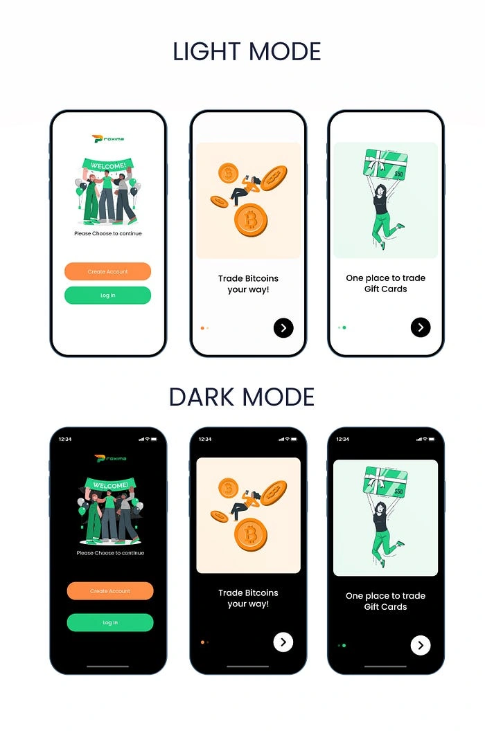
Onboarding Flow
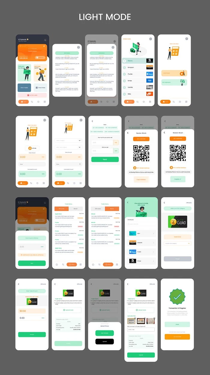
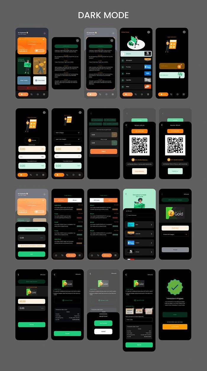
OTHER SCEEENS
CONCLUSION
This project was a significant learning experience for me. Working on it not only deepened my understanding of cryptocurrency trading but also gave me valuable insights into user needs through research and surveys. I’m excited about the potential for wider adoption and look forward to seeing how users engage with it. I’d love to hear your thoughts — feel free to share your feedback. Thanks for reading!
Like this project
Posted Apr 21, 2025
Designed UI/UX and branding for Proxima's crypto and gift card trading app.
Likes
0
Views
2
Timeline
Jan 3, 2023 - Feb 28, 2023
Clients
Proxima