Building the Brand: Identity Design for Mirapeak Property
Ojo Oyewole
Building the Brand: Identity Design for Mirapeak Property
Client: MIRAPEAK
Scope: Brand Identity Design
Services: Brand Strategy, Logo Design, Visual Language Development, Social Media Asset Creation, Brand Guidelines Documentation
MIRAPEAK approached me to create a cohesive and memorable brand identity that would reflect its mission of blending growth, home, and ambition into a single, resonant vision. The challenge was to design a visual language that felt both aspirational and grounded, capable of connecting with audiences across diverse markets while remaining distinctive and authentic.
To address this, I led a comprehensive brand identity project that encompassed strategic positioning, logo creation, color and typography systems, social media asset development, and a complete set of brand guidelines. Every step of the process was anchored in a deep understanding of MIRAPEAK’s values and aspirations.
LOGO DESIGN
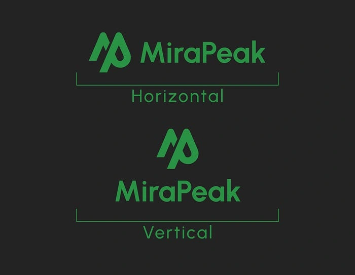
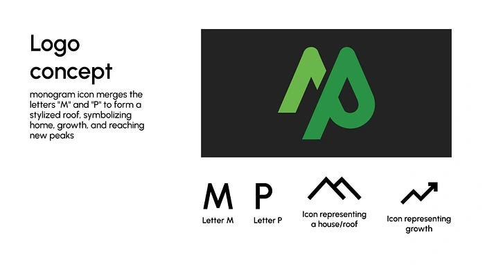
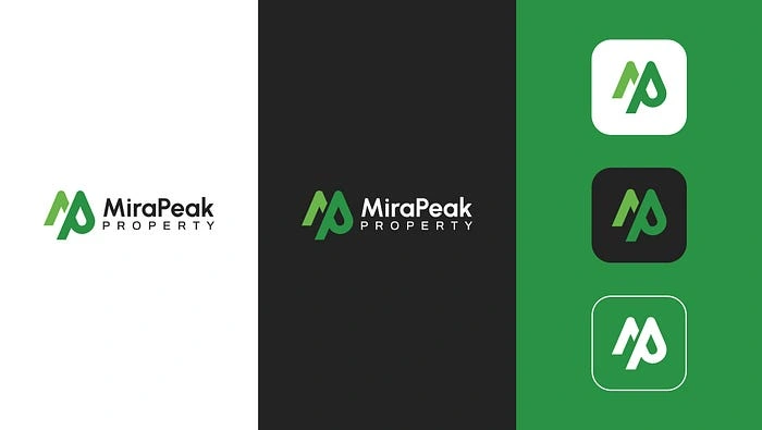
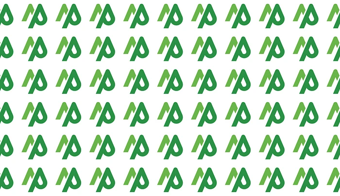
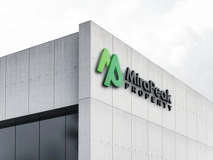
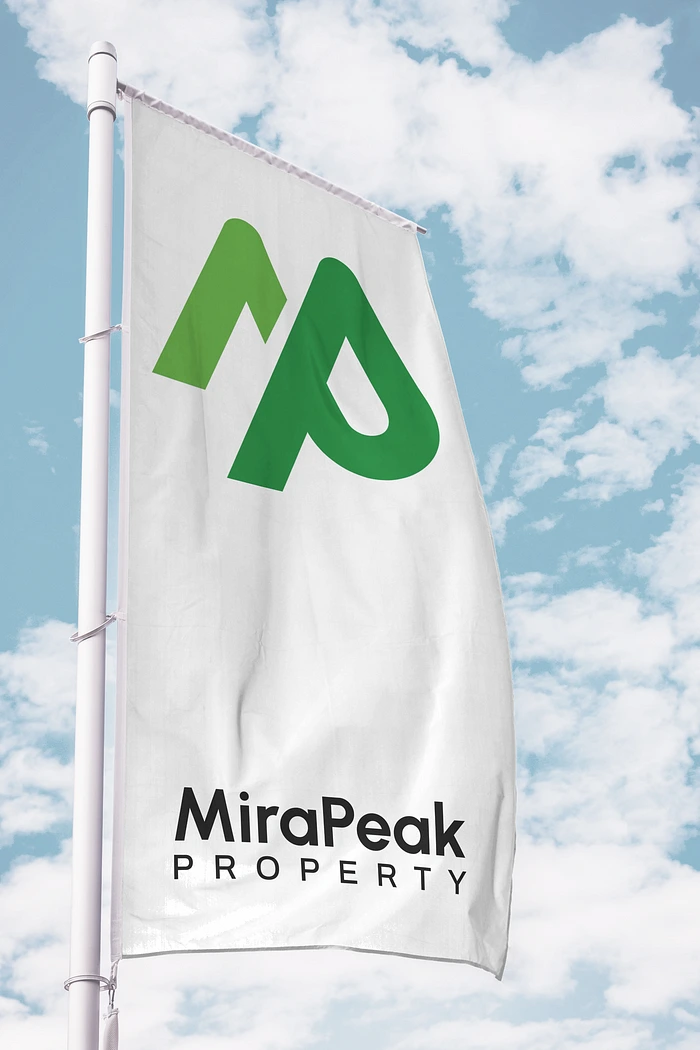
The logo suite crafted for MIRAPEAK centers around versatility and clarity. The primary logo consists of a modern wordmark that conveys a strong and confident brand presence. Alongside the wordmark, a monogram icon merges the letters “M” and “P” to form a stylized roof, symbolizing home, growth, and reaching new peaks. This conceptual combination creates an immediate visual tie to the brand’s name and its core purpose.
The strategy behind the monogram was to forge a memorable, meaningful symbol that could stand independently across digital, print, and environmental applications without losing brand recognition or emotional resonance.
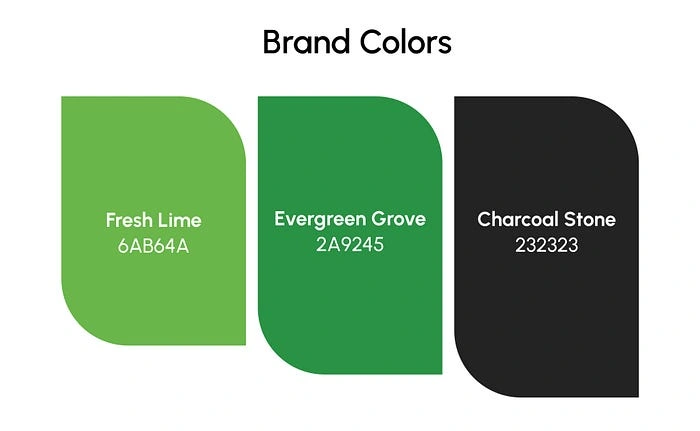
COLOR PALETTE AND TYPOGRAPHY
The color palette for MIRAPEAK strikes a balance between boldness and sophistication. Fresh Lime (Light Green #72BF44) conveys growth and freshness, while Evergreen Grove (Deep Green #2D9445) establishes stability and trust. Charcoal Black (#232323) grounds the brand in professionalism and timeless elegance.
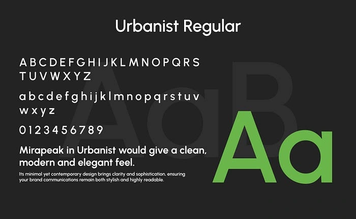
Typography is anchored by the Urbanist typeface, used consistently across all brand communications. Urbanist’s contemporary, geometric sans-serif form ensures clean readability and a modern, approachable appearance. This choice reinforces MIRAPEAK’s commitment to clarity, community, and creative progress.
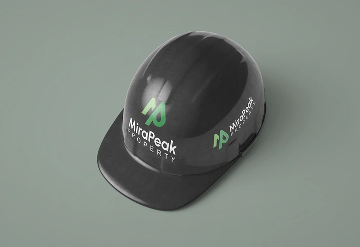
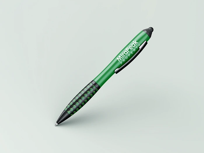
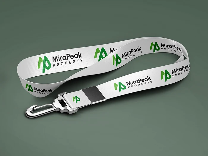
BRAND APPLICATION
The brand identity was activated across a range of launch-ready applications, including social media templates, merchandise mockups, and marketing collateral. Each asset was designed to convey a sense of movement, growth, and cultural exchange, supporting MIRAPEAK’s goal of building an authentic and engaged audience. The adaptable design system ensures a cohesive experience across all customer touchpoints while allowing for creativity and organic expression.
OUTCOME
The final MIRAPEAK brand identity delivers a strong and timeless foundation that unites creativity, culture, and community. The visual system ensures consistency across digital, print, and environmental platforms while maintaining expressive flexibility. With a clear, confident, and purposeful voice, MIRAPEAK is now positioned as a trusted and inspiring presence, ready to grow its influence and foster meaningful connections within the real estate landscape.
Like this project
Posted May 14, 2025
A modern brand identity for MIRAPEAK, blending trust, growth, and design to elevate real estate experiences.
Likes
0
Views
0
Timeline
Jul 14, 2024 - Aug 1, 2024