KidsAI Product Design and Prototype Development

Aleyna Çatak


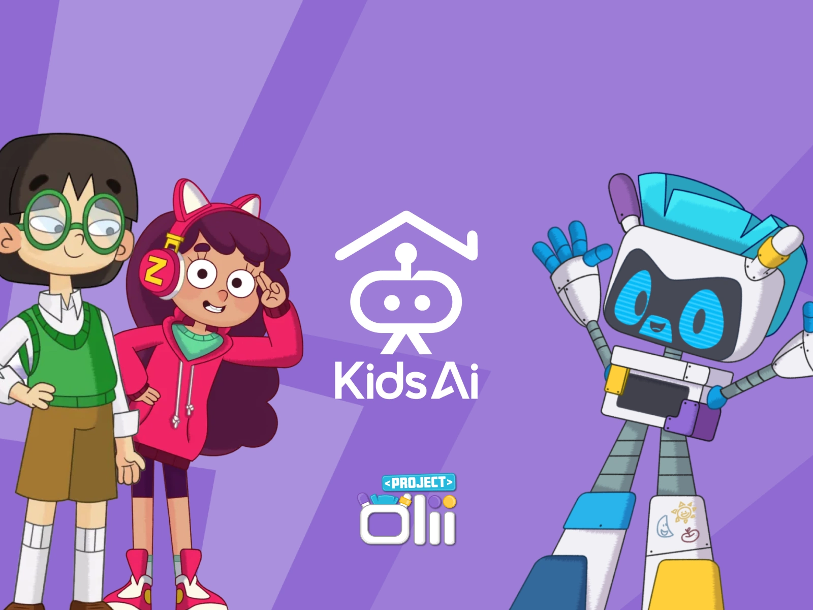
An AI app for kids that didn't know what it wanted to be. Now it does, and there's a prototype to prove it.
Scope: Product Design, Design System, Creative Direction, Consulting (retainer)
Timeline: 2025–2026 · 3 months
My role: Sole designer / consultant
The Problem
Pre-launch, the product direction was unclear in UX and in visual identity, which is two ways of saying the same thing: nobody could show an investor or a parent what the app actually was.
Constraints
Pre-launch: no users to test against, everything argued from judgment
An existing IP (Project Olii) whose visual language had to carry over
The Approach
Decision 1: Audit before adding. I audited the existing designs before proposing anything. The new user flow extended the feature set, but on a diagnosed base — not a fresh-start redesign that throws away what worked.
Decision 2: Prototype as the deliverable, not the presentation. Instead of static screens, I built a fully interactive Figma prototype and turned it into a pre-launch product walkthrough. The demo is the direction — stakeholders react to behavior, not to slides about behavior.
Decision 3: Generative tools for IP consistency. Applied Project Olii's visual language using Morphic Studio's generative tools, so the IP scales across screens without hand-drawing every asset.
The Range Moment
One person covered audit, UX, design system, creative direction, and the launch demo, which is why none of them contradict each other.
The Outcome
KidsAI went from unclear direction to a pitch-ready product story: within months of the redesign, the company advanced from hundreds of applicants to the final ten at Eureka! GCC's 5th Edition and finished as 1st Runner-Up at the Grand Finale.
Like this project
Posted Sep 1, 2026
Designed a prototype for KidsAI to clarify product direction with a pitch-ready story.
Likes
0
Views
11
Timeline
Jan 1, 2025 - Jan 1, 2026
Clients
KidsAI