Barqco

Brady Marchant


Barqco
A B2B | B2C SaaS platform helping pet influencers maximize tax savings with pet-related expenses through incorporation.
Overview
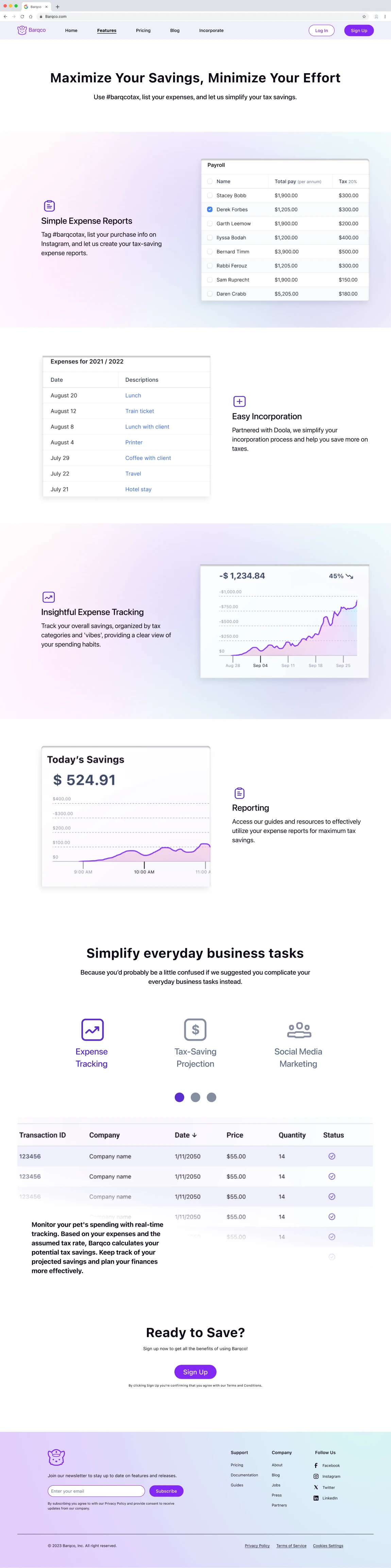
Barqco is an innovative B2B | B2C SaaS solution. A bridge between passion and profitability that recognizes the rising trend of pet influencers, Barqco provides tools and services to help pet owners monetize their pets' social media accounts. The primary aim is to save money and make tax calculations a breeze. Designed to empower pet owners to convert their pets' social media presence into a revenue-generating entity, ensuring correct tax calculation and savings. Their unique system allows users to effortlessly track business expenses on Instagram using the hashtag #barqcotax, paired with the relevant expense information.
Challenge
Barqco's website needed more clarity to convey the product's value effectively. Navigating the site was cumbersome, with critical information buried beneath layers of confusion. The brand identity needed consistency to instill trust and draw new users. Their vital touchpoint blog contained irrelevant content, further diluting the brand message.
Solution
Redefining Barqco's digital landscape was imperative; our team’s main objective was to improve the overall website design and brand identity while also improving the content displayed on the site.
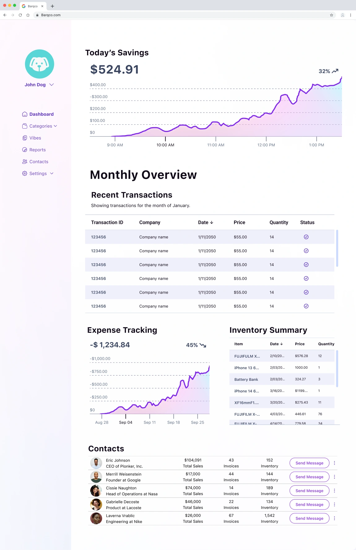
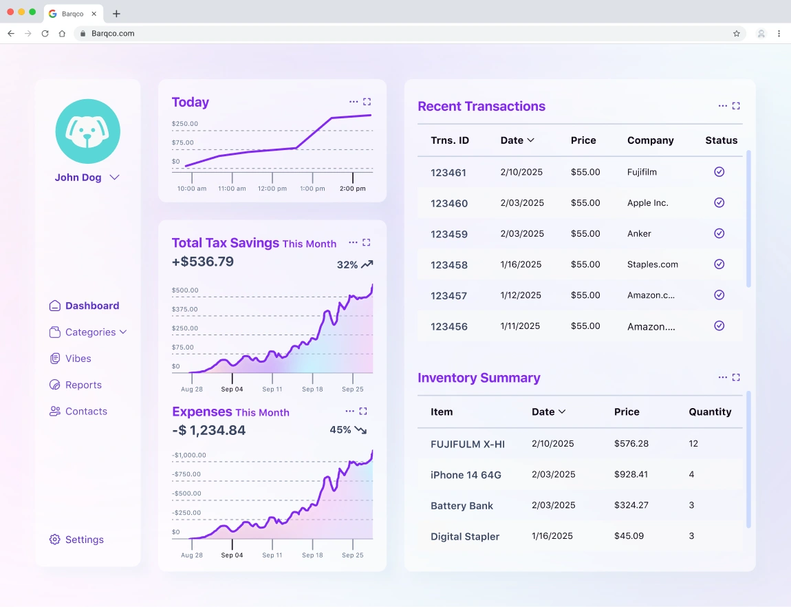
Website Design: Crafted a website that encapsulated Barqco's essence, ensuring visitors instantly understood the brand, its offerings, and its relevance to their needs. The design was intuitive, guiding the user through the process seamlessly.
Brand Identity: Established a robust and cohesive brand identity. While the mascot was a starting point, the branding journey extended beyond it. Crafted a consistent theme, including colors, fonts, and other design elements, which was paramount. This theme became Barqco's signature, ensuring a uniform client-facing experience on the website, app, or any other platform.
Role
UX/UI Designer (Team of 5)
Process
Discovery
Ideation
Design
Developer Handoff
Reflection
Tools
Miro
Figma
Zoom
Loom
Adobe Photoshop
Adobe Illustrator
Google Workspace
Leonardo Ai
Duration
3 months
1
Discovery
2
Ideation
3
Design
4
Developer Handoff
5
Reflection
Discovery
Kick-off
Our design team reviewed the client file, which included a Barqco mascot image, user stories, and a link to their website's "About" video. The objective was to redesign their existing website to convey Barqco's purpose and facilitate user interactions, particularly for viewing expense reports. The client wanted the website to quickly inform visitors about Barqco's value proposition and its advantages for pet owners aged 20-50 in the United States. Barqco needed to redefine its online presence and establish a distinct brand personality that would appeal to its potential client base. Understanding Barqco's vision and target audience was crucial in developing design strategies aligning with its business goals while engaging users.
Clarity and Accessibility: The site must make it easy for users to understand Barqco's services and how they can benefit from them.
Target Audience Engagement: Our design strategy should appeal to pet enthusiasts with discretionary income interested in travel and luxury who are also savvy about the U.S. tax system.
Cohesive Brand Identity: Success would be measured by the site’s informative clarity and by establishing a unified theme incorporating the mascot, a chosen font, and a color scheme to create a consistent client-facing experience across all platforms.
Client Questionnaire
While shaping Barqco's digital presence, our team reviewed the client materials and were left with a few questions. Our main objective was to determine the client’s overall design preferences and the type of brands they draw inspiration from. In doing so, we were hoping to have a better understanding of the direction we needed to go in Key takeaways that informed our design strategy:
Research and Trust Building: The client highlighted the necessity for establishing trust as Barqco introduces a novel approach to leveraging social media for financial benefits.
Inspirational Brands: Barqco admired Stripe's clarity and Rocket Money's inviting aesthetics, guiding our design's tone and simplicity.
Competitive Landscape: Understanding Barqco’s unique position in the market led to differentiating the brand from competitors like Doola and various expense management apps.
Product Focus: Barqco prioritized showcasing the money-saving advantages of their service by simplifying the expense management process, differentiating from competitors by eliminating the need for credit card linking or receipt scanning.
Design Philosophy: The client’s preference for a "Trustworthy, Approachable, and Modern design" and a penchant for light color schemes gave us creative direction for the MVP’s look and feel.
Current Design Feedback: The client expressed a need for a cohesive design philosophy, which needed to be present in their current setup.
This direct feedback was imperative for a user-centered design approach to encapsulate Barqco's innovative service through a trustworthy, user-friendly, and modern interface.
Competitive Research
To establish a distinct brand presence for Barqco, my teammate and I performed a thorough competitive analysis focusing on key players in the business and expense SaaS platforms sector.
Doola: Doola is well known for its simplicity of business formation for smaller markets, even for those without extensive experience. Its user-centric design minimizes complexity, making it an ideal choice for efficient establishment.
Mesh Payments: Mesh Payments targets larger organizations and offers multi-entity and multi-currency operations solutions. It's less ideal for smaller businesses, indicating a gap Barqco could fill by focusing on individual entrepreneurs and small firms seeking a more personalized service.
Airbase: Airbase's platform is noted for its intuitive design and comprehensive spend tracking. However, it may lack customization options, suggesting that Barqco can differentiate itself by providing more tailored and flexible services.
Divvy: Divvy offers robust expense management tools but may intimidate smaller businesses due to its complexity and broad feature set. Barqco can capitalize on this by providing a streamlined and more approachable user experience.
Critical Differentiators for Barqco:
User Experience: All competitors emphasize ease of use and intuitive interfaces; Barqco could benefit from focusing on a friendly UI and straightforward functionality to appeal to non-corporate users.
Service Personalization: There's a niche for services catering to individual and small business needs that prioritize personal touch and ease without complex integrations.
Market Niche: None of the competitors specifically target "petpreneurs," presenting Barqco with an opportunity to own this space by catering to pet-related businesses.
Pricing and Accessibility: Some competitors' pricing might be prohibitive for smaller entities, suggesting that Barqco could attract users with competitive pricing and a clear, accessible value proposition.
By aligning these insights with Barqco's unique value proposition—leveraging social media for expense management—our team will design a platform that stands out in the current market landscape.
Heuristic Evaluation
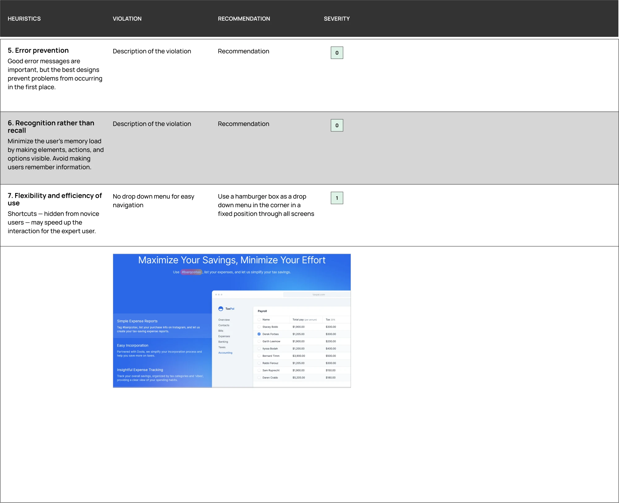
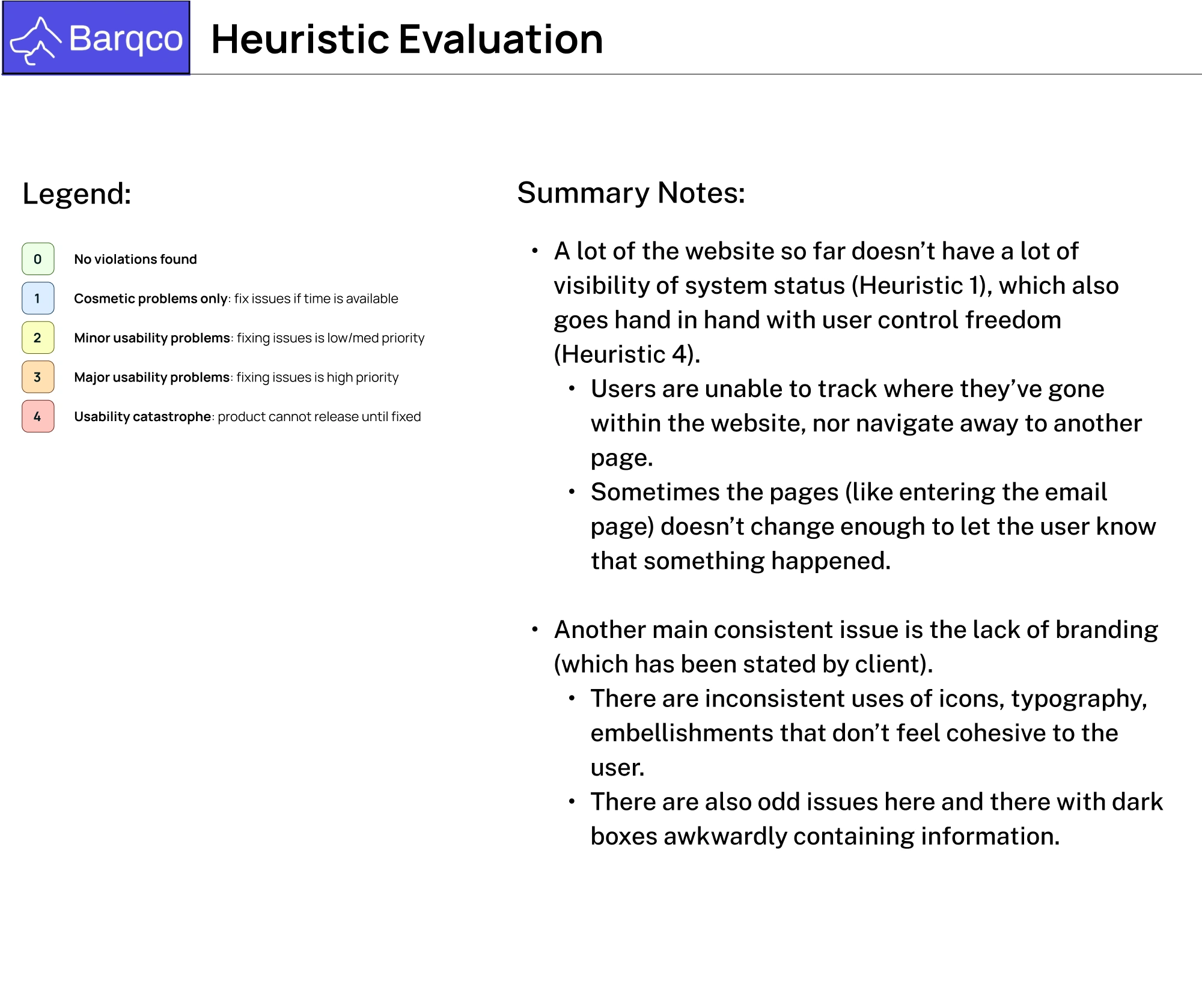
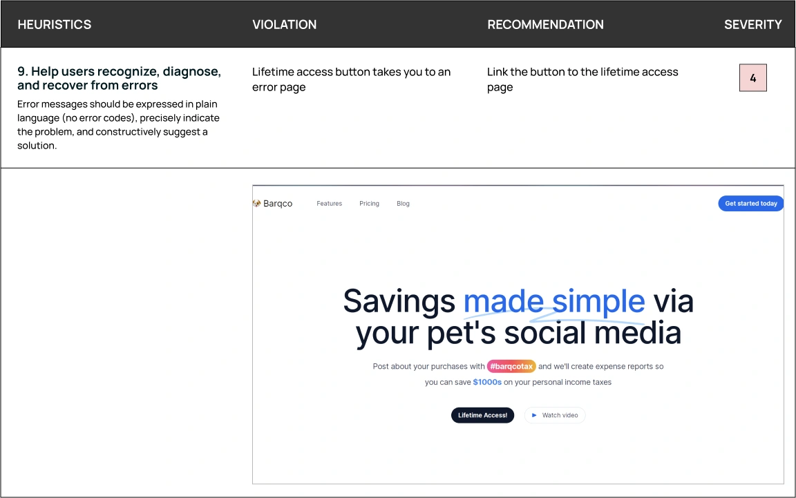
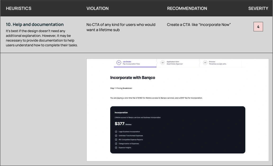
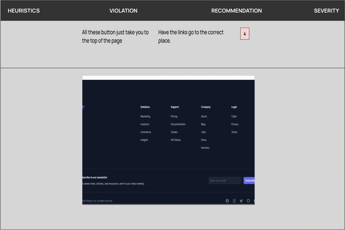
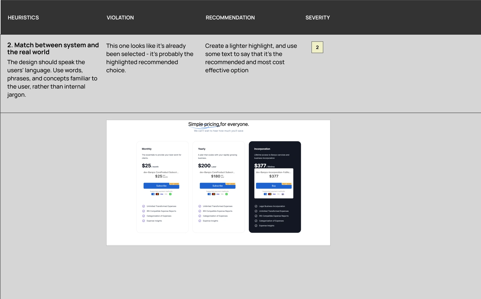
The team cross-referenced each aspect of the Barqco website against Nielsen’s ten usability heuristics. We analyzed competitor sites to gauge industry standards, then compared Barqco’s website and recorded corresponding heuristic violations and recommendations for improvement. By addressing these issues, the Barqco website can improve its usability significantly, creating a more intuitive and satisfying user experience.
Key Findings
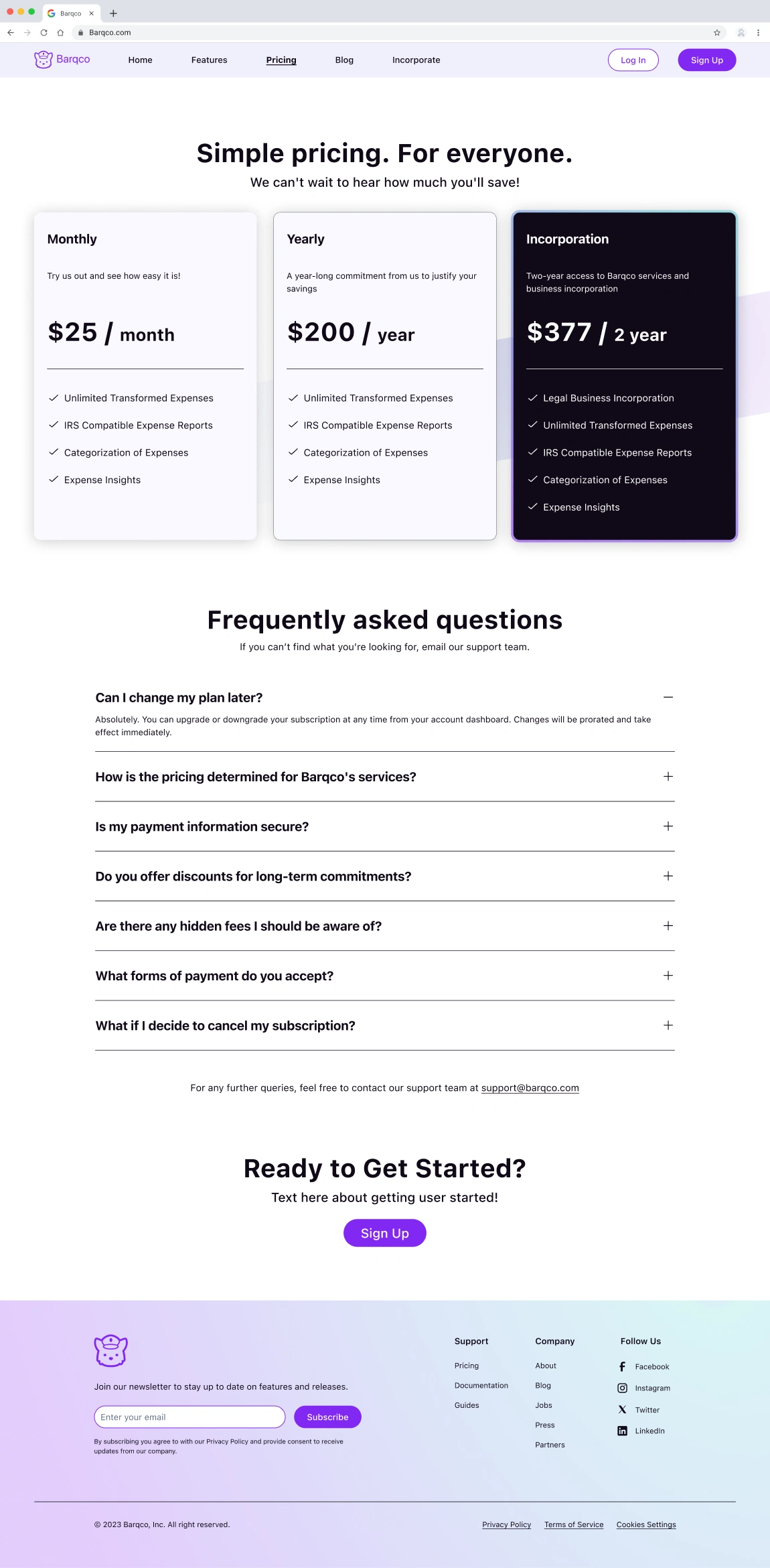
Confusing Pricing Page: The pricing page needed a more straightforward presentation to ensure customers could easily understand pricing information.
Inconsistent Branding Elements: The varied use of colors, fonts, and graphic elements did not align with a cohesive brand identity.
Inadequate Navigation: Users needed a clear pathway to backtrack or proceed, which could have resulted in a frustrating experience.
Insufficient Feedback Mechanisms: There need to be more visual or textual indicators to confirm user actions, such as form submissions.
Lack of Error Prevention: Forms and interactive elements did not prevent user errors or provide adequate instructions for use.
Overwhelming Content: Some pages were overloaded with information, making it difficult for users to focus on critical tasks or messages.
Ideation
User Stories
The client presented the following user stories that defined the project scope, each outlining the specific objectives set by the client for the Barqco Platform.
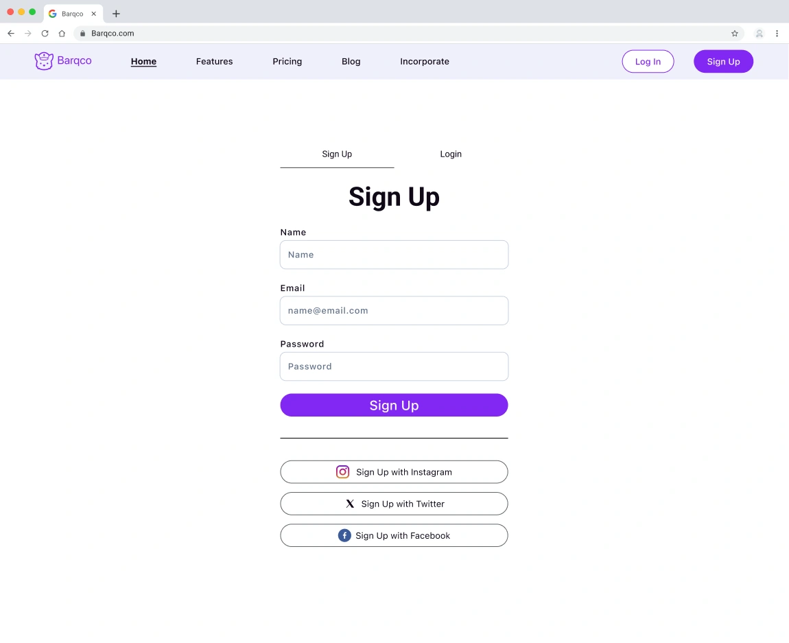
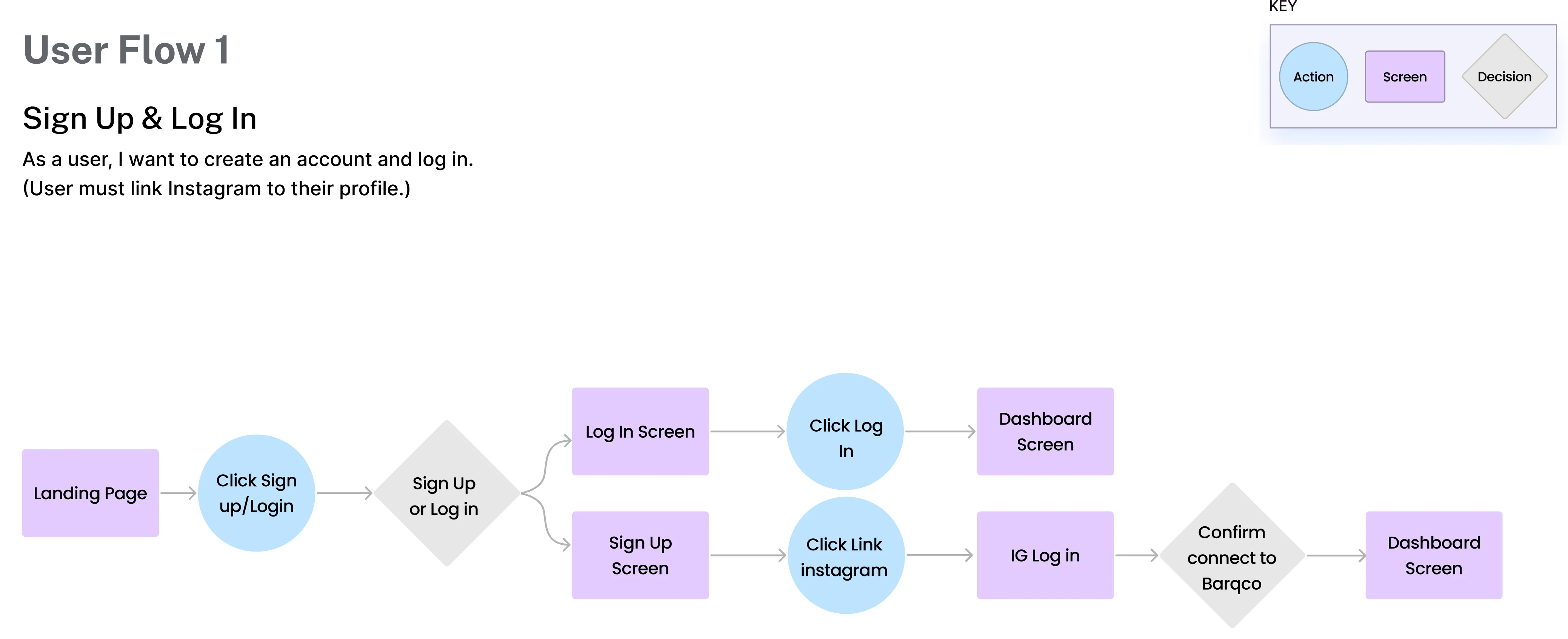
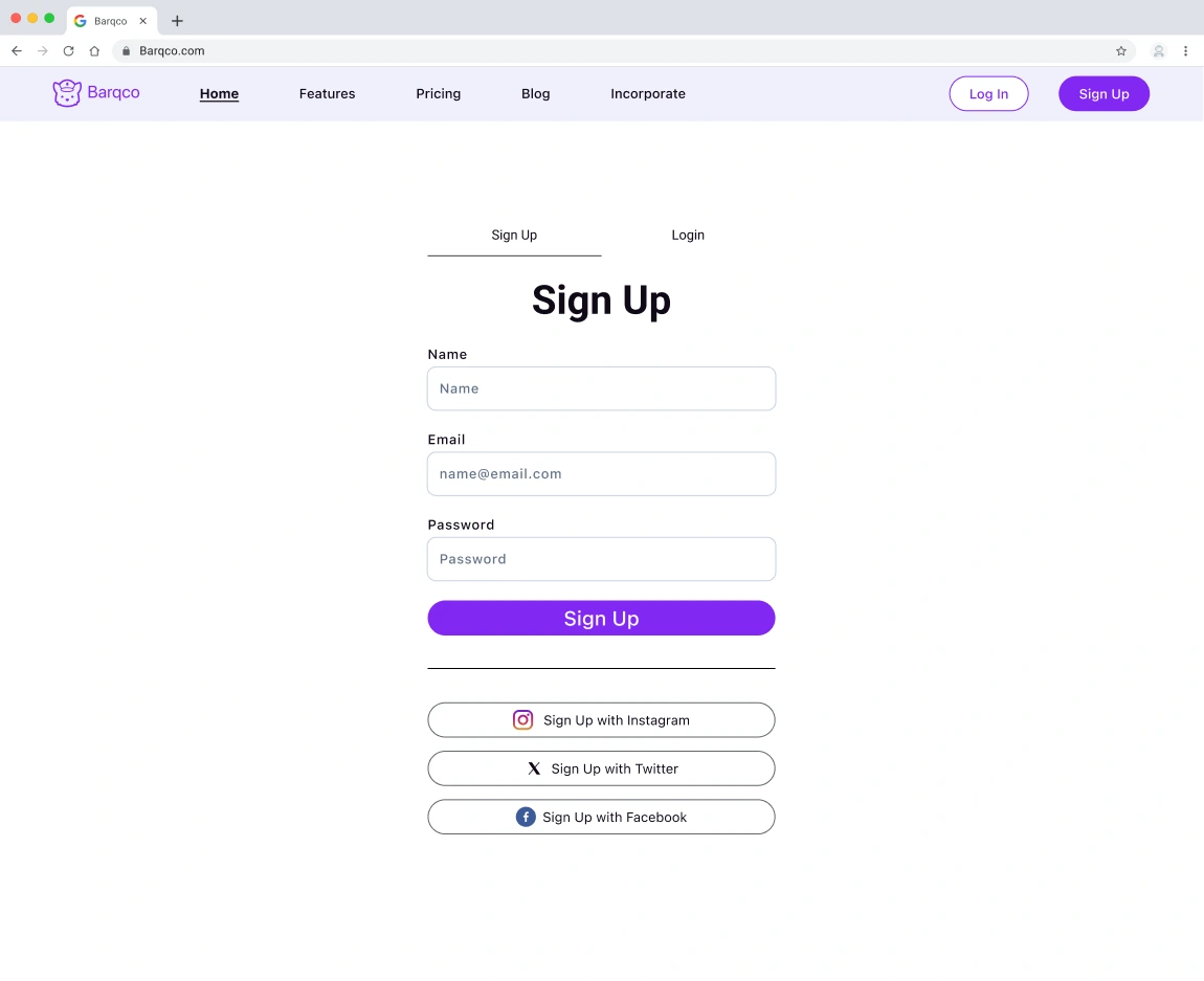
As a user, I want to create an account and log in.
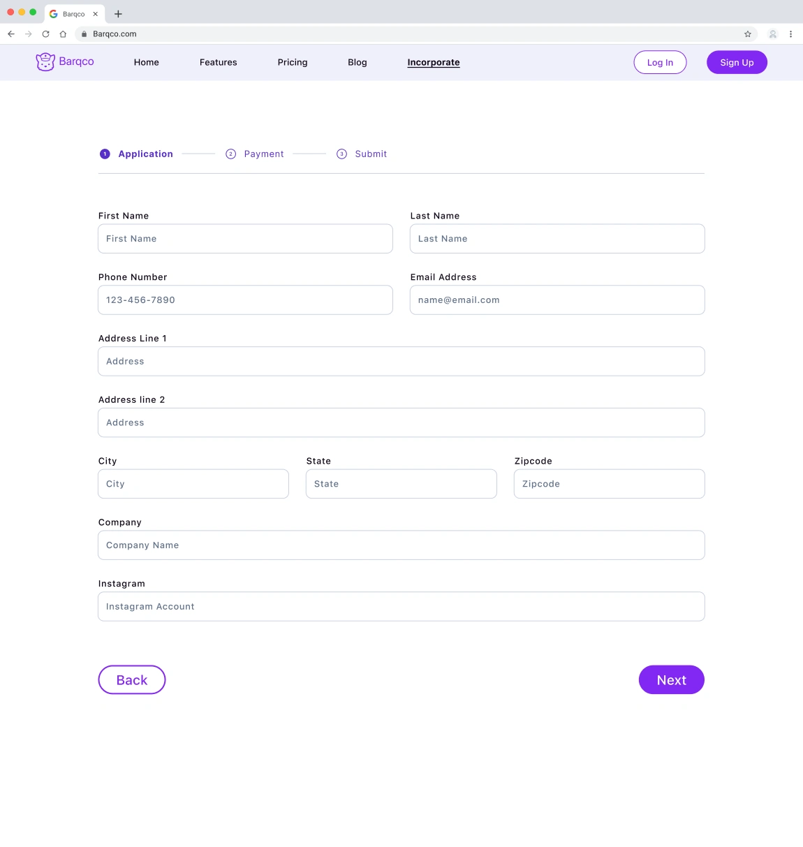
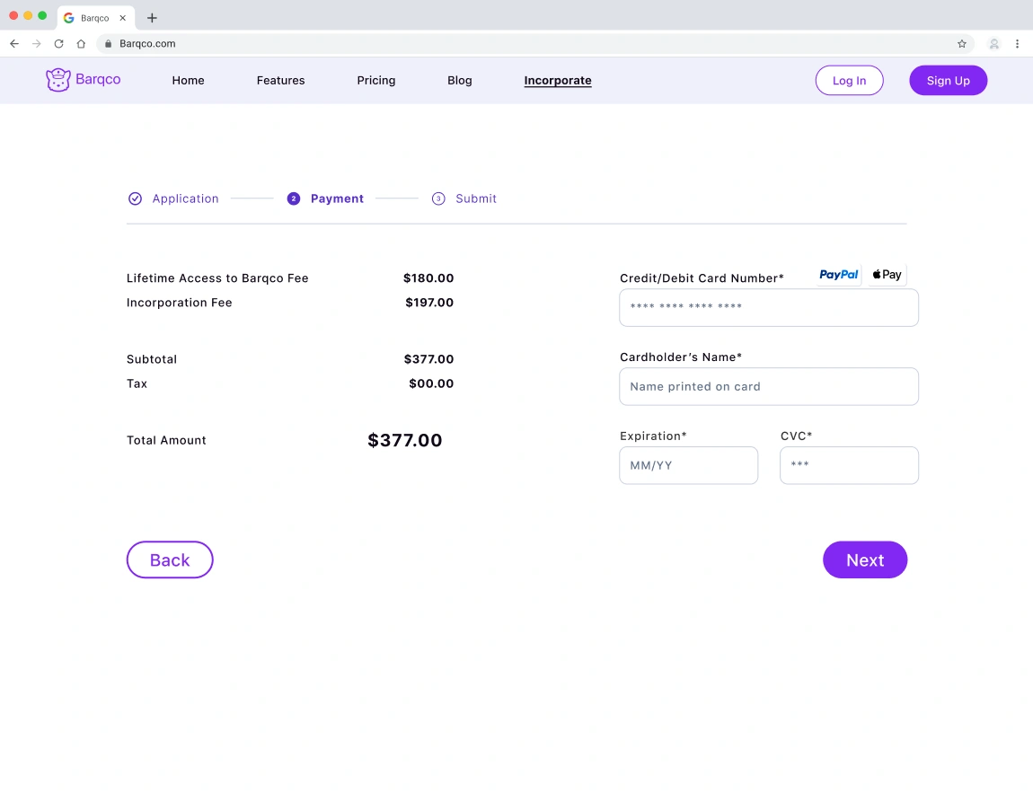
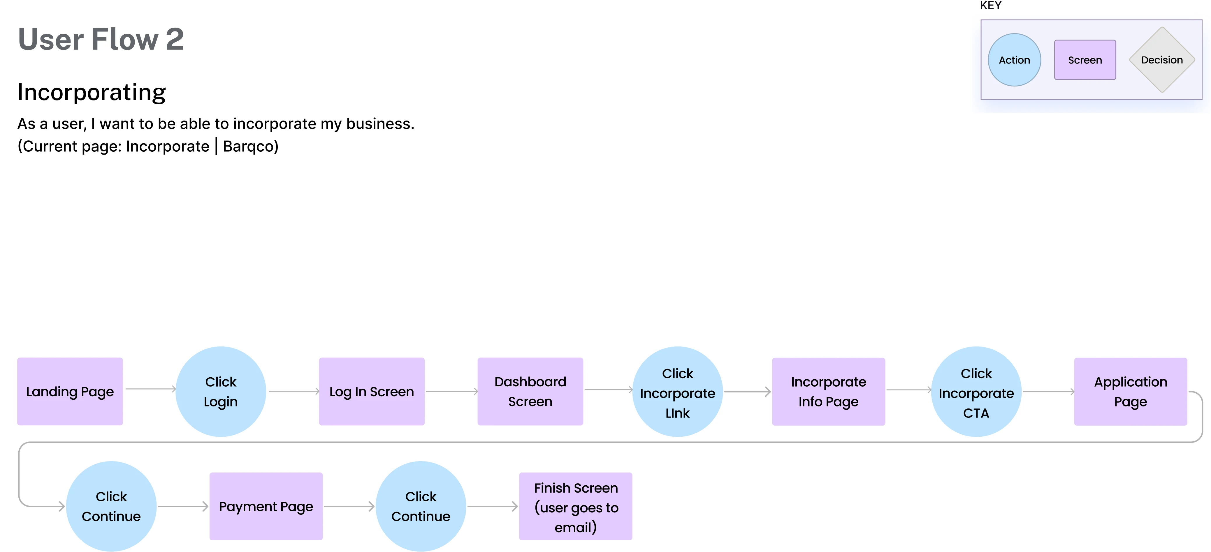
As a user, I want to incorporate my business.
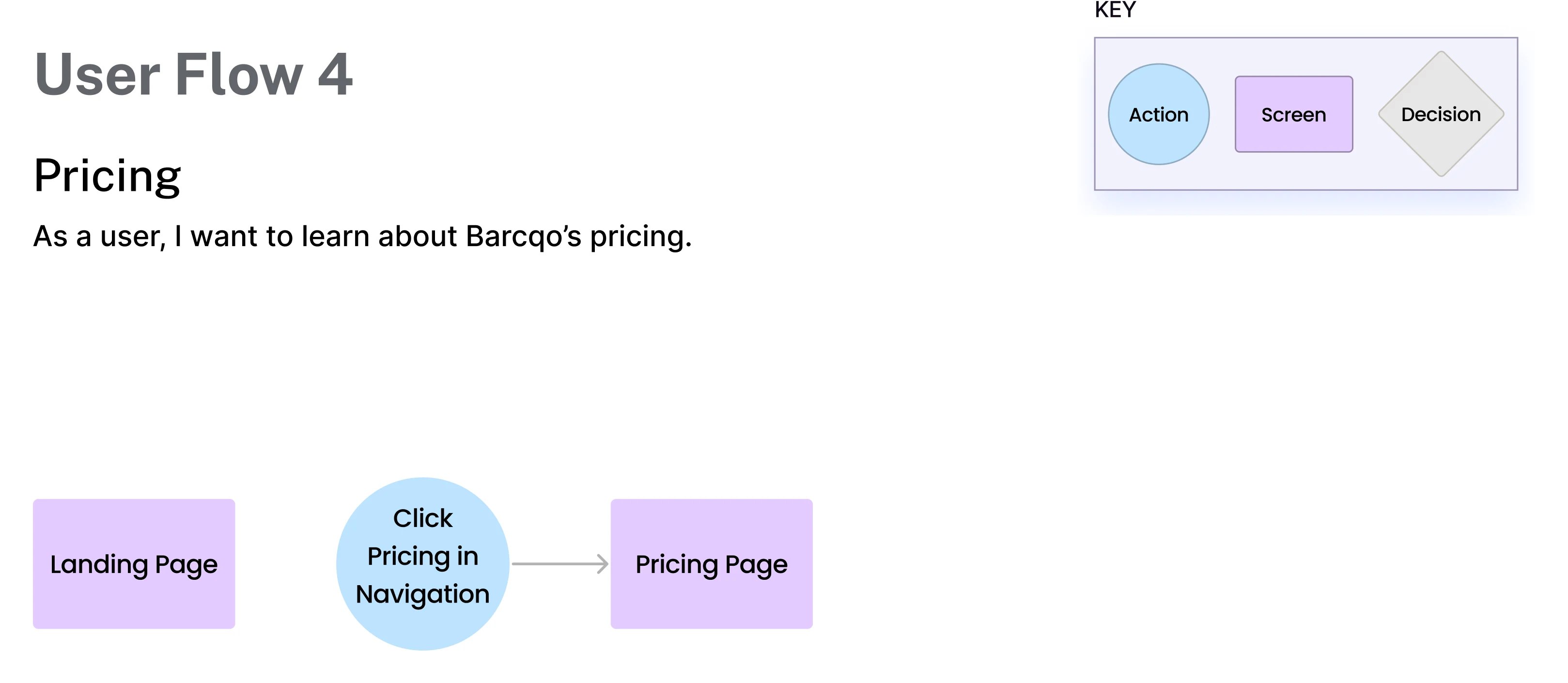
As a user, I want to learn about Barcqo’s pricing.
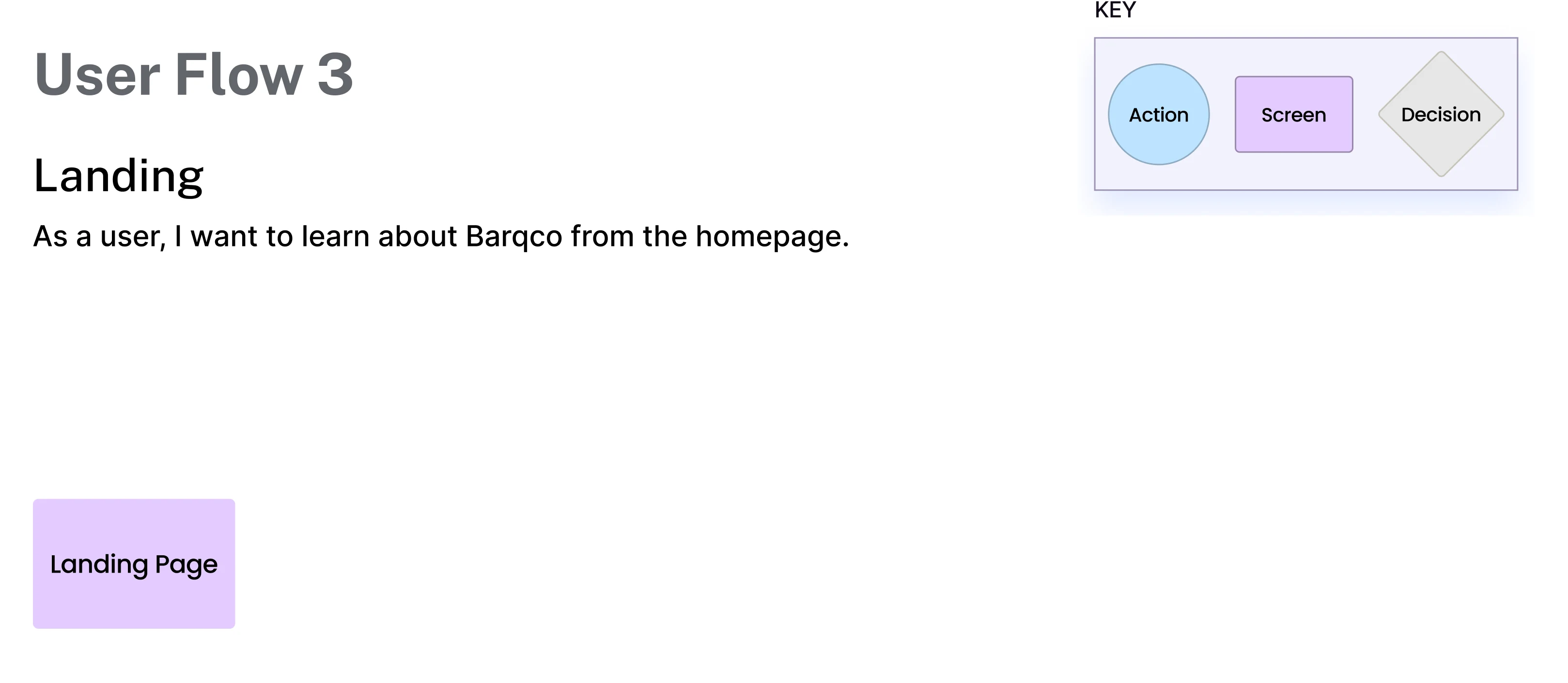
As a user, I want to learn about Barqco from the homepage.
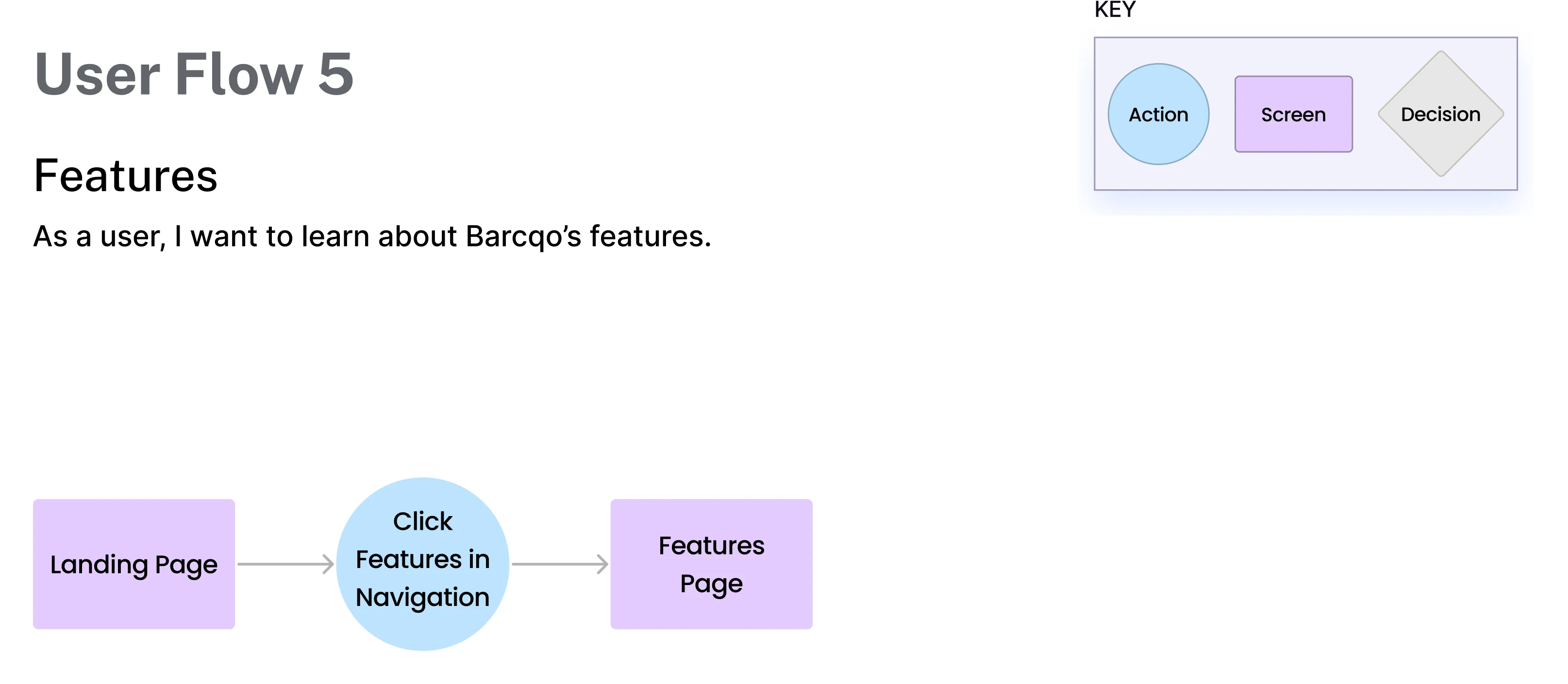
As a user, I want to learn about Barcqo’s features.
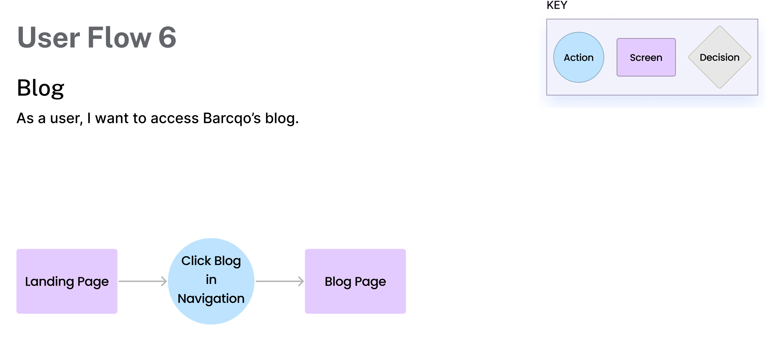
As a user, I want to access the Barcqo blog.
User Flows
Each team member translated a user story to create a detailed user flow. By constructing these flows, we determined the number of screens required to begin our design. We charted the most efficient path for users to accomplish a task, ensuring a seamless user experience. I constructed user story 6. As a user, I want to access the Barcqo blog.
Low & Medium Fidelity Wireframes
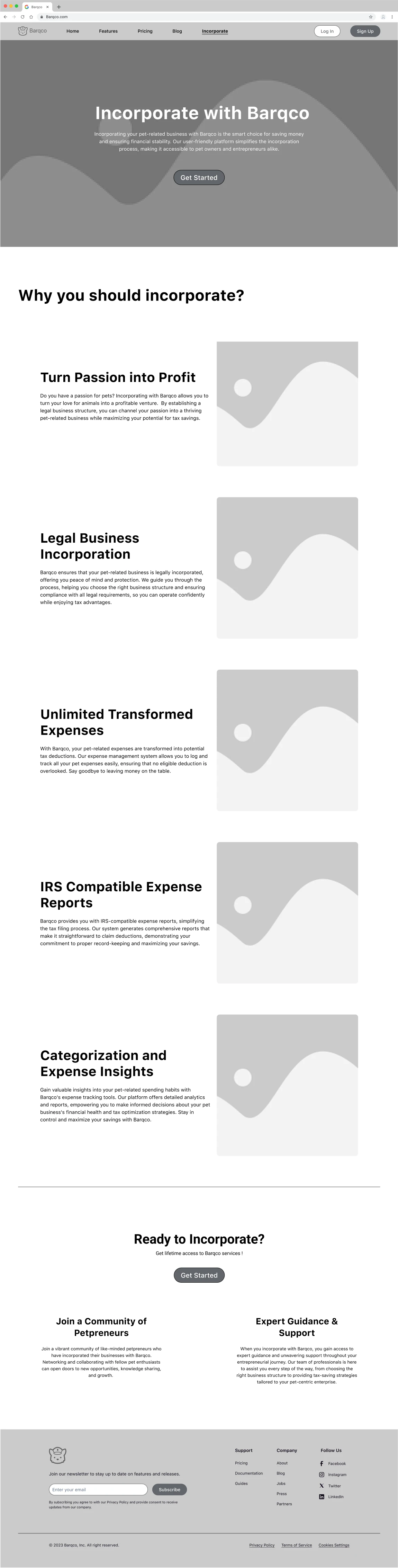
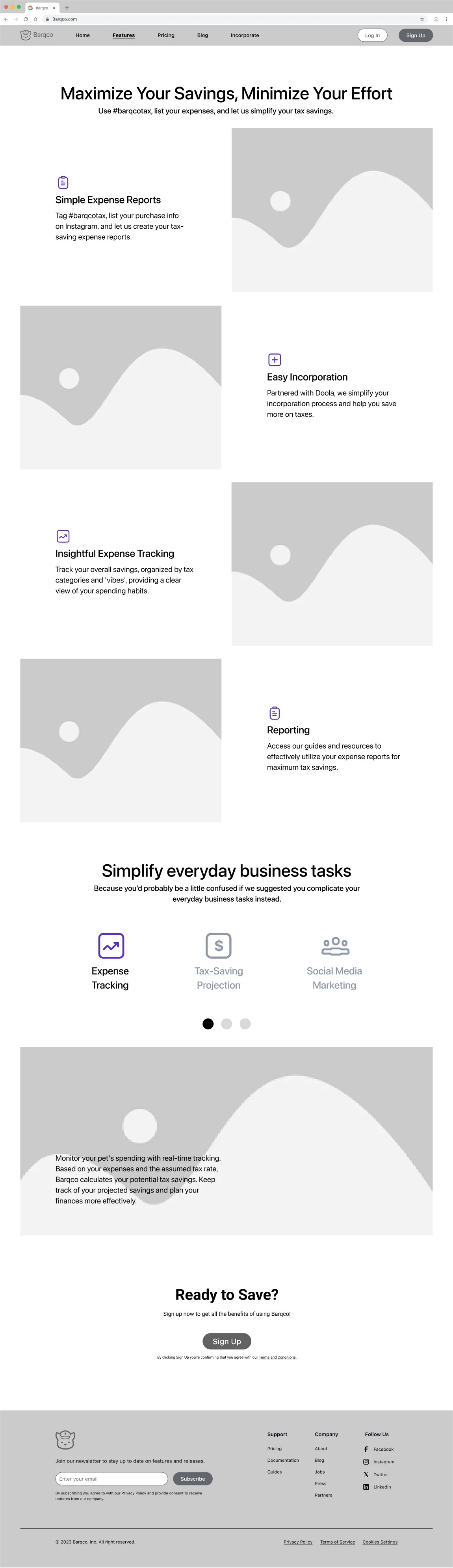
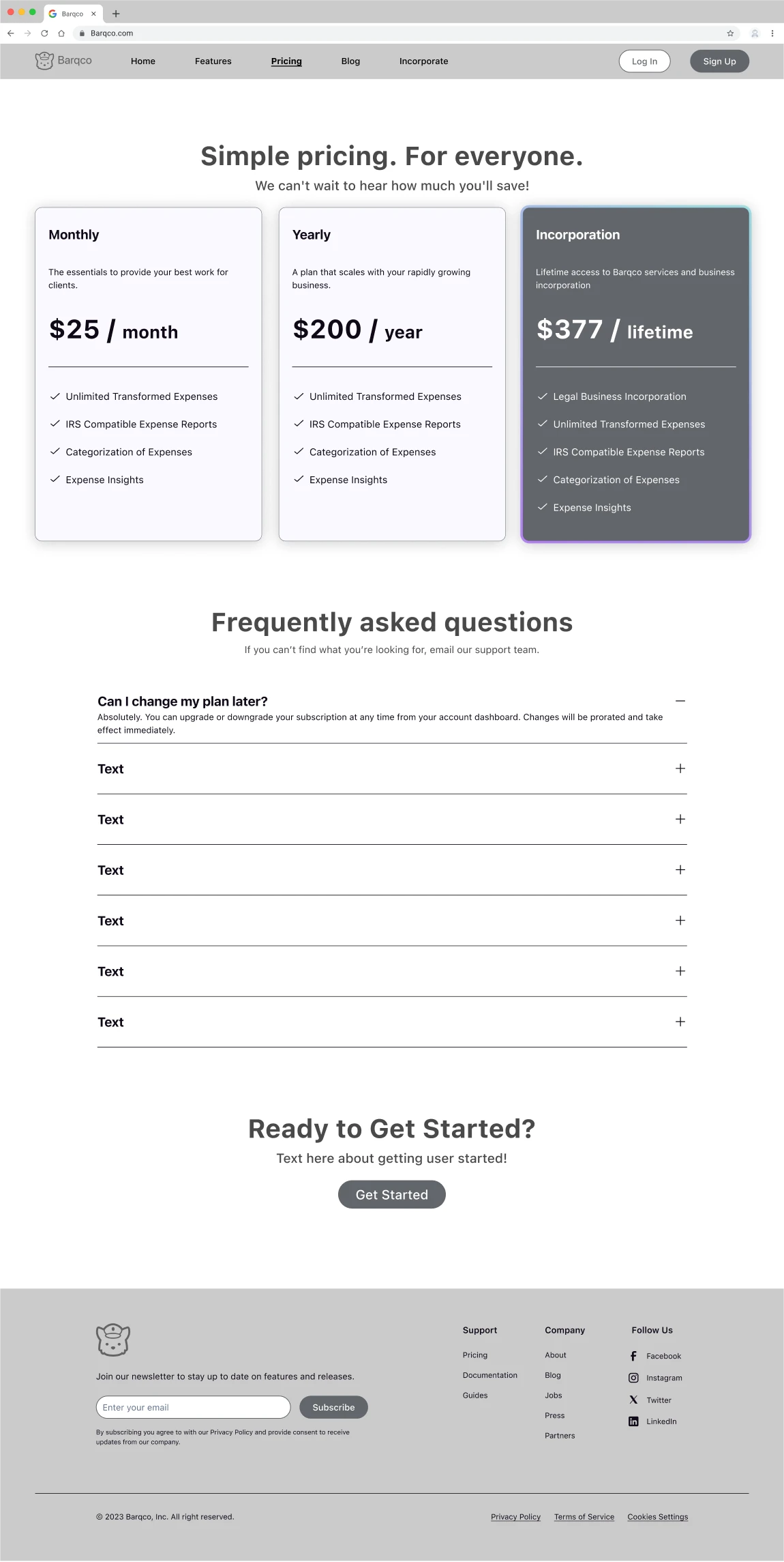
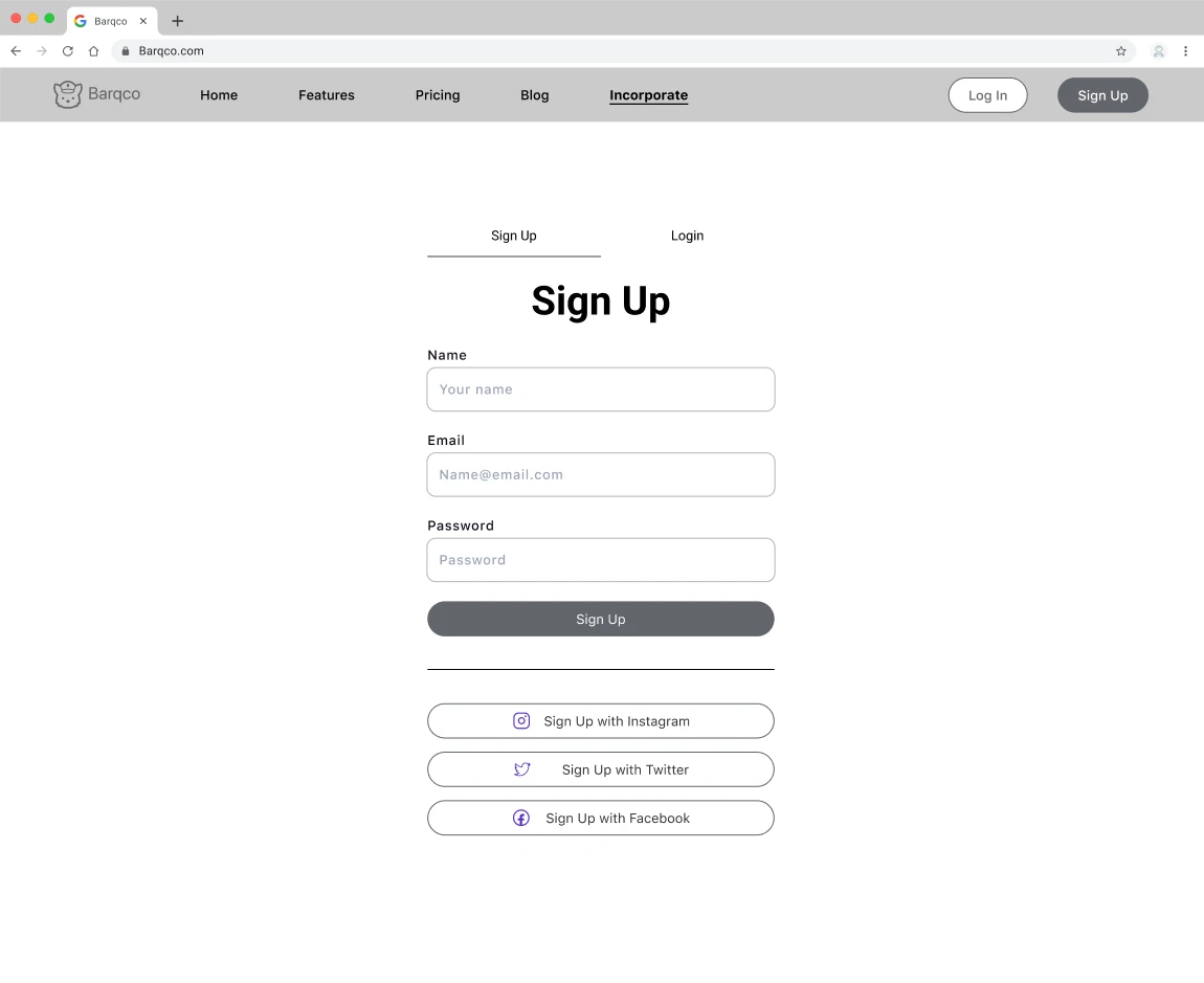
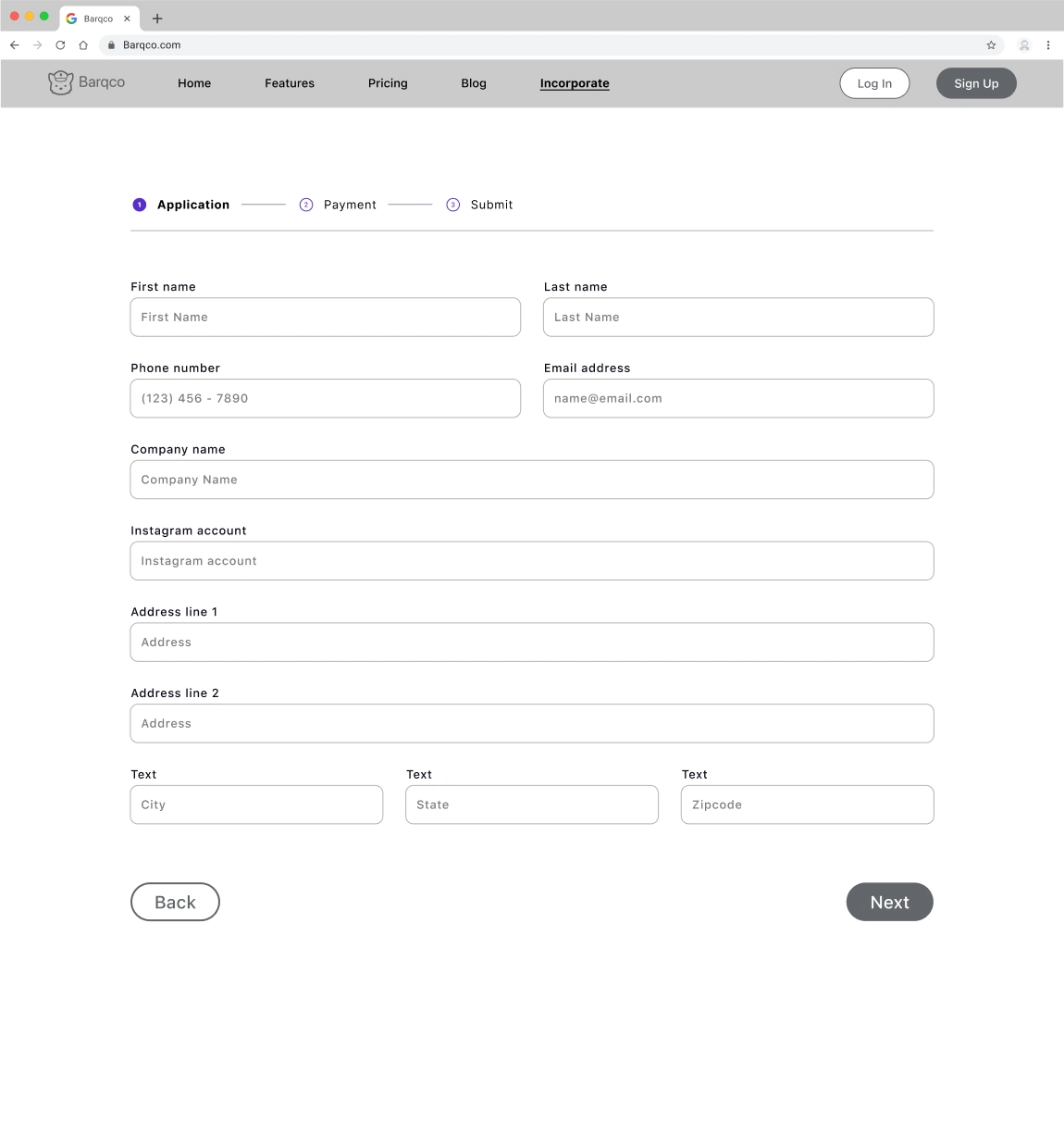
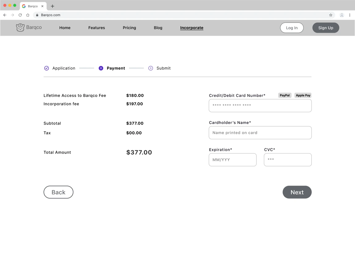
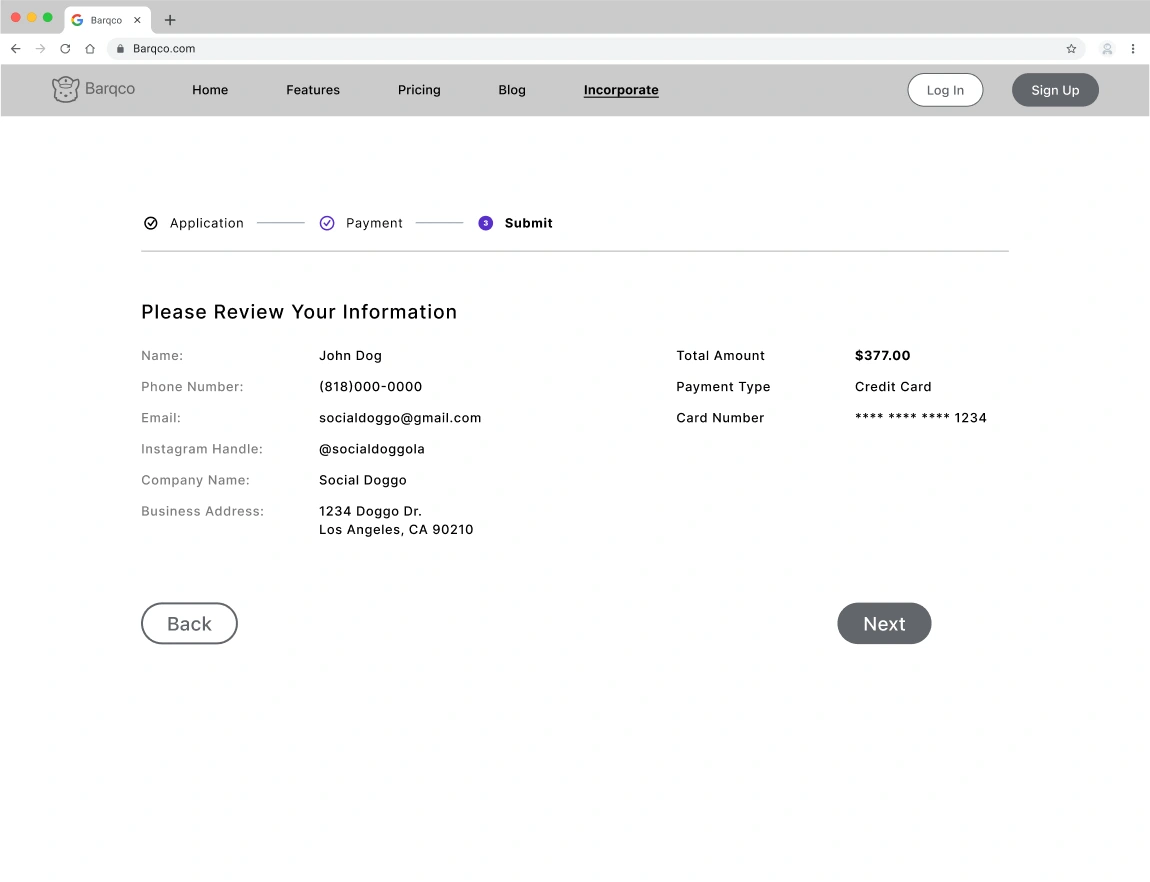
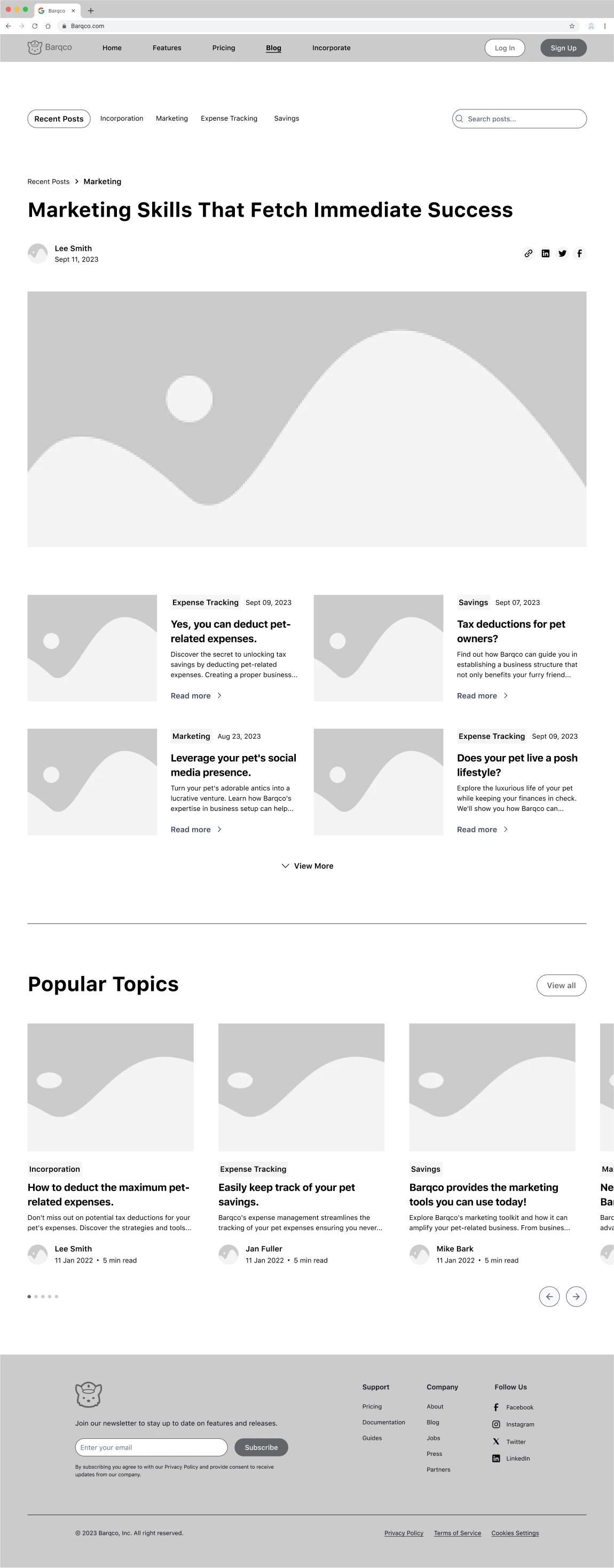
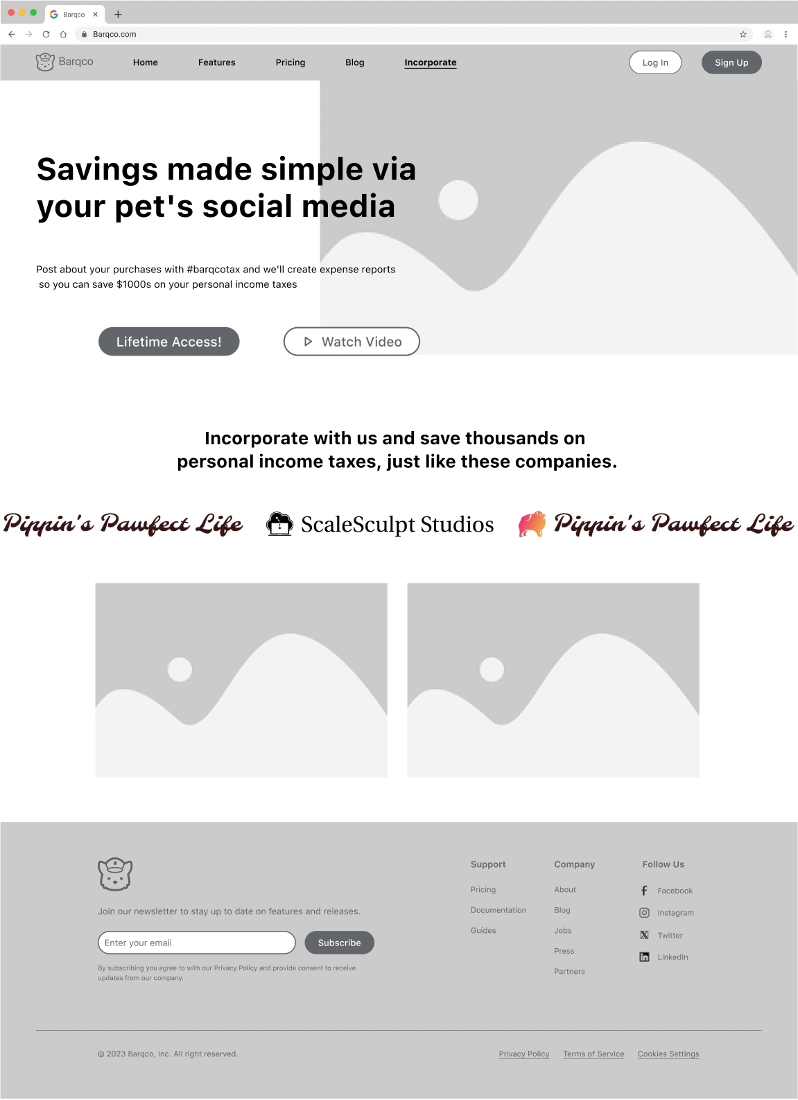
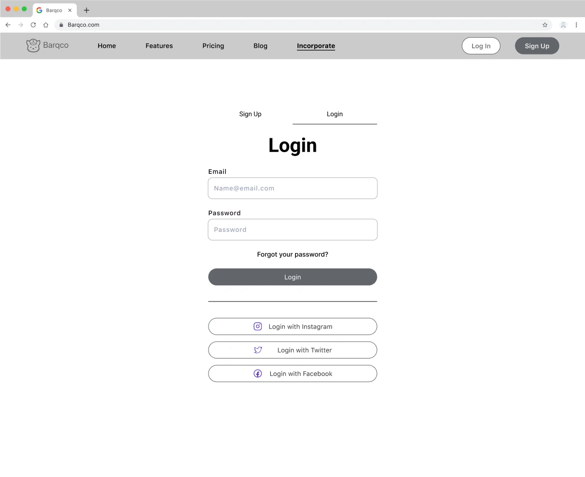
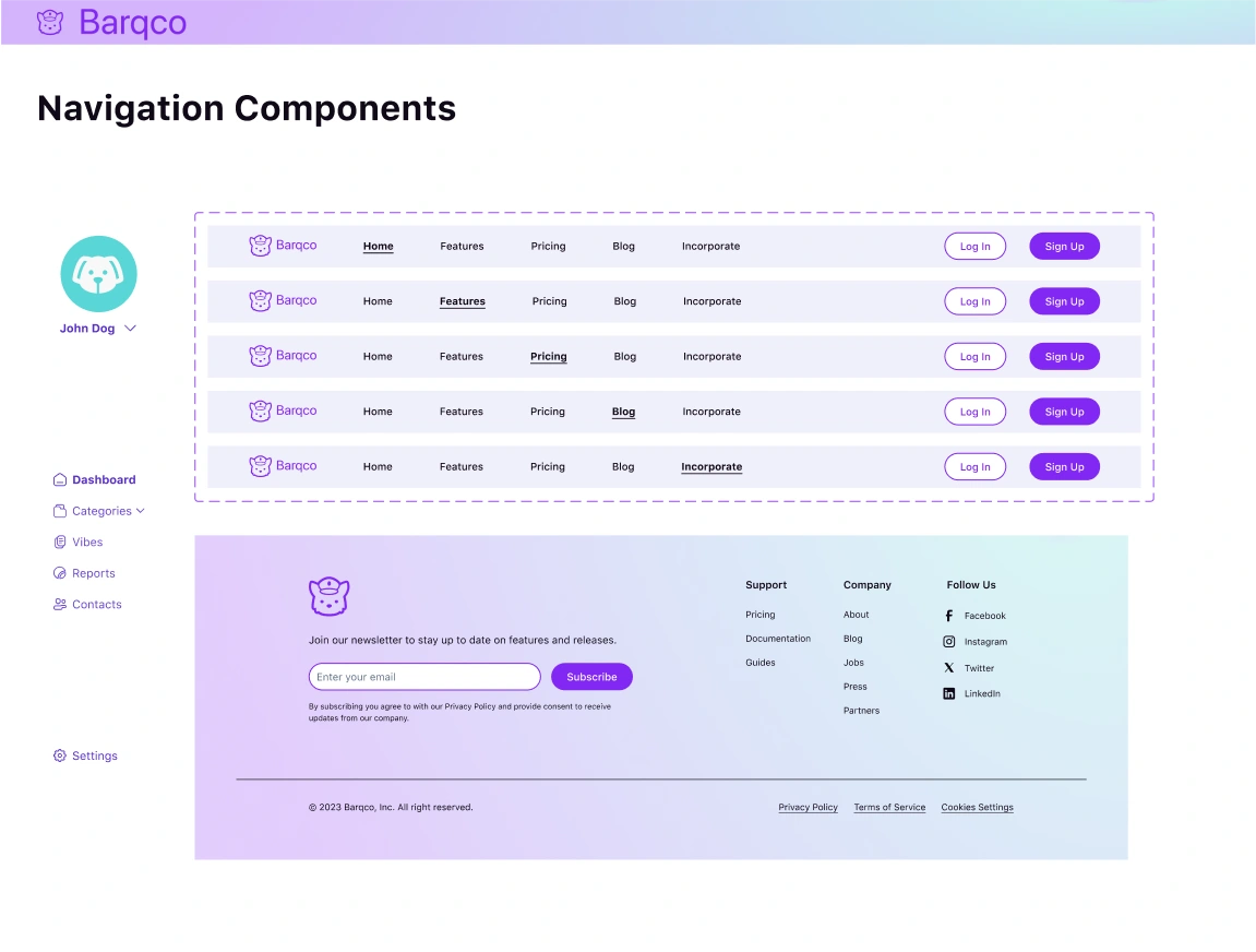
Each team member continued working on the same flow they constructed to develop the Low and Medium Fidelity Wireframes. I created the platform footer and designed the low and medium-fidelity designs for the 'Incorporate Information Page,' and the 'Barqco Blog,' which are integral components of user flows 2 and 6.
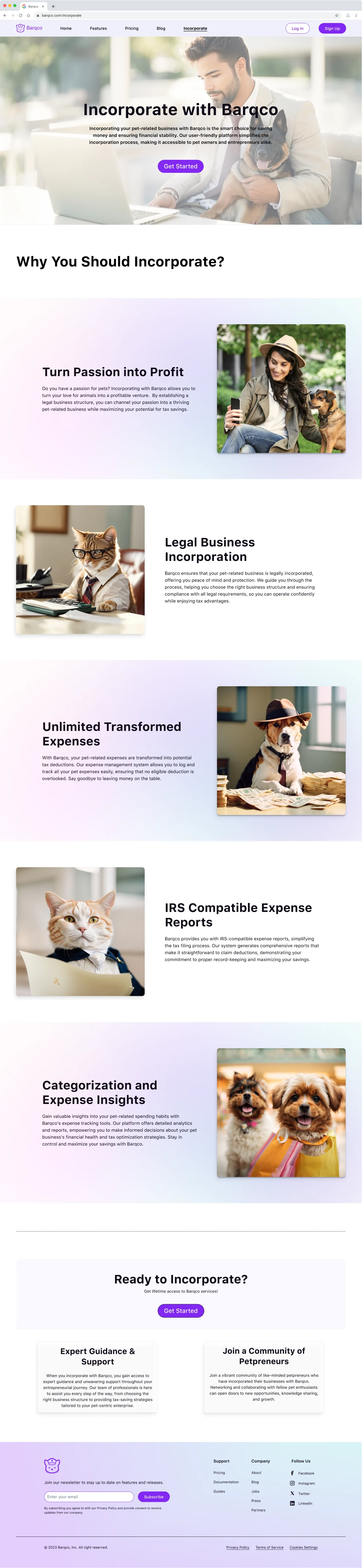
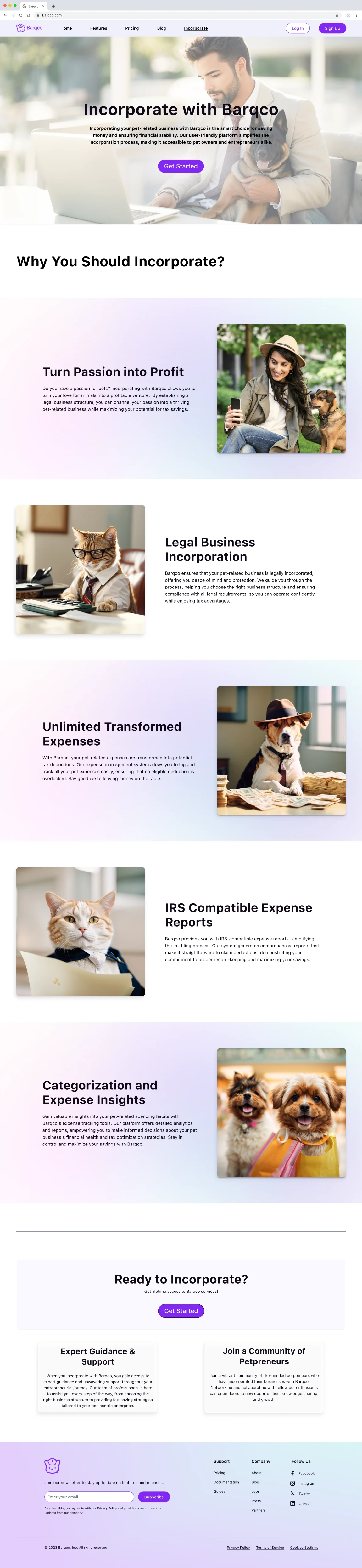
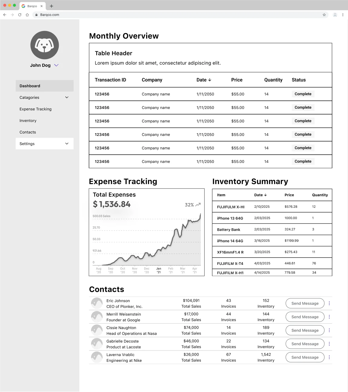
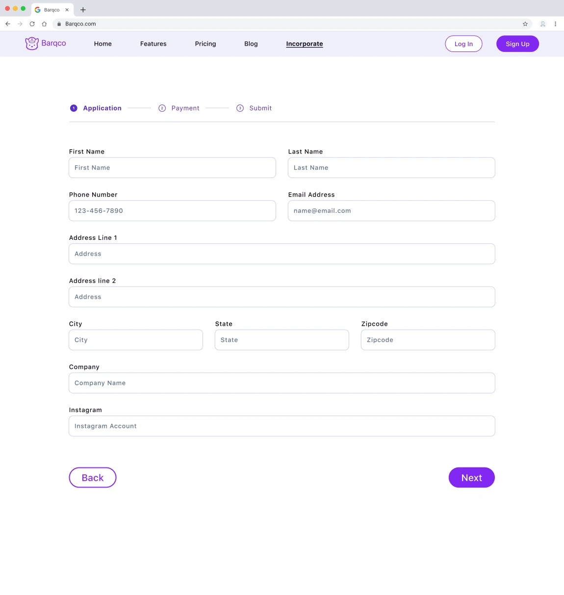
Incorporate Information Page: I emphasized the information hierarchy and an intuitive interface accentuated by a modern design language. This page is the gateway, introducing the user to Barqco and its offerings. I strategically segmented the content with a user-centric approach, ensuring ample whitespace to optimize readability—this intentional design aimed to facilitate a smooth experience without inundating the user with excessive content.
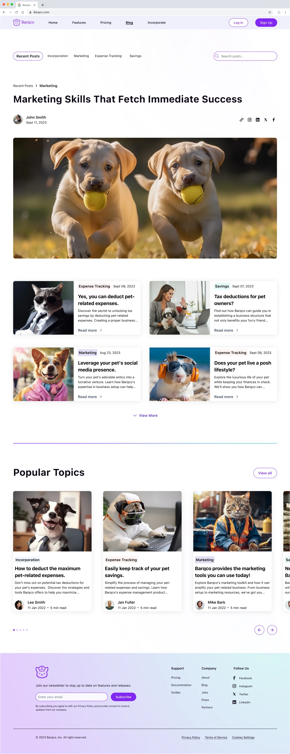
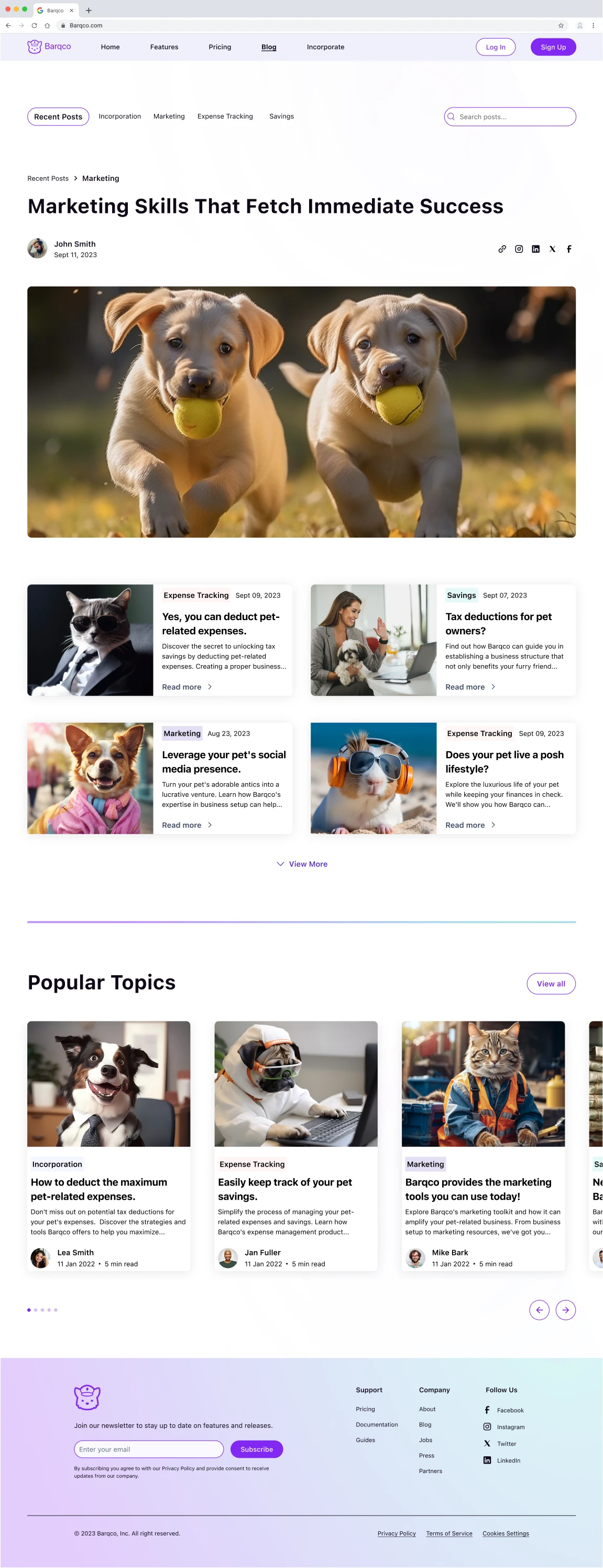
Barqco Blog: Transitioning to the blog design, I emphasized a structured layout rooted in user experience principles. The blog's landing view showcases the latest article taking a spotlight position, ensuring that users are instantly greeted with the most current insights. Following the latest articles is a section dedicated to trending or most popular articles with multiple engaging topics. Additionally, I incorporated subject tags and a search option for content discoverability and to promote user exploration of the blog content.

Design
UI Inspirations
The team and I analyzed the additional business platforms that resonated with the client's vision, gaining crucial insights and shaping the foundational stages of our design sprint. This strategy enabled us to align the client's specifications, ensuring a streamlined and effective design journey.
Stripe Interface
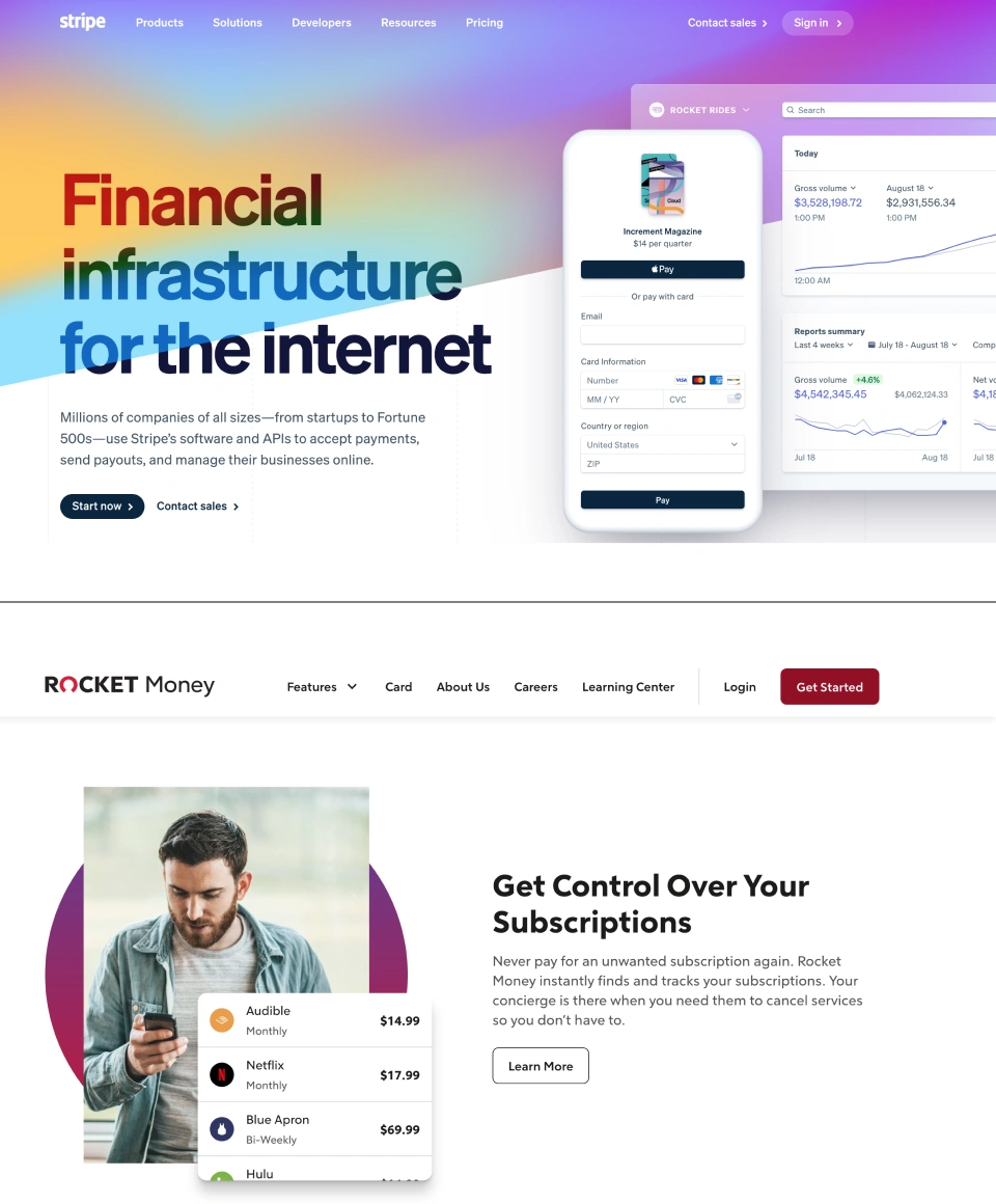
Stripe employs bold, straightforward messaging, immediately clarifying its purpose. This direct communication could benefit Barqco by ensuring its users immediately understand its value proposition. The dominant use of a gradient from deep purple to a lighter shade creates an inviting and modern aesthetic. This color choice suggests trustworthiness and sophistication. Clear separation of content with ample whitespace ensures that information is digestible. Integrating a sample dashboard gives users a tangible sense of the platform's capabilities.
Rocket Money Interface
The subscription fees are presented clearly and concisely, which allows users to understand and interpret them easily. Using a similar structure would improve the clarity of Barqco's pricing packages. The CTA is prominent, encouraging user action. Barqco's redesign could benefit from clear CTAs guiding users toward desired activities.
Fiverr Blog Interface
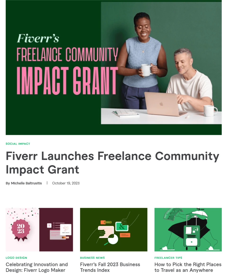
Content is well-organized into different sections with clear categories; the organization aids user navigation and could be applied to Barqco’s Blog, which contains multiple categories.
Stripe / Rocket Money
Fiverr
UI Iterations
During the early stages of Barqco's design, our team gathered crucial insights to guide our strategy as we moved forward. This foundation ensured our alignment with the client's preferences and brand inspirations. For the Barqco interface, we underwent a design sprint, adhering to a chosen color scheme. Each team member crafted a version of the "Incorporate Information" page with individual styles. Out of the five UI versions presented, the client chose my design to be implemented across the Barqco platform.
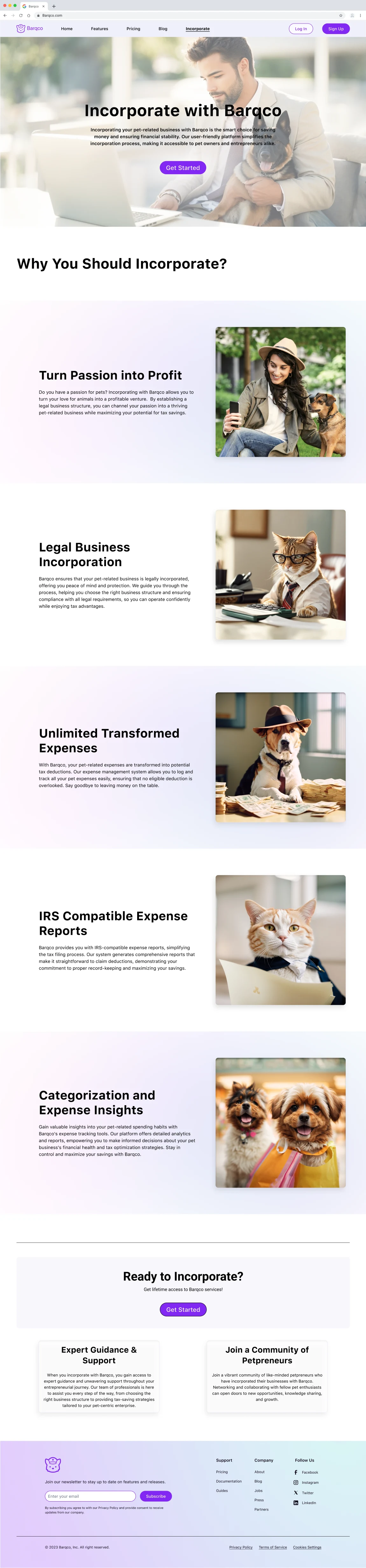
My design
Gradients Introduced: Mesh gradient with pink, purple, blue, peach, and teal at 30% transparency. Diamond gradient with teal and purple at 50% transparency.
Gradient Utilization: Mesh gradient as an alternating background for content. A diamond gradient to highlight the footer.
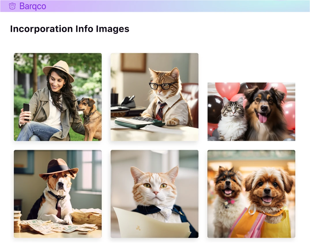
Image Generation: I created the images within the design through specific prompts using Leonard Ai—the Images combined corporate professionalism with social media humor for a user-friendly atmosphere.
Layout Strategy: Implemented generous spacing and whitespace to ensure clarity of information and designed for a clean and uncluttered user interface.
Strategic Image Placement: Specific images are strategically placed throughout the design. In the final informational section, a cheerful image is deliberately set to foster a sense of positivity and joy just before users are encouraged to "Get Started" with Barqco's services.
Accessibility Compliance: Ensured the design met WCAG 2.0 requirements to enhance accessibility for all users, including those with disabilities.
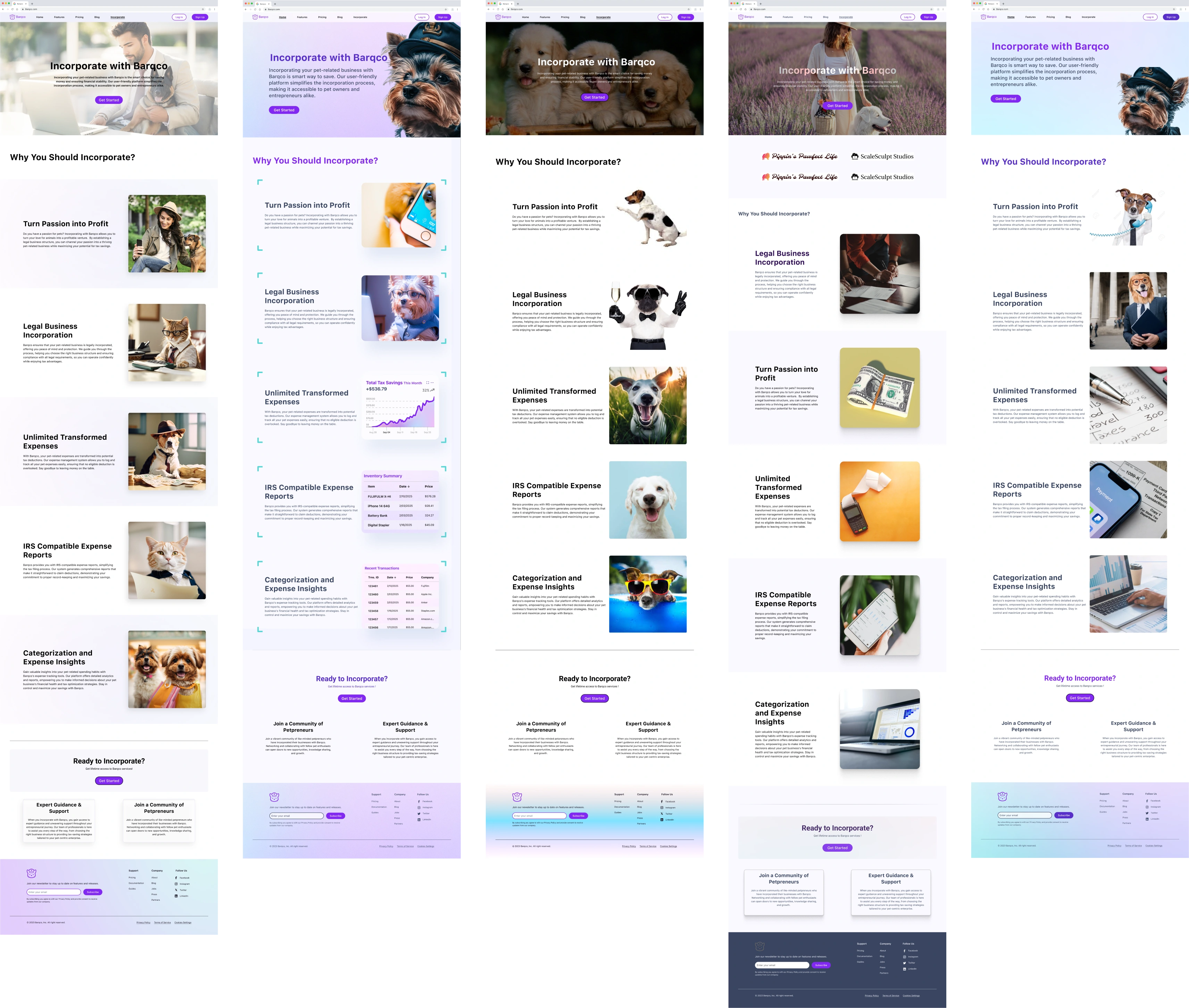
UI Iterations: I designed the first screen on the left.
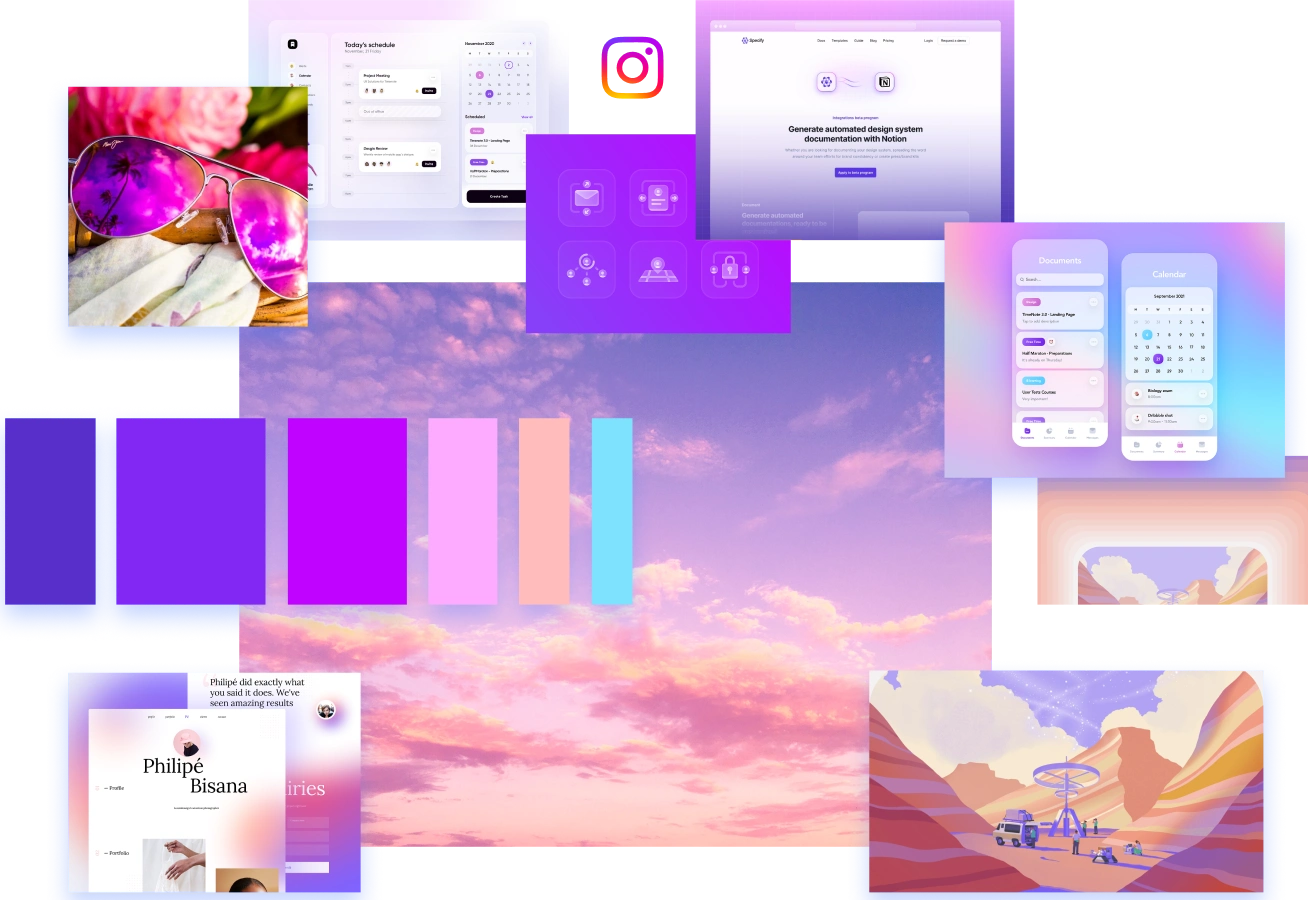
Color Exploration
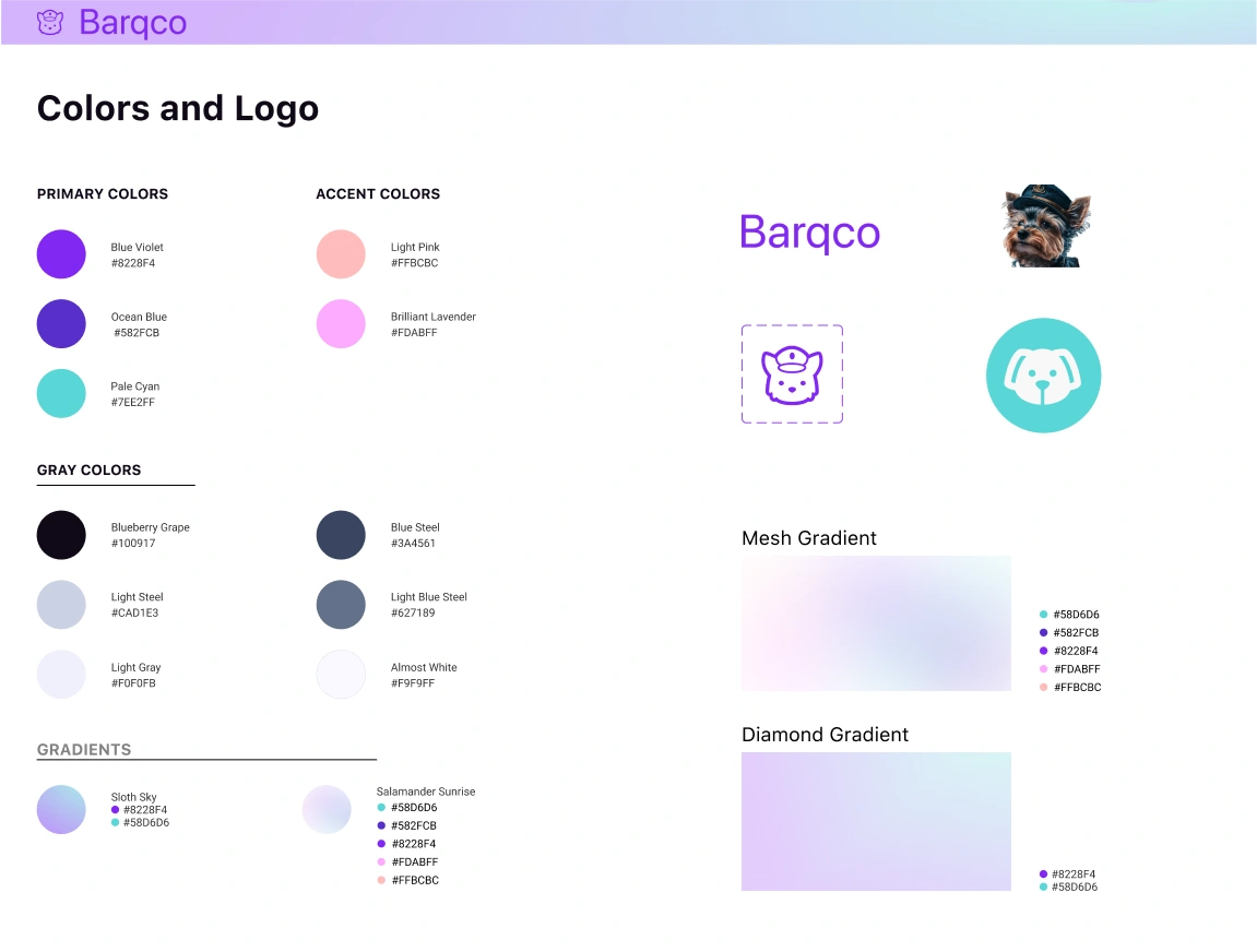
Integrating the client's design preferences, the team crafted a palette that resonates with trustworthiness, approachability, and a modern interface. Our palette transitions from deep purple and blue to inviting pinks. These carefully chosen colors enhance modern aesthetics and establish a genuine connection with users, making the brand both reliable and welcoming.
Trustworthy Tones: Deep blues symbolize stability and trust, ensuring users feel a sense of reliability when engaging with the brand.
Approachable Hues: Pastel pinks and purples, inspired by twilight, exude warmth and approachability, making the interface feel friendly and inviting.
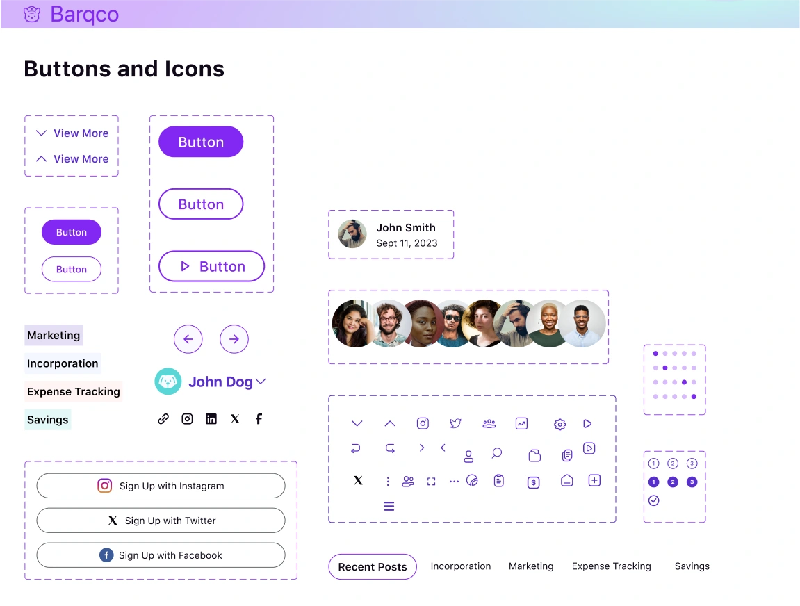
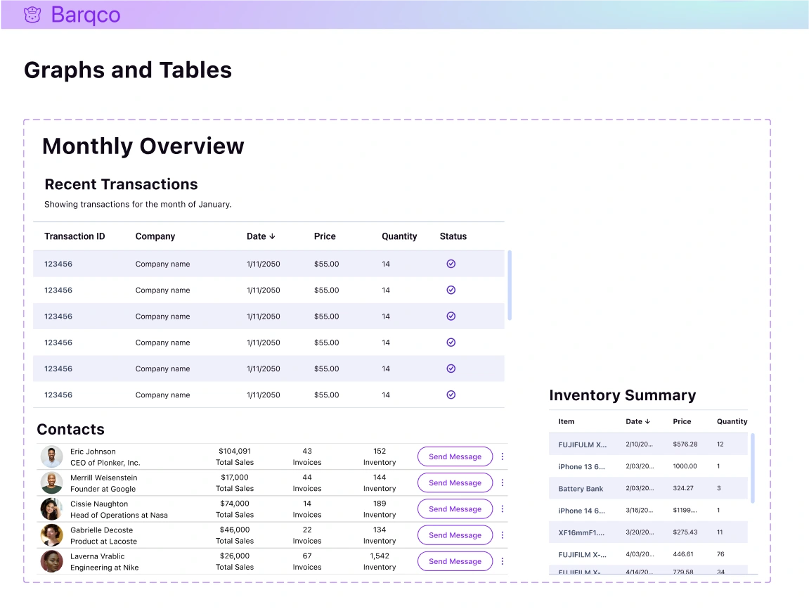
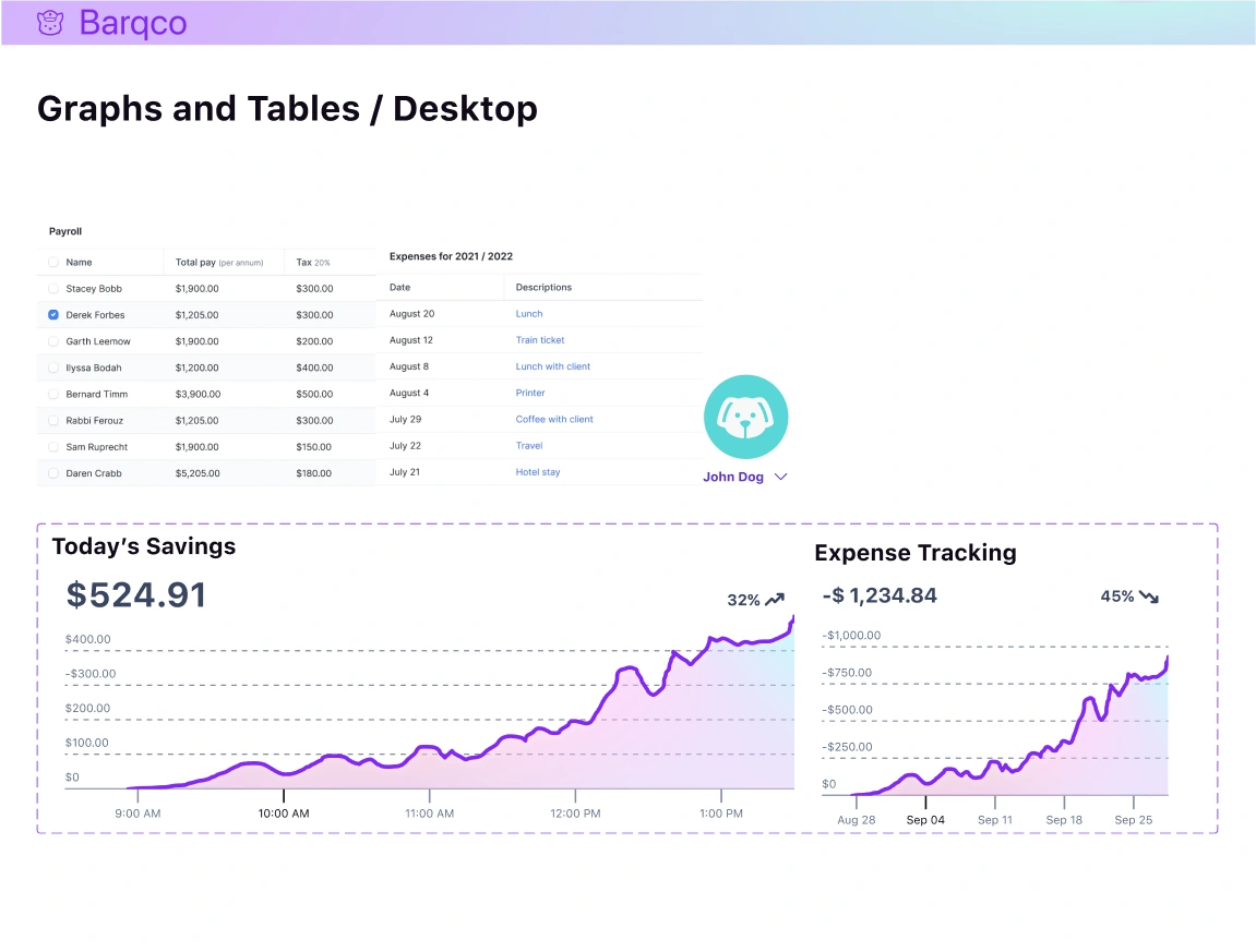
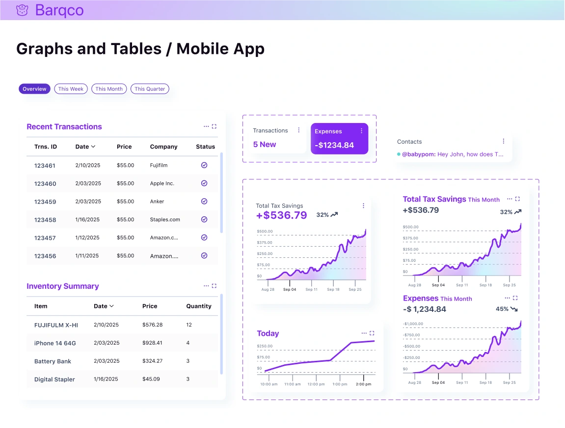
Style Guide
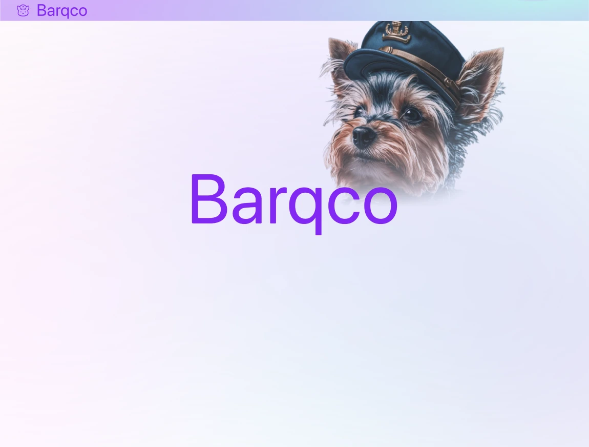
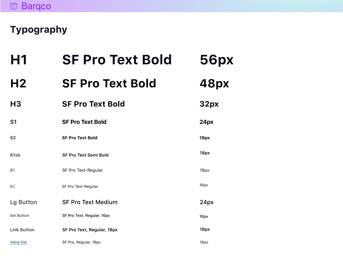
In crafting the visual framework for Barqco, I chose SF Pro Text for its clean, modern aesthetic that aligns with the brand's ethos of simplicity and accessibility. This font's range of weights facilitates a clear hierarchy in our user interface, which is essential for user experience. The color scheme was assembled with primary colors representing the brand's core values of trust and innovation, while accent colors introduce warmth and energy.
While the client allowed considerable creative leeway, the design was always steered to resonate with a tech-savvy audience, emphasizing inclusivity and approachability.
Key Points:
Font: SF Pro Text is used for its clarity and adaptability across different platforms.
Color: The chosen palette combines professional tones with inviting accents to ensure brand consistency and foster user engagement.
Client Collaboration: Minimal restrictions from the client paved the way for a design that's both authentic to the brand and appealing to its users.
Hi-Fi Screens
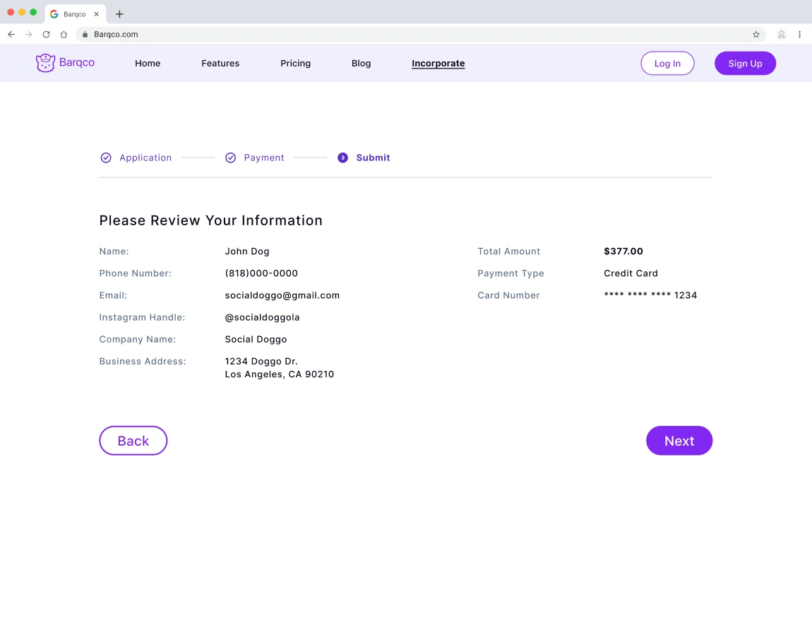
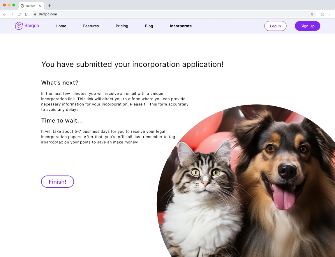
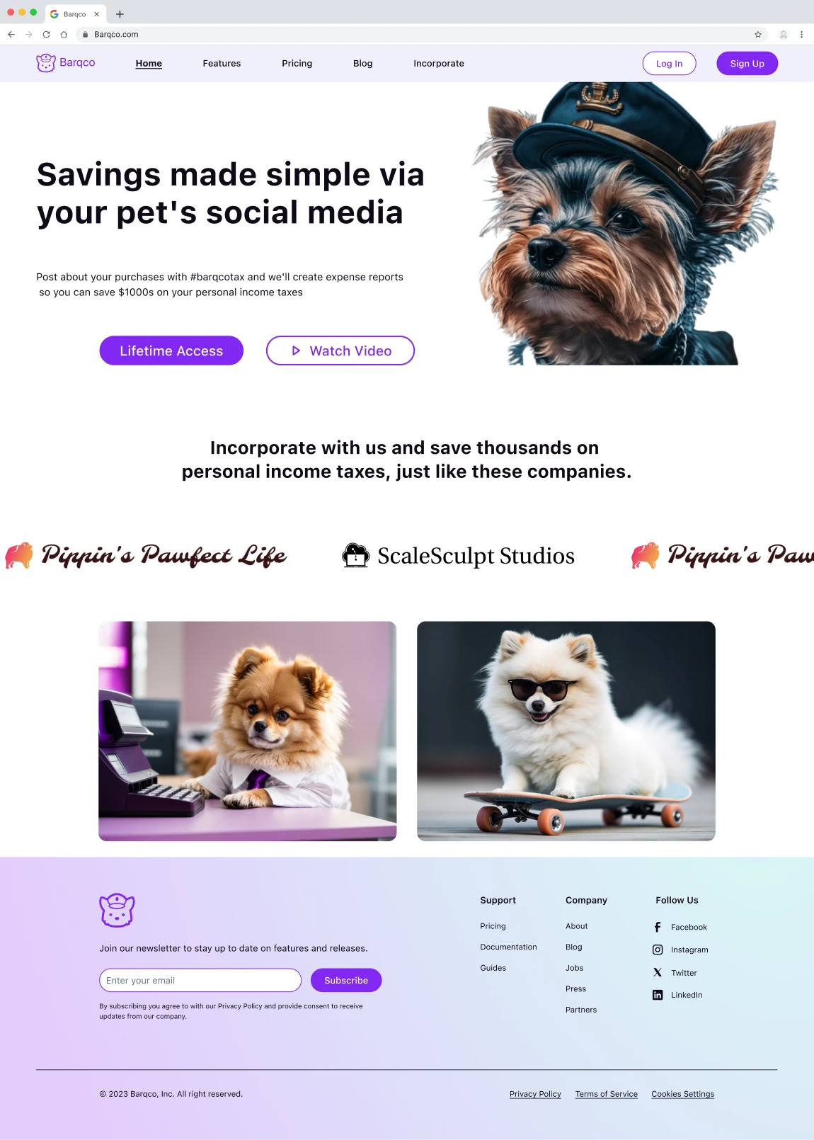
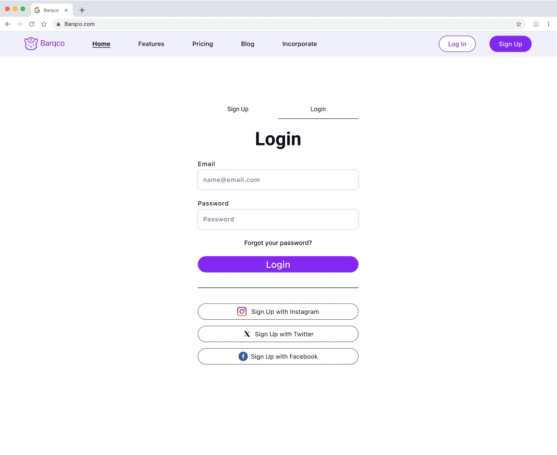
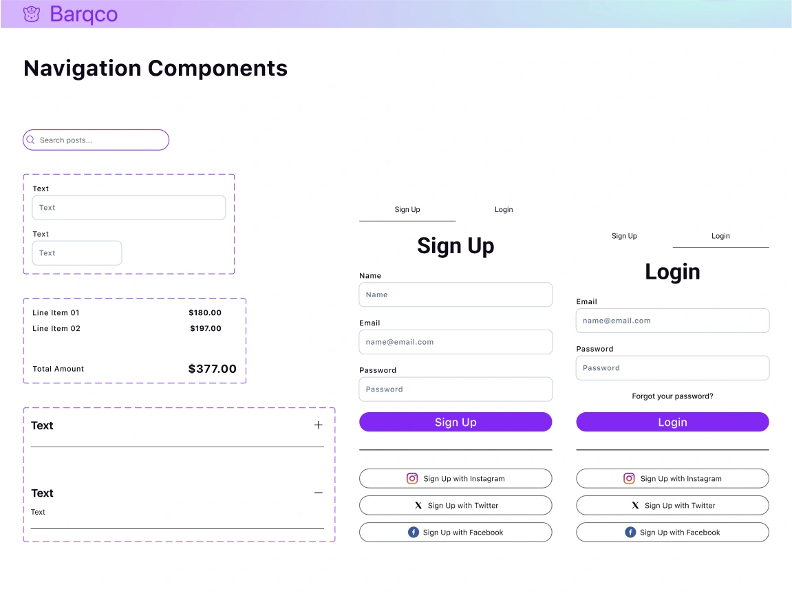
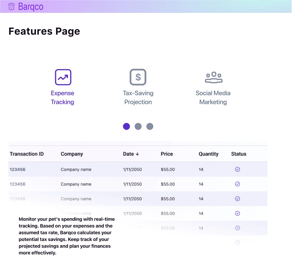
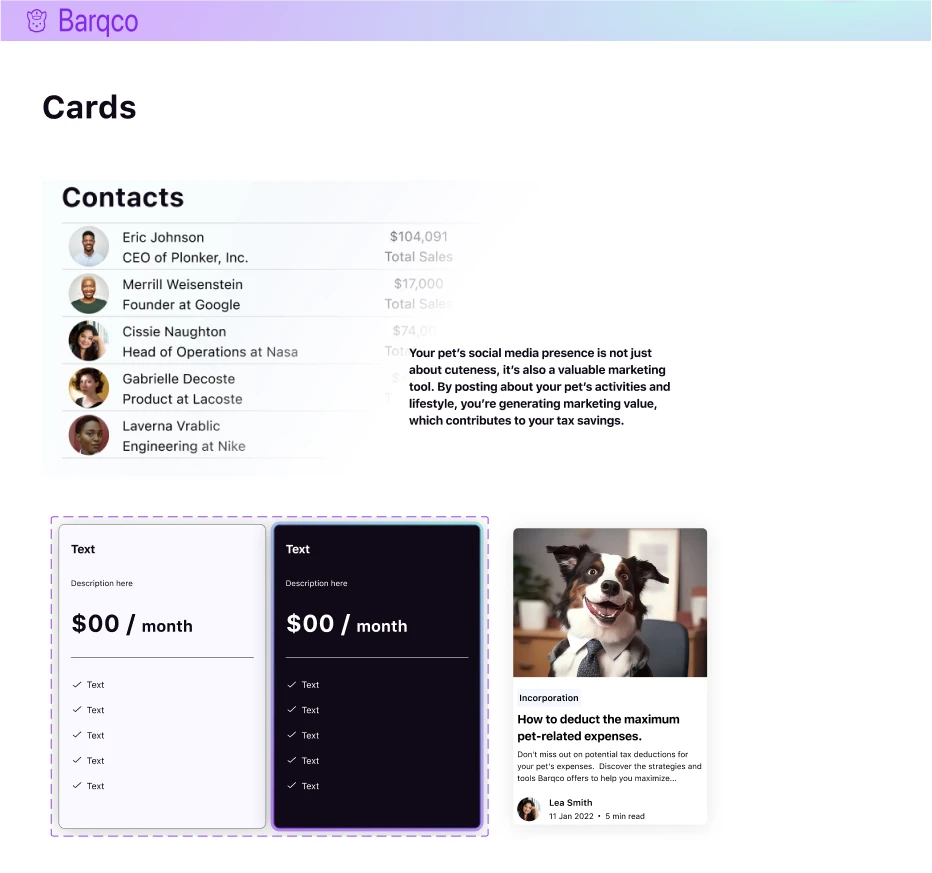
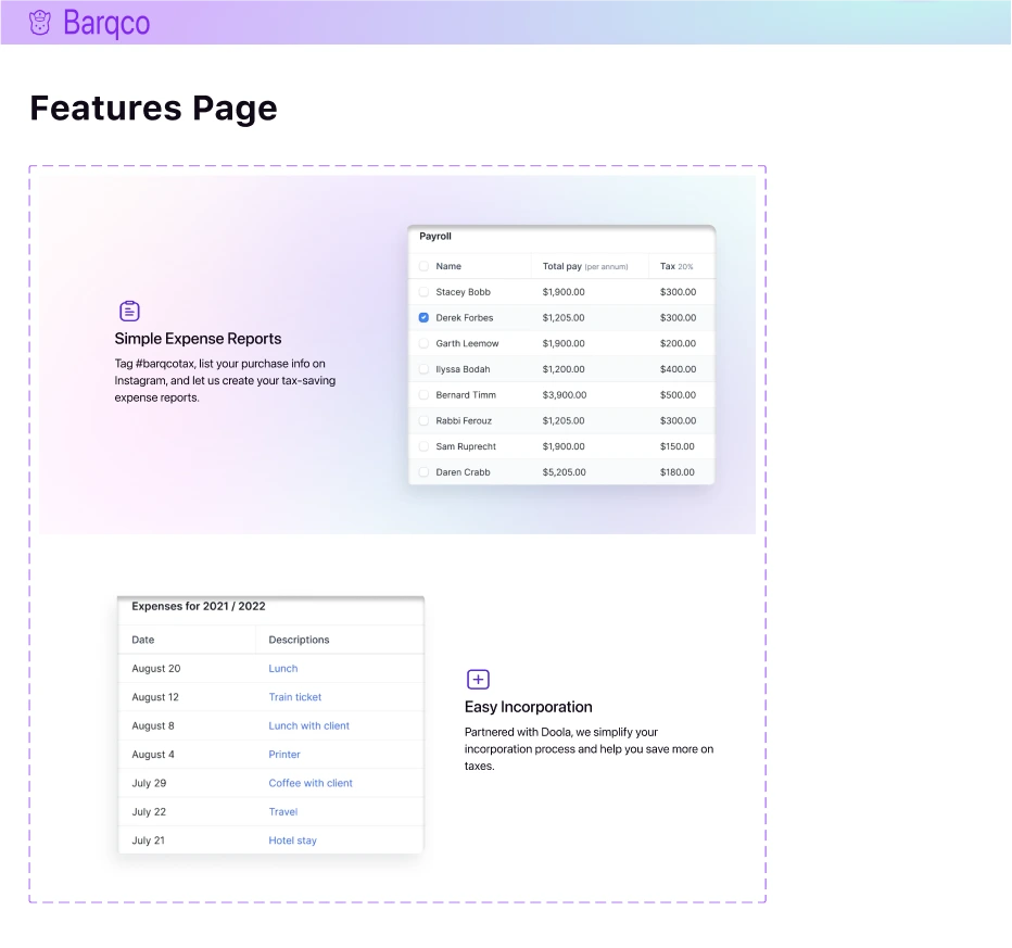
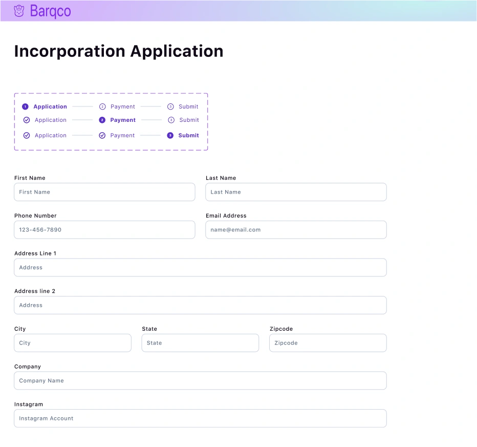
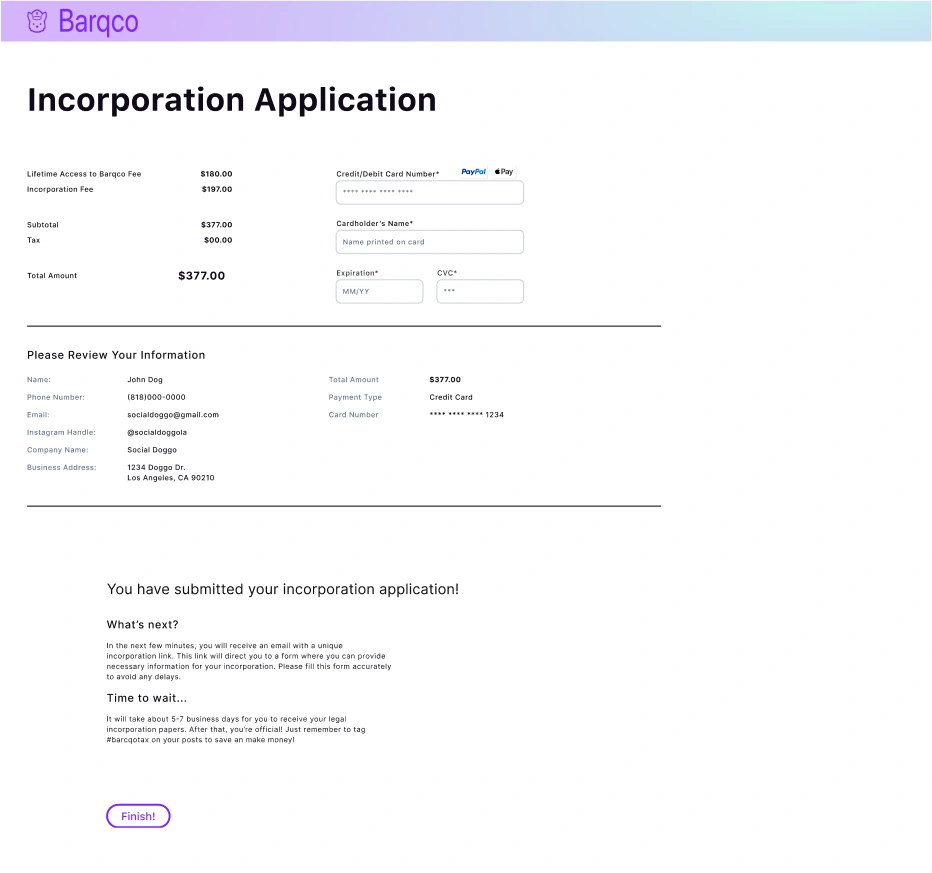
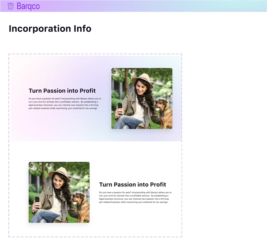
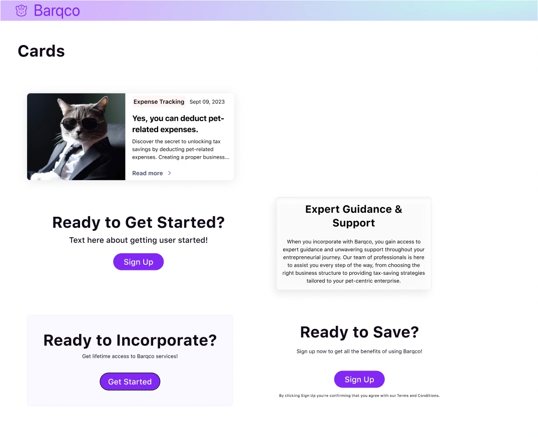
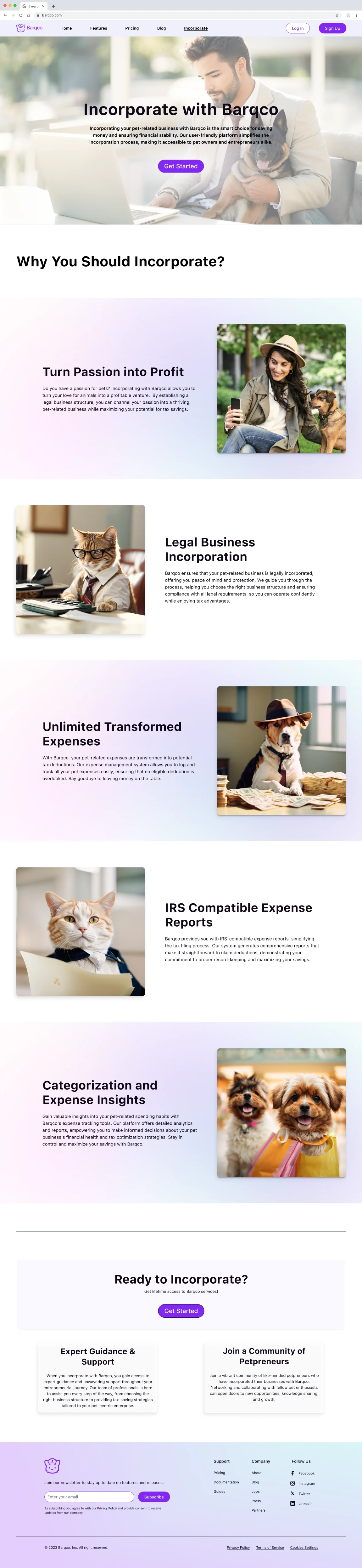
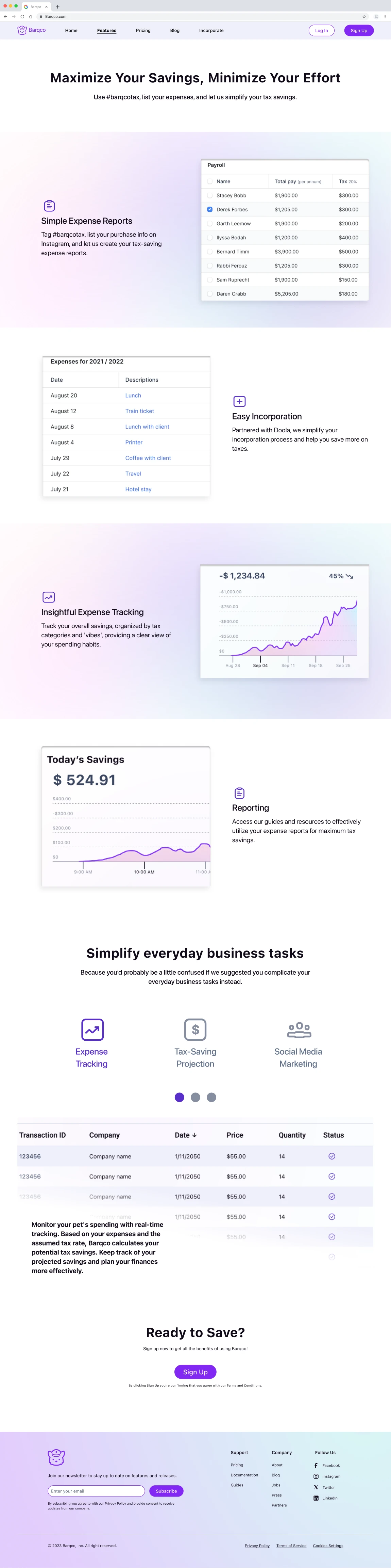
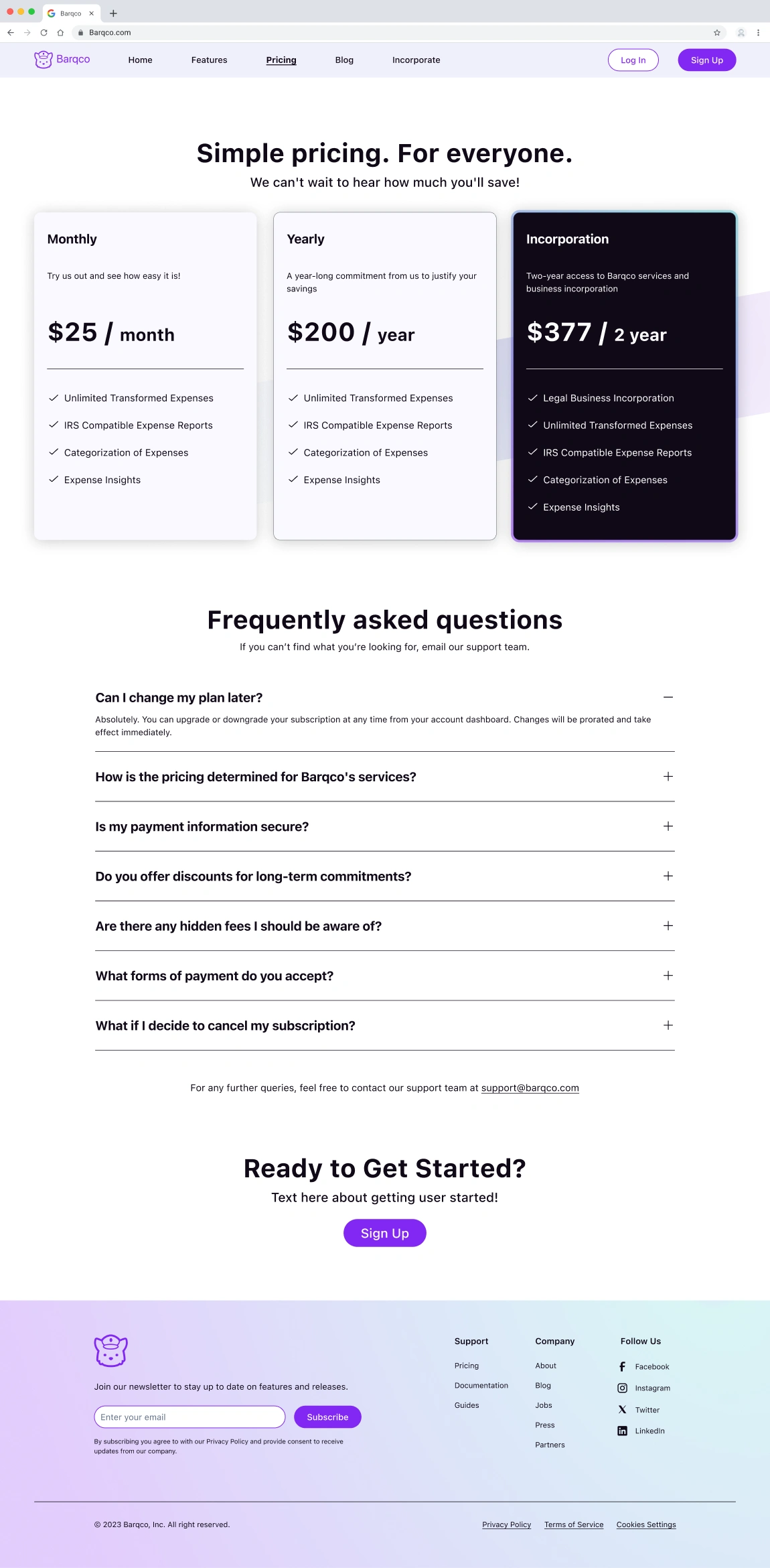
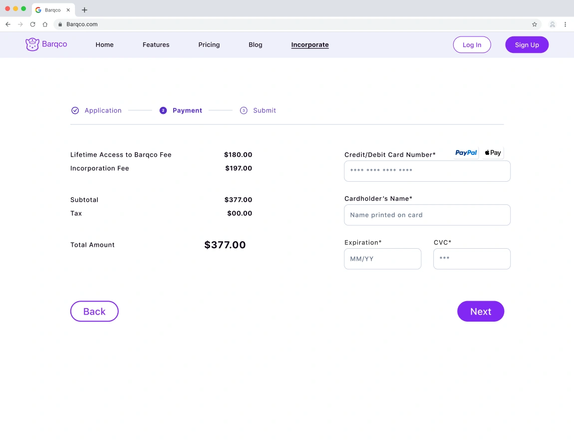
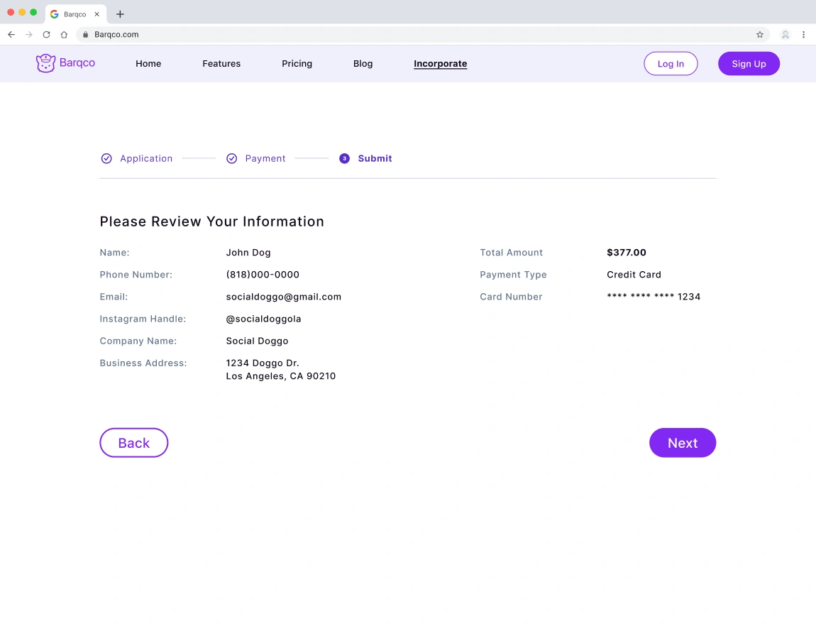
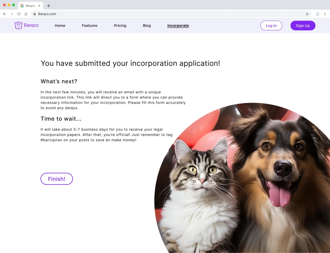
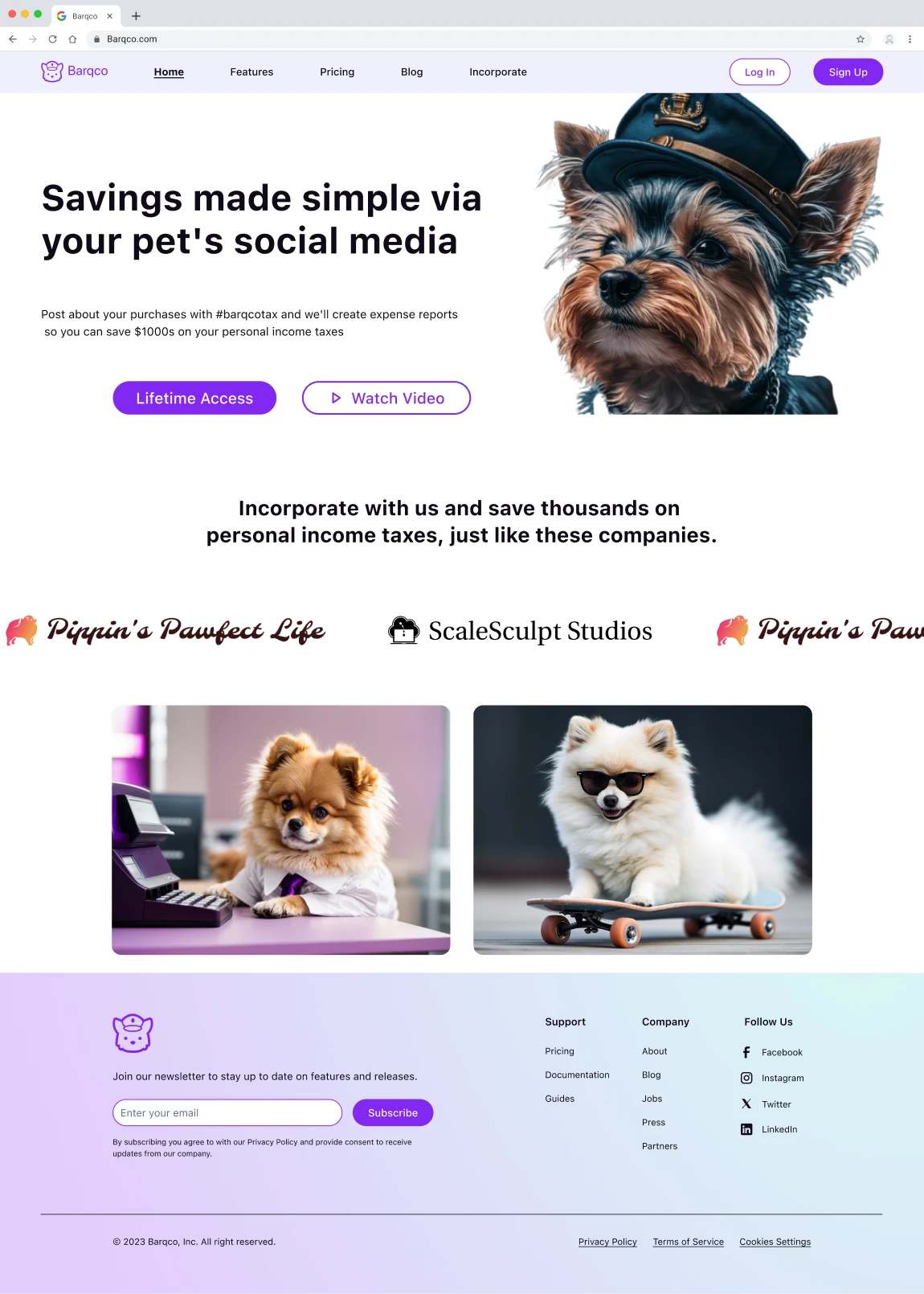
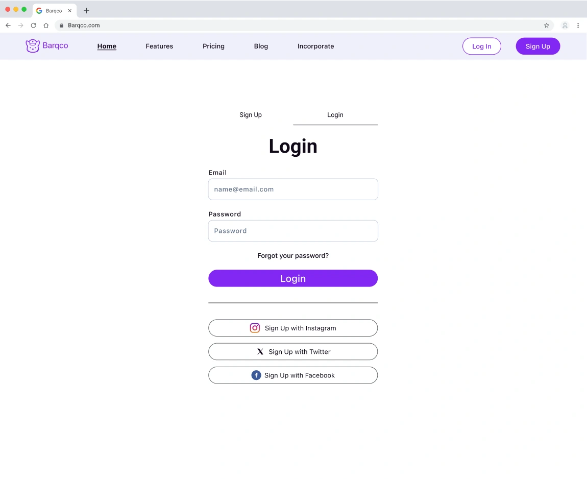
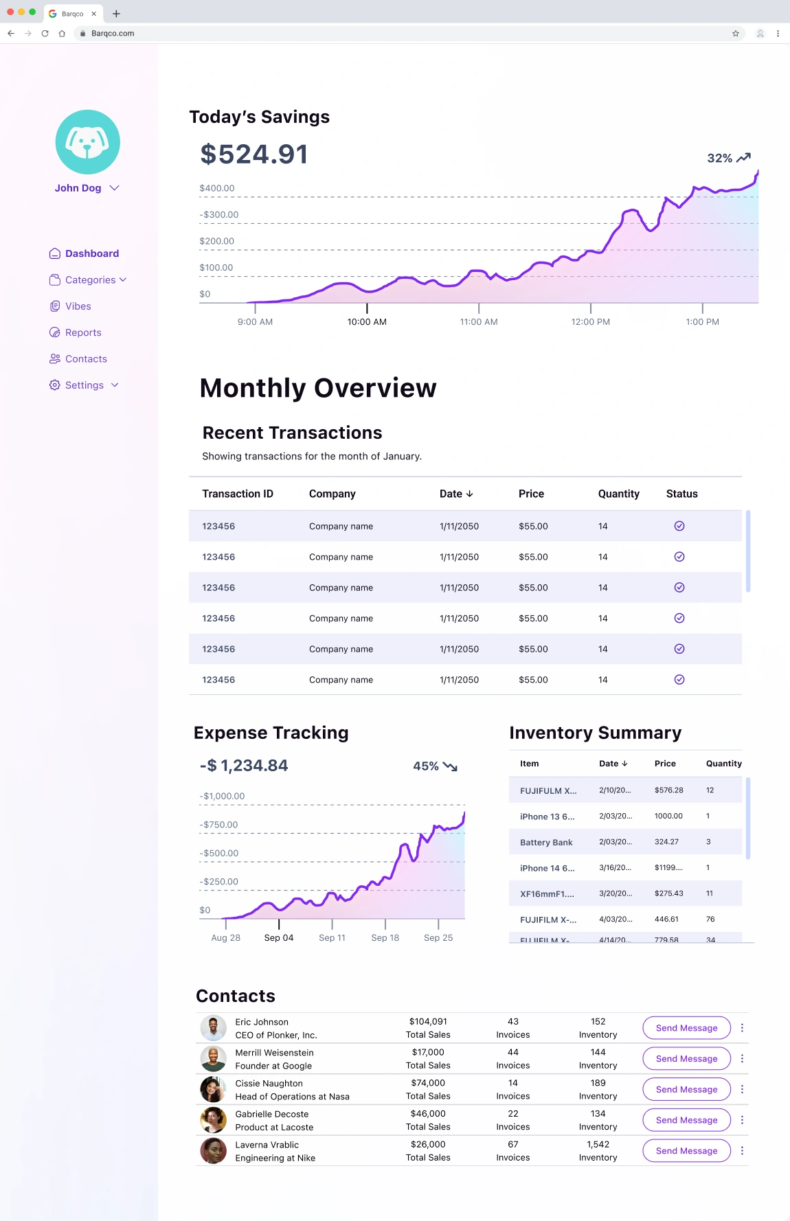
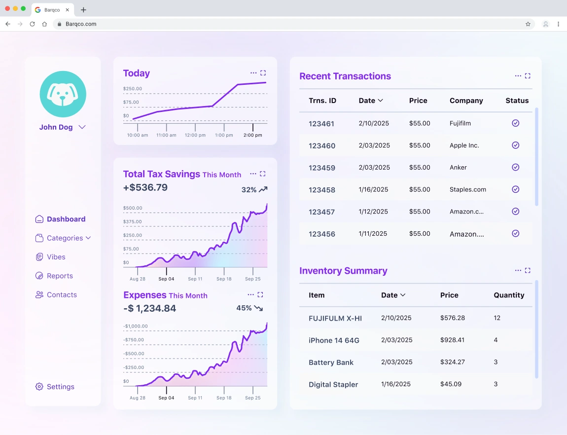
The team effectively integrated the client's preferred design style, ensuring the style guide components were seamlessly incorporated into the high-fidelity wireframes. I completed the "Incorporate Information" screen with a few changes, finalized the "Barqco Blog" screen, and collaborated with my teammates to refine the Barqco platform.
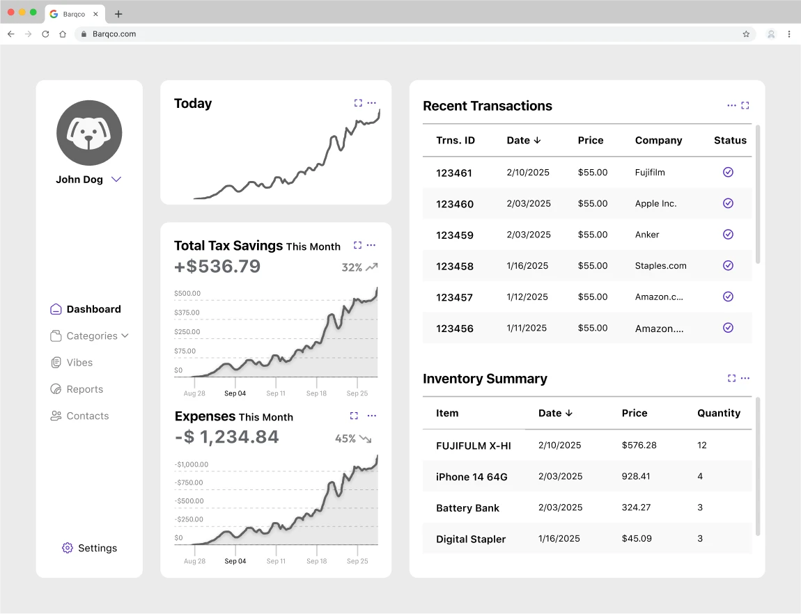
Incorporate Information Screen: I enhanced the content presentation in the subsequent sections by alternating information and images from left to right for a more dynamic flow.
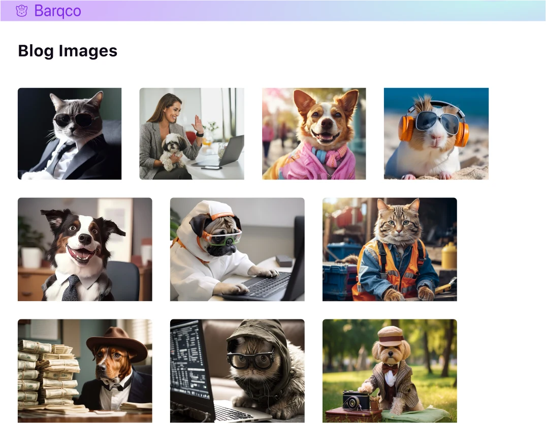
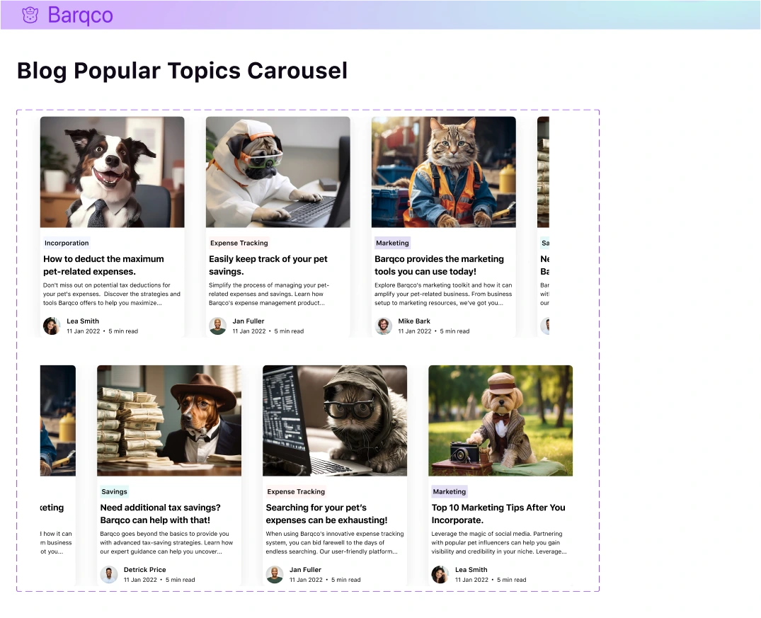
Barqco Blog Screen: Maintaining the consistency in spacing and format established in the medium-fidelity wireframe, I infused the style guide's colors into the category tags. Additionally, I incorporated individual post images and author avatars to provide a more personalized touch.
Developer Handoff
Screen Annotation
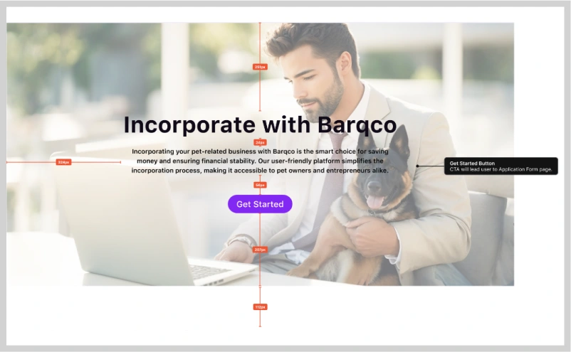
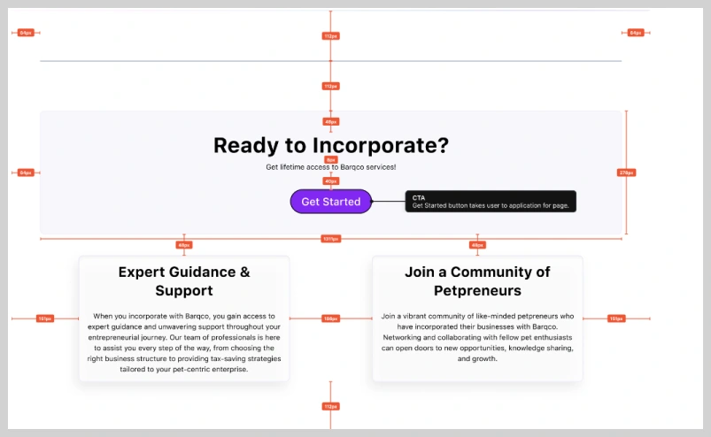
In the final stages, the team implemented a developer hand-off file. This comprehensive file encompassed all the screens and components we designed and was enriched with precise measurements and annotations to serve as references for the developers during their implementation phase.
We also integrated measurements directly into the master components to enhance legibility, ensuring that individual pages remained uncluttered and easily interpretable.
Reflection
Looking Back
The journey of conceptualizing and designing for Barqco proved rewarding and transformative. As I delved into Barqco's vision for pet entrepreneurs, my admiration for this distinctive concept grew. It seamlessly blends the realms of business incorporation with pet-related expenses, providing a valuable tax offset.
Throughout the case study, I was propelled by two driving forces: the passion of pet enthusiasts and the precision required for business incorporation. Merging these two realms required not only an understanding of the user's aspirations but also a deep dive into the technicalities of business operations. The iterative design process was significant in refining additional concepts and ensuring that the final product was not only user-friendly but also simplified, assisting the user in understanding Barqco’s vision and offerings.
One of the most challenging yet rewarding aspects of this project I endured was encompassing the style guide and the vast array of components from other team members; communication within the team was a fundamental necessity to keep their assets intact.
From the initial brainstorming sessions to the developer handoff, there was a shared sense of purpose and dedication. I encountered challenges, certainly, but they only served to sharpen my focus and fuel my determination to create a platform that truly catered to the unique needs of Barqco and its users.
In retrospect, Barqco was more than just another design project; it was an exercise in innovation and meticulous execution. I’ve concluded this project with a continued appreciation for the power of targeted solutions and the magic that unfolds when creativity meets purpose.
Read more of my case studies

Irule Kids TV Inc.
Irule Kids TV Inc.
UX/UI Designer & UX Researcher (Team of 5) | Product Design | Delivered an accessible AR/VR platform teaching entrepreneurial skills to children ages 2–18.
HomeWorks
HomeWorks
Sole UX/UI Designer & UX Researcher | Product Design | Simplified home maintenance and expense tracking for homeowners with an intuitive B2C app.
Plannie
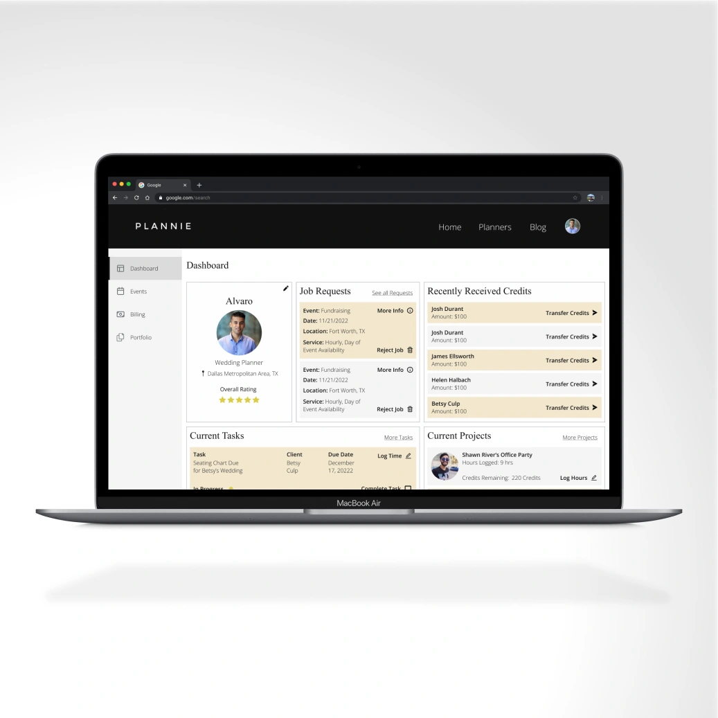
Sole UX/UI Designer | Product Design | Enabled seamless event and project management for planners and clients through a collaborative B2B2C platform.
Like this project
Posted Jul 10, 2026
Redesigned Barqco’s website and brand identity to clarify value proposition and improve UX for a pet-influencer financial SaaS.
Likes
0
Views
5