Plannie

Brady Marchant


Plannie
A B2B2C platform helping planners and clients manage events and special occasions.
Overview
Plannie offers a unique global network of experienced event planners and day producers who can be hired hourly. They aim to make event planning seamless and straightforward for clients by providing global access to top-tier planners. As Plannie's reputation has grown, so has its clientele base.
Challenge
As Plannie continues to expand, there's a pressing need to enhance its website user experience to facilitate better interactions between event planners and their clients. The lack of an online marketplace has hindered direct communication, and their current dashboard needs the features necessary to address the growing needs of planners and clients.
Lack of direct communication between clients and planners.
The dashboard feels cluttered and overwhelming.
No online marketplace platform is in place.
Solution
The primary solution involves redesigning the current Dashboard to provide more clarity and functionality. Introducing a marketplace platform where consumers and planners can interact directly is crucial. This newly designed space should allow for easy tracking of tasks, jobs, and budgets and facilitate smooth communication.
Redesign the dashboard for better clarity and functionality.
Introduction of a marketplace platform for direct communication.
Implement features to track tasks and budgets and facilitate messaging.
My Role
UX/UI designer
Tools
Jira
Figma
Process
Discovery
Design
Prototype
Reflection
1
Discovery
2
Design
3
Prototype
4
Reflection
Discovery
Kick Off
Plannie was presented as a learning opportunity with the challenge of redesigning the Event and Dashboard pages. As part of this project, I was also asked to create a messaging area on the Event page. To better understand the project and its requirements, I received two Jira tickets that contained valuable user feedback. This feedback helped me understand the users' needs and preferences and informed my design choices.
*role="textbox"*tabindex=0
Jira Ticket - Events Page Enhance and Redesign to Facilitate Interaction with Planner.
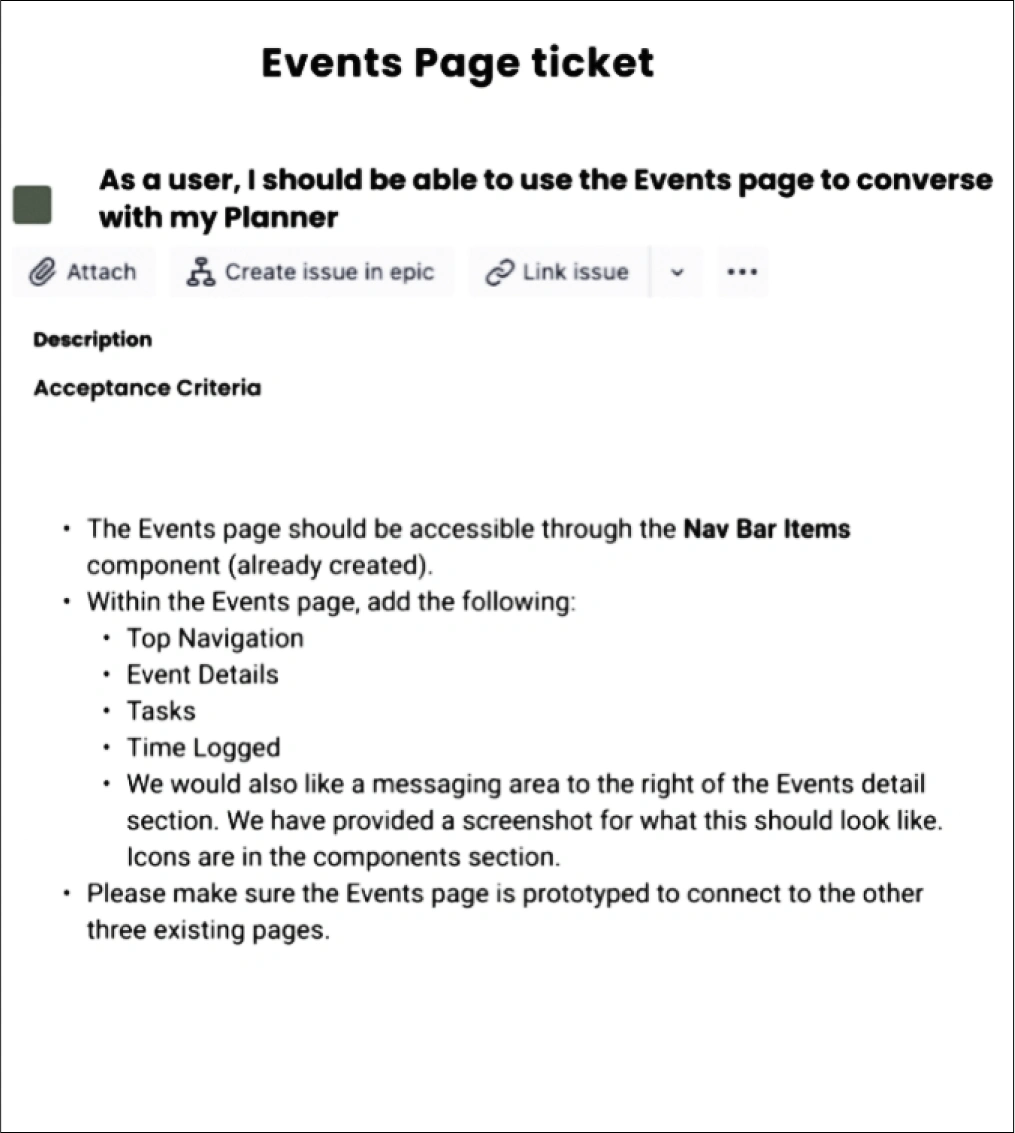
User Need Statement: As a user, I should be able to use the Events page to converse with my Planner.
Events Page Ticket: Seeks to refine user interactions with the Planner. Specifically, it requests that the Events page be integrated into the main navigation bar while also detailing specific sections—like Top Navigation, Event Details, Tasks, and Time Logged—to be present on the page. A new messaging area should also be added to the right of the Event details for enhanced communication. Lastly, the Events page should be prototyped consistent with the other pages on the platform.
Jira Ticket
Jira Ticket
*role="textbox"*tabindex=0
Jira Ticket - Dashboard Page | Refine the Dashboard for Enhanced User Experience.
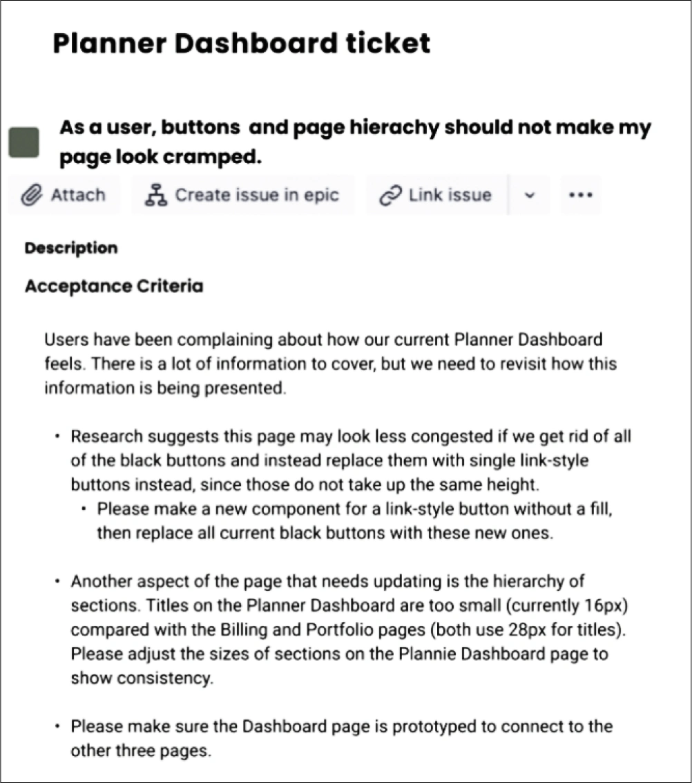
User Need Statement: As a user, buttons and page hierarchy should not make my page look cramped.
The Planner Dashboard Ticket: Address user feedback about the page's cluttered appearance. It suggests the replacement of existing black buttons with more minimalistic link-style buttons. There's also an emphasis on ensuring consistency in the hierarchy by adjusting the size of section titles on the Planner Dashboard to match other pages. After these modifications, the Planner Dashboard should be prototyped to ensure seamless integration with other platform pages.
Secondary Research
After reviewing the existing screens, I conducted an in-depth analysis of the Laws of UX. The aim was to develop a user-friendly design for Plannie. The research findings provided clear direction on how the platform should function. Based on these insights, a roadmap was created to address the identified pain points, as well as to align with user expectations and industry trends.
Law of Uniform Connectedness:
Application to Plannie: Visually connect related tasks, such as events and their corresponding deadlines or budget details.
Helps users intuitively understand the relationship between tasks and their details.
Streamlines the process of tracking progress or making updates.
Law of Similarity:
Application to Plannie: Group similar items, such as event details or messaging features, using consistent design elements.
Improves user's ability to categorize and find information.
Reduces cognitive load by presenting similar functions in a recognizable pattern.
Aesthetic-Usability Effect:
Application to Plannie: Prioritize a clean, modern, and appealing design for the dashboard and event pages.
Increases user satisfaction and engagement.
Reduces user frustration by making the platform seem more user-friendly, even if they encounter minor challenges.
Hick’s Law:
Application to Plannie: Limit the number of choices or categorize them effectively when presenting event planners or other options.
Ensures users don’t get overwhelmed with too many options.
Speeds up the decision-making process, leading to faster user actions.
Design
Style Guide
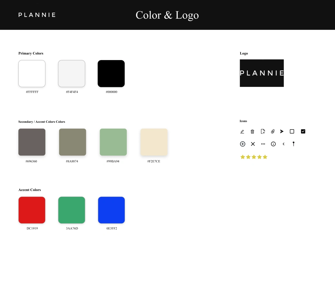
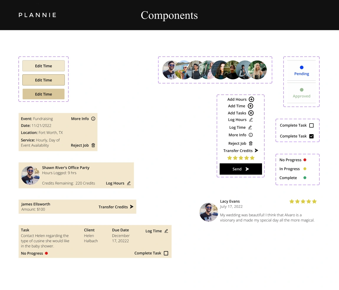
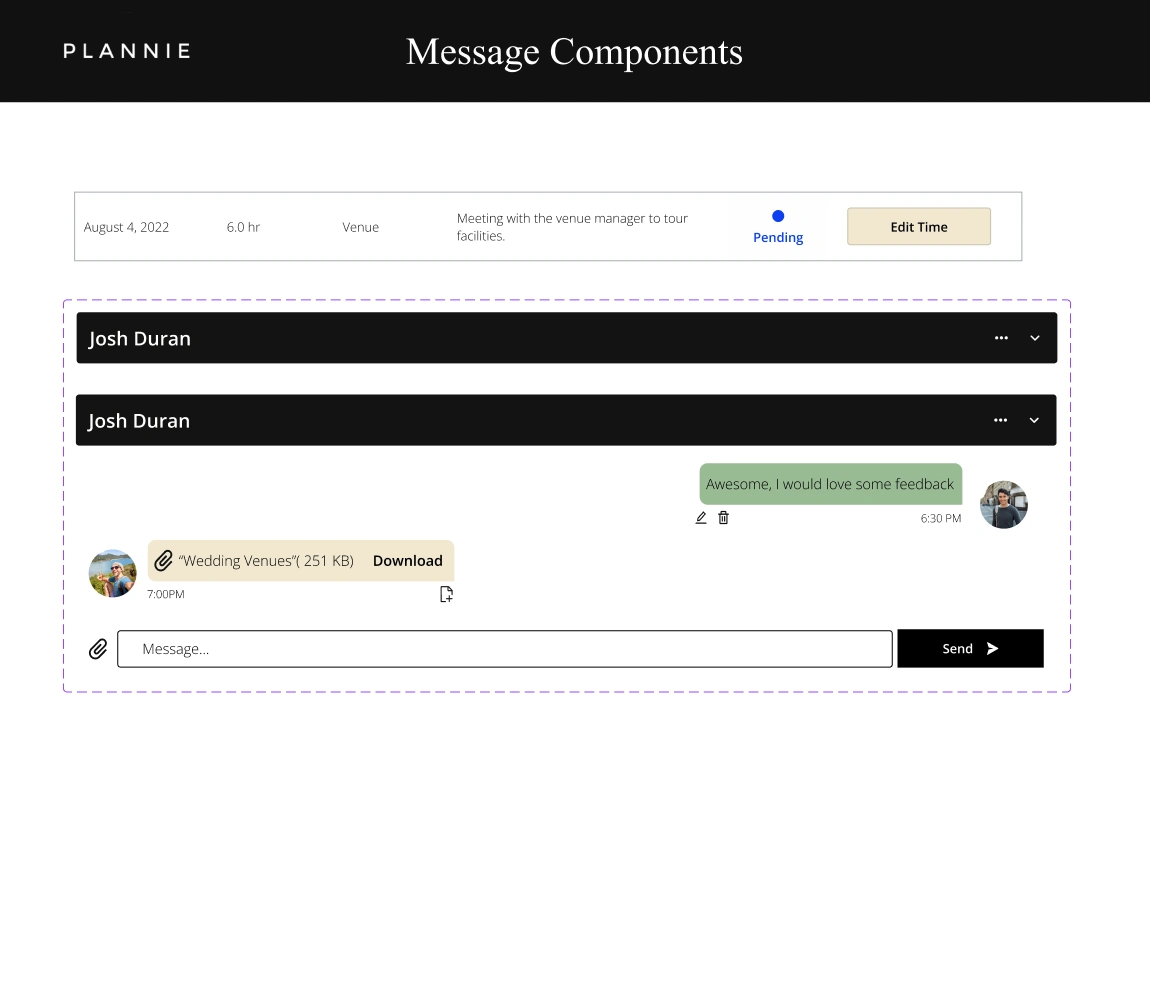
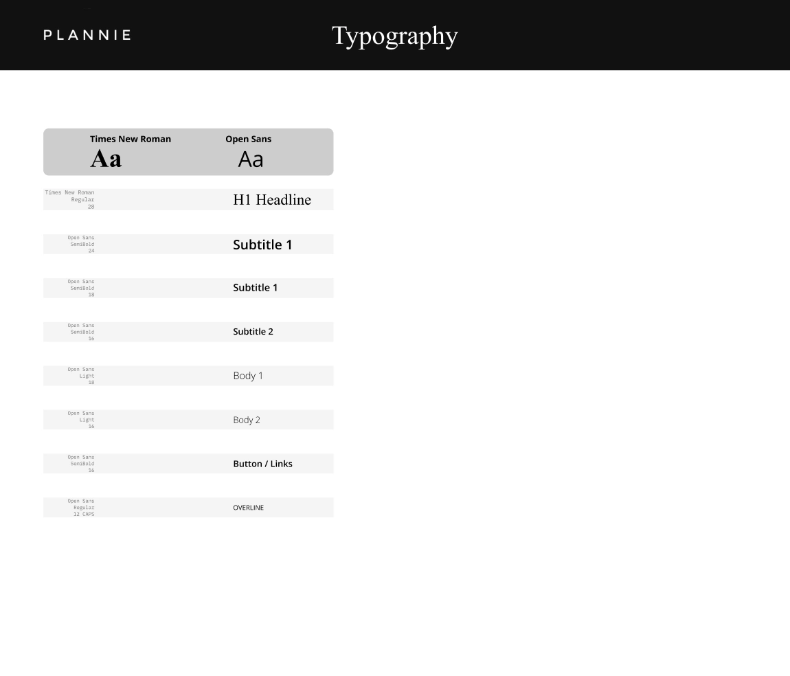
The Plannie style guide outlines the visual identity and design elements essential to the brand's representation. The primary color palette is anchored in neutral white, light gray, and black tones, contrasted by a secondary palette of dark gray, olive, sage green, and cream. vibrant red, green, and blue accent colors inject energy into the design. The brand's logo is a sleek rendition of Plannie, complemented by a suite of functional icons tailored for user interactions. This cohesive design philosophy extends to the UI components, emphasizing intuitive task management, user interactions, and a streamlined messaging interface. Through its meticulous design approach, the style guide ensures a consistent and user-friendly experience across all Plannie platforms.
Hi-Fidelity Screens
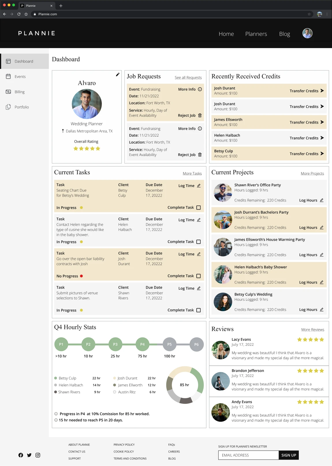
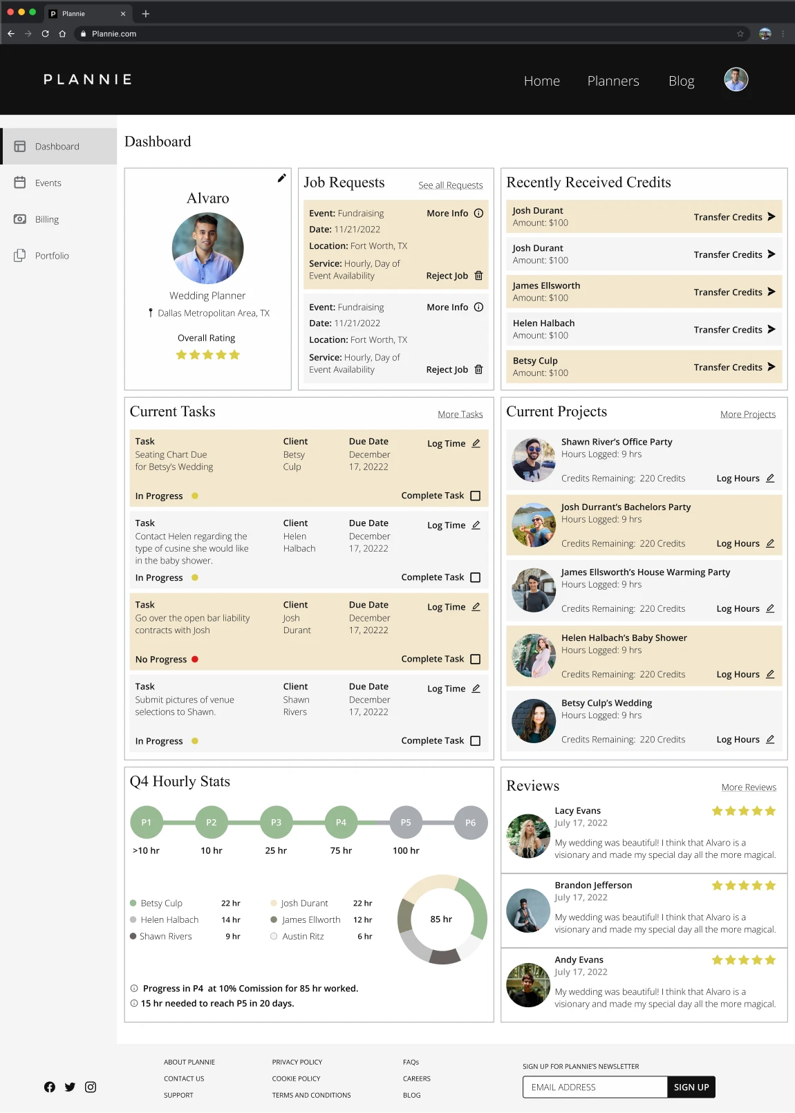
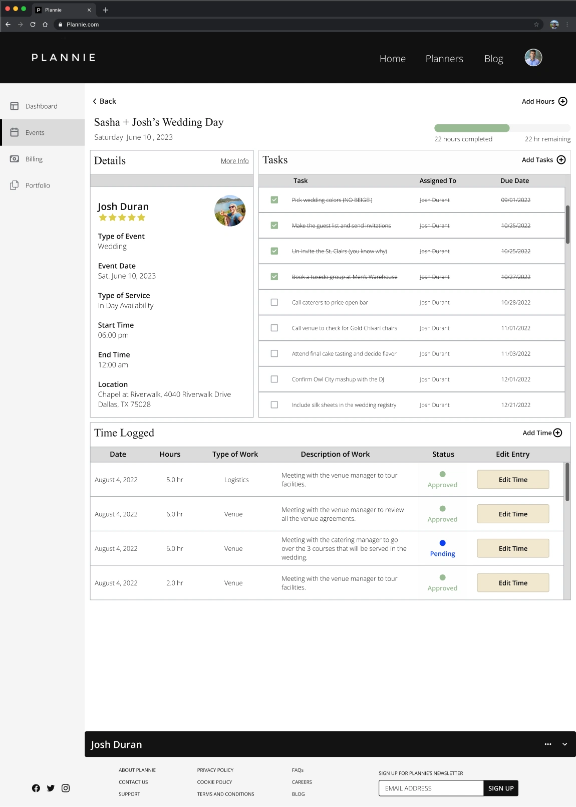
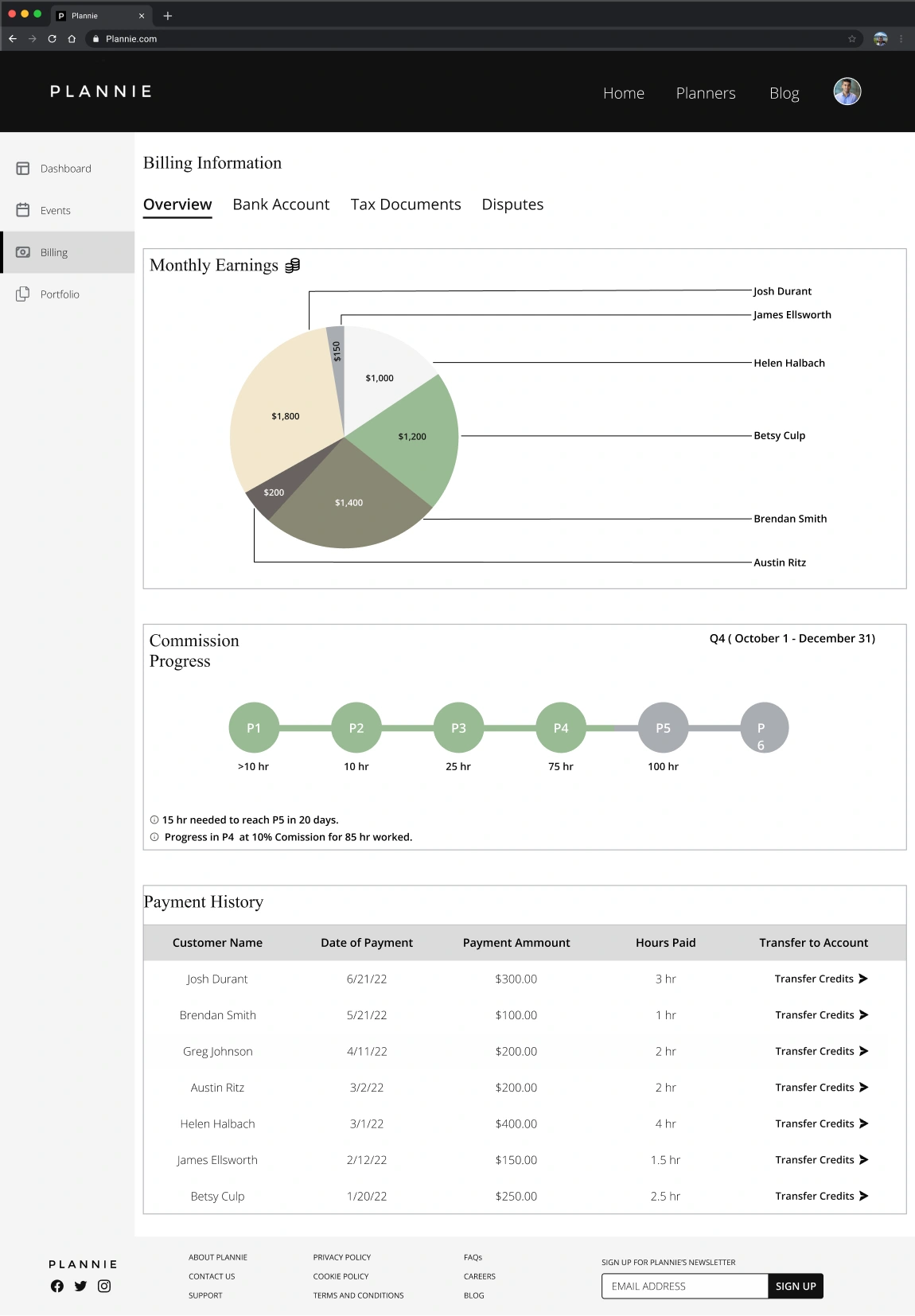
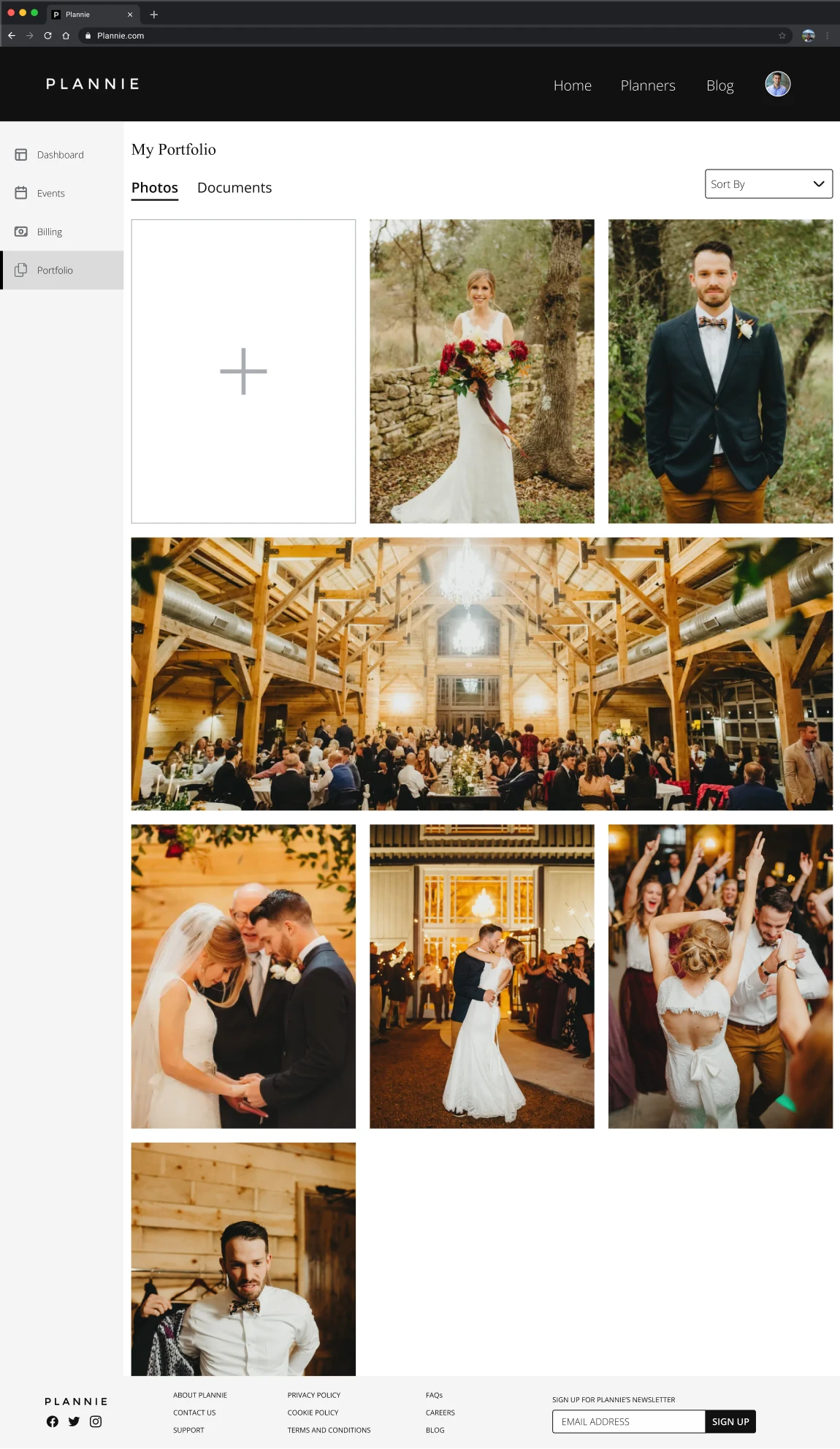
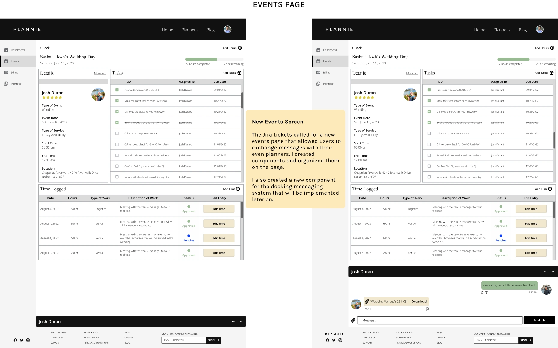
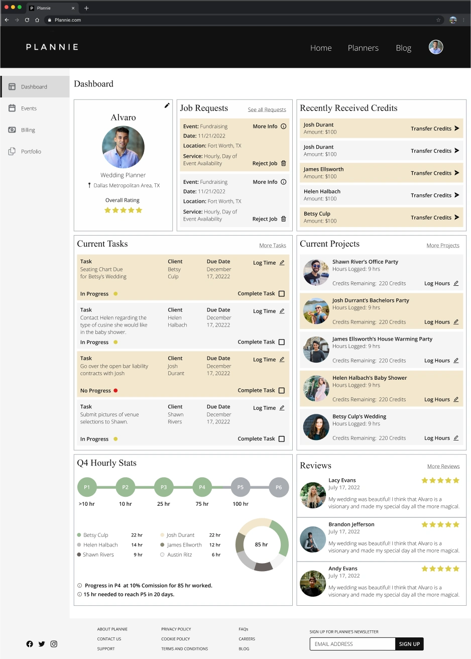
I redesigned the Dashboard screen and created a high-fidelity Events Screen. The Dashboard presents a more evident hierarchy, optimized text sizes, and streamlined CTA buttons, addressing previous inconsistencies and visual congestion.
The Dashboard
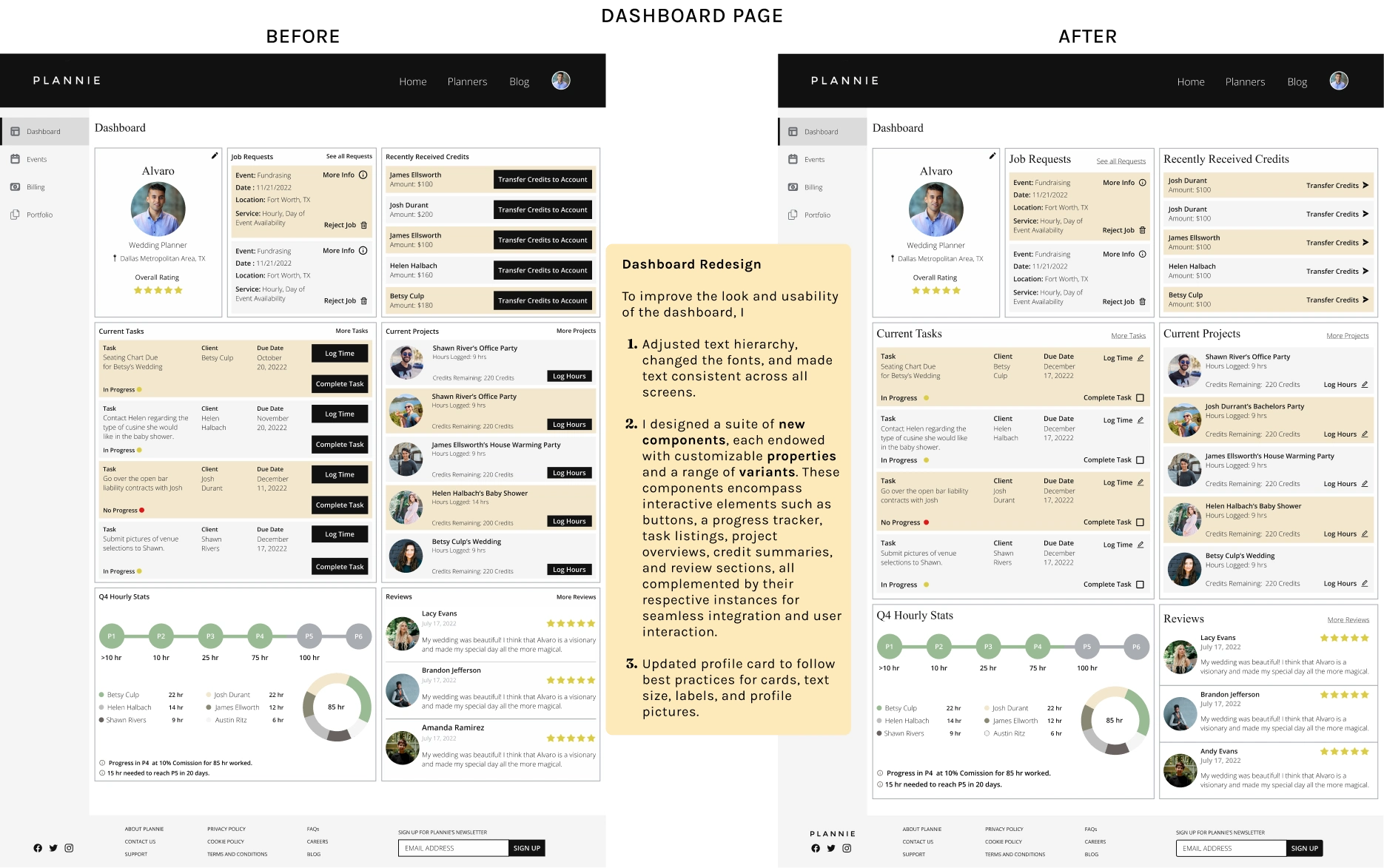
The Dashboard had inconsistencies, particularly in the hierarchy, text sizes, and CTA buttons—the overabundance of information led to a visually congested design. I substituted the black-filled buttons with clickable text and icons to alleviate this clutter. The redesigned CTA buttons now have ample space, enhancing the page's aesthetic appeal. Using the style guide, I introduced a distinct font hierarchy, which assists users in discerning between various text elements. This revamp has resulted in a more organized and consistent dashboard.
Dashboard Page
Events Page
*role="textbox"*tabindex=0
The Events Page
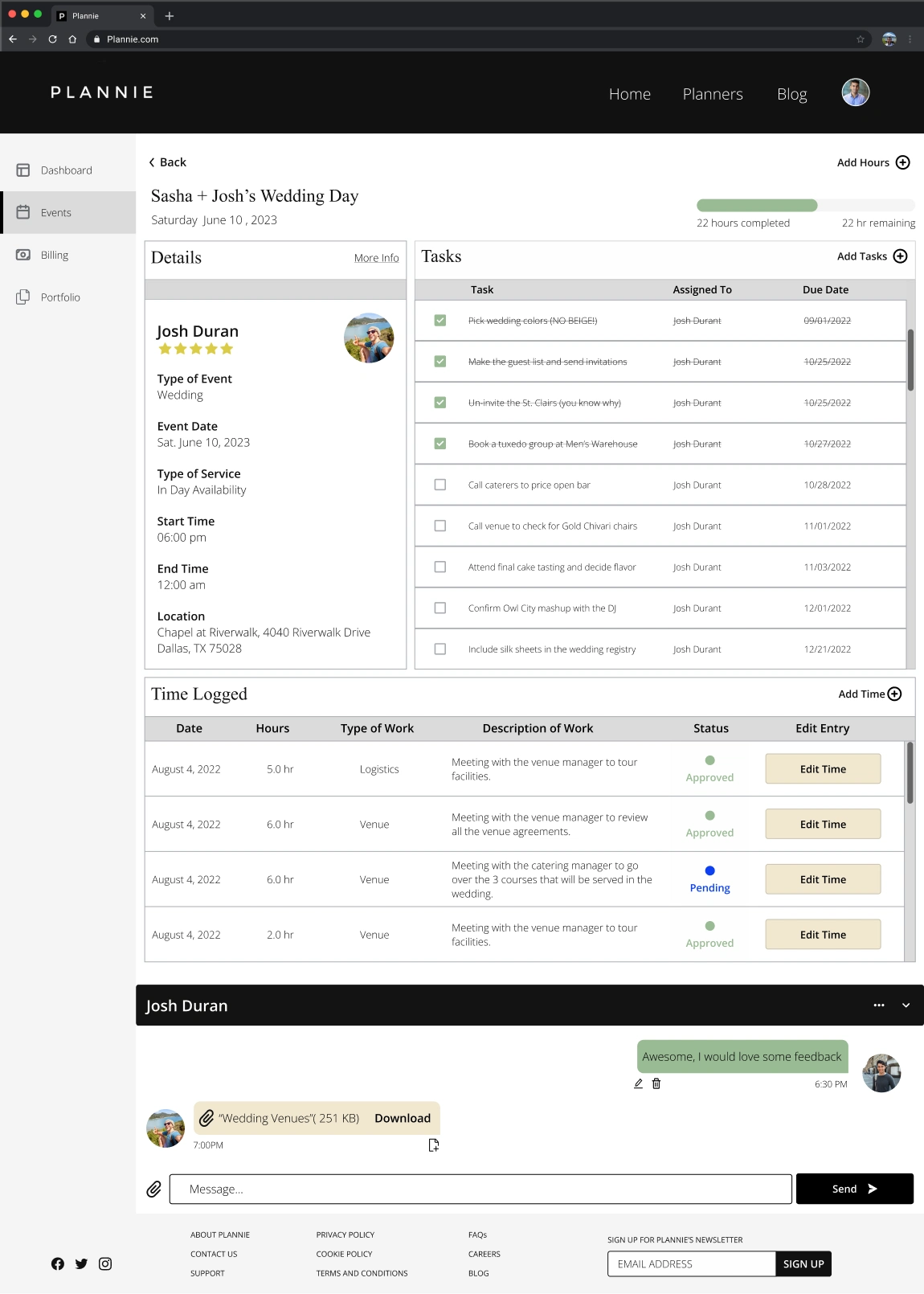
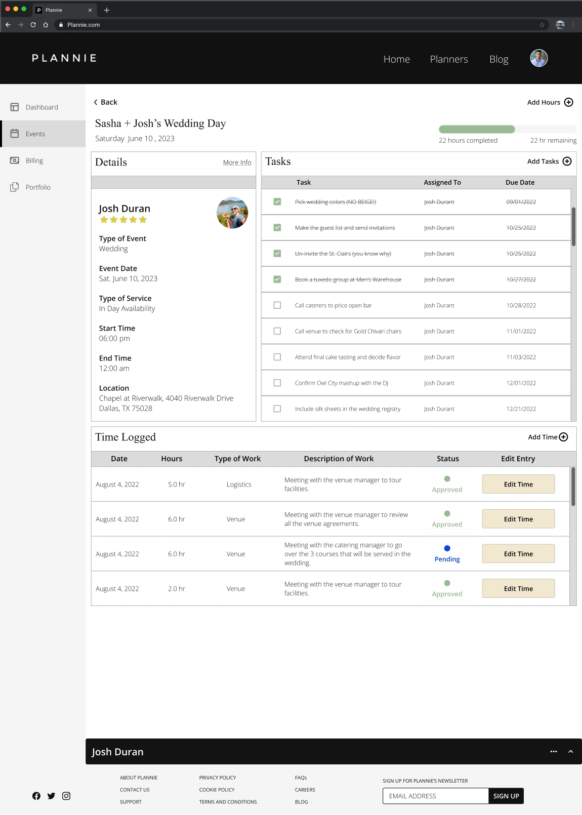
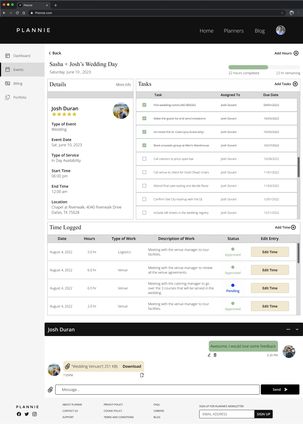
I designed the event page incorporating detailed event insights, time logs, and task lists. A standout feature is introducing a closed/open messaging system, fostering seamless communication between planners and users. While building the Events page, emphasis was laid on consistency and clarity. I integrated components and variants to facilitate future updates by other designers, ensuring a streamlined and user-friendly interface.
*role="textbox"*tabindex=0
Prototype
Upon completing the redesign of the Dashboard and the Events page, I developed a prototype to facilitate an immersive user experience. This interactive prototype allows users to transition between pages via the side navigation bar seamlessly. Additionally, it incorporates a messaging pop-up system, granting users the flexibility to open or minimize their communication interface.
Plannie Prototype
Reflection
*role="textbox"*tabindex=0
Looking Back
Plannie's initial setup presented significant challenges, chiefly stemming from unlabeled frames, layers, and disorganization. I delved deep into streamlining the existing structure to rectify this and lay a robust foundation for future designers. I meticulously crafted components and variants that boasted multiple states and nested instances. The organization of multifaceted components ensures that any future redesigns or updates can be executed efficiently, maintaining the integrity and consistency of the platform's design.
The redesigned Dashboard exudes a sense of unity. The optimized design provides users with an uncluttered experience, mitigating the stress of dense information consumption. On the other hand, with its revamped features, the Events page ensures users can monitor event progress and bolster their collaborative efforts with clients, fostering a seamless event management experience.
Read more of my case studies

Diy55
Diy55
Sole UX/UI Designer & UX Researcher | A B2C Interface for DIY skincare and aesthetic treatments.
CDPH - SCRL
CDPH - SCRL
Senior UX/UI Designer & UX Researcher | Redesign | Streamlined immunization record management for the California Department of Public Health
Barqco
Barqco
UX/UI Designer & UX Researcher (Team of 5) | Redesign | Maximized tax savings for pet owners with a B2B/B2C financial SaaS platform.
Like this project
Posted Jul 10, 2026
Redesigned Plannie’s dashboard and Events page, adding messaging and marketplace features to improve planner–client interactions.
Likes
0
Views
4