Irule Kids TV Inc.

Brady Marchant


Irule Kids TV Inc.
A B2C educational platform teaching entrepreneurial skills to youths through AR/VR technology.
Overview
Irule Kids TV is a new and exciting startup devoted to creating an innovative and forward-thinking educational platform for children aged 2 to 18. The platform integrates entrepreneurial and faith-based learning, offering a seamless learning experience using innovative AR/VR (Augmented Reality and Virtual Reality) technology.
Challenge
Irule Kids TV was facing a pivotal challenge: the need for a web application to deliver their AR/VR interactive educational content. The client sought a website for Irule Kids TV that would serve as a digital portal and encompass critical features. The site needed to support user registrations, manage subscriptions, facilitate direct communication within the company, offer language preferences, and provide a bridge to download their mobile application, all while presenting an engaging homepage.
The endeavor's complexity stemmed from the need to cater to diverse age groups, optimize content display, set varying parental controls, offer multilingual options, and amplify the overall user experience.
Solution
Our team developed a customized solution to address the main challenges faced by Irule Kids TV. Our focus was on enhancing user experience, and we achieved this by designing a sleek and intuitive homepage that would appeal to parents and students. We integrated language toggling tools and a direct communication channel and streamlined the registration process by providing clear subscription options and a user login portal. A dedicated space was also a necessity for the upcoming mobile app. These enhancements addressed the immediate needs of Irule Kids TV and laid the foundation for its long-term success in the highly competitive educational market.
Role
UX/UI Designer (Team of 5)
Process
Discovery
Ideation
Design
Developer Handoff
Reflection
Tools
Miro
Figma
Zoom
Loom
Adobe Photoshop
Adobe Illustrator
Google Workspace
Leonardo Ai
Duration
4 months
1
Discovery
2
Ideation
3
Design
4
Developer Handoff
5
Reflection
Discovery
Kick-off
At the beginning of the project, we held a kick-off meeting where our team thoroughly analyzed the client's specific needs and requirements of the Irule Kids TV educational platform. The client shared their logo and color preferences for the platform, which served as a starting point for our design process. To ensure that we understood their subscription framework and plans for the platform, we asked the client additional questions to clarify the design elements.
Client Questionnaire
In shaping the UX/UI for our educational platform, we honed in on questions to ensure the design resonated with parents while enchanting young users. We inquired about gamification preferences, brand-specific design elements, and desired parental controls, informed by a keen analysis of competitor sites. This approach allowed us to tailor an interface that blended functionality with creativity, catering to a global audience while reflecting the brand's unique values and attributes.
Design and Functionality
Target Audience: The main interface of the home page catered more to parents, the primary decision-makers, while bearing in mind the children as the end-users.
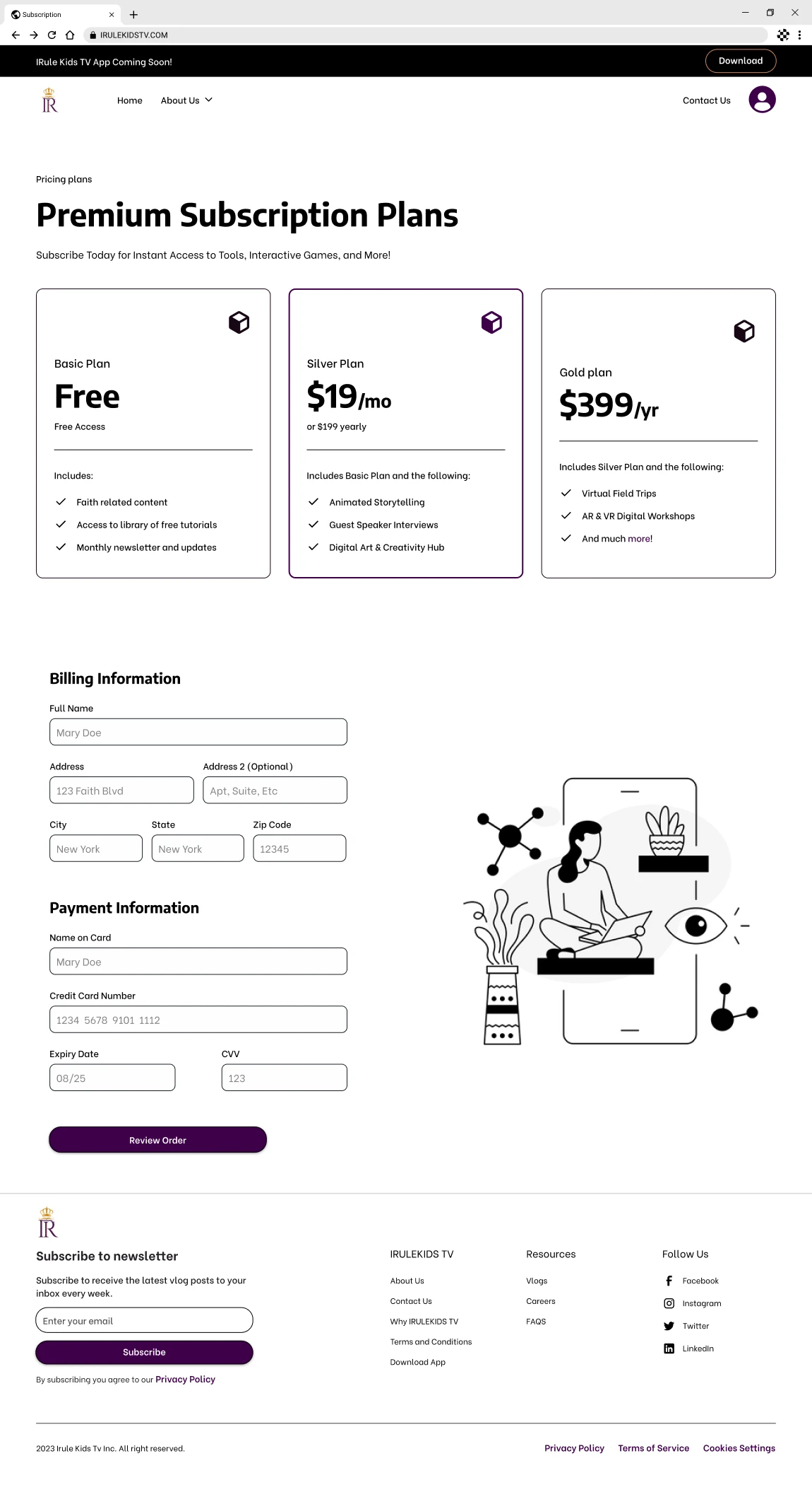
Service Accessibility: Users could initially use the platform for free but with limited features. To experience the complete suite of services, a subscription was necessary.
Content Variety: The platform offered diverse tools and resources, such as interactive digital sessions, immersive role-playing exercises, and faith-oriented case evaluations.
Design Elements: The design incorporated the color tones reflected in the brand's logo and emulated the typographic styles presented by the client.
Competitive Landscape
Visual Attraction: Incorporated vibrant colors, dynamic animations, and captivating graphics.
Interactive Engagement: Integrated game-based elements, quizzes, and challenges for an active learning environment.
Multimedia Integration: Blended various formats like videos, animations, music, and narratives to suit learners' preferences.
Linguistic Diversity: Featured multiple language selections catering to a global audience.
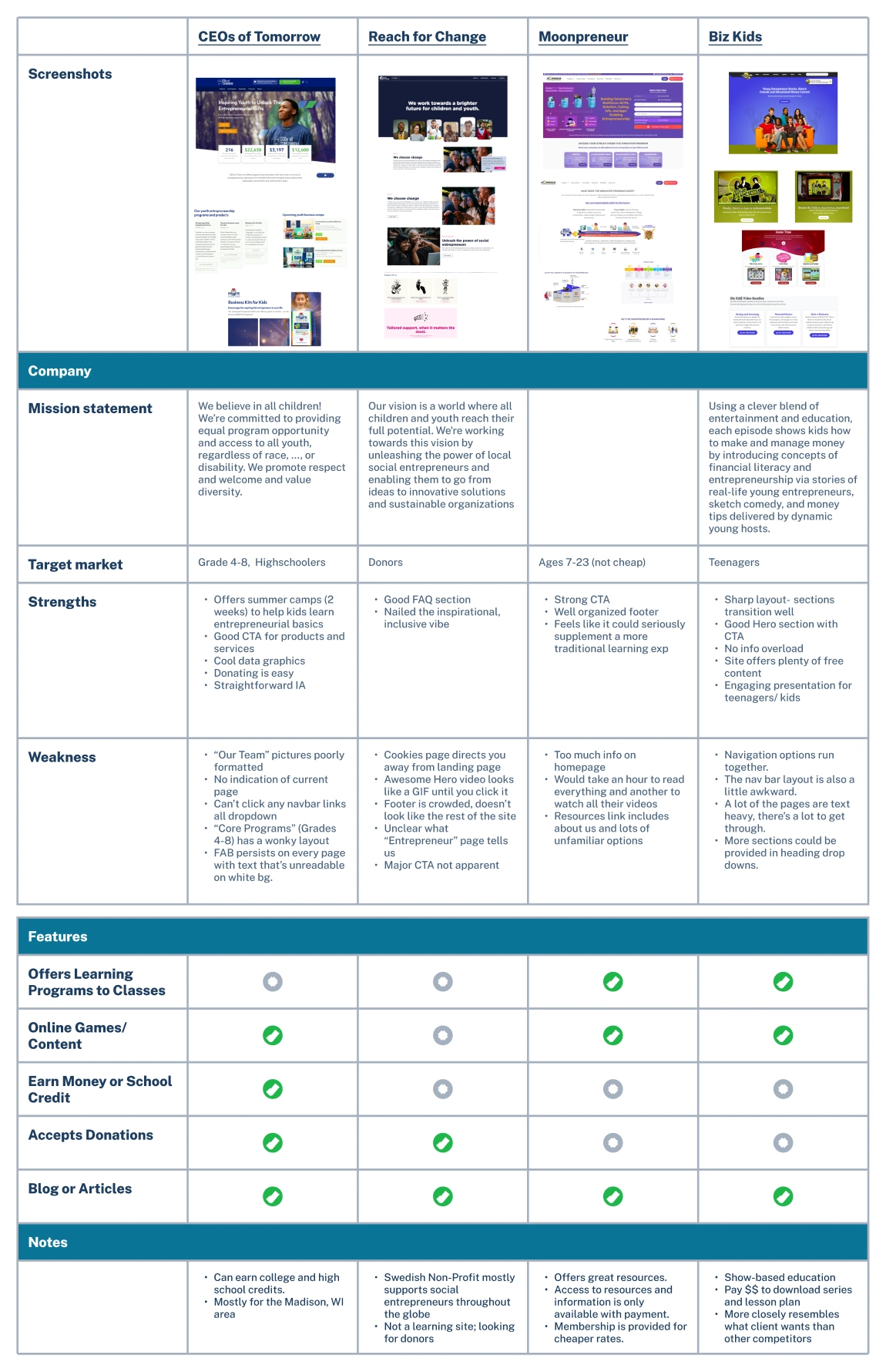
Competitive Analysis
To contextualize our design approach, we thoroughly analyzed the competitive landscape, reviewing platforms selected by the client (Moonpreneuer, BizKids, and CEO's of Tomorrow) and those we identified for their exemplary user experiences. This examination gave us various insights and inspirations that shaped our design strategy for Irule Kids TV.
In addition, we drew creative cues from industry giants like Disney (Marvel), Lego, and Hot Wheels, which serve as benchmarks for engaging young audiences. These insights and inspirations are pivotal in crafting a platform that is both educational and entertaining, ensuring a balance between learning and play.
Moonpreneur: Emerged as the closest match in service offerings to IRuleKids TV.
Scattered layout, potentially impacting user-friendliness.
The registration process was intuitive, with effective Call-to-Actions.
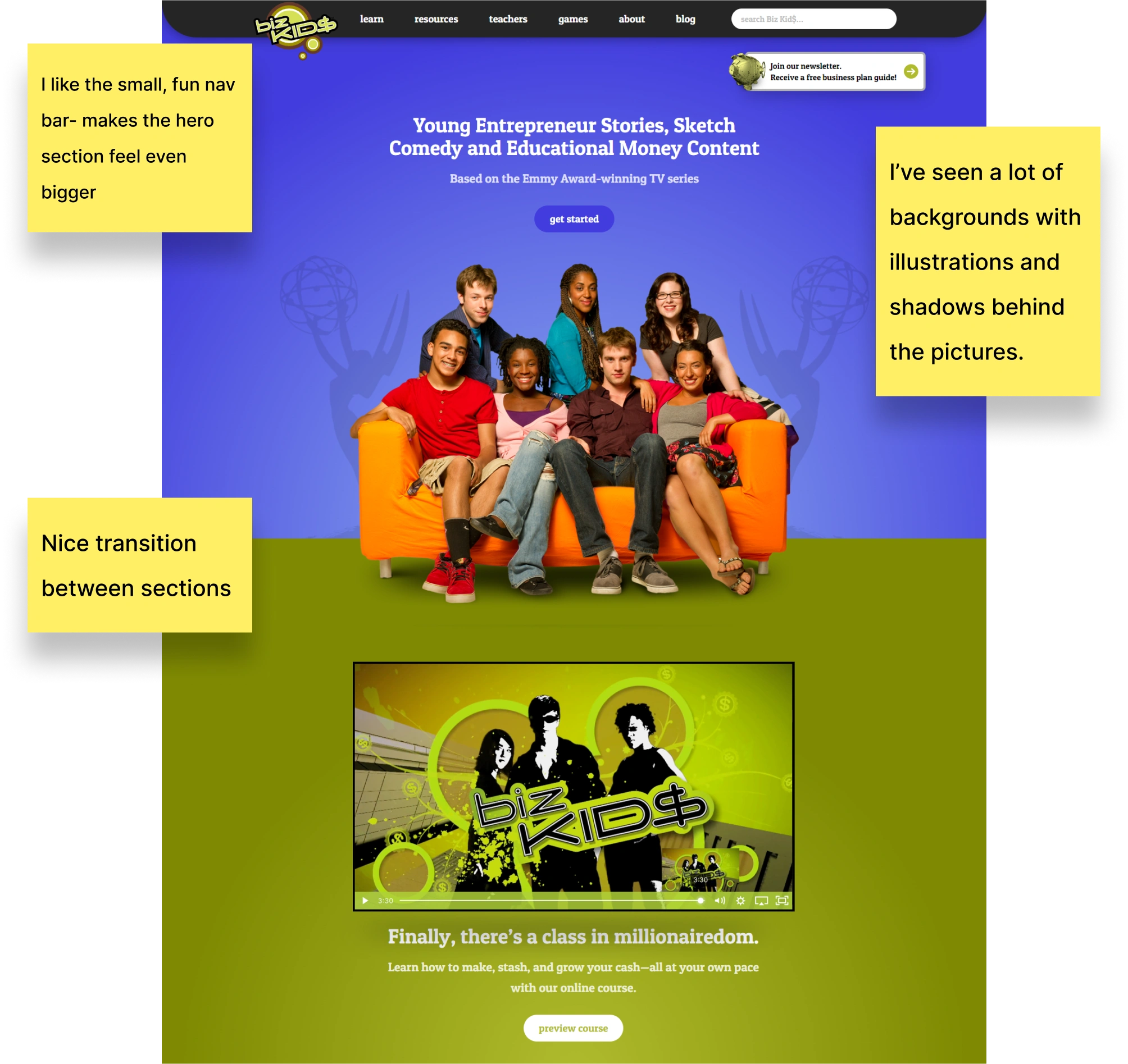
Biz Kids: This competitor wasn’t suggested by the client but offered relevant insights. Their hero section and engaging content presentation stood out, and a possible design perspective could be utilized.
CEOs Of Tomorrow: Offered short-duration summer programs introducing children to entrepreneurship.
Efficient CTAs for their offerings.
Exhibited a clear mission and maintained a consistent visual theme across their platform.
The information is represented with clear architecture.
BizKids: Particularly commendable was their approach to presenting content that appealed to both teens and younger children.
Exemplary User Experiences: Reach For Change, Moonpreneur, Disney (Marvel), Lego, Hot Wheels.
Competitive Analysis
Ideation
User Stories
The client presented the following user stories that defined the project scope, each outlining the specific objectives set by the client for Irule Kids TV.
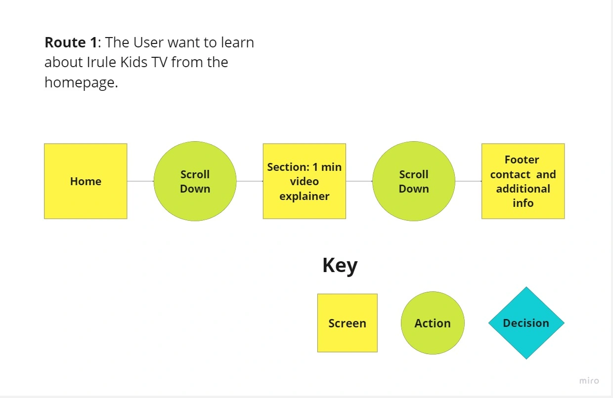
As a user, I want to learn about Irule Kids TV from the homepage.
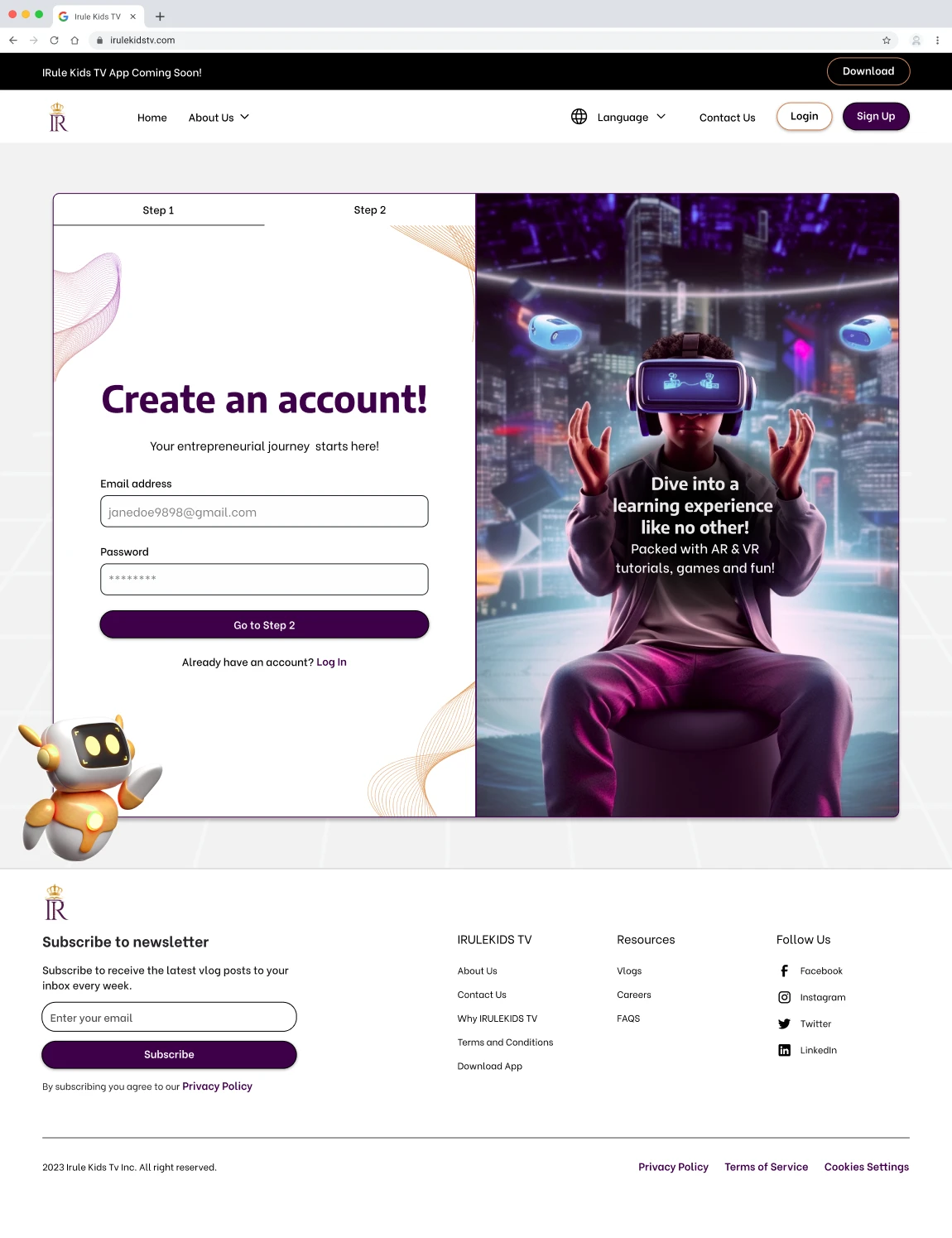
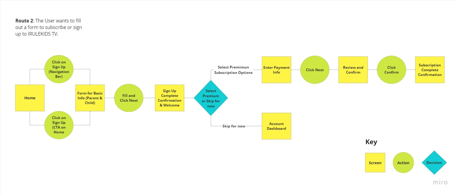
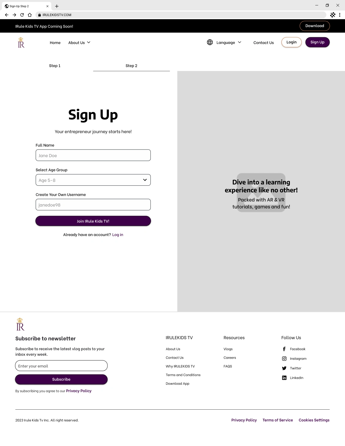
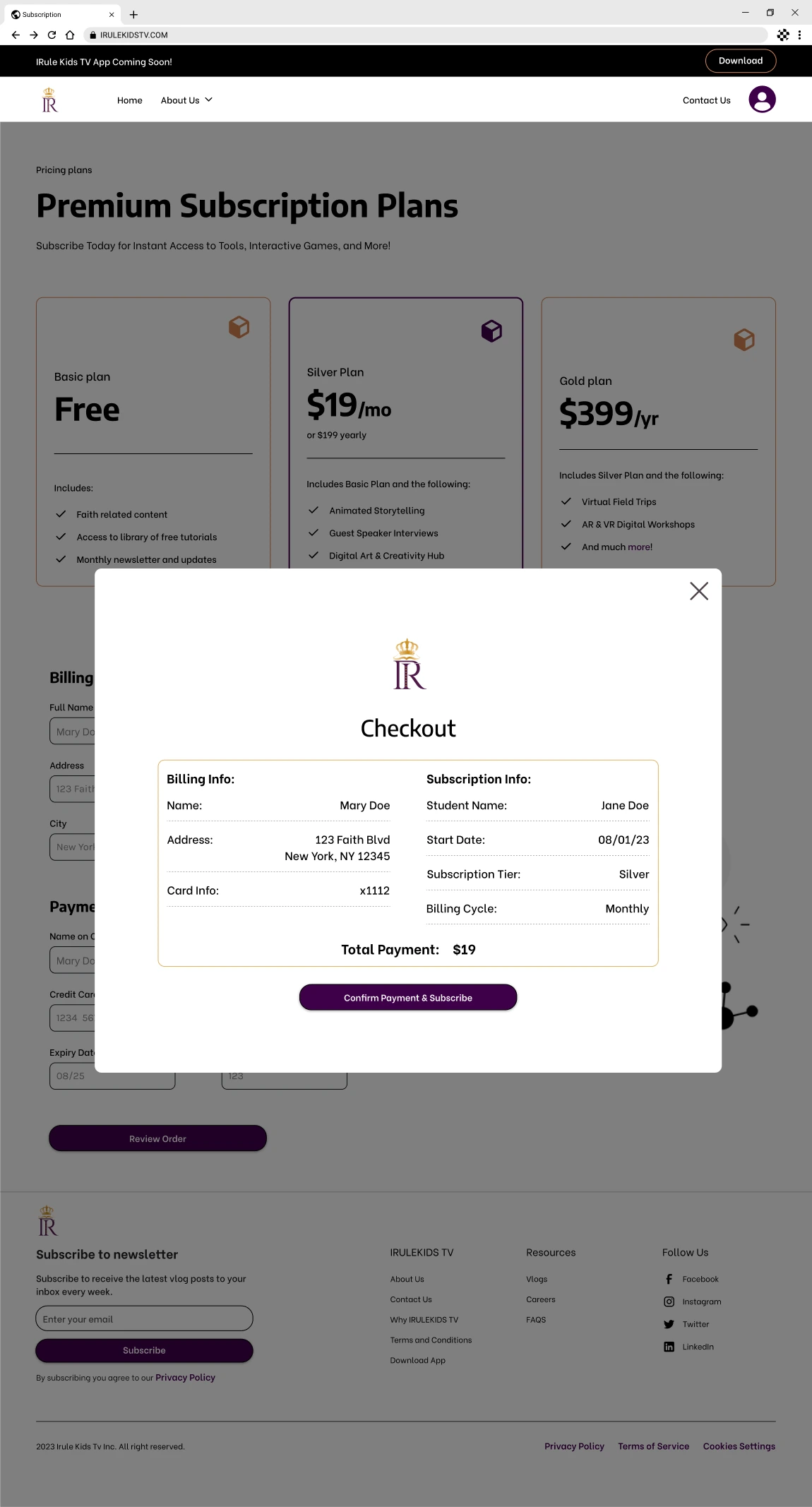
As a user, I want to fill out a form to subscribe or sign up to Irule Kids TV.
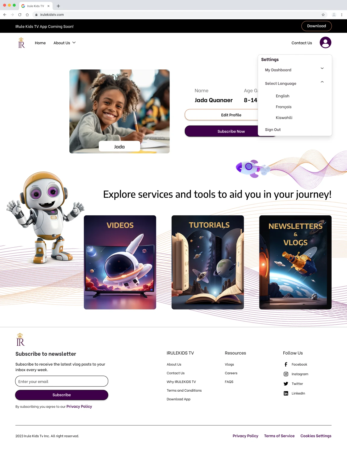
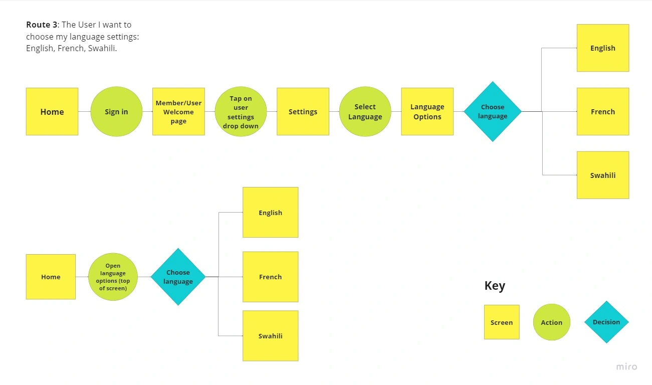
As a user, I want to choose my language settings: English, French, and Swahili.
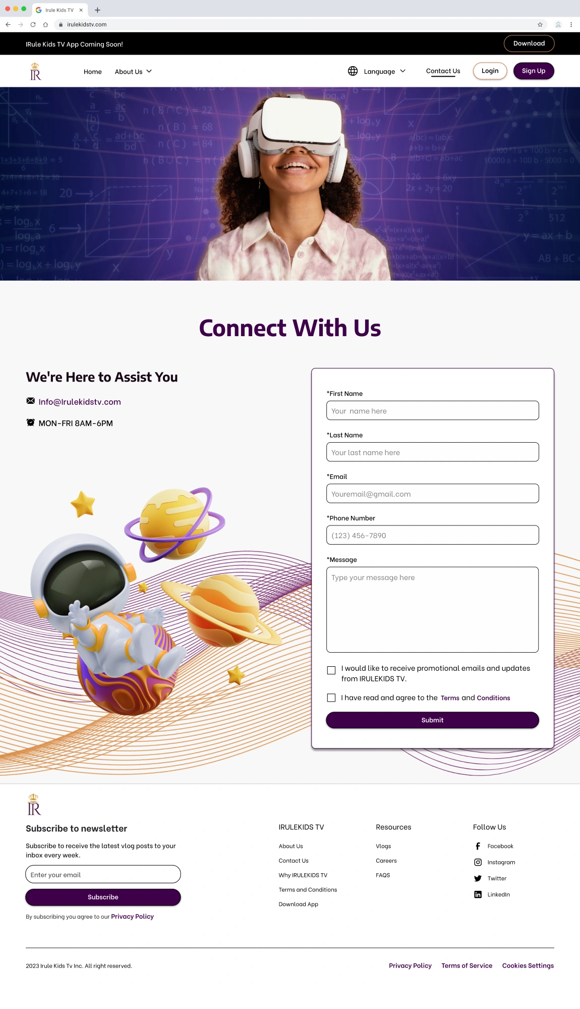
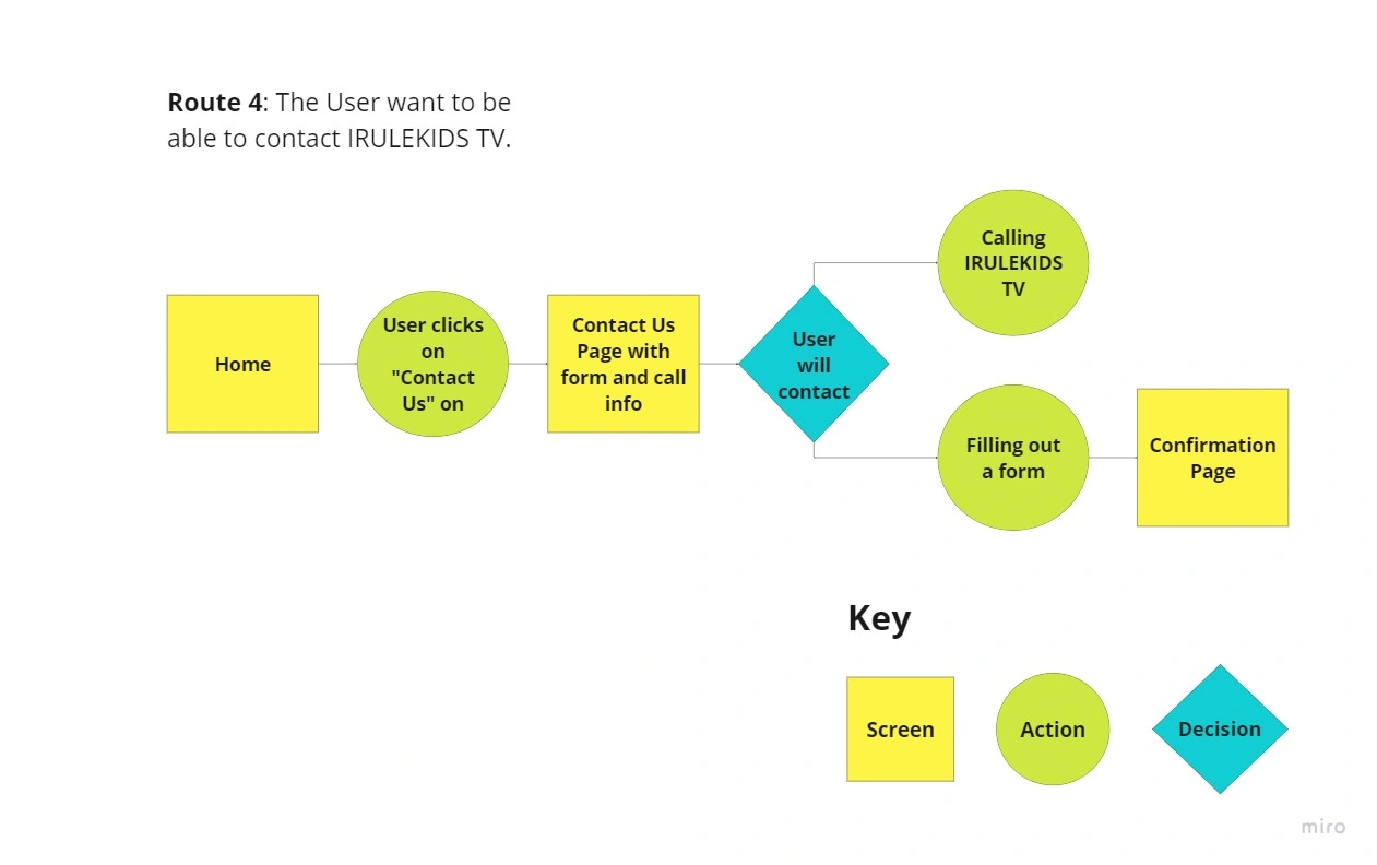
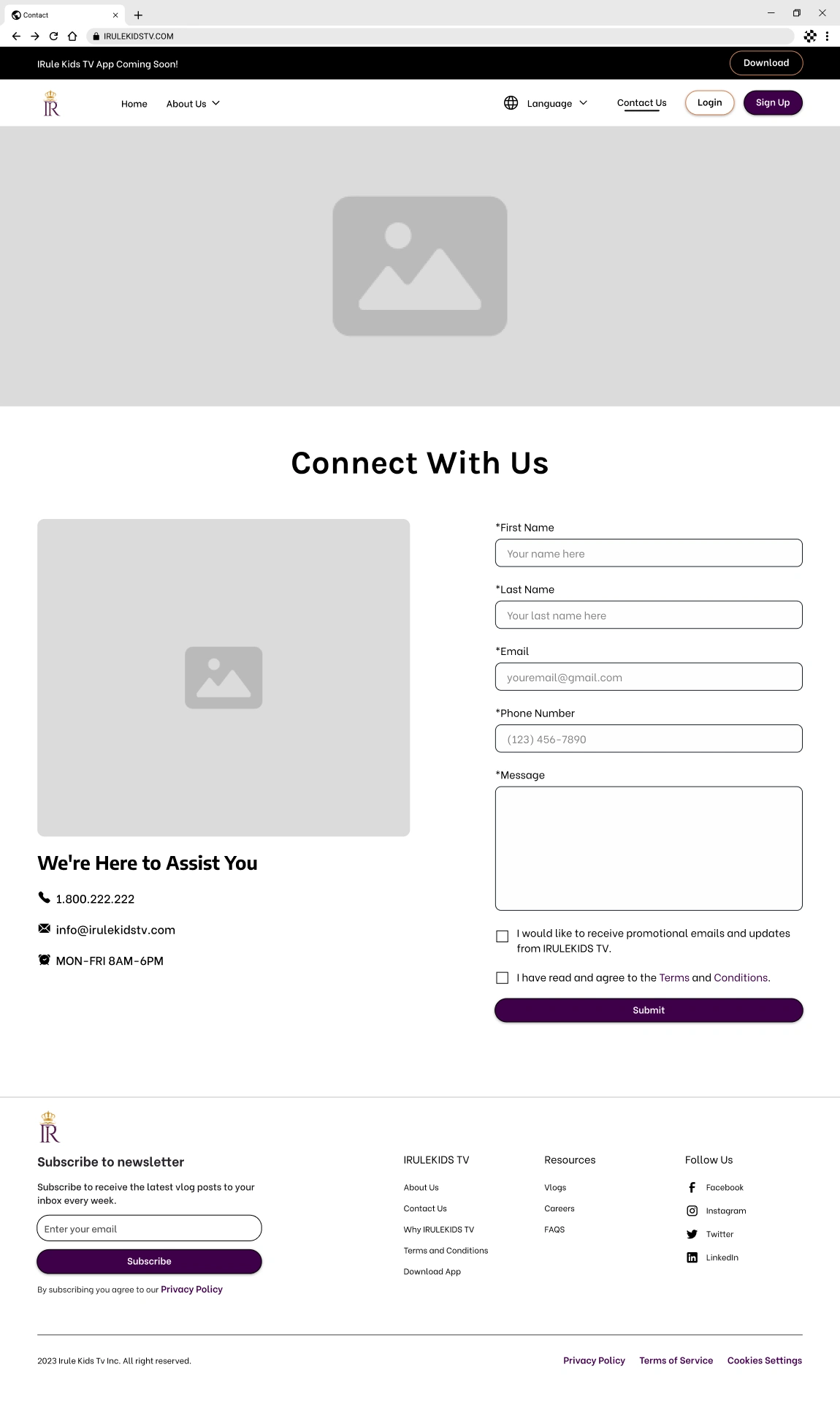
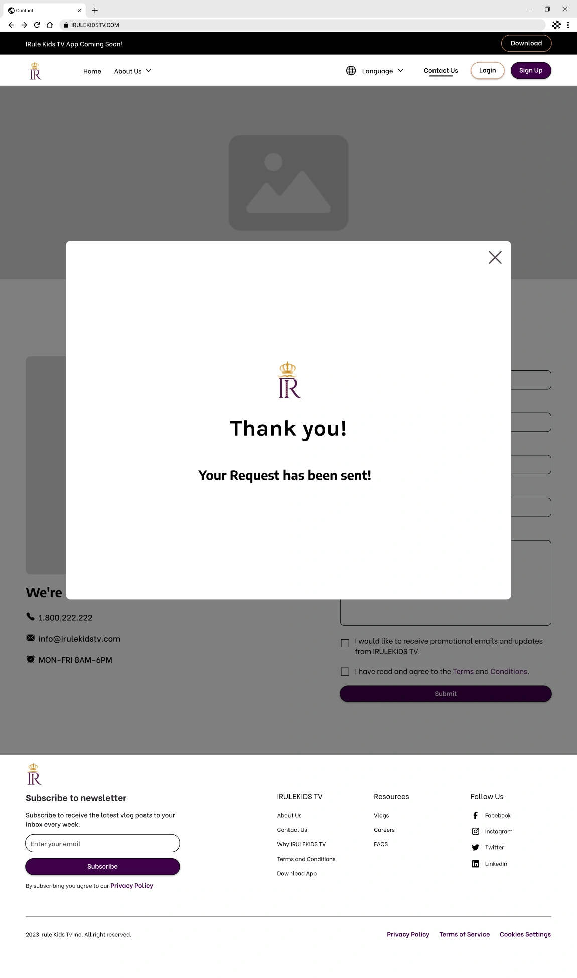
As a user, I want to be able to contact Irule Kids TV.
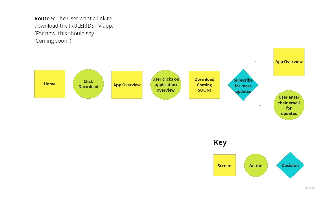
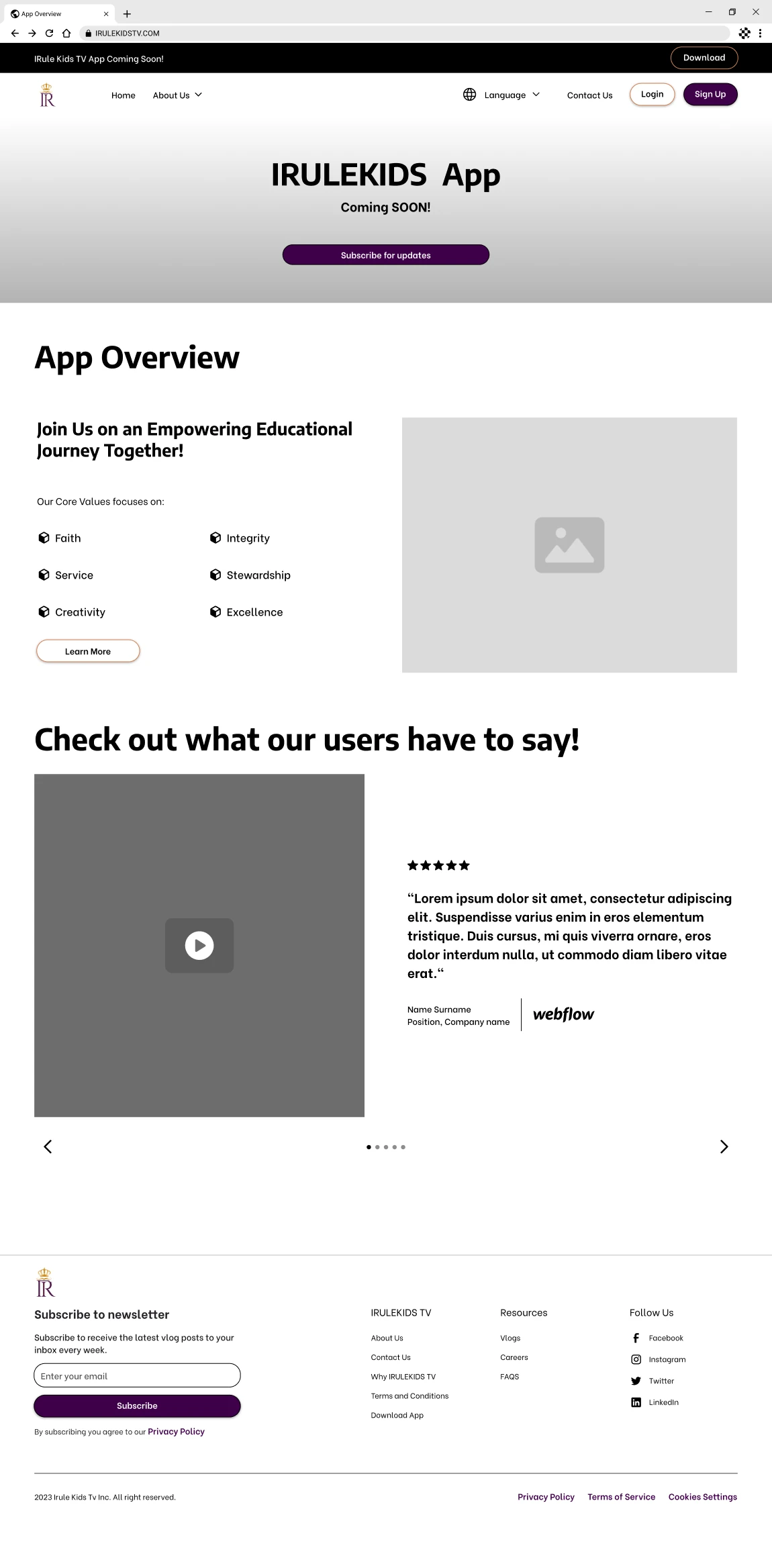
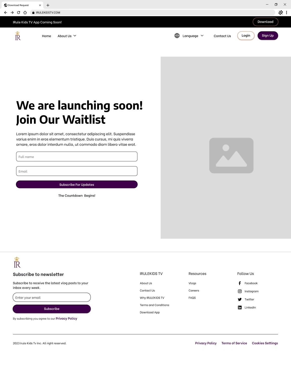
As a user, I want a link to download the Irule Kids TV app. (For now, this should say 'Coming soon.'
User Flows
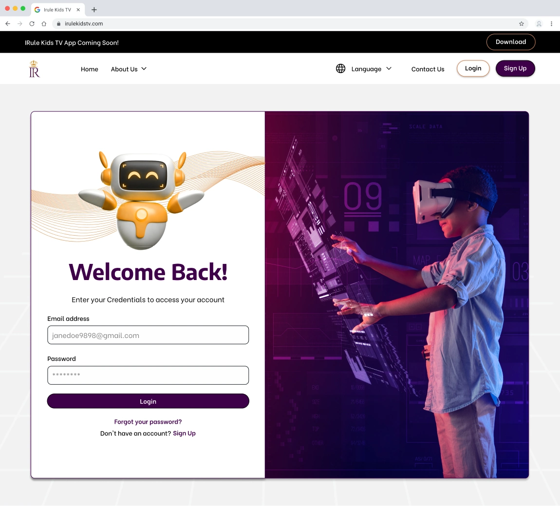
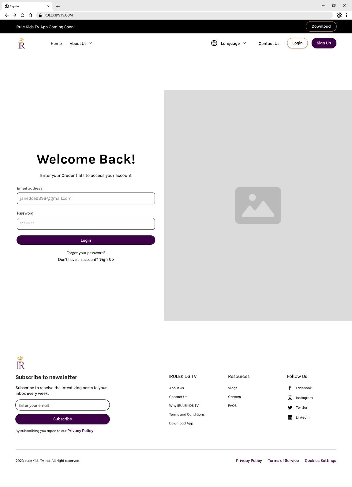
As a part of our design process, each team member created a user flow for every user story related to a feature or function on the platform. I was responsible for User Flow 3, which allows users to choose their language settings between English, French, and Swahili. We then compared all the user flows to identify similarities, which helped us ensure users have a seamless and consistent journey throughout the platform. I specifically worked on the user flow for language settings to enhance accessibility.
Low & Medium Fidelity Wireframes
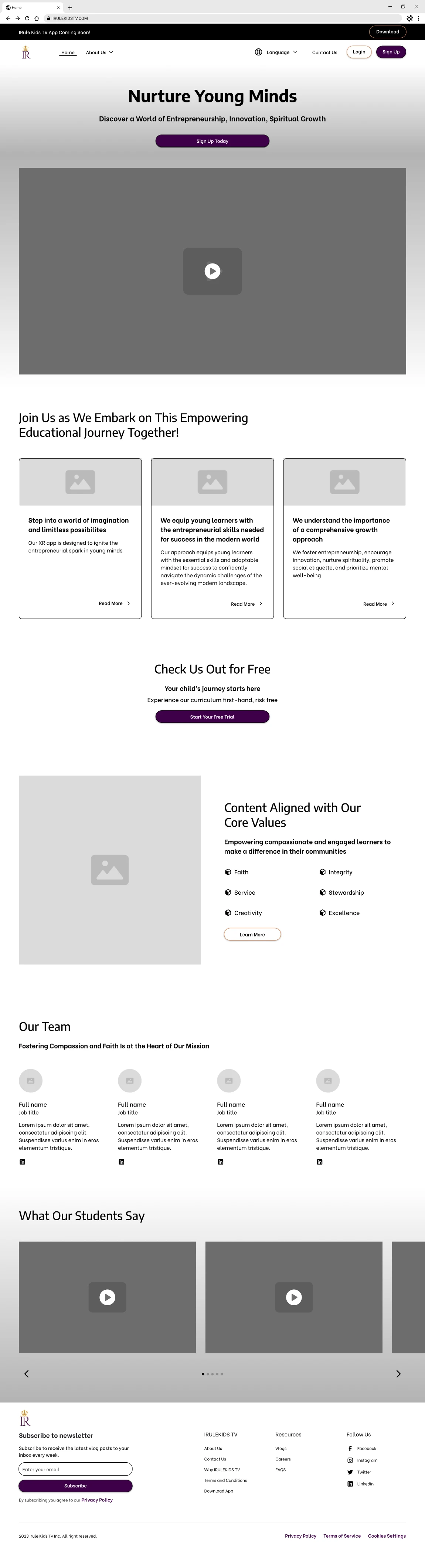
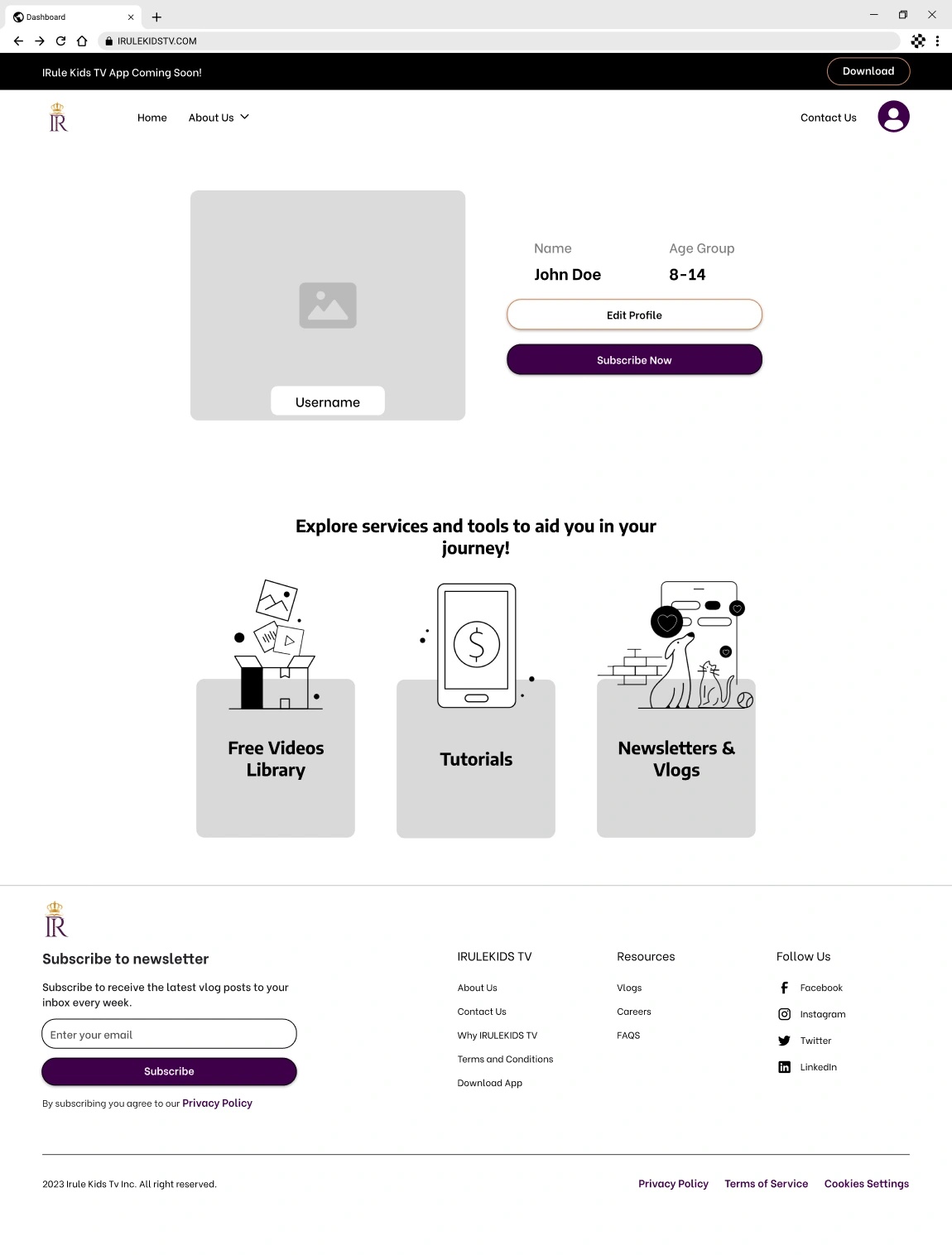
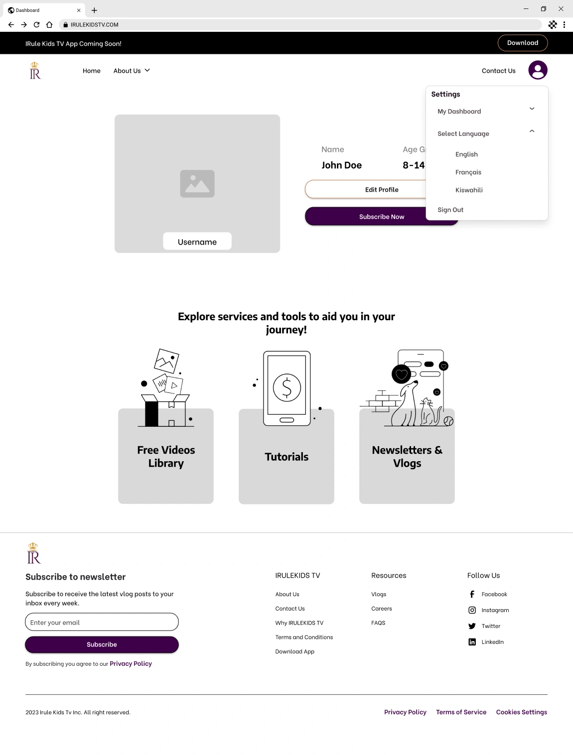
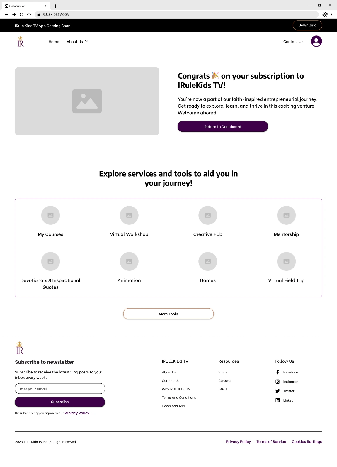
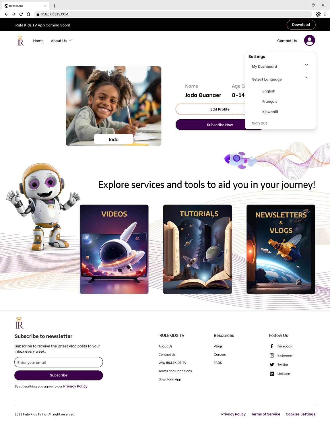
Team members continued working on the same flow they had previously assigned to develop the Low and Medium Fidelity Wireframes. My responsibilities included designing low-fi and med-fi screens for the Home Page Settings and the Dashboard Setting within user flow 3.
Settings: As part of my exploration into design best practices and inspirational layouts, I thoroughly analyzed the website and user account settings. This analysis allowed me to identify the different layout options to facilitate a more seamless and enjoyable user experience. As a result, I introduced a dropdown feature to both the home page and user dashboard, providing users with greater convenience and ease of use.
Accessibility: To design an accessible language setting, it was crucial to identify where users typically expect to find these features. I researched the best practices for icon use in language settings and selected a recognizable icon that users can quickly identify. Ensuring the icon was placed consistently was essential, providing a user-centric design.
Design
UI Inspirations
During our competitor analysis, we gained several key design features and elements that offered valuable insights for enhancing the platform user experience and engagement.
Navigation & Transitions: BizKids
Minimalistic Design: The BizKids website uses a compact and playful navigation bar that accentuates the hero section.
Fluidity: Smooth transitions between sections ensure an uninterrupted user journey.
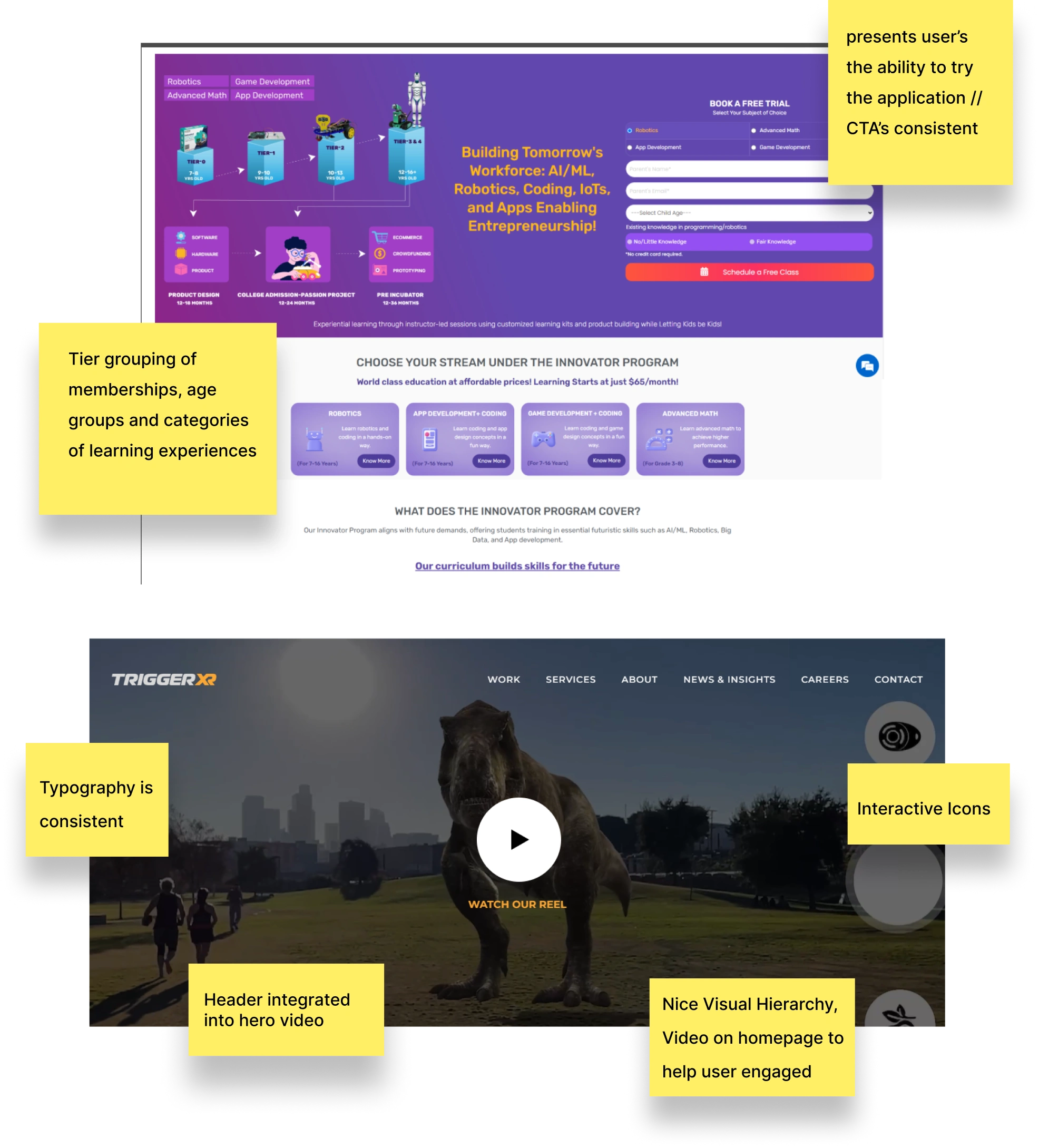
Visual Elements: TriggerXR
Dynamic Backgrounds: Incorporating backgrounds featuring illustrations and soft shadows adds depth and liveliness to the design.
Interactive Visuals: Video inclusions, as seen on the TriggerXR website, and interactive icons can significantly enhance user engagement.
Content Organization & Presentation: Moonpreneurs
Tiered Structure: The learning platform of Moonpreneurs showcases a clear tier grouping of memberships, age groups, and learning experiences.
Engaging CTAs: Consistent and compelling call-to-action buttons guide user interactions.
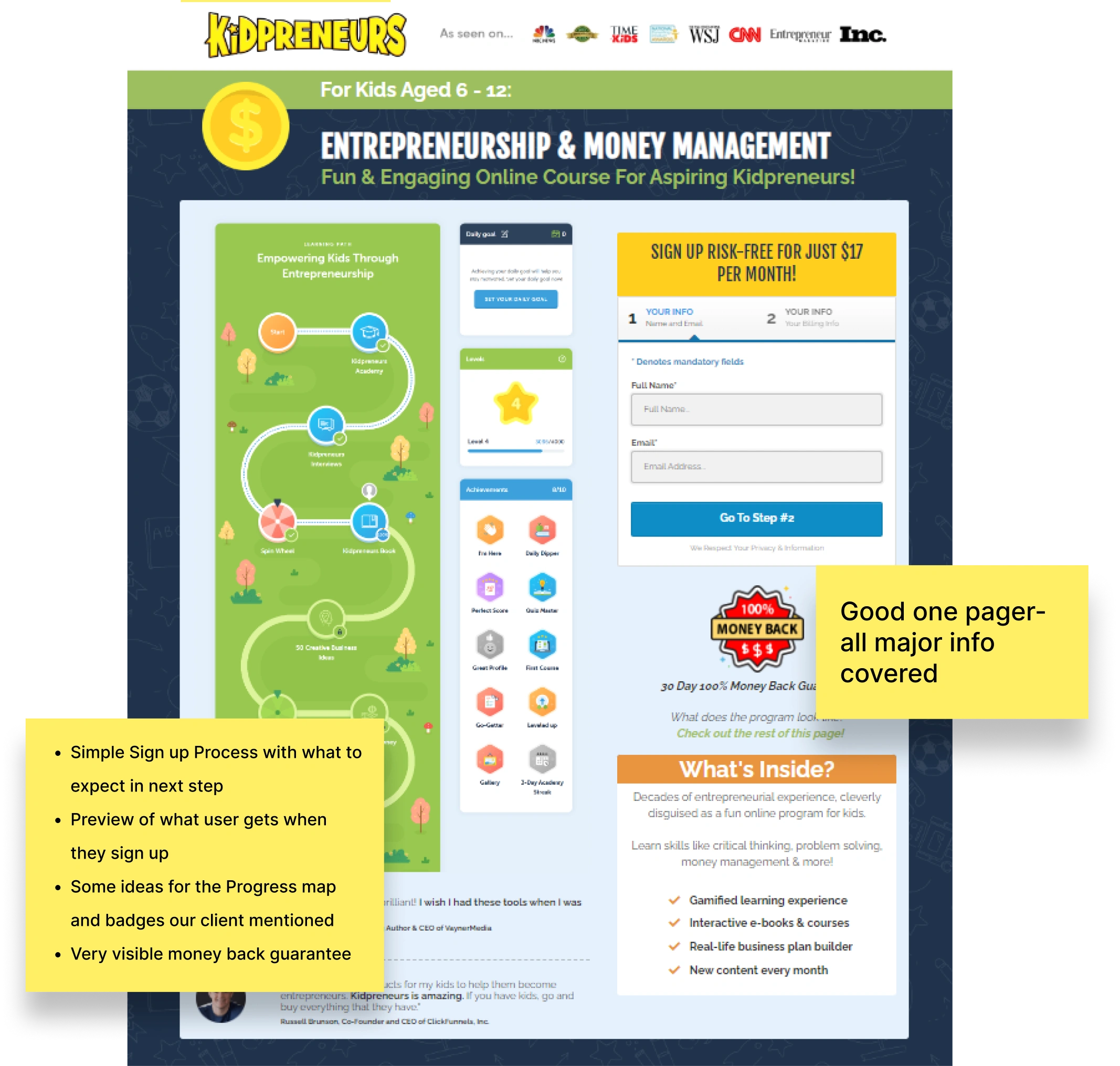
User Interaction: Kidpreneurs
Transparent Sign-Up Process: The Kidpreneurs site offers a straightforward sign-up process, providing users with clear expectations.
Trust Indicators: Prominent visibility of guarantees, like the money-back offer, can foster user trust and confidence.
Biz Kids
Kidpreneurs
Moonpreneurs | Trigger XR
Color Exploration
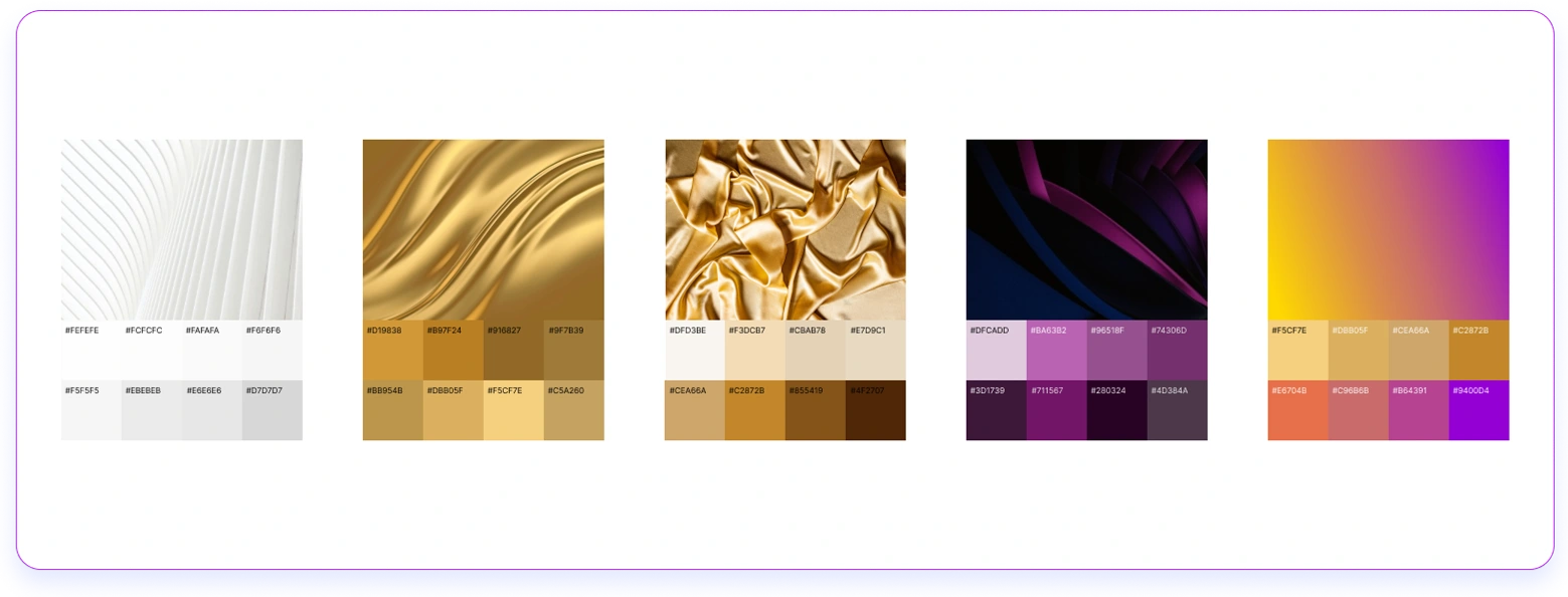
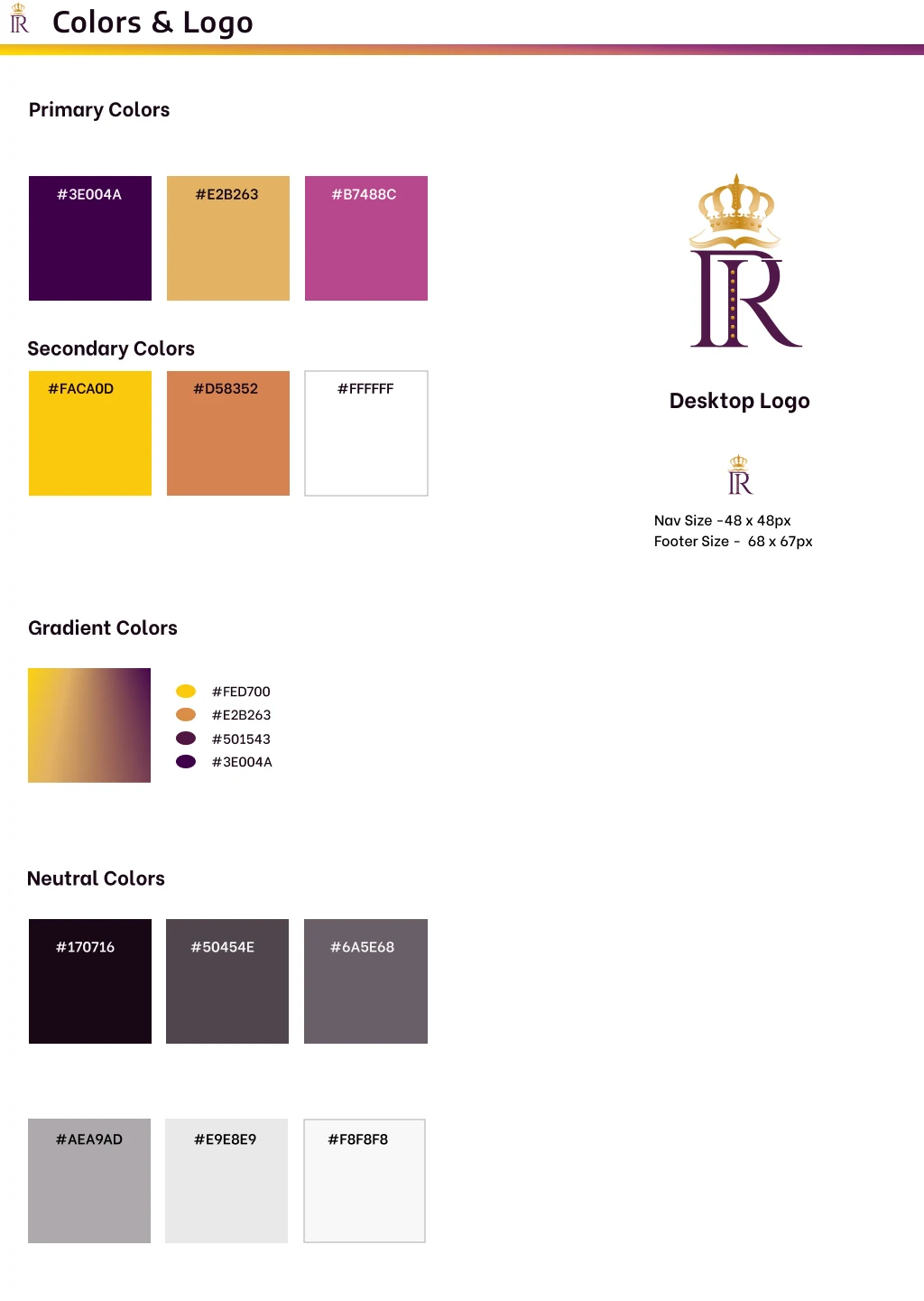
During our effort to finalize a color scheme, our client expressed their fondness for "dark purple and gold," associated with the regal colors mentioned in biblical narratives. Our team created a variety of color options, which led us to agree on the desired shades. To balance out the richness of the chosen hues, we added elements of darker visuals, hints of white, and distinct icons, resulting in a cohesive UI palette.
Color Inspirations
UI Iterations
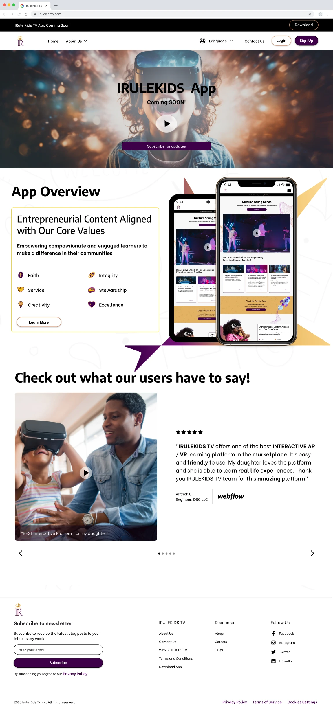
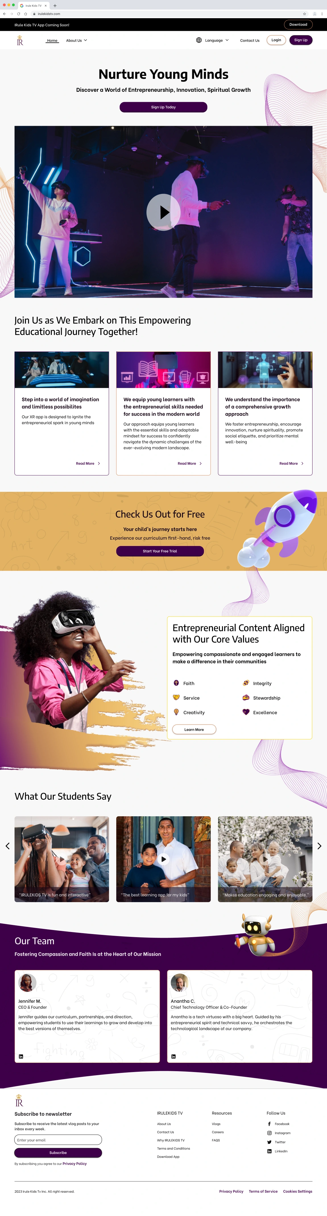
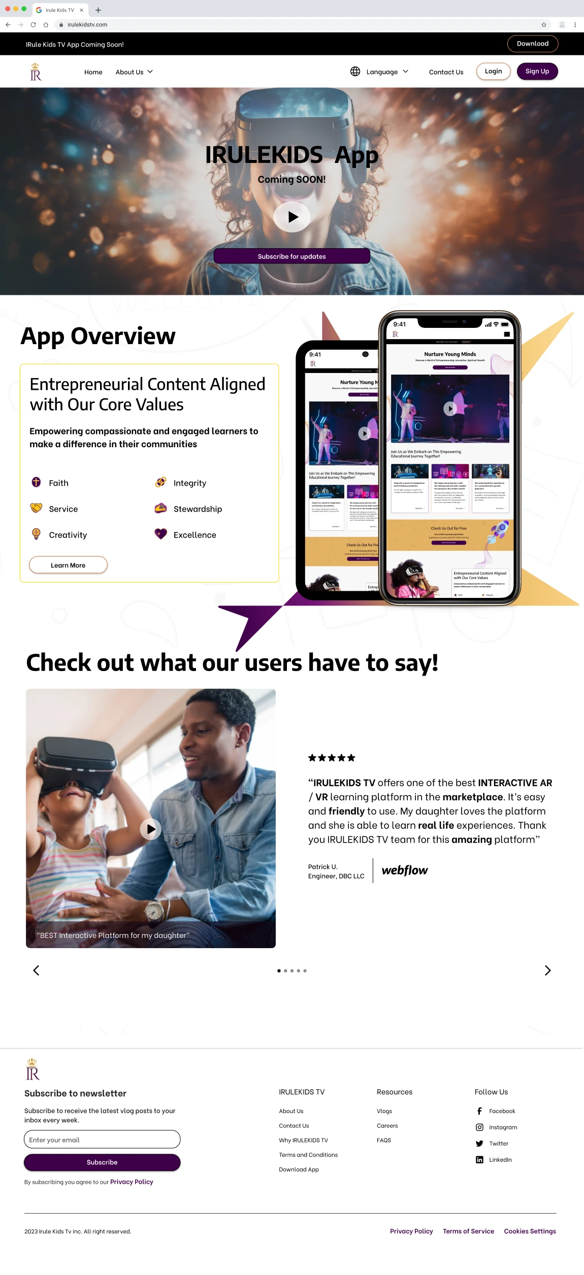
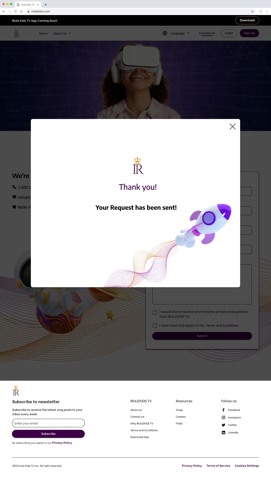
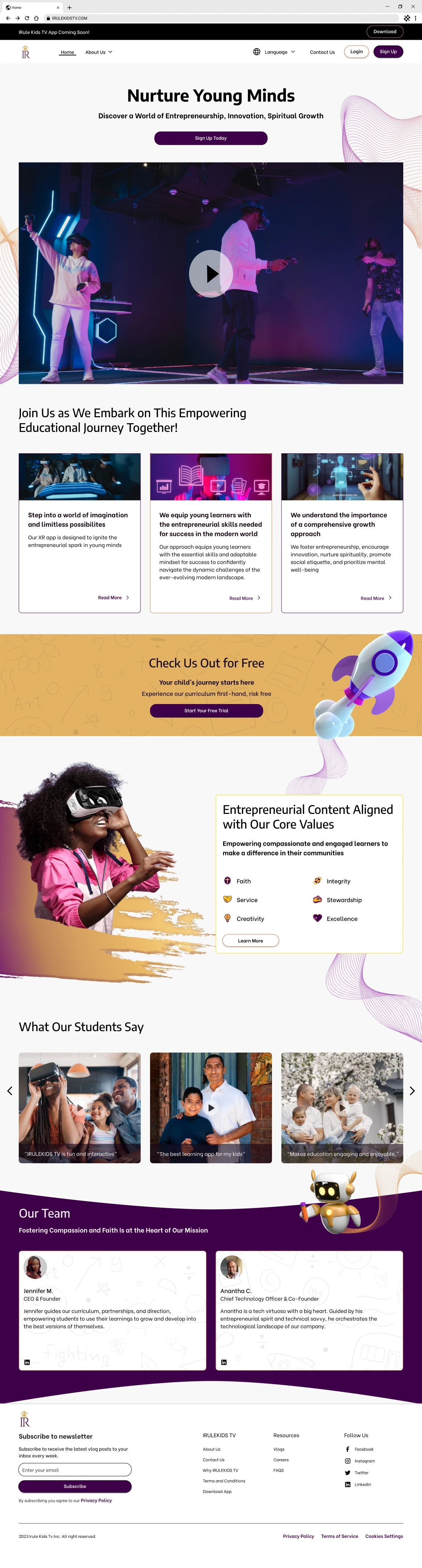
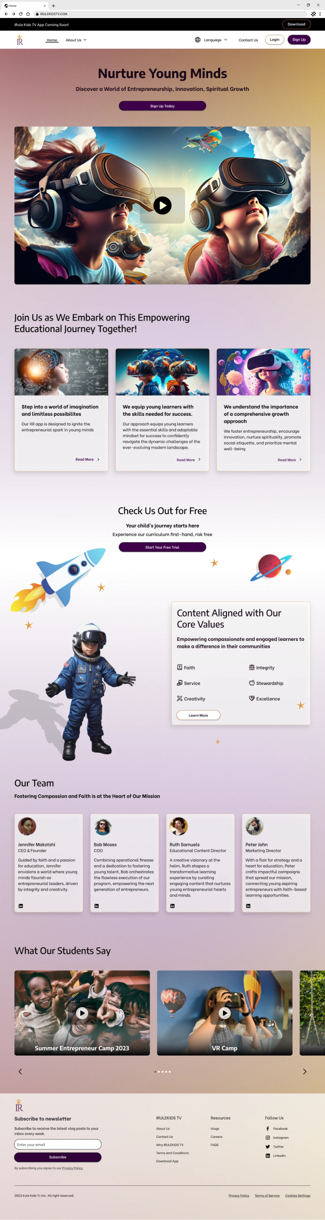
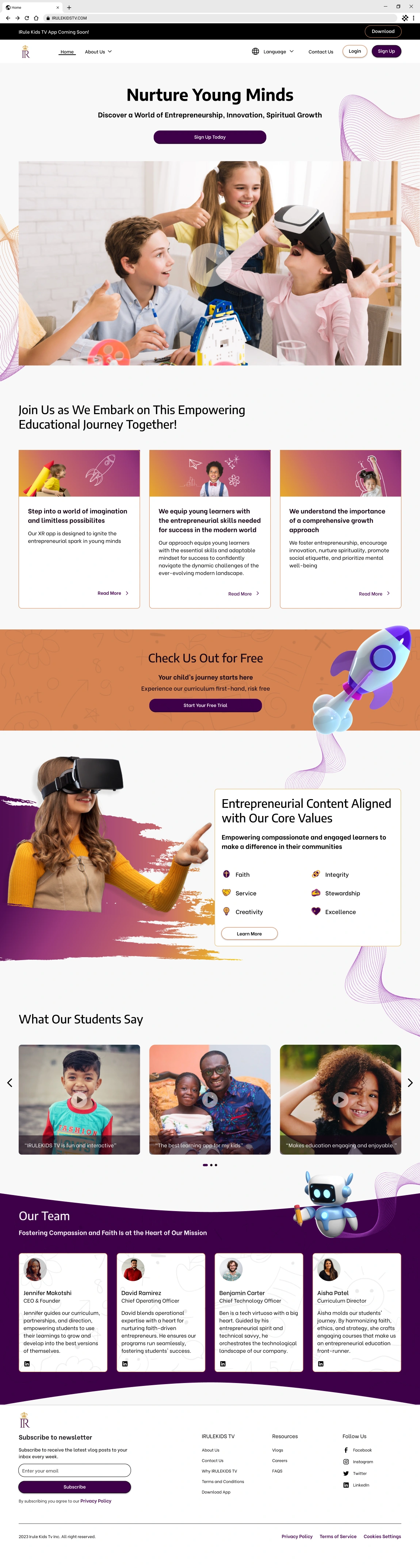
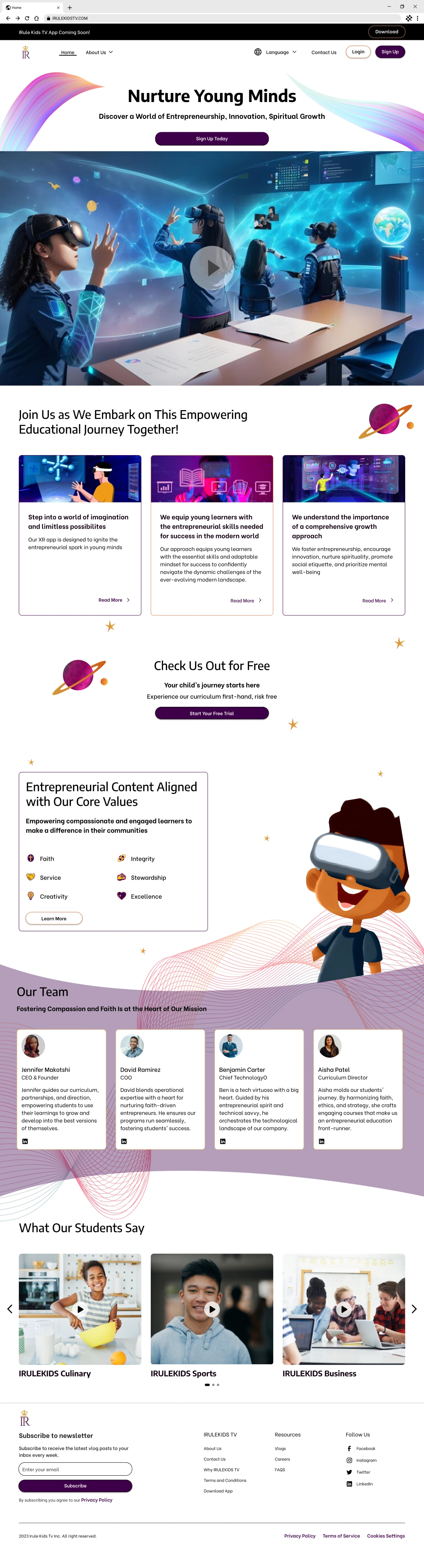
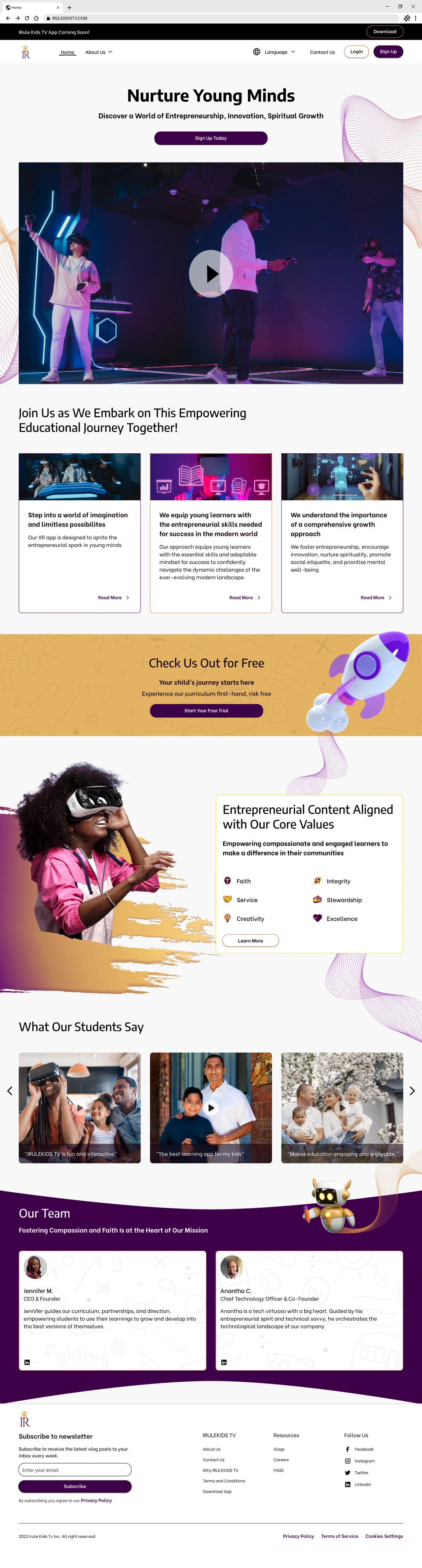
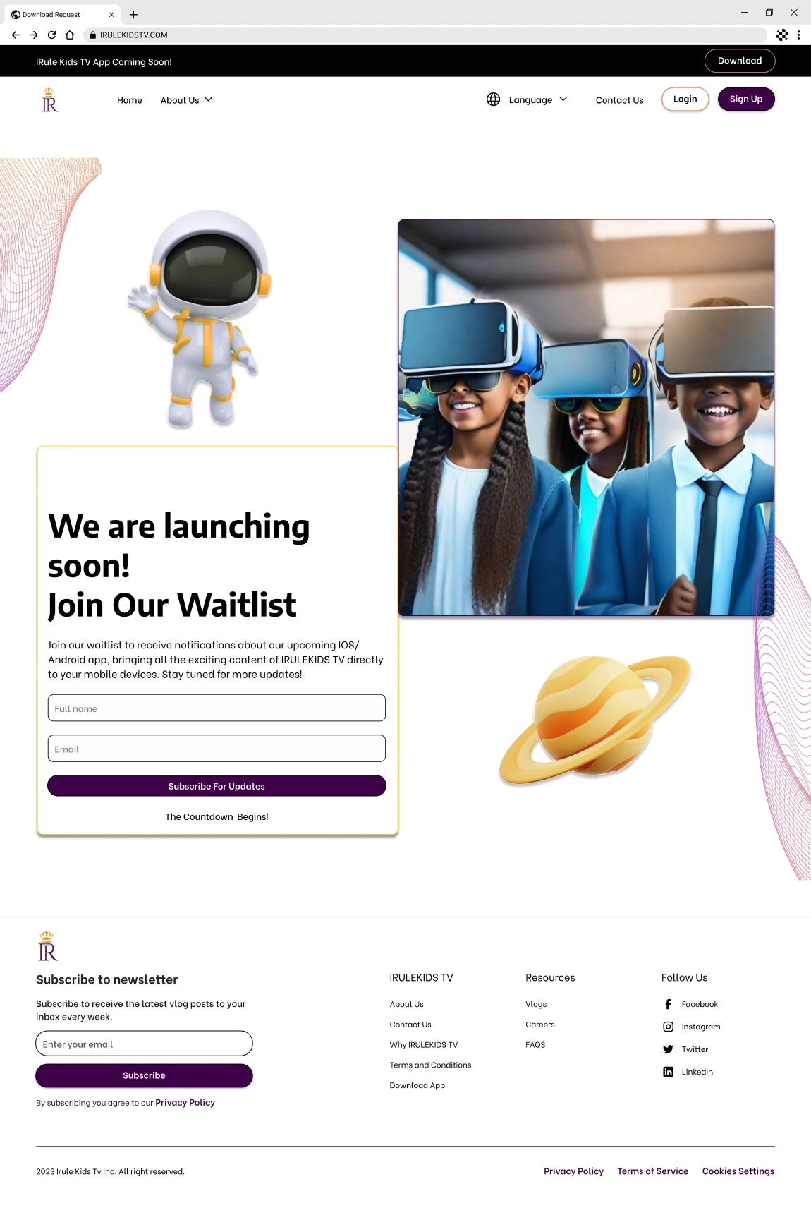
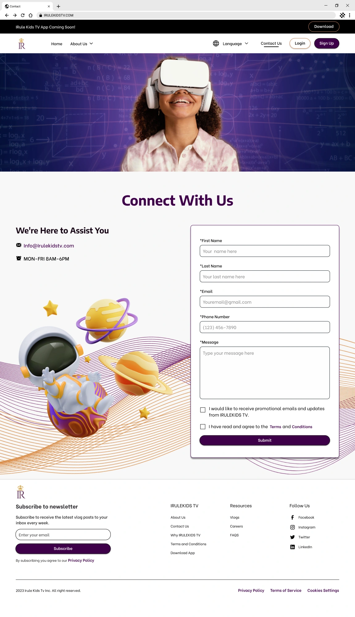
Our team joined in pairs to craft the home screen iteration during the design phase. Each pair presented a unique design for the client to choose from. Collaborating with my partner, we embraced a gradient background enriched with 3D visuals, AI-generated artwork, and genuine photographs, delivering a mesmerizing, forward-thinking ambiance. Conversely, other team members opted for designs featuring whimsical, child-centric icons against solid backdrops.
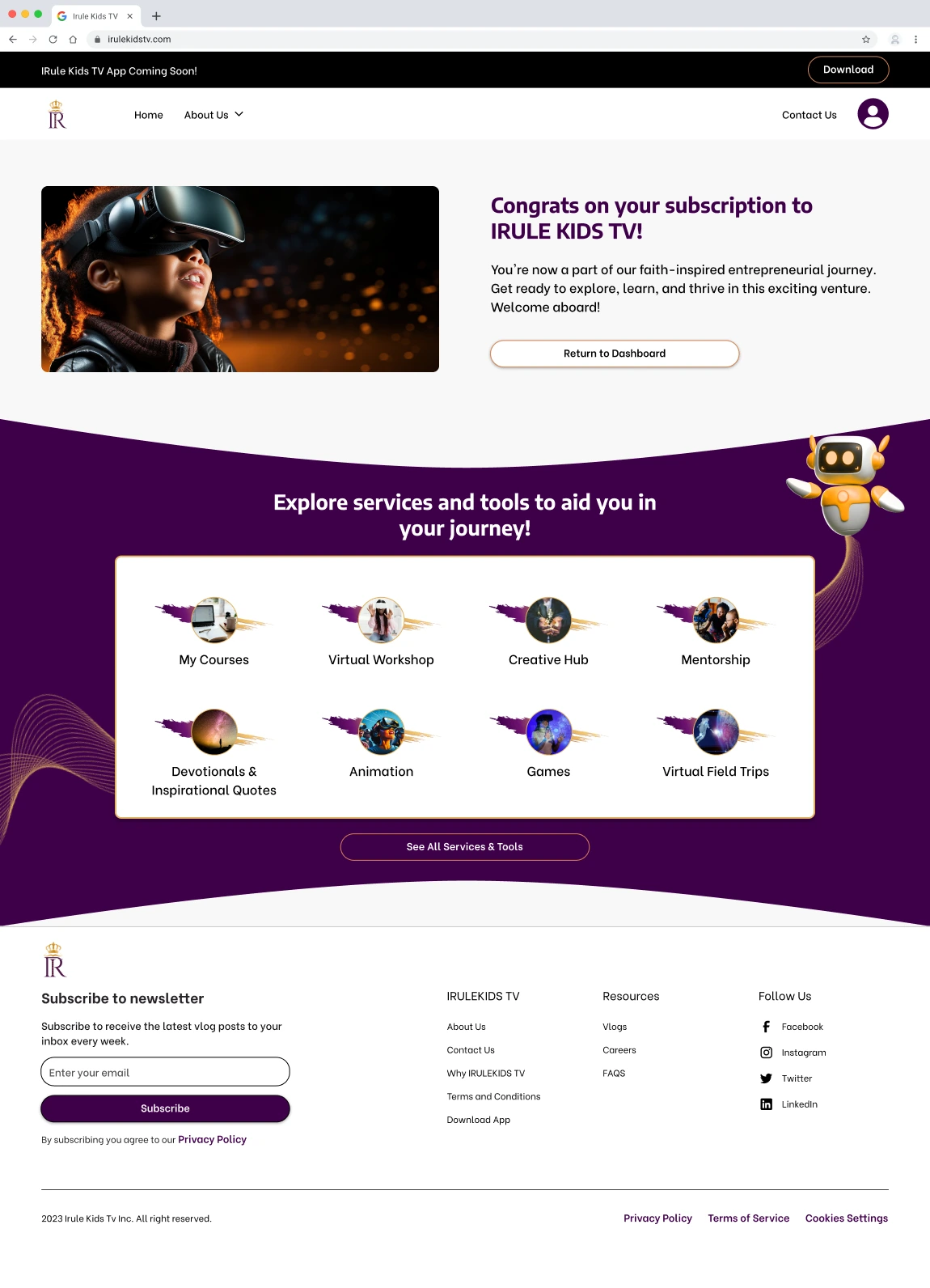
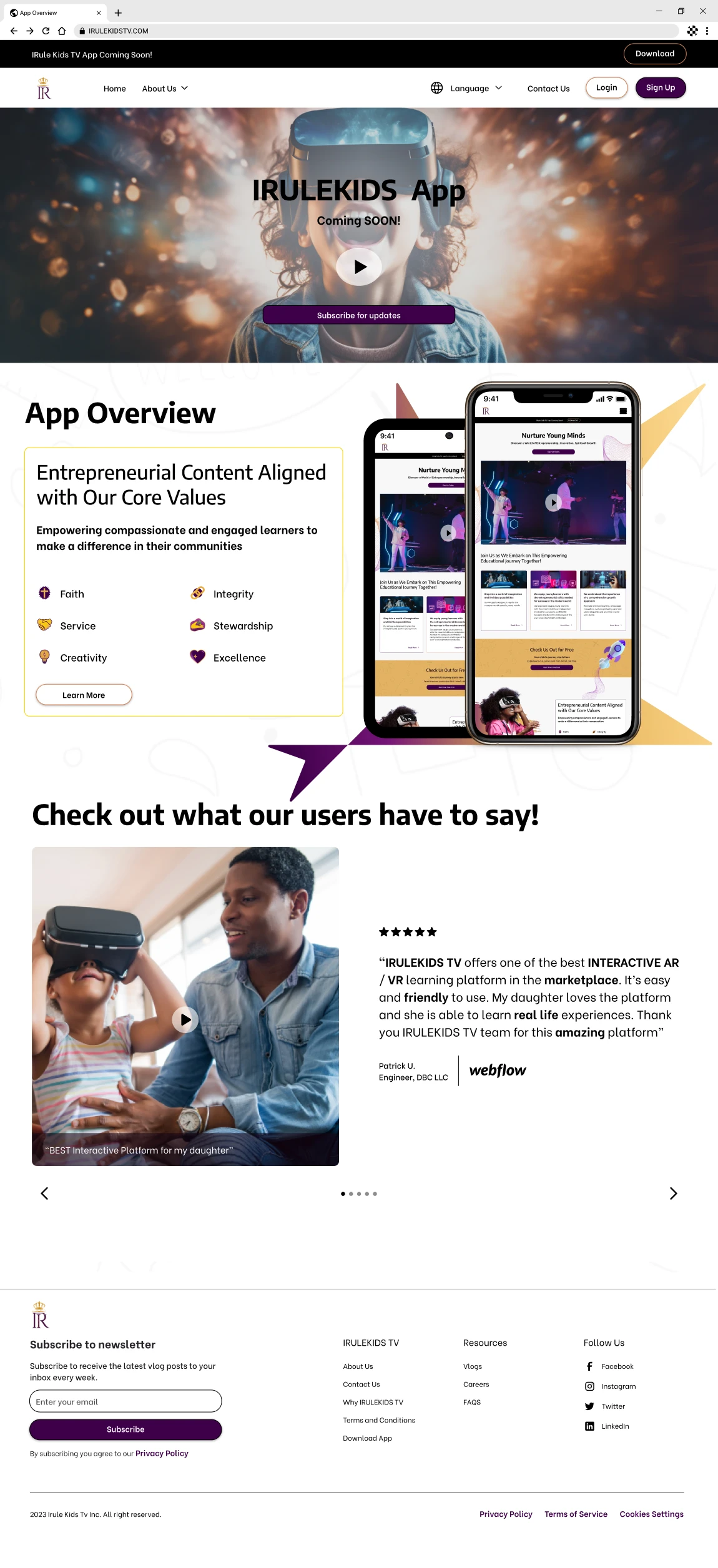
Upon assessment, the client leaned towards designs with vibrant backgrounds incorporating real-life images, believing they would better connect with families, particularly parents. Nevertheless, they valued the innovative touch of AI-driven photos and the depth offered by the 3D components seen in the other iterations. In response, we incorporated these admired features into the preferred design, producing a final rendition that was visually striking and aligned seamlessly with the client's vision.
The first screen below was the preferred iteration.
Style Guide
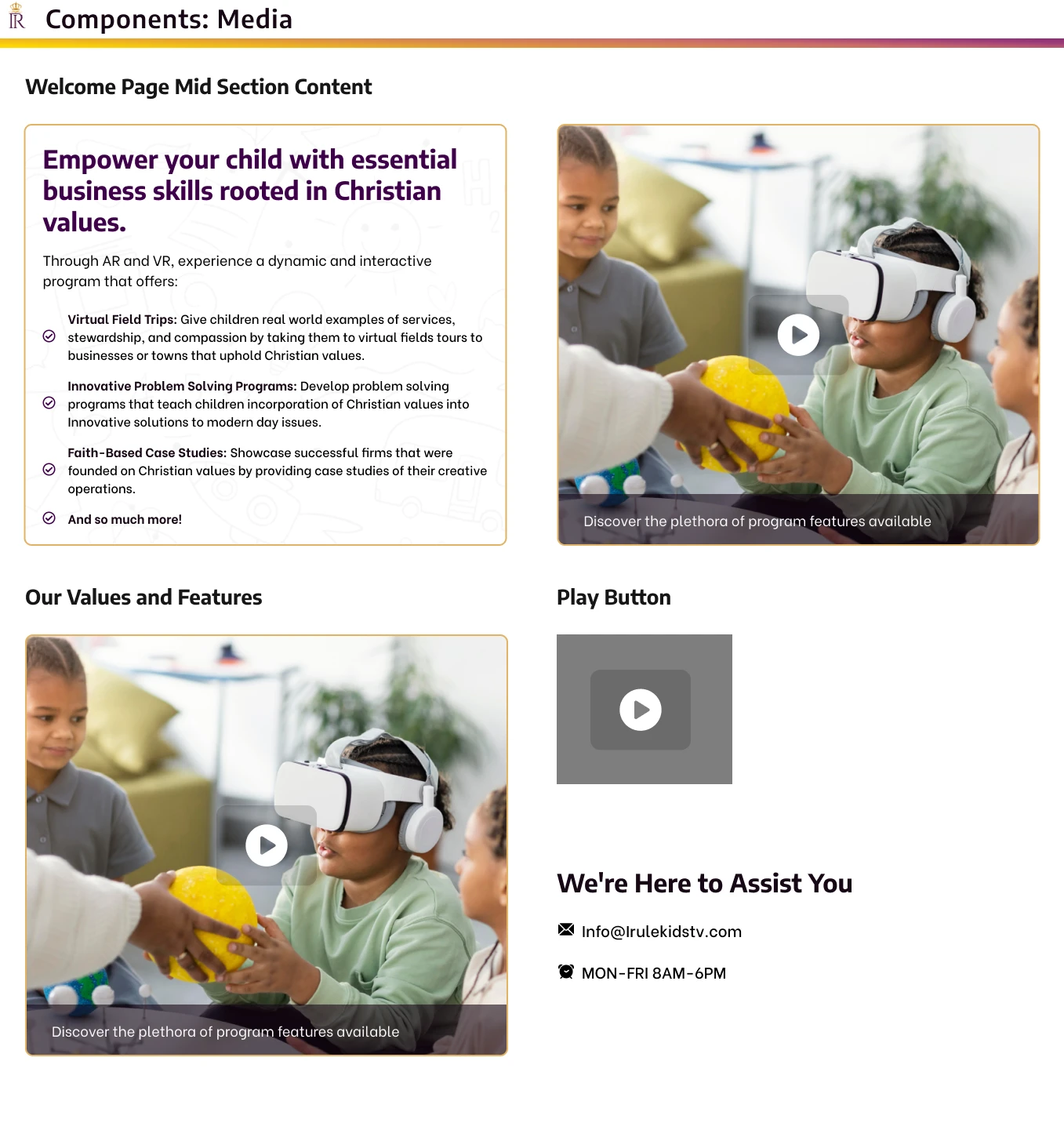
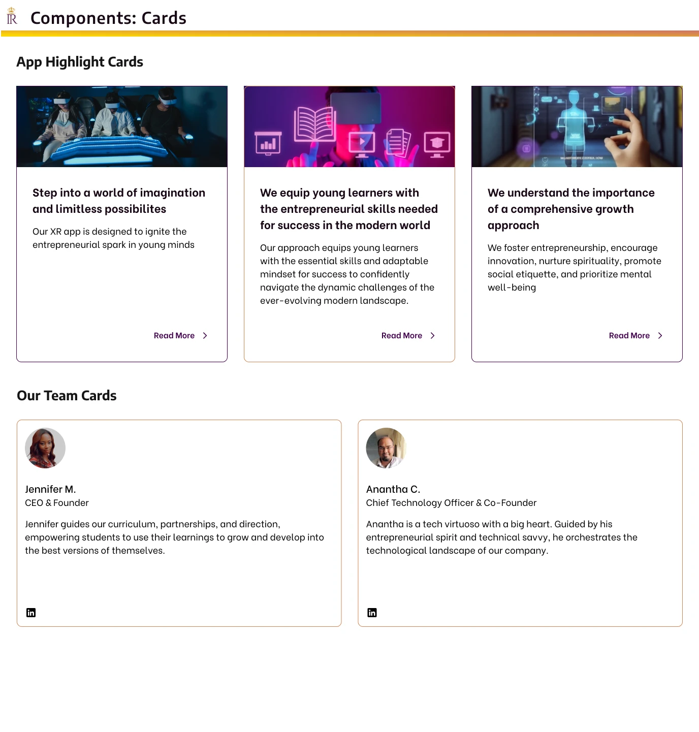
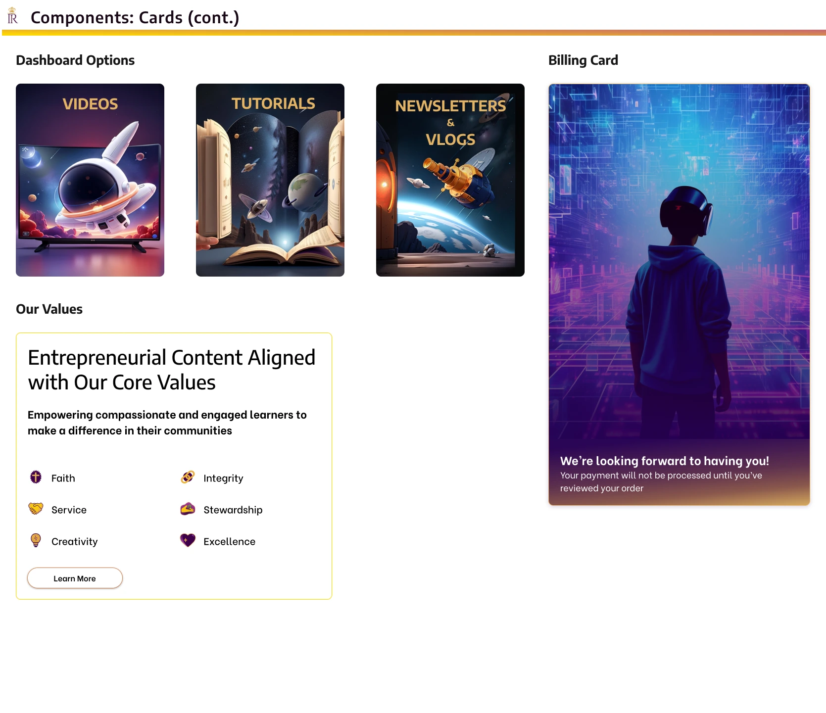
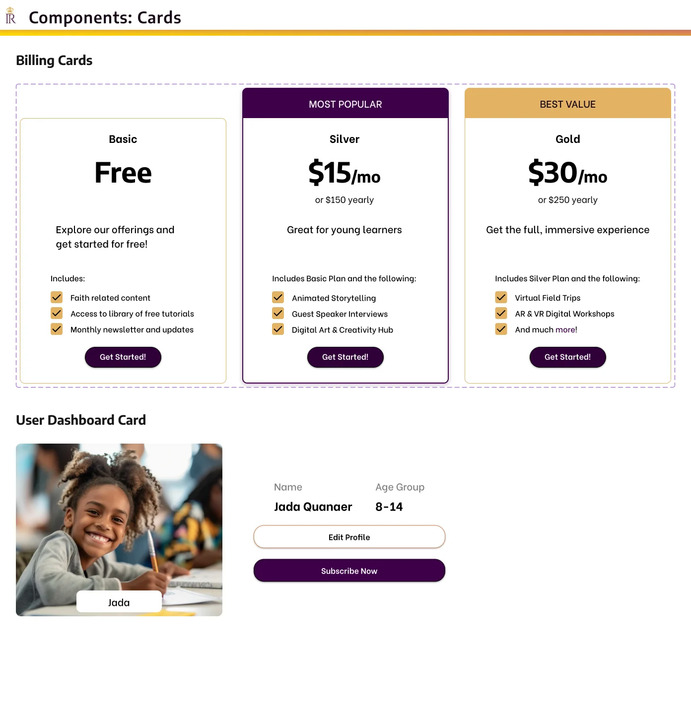
The team and I created a detailed style guide, drawing insights from our earlier color experiments. Taking cues from the client's logo and provided materials, we tailored a color scheme and font style in sync with the brand's image.
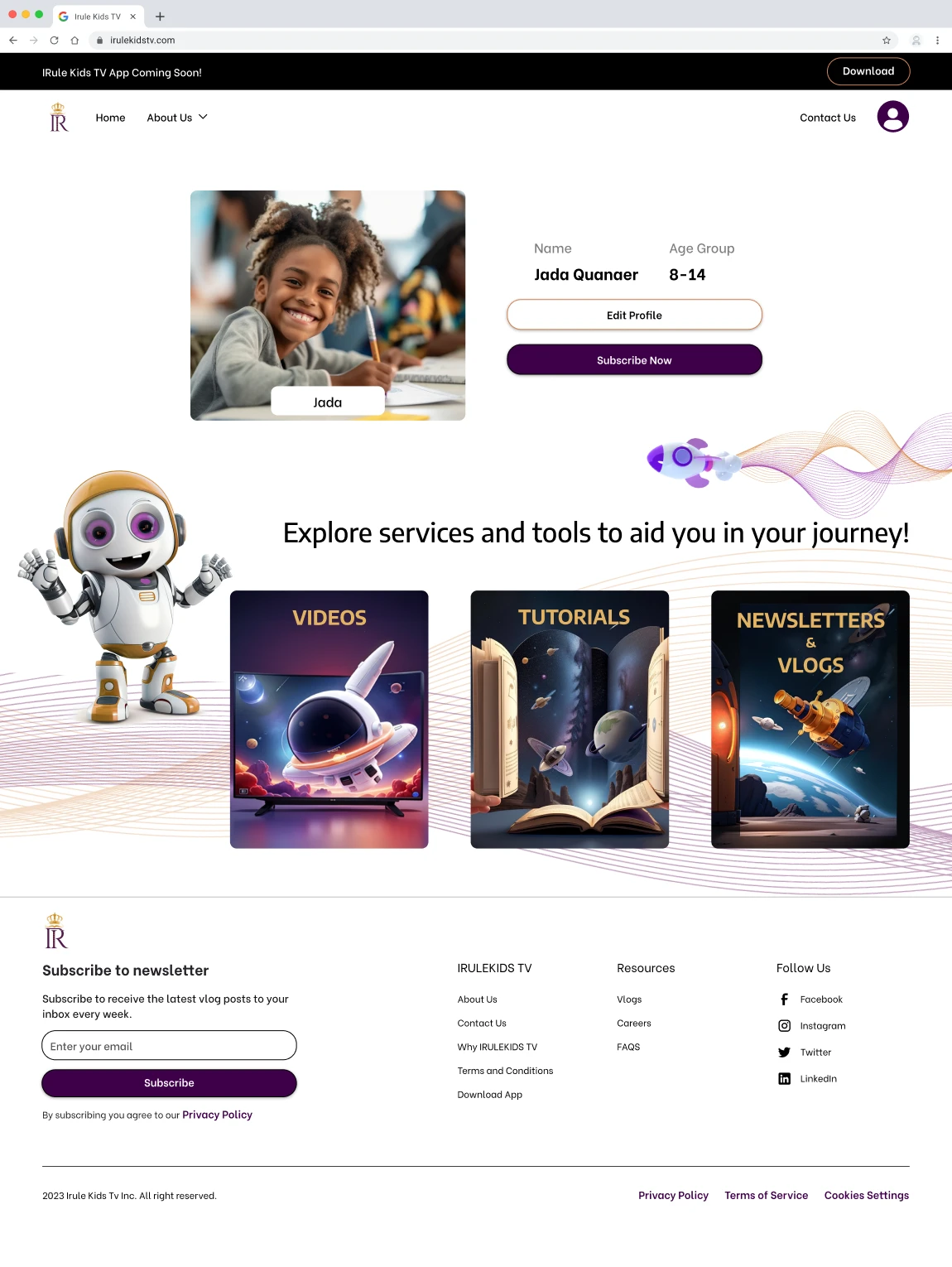
Emphasizing the goal of delivering a futuristic AR and VR journey, we integrated cosmic and forward-thinking characters and designs, blending stock photos with AI-derived visuals. This thoughtful integration balanced cutting-edge technology with values-based learning, enriching the user experience.
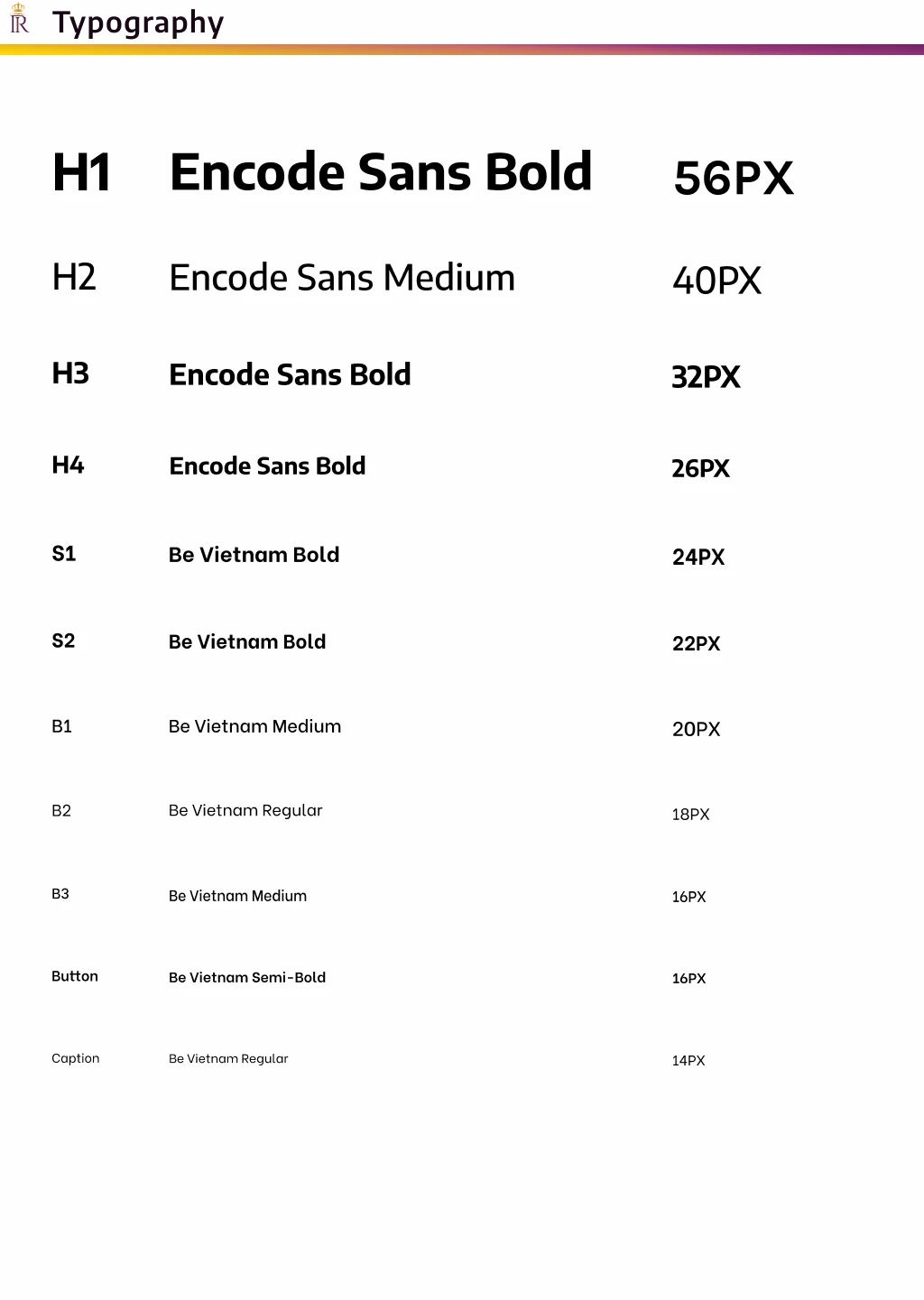
After careful consideration, the team chose Encode Sans for headings H1 through H4 and Be Vietnam for subheadings S1 and S2, as well as for body text B1 to B3, button labels, and captions. These typefaces were selected for their legibility, their aesthetic synergy with the client's branding, and their ability to convey a sleek, professional appearance.
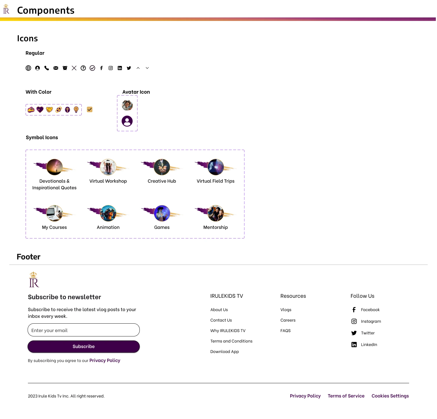
These design methods were consistently applied to buttons, icons, and user interface elements, ensuring brand cohesion and creating a lively and interactive web ambiance. This groundwork guaranteed uniformity in our user interface designs across every display. Our style guide became essential for future iterations.
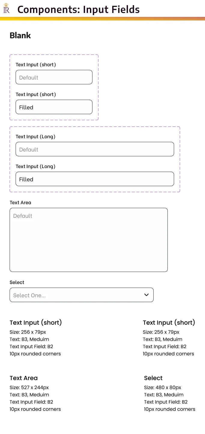
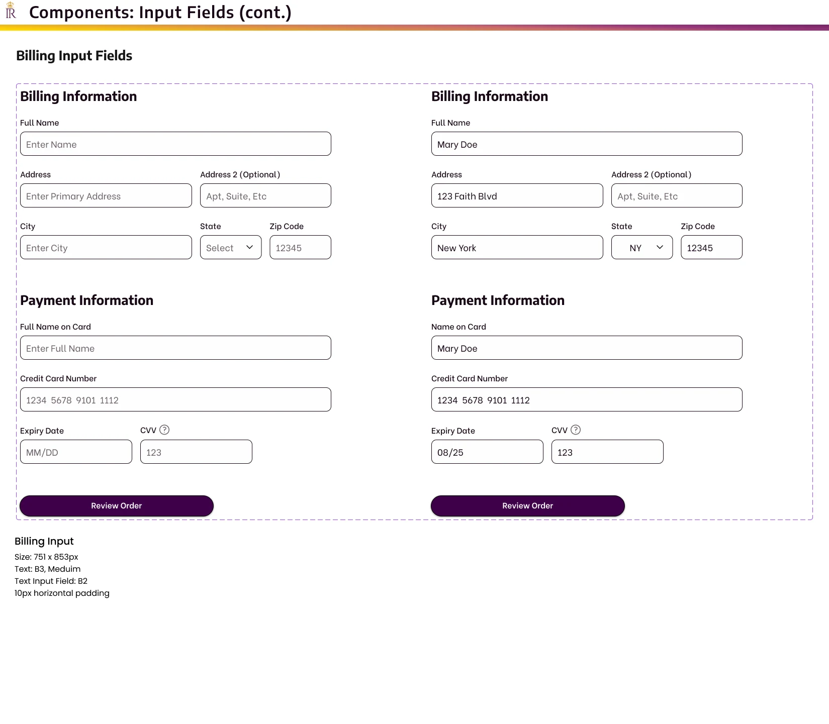
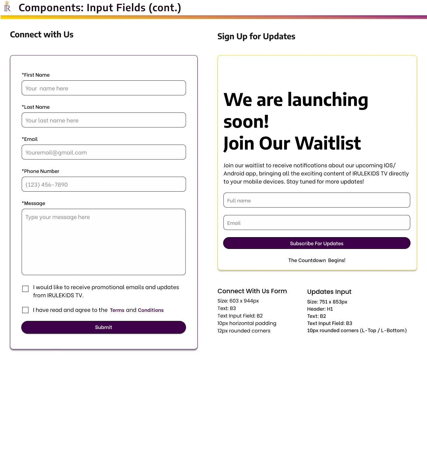
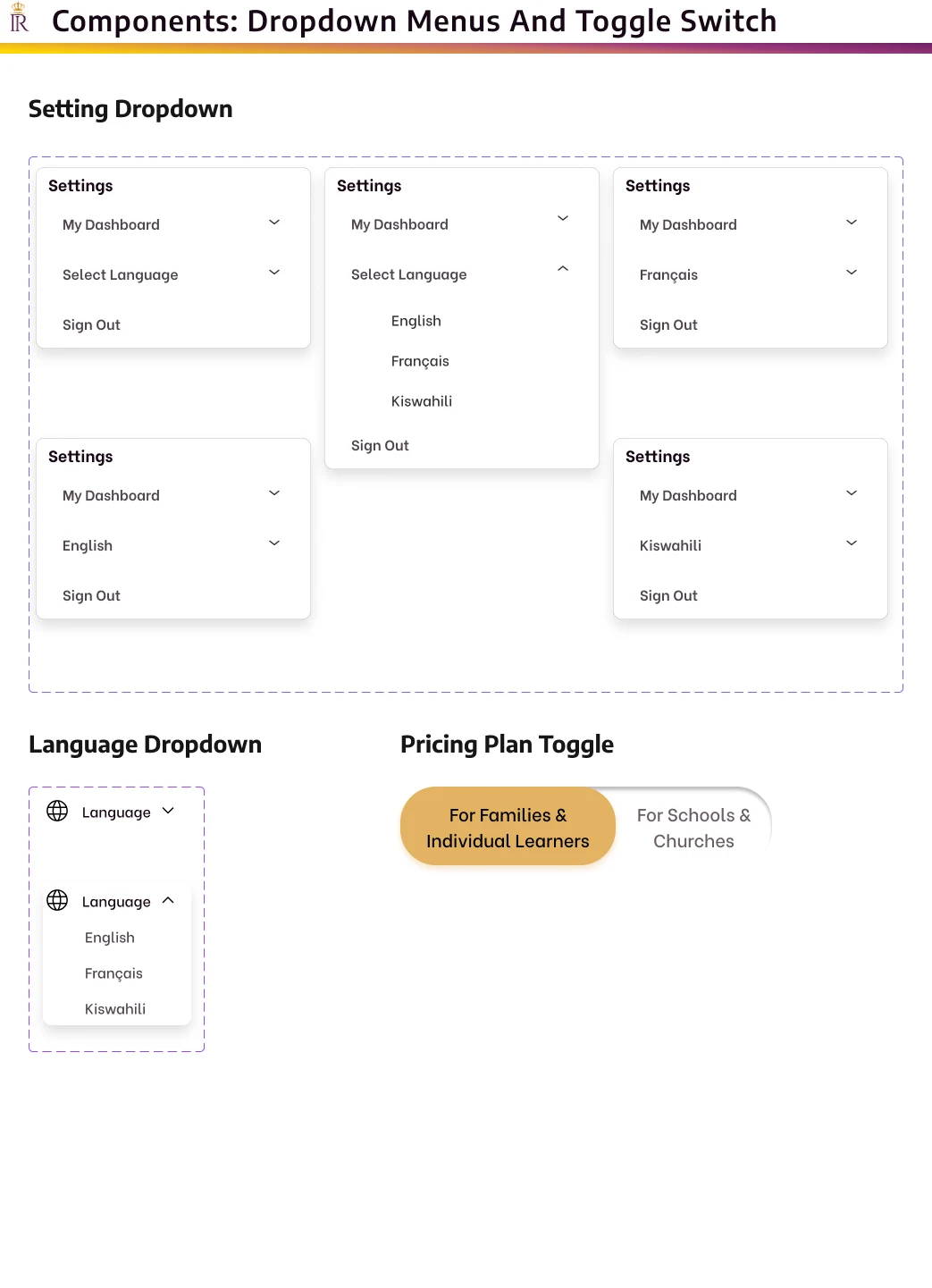
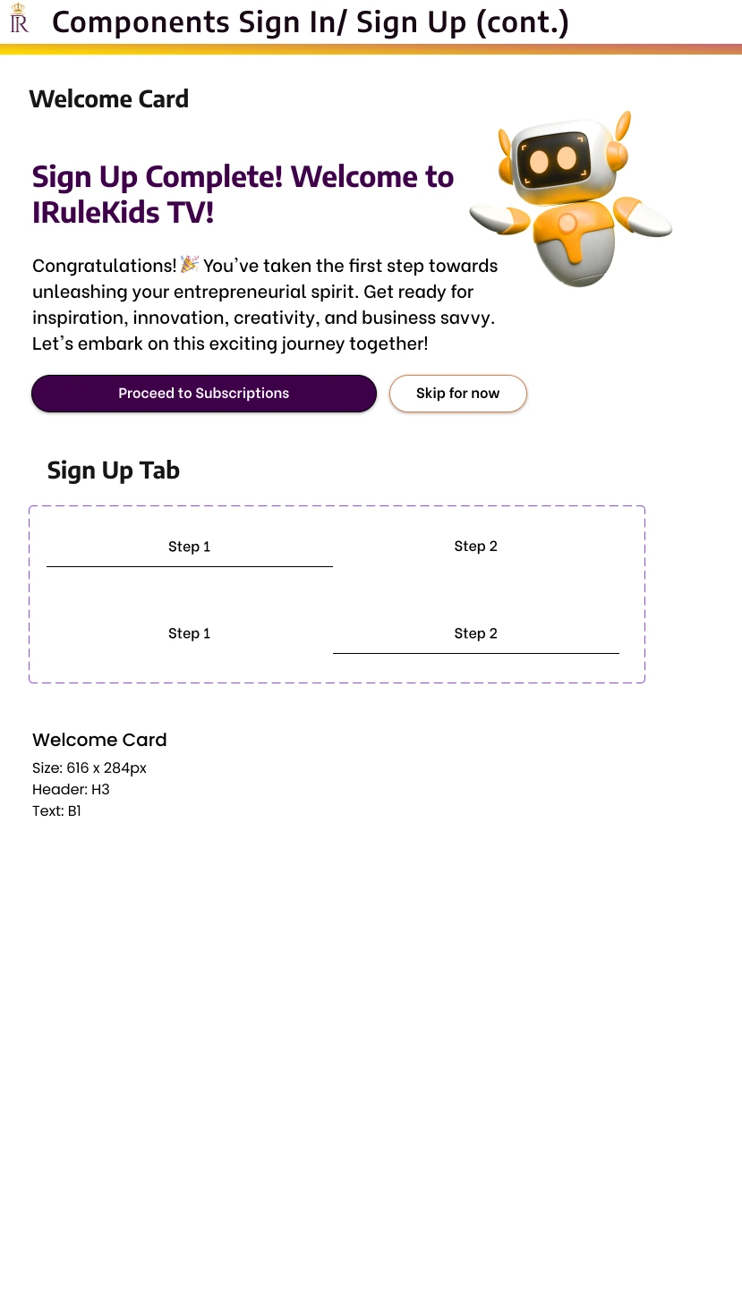
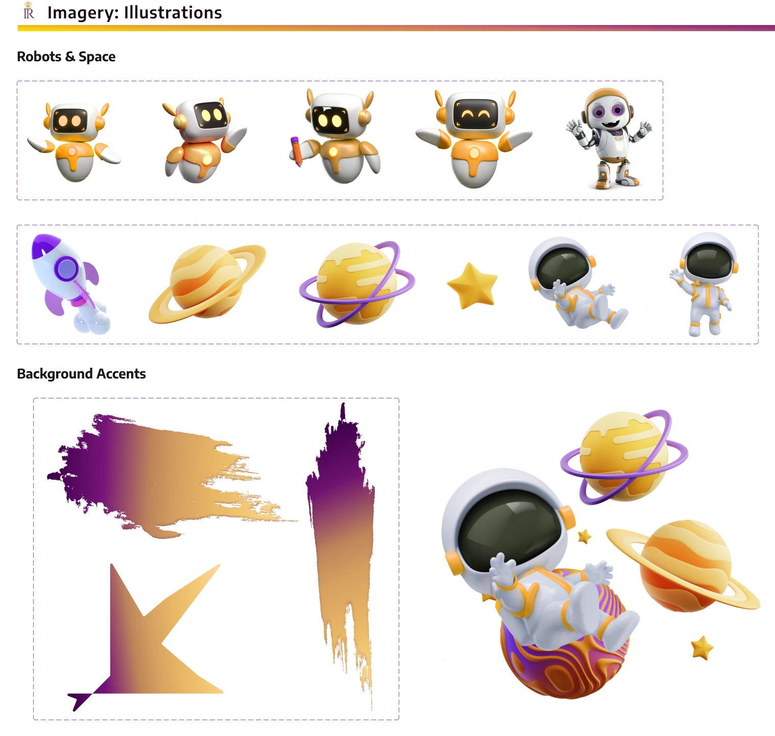
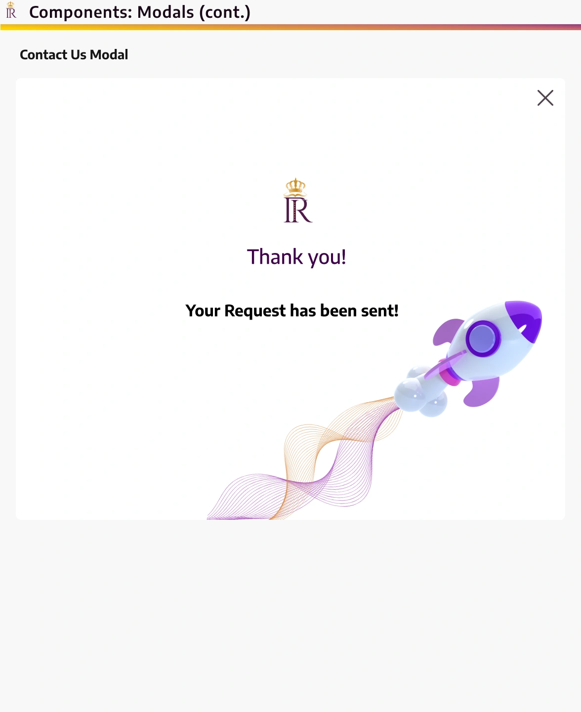
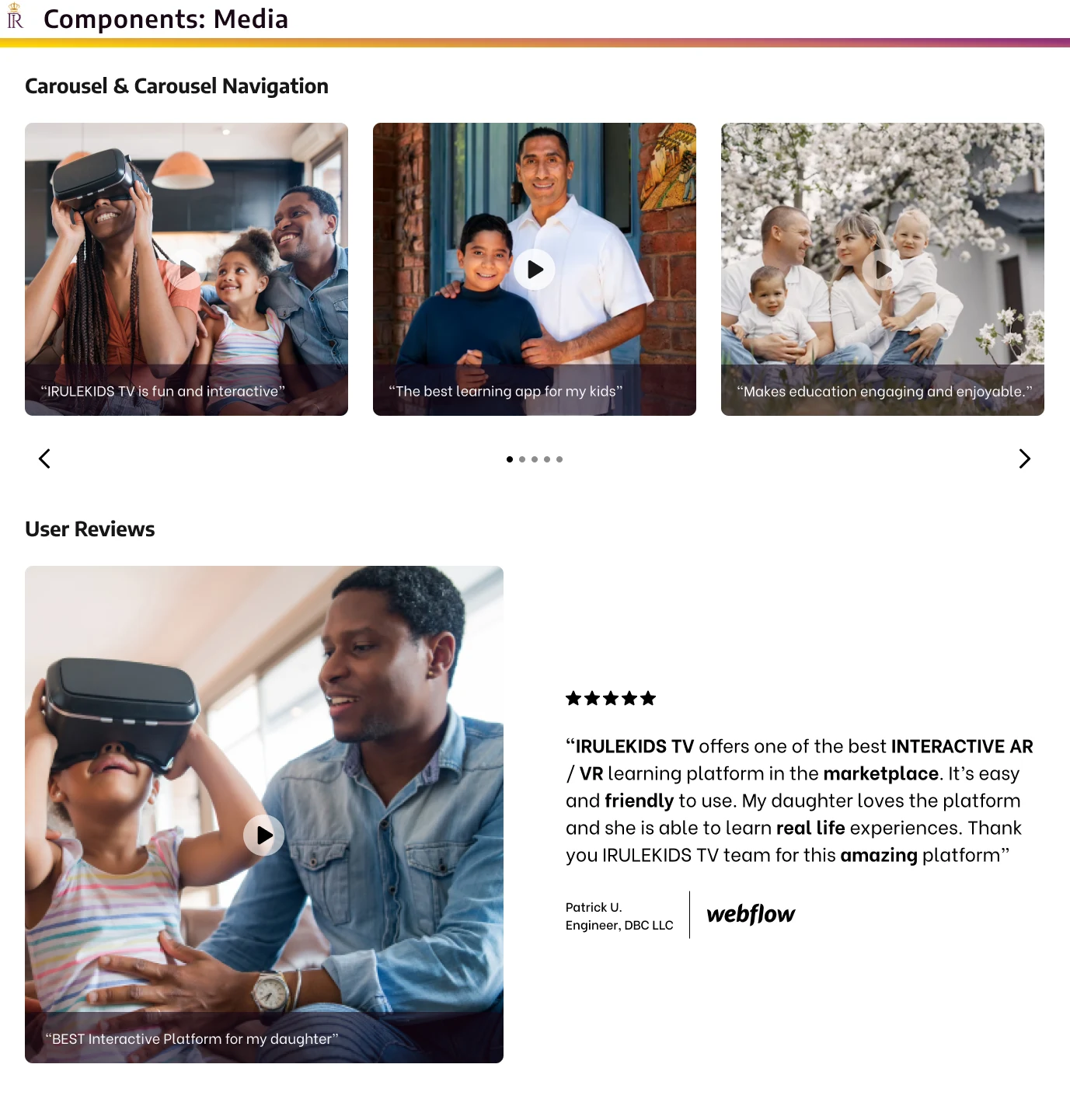
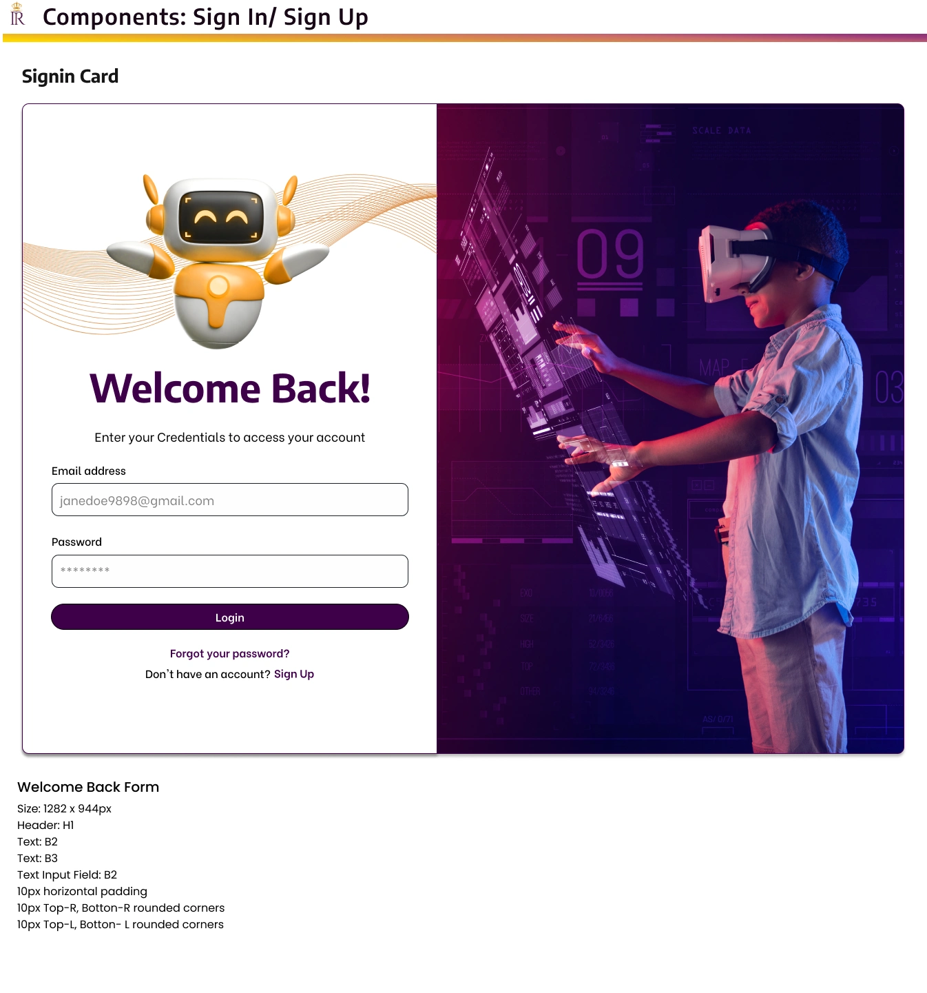
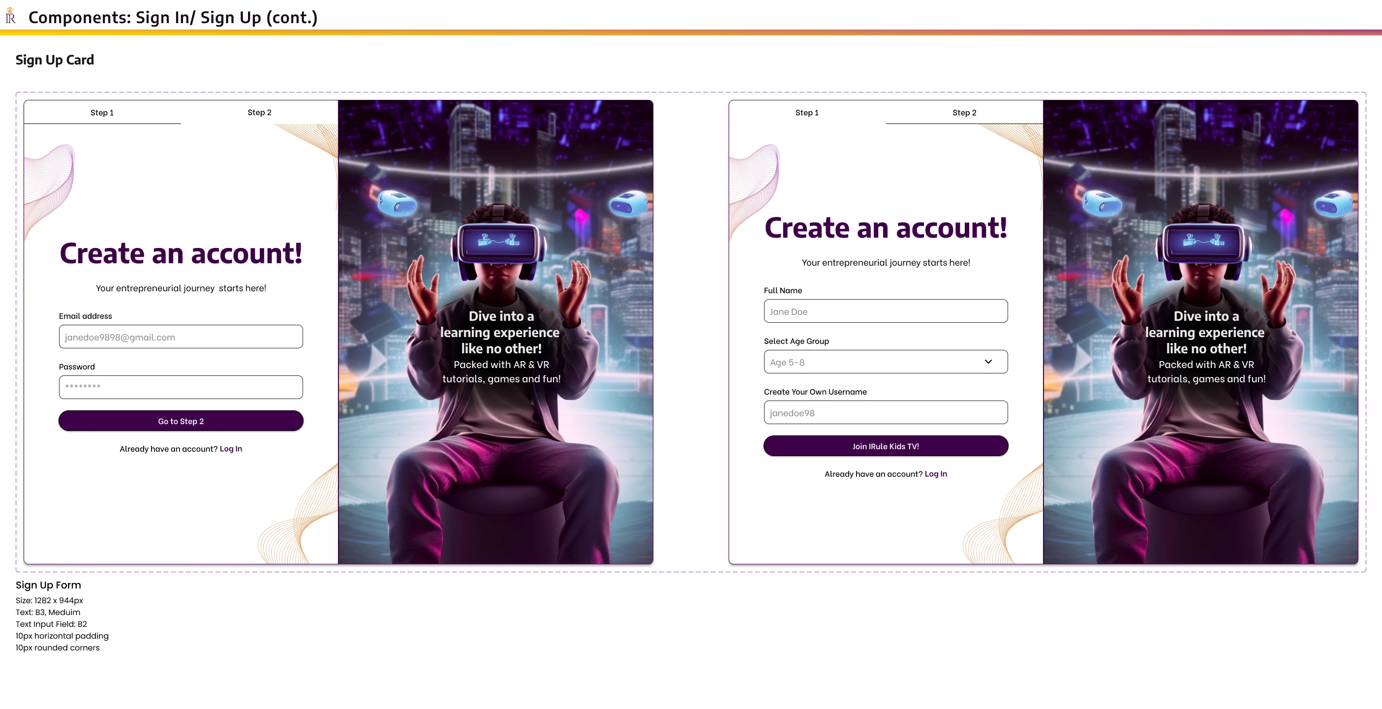
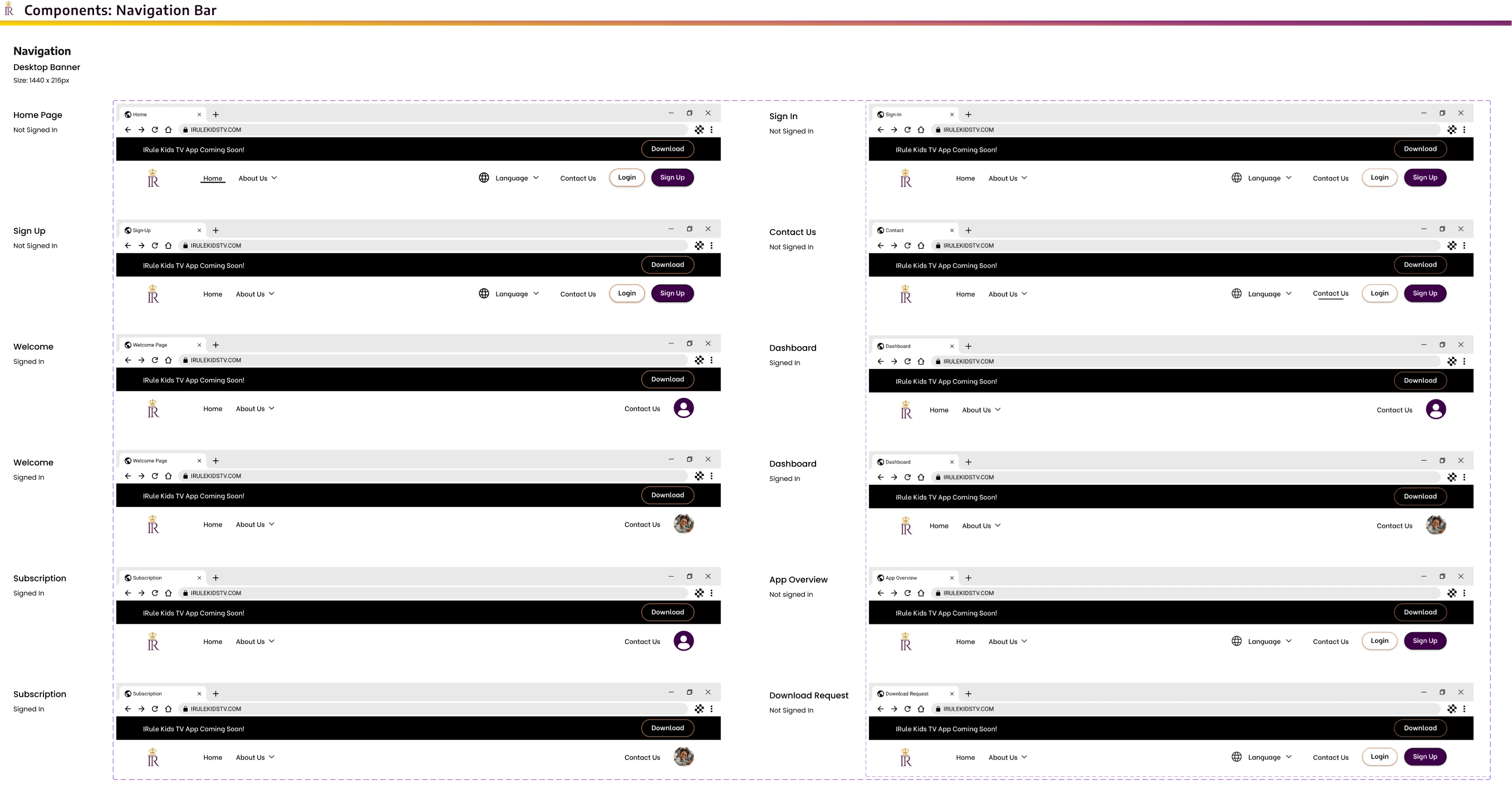
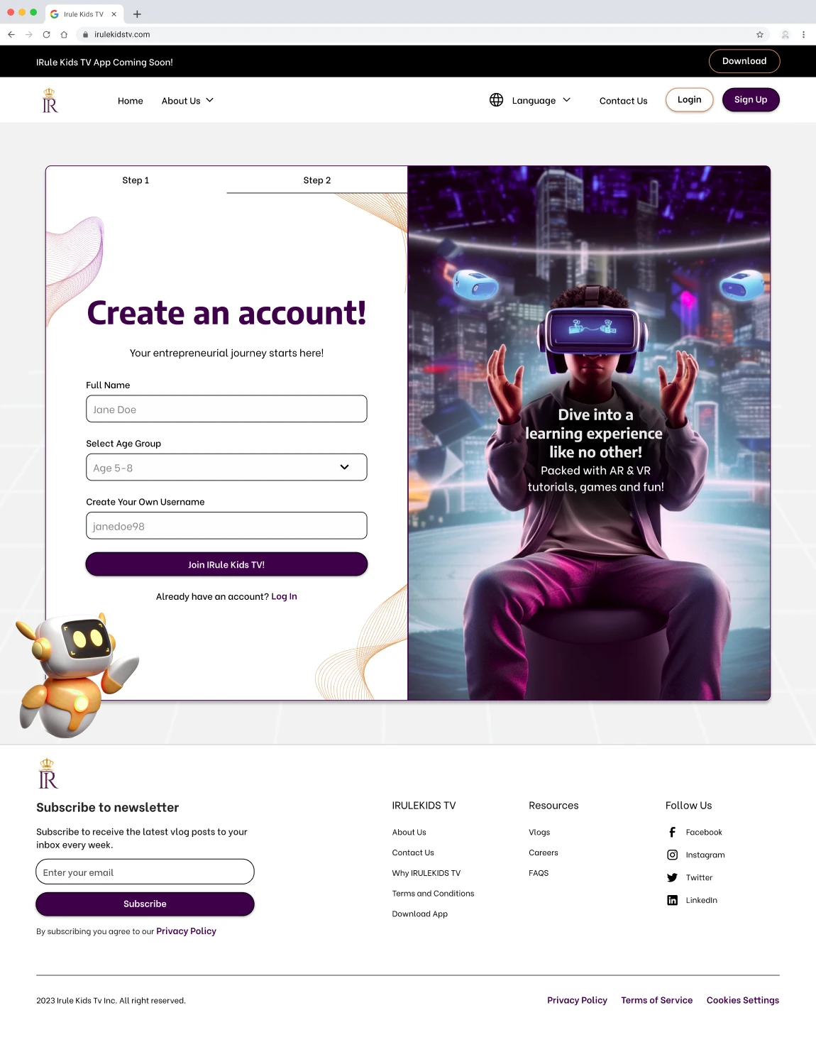
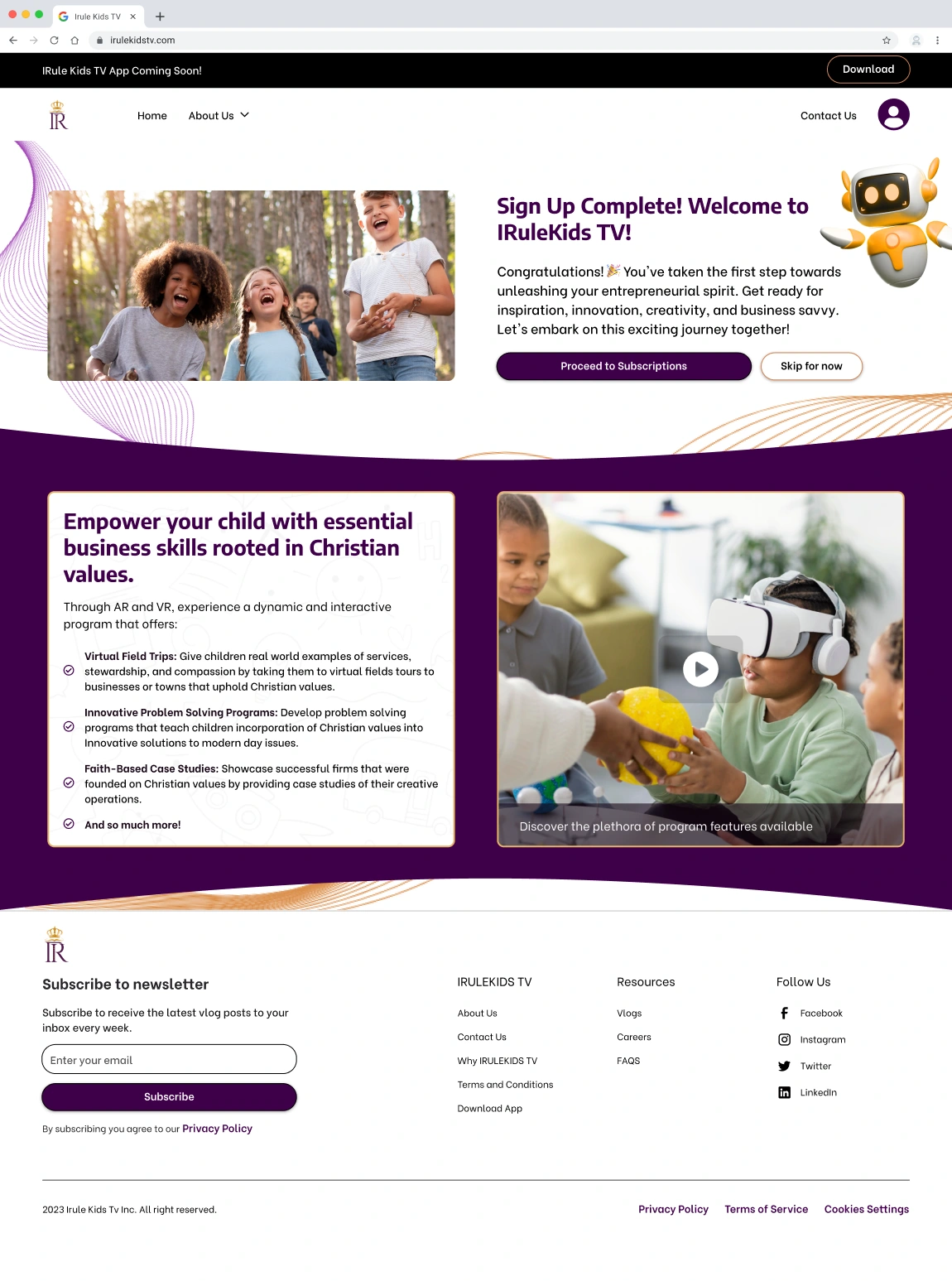
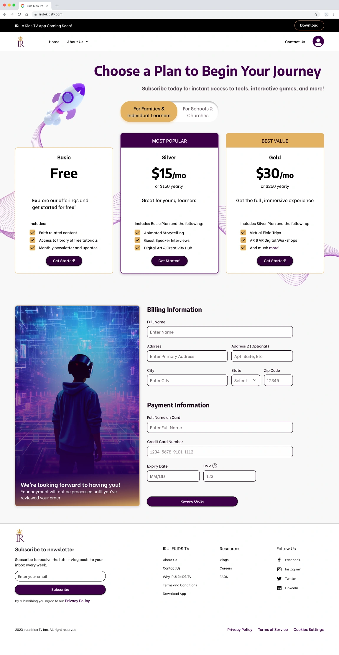
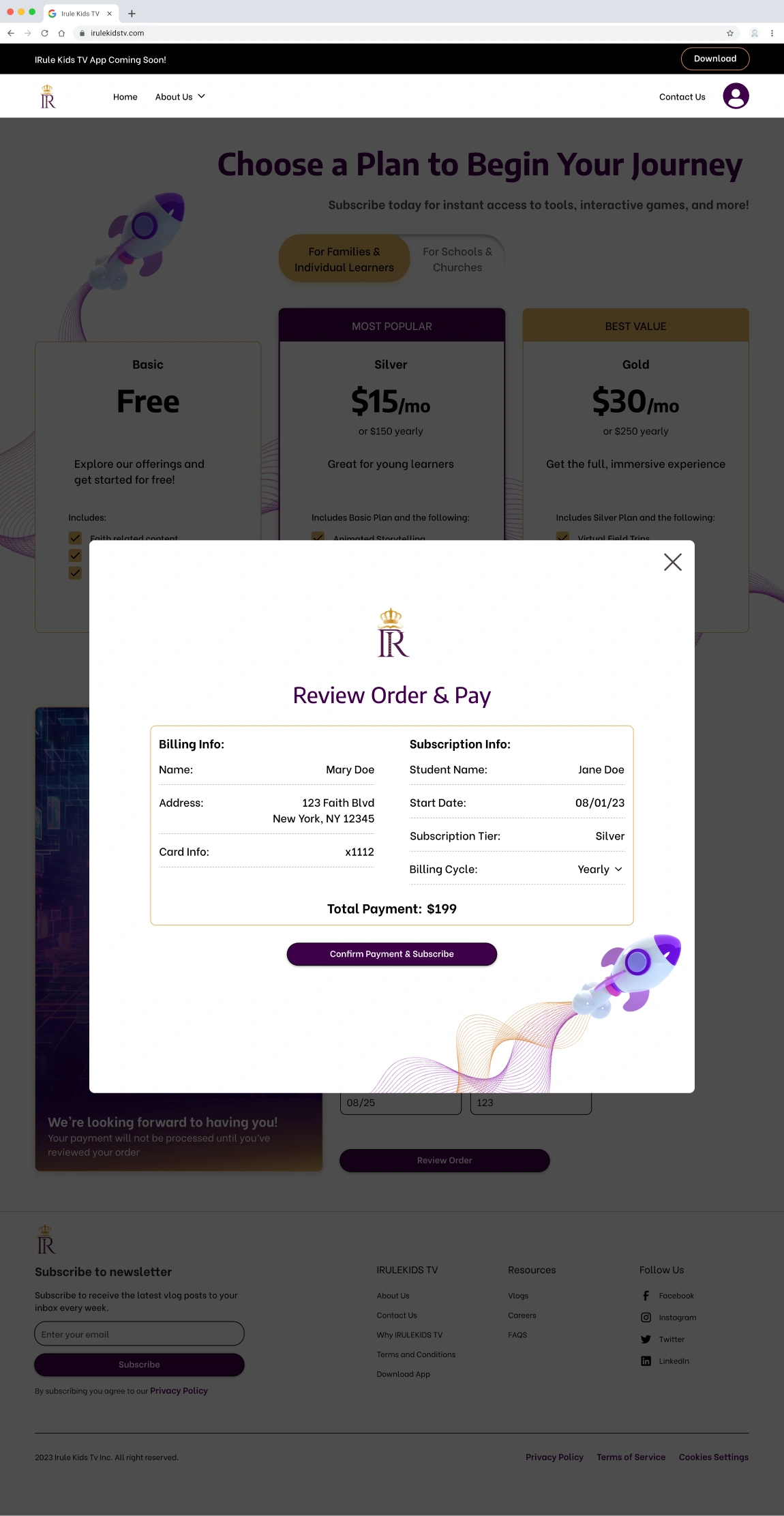
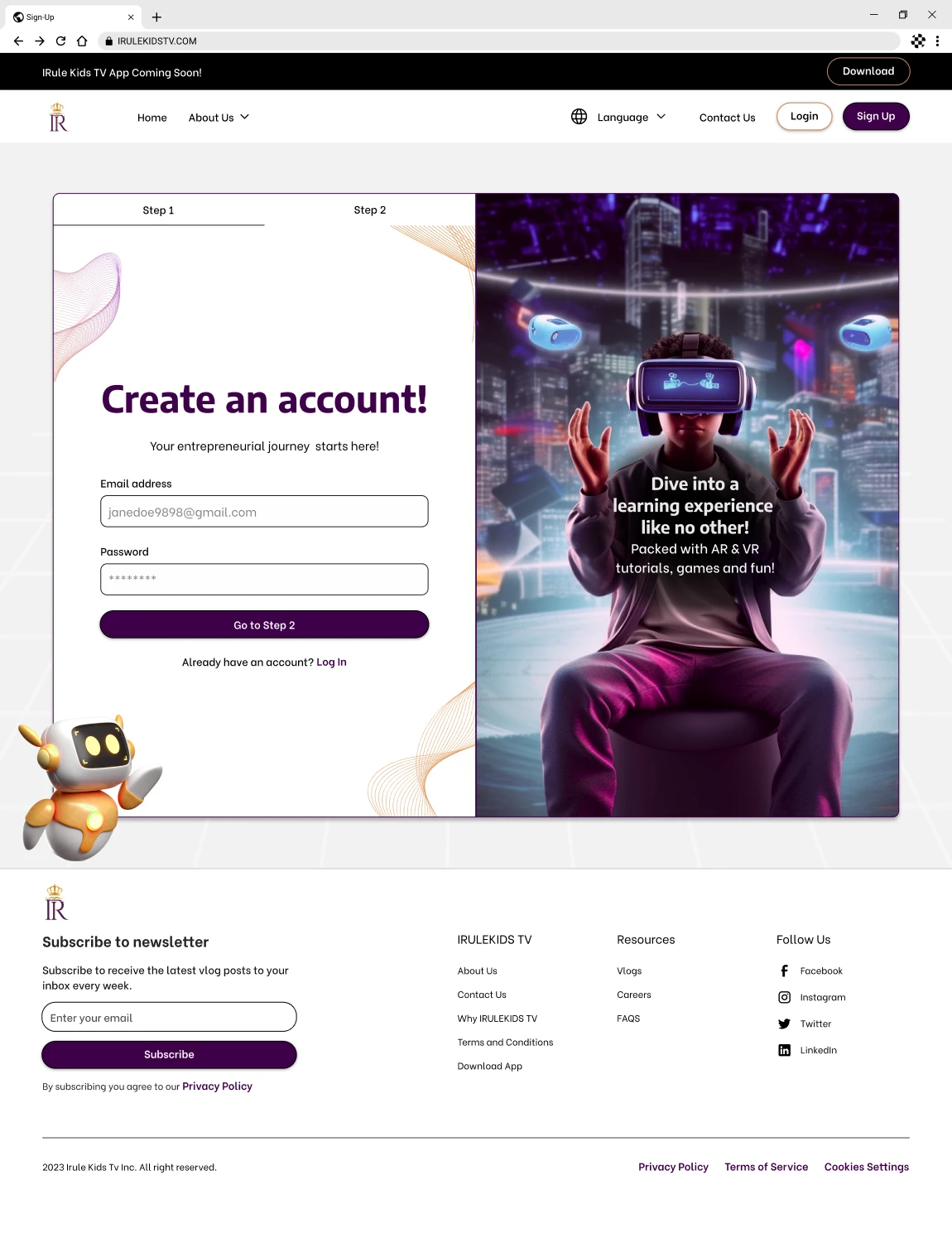
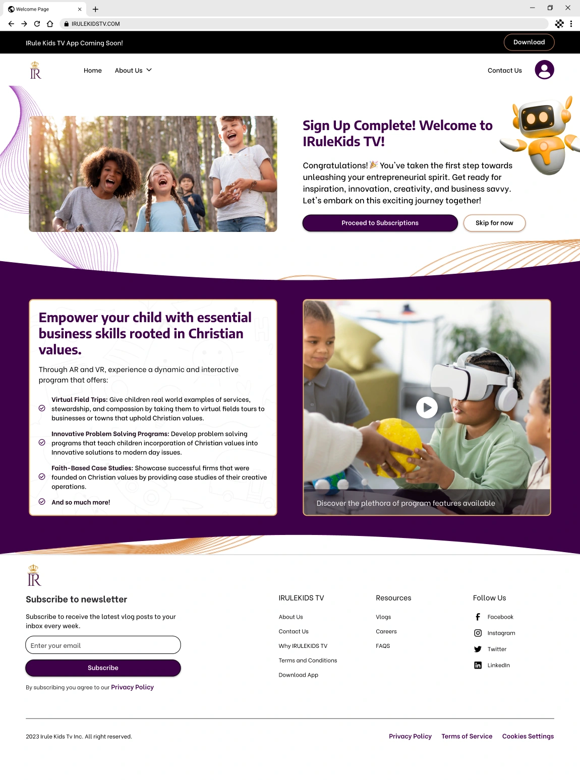
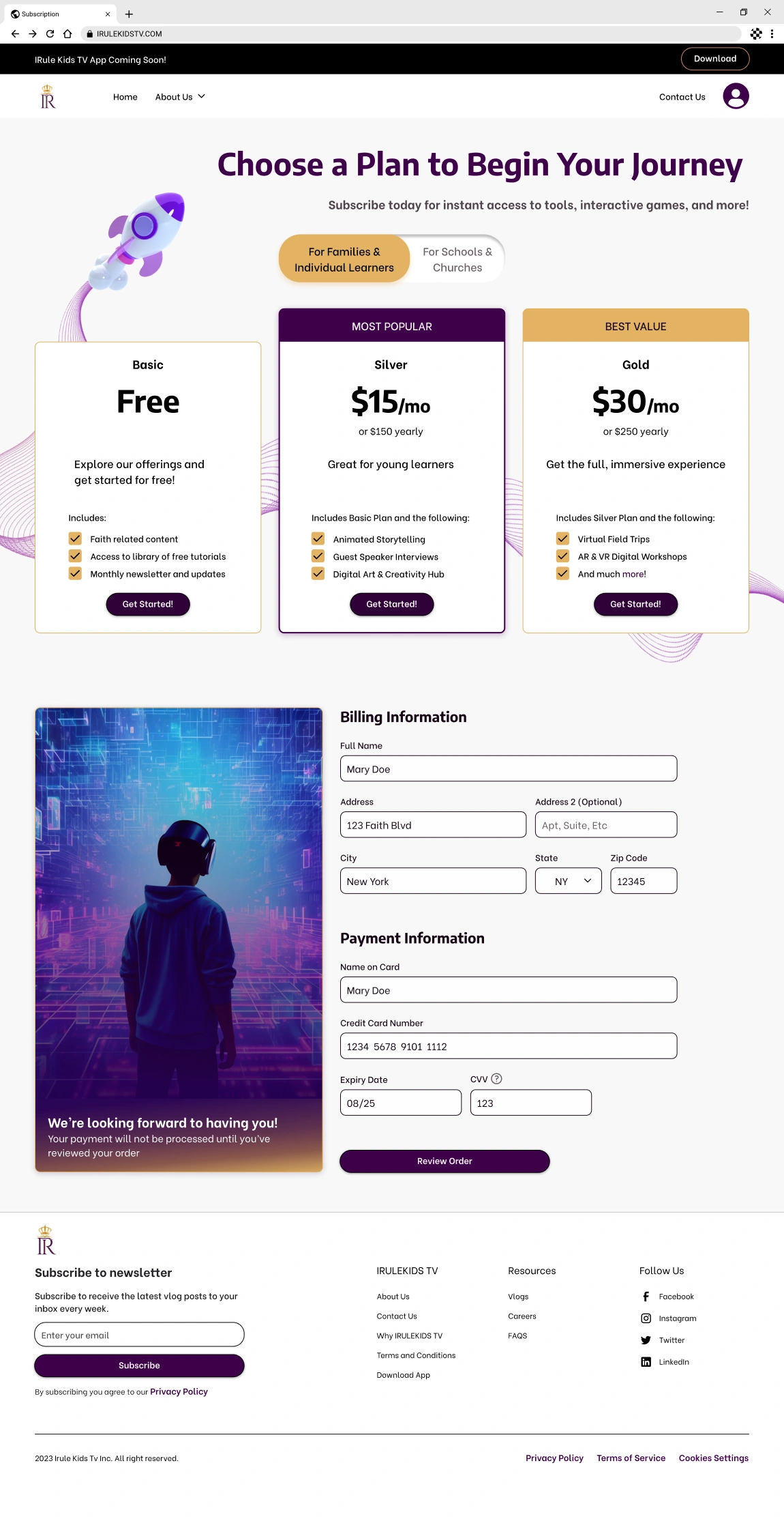
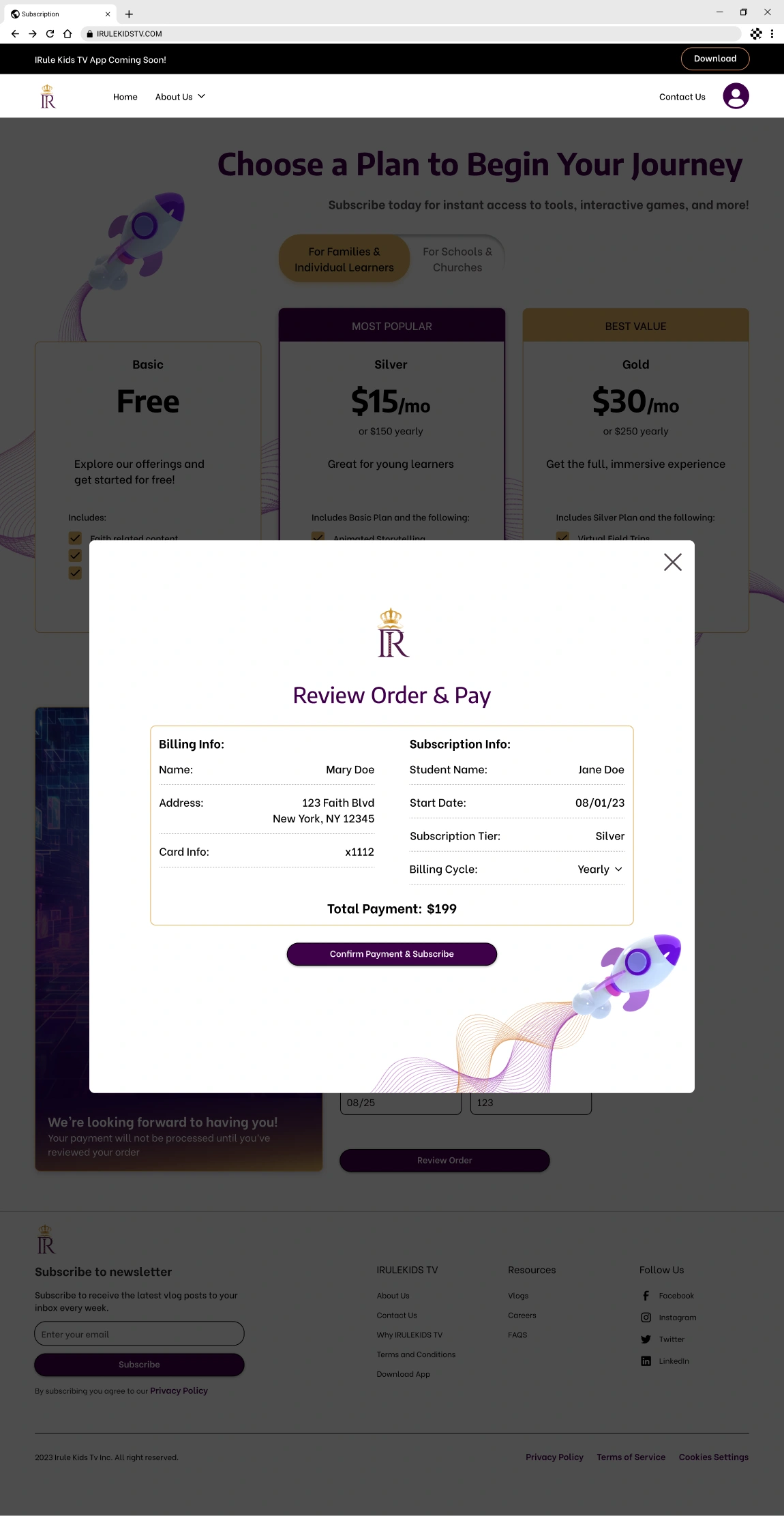
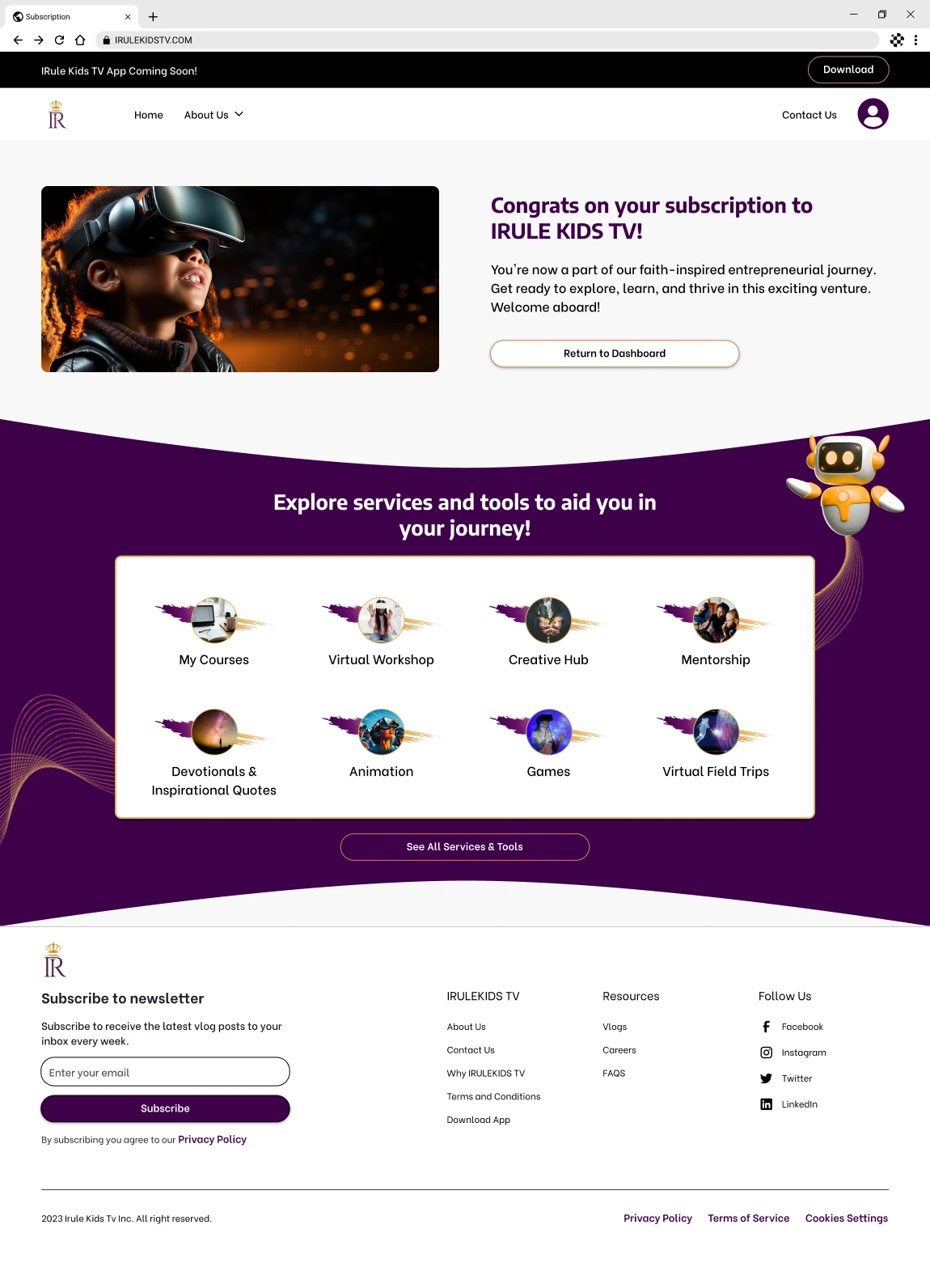
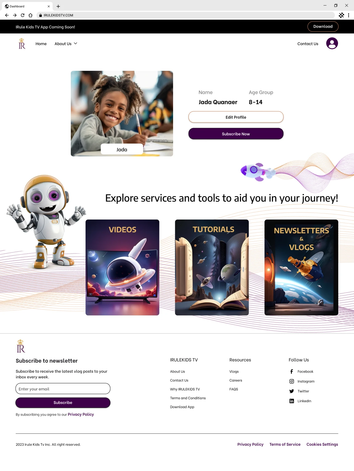
Hi-Fi Screens
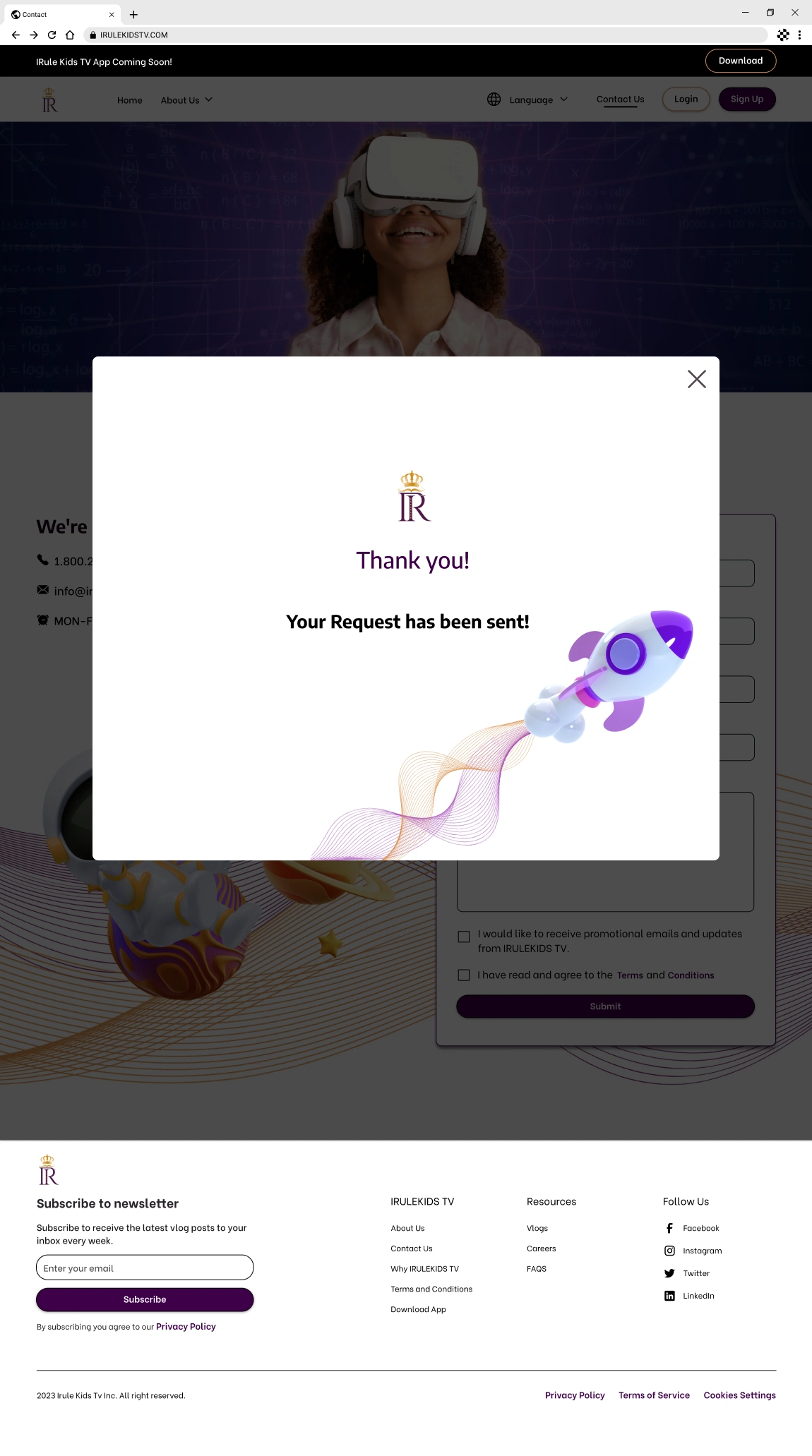
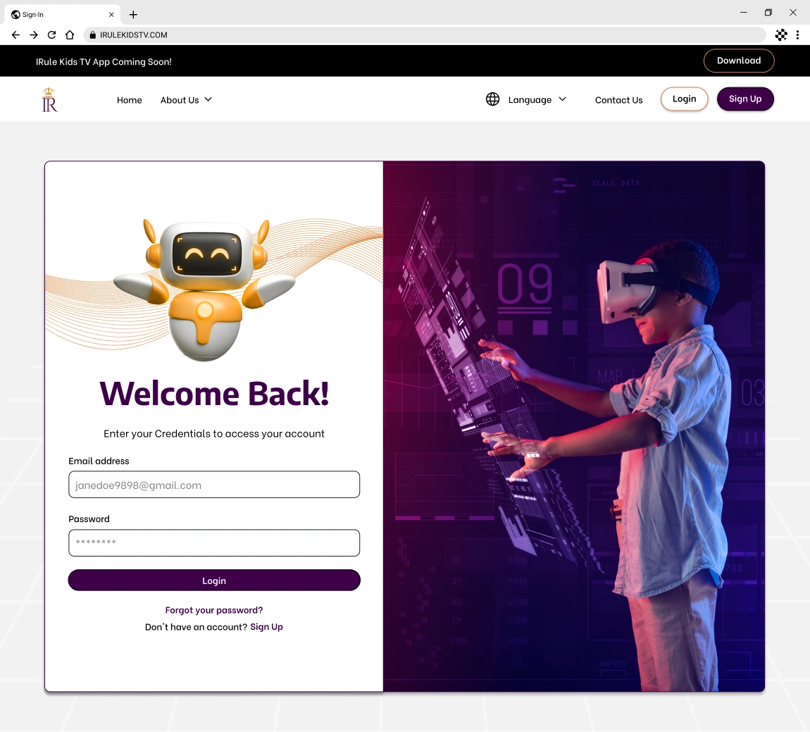
Throughout the development of the educational platform, the client remained actively involved, offering consistent feedback. This collaboration allowed us to finely tune our designs, aligning them with the client's vision. Their input was invaluable as we moved towards the platform's final iteration.
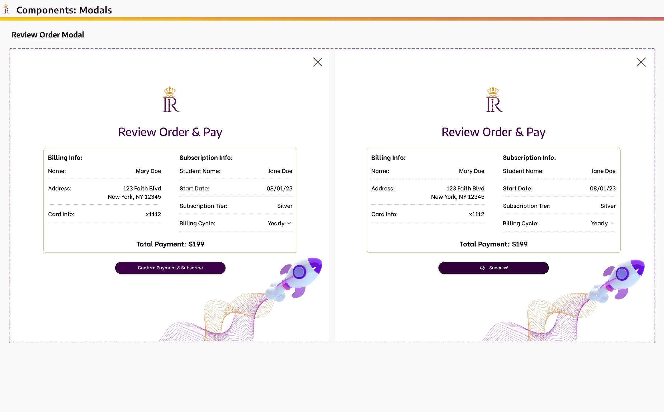
In my role, I took the lead in designing the user dashboard screen. I emphasized accessibility, integrated, forward-thinking characters, and leveraged AI-generated visuals to underscore the theme of technological innovation. While crafting the user settings, I also ensured that language preferences were seamlessly accessible from both the home page and the user dashboard. My primary aim was to foster a warm and inviting environment, assuring parents of a delightful and enriching learning experience for their children in a contemporary setting.
Developer Handoff
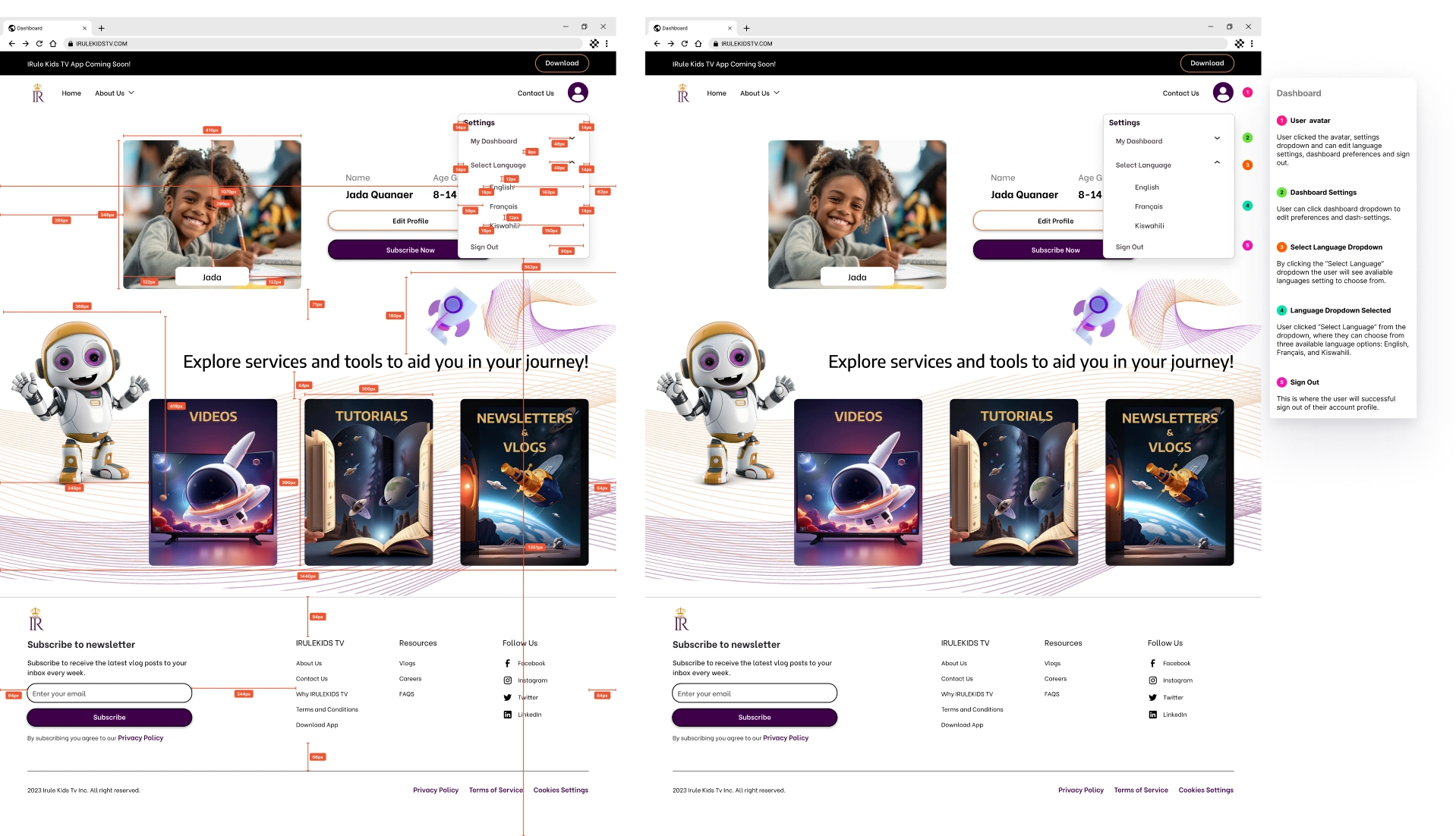
Screen Annotation
My team and I executed a detailed handoff with annotations and measurements to minimize errors and ensure the product meets the desired specifications and standards. This critical aspect requires careful planning, communication, and collaboration to ensure a successful transition and a high-quality end product.
Reflection
Looking Back
This project was a journey that genuinely exemplified the essence of teamwork and shared vision. Rising to challenges has always been invigorating; this project was no exception. One of the standout experiences was the meticulous crafting and organization of design components, making the design process more efficient than I had initially projected. Integrating AI-rendered visuals and genuine photos injected depth, offering an engaging and innovative visual palette. Weaving AI-generated illustrations with 3D characters into our selected design was a testament to our team's ability to think out of the box. Working cohesively with a diverse team was paramount to the project's success. Our combined skill sets and unique perspectives enabled us to address design challenges from various angles, leading to a more holistic solution.
This endeavor wasn't just about design; it was about growth. It underscored the criticality of accessibility, provided hands-on experience in handling contrasting elements, and sharpened my proficiency in using AI for photo generation. In sum, this case study wasn't just a project; it was a learning curve, an experience, and a testament to the endless possibilities in UX/UI design.
Read more of my case studies

HomeWorks
HomeWorks
Sole UX/UI Designer & UX Researcher | Product Design | Simplified home maintenance and expense tracking for homeowners with an intuitive B2C app.
Plannie
Plannie
Sole UX/UI Designer | Product Design | Enabled seamless event and project management for planners and clients through a collaborative B2B2C platform.
Diy55
Diy55
Sole UX/UI Designer & UX Researcher | A B2C Interface for DIY skincare and aesthetic treatments.
Like this project
Posted Jul 10, 2026
Designed an AR/VR educational platform and web portal focused on accessibility, multilingual support, and engaging UI for ages 2–18.
Likes
0
Views
5