HomeWorks

Brady Marchant


HomeWorks
A B2C home management app that helps homeowners with maintenance and provides valuable insights into homeownership expenses.
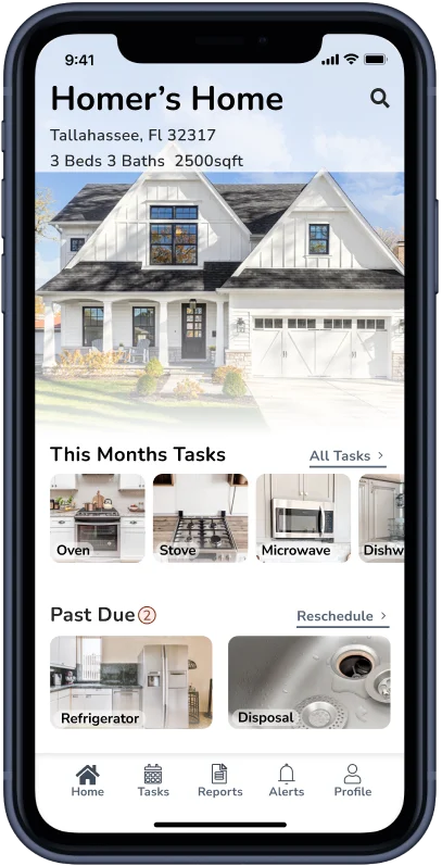
Transforming home management with HomeWorks
HomeWorks is not just a home management app; it’s your partner in maintaining a thriving home. It simplifies routine maintenance by offering clear directions and tracking the lifespan of your essential systems. With HomeWorks, you can effectively plan and budget for replacements, ensuring your home stays in peak condition. More than that, it provides invaluable insights into the overall costs of homeownership, empowering you to make informed decisions.
Understanding the Homeownership Challenge
Homeownership comes with ongoing responsibilities, unexpected repairs, and unexpected expenses that often catch homeowners off guard. The overwhelming abundance of information and how-to videos can lead to frustration. Time constraints, lack of motivation, and insufficient knowledge create a perfect storm of challenges for homeowners, resulting in feelings of buyer's remorse.
A proactive solution for home maintenance
HomeWorks transforms home care by providing personalized maintenance plans and timely alerts when systems and appliances approach their expected lifespan. This empowers homeowners to effectively plan and budget for future replacements. Additionally, HomeWorks supports homebuyers by guiding them through essential care, responsibilities, and the costs associated with homeownership.
My Role
Sole UX/UI Designer
Timeline
Overall: 7 months
Discovery & Research: 2 months
Design & testing: 5 months
Tools
Miro
Figma
Zoom
Loom
Adobe Photoshop
Adobe Illustrator
Google Workspace
Process
Discovery
Ideation
Design
Test
Reflection

1
Discovery
2
Ideation
3
Design
4
Test
5
Reflection
Discovery
Secondary Research
After conducting extensive research, I uncovered the critical challenges homeowners face: a lack of awareness about maintenance responsibilities and the actual cost of homeownership, an underestimation of home system life expectancy and replacement costs, and a demand for more knowledge, time, and motivation for proactive maintenance.
Key Findings
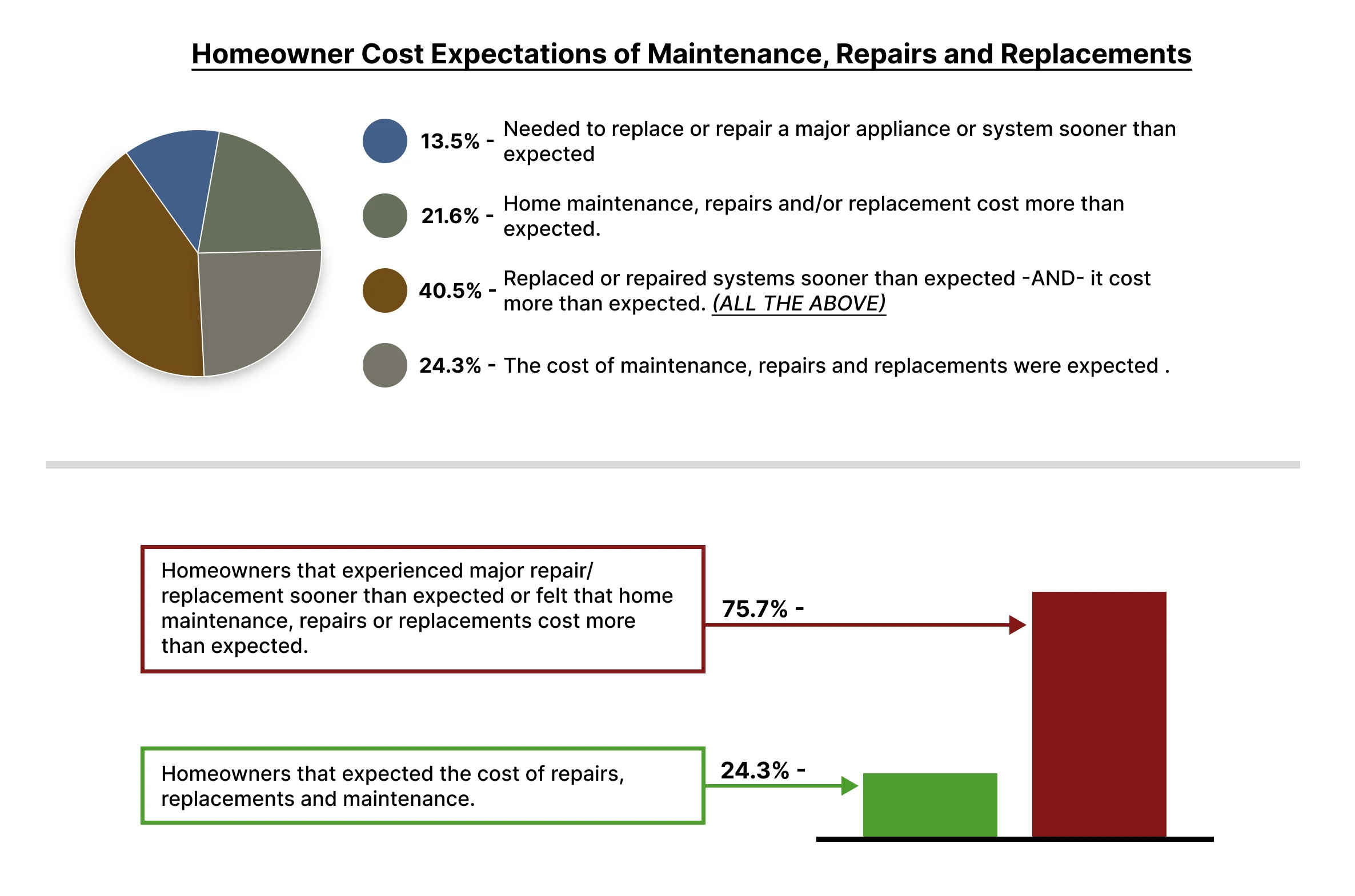
According to the 2022 Government Housing Statistics,63% of homeowners underestimated regular repair costs, and 60% underestimated regular maintenance and upkeep costs.
Consumer Affairs reported that 60% of homeowners said they've often felt buyer's remorse, and 52% said the actual cost of owning a house took them by surprise.
The American Society of Home Inspectors (ASHI) found that homeowners not only underestimated the life expectancy of major home appliances, but they also significantly underestimated the cost of replacing them.
Understanding the hurdles homebuyers face
Through my research on the challenges homeowners encounter when estimating maintenance and repair costs, I uncovered how time-consuming this task can be. I examined the resources they depend on for cost estimation and the common obstacles that hinder their progress.
By exploring these issues, I aimed to reveal insights that could lead to a solution simplifying the estimation process. I also assessed the availability of information and the awareness levels among homebuyers regarding additional costs tied to homeownership. These findings will illuminate knowledge gaps and guide the design of a solution that provides homebuyers and homeowners with accurate, easily accessible information, ultimately empowering them to make informed decisions.
Screener Surveys
To ensure the selection of participants who met specific criteria for the research study, a screener survey was designed and distributed through various social media platforms. The survey targeted individuals who had purchased a previously-owned home, homeowners who had experienced higher-than-expected maintenance costs, individuals who had underestimated the life expectancy and replacement costs of home appliances, those who had encountered unexpected repairs or replacements, and homeowners who had experienced regret after purchasing a pre-owned home due to maintenance issues. By using the screener survey as a tool, the research aimed to gather insights and perspectives from individuals who had relevant experiences and could provide valuable information for the study.
Interviews
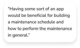
Through virtual interviews conducted via Zoom, I engaged with four participants to uncover prevalent challenges encountered by homeowners regarding the maintenance, repair, and replacement costs of home systems. These interviews led to the identification of two distinct user groups, enabling me to customize design decisions that specifically cater to the unique challenges, motivations, needs, and goals of each group. The interviews revealed noteworthy patterns among the participants, offering valuable insights to inform the project's progression.
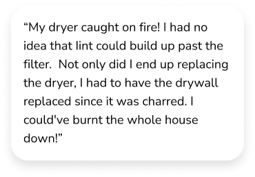
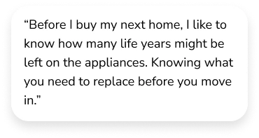
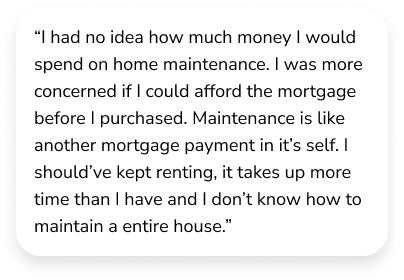
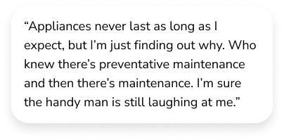
Affinity Map
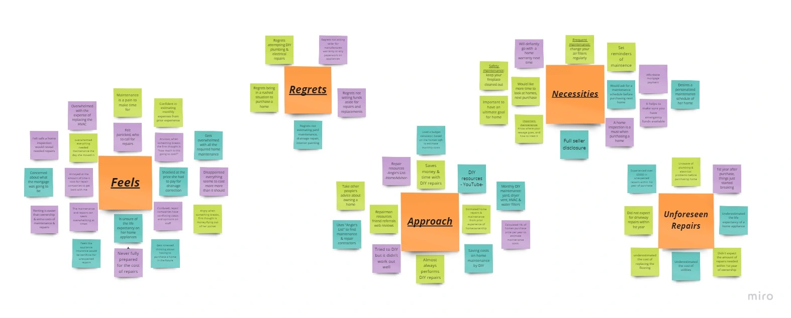
I thoroughly analyzed the interview data to ensure a comprehensive understanding of the insights. By extracting key quotes and categorizing similar findings, I created an Affinity Map to examine the connections between different data sets, including:
Feelings about homeownership.
Regrets of the home purchase.
The approach used for home maintenance and repairs.
Necessities desired to change.
Unforeseen repairs experienced.
Empathy Map
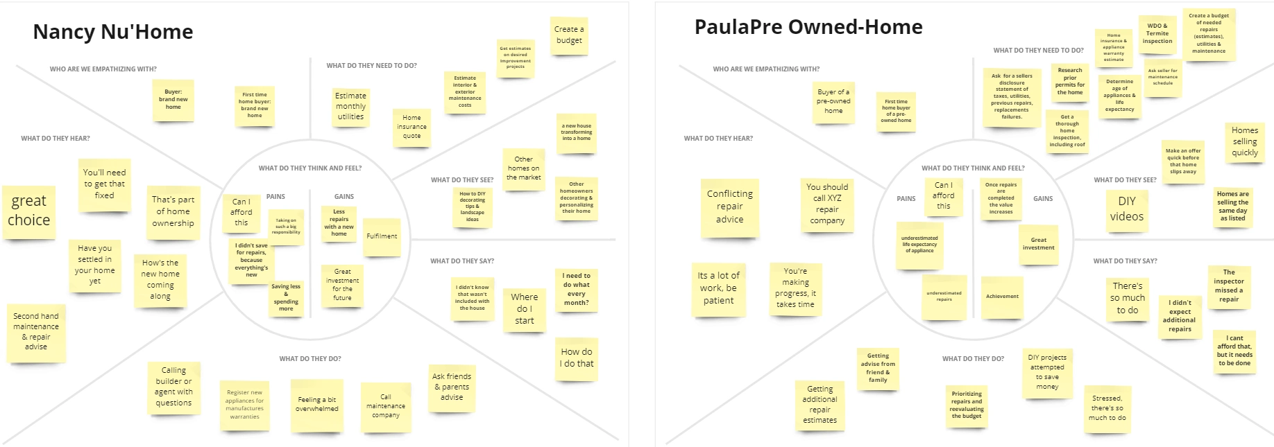
The empathy maps focused on two types of personas and provided a deeper understanding of user needs. These maps served as powerful tools for organizing insights, observations, and significant quotes from interviews, allowing me to identify the most prevalent emotions, thoughts, and actions related to homeownership. This comprehensive understanding enabled the creation of a more personalized and tailored design solution that addresses the users' experiences, pains, gains, actions, and mindset.
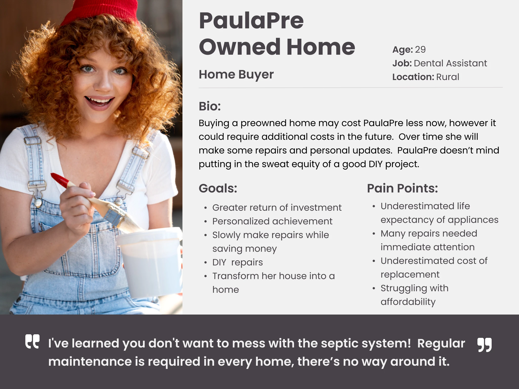
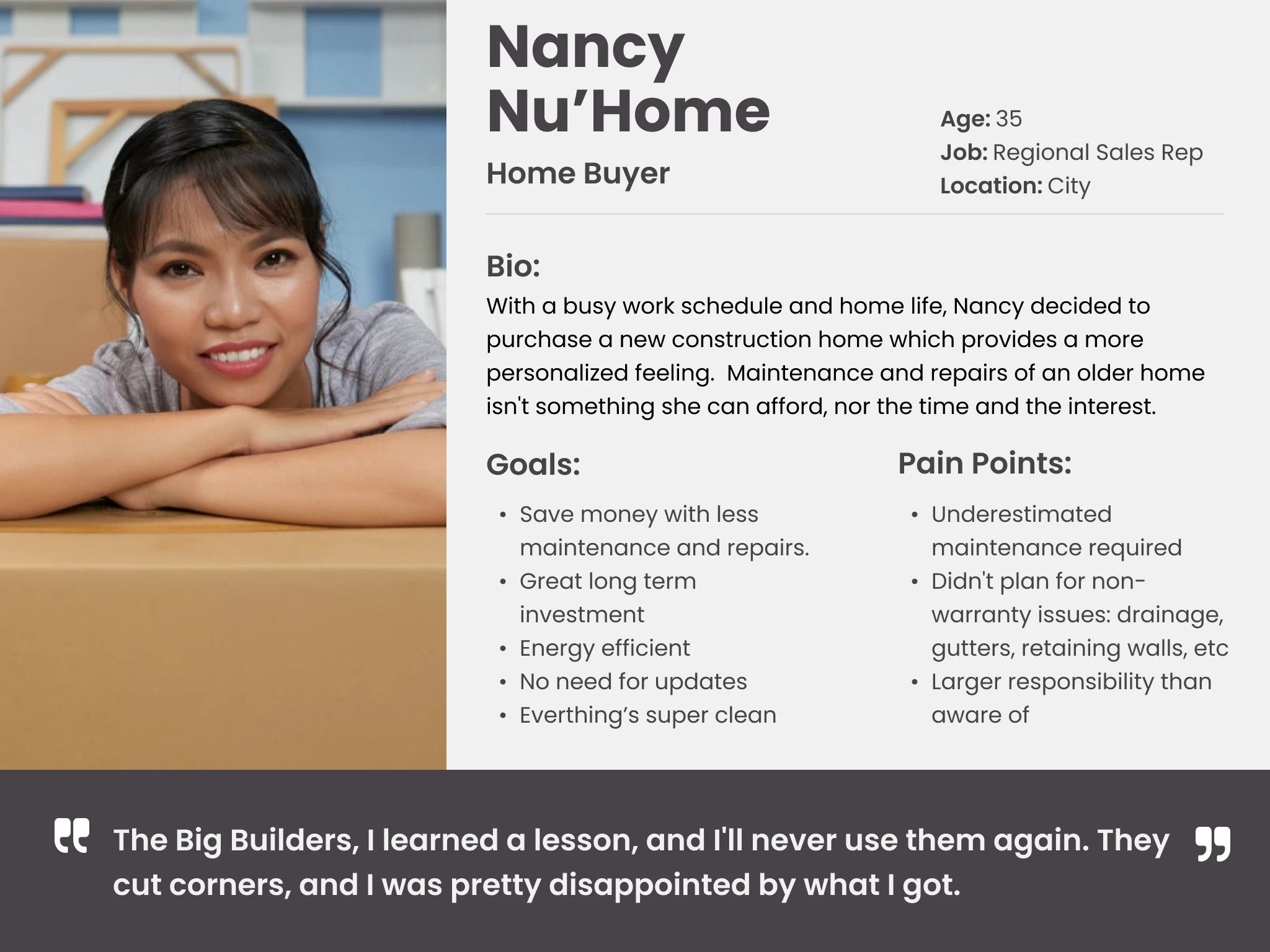
Personas
By leveraging the insights from the two primary user personas, I was able to make informed decisions throughout the design process that effectively addressed the unique challenges, motivations, needs, and goals of the end users. This user-centered approach ensured that the design solution catered to their requirements, resulting in a more effective and impactful outcome.
Paula - Pre-Owned Homebuyer
Paula is in the process of purchasing a previously owned home. She is budget-conscious and wants to make a wise investment. She has some experience with DIY projects and is familiar with basic repairs and maintenance.
Nancy - New Homeowner
Nancy is a recent homeowner of a newly constructed home. She's excited about homeownership but lacks proficiency in do-it-yourself projects, property possession, upkeep, and repairs. She seeks guidance and support to ensure her new home remains in excellent condition.
Ideation
Problem Statements (HMW's)
In the final stage of my research, I synthesized the collected data to extract user insights and transform them into actionable How Might We (HMW) statements. These statements provided a framework for reframing problems in an inspiring manner, fostering creativity, and encouraging ideation.
My primary objective was to pinpoint the critical issues that could effectively address the persistent pain points and challenges faced by homeowners. By identifying these critical areas of concern, I could focus on developing solutions.
How might we design a product that decreases the stress of buying a home?
How might we prepare users for unexpected home costs?
How may we construct a product that provides users with a personalized home maintenance schedule?
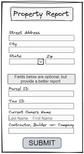
How might we provide users with detailed property reports before they purchase?
How might we collect information to determine future repairs?
Brainstorm
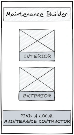
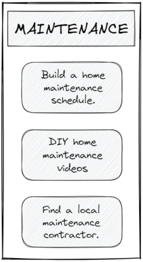
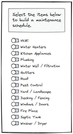
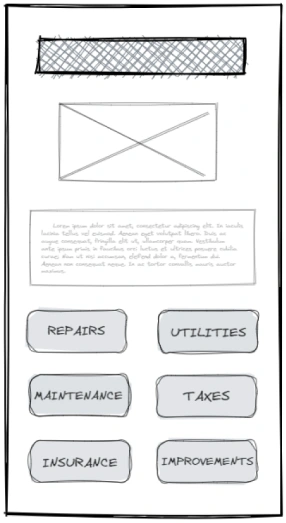
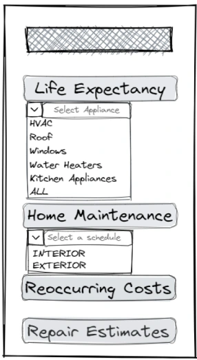
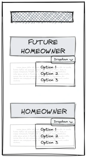
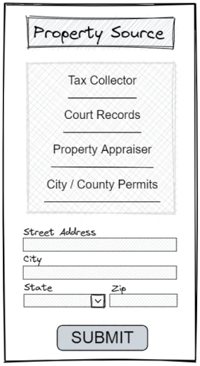
During the ideation phase for HomeWorks, I generated a wide range of sketches and concepts to explore different design possibilities and potential solutions. These sketches served as a visual representation of ideas, allowing me to iterate and refine the design direction. The ideation sketches provided a creative and flexible framework to shape the design of HomeWorks and create a meaningful and impactful user experience.
User Stories
To develop a thorough understanding of my target audience, I created user stories that captured the key scenarios and goals of users. By prioritizing features based on significance, I identified the essential functionality for the minimum viable product (MVP). This approach helped me focus on delivering core value to users. Additionally, I identified the key elements and values that would resonate with the ideal user, ensuring that the product aligns with their needs and preferences. By incorporating user stories and prioritizing features, I laid the foundation for a user-centered design approach and a product that meets the expectations of the target audience.
As a user, I want to create an account to personalize a home maintenance schedule to reduce unexpected repairs in the future.
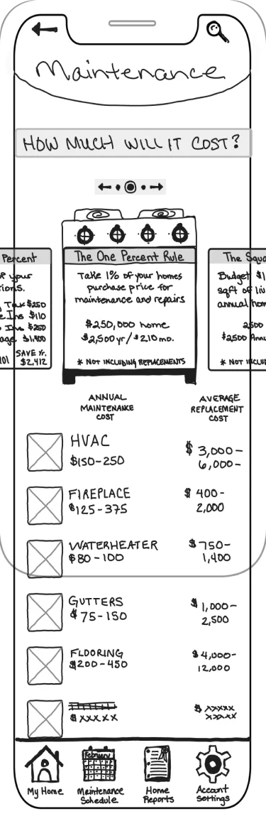
As a user, I want to estimate my home maintenance costs before I purchase a home so I can determine if it’s affordable.
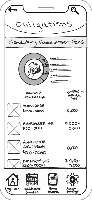
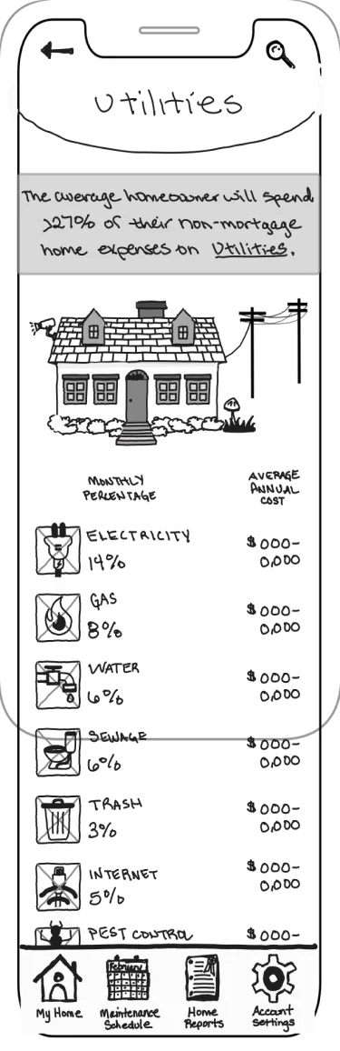
As a user, I want to estimate all the extra costs of owning a home so I can determine if it’s something I can afford now or in the future.
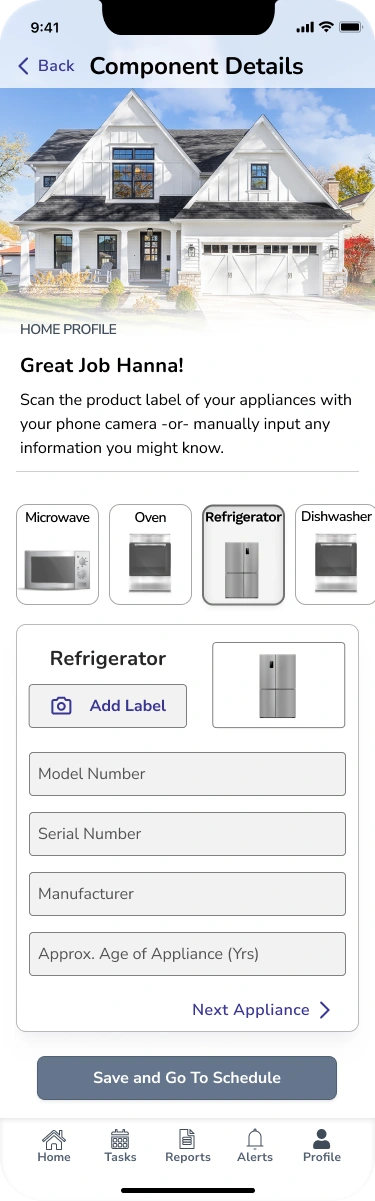
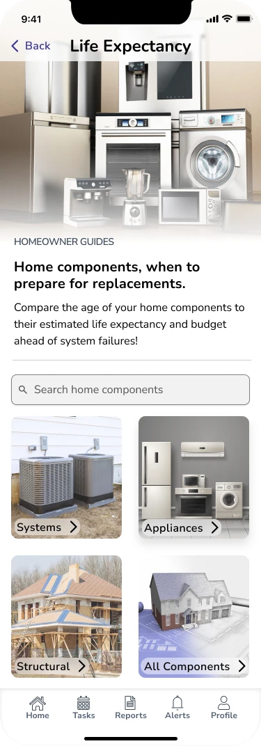
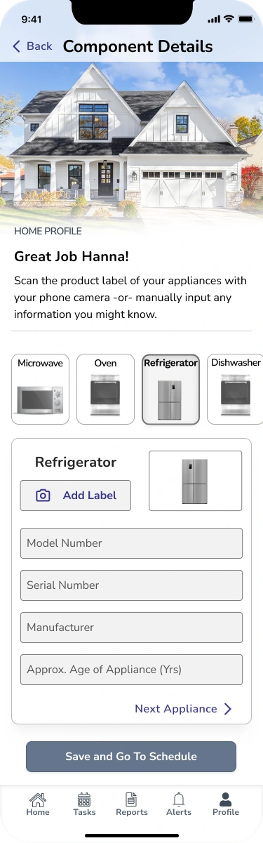
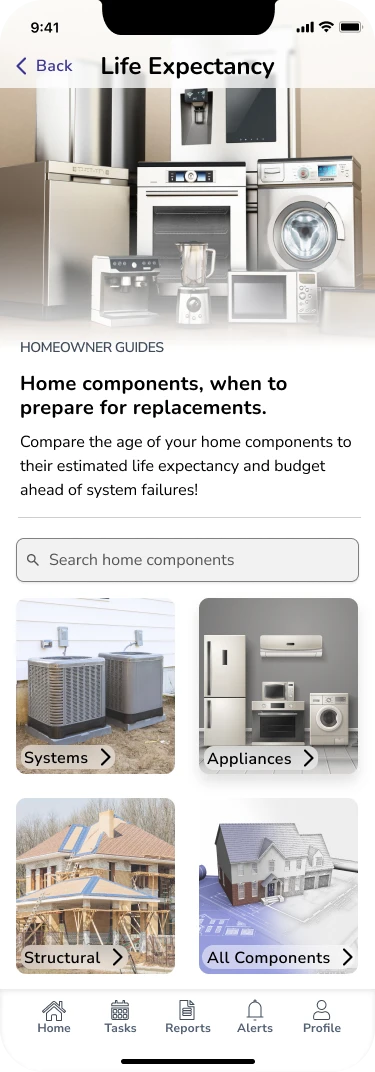
As a user, I want to create a home profile of my current appliances so I can learn more about their life expectancy and when I might need to replace them.
As a user, I want to create an account for monthly and seasonal maintenance reminders to avoid unnecessary repairs or replacements.
Site Map
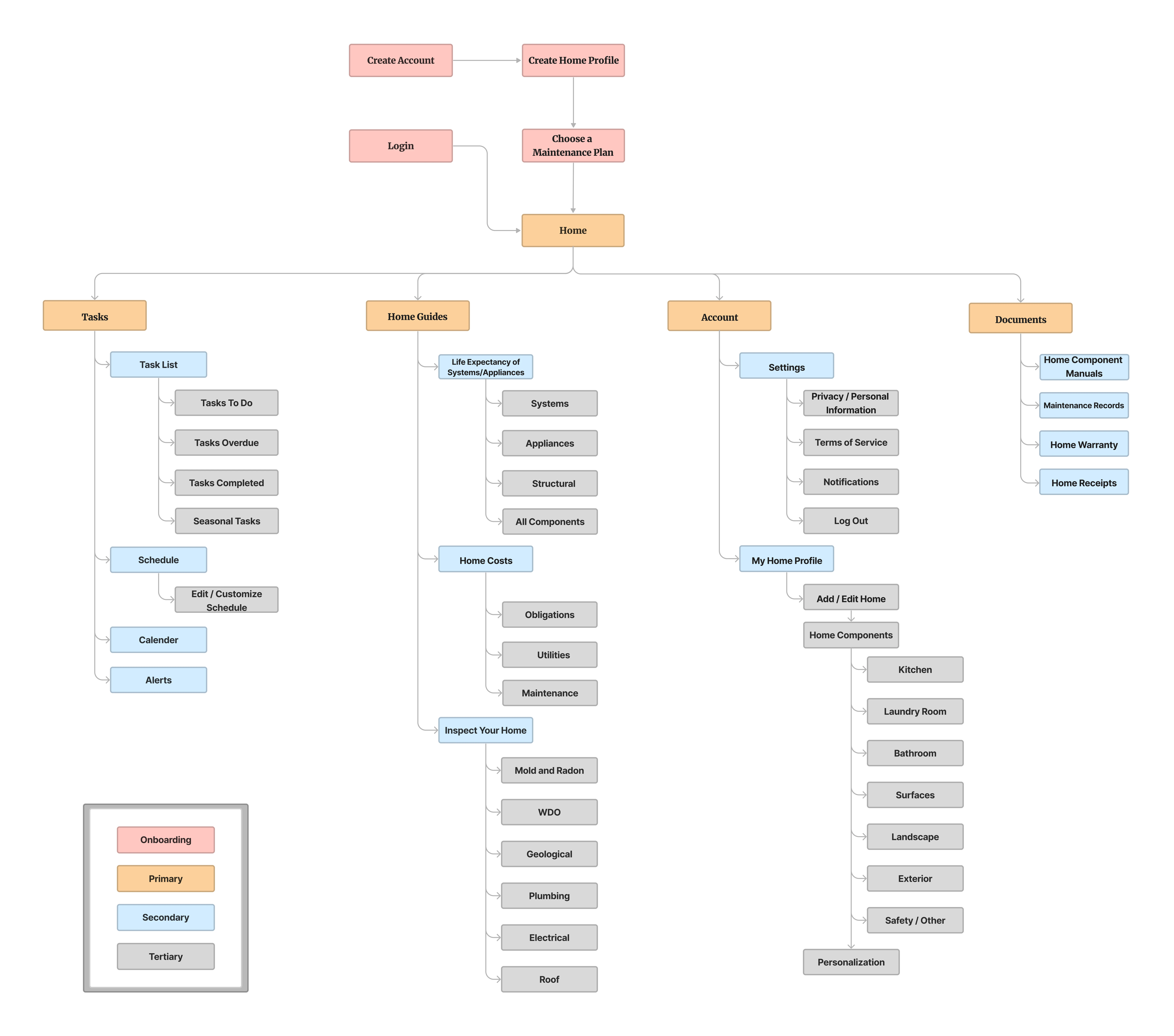
In the case study, I prioritized the identification and mapping of the critical features of the application. I utilized a sitemap to ensure a clear and organized information architecture. The sitemap played a crucial role in aligning all the functions, screens, and features of the application. By considering the user stories, I developed a solution to simplify the user's actions throughout the app. The site map was a valuable tool in guiding the design process and ensuring a seamless user experience.
User Flows
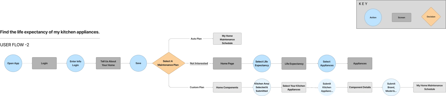
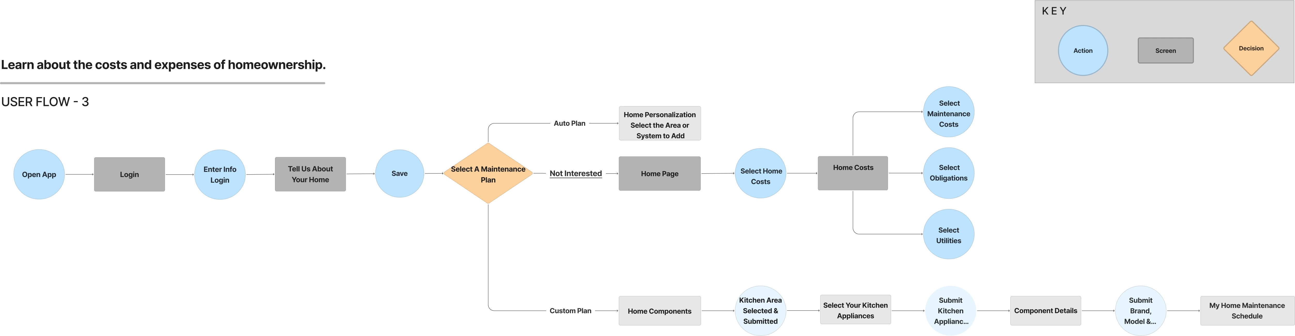
I conducted a thorough analysis of user flows to gain insights into optimizing the layout of each screen and enhancing task completion efficiency for users. After reviewing the minimum viable product (MVP), I identified three key routes users would take to accomplish their goals. By understanding these user flows, I could design screens and interactions that align with users' expectations and facilitate a seamless navigation experience. The user flow analysis was a valuable guide in streamlining the app's interface and ensuring users could efficiently and effectively complete their desired tasks.
Flow 1: Create a personalized home maintenance schedule.
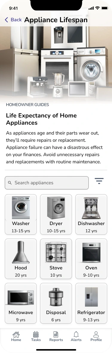
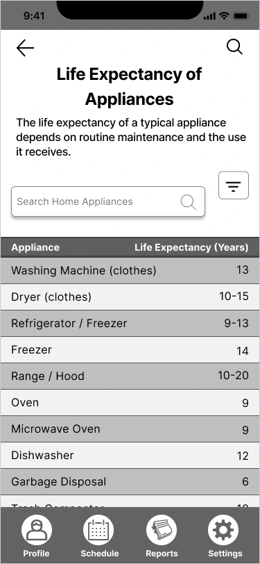
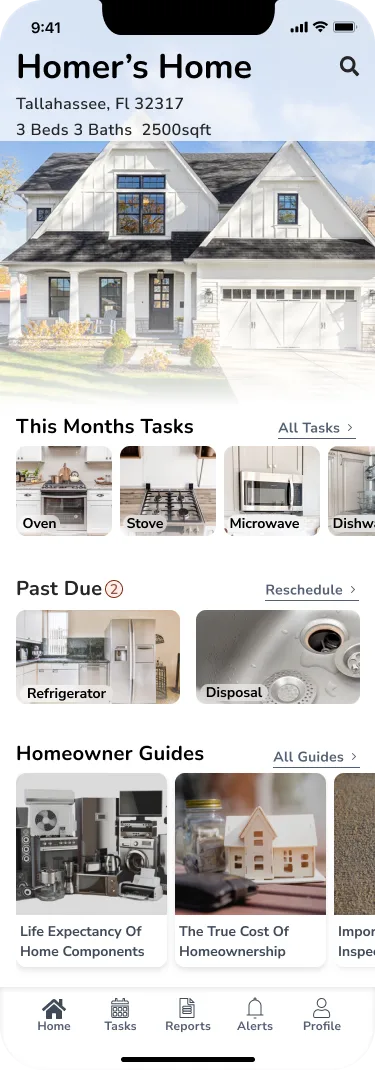
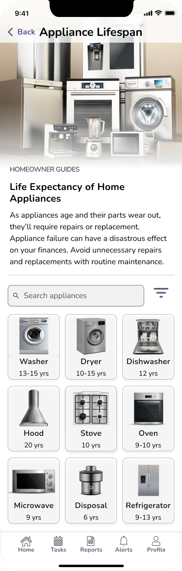
Flow 2: Find the life expectancy of my kitchen appliances.
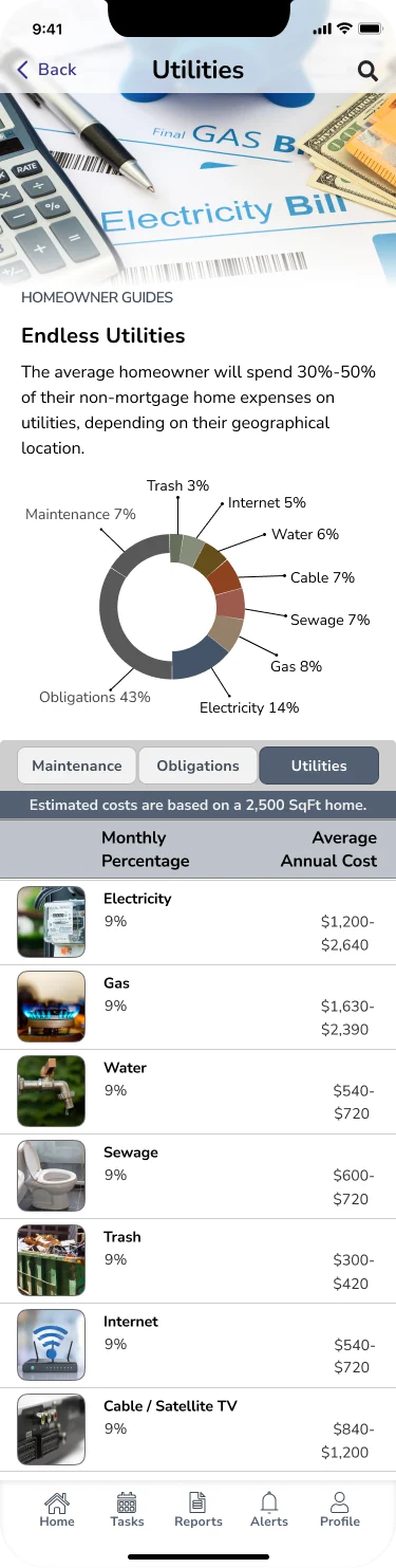
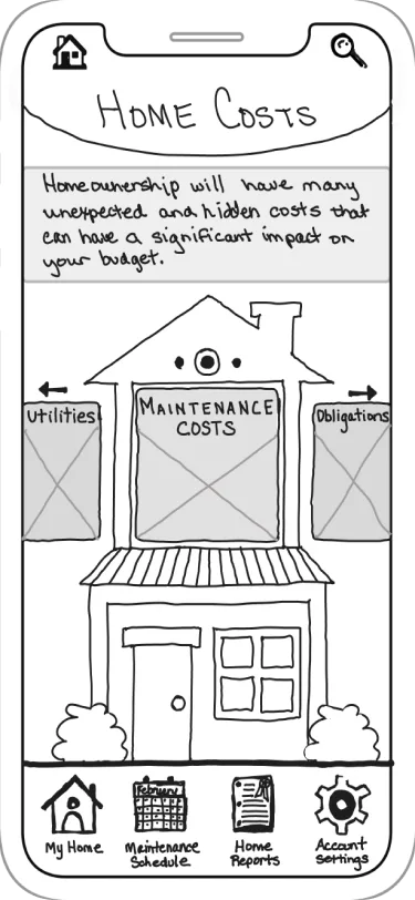
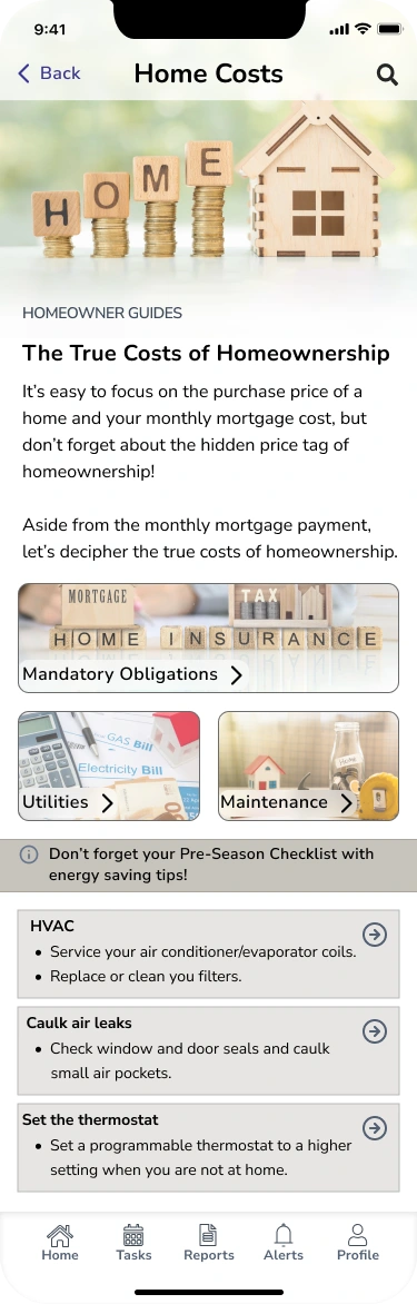
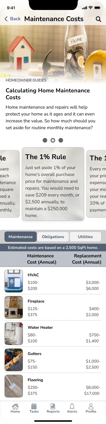
Flow 3: Learn about the extra costs and expenses of homeownership.

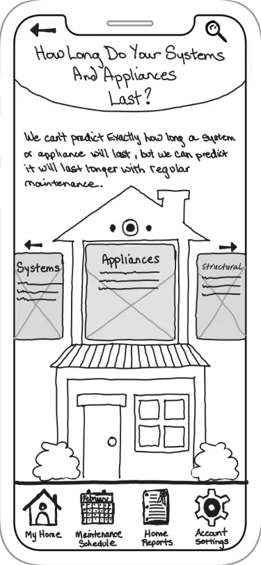
Sketches
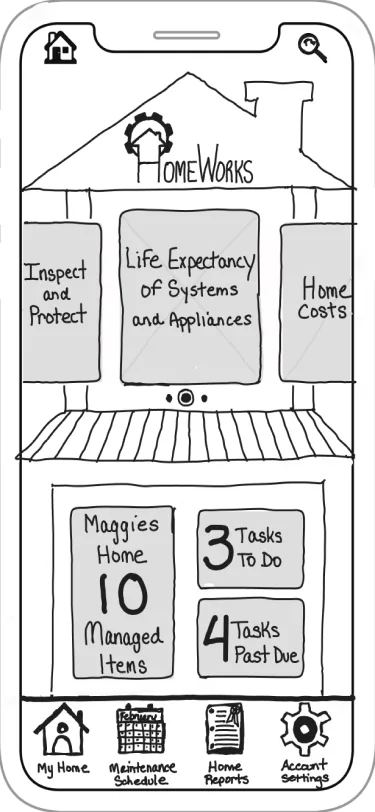
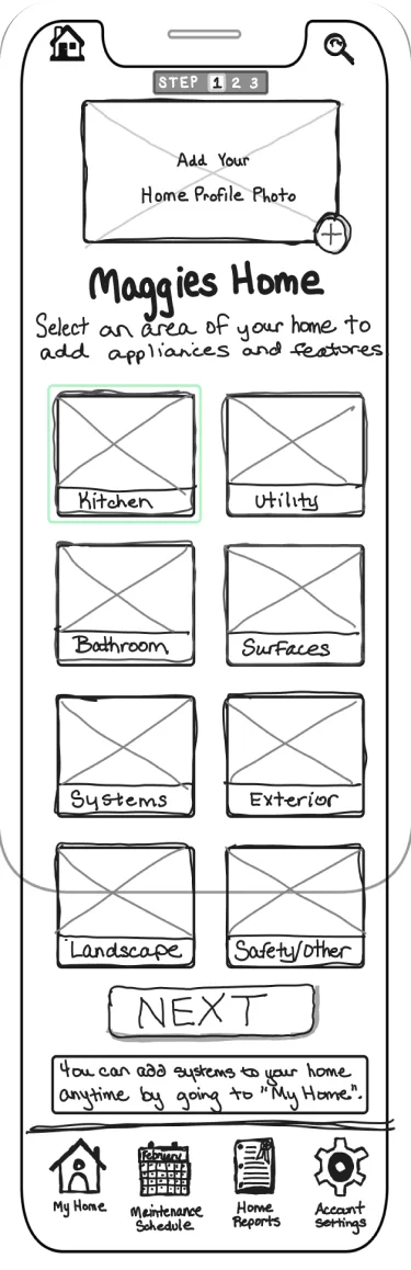
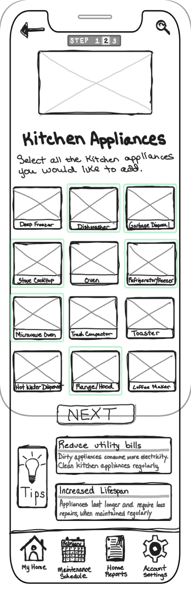
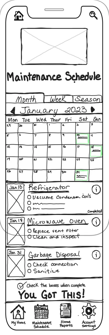
Sketching was crucial in bringing ideas and concepts to life, allowing for exploration and iteration. By sketching drafts of the app, I was able to visualize different design possibilities and assess their feasibility. The main objective of the app design was to create an intuitive and user-friendly experience, and sketching provided a valuable medium to ideate and refine the interface. Through sketching, I could iterate on the layout, placement of elements, and overall flow of the app, ensuring that it meets the needs and expectations of the target users. Sketching served as an essential tool in the design process, enabling me to translate concepts into tangible visual representations and iterate toward a well-crafted user experience.

Design
Wireframes
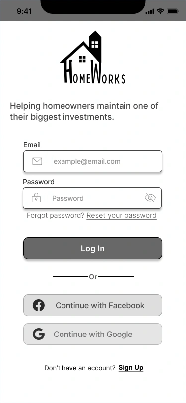
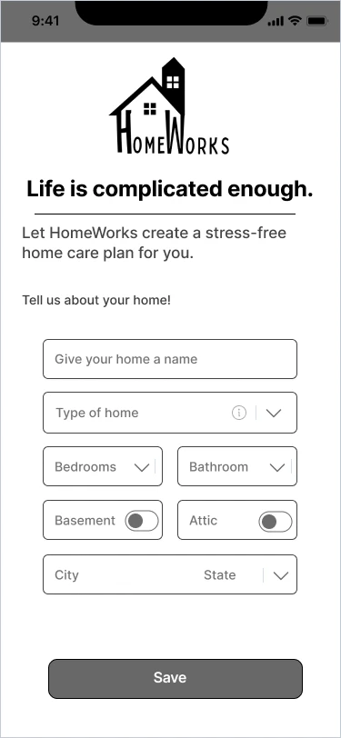
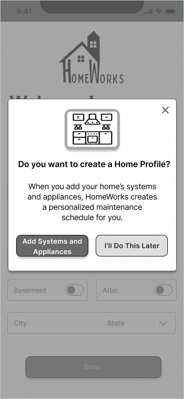
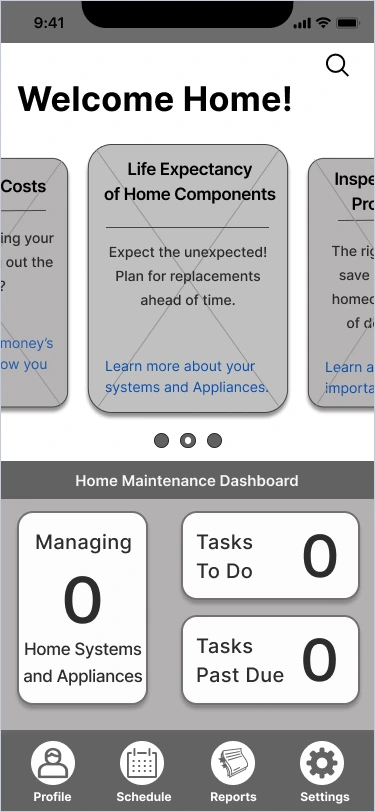
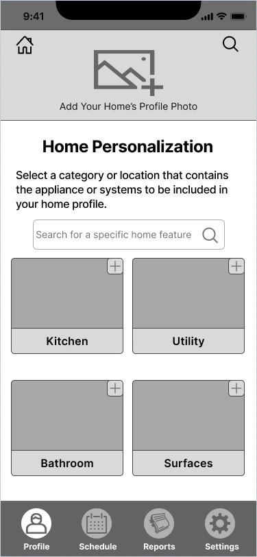
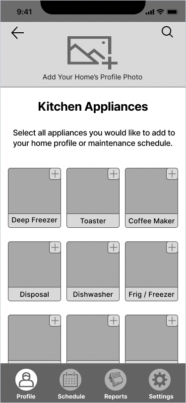
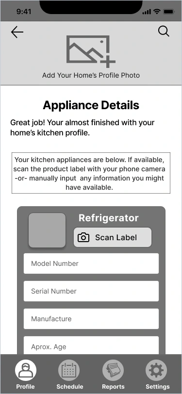
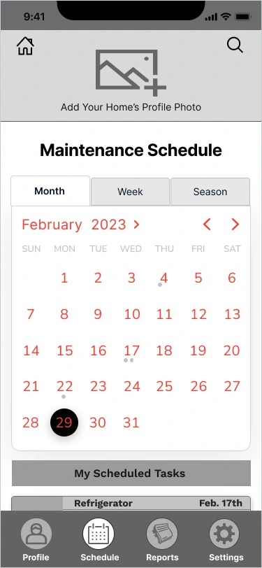
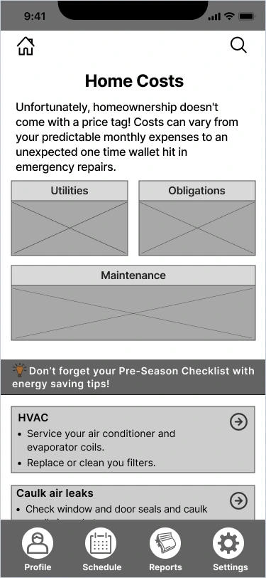
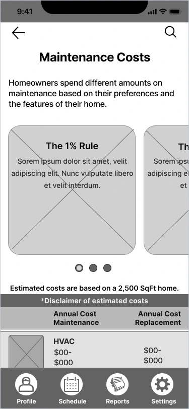
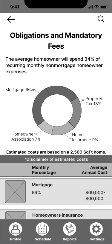
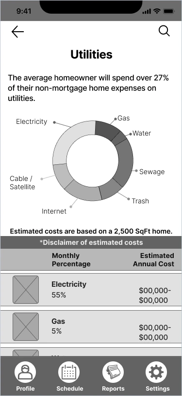
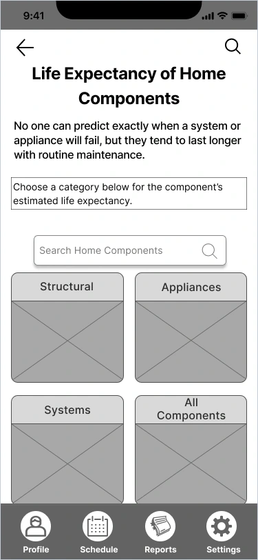
I used HMW statements and sketches as a foundation to create low-fidelity wireframes for the application. Leveraging the design tool Figma, I translated my initial sketches into digital wireframes. This process allowed me to determine the optimal arrangement of information on each screen, considering factors such as content hierarchy and navigation placement.
By creating wireframes, I could visualize the layout and structure of the app, ensuring that the right amount of information was presented on each screen. Additionally, the wireframes helped me envision the transition and flow between different pages, ensuring a seamless user experience. The low-fidelity nature of the wireframes focused on the core functionality and layout, allowing for quick iterations and feedback before moving into higher-fidelity design stages.
Brand Platform
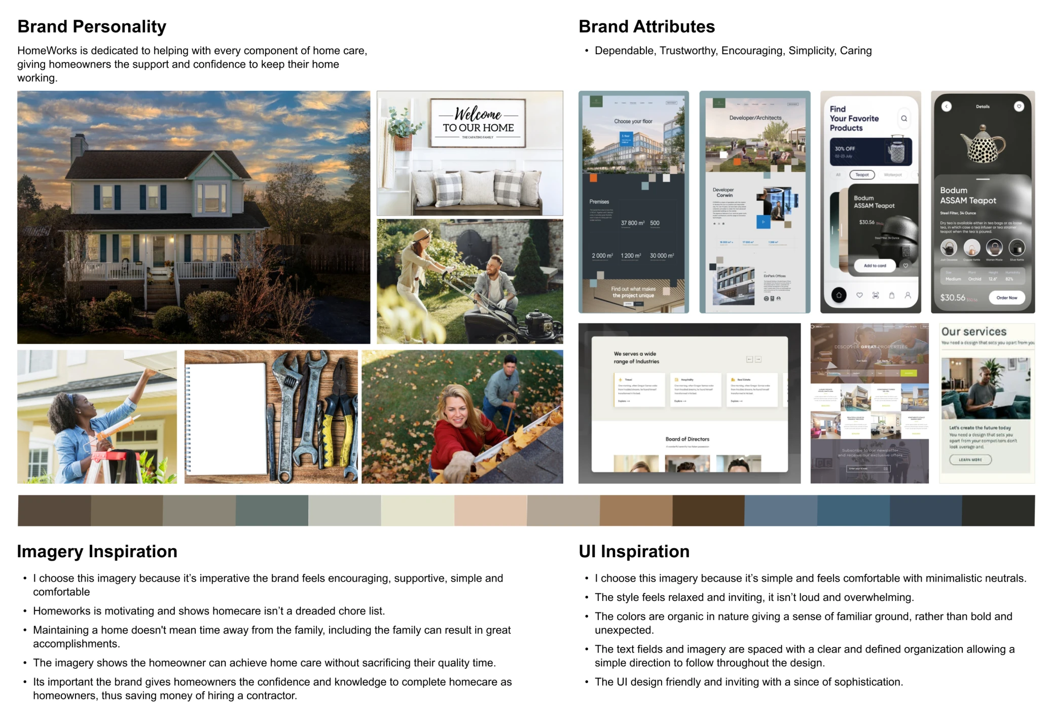
HomeWorks is a brand that aims to assist homeowners in maintaining their properties and avoiding expensive repairs and replacements. The company provides personalized maintenance schedules and information about the remaining useful life of home systems. The brand portrays itself as a dependable and trustworthy assistant for homeowners, offering simplicity, encouragement, and care throughout the homeowner's maintenance journey. By embodying these attributes, HomeWorks instills confidence in users and establishes a strong reputation in the industry.
Mood Board
In the app's design, I prioritized creating an atmosphere of comfort, trust, and confidence. To achieve this, I developed a mood board and carefully selected a color palette that would evoke the desired emotions. The color palette predominantly featured neutral tones such as blue, beige, and gray. Blue was chosen for its associations with trust, dependability, loyalty, and confidence. It is a widely favored color across different genders and age groups, making it an ideal choice for the app. Additionally, beige was incorporated to enhance the sense of comfort for users. To ensure the design was aligned with industry standards and user expectations, I researched similar apps in the target domain to gain inspiration for the UI design. This helped me gather ideas and visualize the final design before proceeding with high-fidelity designs. The mood board was a valuable tool in setting the visual direction and creating a cohesive and appealing app design.
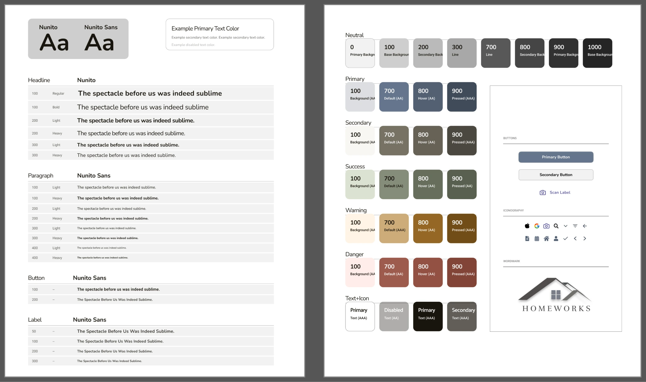
Style Guide
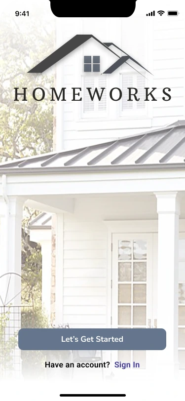
In the case study, I prioritized maintaining a consistent and reliable user experience by creating a style guide. The style guide showcases a simple and confident design approach, incorporating specific typography choices to enhance readability and visual appeal. For headlines, I selected the Nunito font, known for its clean and modern appearance. To ensure clarity in paragraphs, buttons, and labels, I opted for the Nunito Sans font, which offers legibility and versatility. Additionally, the style guide includes the HomeWorks logo, designed to be simple yet evocative of security, with the representation of a roof above the HomeWorks label. By adhering to the guidelines outlined in the style guide, the aim is to provide users with a cohesive and trustworthy visual experience throughout the app.
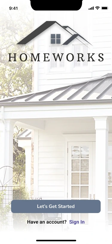
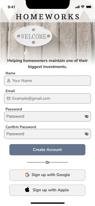
Hi-Fi Screens
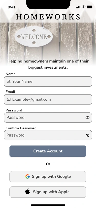
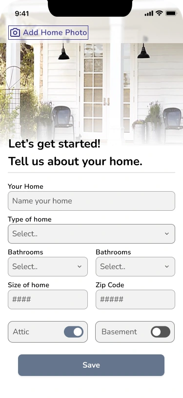
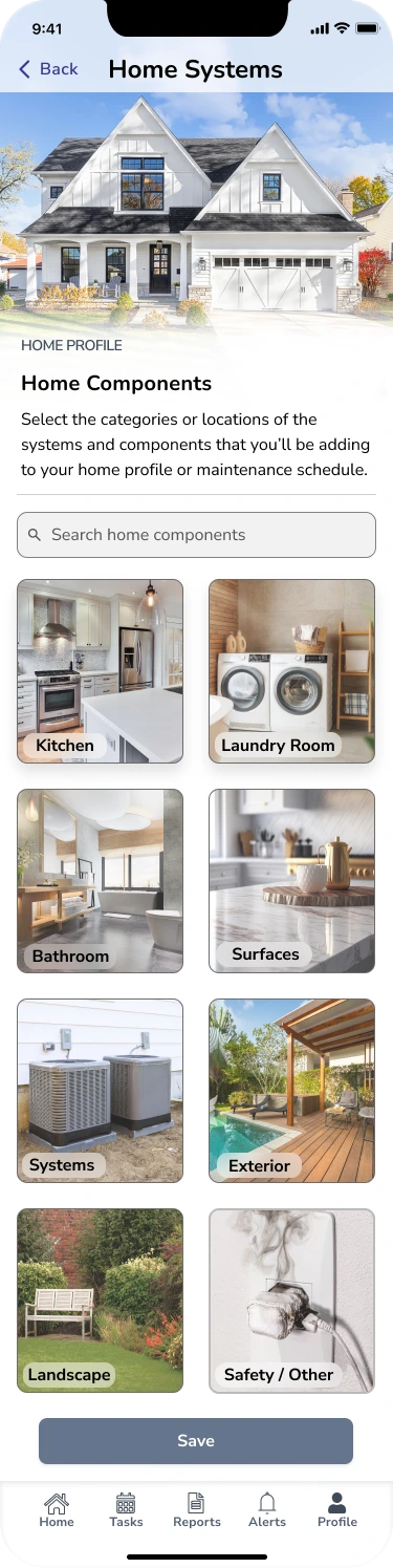
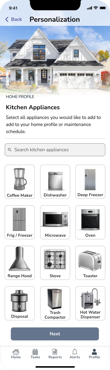
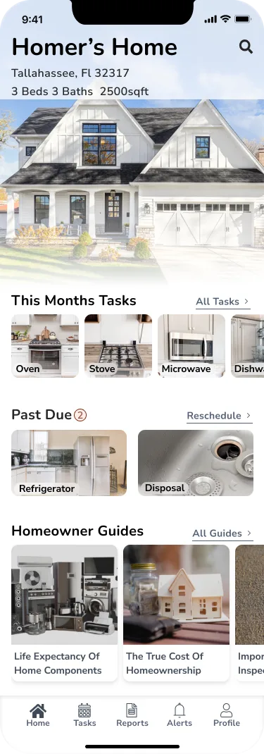
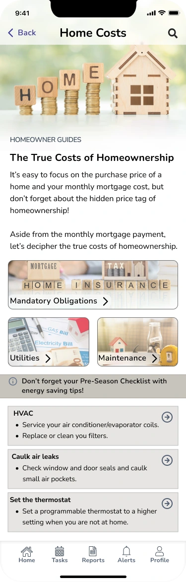
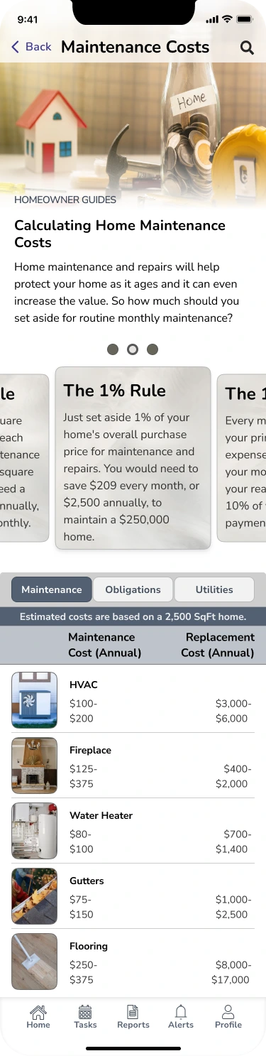
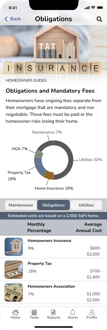
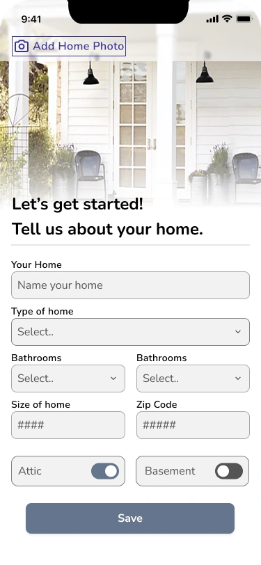
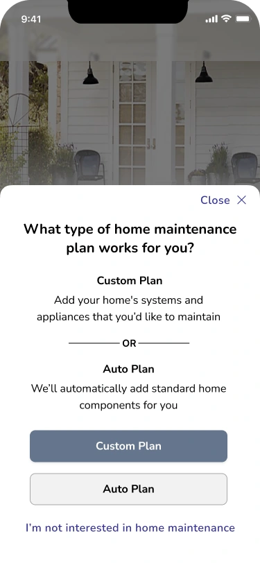
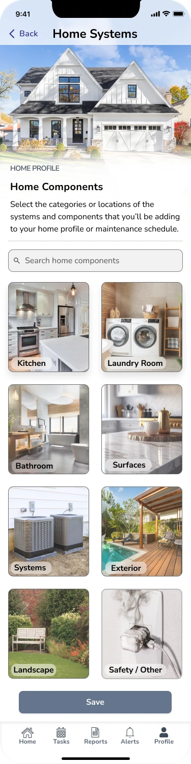
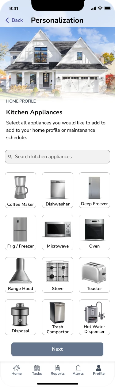
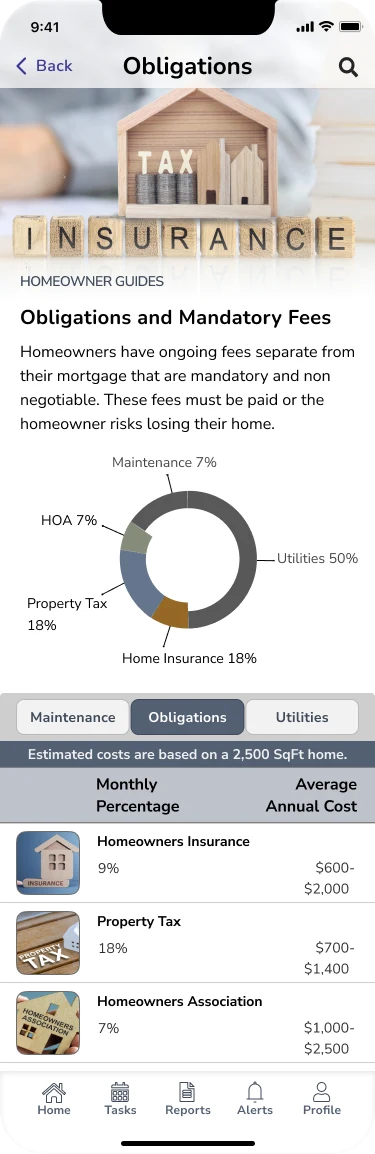
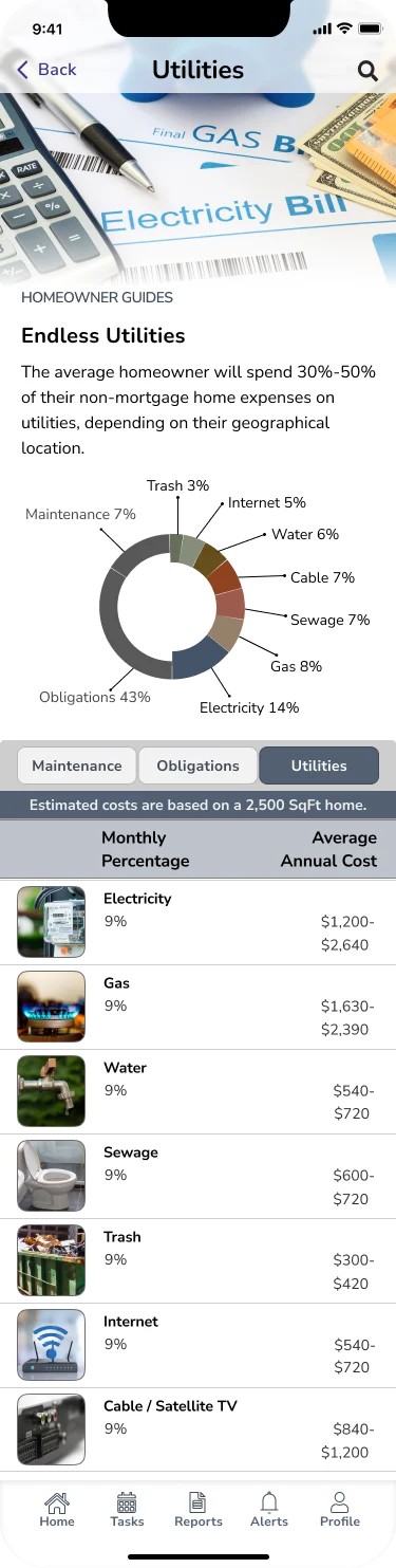
In the case study, while working on the Hi-Fi screens, my main objective was to create an app that is solution-oriented, engaging, and inspiring. The focus was on developing visually appealing screens that are user-friendly and well-organized. I incorporated concise and descriptive features, along with compelling content, to captivate the user's attention. Throughout the design process, I made multiple adjustments to ensure the app's visual design aligned seamlessly with the brand's identity. The aim was to deliver an app experience that not only meets the functional requirements but also resonates with users on a visual and emotional level.

Test
In the case study, I utilized Figma to create a prototype consisting of three user flow routes. The prototype aimed to analyze and improve the navigation of the application. Throughout the iterative design process, I ensured a consistent and cohesive design across all screens, providing users with a streamlined navigation experience. Designing the prototype was a pivotal step in gathering valuable user feedback, specifically regarding the app's navigation and features. By incorporating user input, I could refine and enhance the overall user experience of the application.
HomeWorks Prototype
Usability Testing
In the case study, I conducted usability testing to evaluate the user-friendliness and functionality of the application. To begin, I created a prototype using Figma, which served as a visual representation of the app's design. This prototype was then shared with users to gather feedback on their experience.
Recruitment for usability testing was done through social media, targeting individuals who were homebuyers and/or homeowners. A total of five participants took part in the testing process. Usability tests were conducted in person and remotely, with a moderator guiding the participants through the tasks and observing their interactions with the app.
During the testing sessions, I focused on understanding the users' initial impressions of each screen and their overall task flow. This allowed me to identify areas that needed improvement and address any issues or frustrations that users encountered.
The insights and feedback gathered from usability testing played a crucial role in refining the application's design and enhancing user-friendliness. By incorporating user perspectives and addressing their needs, I created a more intuitive and satisfying user experience.
Tasks
Create a personalized kitchen maintenance plan
Find the life expectancy of kitchen appliances
Learn about the extra homeownership expenses
Test Results
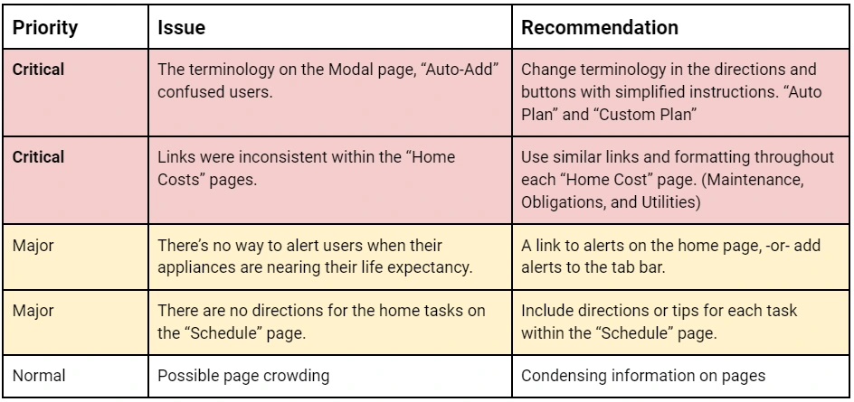
During the analysis phase, I identified major and critical issues that were hindering the user experience. These issues were prioritized based on their impact and severity. By focusing on these key areas, I was able to determine the necessary redesign steps to address the identified issues.
Redesign
After identifying the usability issues through user feedback, I undertook a redesign to address and correct these issues within the prototype. The primary goal was to enhance the overall usability and user experience of the application.
During the redesign, I focused on the following key areas:
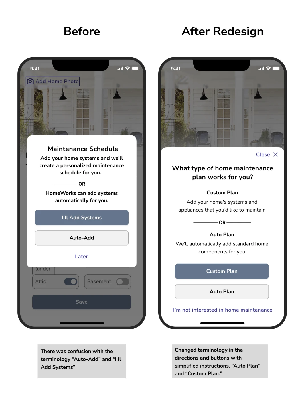
Terminology and clarity: I rephrased confusing terms and instructions to ensure that users could easily understand the functionality and purpose of different features. This involved simplifying language, providing clear definitions, and using questions to guide users.
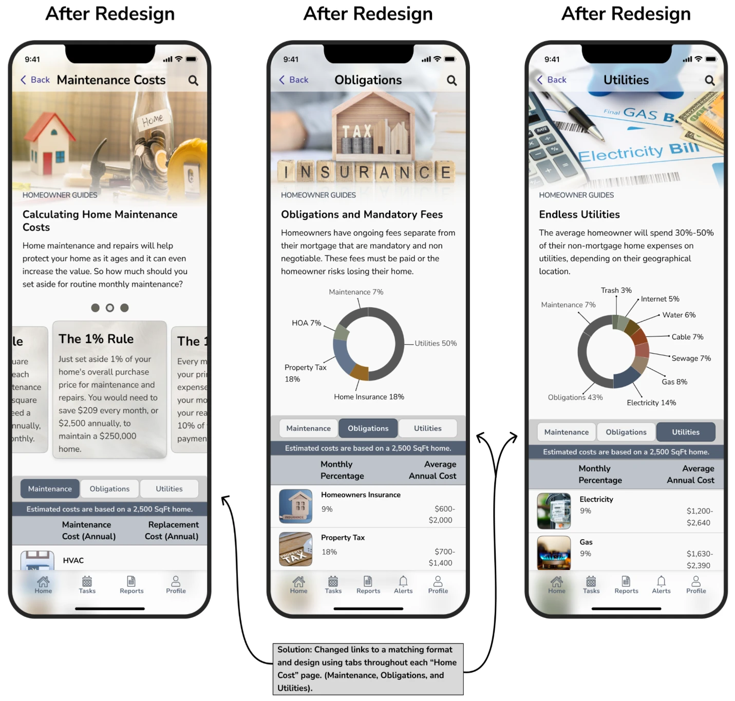
Consistency and navigation: I standardized links and implemented a consistent design approach throughout the "Home Costs" pages. By using tabs, I ensured that users could easily navigate between different cost categories, such as Maintenance, Obligations, and Utilities.
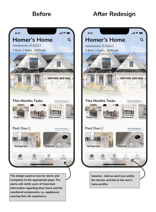
Visual cues and alerts: To address the lack of an alert icon and navigation to the appropriate page, I added an alert icon within the tab bar and linked it to the user's home profile. This visual cue will notify users of important information regarding their home and the monitored components.
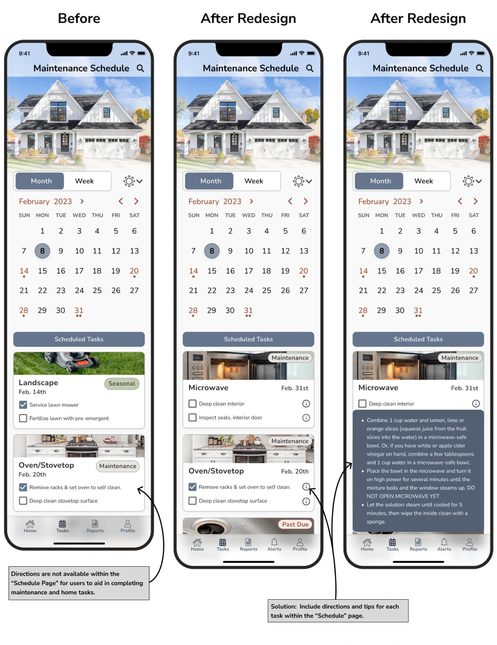
Task guidance: To assist users in completing maintenance and home tasks, I included directions or tips within the "Schedule" page. This additional information will guide users through the tasks, ensuring they have clear instructions to follow.
Through this redesign process, I aimed to improve the overall user experience by addressing the identified usability issues and making necessary corrections. By implementing these design changes, the application will be more intuitive, user-friendly, and aligned with the users' needs and expectations.
Issue 1: Terminology
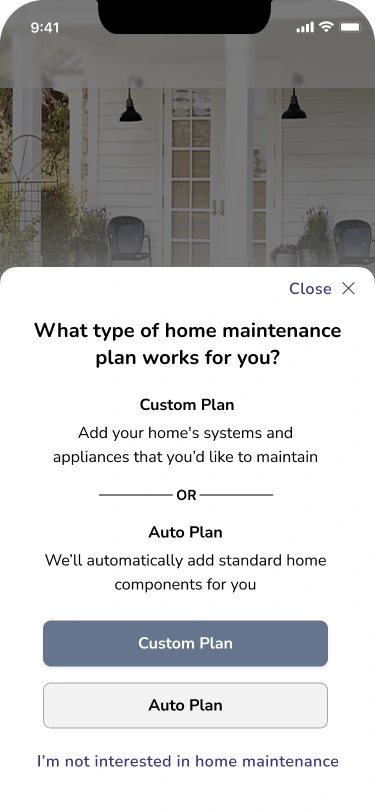
The primary issue identified was confusion among users regarding the terminology "Auto-Add" on the Modal page. Participants expressed uncertainty about its meaning and found it challenging to understand the distinction between "Auto-Add" and "Custom Maintenance Schedule."
Solution:
To address the confusion with the "Auto-Add" feature, I will implement the following solutions:
Rephrase the directions as a question: Instead of using "Auto-Add," I will rephrase the directions to ask, "What type of home maintenance plan works for your home?"
Define the options: I will clarify the options by renaming them "Custom Plan" and "Auto Plan" and providing clear definitions for each.
Replace buttons: The buttons will be updated to reflect the revised options, including "Custom Plan," "Auto Plan," and an additional option for users not interested in home maintenance.
These changes aim to improve user understanding and provide more precise choices for users when selecting a maintenance plan for their homes. By implementing these solutions, I aim to eliminate confusion and enhance the user experience within the application.
Issue 2: Interactive Elements
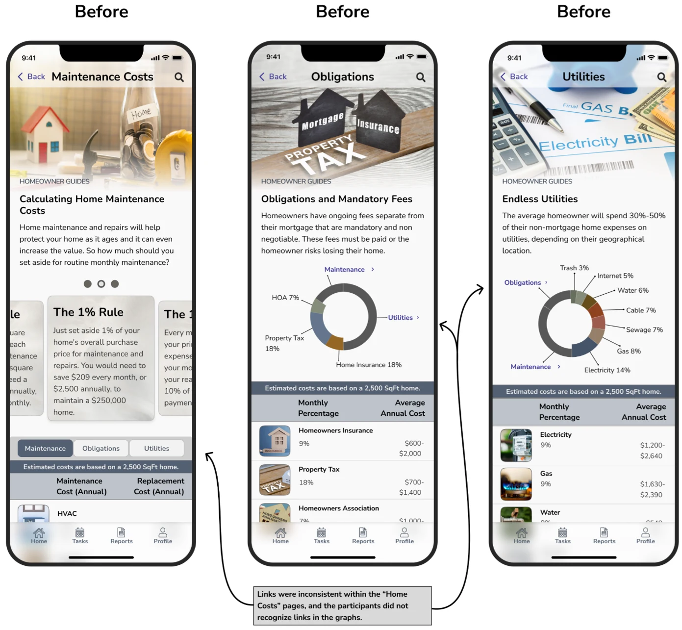
With the "Home Costs" links being inconsistent within the pages, the participants had difficulty recognizing links in the graphs.
Solution:
Standardize link format: I will ensure that all links within the "Home Costs" pages follow a consistent format in terms of design and placement. This will make it easier for users to identify and interact with the links.
Implement tabs: Instead of relying solely on links, I will introduce tabs on each "Home Cost" page, specifically for maintenance, obligations, and utilities. This will provide a clear and organized structure for users to navigate and access relevant information.
By implementing these solutions, I aim to improve the consistency and visibility of links within the "Home Costs" pages and provide a more intuitive navigation experience for users. This will enhance their ability to access and explore different cost-related information easily.
Issue 3: Design
The app design lacked an icon for alerts and a clear navigation path to the appropriate page, and I propose the following solution:
Solution:
Add an alert icon: I will introduce a dedicated icon within the tab bar to represent alerts. This icon will serve as a visual indicator for users to quickly identify when there are important notifications or updates related to their home and monitored components.
Link to the user's home profile: By clicking on the alert icon, users will be directed to their home profile page, where they can access detailed information and take necessary actions based on the alerts received. This will provide a clear and straightforward navigation path for users to address any issues or concerns related to their homes.
By implementing these solutions, I aim to enhance the overall user experience by introducing a prominent alert icon and providing a seamless way for users to access relevant information and take necessary actions. This will ensure that users know important updates and can proactively manage home maintenance and components.
Issue 4: Missing Information
Tips are unavailable on the "Schedule" page to assist users in completing maintenance and home tasks. I propose the following solution:
Solution:
Include directions or tips for each task: I will enhance the "Schedule" page by providing precise and concise directions or tips for each task listed. This will guide users in effectively completing the maintenance and home tasks, ensuring they have the necessary information and guidance.
By incorporating directions or tips within the "Schedule" page, users will have access to valuable information that can help them perform tasks correctly and efficiently. This will increase user confidence and reduce confusion or uncertainty when carrying out maintenance and home-related activities.
Reflection
Learnings
Throughout this project, I have experienced tremendous growth in my knowledge, understanding, and skills. Identifying a problem and developing a solution has been incredibly rewarding. As a dedicated problem solver passionate about helping others, I have learned valuable lessons throughout this project. Here are some essential reflections:
User-Centric Approach: I have realized that users are the cornerstone of finding practical solutions. Initially, I may have relied on my own experiences and assumptions. Still, I soon recognized the importance of conducting thorough research, actively listening to users' challenges, and empathizing with their experiences. This approach allowed me to create an app, HOMEWORKS, that directly addresses their needs and provides a clear and compelling solution.
Creative Problem-Solving: I have embraced the iterative nature of the design process and learned to navigate the challenges that come with it. As someone who strives for perfection, I have learned the value of embracing multiple iterations and continuous improvement. I now understand that great design is an evolving process, and what may be considered ideal today can be further refined and expanded upon in the future.
Overall, I am thrilled with the progress made in this project, although there may be additional design iterations to come. The experience has taught me the importance of user-centered design, creative problem-solving, and the limitless possibilities within the design process. I am proud of the work done so far and look forward to further refining and enhancing the app to meet the evolving needs of homeowners.
Looking Ahead
Expanding the Application
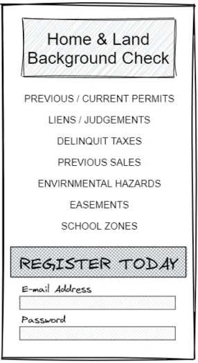
In my journey to develop the HOMEWORKS application, I have identified an exciting opportunity to enhance the user experience for homebuyers and homeowners. Building upon the existing features, I envision the addition of new functionality. This feature would empower users by providing them with the ability to perform comprehensive home and land background checks. By integrating links to relevant sources such as:
County
City
Tax Collector
Property Appraiser,
Department of Environmental & Growth Management,
Users could access crucial information to make informed decisions about their potential or existing properties.
The Enhanced Homeownership Experience
This expansion would truly empower users with a holistic view of their homes, ensuring peace of mind and confidence in their homeownership journey. The background check would also provide the following information:
Flood zones
Easements
Environmental hazards
Previous/current liens, delinquent taxes, legal documents
Approved/denied permitting related to the property.
Public records show significant damage that required permitting for repairs.
School zones
Previous sale price
Read more of my case studies

Plannie
Plannie
Sole UX/UI Designer | Product Design | Enabled seamless event and project management for planners and clients through a collaborative B2B2C platform.
Diy55
Diy55
Sole UX/UI Designer & UX Researcher | A B2C Interface for DIY skincare and aesthetic treatments.
CDPH - SCRL
CDPH - SCRL
Senior UX/UI Designer & UX Researcher | Redesign | Streamlined immunization record management for the California Department of Public Health
Like this project
Posted Jul 10, 2026
Designed HomeWorks, a B2C app providing personalized maintenance plans, lifespan tracking, and cost insights for homeowners.
Likes
0
Views
2