CDPH-SCRL

Brady Marchant


CDPH-SCRL
SCRL helps California schools stay compliant with student immunization requirements, ensuring compliance with California state health regulations.
Overview
The School and Childcare Roster Lookup (SCRL) is an essential module within the California Immunization Registry (CAIR) Hub, designed to empower schools and childcare providers. It facilitates swift access to and verification of student immunization records, ensuring compliance with state public health regulations.
This tool is crucial for safeguarding community health, delivering real-time and accurate data while significantly easing the administrative load on staff.
Overcoming a visual chaos
Over time, the SCRL platform underwent numerous updates that left it visually inconsistent and challenging to navigate. Users faced significant hurdles such as:
Misaligned margins and uneven spacing that disrupted the visual hierarchy.
Confusing iconography and duplicated buttons, leading to uncertainty.
Redundant navigation paths, which introduced unnecessary complexity.
These challenges proved detrimental for users trying to complete time-sensitive tasks, resulting in frustration and usability barriers.
Transforming the SCRL platform for better accessibility
The goal was to create a more intuitive and accessible experience while maintaining familiarity for returning users.
As the sole Senior UX/UI Designer, I undertook a comprehensive redesign of the SCRL platform, focusing on the following enhancements:
Accessibility-first design system: I updated brand colors and interface elements to achieve a 7:1 contrast ratio, meeting WCAG AAA standards.
Consistent layout structure: I standardized spacing, alignment, and margins to strengthen visual hierarchy and enhance page clarity.
Streamlined navigation: I reduced redundancy and simplified filters, allowing for quicker access to key data.
Enhanced usability: I implemented clear CTAs, accessible menu structures, a persistent search bar, and contextual breadcrumbs to improve wayfinding.
👩🏼💻 Role
Senior UX/UI Designer (sole designer)
🔍 Process
Discovery
Ideation
Design
Reflection
🛠️ Tools
Figma
FigJam
Microsoft Teams
Jira
Adobe Photoshop
Adobe Illustrator
⏳ Duration
3.5 months
1
Discovery
2
Ideation
3
Design
4
Reflection
Discovery
Setting the stage for user-centered design
To create an inclusive redesign, I anchored my approach in the U.S. Web Design System Principles and WCAG 2.2 accessibility standards. These frameworks were instrumental in guiding critical design decisions aimed to enhance usability for all users.
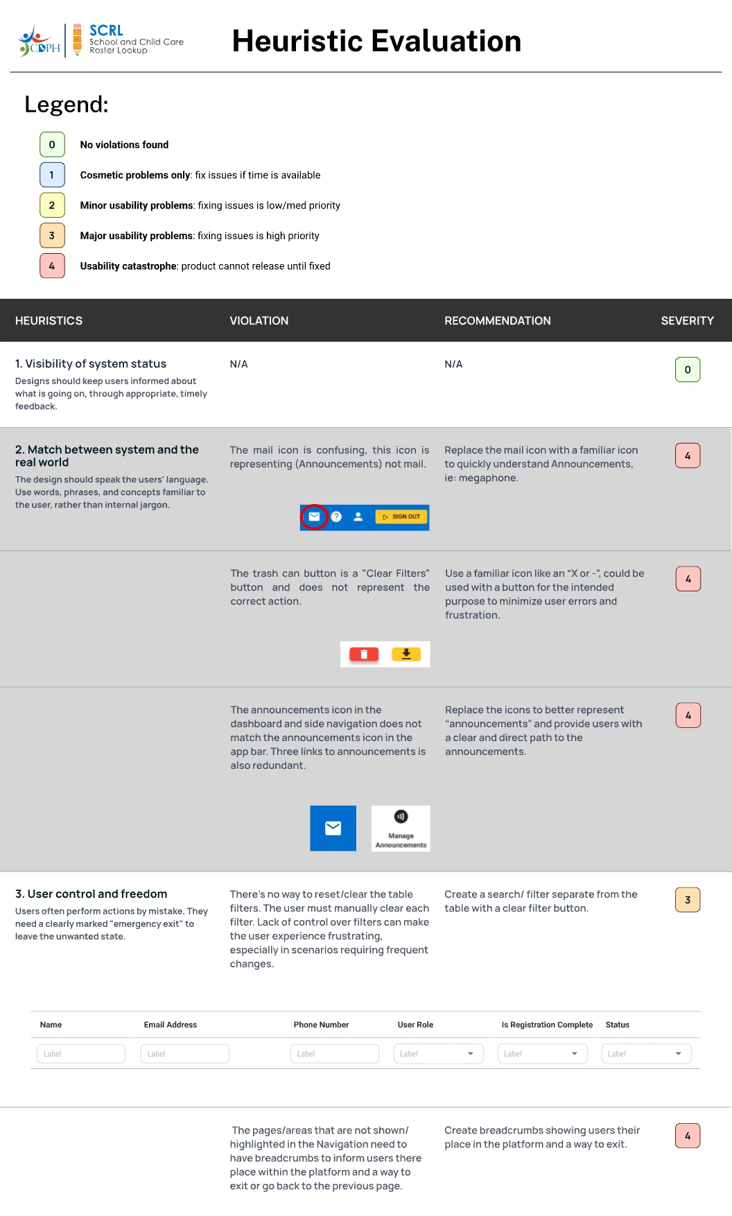
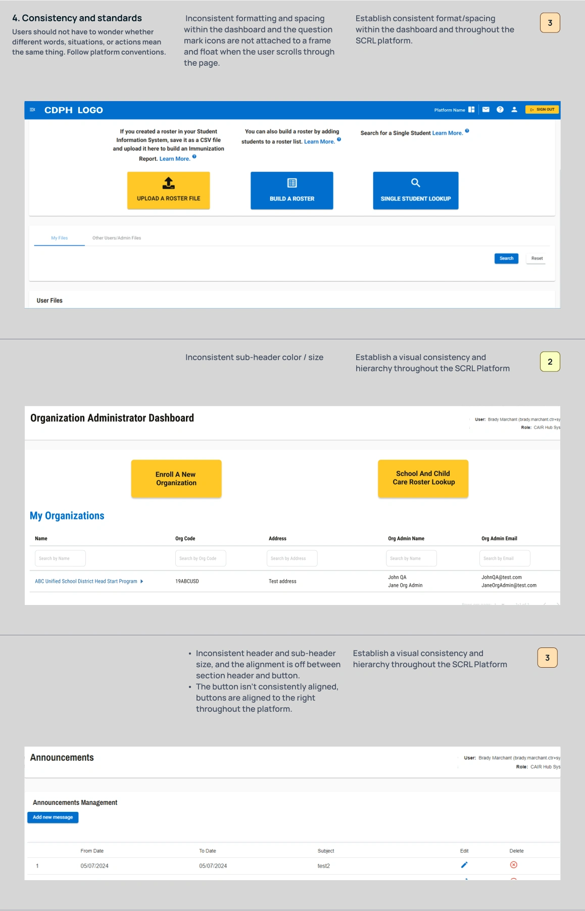
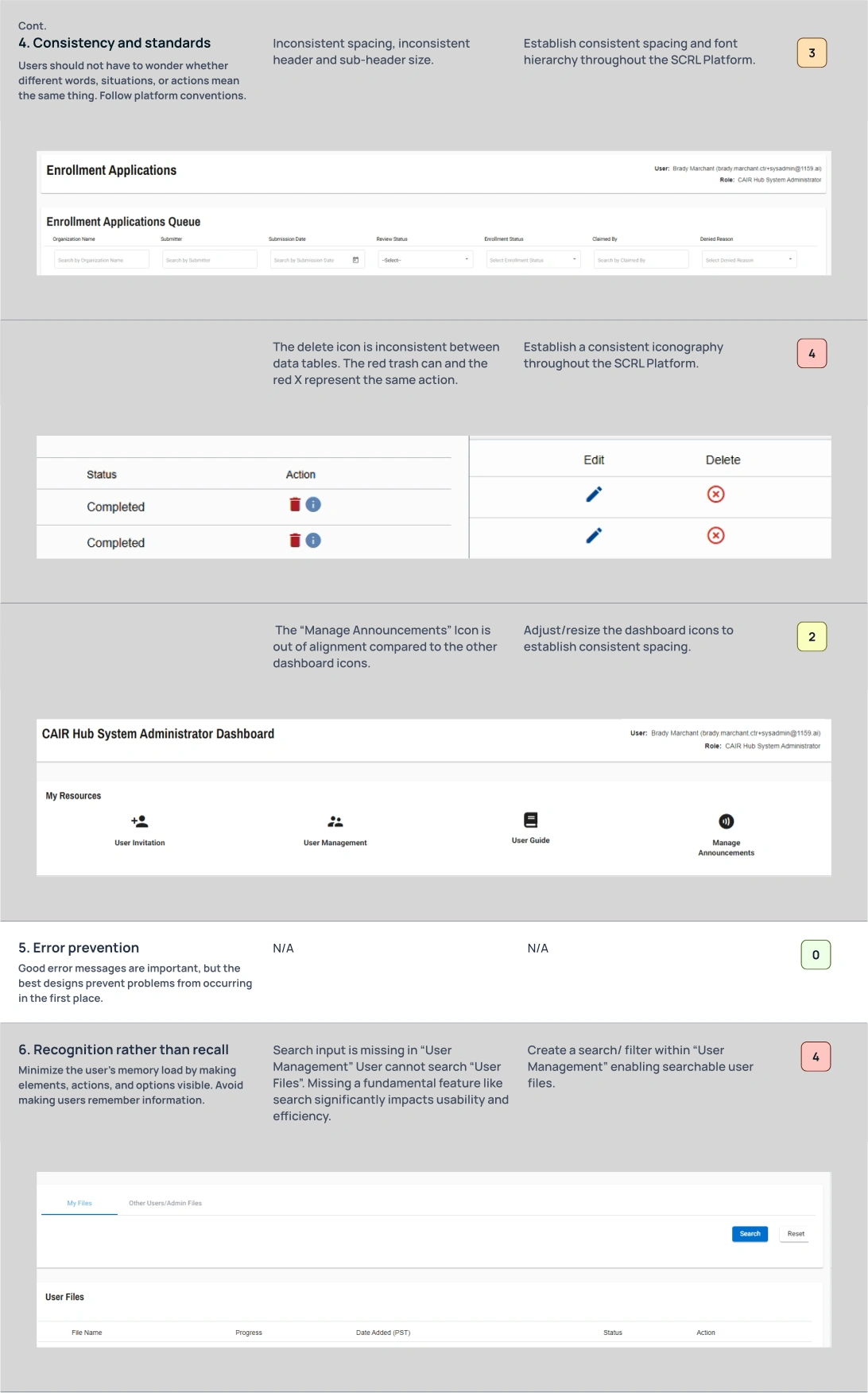
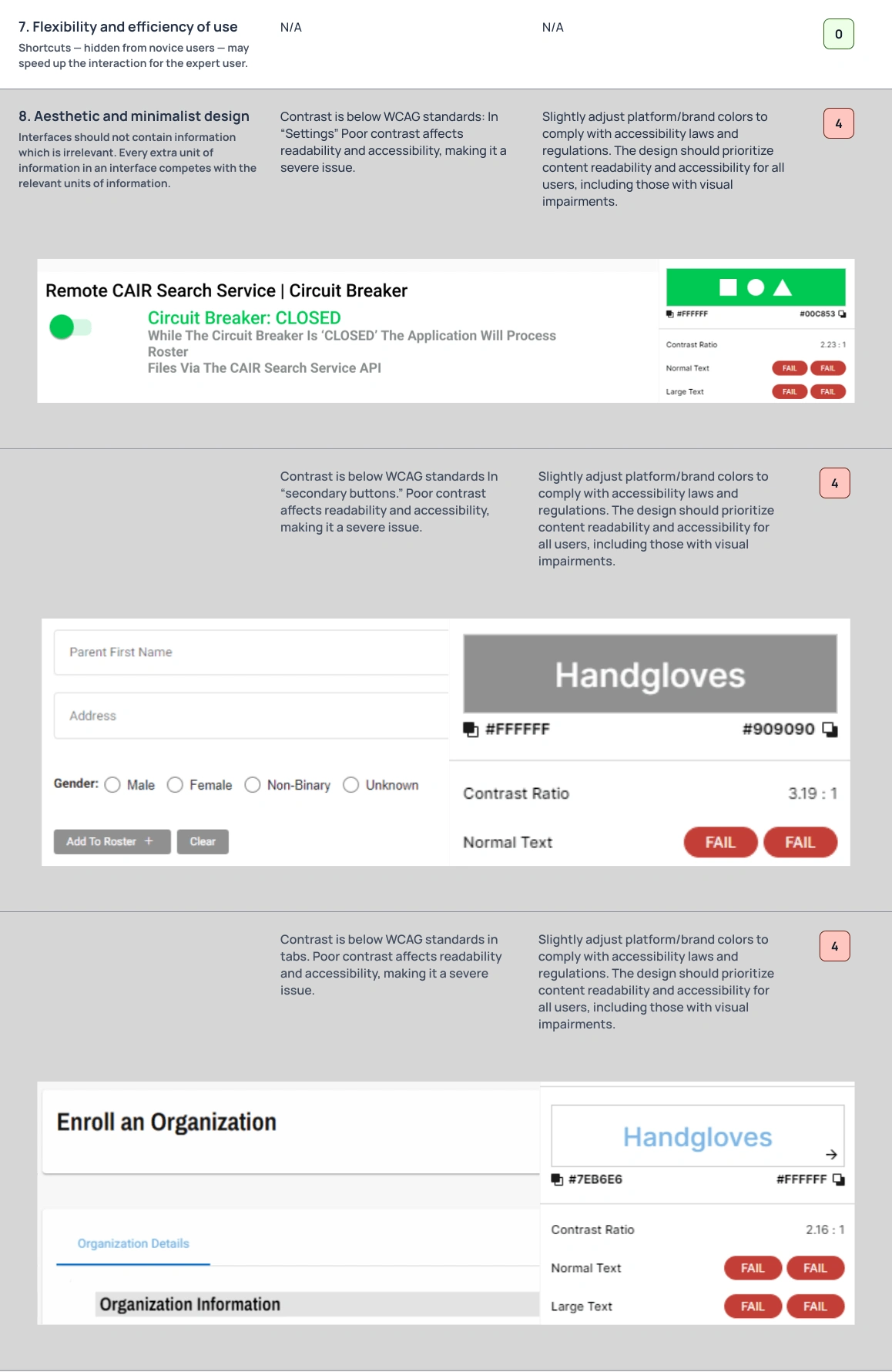
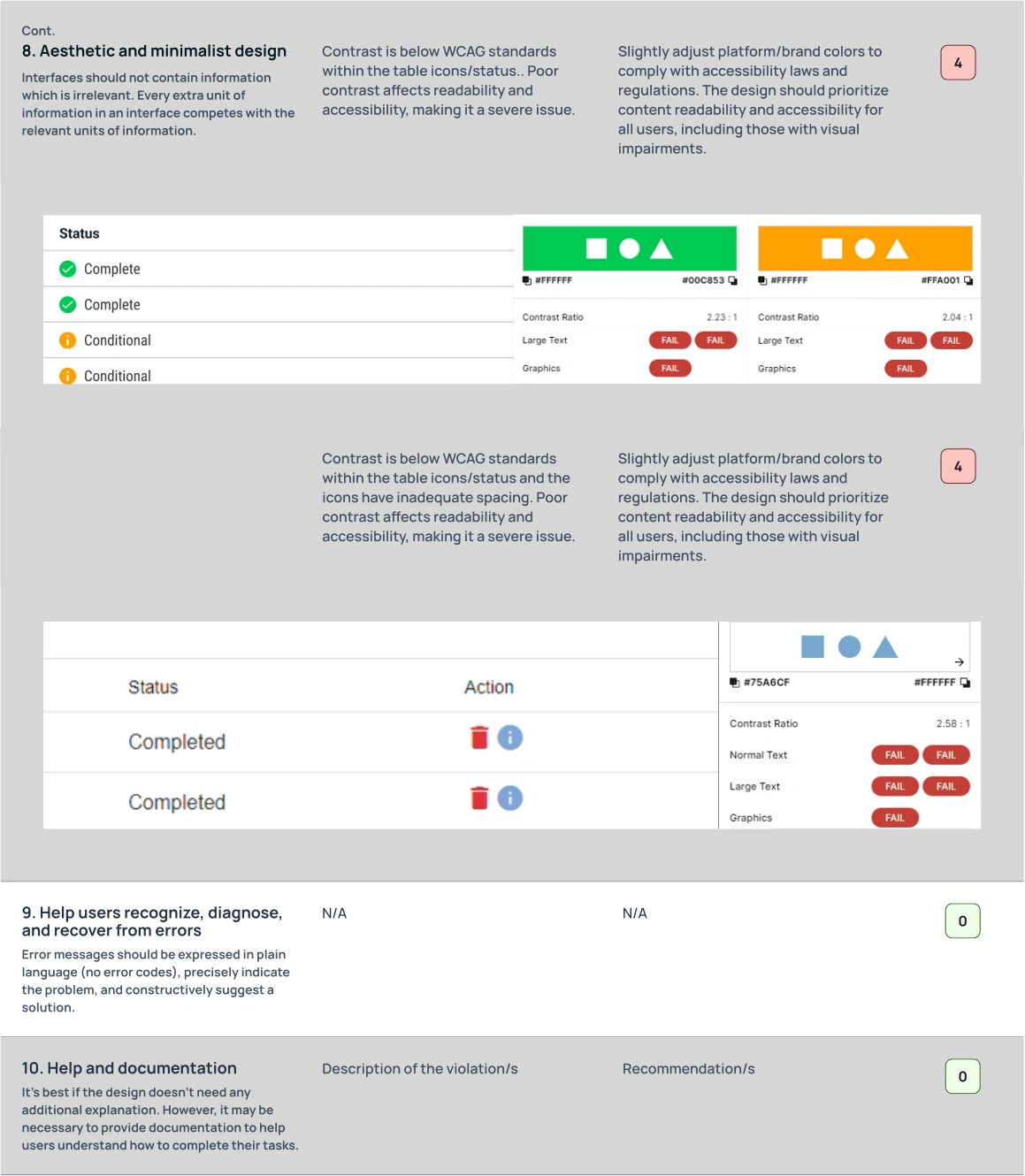
In the discovery phase, I thoroughly examined the existing SCRL platform to assess its alignment with established UX and accessibility standards. I also conducted a heuristic evaluation based on Jakob Nielsen’s 10 Usability Heuristics to uncover pain points, inconsistencies, and opportunities for improvement.
Heuristic Evaluation
In a systematic review of the platform, I evaluated it against Nielsen’s usability heuristics—covering system feedback, icon recognition, accessibility, and consistency. For each usability issue identified, I provided actionable recommendations, focusing on high-severity violations that impacted usability and accessibility.
Key takeaways:
Misleading icons disrupted mental models and caused confusion among users, such as using a mail icon for announcements.
Inconsistent layout and hierarchy hindered users' ability to scan and interact with essential elements.
Inadequate contrast ratios across buttons and text failed to meet WCAG compliance standards.
Lack of feedback and filter controls left users unclear on how to reset or understand their position within the system.
These insights served as the foundation for designing a cleaner, more accessible, and task-friendly interface that meets industry standards and enhances the user experience for school and childcare staff.
Ideation
User stories that drive design
To define the project's scope and ensure it centered around real user needs, I crafted user stories from the viewpoint of a SCRL System Administrator. These narratives illuminated the essential tasks the system must support:
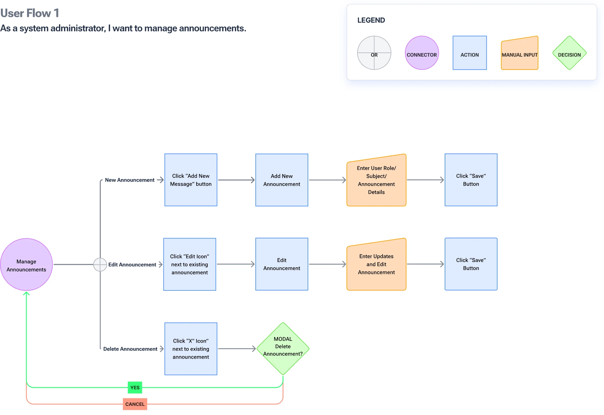
As a user, I want to manage announcements so I can share timely updates with staff.
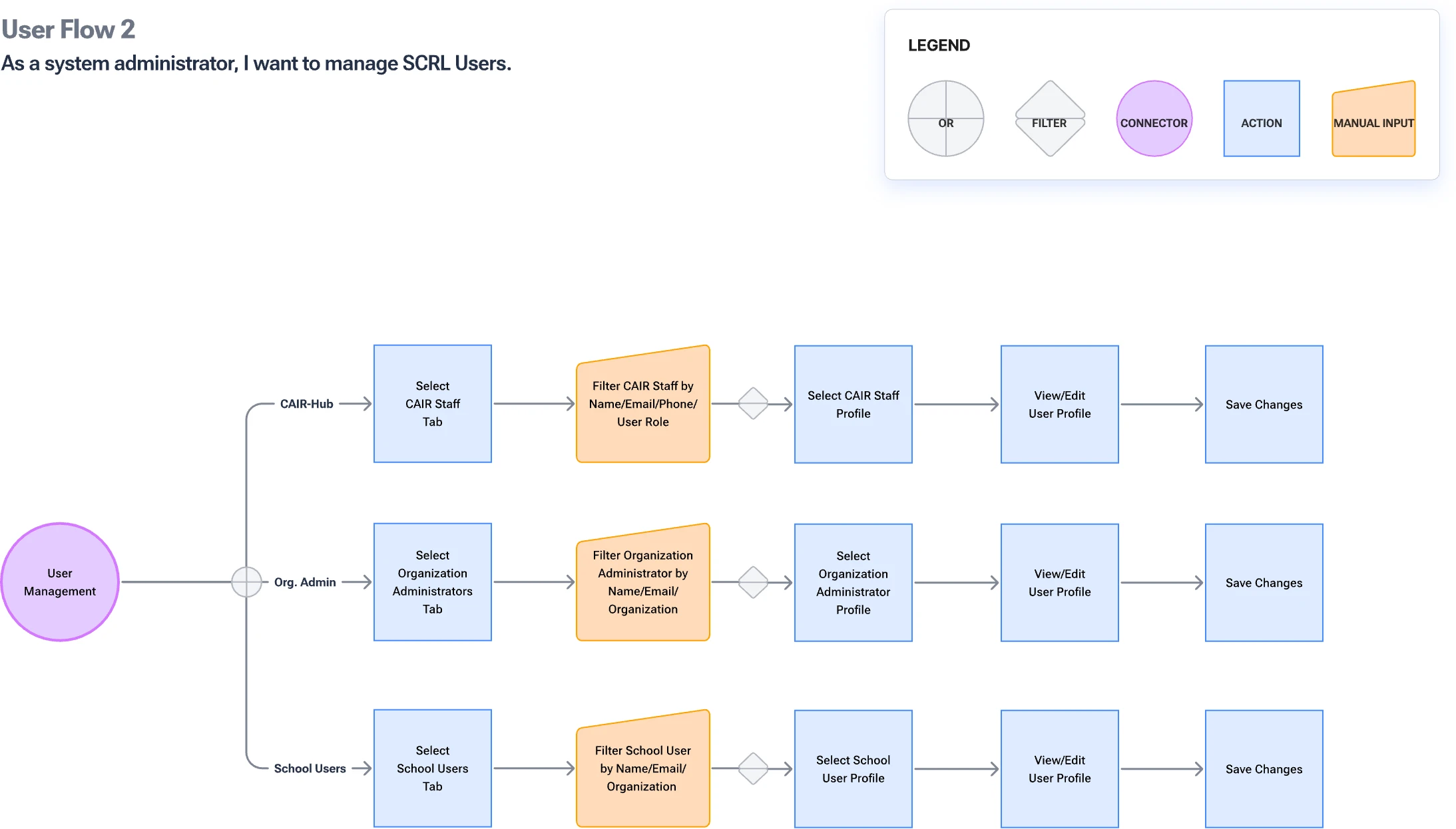
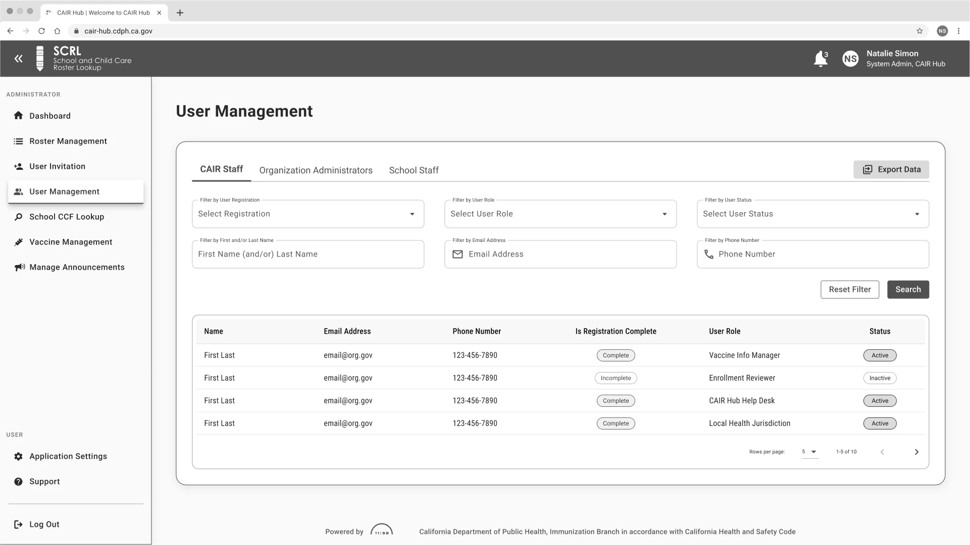
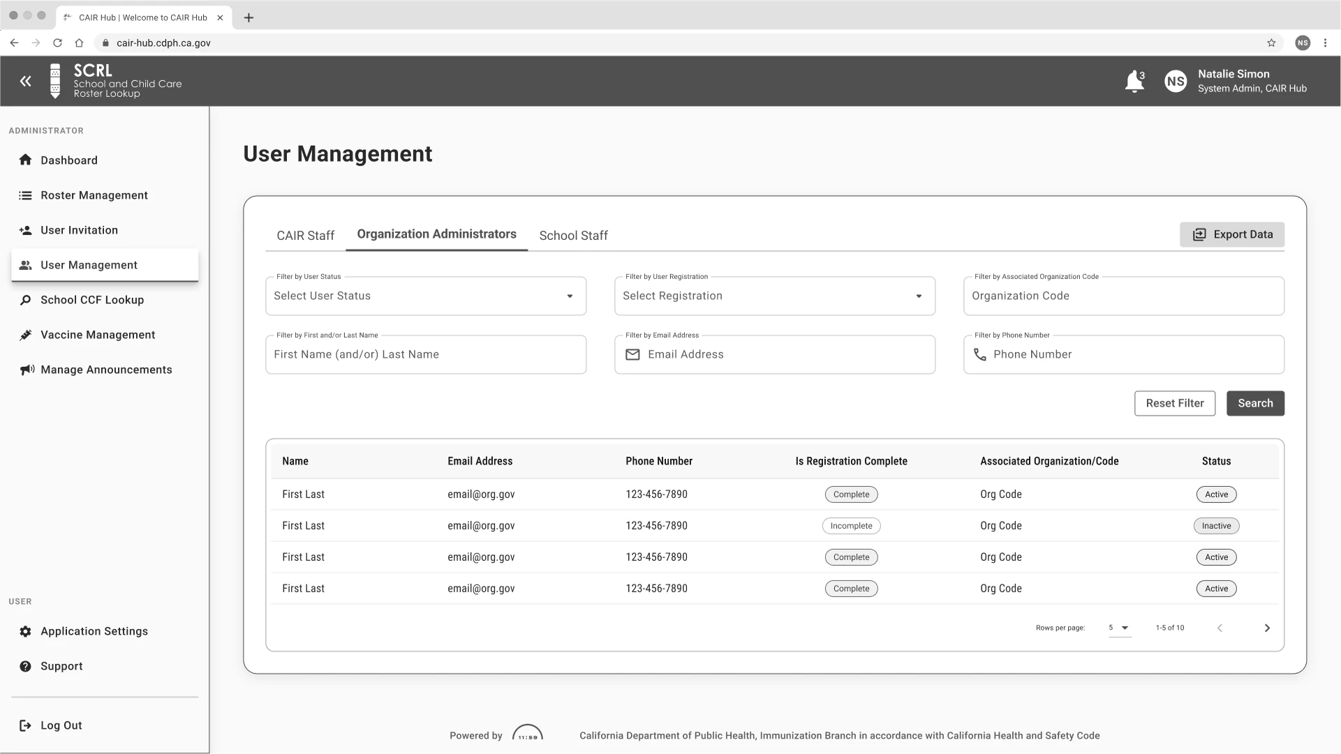
As a user, I want to manage SCRL users to maintain accurate access and roles.
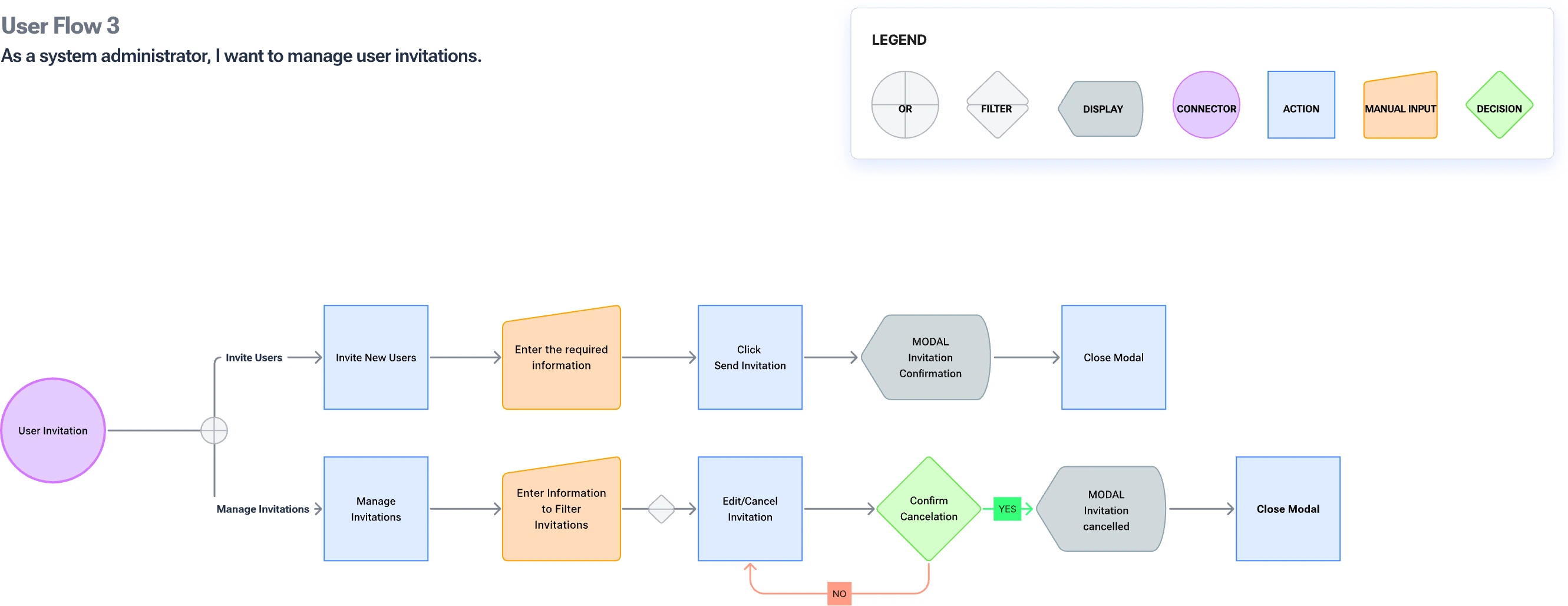
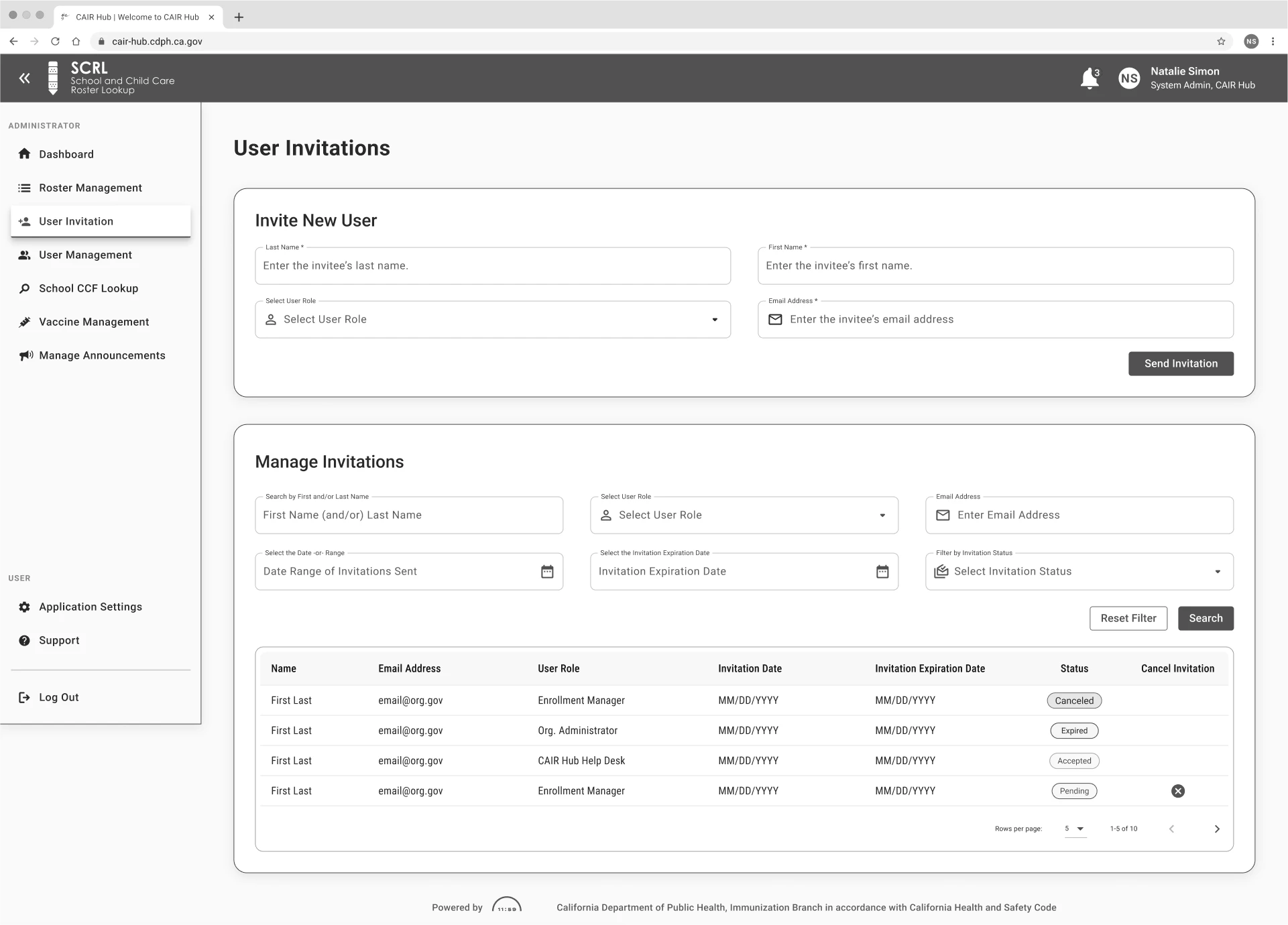
As a user, I want to manage user invitations to streamline onboarding.
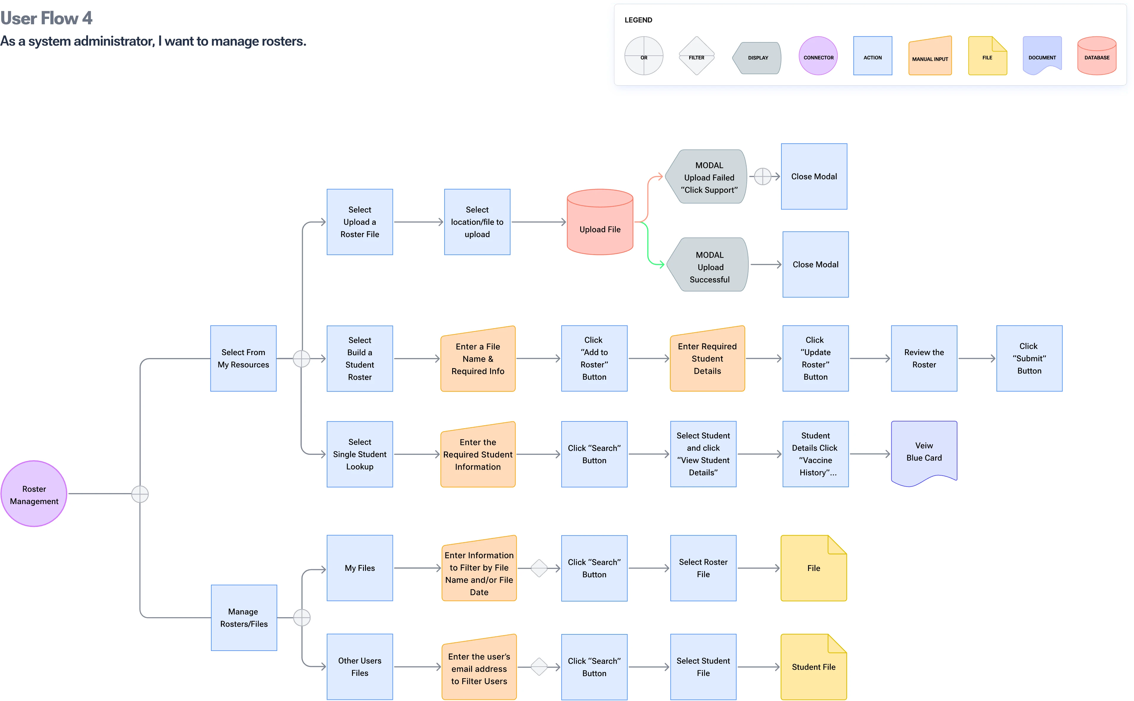
As a user, I want to manage immunization rosters to ensure compliance with health regulations.
These stories formed the foundation of the information architecture and user flows, guiding the design process toward impactful and user-centered solutions.
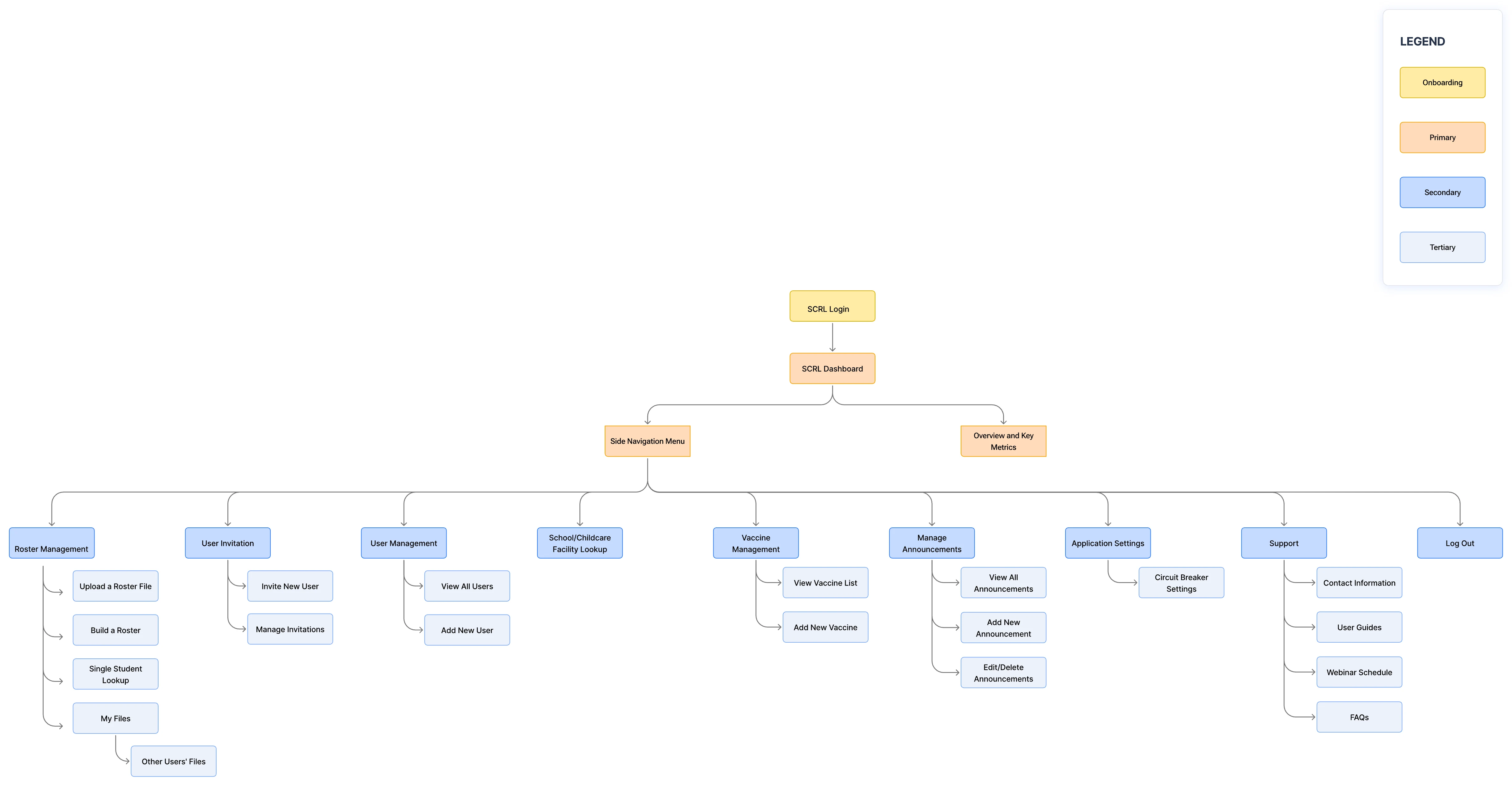
SCRL site map outlining the full platform architecture and navigation hierarchy.
Crafting a clear roadmap
To untangle the complexities of the SCRL platform, I created a comprehensive sitemap that outlined all key features and navigation paths. This strategic overview not only brought clarity but also set the stage for a more intuitive user experience.
This high-level view enabled me to:
Audit and organize related tasks in a logical manner
Identify redundancies and gaps in the existing structure
Ensure that navigation supports essential workflows
The final sitemap emerged as a vital blueprint for streamlining user interactions and fostering development around a cohesive framework.
Seamless user flows for administrators
To demonstrate how administrators navigate the system to accomplish essential tasks, I designed task-based user flows based on user stories. Each flow:
Targets a specific objective (such as managing announcements or uploading a roster)
Outlines the sequence of actions, inputs, and decision points
Identifies areas for enhancement, such as minimizing clicks or clarifying processes
These user flows played a vital role in collaborating with developers, pinpointing UI bottlenecks, and ensuring every navigation path was efficient and user-centered.
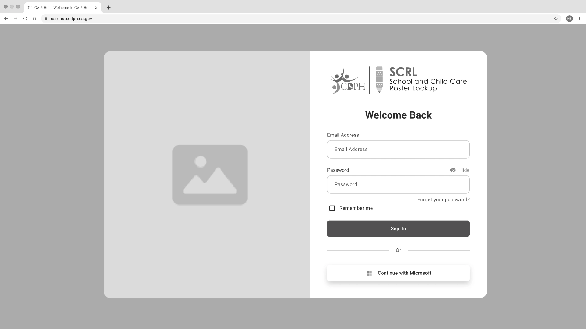
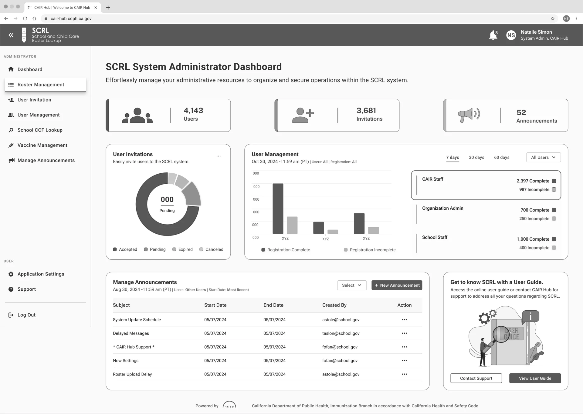
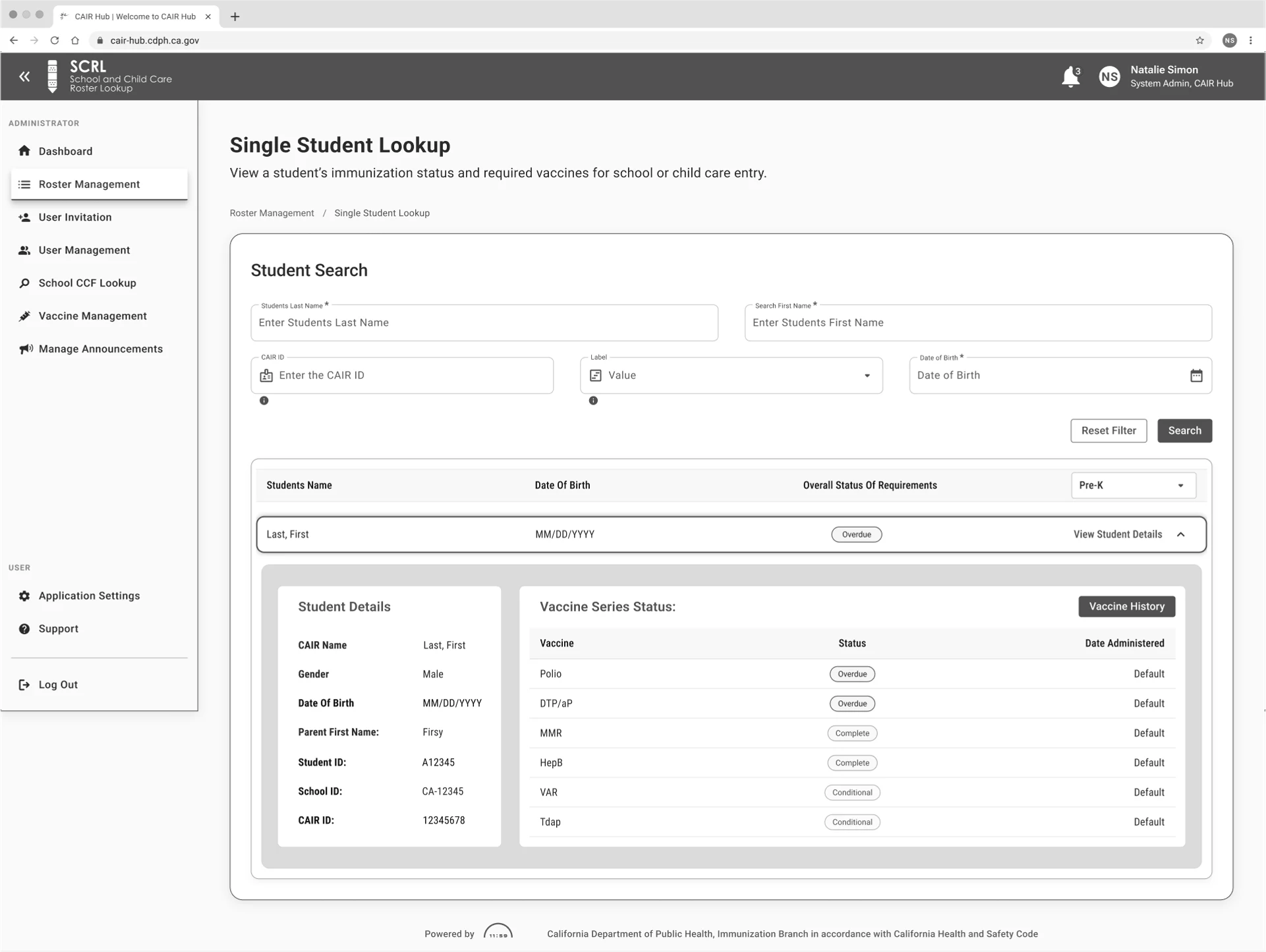
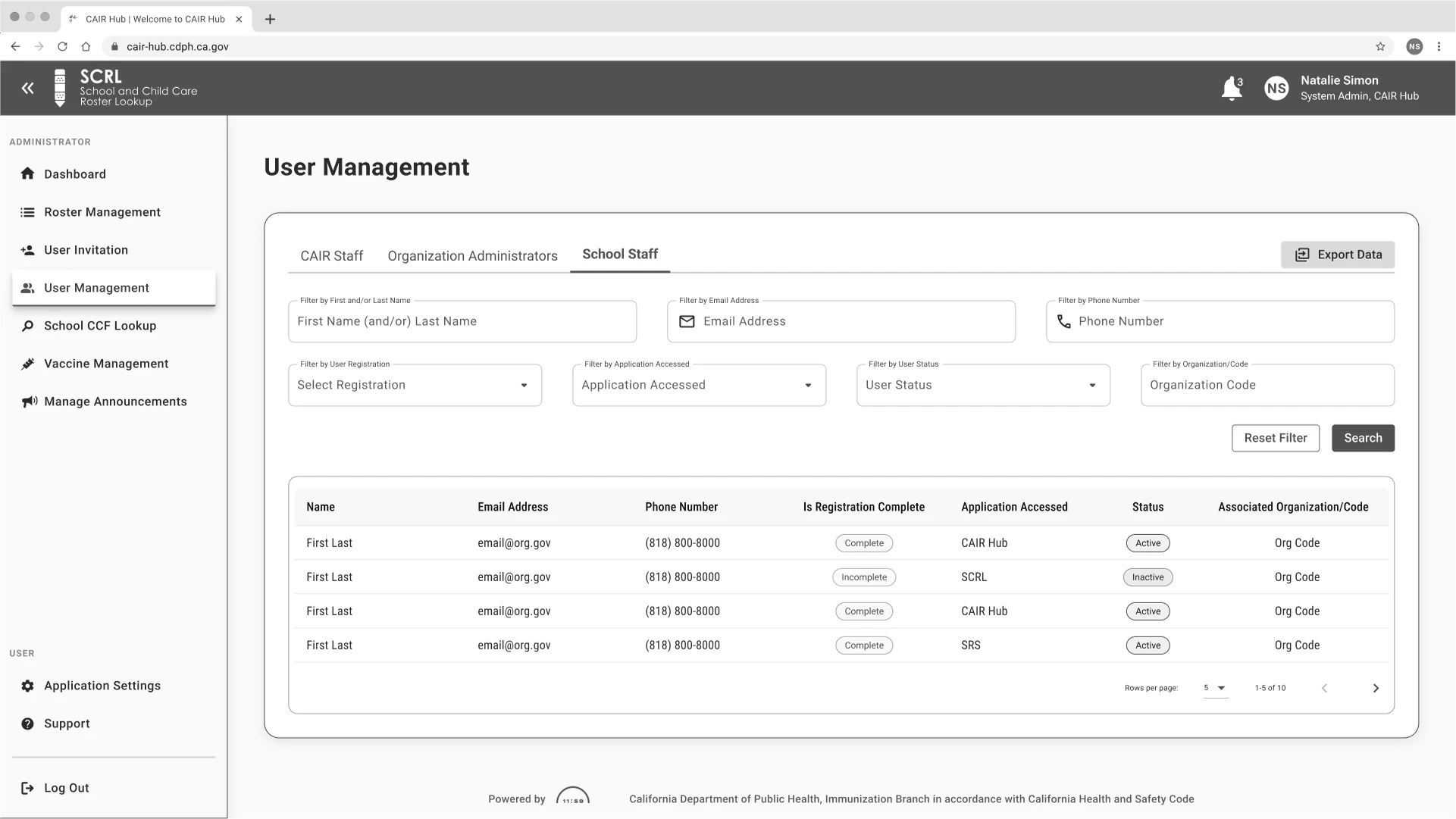
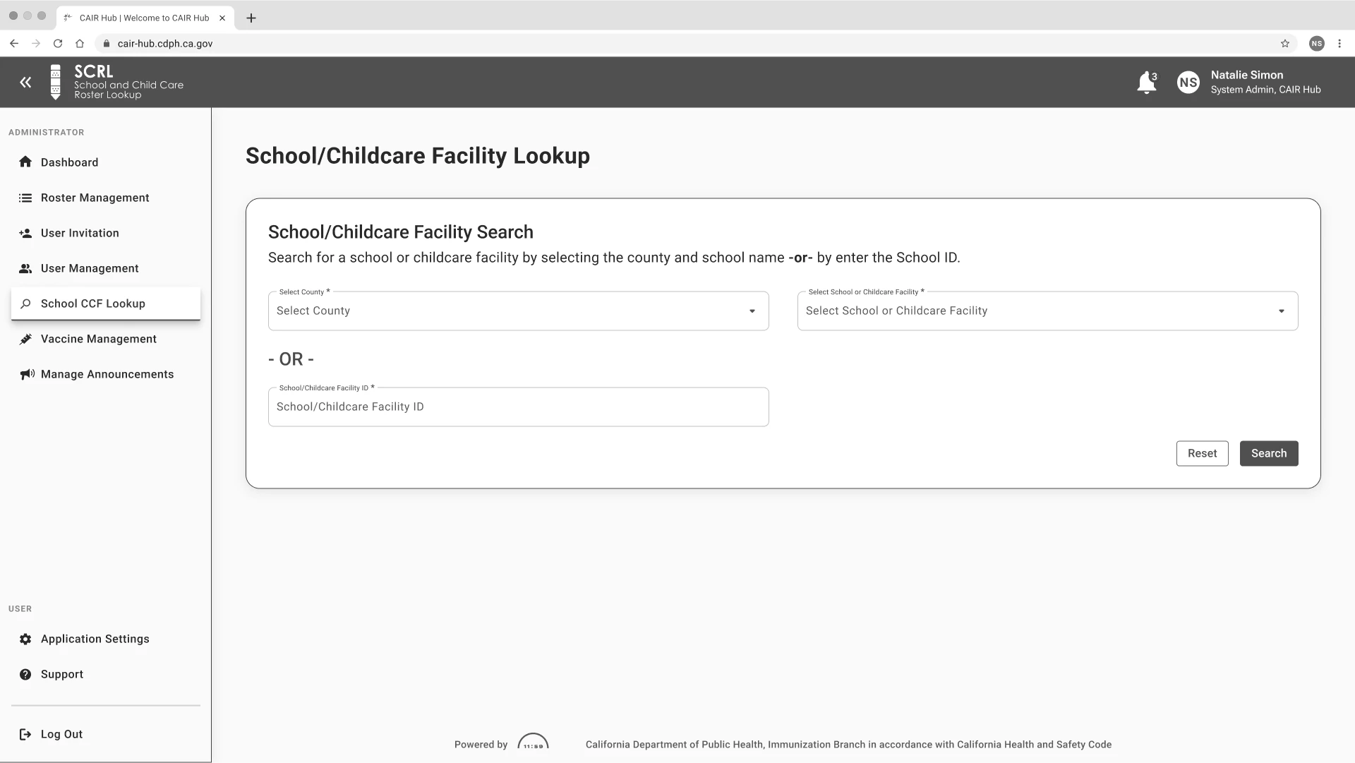
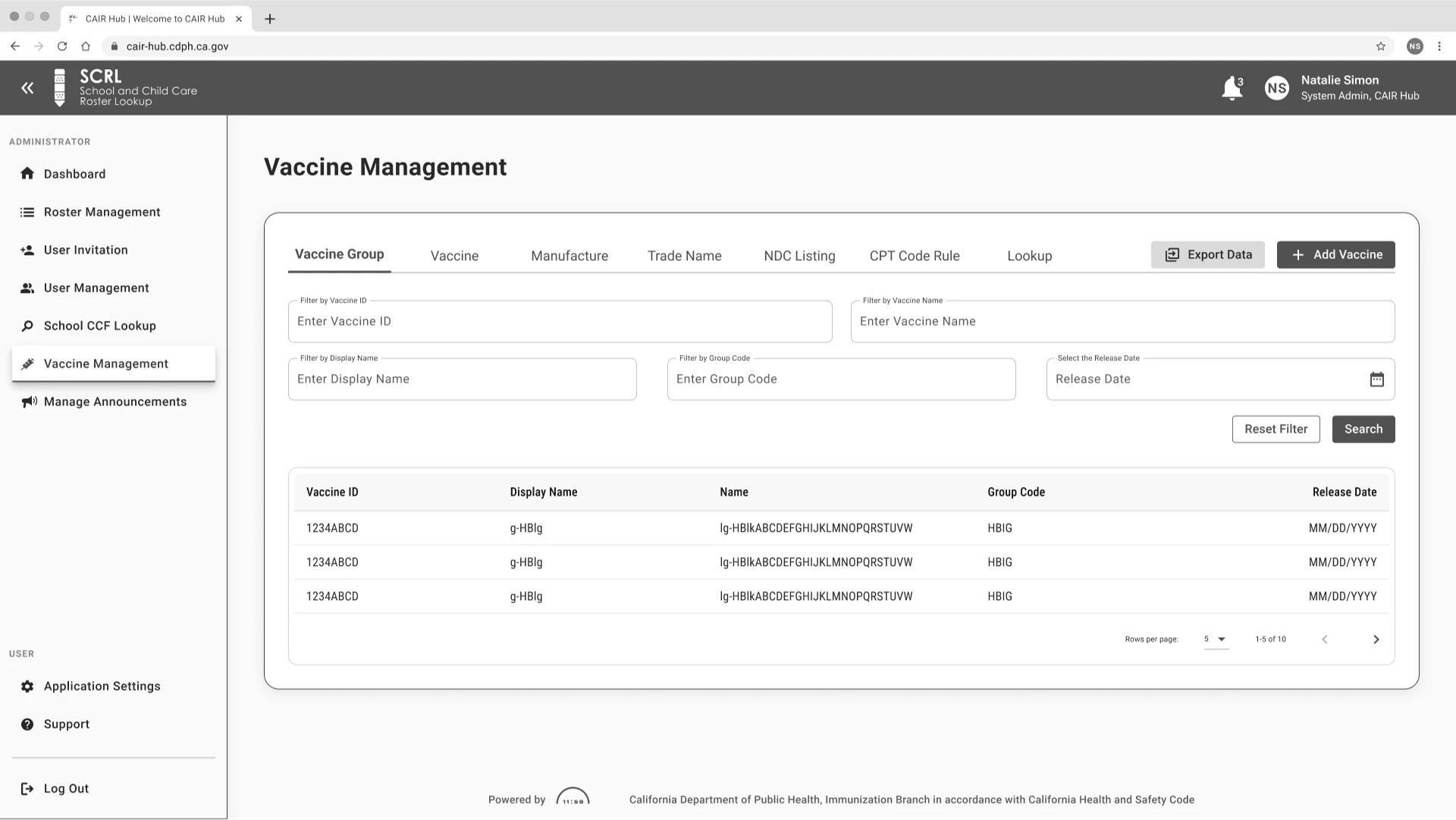
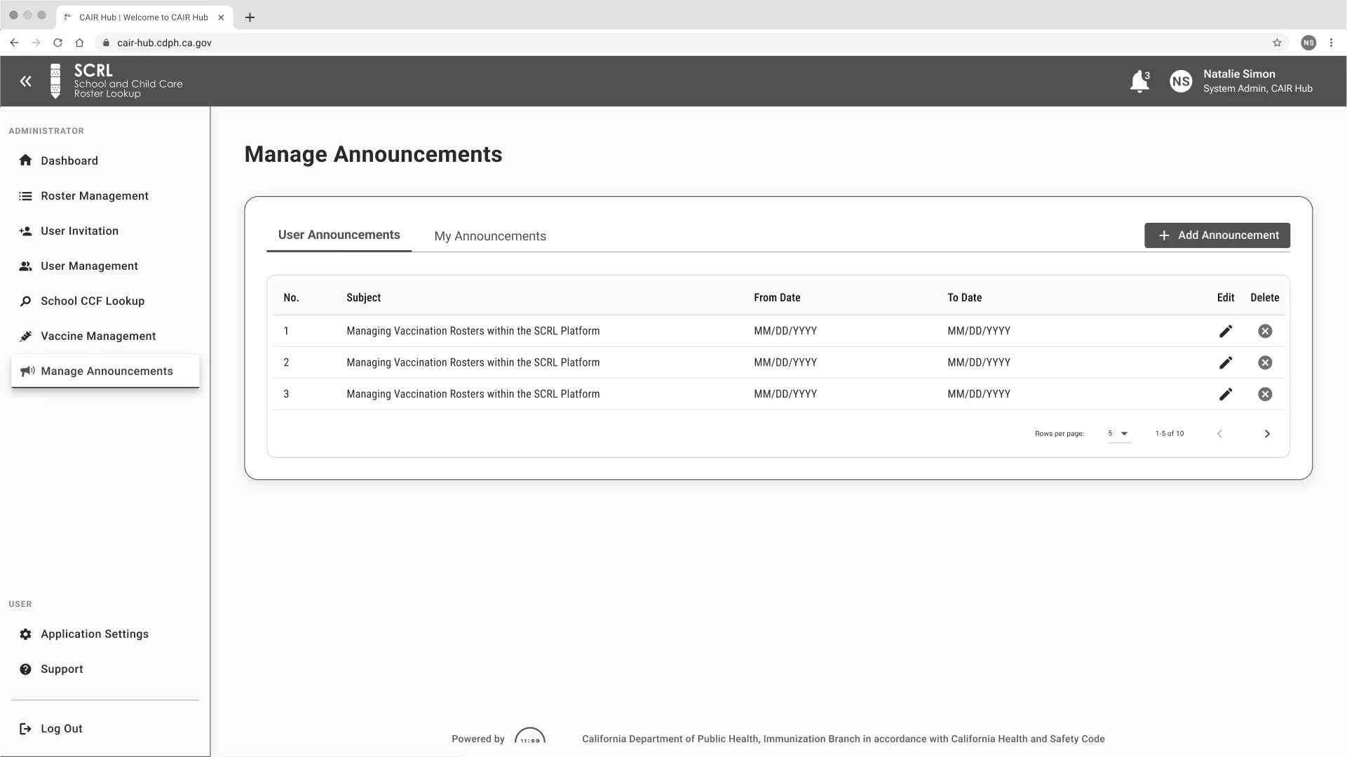
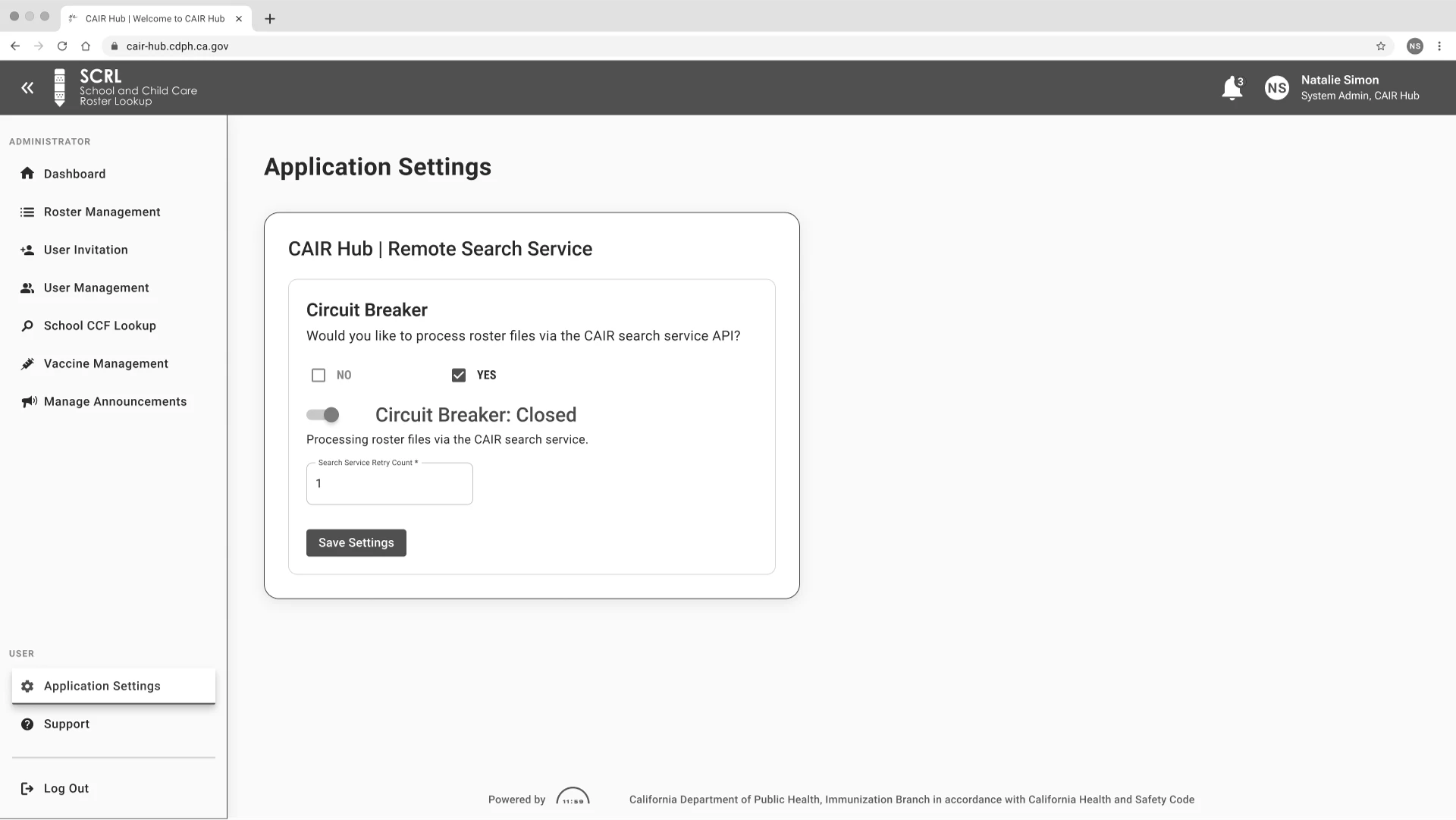
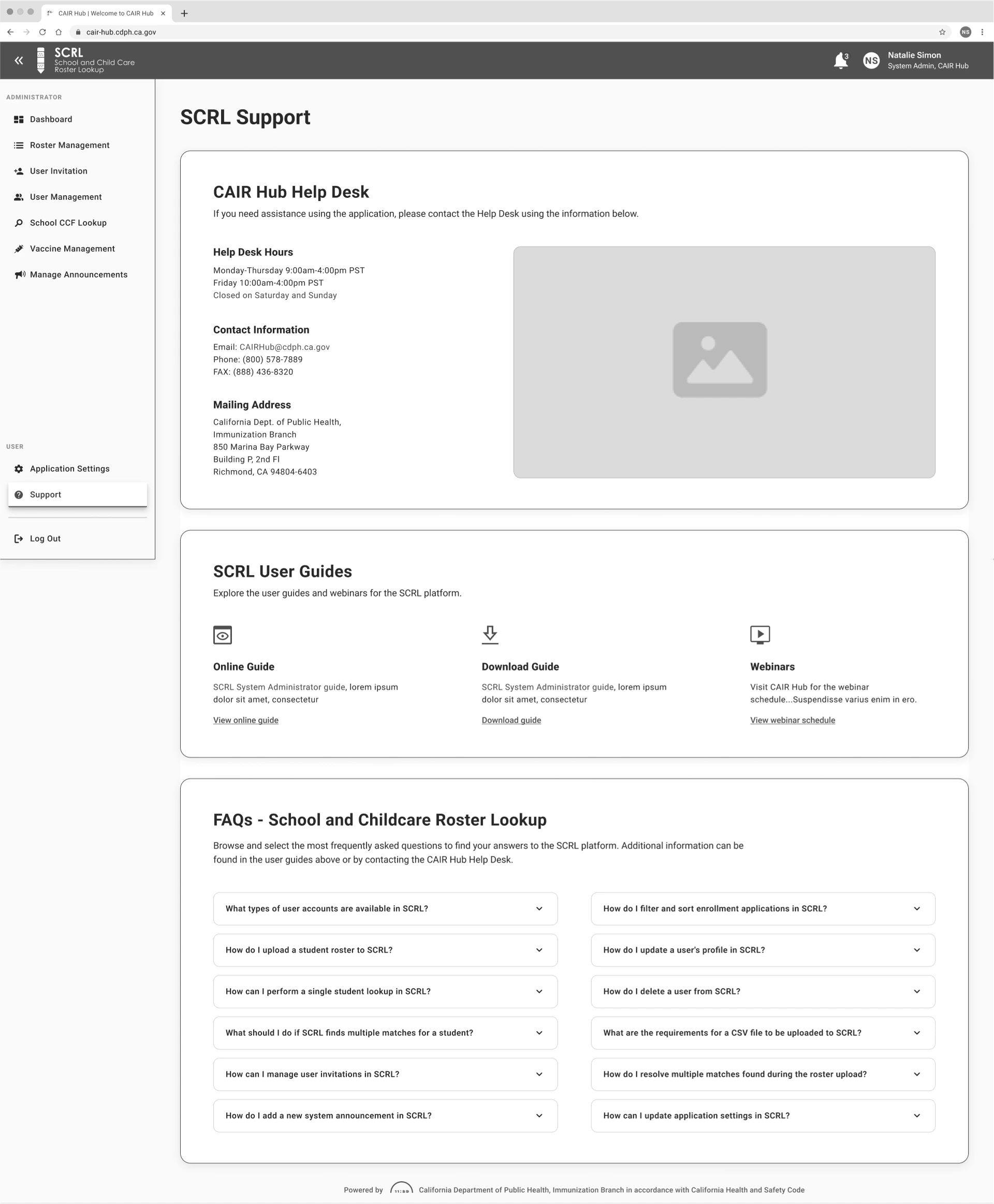
Crafting the Mid-Fidelity Wireframes
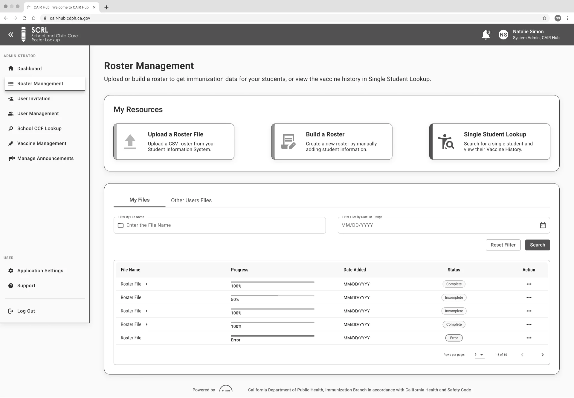
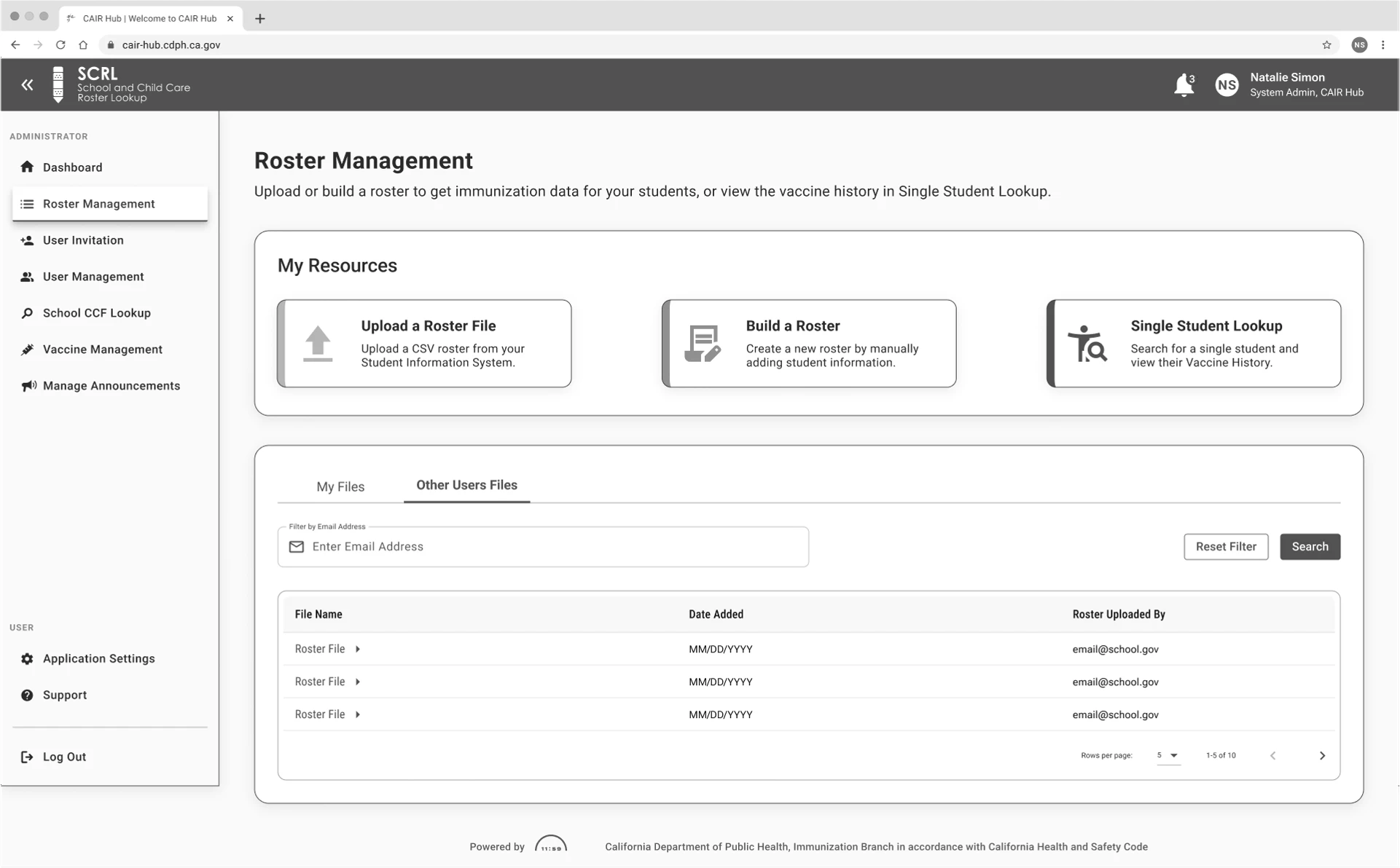
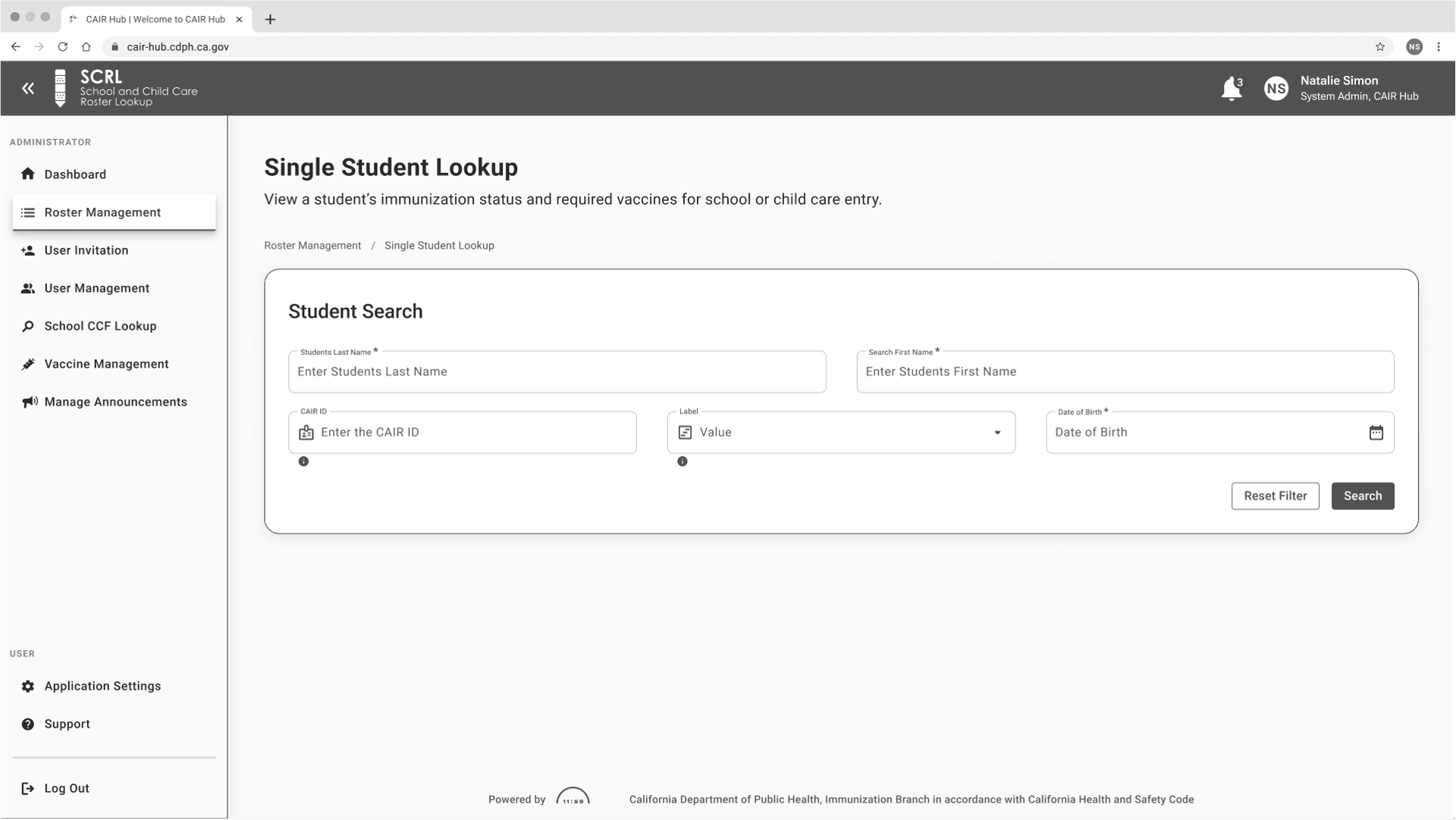
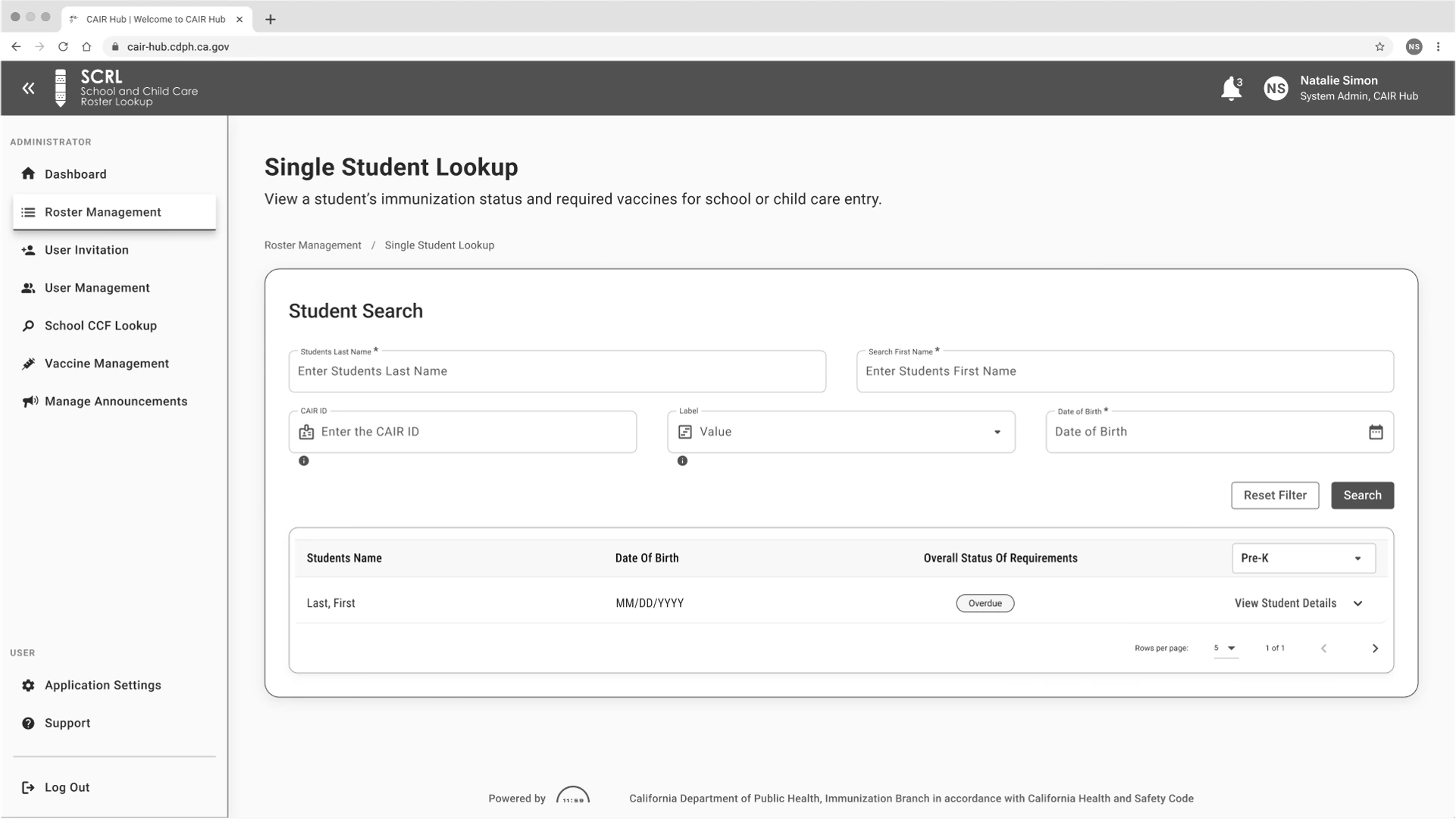
The mid-fidelity wireframes acted as a foundational blueprint for the SCRL System Administrator Dashboard, emphasizing clarity in layout, smooth navigation flow, and essential interactions. Through multiple iterations, these wireframes were enhanced to strengthen hierarchy, streamline task flows, and enhance accessibility. This phase was crucial for validating the overall structure and usability, setting the stage for the high-fidelity design refinement.
Design
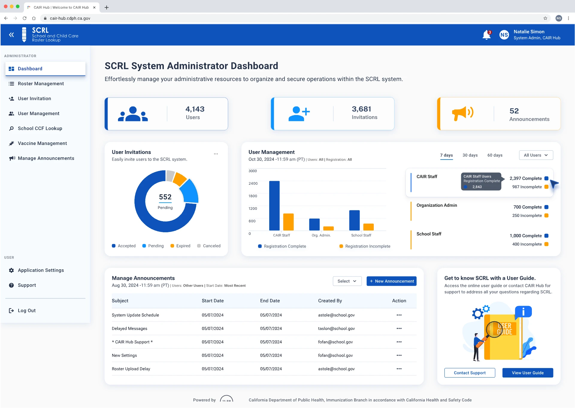
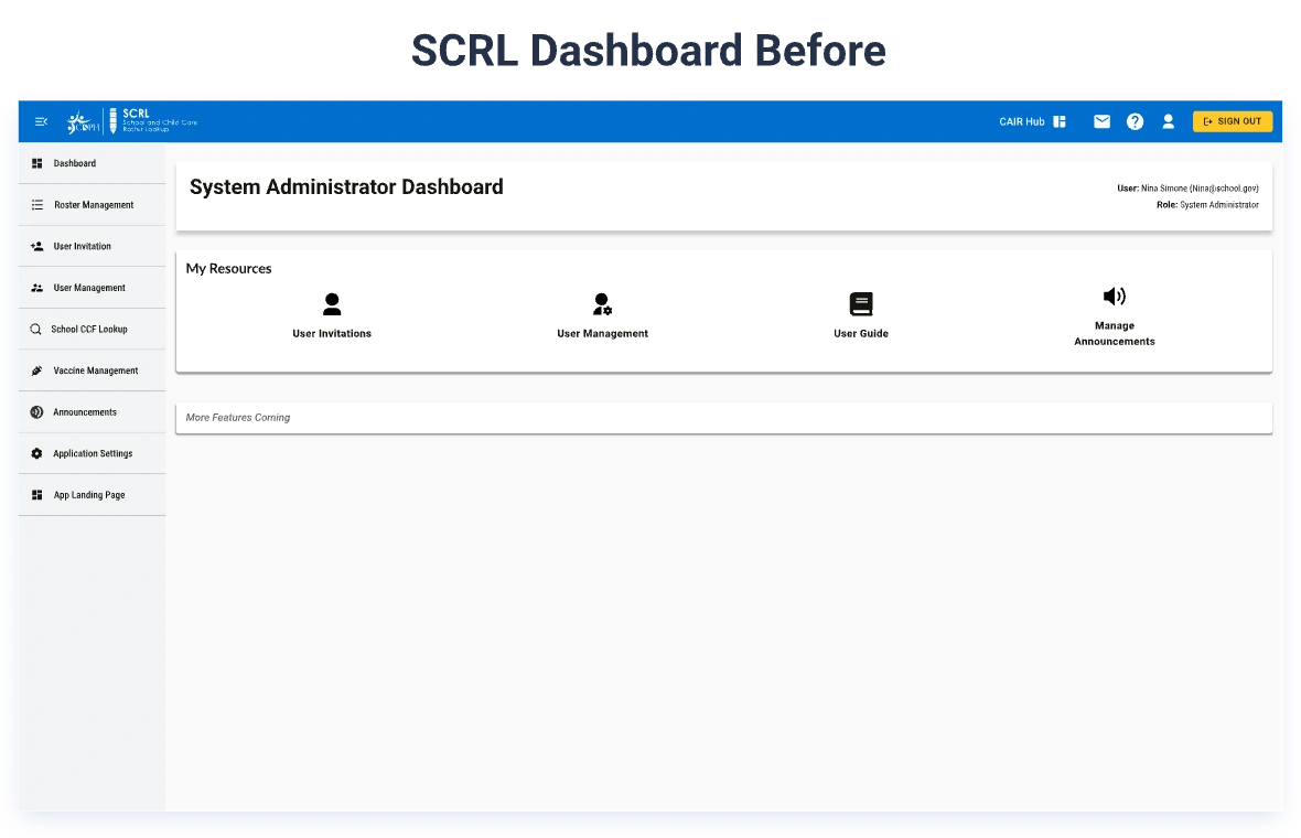
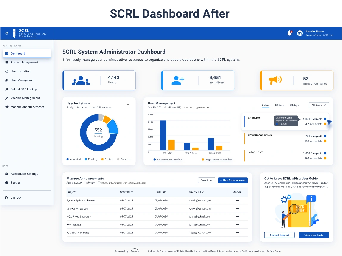
Transforming the SCRL Administrator Dashboard
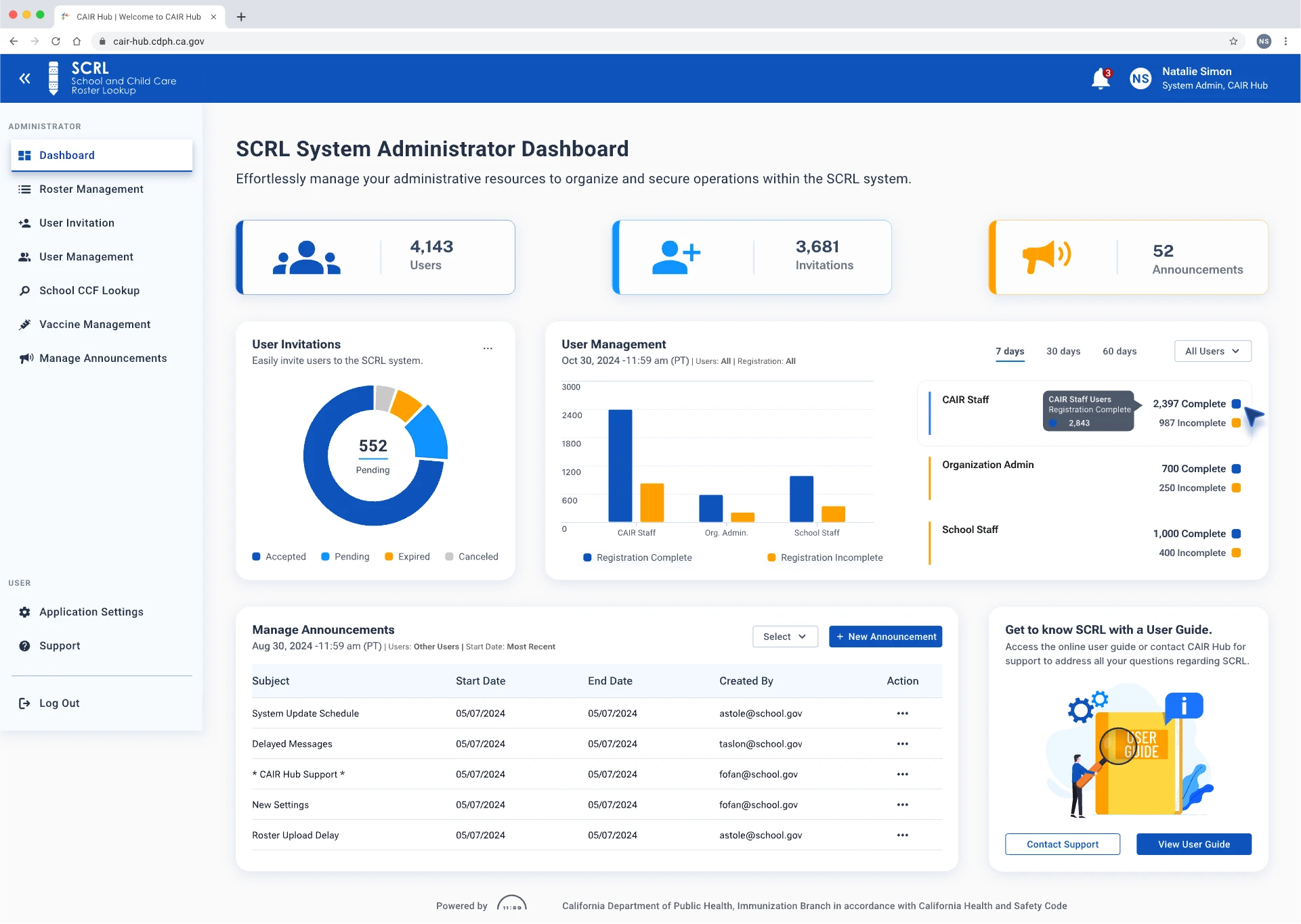
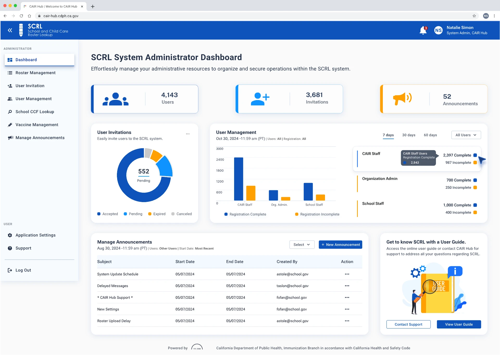
The redesigned SCRL System Administrator Dashboard represents a significant leap in usability and accessibility. By implementing a responsive layout and adhering to strict accessibility standards, we have created an interface that is both inclusive and efficient.
Highlights:
Improved Visual Hierarchy: The layout was meticulously refined for clearer structure and effective content prioritization, allowing users to navigate swiftly and complete tasks with ease.
Enhanced Functionality: New features, including customizable widgets, advanced search filters, and real-time user data visualization, significantly streamline administrative workflows.
Layout Strategy: A focus on increased white space and consistent alignment fosters a clean, uncluttered user experience.
Redesign Focus: Our efforts concentrated on simplifying navigation, ensuring visual consistency, and improving responsiveness across various screen sizes.
These collective updates not only enhance user satisfaction but also ensure that the dashboard remains intuitive, modern, and scalable to meet evolving user needs.
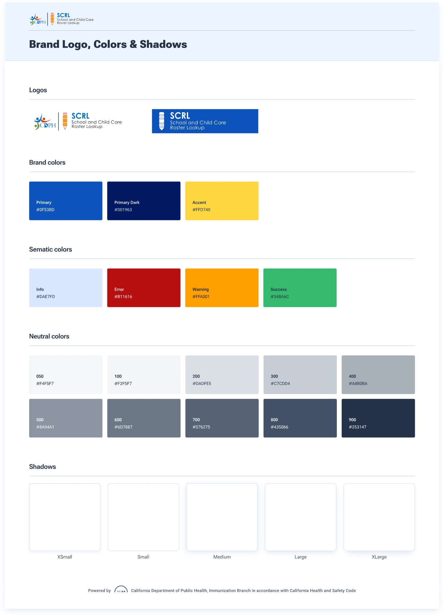
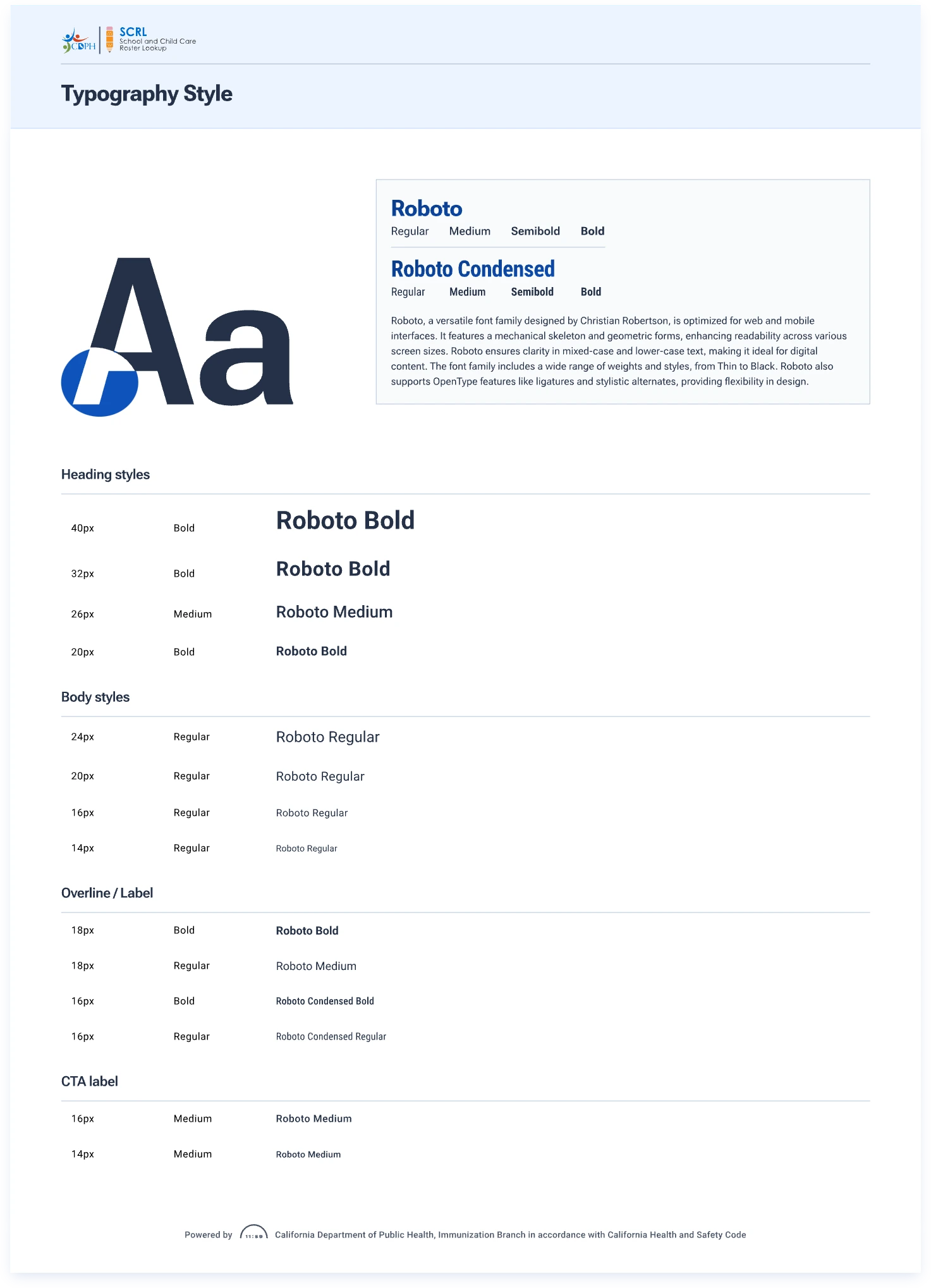
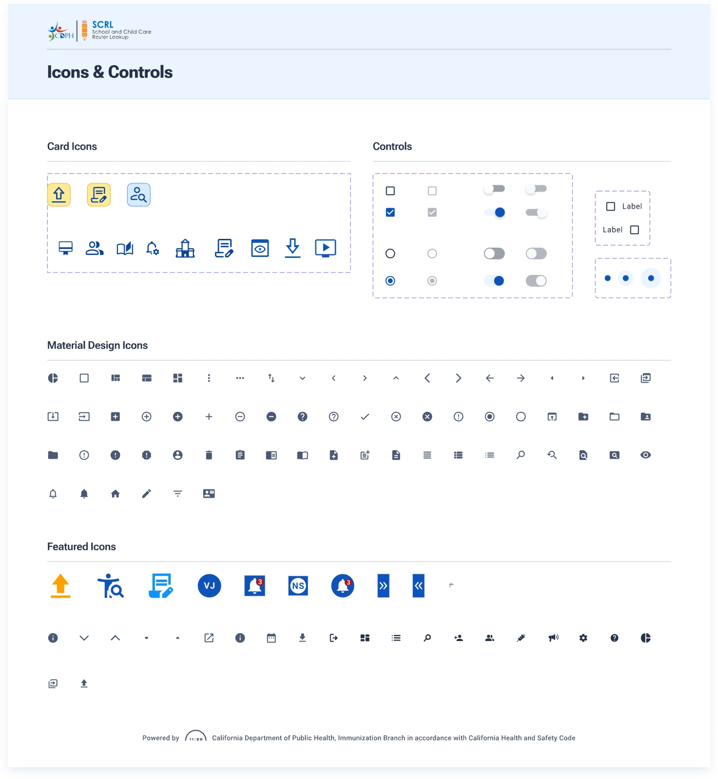
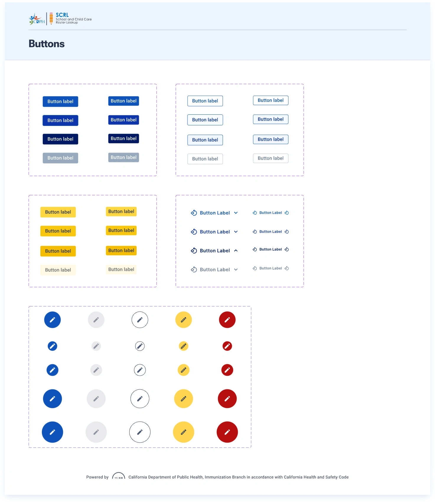
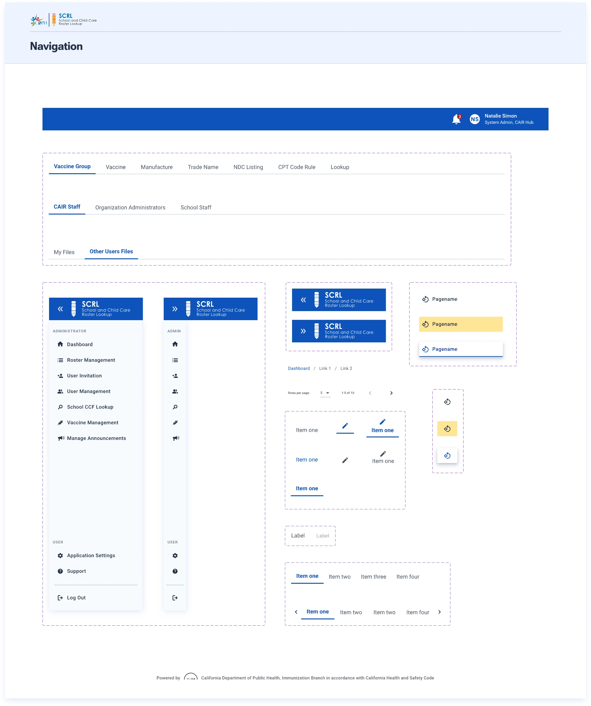
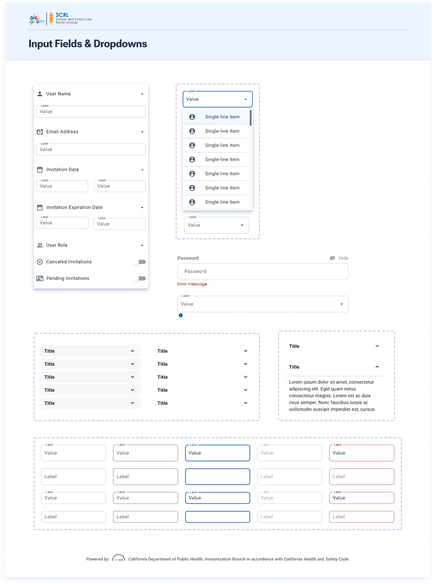
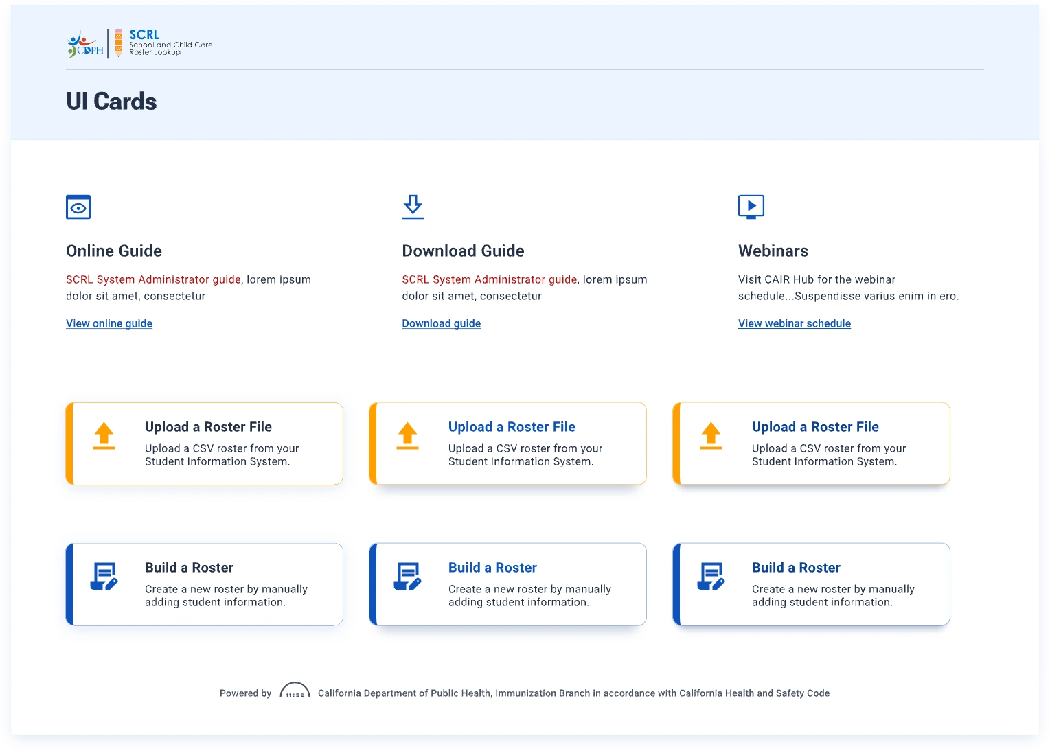
Modernizing the design system for SCRL platform
I undertook a comprehensive overhaul of the SCRL platform’s design system, driving the project from strategy through to implementation. My objective was to modernize the interface, enhancing accessibility, scalability, and future readiness.
What I Changed
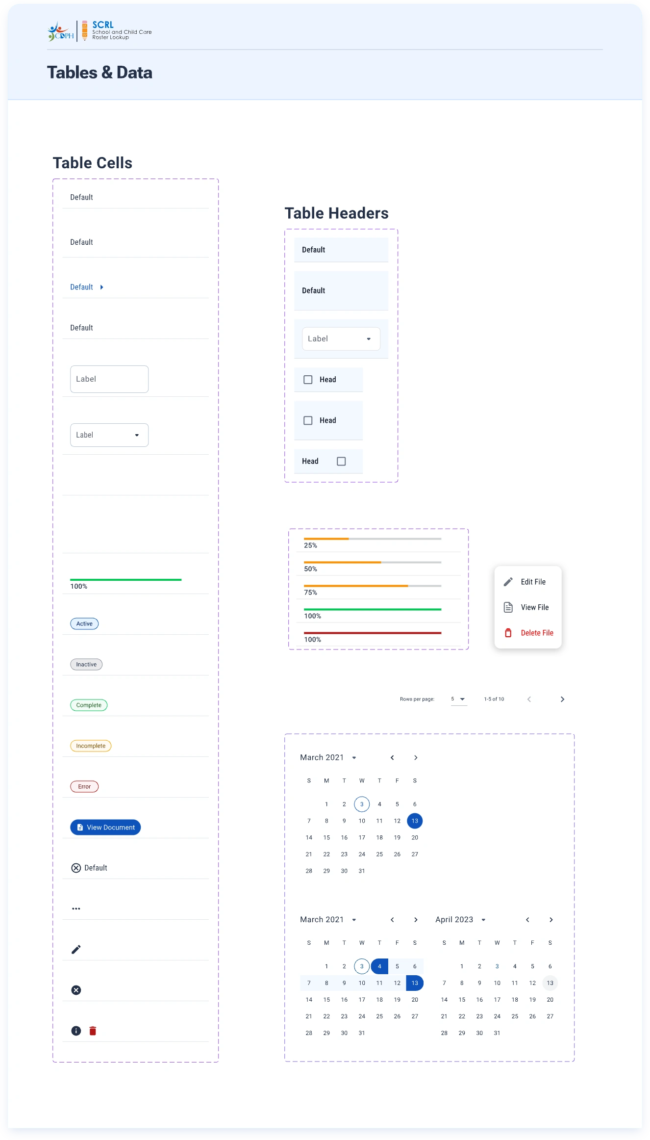
Brand & Colors: Revamped the color palette to meet WCAG 2.2 AAA contrast standards, enhancing accessibility while ensuring a clean, cohesive visual style.
Design Language: Established consistent styling, strategic spacing, and a clear visual hierarchy to facilitate intuitive user flows.
Technology Shift: Led the transition from React Material Design to Angular Material, collaborating with engineering to ensure long-term scalability.
Custom Components
Developed flexible table structures and advanced filters to empower users in managing large datasets.
Designed accessible components, including status chips, dropdowns, toggles, and input controls.
Created a reusable UI library that ensures consistency and ease of maintenance across the platform.
The Impact
Streamlined workflows and accelerated task completion for administrators.
Enhanced inclusive design, improving usability for all users.
A future-proof system ready to accommodate new features and modules effortlessly.
This new design system serves as the visual and functional backbone of the SCRL platform, marking a significant advancement toward a more responsive and accessible user experience.
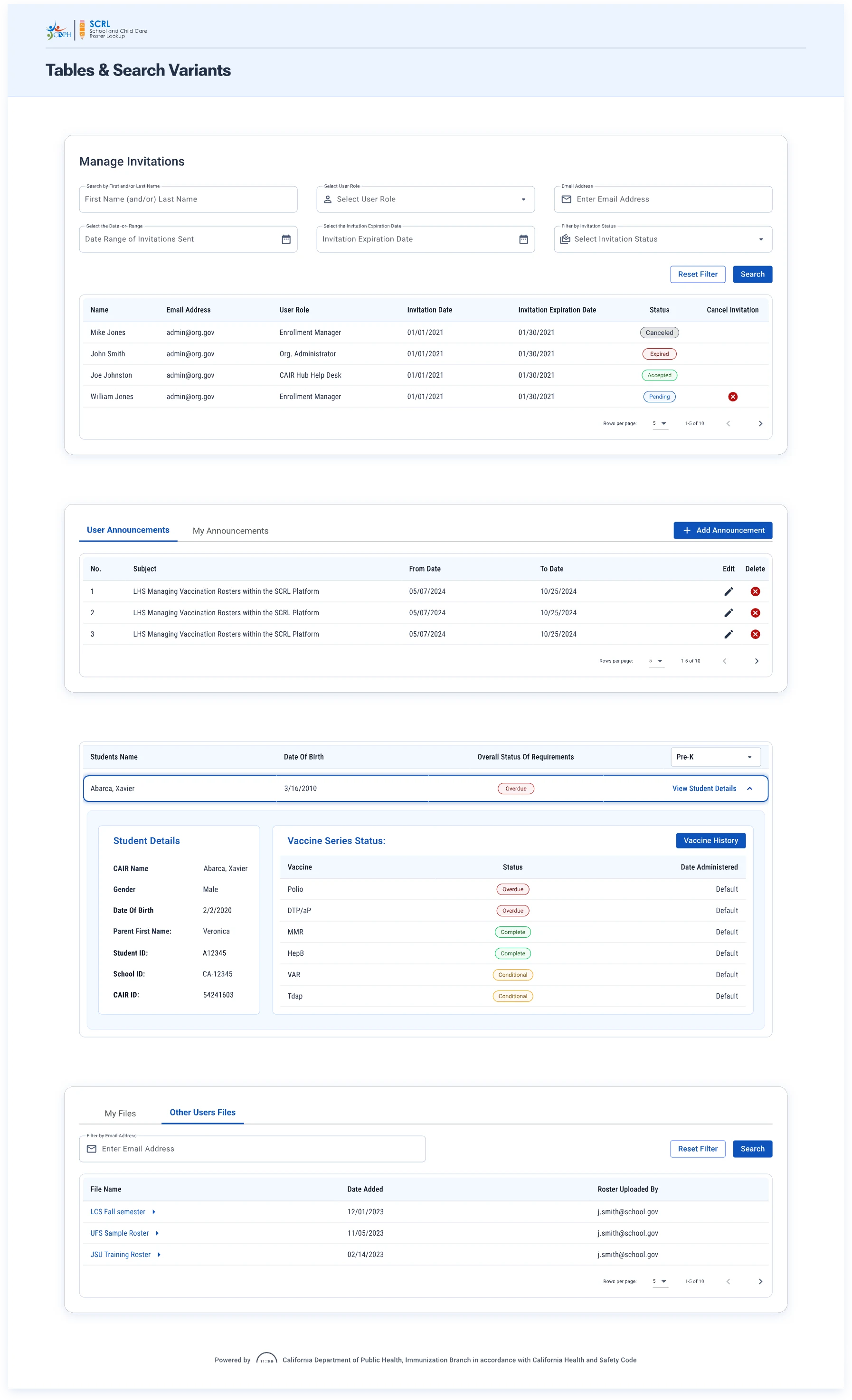
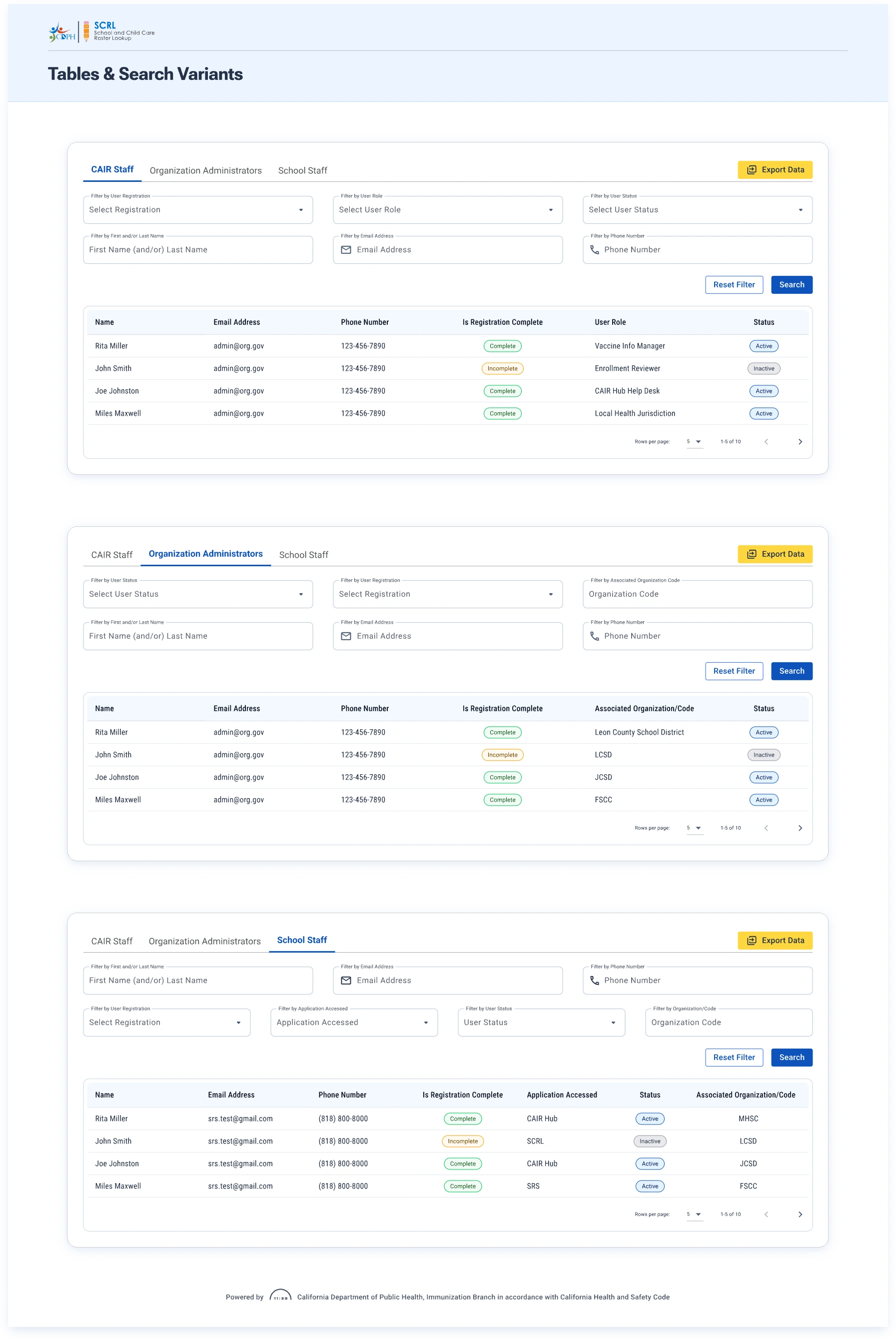
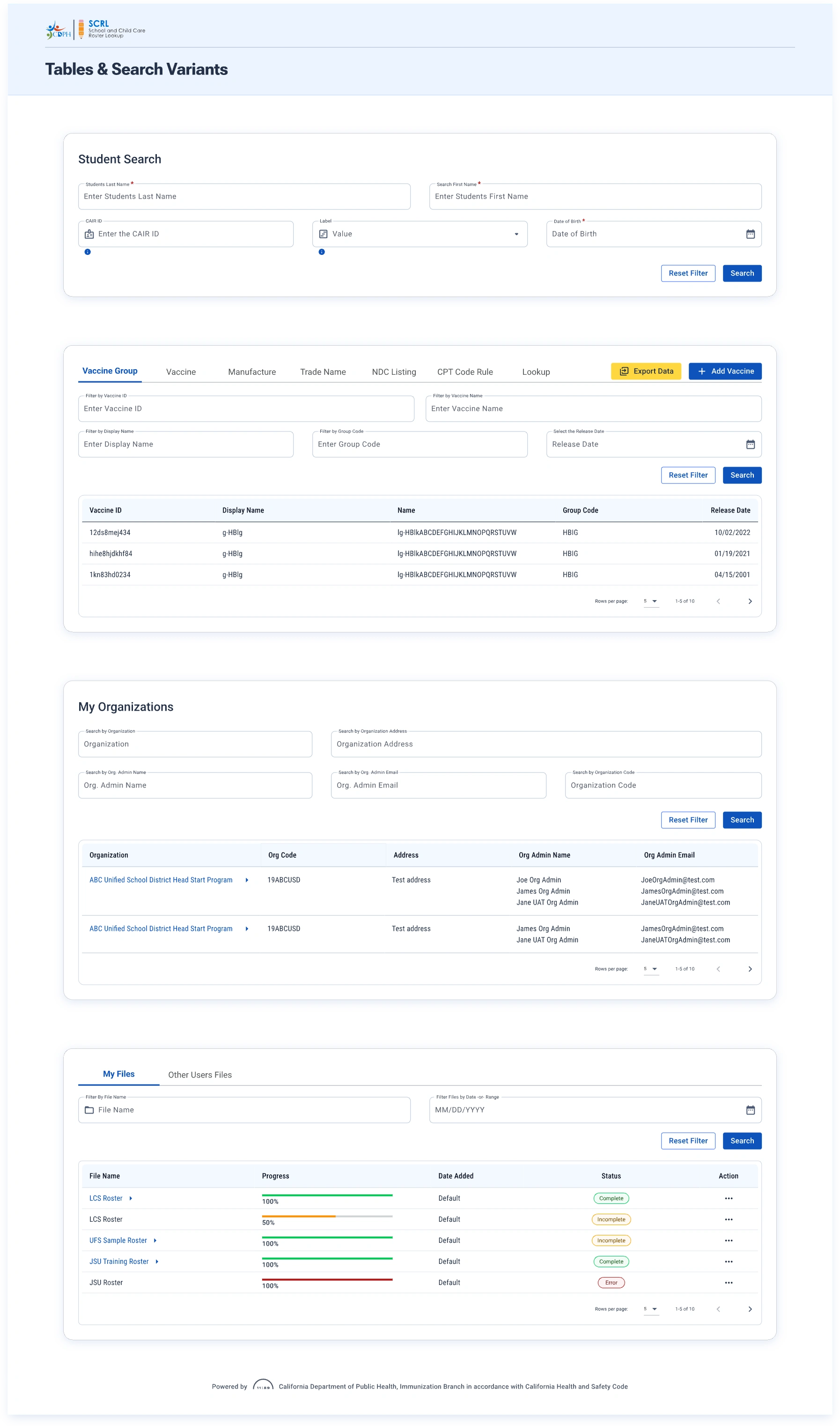
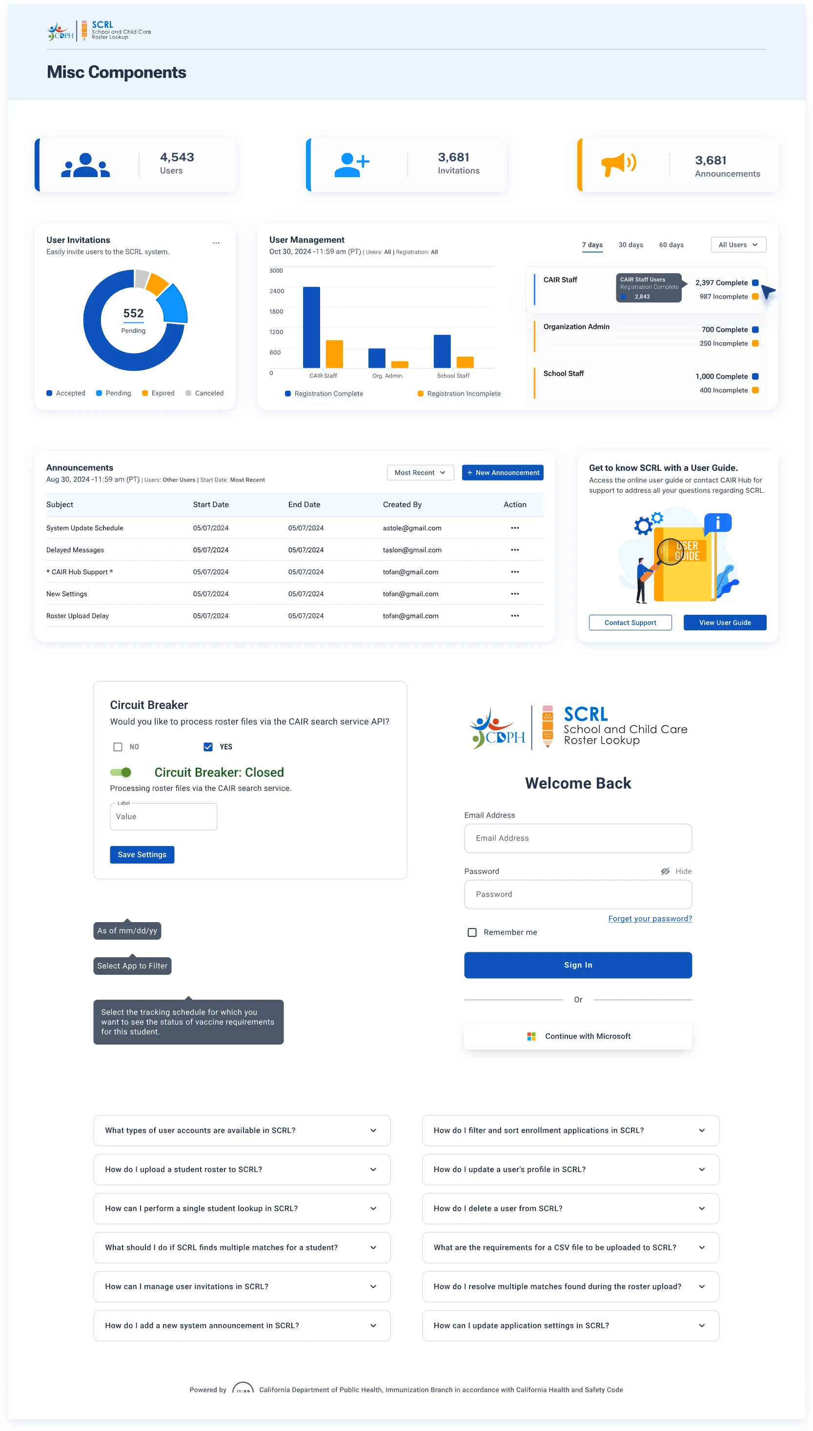
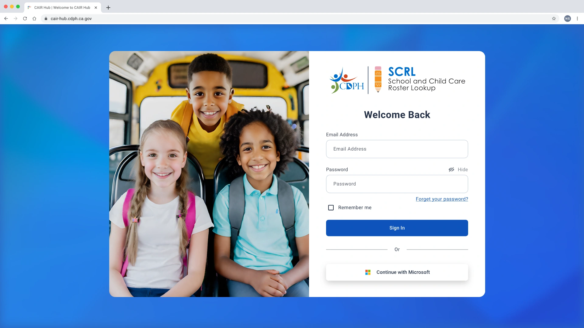
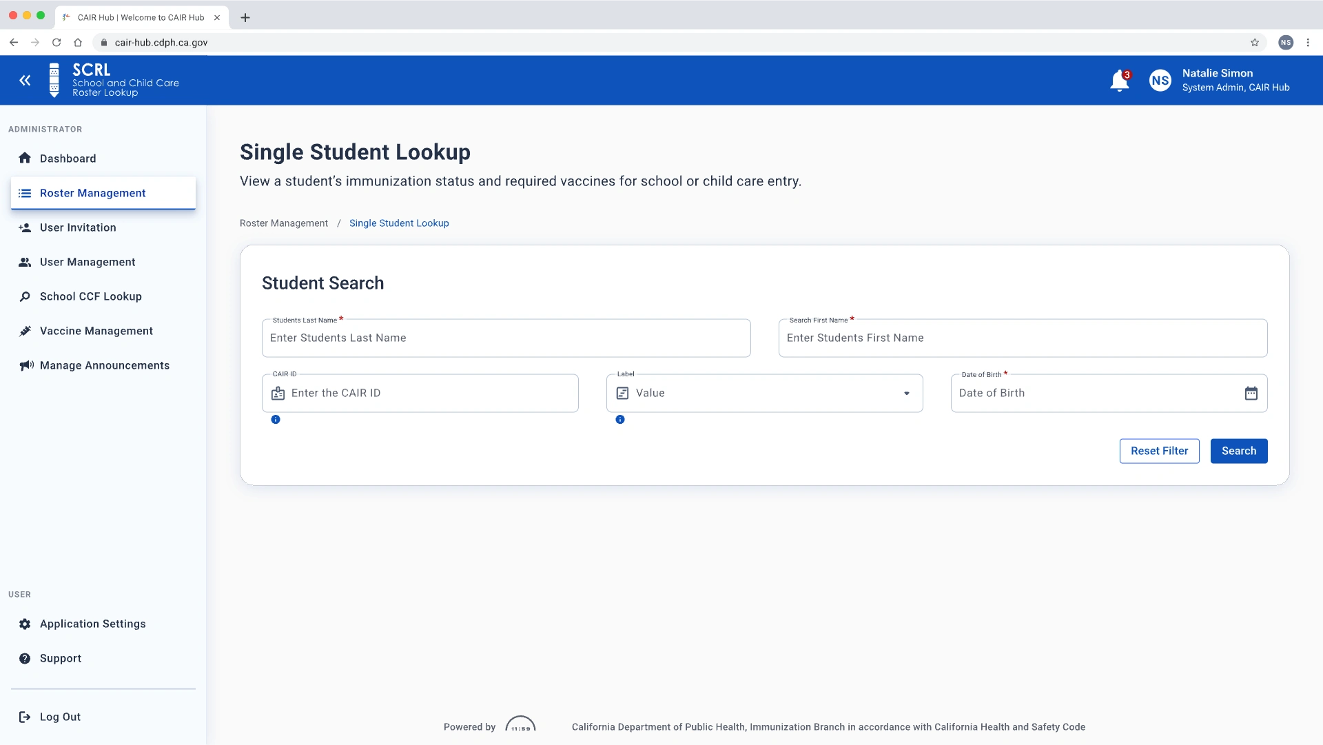
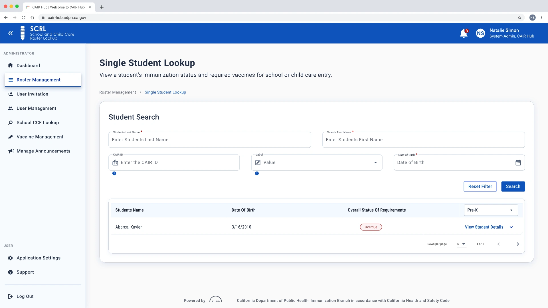
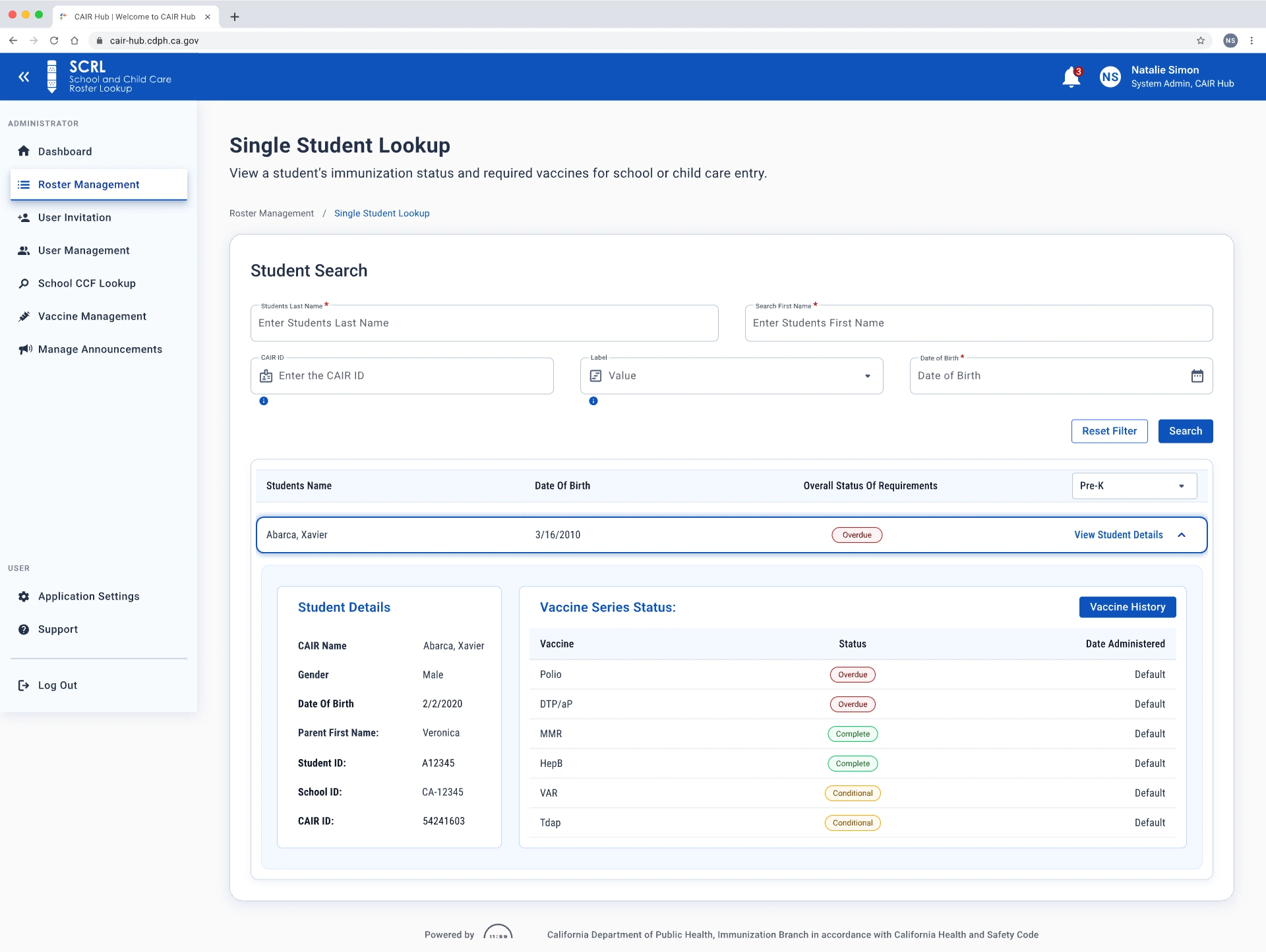
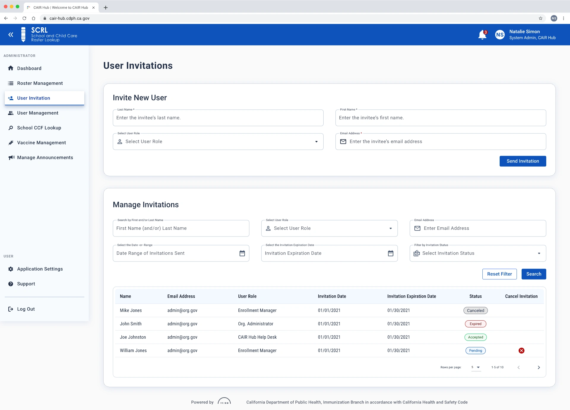
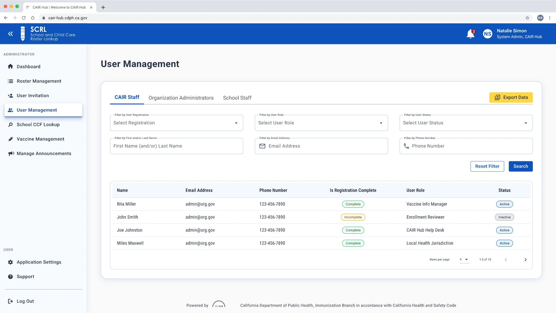
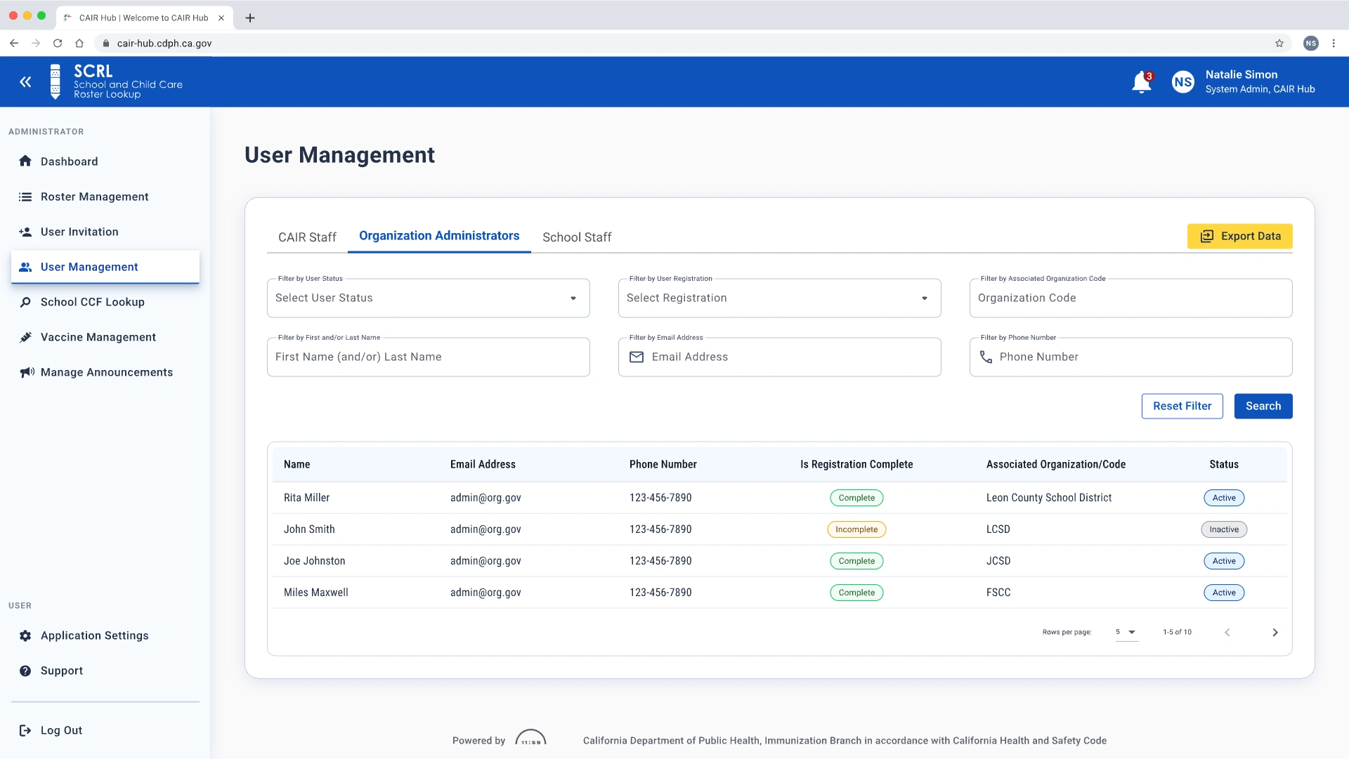
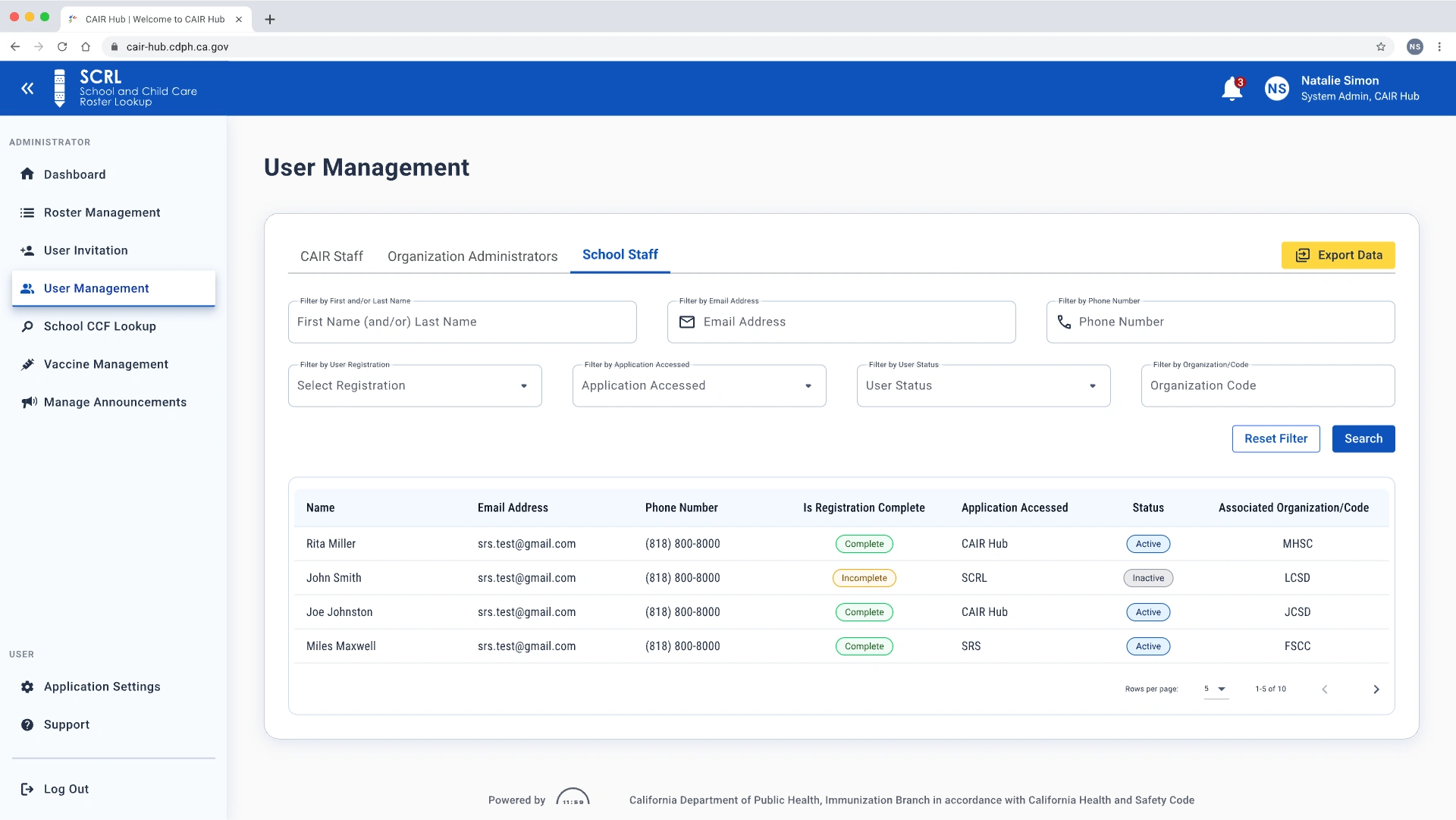
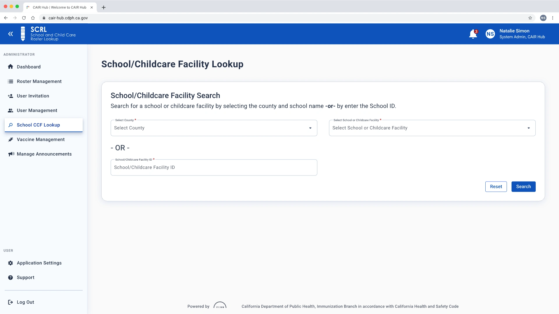
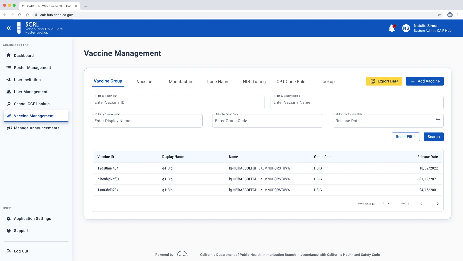
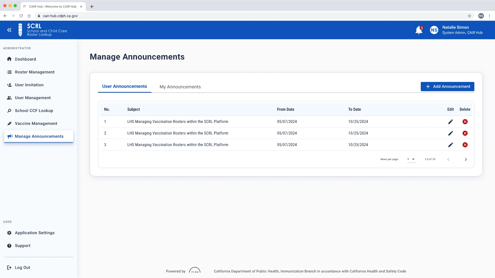
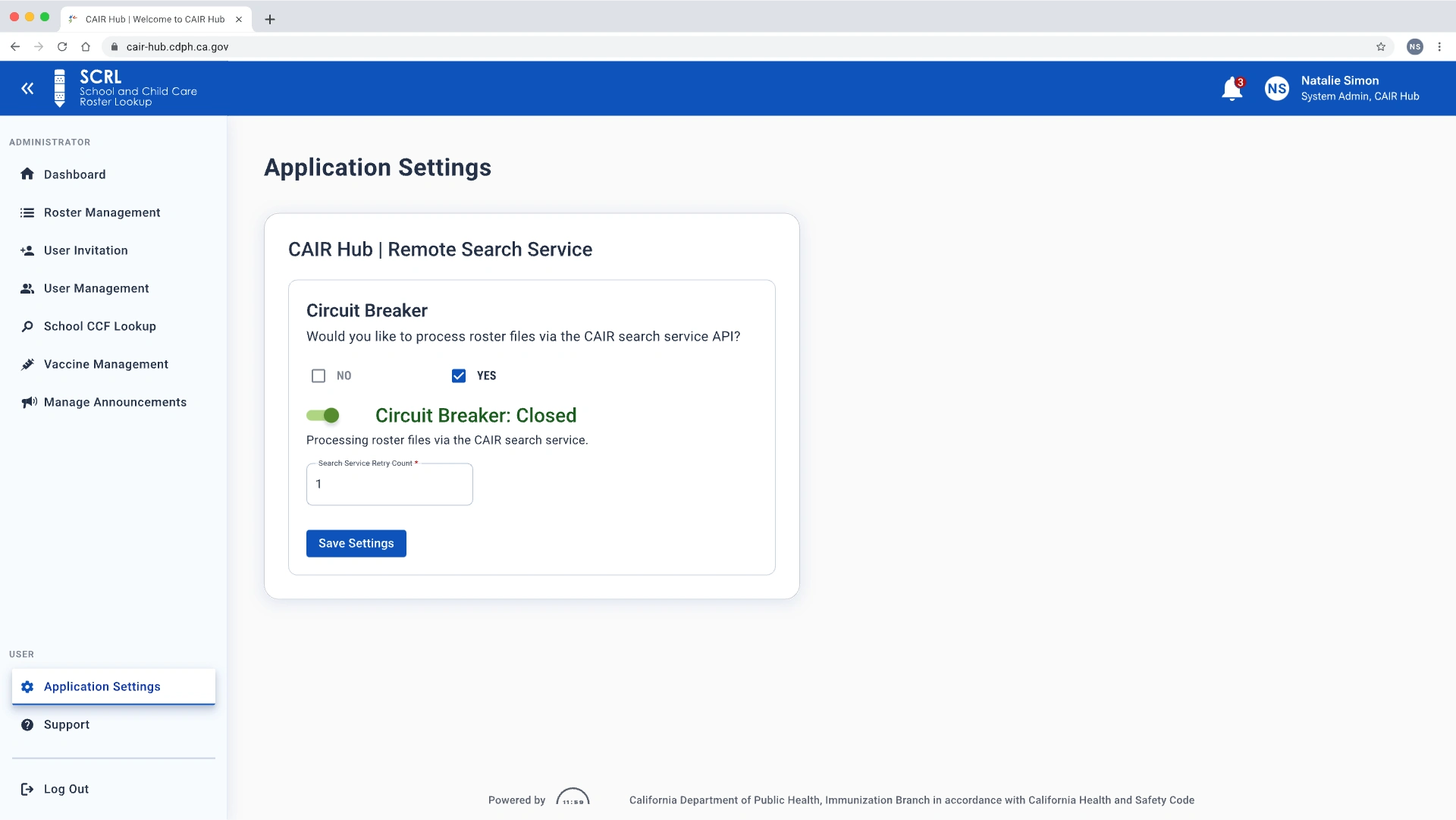
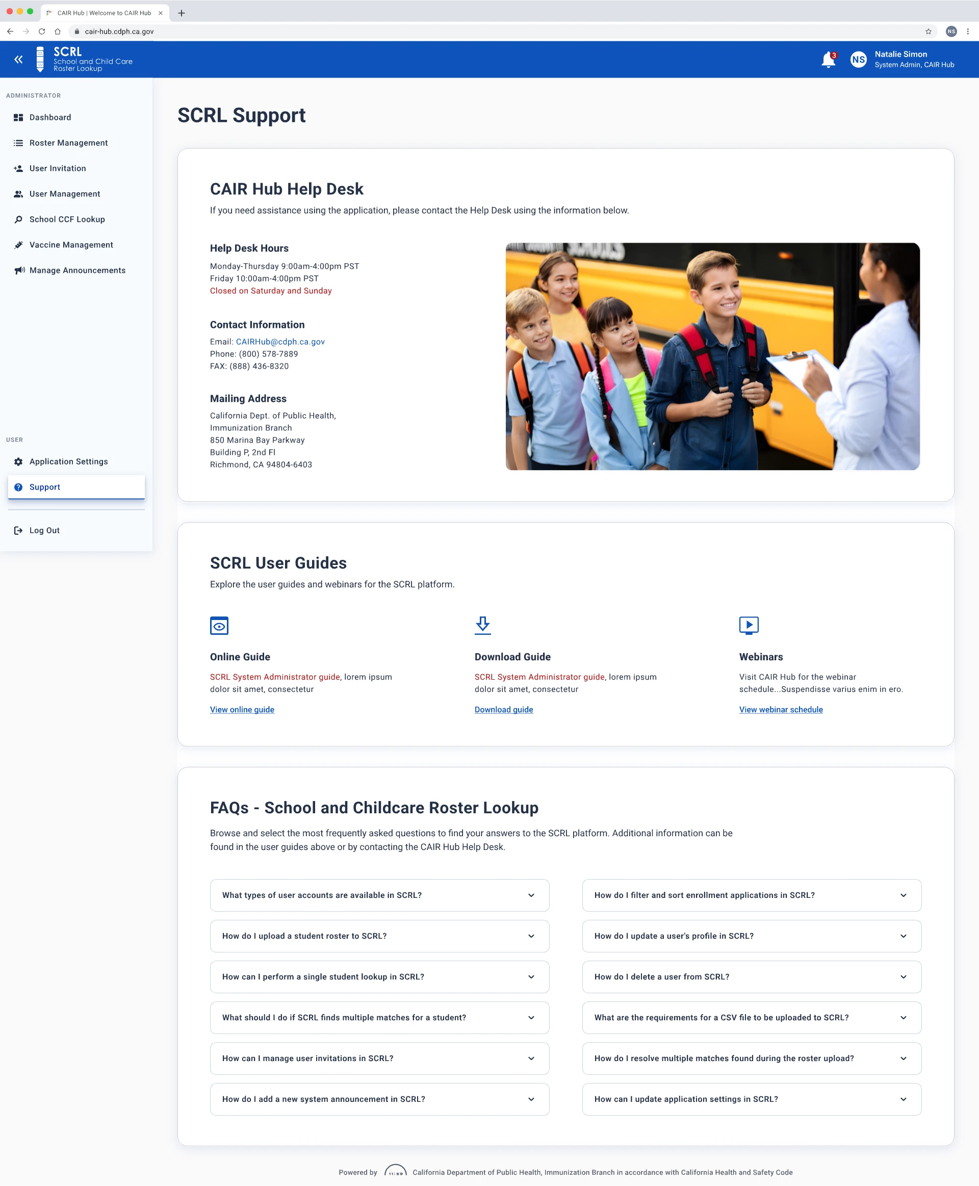
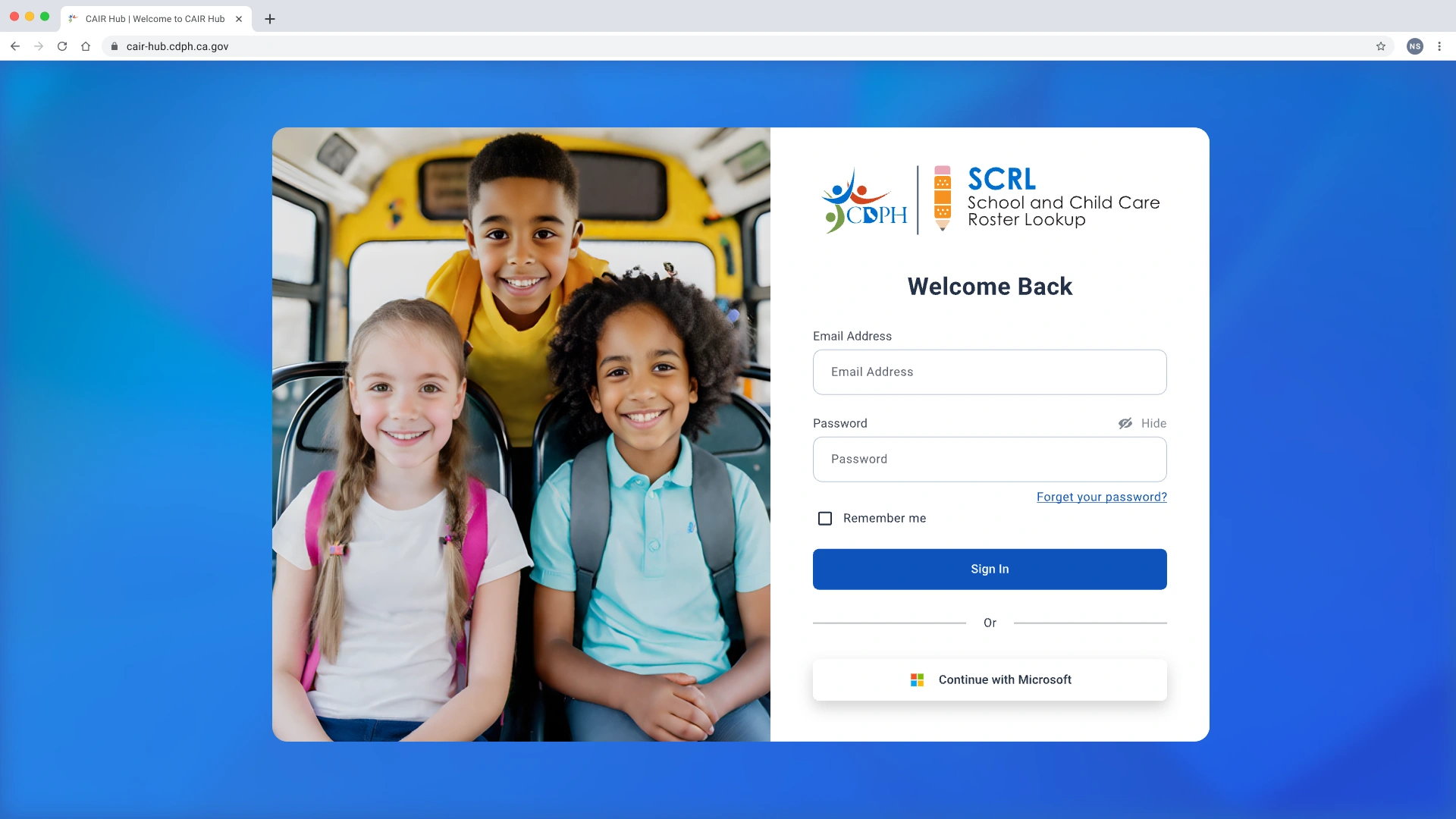
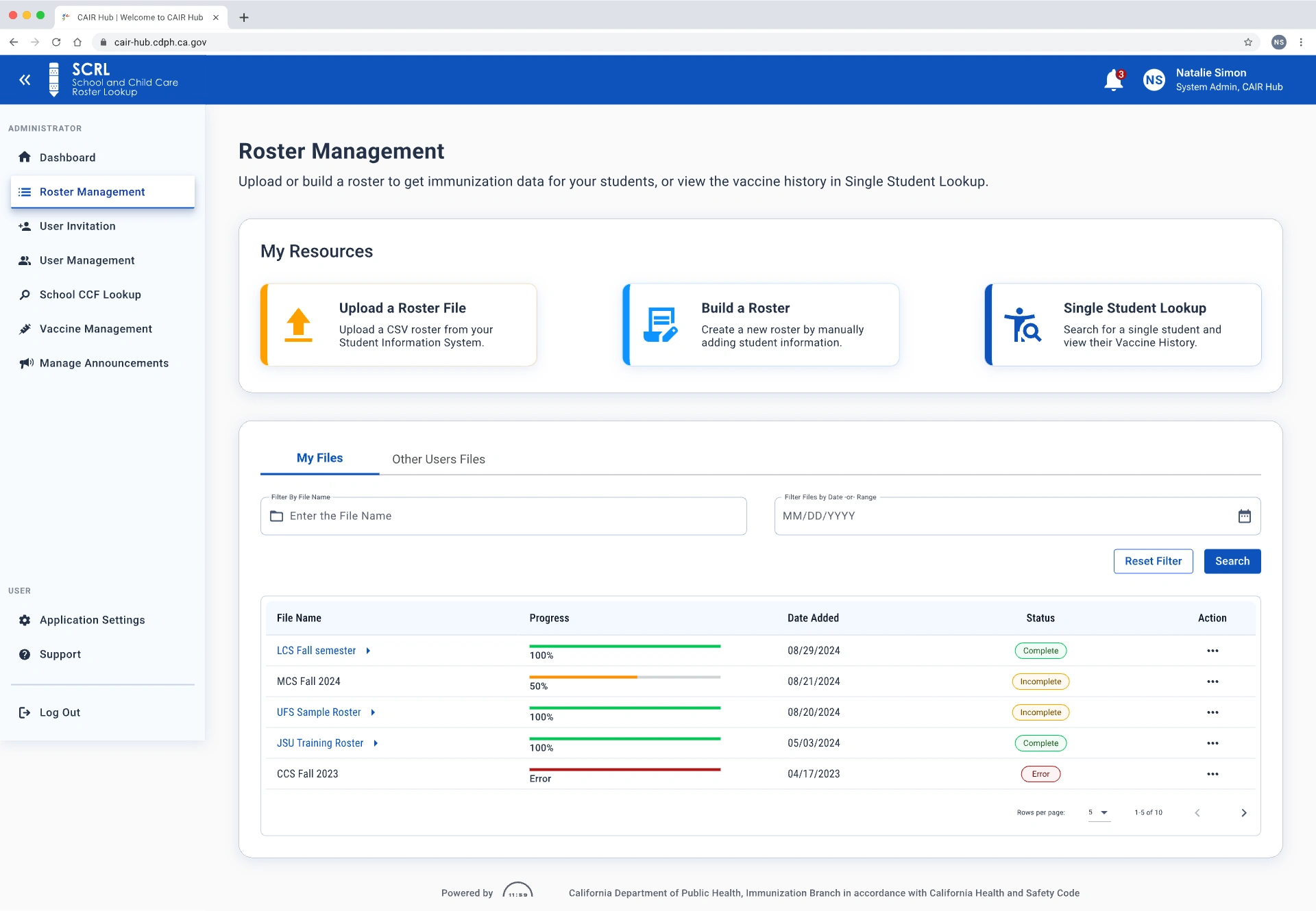
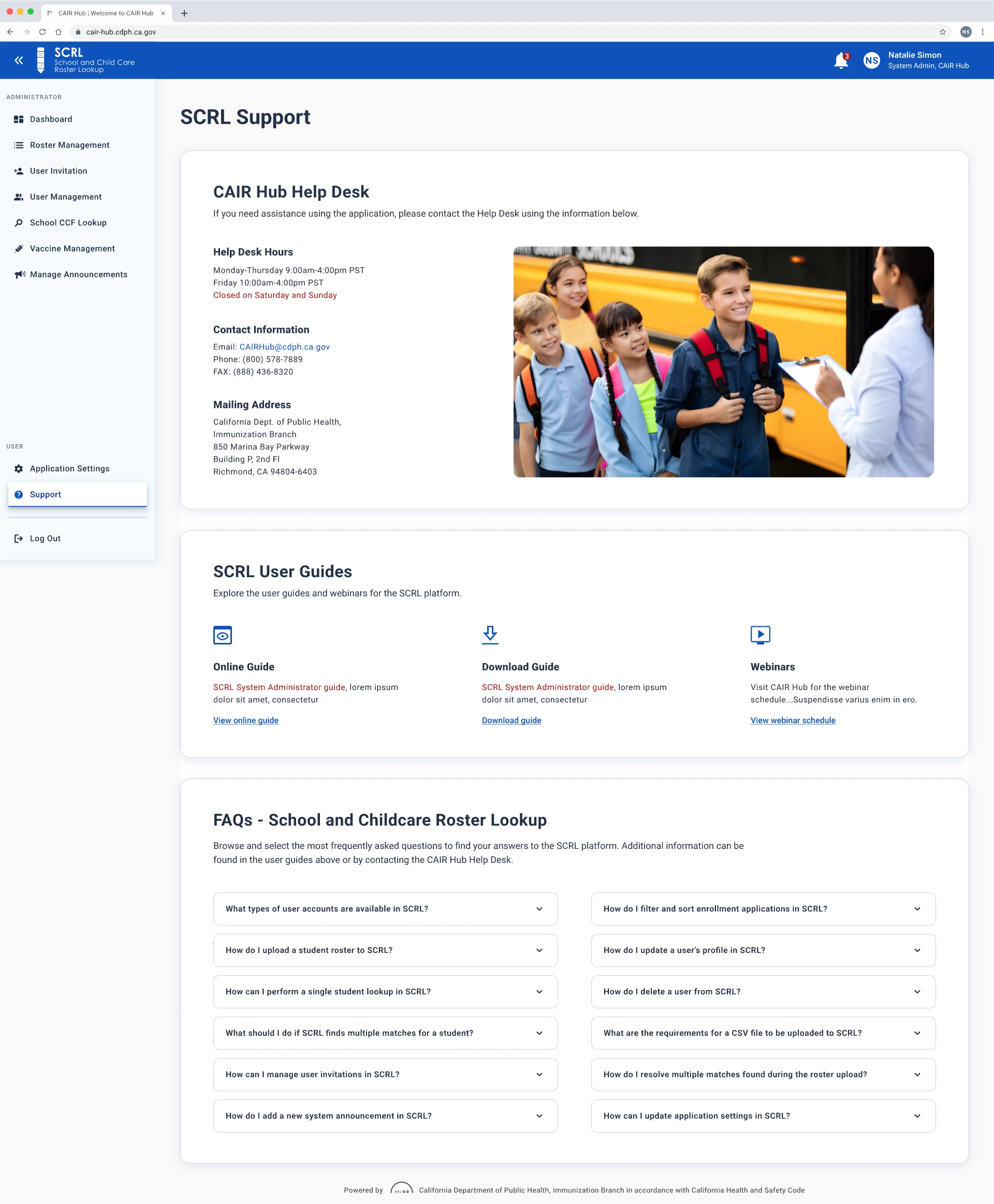
The redesigned SCRL platform with high-fidelity screens
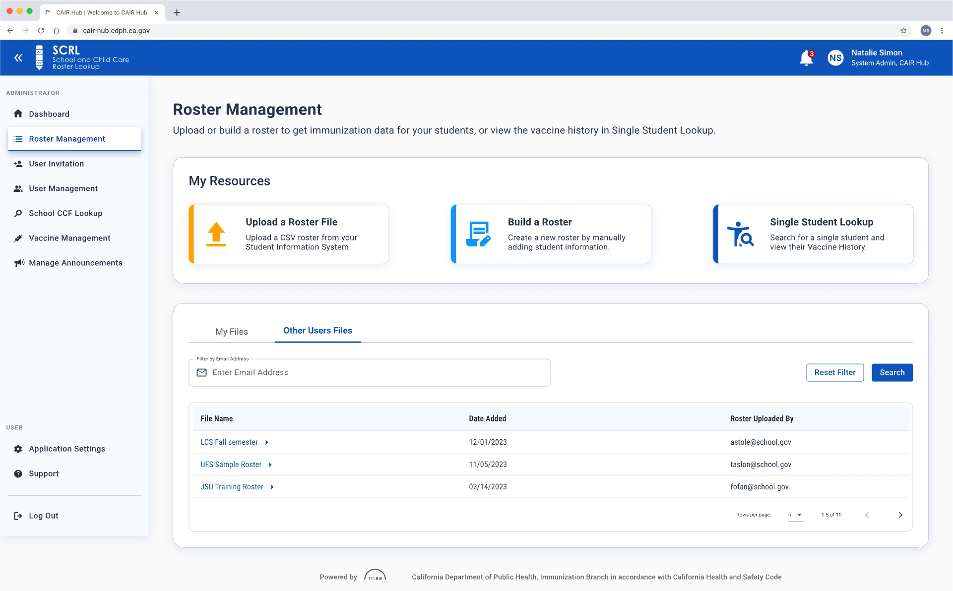
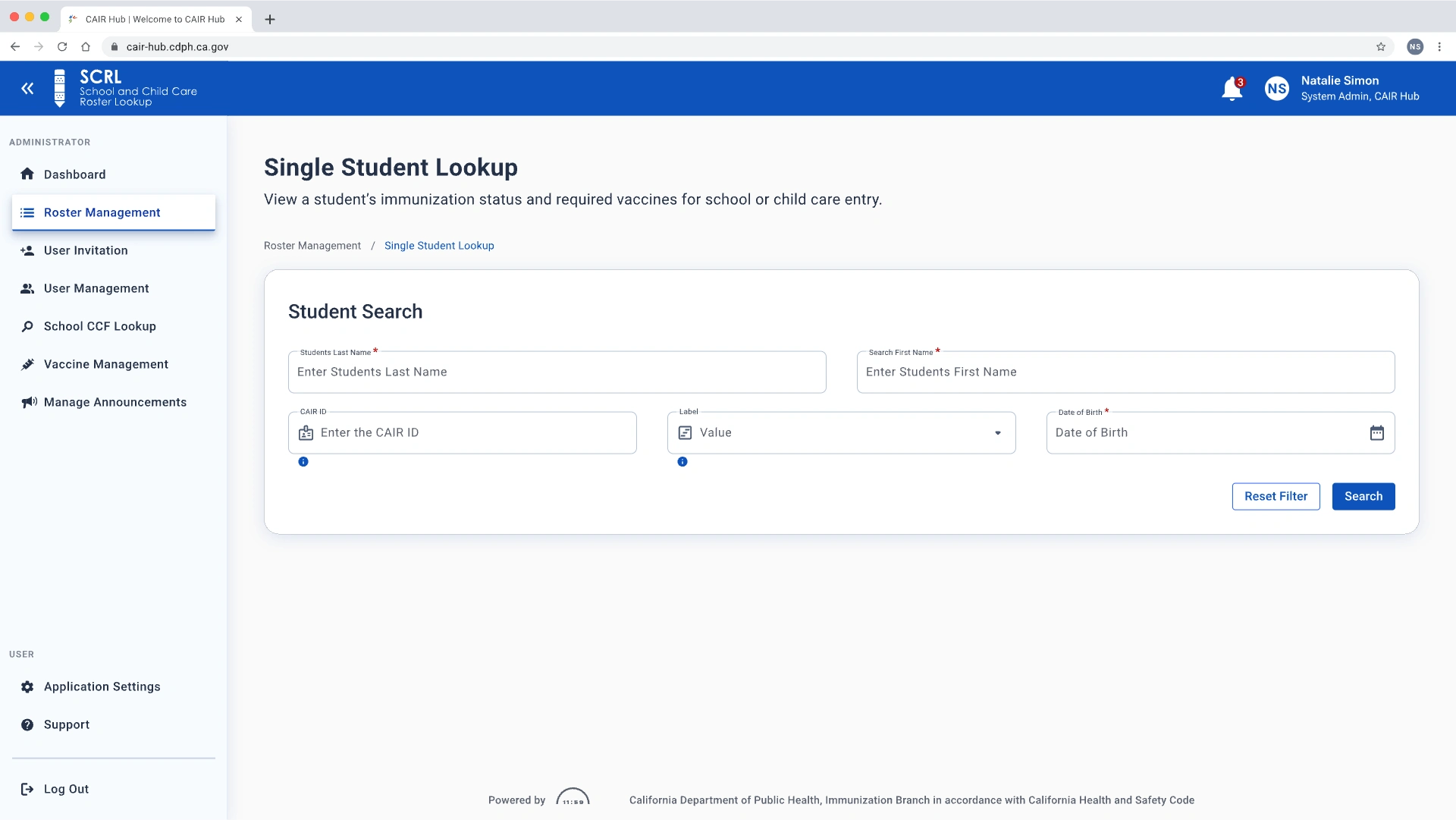
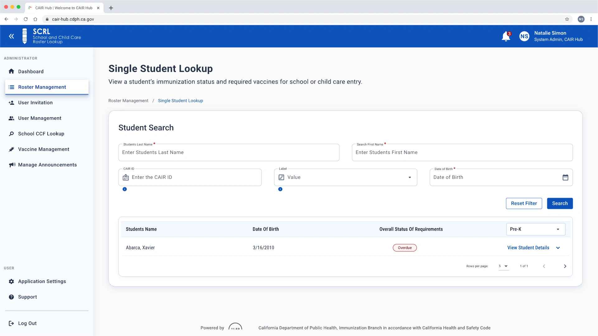
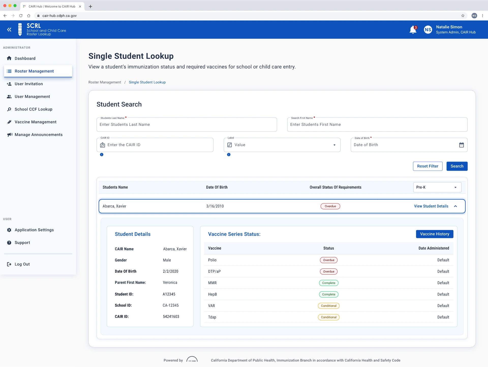
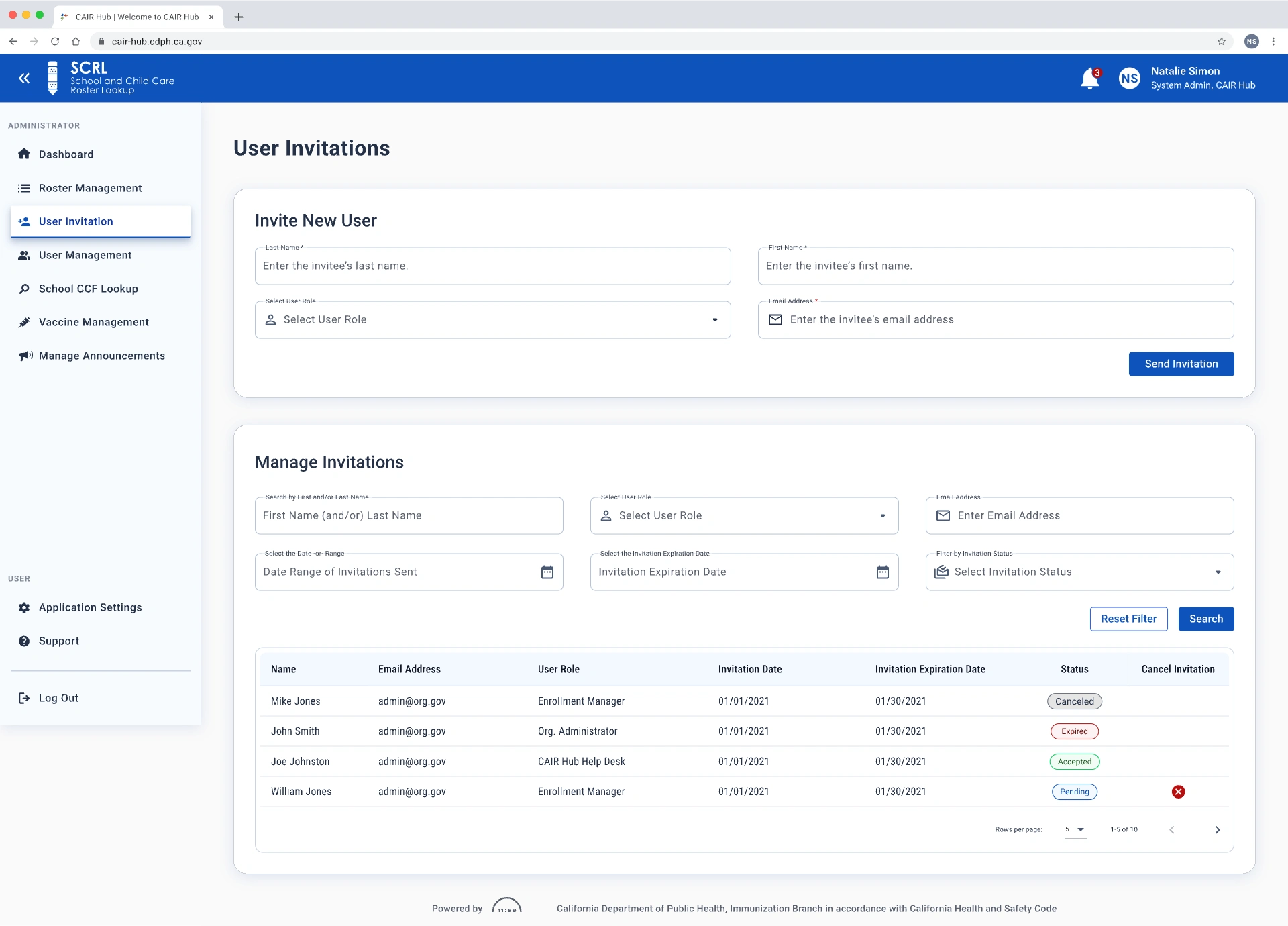
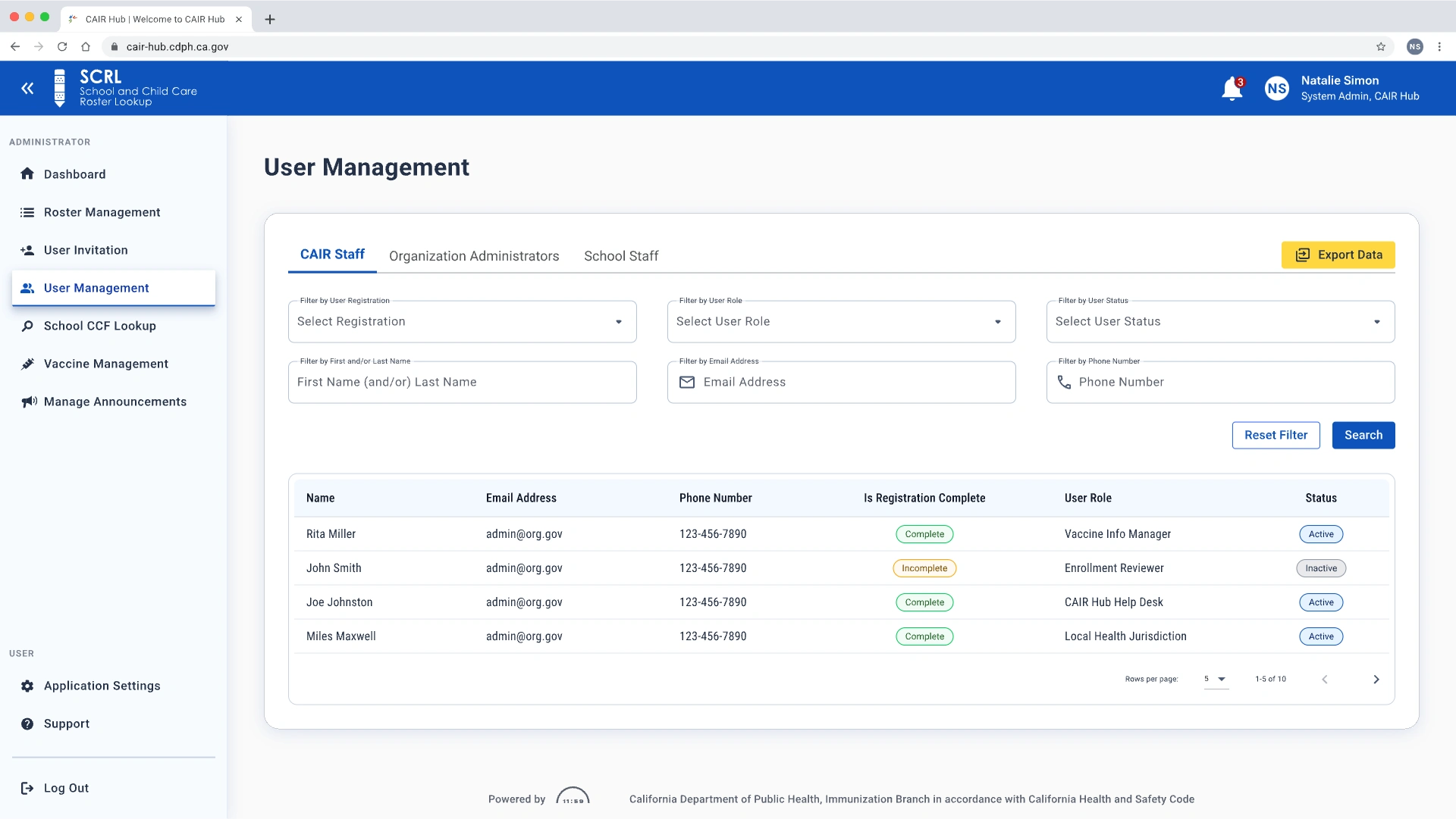
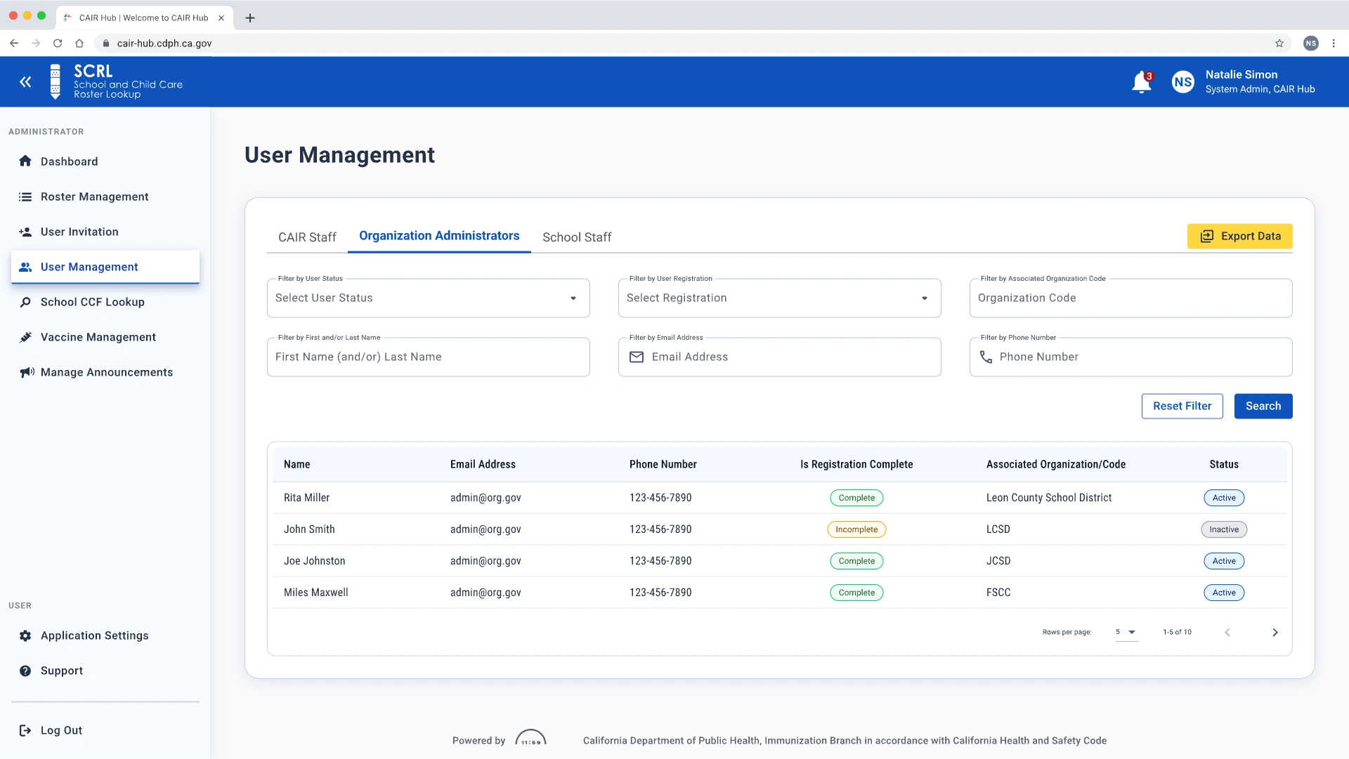
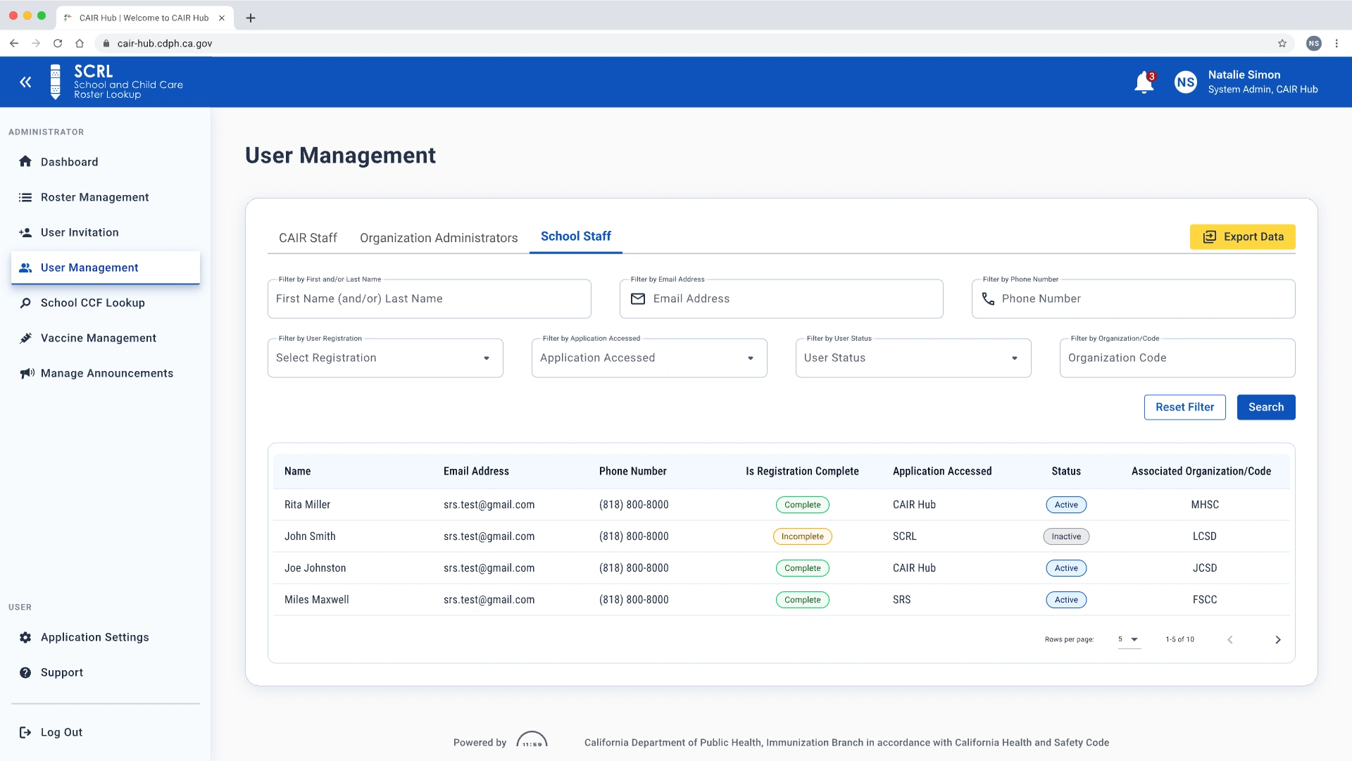
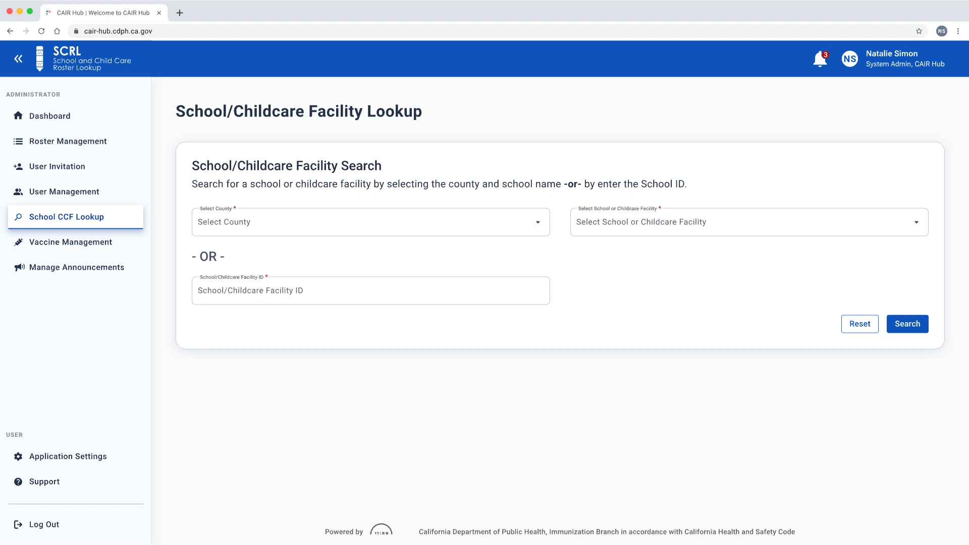
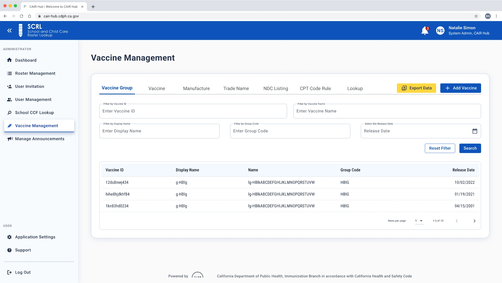
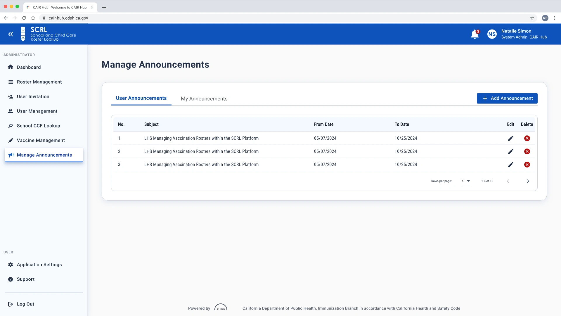
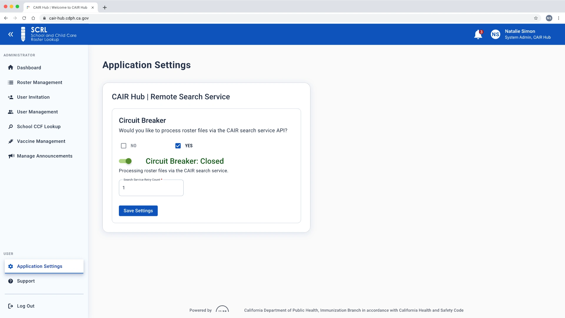
The high-fidelity redesign of the SCRL platform unveiled a modern, accessible interface that enhances usability, efficiency, and visual clarity for admin users.
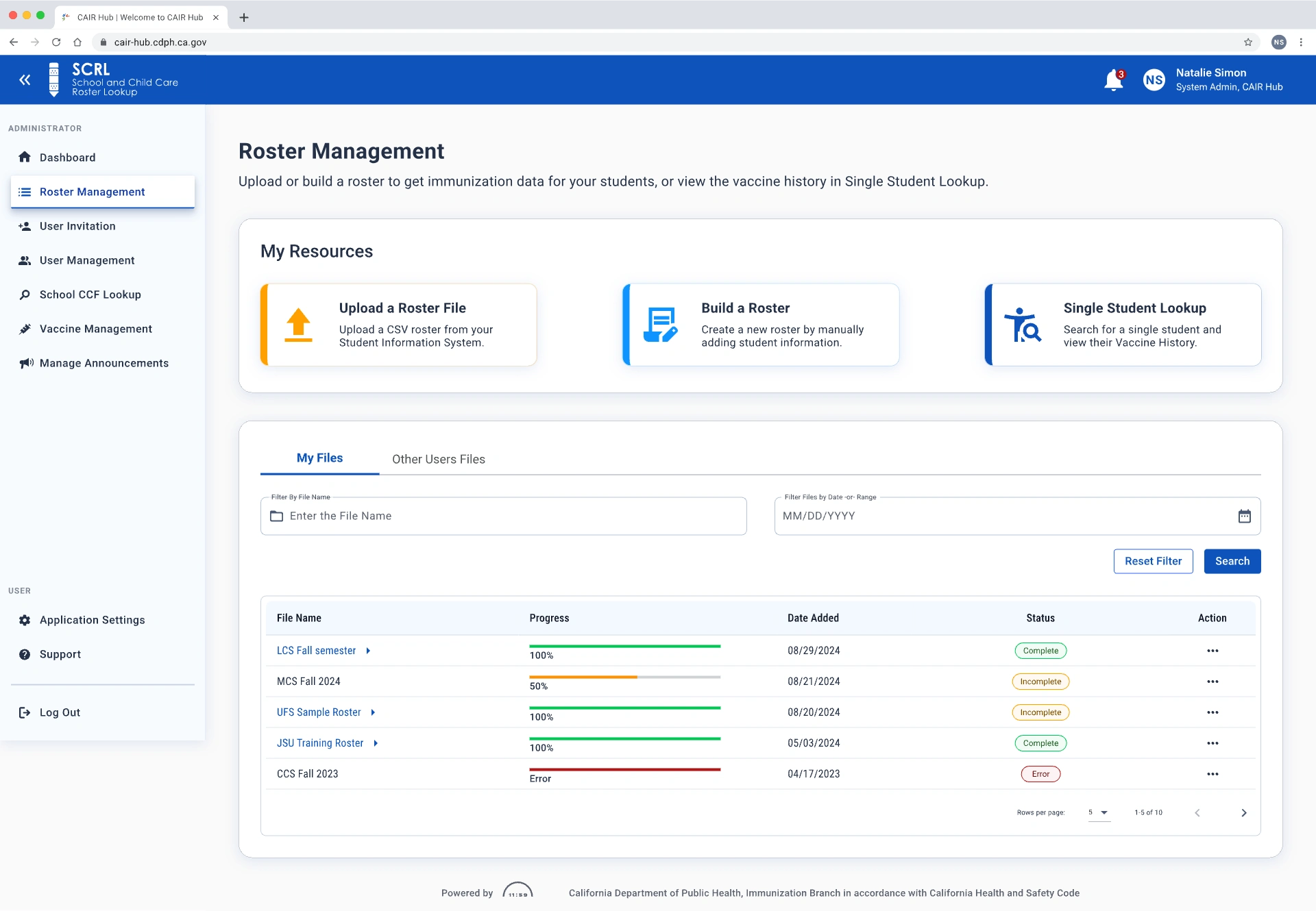
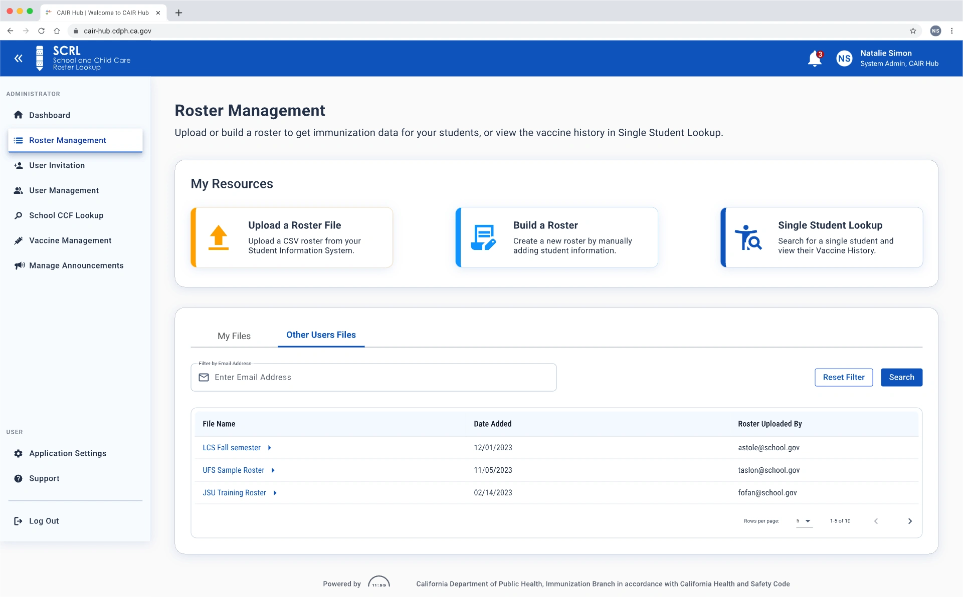
The layout was thoughtfully restructured to facilitate intuitive navigation and responsive interactions across essential workflows, including user management, roster uploads, vaccine tracking, and system configuration.
Key UX Enhancements:
Optimized Information Architecture: Core admin tasks, such as managing invitations, viewing system usage, and accessing student data, are now easier to discover and logically arranged.
Improved Visual Hierarchy: Clear headings, intuitive iconography, and semantic colors guide user attention while minimizing cognitive load.
Enhanced Data Visibility: Tables, filters, and progress indicators were redesigned for improved legibility and efficient management of large datasets.
Accessibility First: Updated components and contrast ratios meet WCAG 2.2 AAA compliance, catering to diverse user needs.
Reflection
Reflecting on a transformative redesign
Redesigning the SCRL System Administrator Dashboard was a pivotal project that deepened my understanding of accessibility-centered design and large-scale usability optimization. This initiative not only modernized the interface but also redefined how administrators interact with critical tools and data, fostering a more intuitive experience.
The success of this redesign has established a new benchmark for future projects. The insights I gained, particularly in accessibility and responsive design, will significantly influence my approach in upcoming endeavors.
Key Achievements:
Enhanced usability: The most noteworthy improvement was the dashboard's usability, achieved through a clearer visual hierarchy and streamlined navigation, making it easier for users to access information.
Accessibility improvements: Adhering to WCAG 2.2 AAA standards transformed our approach, broadening the dashboard's accessibility for users, including those with disabilities. This compliance fosters inclusivity and aligns with best practices in digital design.
Challenges overcome:
Technological transition: Moving from React to Angular presented initial challenges with component compatibility. However, this transition was essential for ensuring long-term scalability and performance enhancements.
Balancing familiarity and innovation: Implementing significant improvements without alienating existing users was crucial. Achieving this delicate balance required thorough consideration of design and functionality, ensuring enhancements felt familiar while distinctly improving the overall experience.
Read more of my case studies
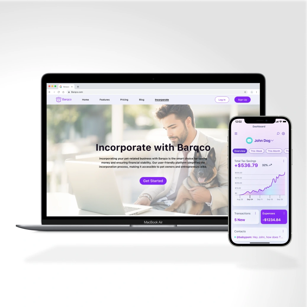
Barqco
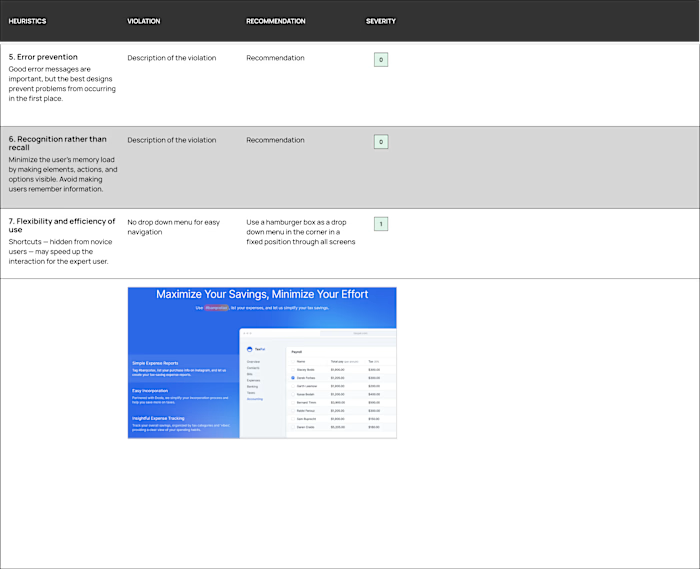
UX/UI Designer & UX Researcher (Team of 5) | Redesign | Maximized tax savings for pet owners with a B2B/B2C financial SaaS platform.
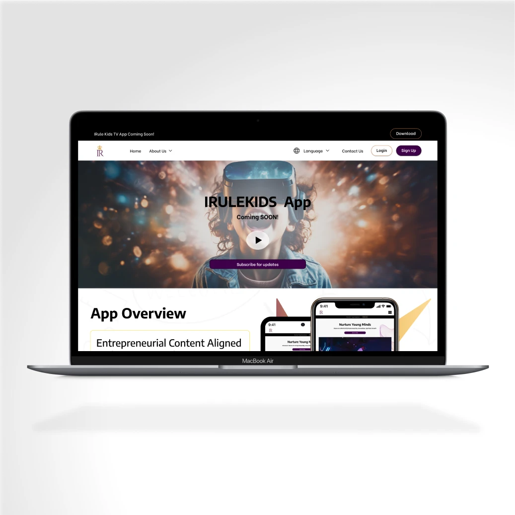
Irule Kids TV Inc.
UX/UI Designer & UX Researcher (Team of 5) | Product Design | Delivered an accessible AR/VR platform teaching entrepreneurial skills to children ages 2–18.
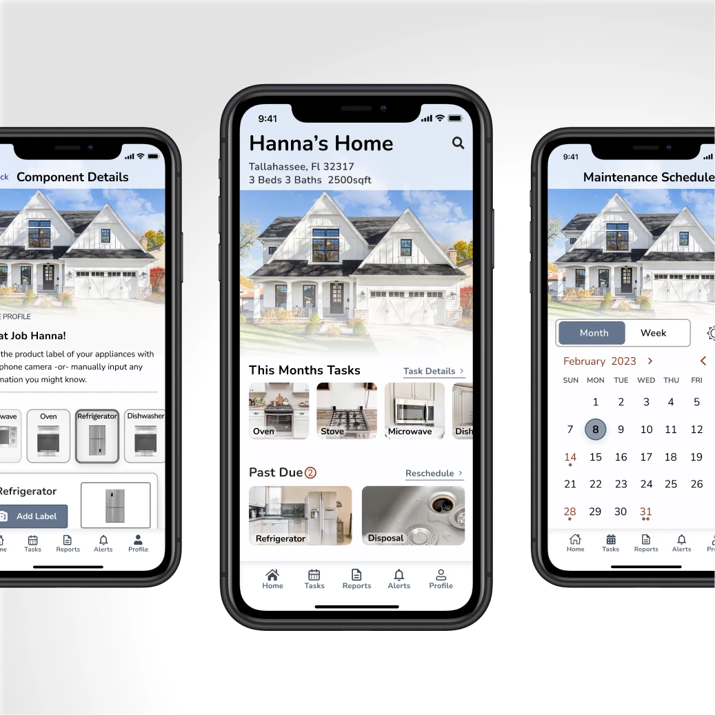
HomeWorks
Like this project
Posted Jul 10, 2026
Redesigned the SCRL module of the California Immunization Registry to improve accessibility, visual consistency, and admin workflows.
Likes
0
Views
4