Built with Framer
BodyBuddy Brand Guidelines Development
Shaheer Malik
Verified
🏋️♂️ BodyBuddy – Brand Guidelines Case Study
Client: BodyBuddy
Category: Fitness / Health Tech
Year: 2025
Prepared By: Shaheer Malik
Services: Brand Strategy, Visual Identity, Brand Guidelines Design
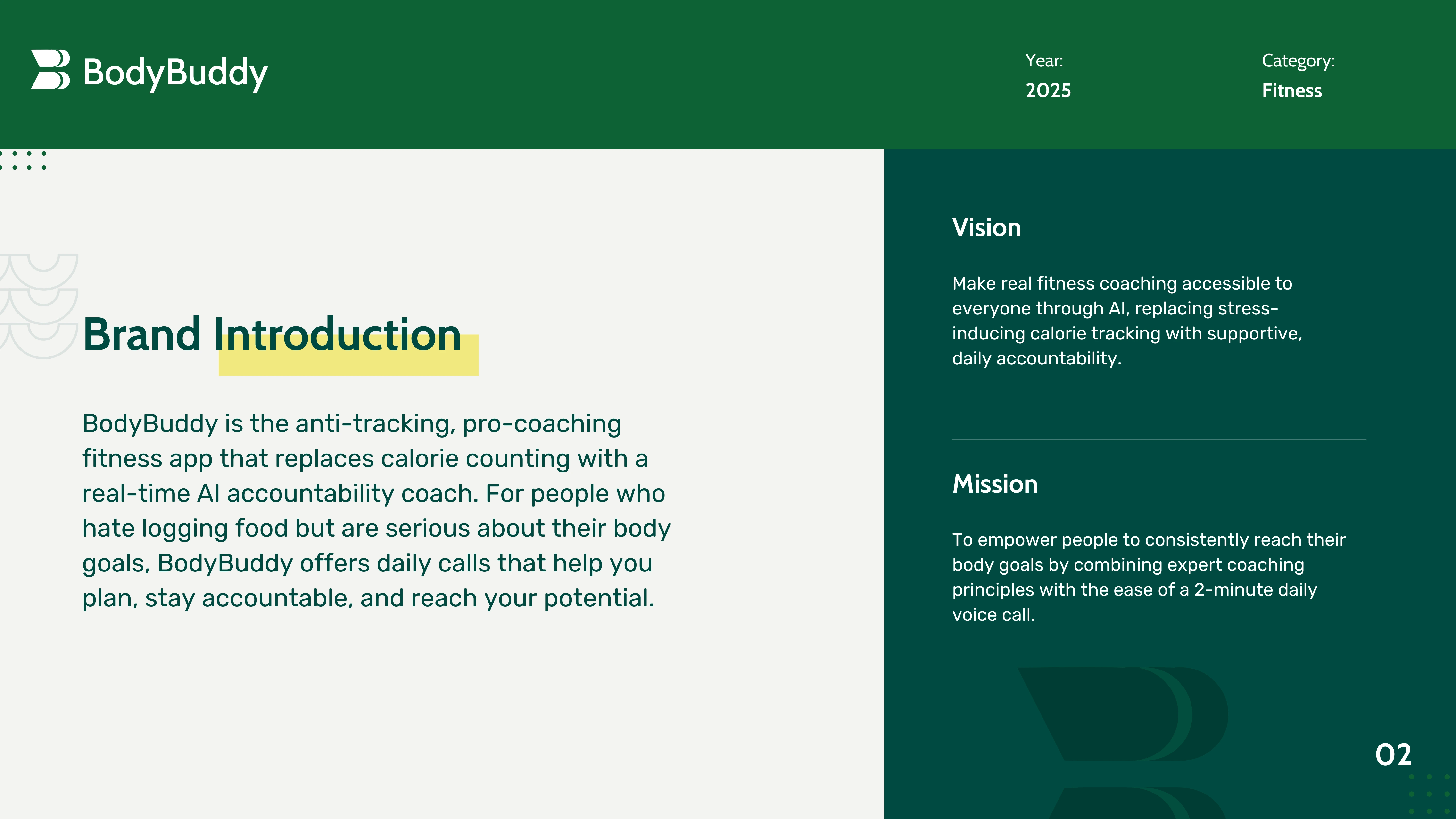
🚀 Overview
BodyBuddy is a revolutionary AI-powered fitness app designed to replace traditional calorie counting with a more sustainable, human approach — daily AI coaching calls. The brand’s goal is to make expert-level coaching accessible, personal, and stress-free for anyone serious about their body goals.
🧠 The Challenge
The core challenge was to communicate BodyBuddy’s unique positioning as the “anti-tracking, pro-coaching” fitness solution. The visual identity had to be:
Fresh and modern, yet grounded in trust
Technically clean for digital-first touchpoints
Reflective of the supportive, non-judgmental tone of the AI coach
💡 Our Approach
We built a brand identity rooted in behavioral psychology and minimalism. Our design system aligned every visual and verbal element with the core product value: Support, Not Stress.
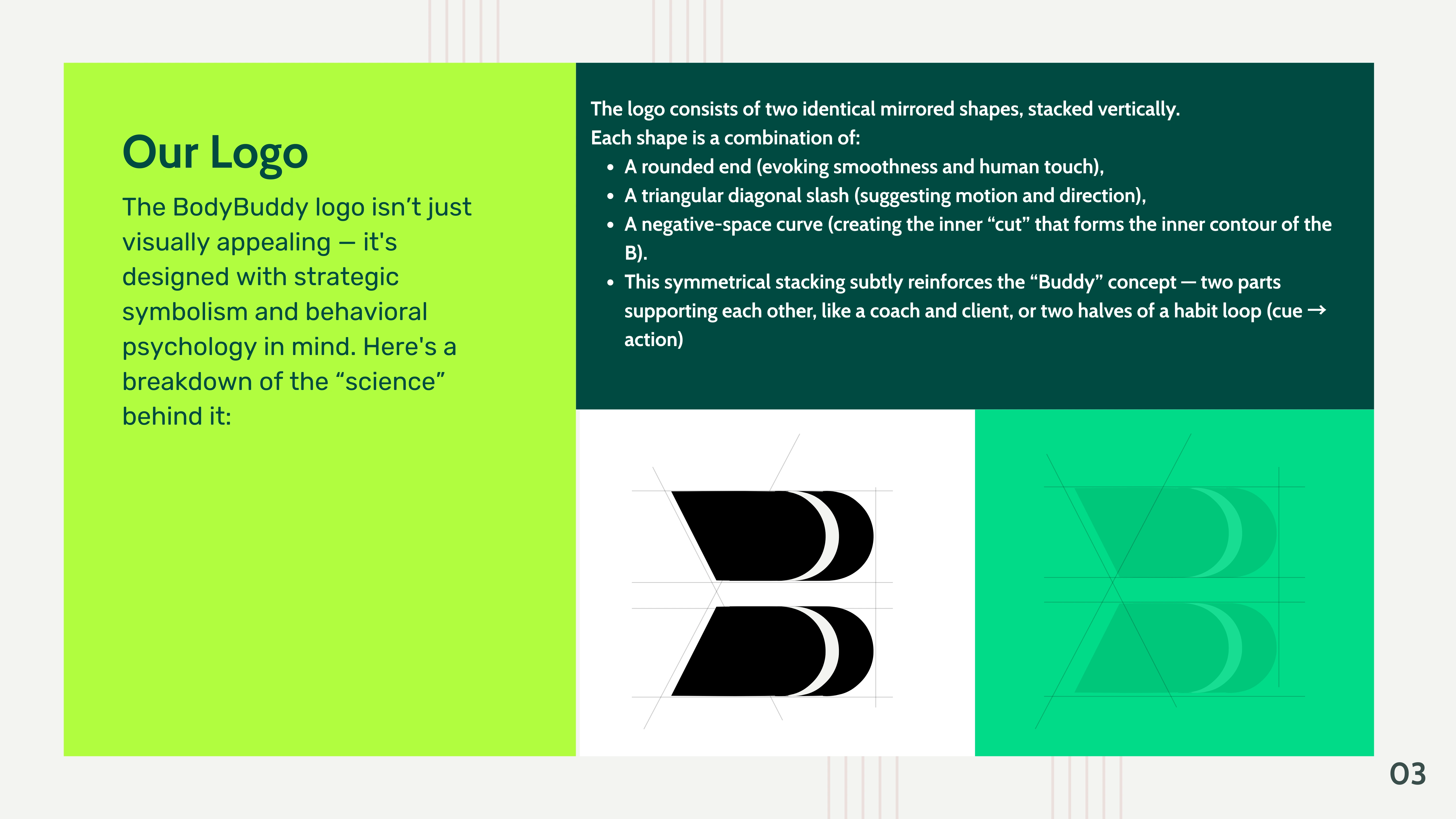
1. Logo Design
Symmetrical mirrored shapes symbolize the “Buddy” concept — two entities supporting each other.
The subtle “B” shape integrates motion, direction, and human warmth — all packed into a clean, scalable form.
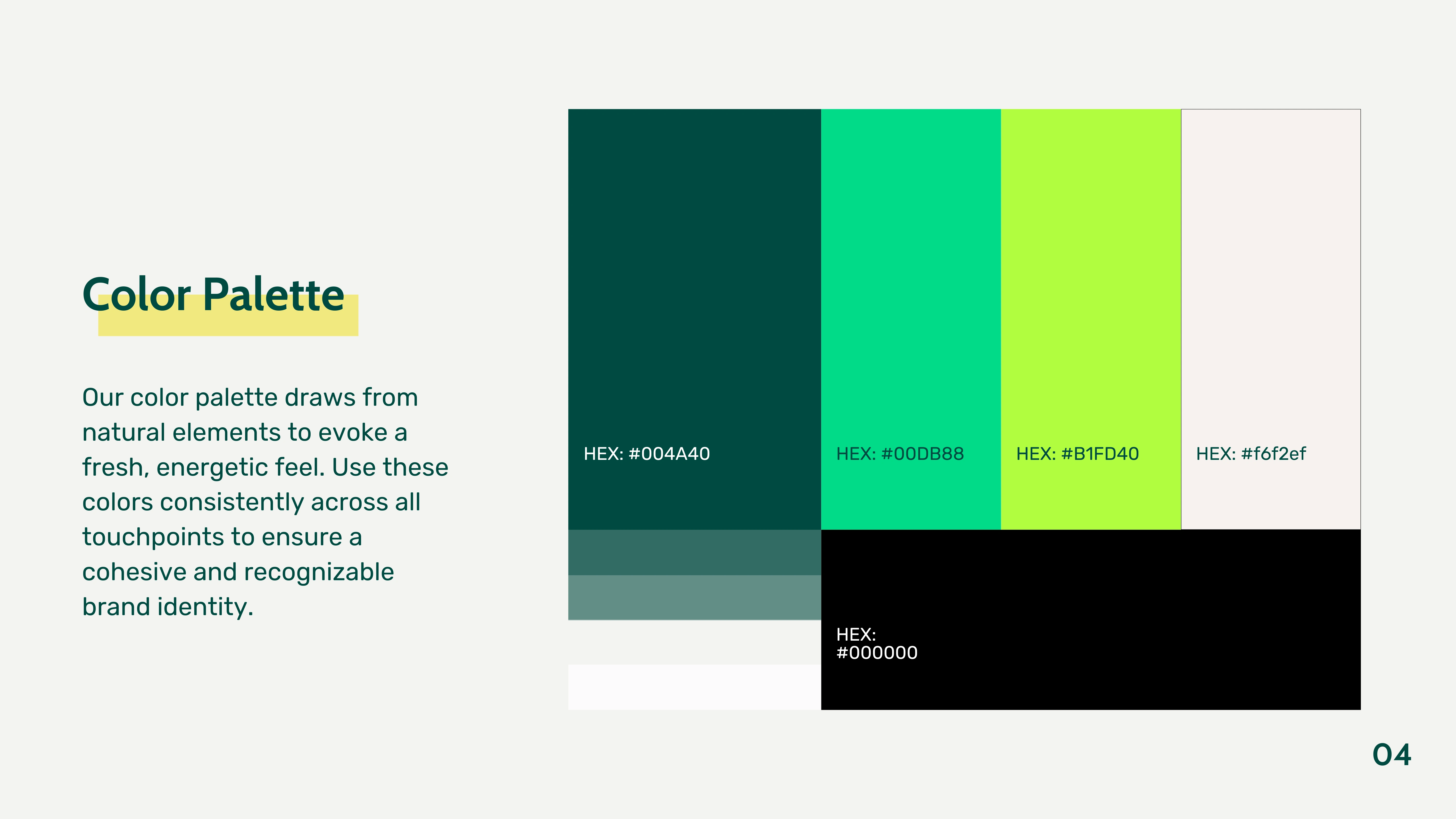
2. Color Palette
A nature-inspired palette that reflects energy, calm, and clarity:
Primary: Deep Green (#004A40), Aqua (#00DB88)
Accent: Neon Lime (#B1FD40), Neutral Sand (#f6f2ef), and Black for contrast
This color strategy brings vibrancy without overwhelming the interface, keeping it wellness-forward.
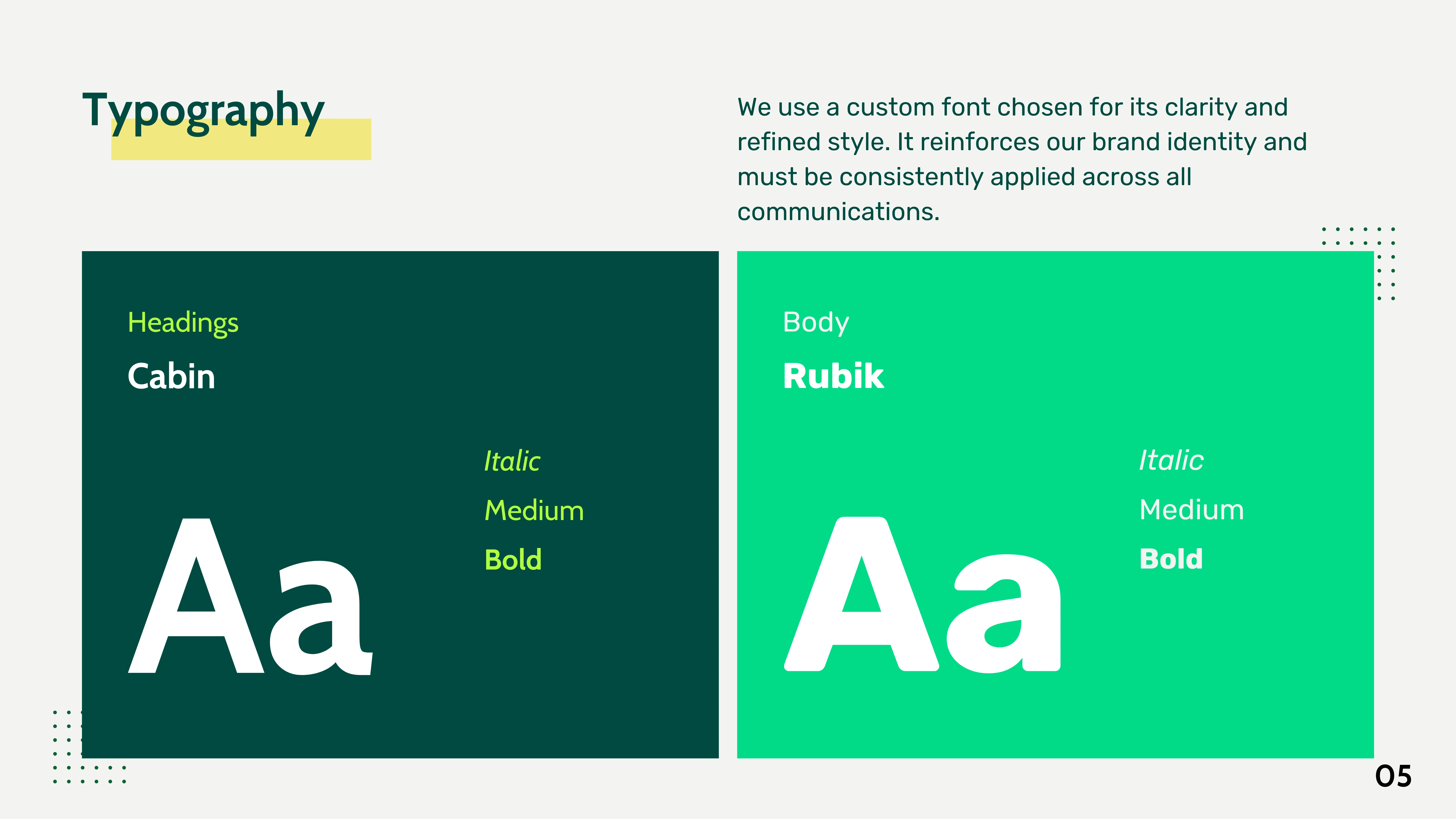
3. Typography
We paired Cabin and Rubik for readability, style, and subtle personality. These fonts strike a balance between professionalism and approachability, ideal for both UI and marketing.
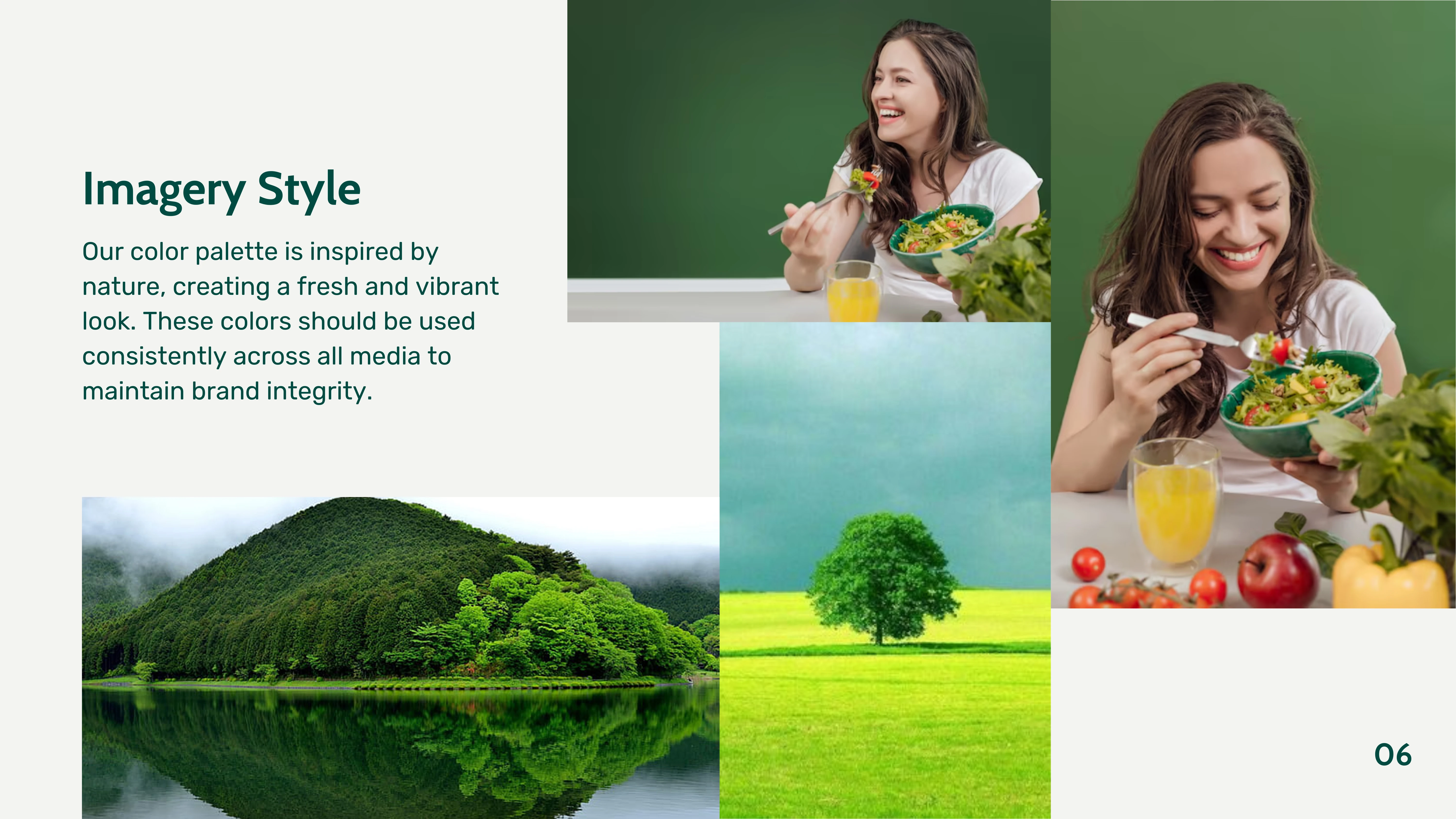
4. Imagery & Aesthetic
All brand imagery was guided to align with a natural, vibrant feel — avoiding sterile gym stock photos. Instead, it reflects real people, real bodies, and real progress.
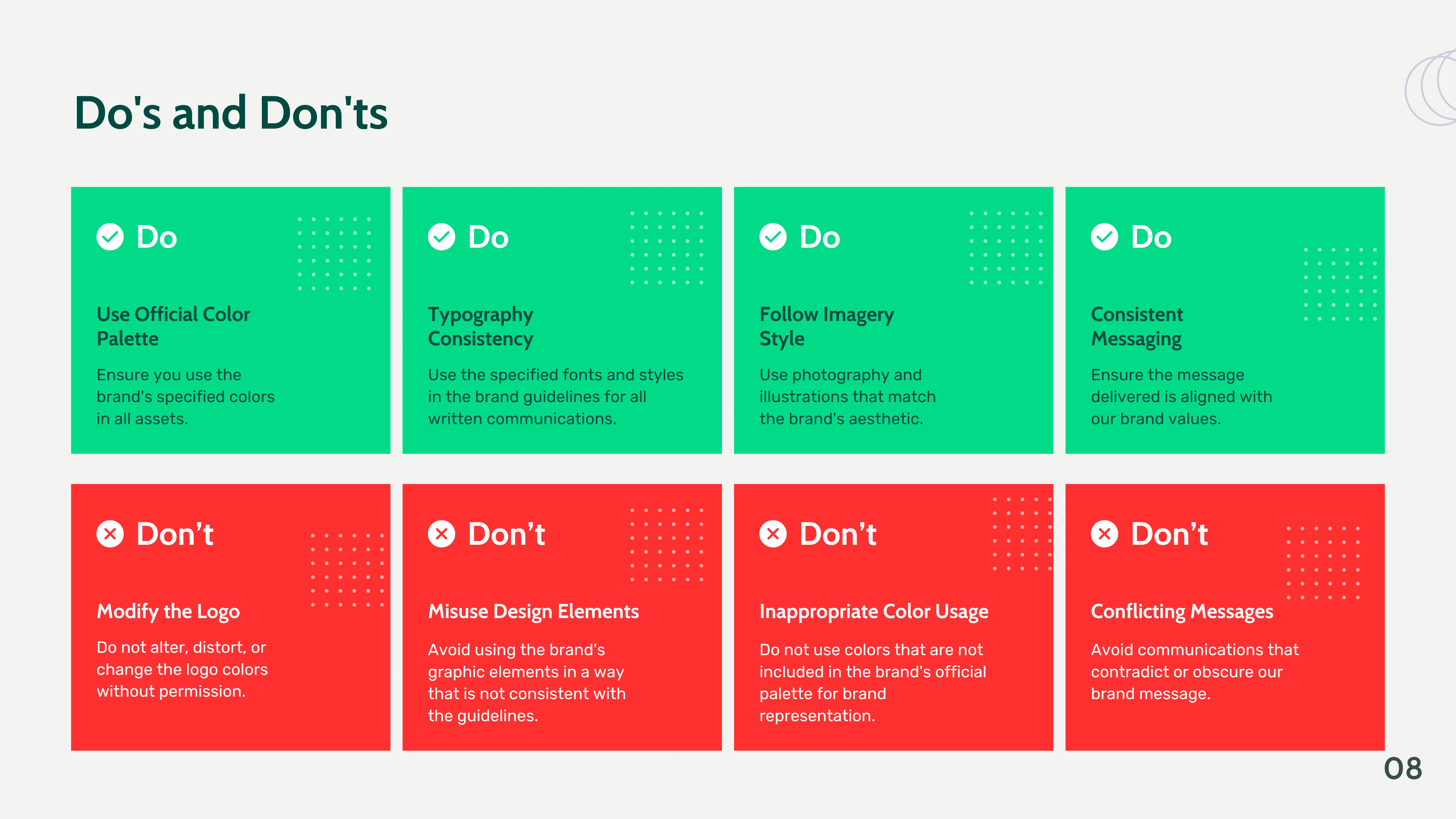
5. Usage Guidelines
We crafted clear Do's and Don'ts for internal and external stakeholders to preserve consistency across platforms. This included:
Logo integrity rules
Color usage dos and don’ts
Tone-of-voice alignment with brand values
📱 Deliverables
Brand Introduction & Messaging Framework
Logo Design & Rationale
Color Palette Specification
Typography System
Imagery Style Direction
Brand Application Examples
Visual Do’s & Don’ts Guide

🎯 Outcome
The BodyBuddy Brand Guidelines have enabled the team to maintain a unified voice across all touchpoints — from app UI to investor decks to social content. The brand now visually communicates its disruptive promise: real coaching in your pocket, no calorie counting required.
🧩 Tools Used
Figma
Illustrator
Notion (for collaborative feedback and revision tracking)
Like this project
Posted Jul 16, 2025
Developed brand guidelines for BodyBuddy, focusing on a supportive, non-judgmental identity. Our branding focus was to leave calorie counting and focus on diet
Likes
3
Views
77
Timeline
Jul 12, 2025 - Jul 16, 2025
Clients
BodyBuddy