Mobile App Redesign | XL
Mobile App Redesign for PT XL AXIATA
Project Brief
A telecommunication management application by XL Axiata allowing users to check their SIM Card payment and spending.
My Role:
Conduct user research to find pain-points of application
Create persona and user journey based on research
Revamped XL's branding and design system
Iterate various design solutions and
Create prototypes for Usability Testing to target user
Understanding XL Postpaid
User Interviews
Customer Journey Map
User Persona

XL Post Paid vs Prepaid
5/8 use it just to check their remaining quota, mostly when close to billing. 1 of them has the app but doesn't really use it. The remaining 2 do not have the app.
4/8 feel the payment method isn't mobile-friendly and feel like it can be utilized more. The remaining 4 are okay with using the current method. 1 of them doesn't fully trust using mobile payment.
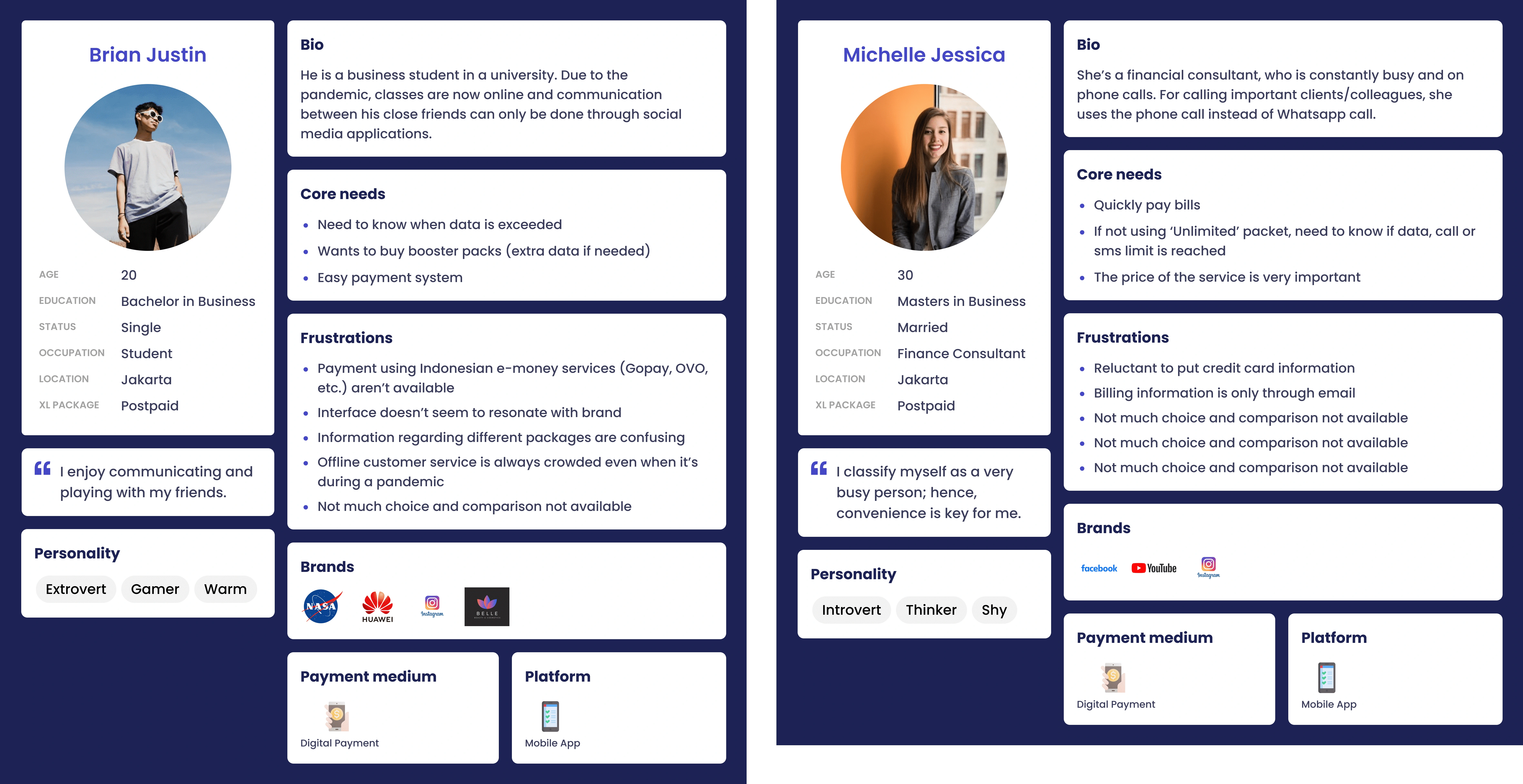
User Persona of Target User
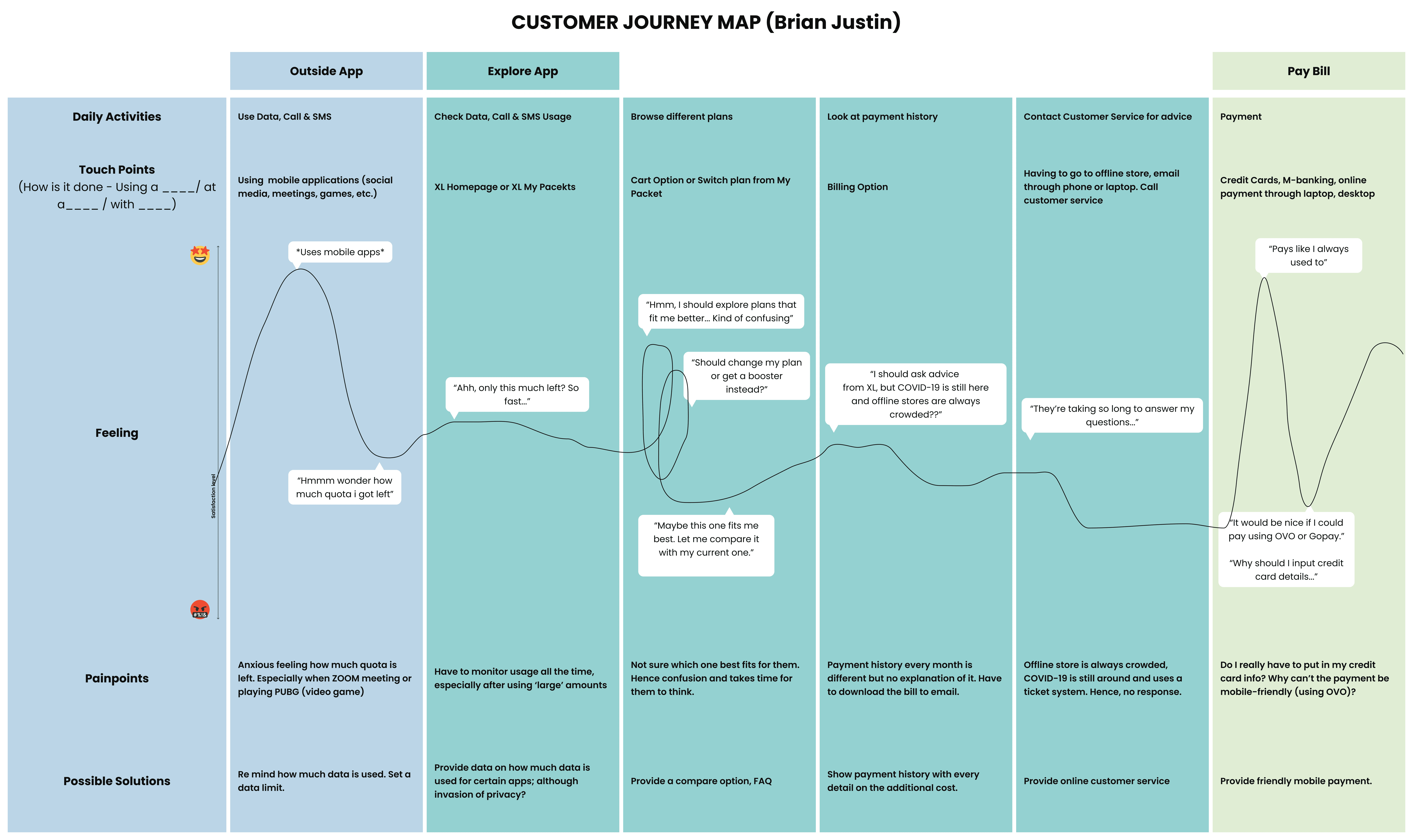
Customer Journey Map of Target User
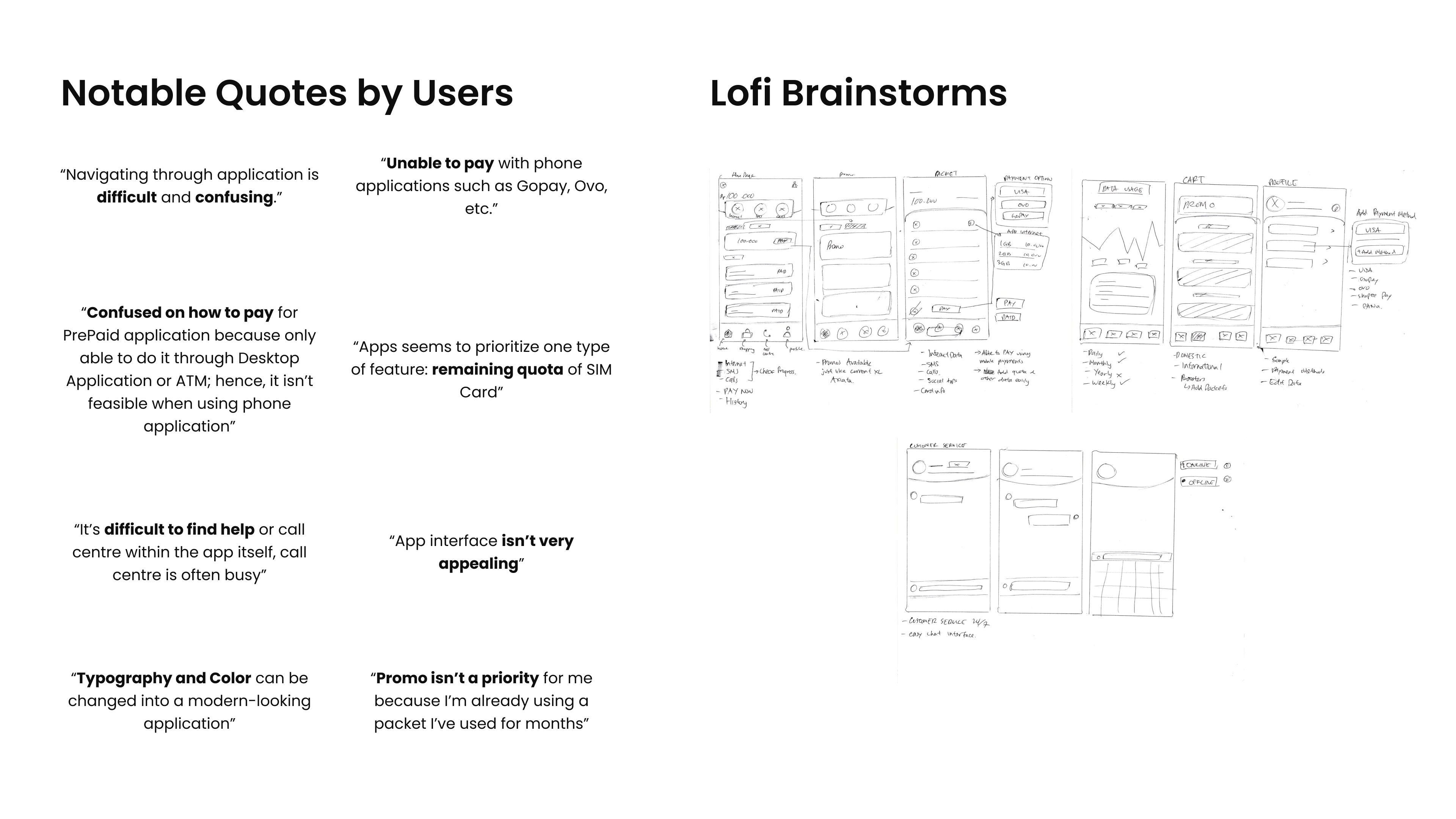
Notable Quotes from Target user & Lori Brainstorming of solutions
Final Design
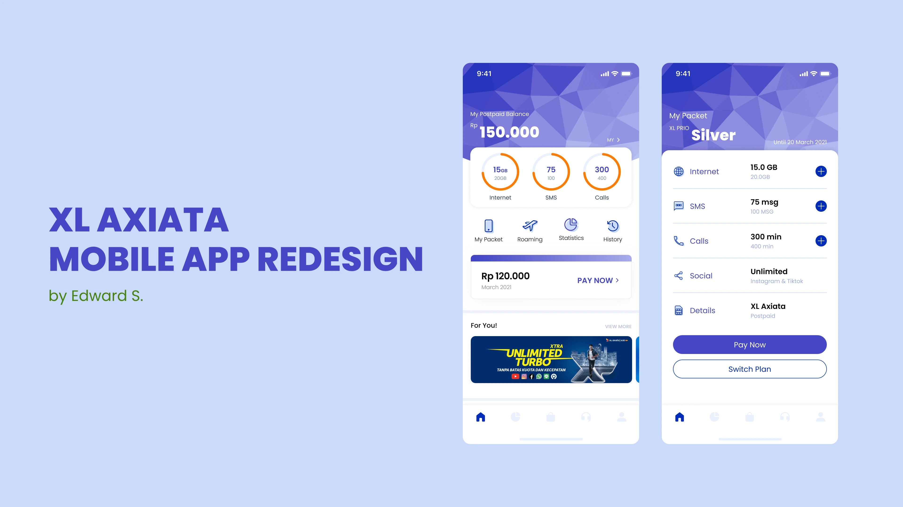
Homepage & Packet Page
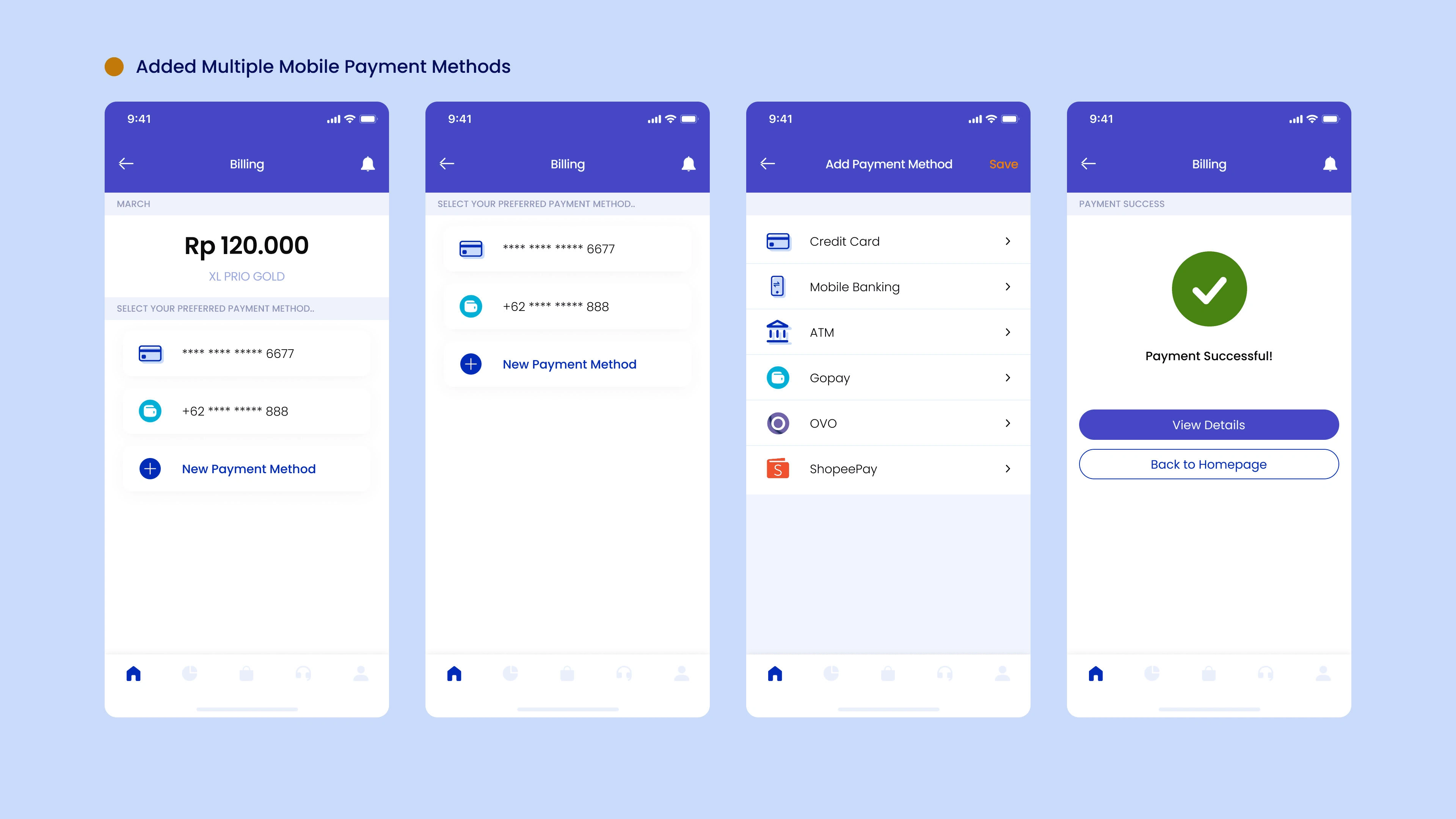
Multiple Payment Platforms
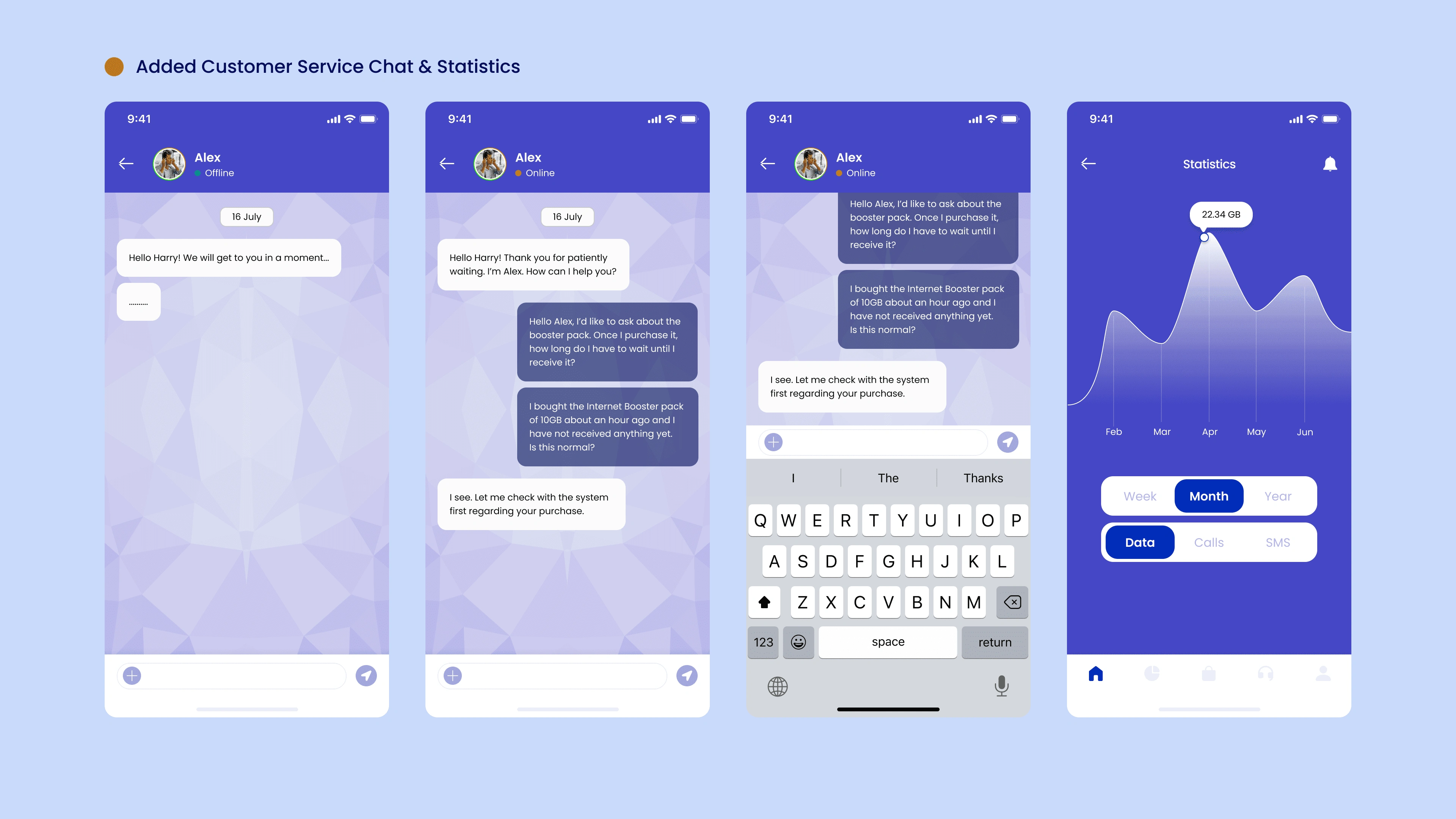
Customer Service & Data Usage Graph
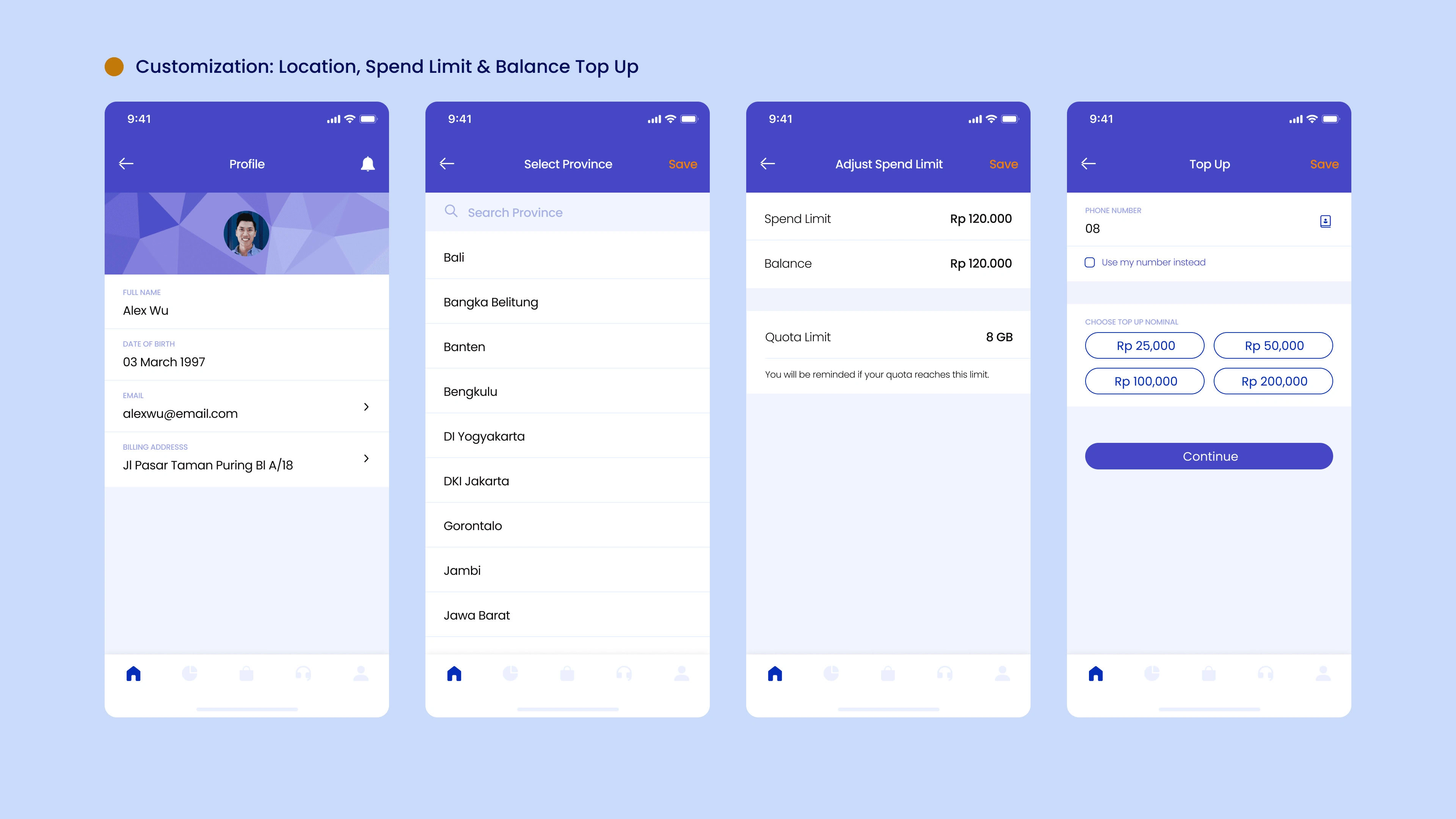
Customization of Location, Spend Limit & Easy Top Up
What we solved in each section
Homepage
• Shows remaining benefits and “Pay Now” Option
• Promos are present
• Explore different available packets for domestic and international services
• Trending Promos are shown on top
Payment Option
• Payment options are now more mobile-friendly
• VISA, OVO, Gopay and many others are now available options
• Shows when the user has not paid their monthly billing
• Users are able to purchase more data or SMS or calls if needed
Customer Service & Graph
• Ready to help customer service whenever customers would like to ask questions or are experiencing problems
• View Daily, Weekly and Monthly use of data
• See usage in a graph format
Customization
• Customize profile easily
• Set location
• Set Spend Limit
• Top Up balance
Like this project
Posted Oct 30, 2021
The redesign of XL's Mobile Postpaid App with a fresh new user interface.


