Avisen Consulting | Brand Design
Avisen Consulting
This branding project was for a client establishing their quantity surveying consultancy - a brand-new company without any prior branding.
Avisen Consulting needed branding that reflected its mission: bringing its clients' visions to reality through cost management and contract administration services that safeguard their interests at every stage.
Initial research into the industry revealed a preference for clean-cut branding that often mirrored architectural elements, aligning with the quantity surveyor's role within the construction sector. The branding needed to be minimal yet convey a strong sense of trust - an essential quality in this field.
While sketching design concepts, I found myself drawn to architectural drawings, exploring ways to integrate them into the brand identity. One idea was incorporating a construction compass, while another was designing the logo to resemble a building, subtly embedding the brand’s initials.
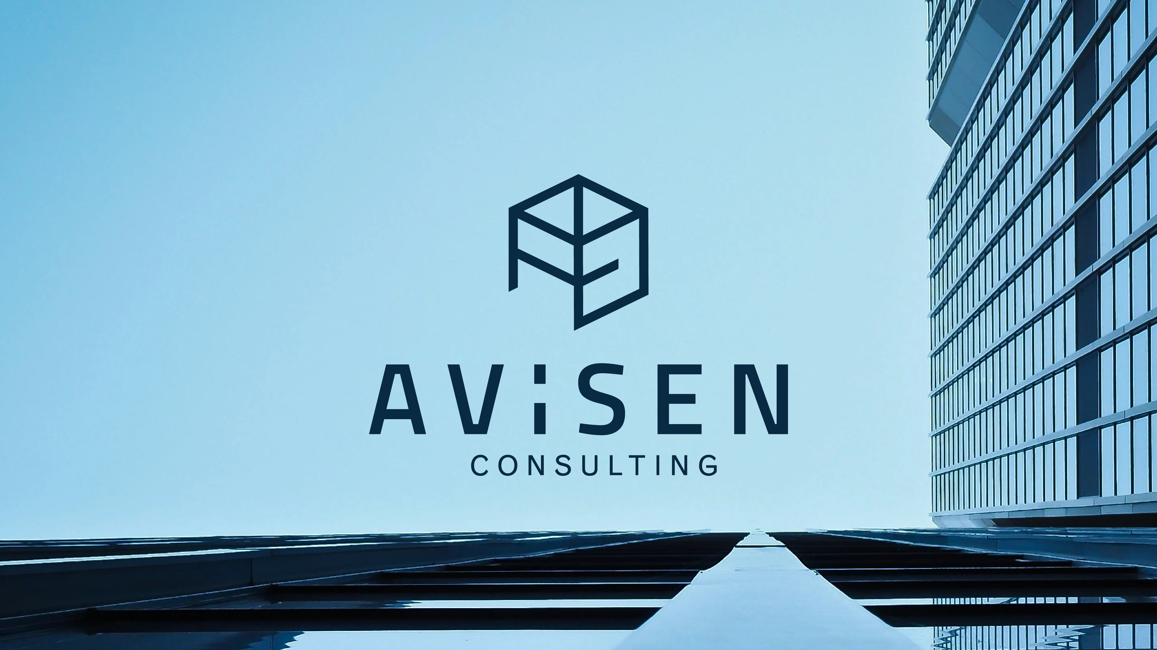
The final logo is an amalgamation of the letters in "Avisen," arranged in a cube format to create a clean, minimal, and distinctive mark. The chosen colours reflect the industry's focus on safety, with a deep blue complemented by contrasting brown and lighter blue tones - elevating the brand and reinforcing Avisen Consulting’s reliability.
I enjoyed creating this brand, as it was quite different from the feminine niche I usually work within. It was a challenge, and I loved it!

A brand showcase for the brand Avisen Consulting
Like this project
Posted Feb 4, 2025
Avisen Consulting brand design for a quantity surveying consultancy
Likes
1
Views
23

