StrongWithDana Branding + Website
Robin Beelow
Summary
Dana Buccheri was moving her personal training practice independent after several years of preparation. She needed a brand identity for the practice, named StrongWithDana, to summarize and promote her unique values. It will be a local brand with a focus on organic, word-of-mouth growth. We had a month to work. Her audience is primarily cisgendered, middle-aged women in north-side Chicago. Robin employed a method to create a suitable logo and website for the celebration of StrongWithDana.
Phase 1: Research
I reviewed some key competitors for their SEO keywords as well as their brand aesthetics, and had strong findings.
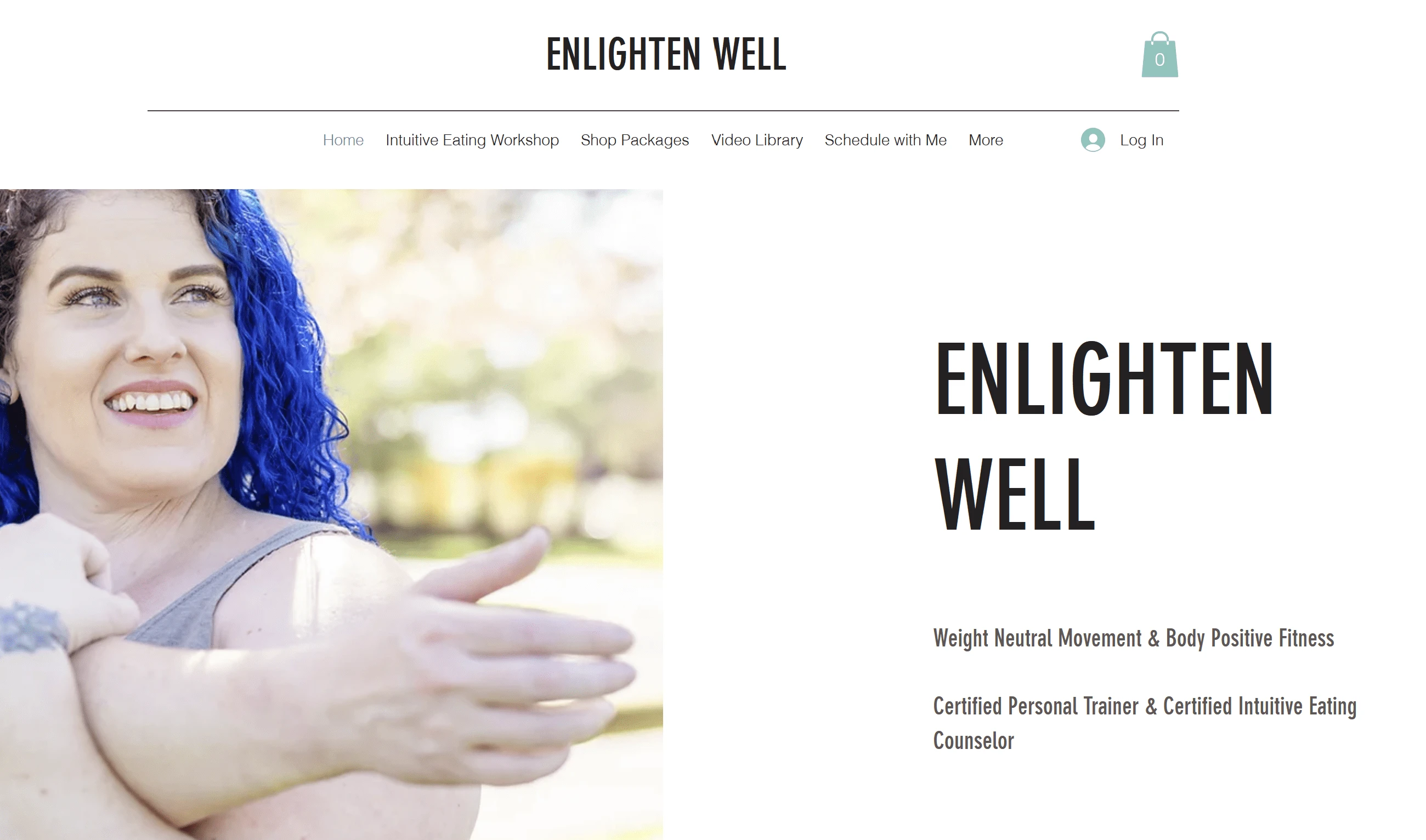
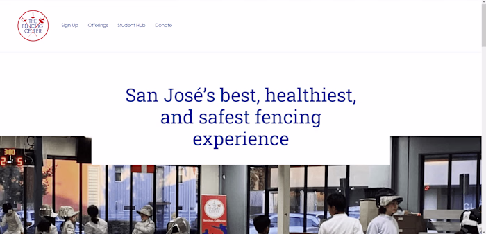
Enlighten Well and others embraced a very minimal aesthetic. Most similar brands shared this look, and I wanted to differentiate with something bolder. Also, male-focused brands used this same color theme.
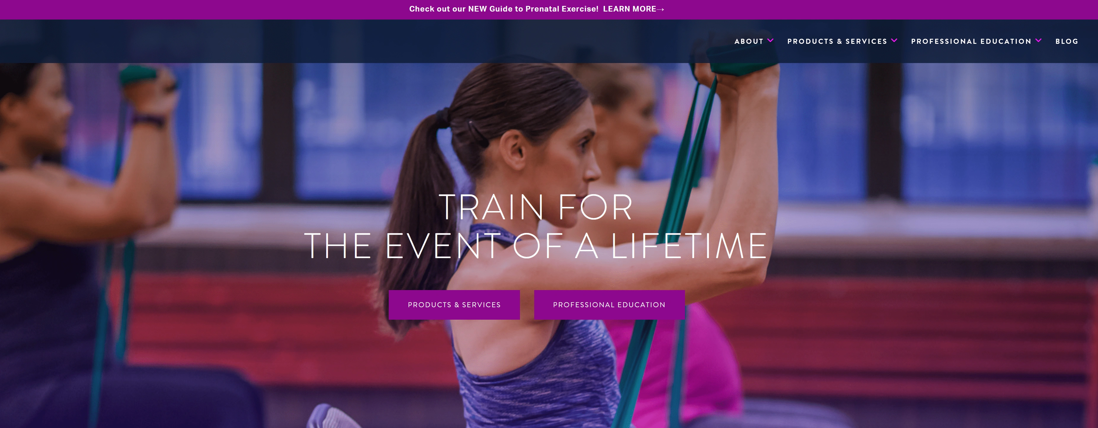
An overwhelming majority of women's brands used purples, pinks, and sleepy lavender hues. I knew we could do better with less stereotypical branding that doesn't talk down to women.
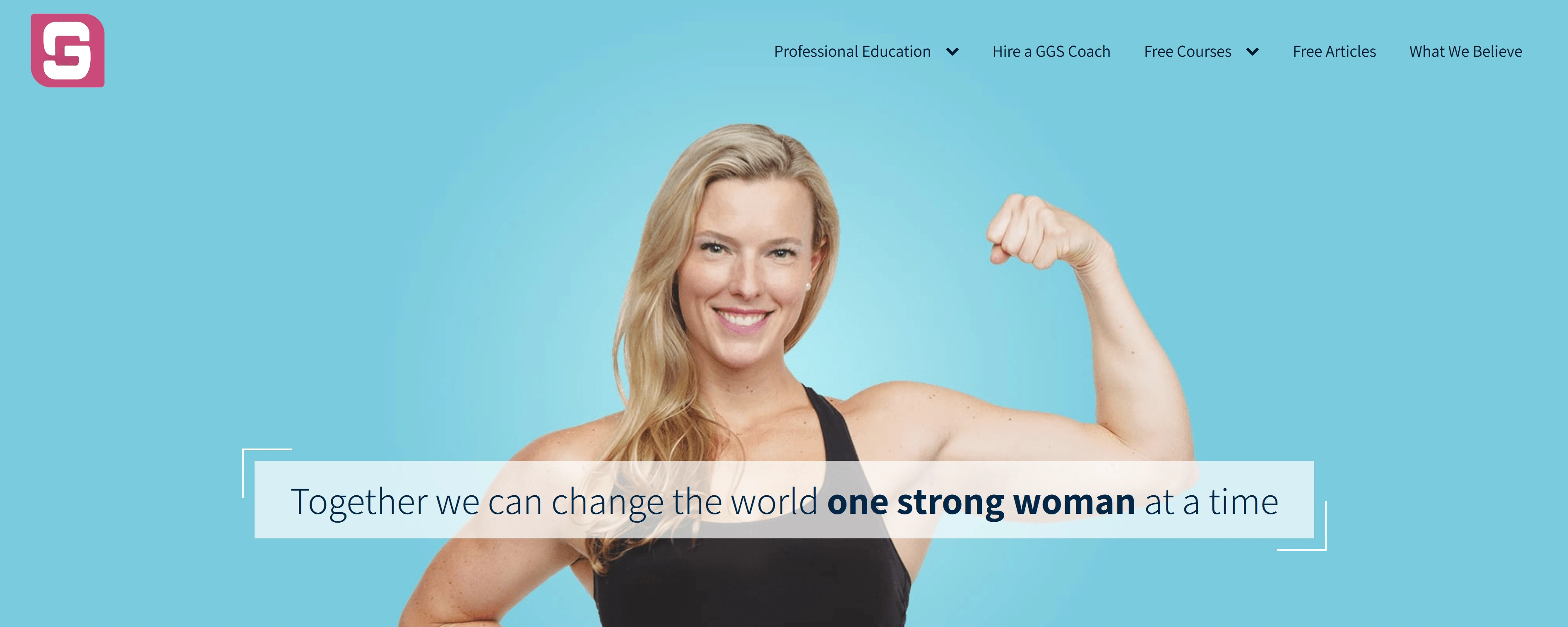
Girls Gone Strong was my favorite in discovery. It was energetic, bold, and still feminine.
Phase 2: Design
Next, I developed three aesthetic directions. I wanted to conjure a calm energy - a friend who would coax you towards your goals, with kindness but also seriousness. We settled on primarily option B for the colorway, while taking cues from option A for typography.
Phase 3: Delivery
The final result included a huge package of logo files. The hand pushing upwards captures the vertical lift I wanted to propel views into action, without relying on tired fitness imagery of weights or biceps. The crooked angles communicate the imperfection of the physical growth journey, and the typography is balanced between emphasis and gentleness. The colors are designed to be unique and set Dana apart from the pack while communicating the mood and tone of Dana herself and the values her practice espouses.
"Get Started" CTA is in header and also bottom of page. Copy supplied by client, and photo touched up and turned into transparent image.
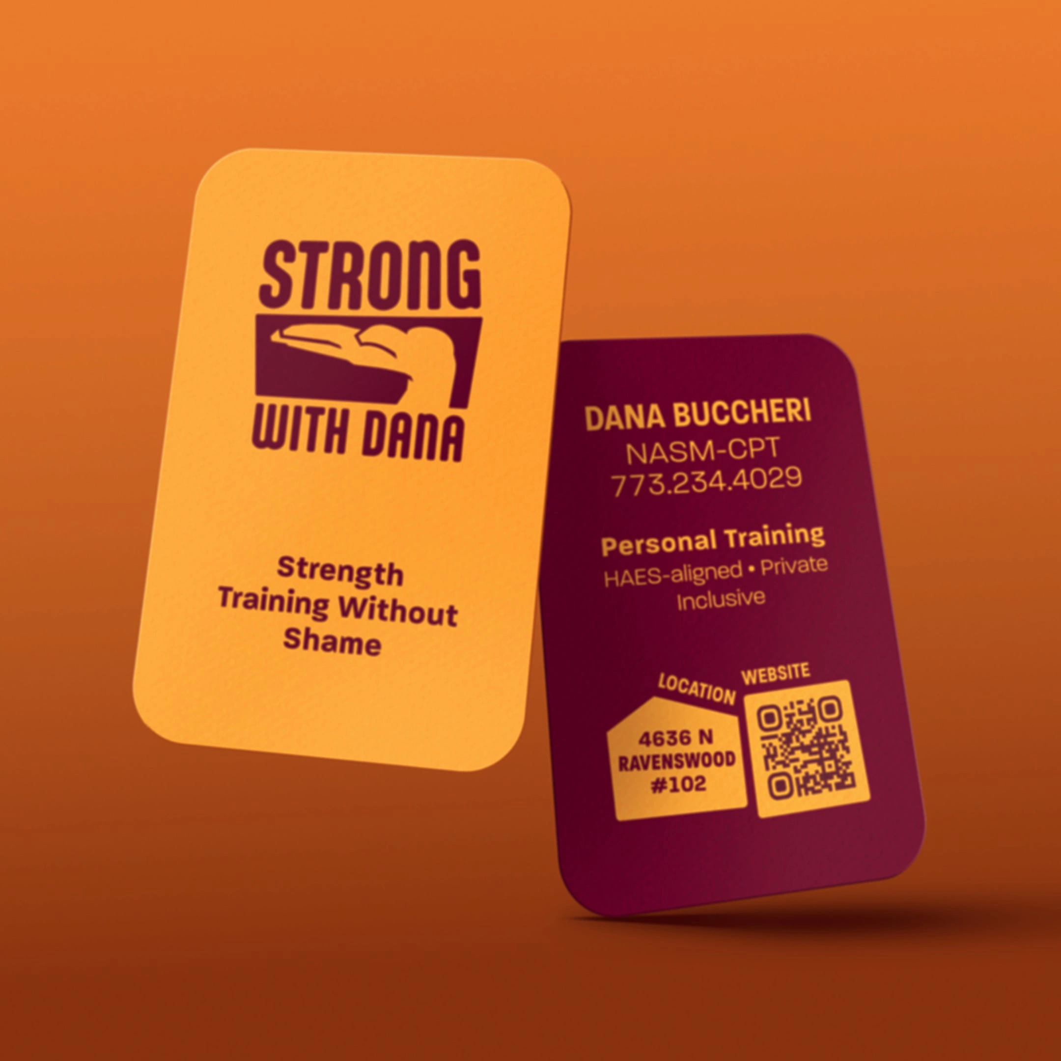
The brand is about verticality - and the cards should convey that! I also rounded the corners to contrast the jagged shape language and marry it with the rounded corners of the logotype.
Like this project
Posted Sep 4, 2023
This was a 1-month simple branding and website job. The website was built in Squarespace, and the logo was optimized for print and digital applications.