The Fencing Center Website
Robin Beelow
Summary
The Fencing Center are a 40-years strong 401c nonprofit fencing club in San Jose. They were undergoing leadership and location changes and the cascading fundraising needs that come with them. In service of increased conversion (and therefore revenue), they are requested I refresh their website’s content, structure, and lookfeel. Specifically, guest signup was a pain point which, if improved, could improve revenue. The new website was to allow for easy content updates without technical expertise and be generally low-maintenance so as to stay relevant over long stretches of time. The legacy website and domain were hosted on TSO Host, which we uncovered in an initial audit.
Phase 1: Pre-production
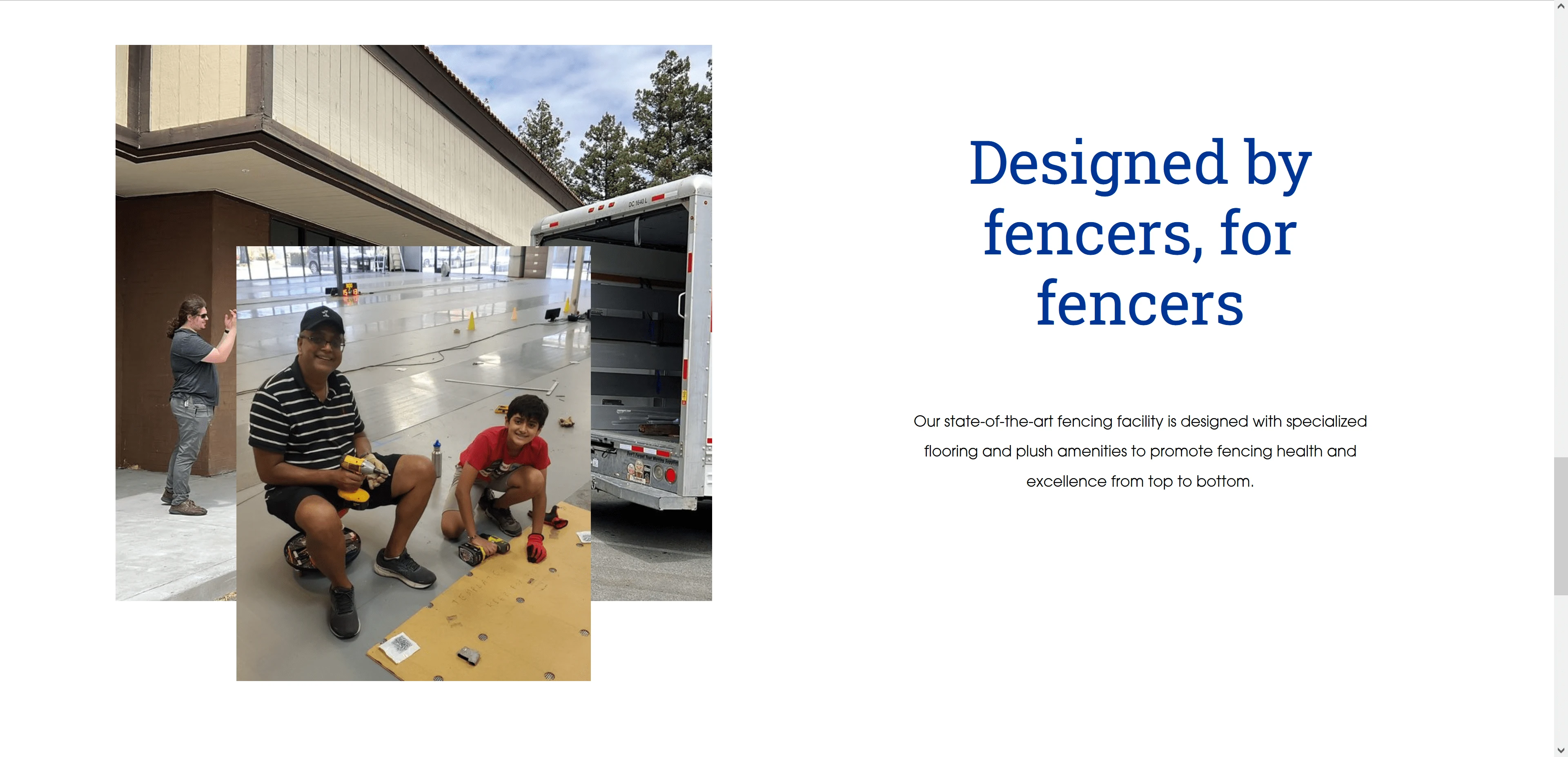
I performed a technical audit and took enormous care to capture the legacy website’s sitemap and content in full. This included downloading all the writing, the lookfeel, every image in the CMS database, and formatting all of those into more modern file formats. This was delivered as a gift in the final handoff. Then, I explored ways to modernize the lookfeel while being true to the sport’s history.
I inherited a logo which contained a URL, which is rather unconventional and looks cluttered at small sizes. That would change later, but for now I used the colorway featured there to guide my design choices for aesthetics.
Old Homepage
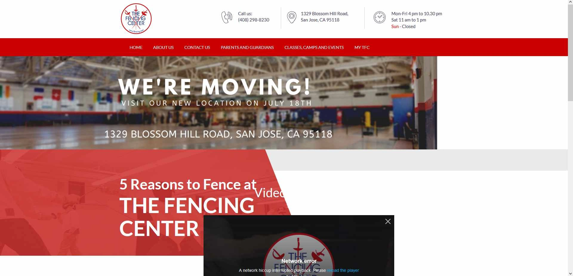
The legacy site. There were many obvious issues, such as a failure to incorporate responsive design principles, and a very overwhelming sitemap.
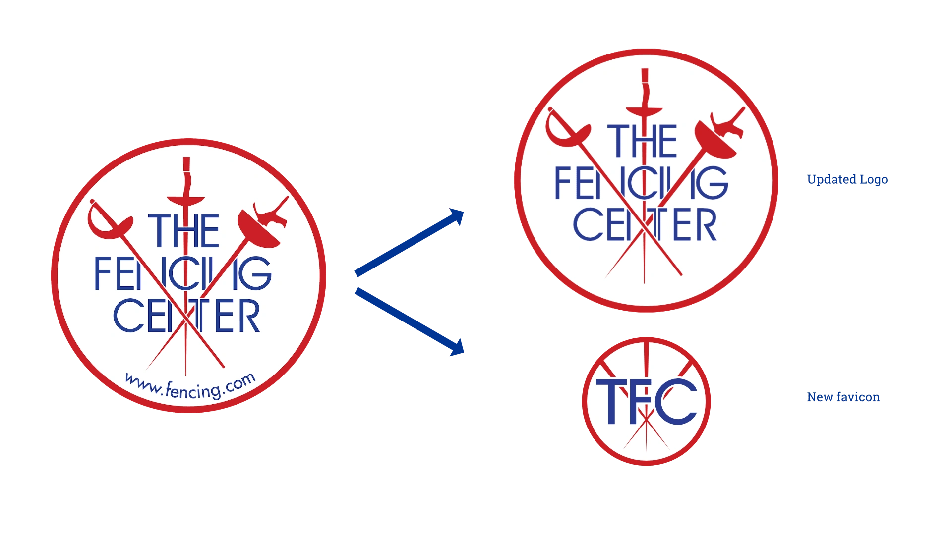
The site didn't have a favicon, and while I was updating the logo I wanted to fix that. Here's the change!
Phase 2: Production
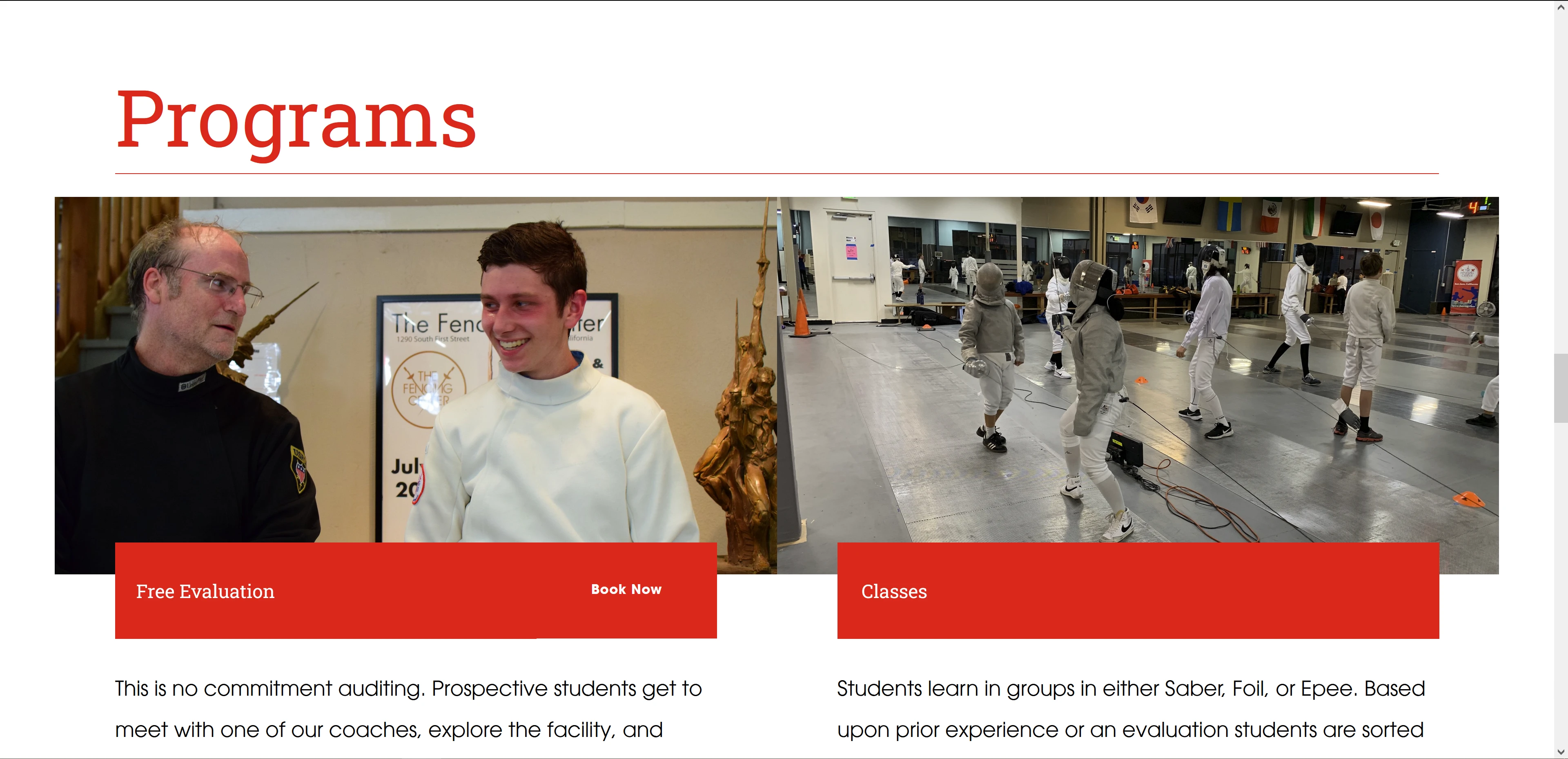
There were some production speedbumps. I started putting things in place to eventually direct the domain to the new Squarespace site, which uncovered some challenges. A lot of infrastructure was reliant on the legacy setup of the DNS. However, the new site went off without a hitch. The new sitemap was less than half as complex as the previous, with ways to encourage signup on every page in the site and modern approaches to mobile layouts, SEO, and UI/UX. I also took this time to quickly animate a logo stinger to match a hype video that they had made years ago, which was another value-add not discussed in the original scope.
Old Sitemap
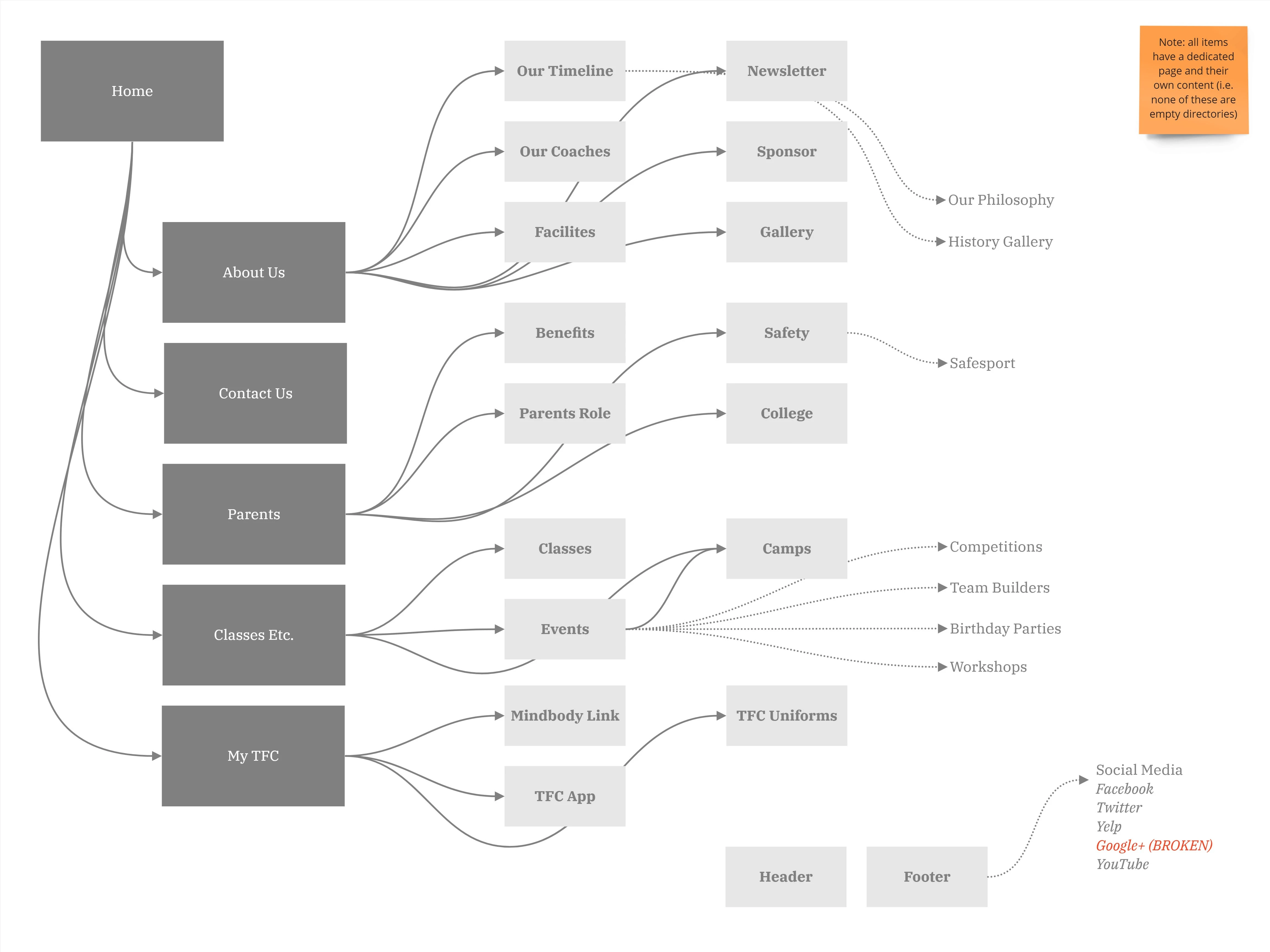
Legacy sitemap from the audit. As you can see, there was an overwhelming quantity of duplicative pages.
New sitemap
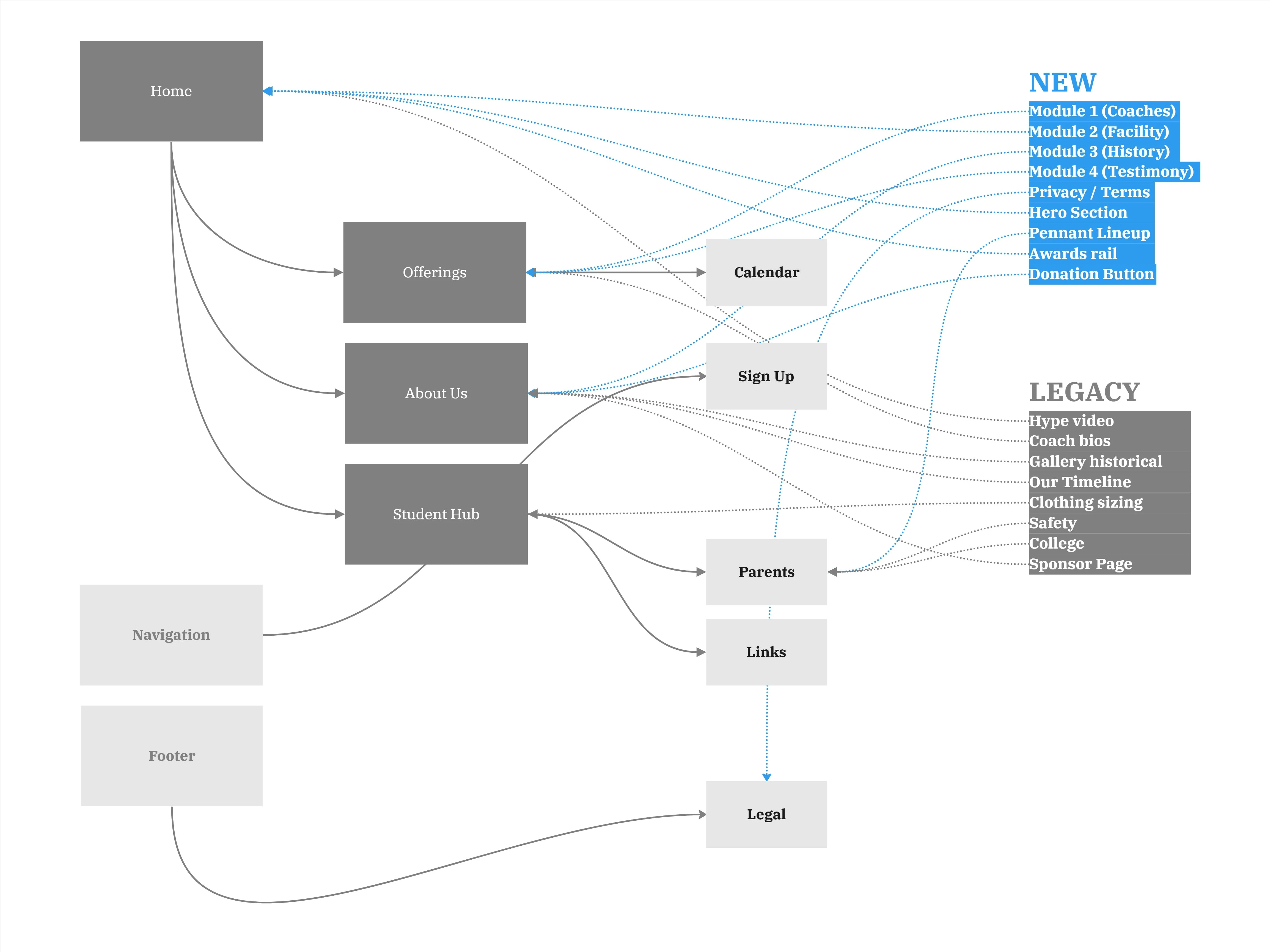
The new sitemap. This slide also details where old and new content will live on each page. This map was tuned to prioritize guest signup at every stage, without losing the evidence of quality from the old site's design.
Phase 3: Implementation
I presented the work to the client for final notes, alongside my audit of the legacy sitemap with the current MVP and ideas for a v1 and v2 of the website. The client approved with minimal changes, and I set out to perform the domain migration and ensure the correct staff had access to changes. I also took care to staff on how to make changes, and over the next months I created templates for key pages so as to make sure up-to-date information was easy to find for guests. A final unexpected aspect of this work was to advice on a service migration for their payment processing, for which I recommended Square, which cut their annual costs by over a thousand dollars.
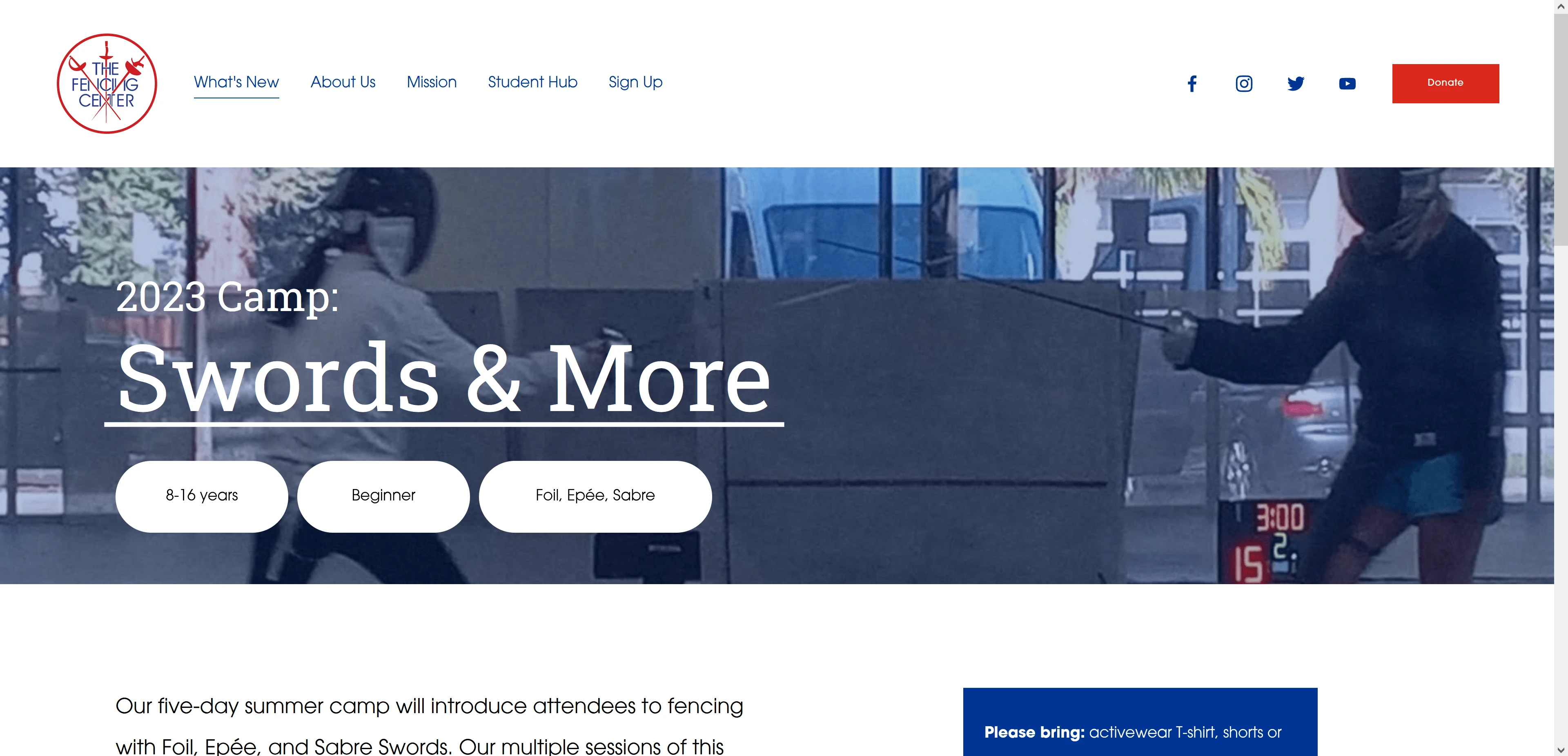
New Homepage

Like this project
Posted Nov 13, 2023
The Fencing Center is a 40-years strong fencing club with all the accolades and technical debt you can expect in that time. I worked with them to update it.
Likes
0
Views
14
Clients
The Fencing Center