louve

Zeynep B
louve
BRAND IDENTITY, ART DIRECTION
/2026
the brief
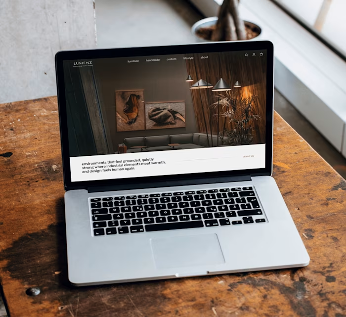
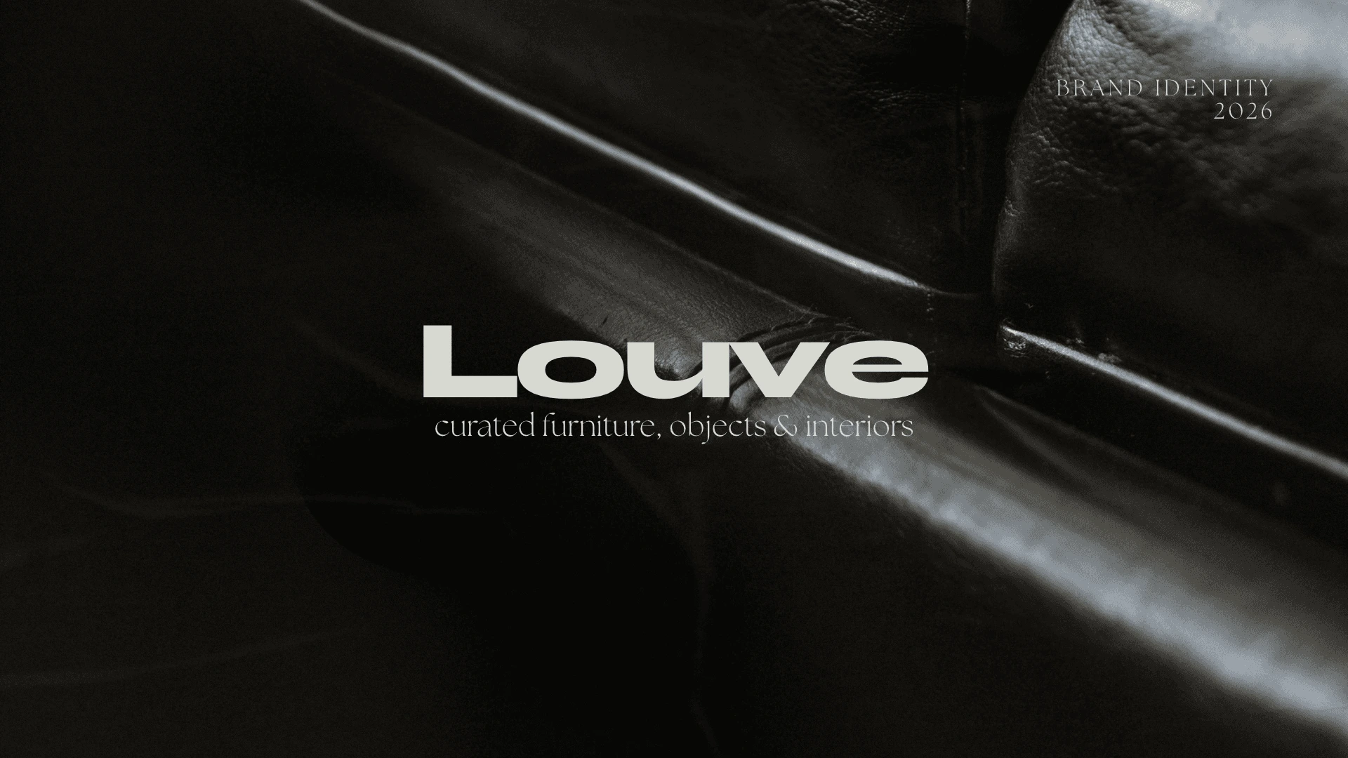
louve is a fictional design house curating furniture, lighting and objects across eras. its identity balances modernist restraint, vintage glamour and an editorial sense of space.
the decisions
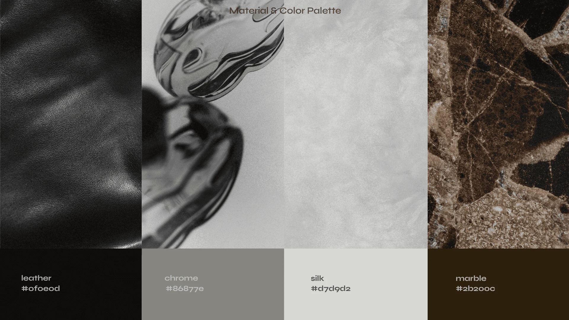
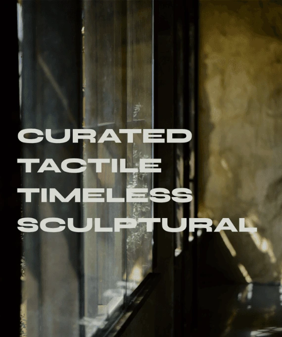
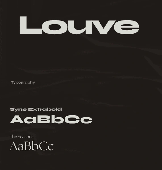
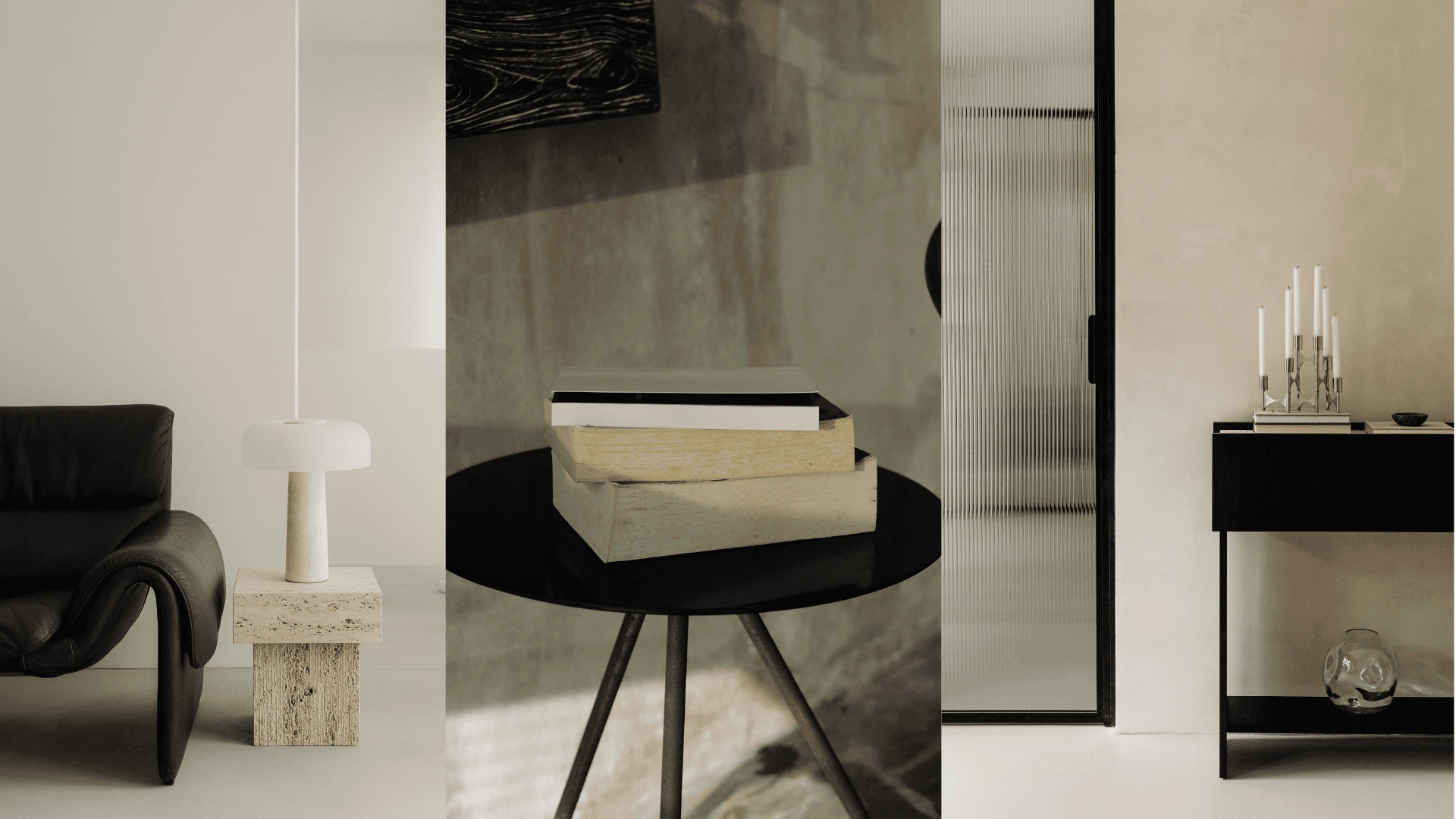
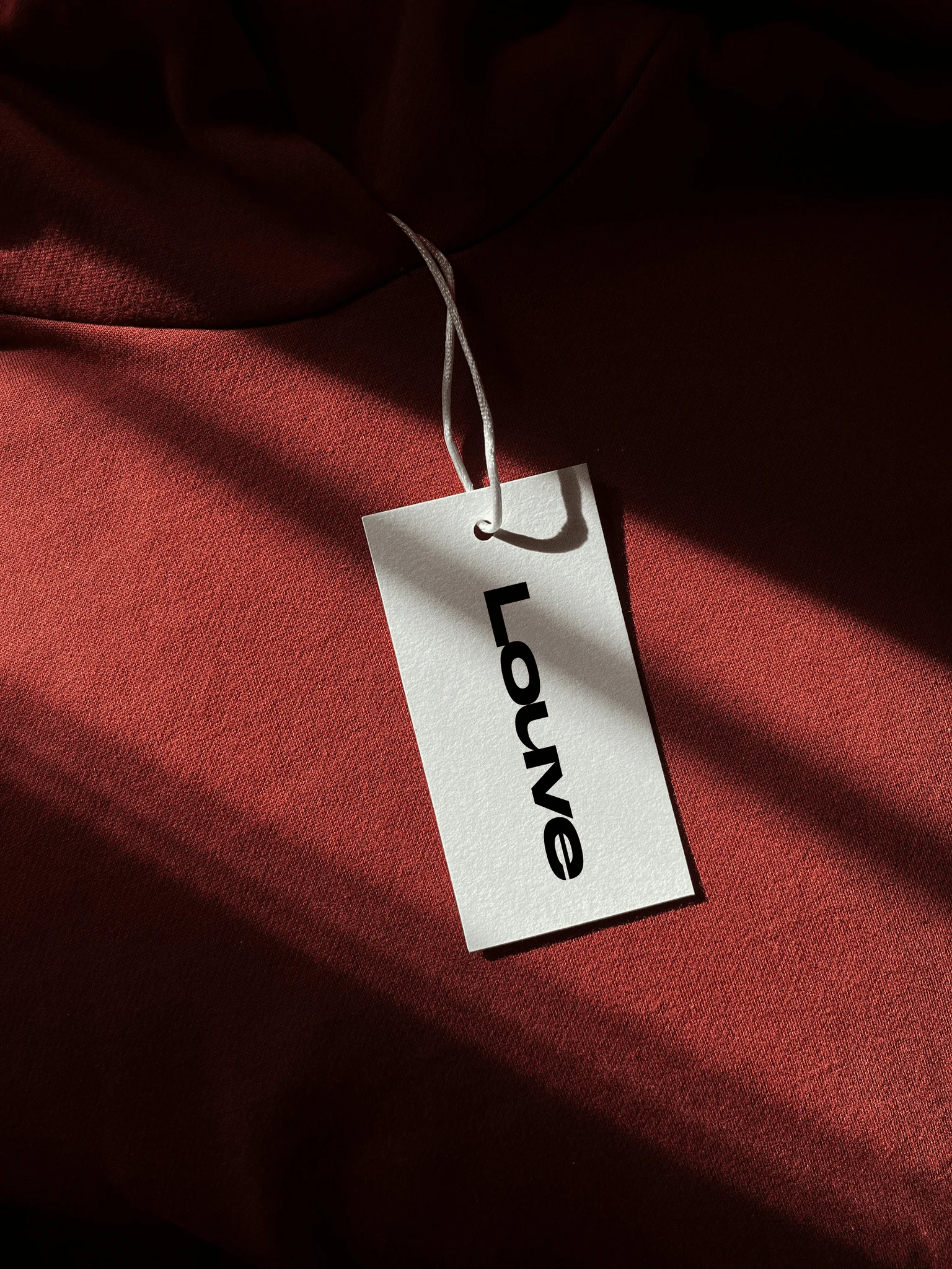
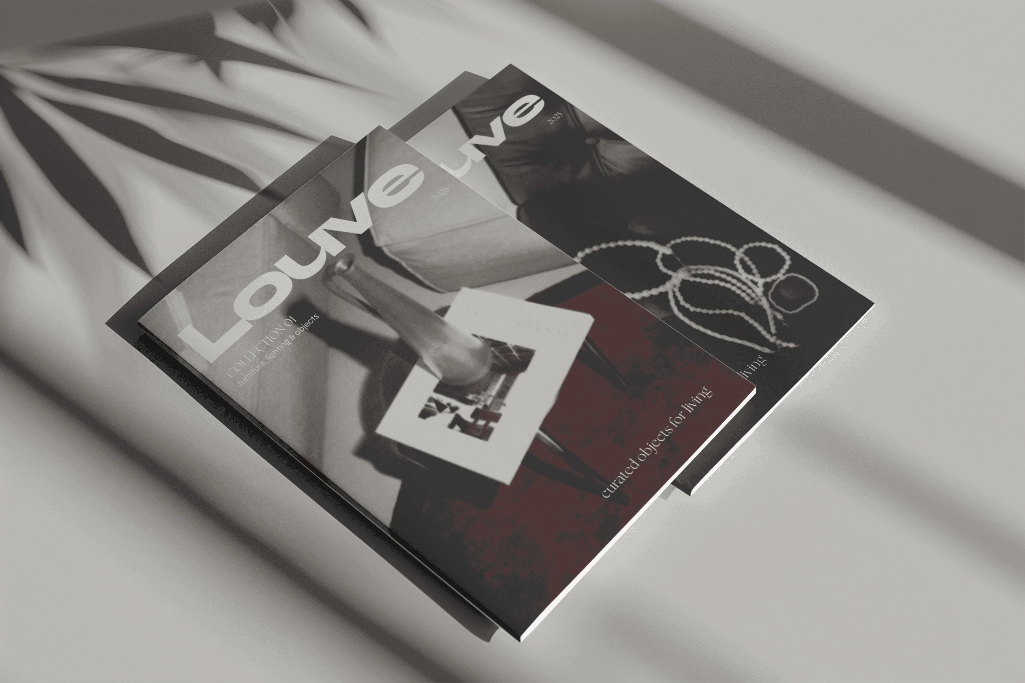
the challenge was to build an identity that could support a curated range of furniture, lighting and objects while giving the brand enough personality to feel like a design house rather than a catalogue. this way, i built the visual system around contrast, between a structured modernist typography paired with tactile, imperfect imagery and warmer material references. the oversized wordmark gives louve a strong and modern presence while being flexible enough for catalogues, campaigns, product cards and physical brand applications.
the outcome
the final identity positions louve as a modern design house with an editorial point of view rather than simply a furniture retailer. the system is intentionally restrained but not sterile, and lets each collection to develop its own visual character.
Like this project
Posted Oct 8, 2026
Developed an identity for a design house balancing modernist restraint and vintage glamour, producing a restrained editorial visual system that adapts across collections.
Likes
0
Views
1