sahibinden redesign

Zeynep B
sahibinden redesign
UI/UX
/2026
the brief
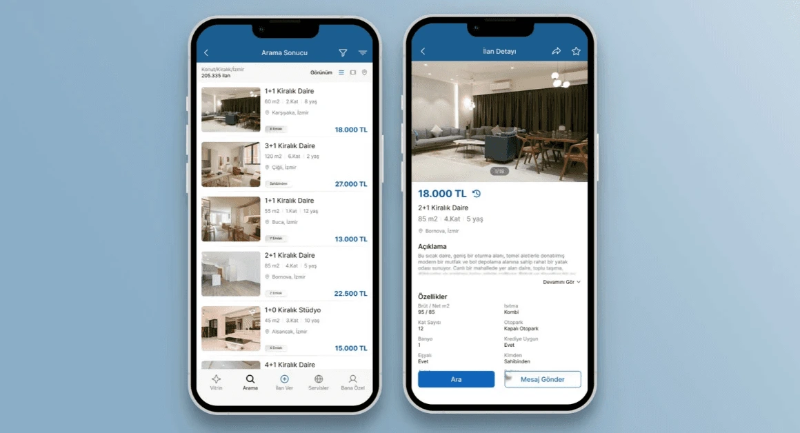
sahibinden has an established visual identity and interaction model. this recognition is valuable but the interface has accumulated a high level of visual density over time. the goal of this redesign wasn't to reinvent the product, but to reduce friction and modernise the experience without making sahibinden feel unfamiliar to its existing users.
decisions
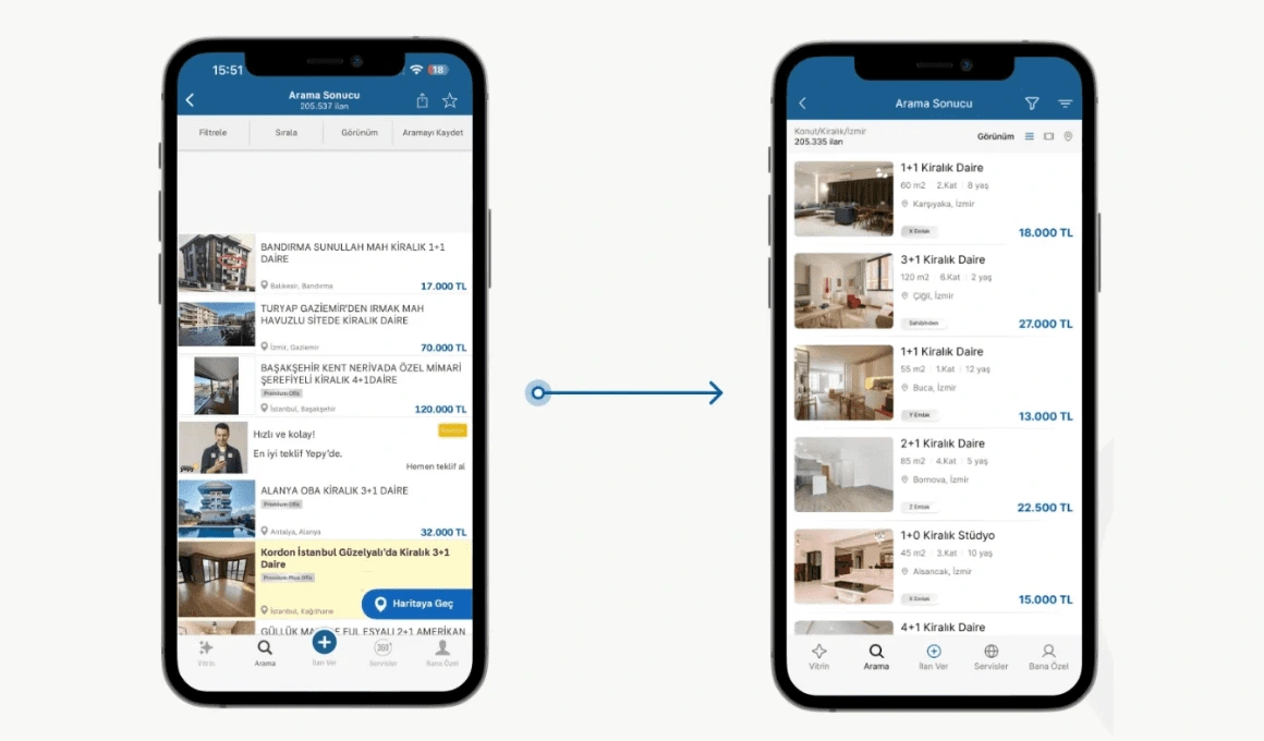
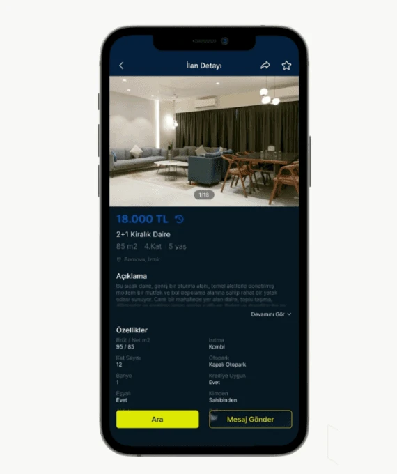
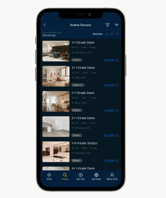
i focused mainly on information hierarchy, readability and visual breathing room. i also designed a dark theme after reviewing the user comments and identifying repeated demand for a more comfortable low-light experience. i analyzed the competitors, and designed a simpler interface that is still compatible with sahibinden's identity. i simplified search results, reorganised listing detail screen and separated price, key property information, description and features, making it look less cluttery.
outcome
the redesign has a cleaner and more scannable version, a reduced visual noise, dark experience, and the visual signals that make sahibinden stilll recognizable.
Like this project
Posted Oct 8, 2026
Redesigned Sahibinden to reduce visual density, improve information hierarchy and readability, and add a dark theme while preserving recognizability.
Likes
0
Views
1
Tags