lumenz

Zeynep B
lumenz
WEB DESIGN, ART DIRECTION
/2025
the brief
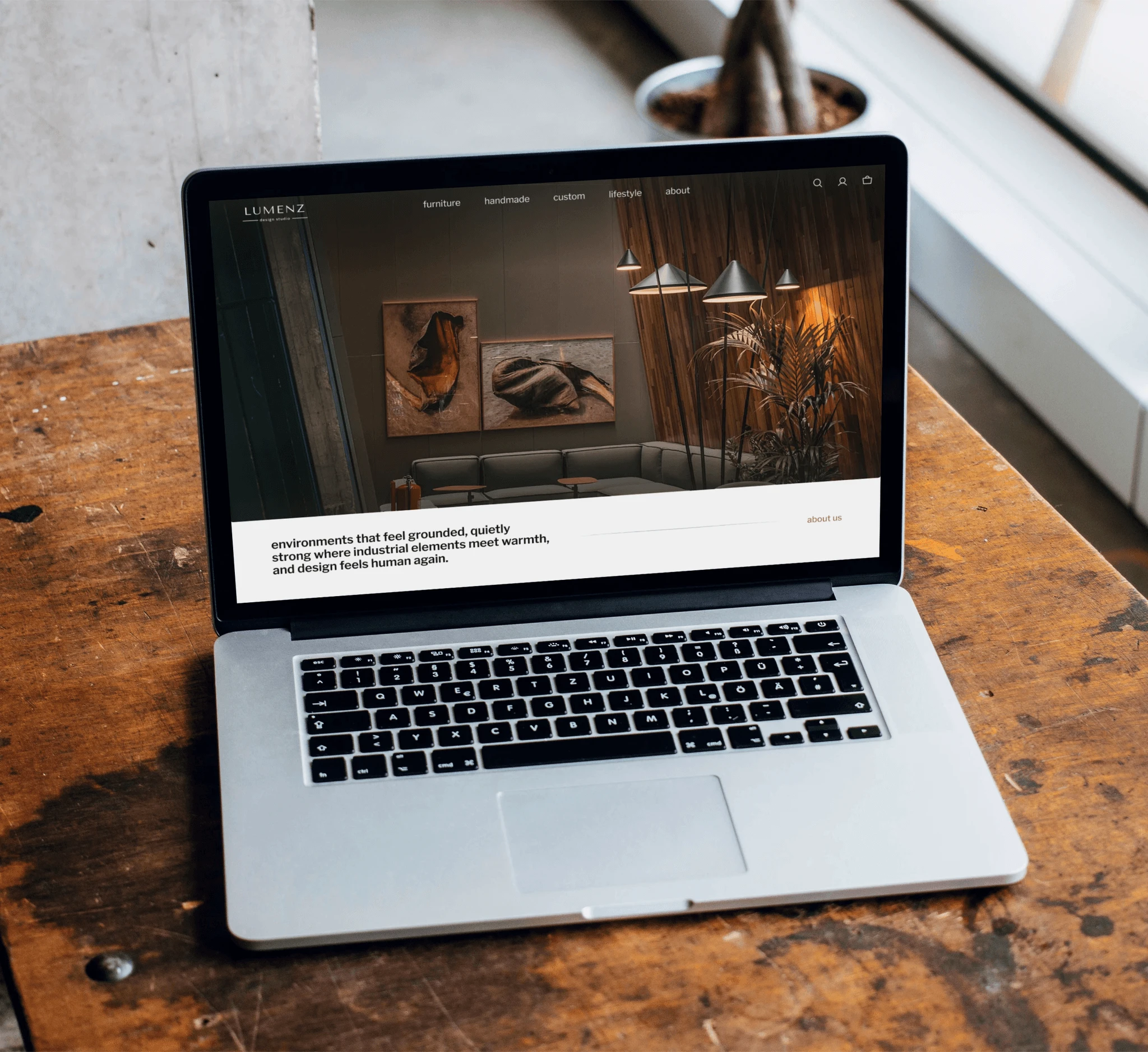
lumenz i̇s a conceptual furniture brand built around the idea that furniture should be experienced as a part of a life, and not presented as isolated products. after doing competitor research, i realized a lot of furniture websites focus on selling the product with multiple sales/campaign banners, rather than letting the customer experience it. i wanted the customer to feel what it is like to be a part of lumenz.
the challenge & the decisions
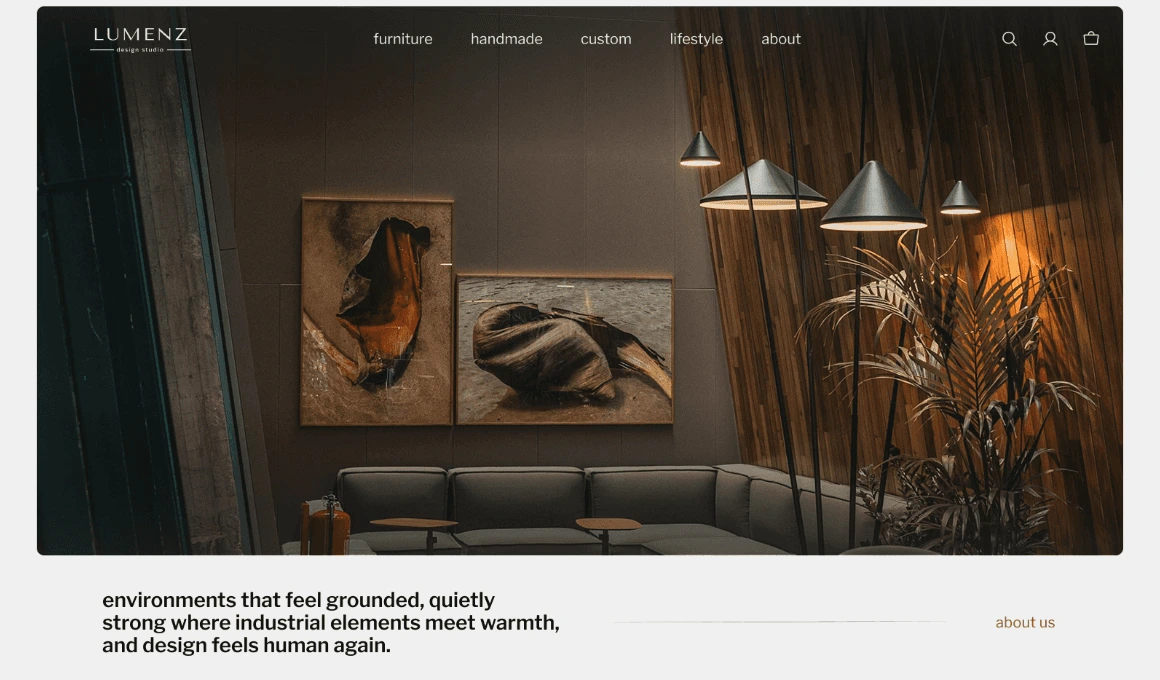
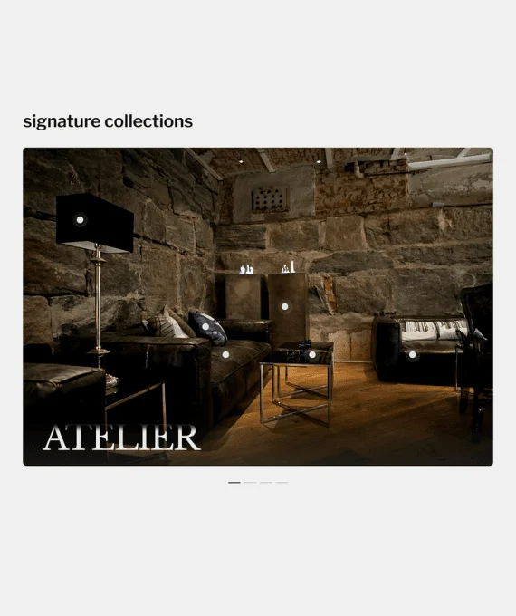
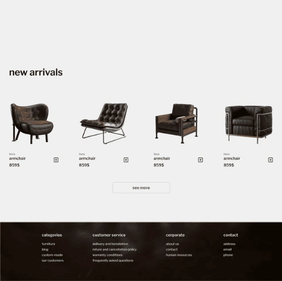
the challenge was to create an e-commerce experience that supports product discovery and purchase without relying on the dense layouts and aggressive sales patterns. the website needed to communicate quality, atmosphere and context while also keeping the path to purchase clear. that's why i approached it like an editorial catalogue than a traditional product grid. large scale lifestyle imagery places products in real environments, helping customers understand scale, moood and use before moving into the product details. i intentionally kept the interface restrained with clear hierarchy and generous spacing to reduce visual competition between products. lowercase typography, warm industrial tones and tactile imagery gave lumenz a distinct brand presence throughout the shopping journey.
outcome
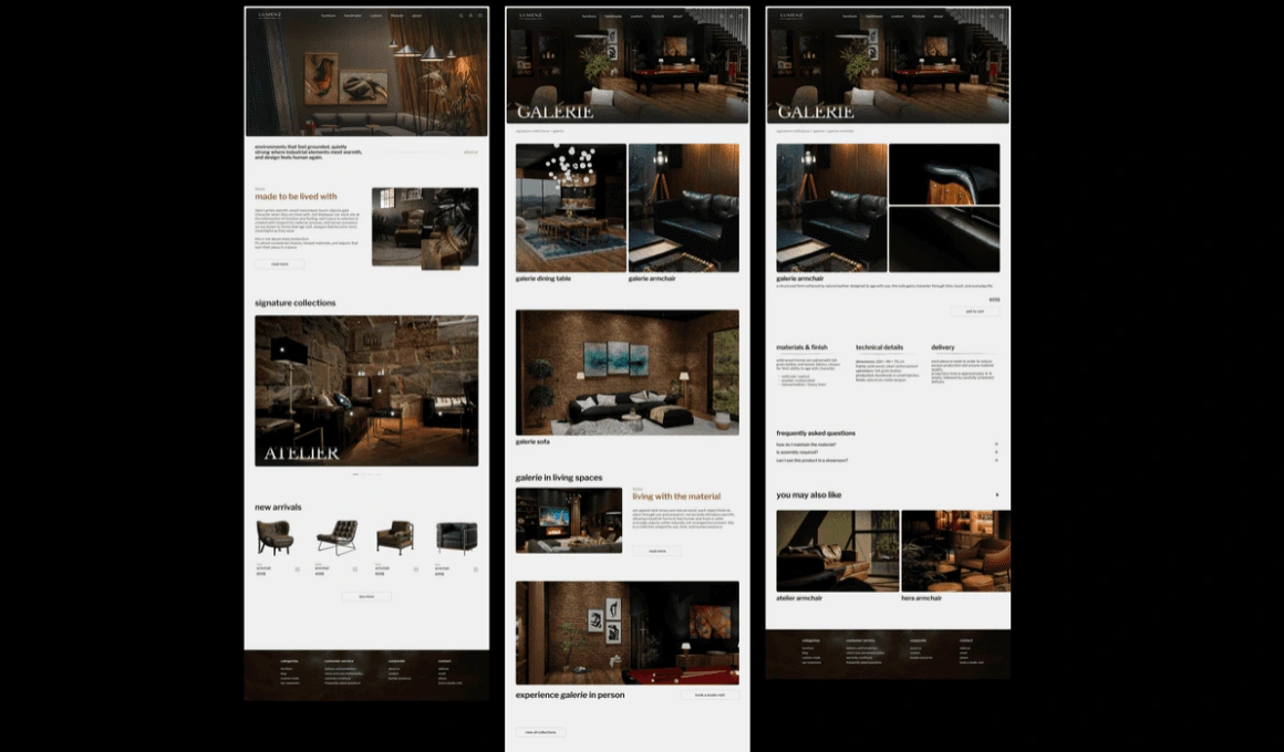
the final concept balances brand storytelling with e-commerce usability. rather than treating branding and conversion as separate layers, the experience uses context and visual hierarchy to support product consideration while maintaining a clear shopping flow.
Like this project
Posted Oct 8, 2026
Designed an e-commerce website concept for a furniture brand that balances brand storytelling and context with clear shopping flow and product discovery.
Likes
0
Views
1