Conversion-Focused Landing Page Design for Freedom Freelancing
Mateja Mitrovic
Verified
Freedom Freelancing - VSL Landing Page
Stefan runs a coaching program helping tech professionals escape the 9 to 5 and build a freelance career with the skills they already have. He needed a landing page that could do one thing really well: turn visitors into booked calls.
The brief was specific. Sales-first, testimonial-heavy, but it also had to feel premium. His audience is technical, they have high standards, and they can smell a generic template from a mile away. So we had to build something that converts without looking like it's trying too hard to convert.
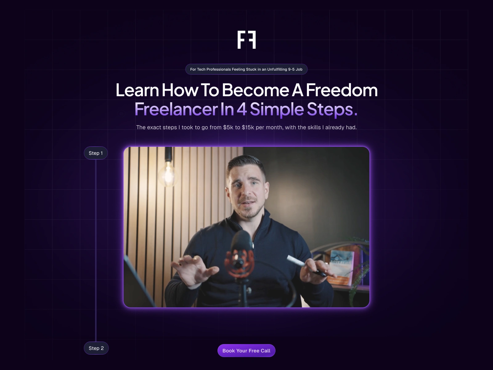
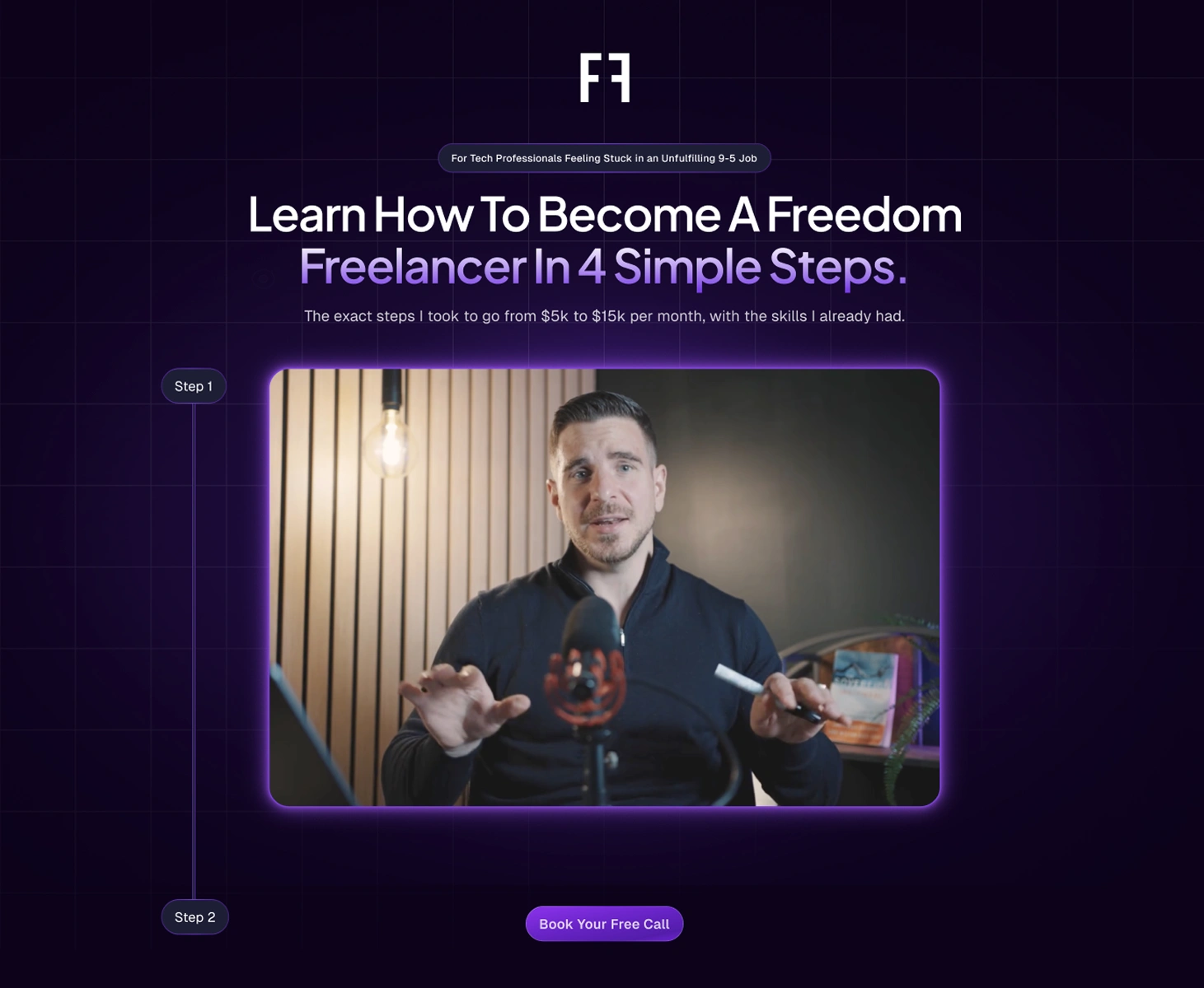
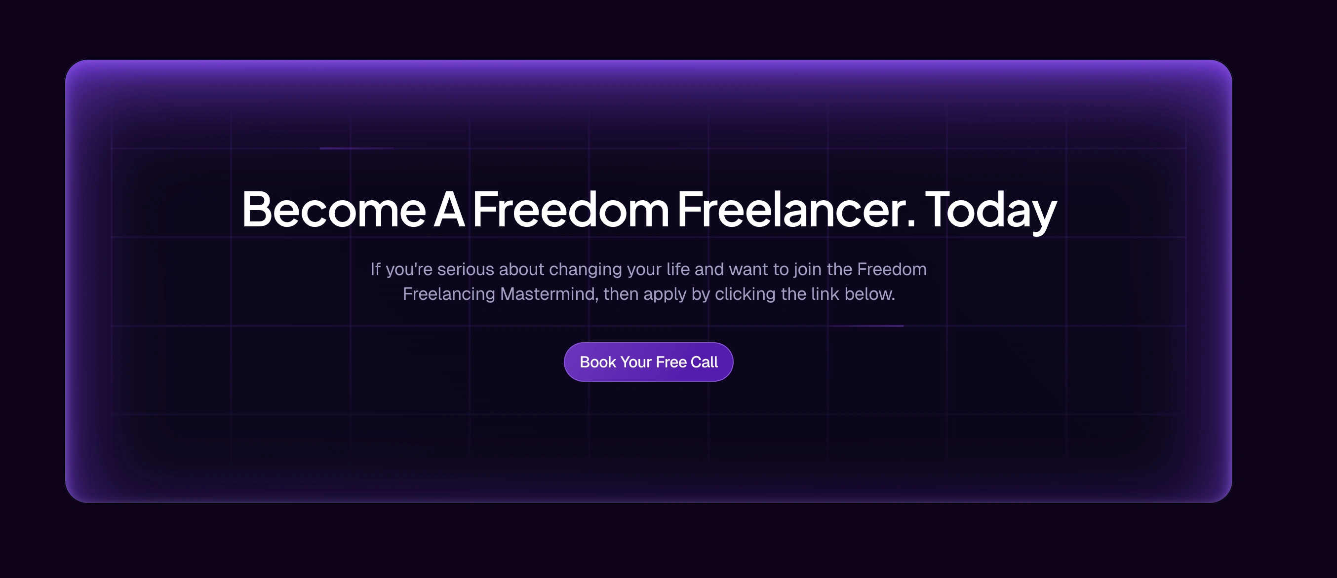
The Hero
The first thing you see sets the tone for everything. We went with a deep navy background with a subtle grid overlay because it immediately speaks the visual language of SaaS and developer tools. It feels familiar to a tech audience without being a cliche.
The headline leads with the transformation, the VSL sits front and center with a glowing purple frame, and the "Step 1 / Step 2" markers on the side do something subtle but effective: they tease that there's a system, which makes people want to keep scrolling to find out what comes next.
Social Proof Strip
Right after the hero, we hit them with numbers. 100+ freelancers helped, 2.6x average salary increase, over 2 million euros in income generated. Short, specific, impossible to ignore.
We paired that with a featured testimonial from a real client. No vague quotes, no stock photos. Real name, real face, real result. That combination of data and personal story is what builds the kind of trust that actually moves people.

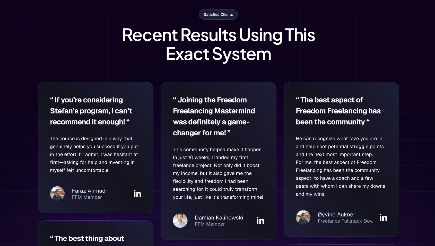
Testimonials
This section does the heavy lifting. We gave every testimonial its own card with the person's name, role, and a LinkedIn link. That last part matters more than people think. Anyone can write a fake quote, but a LinkedIn link says "go check for yourself." It removes doubt.
The quotes themselves lead with the most compelling line in big text, so even a skim reader gets the point. The layout is intentional: three columns, enough density to feel like there's real momentum behind this program, but with enough breathing room that it doesn't feel overwhelming.
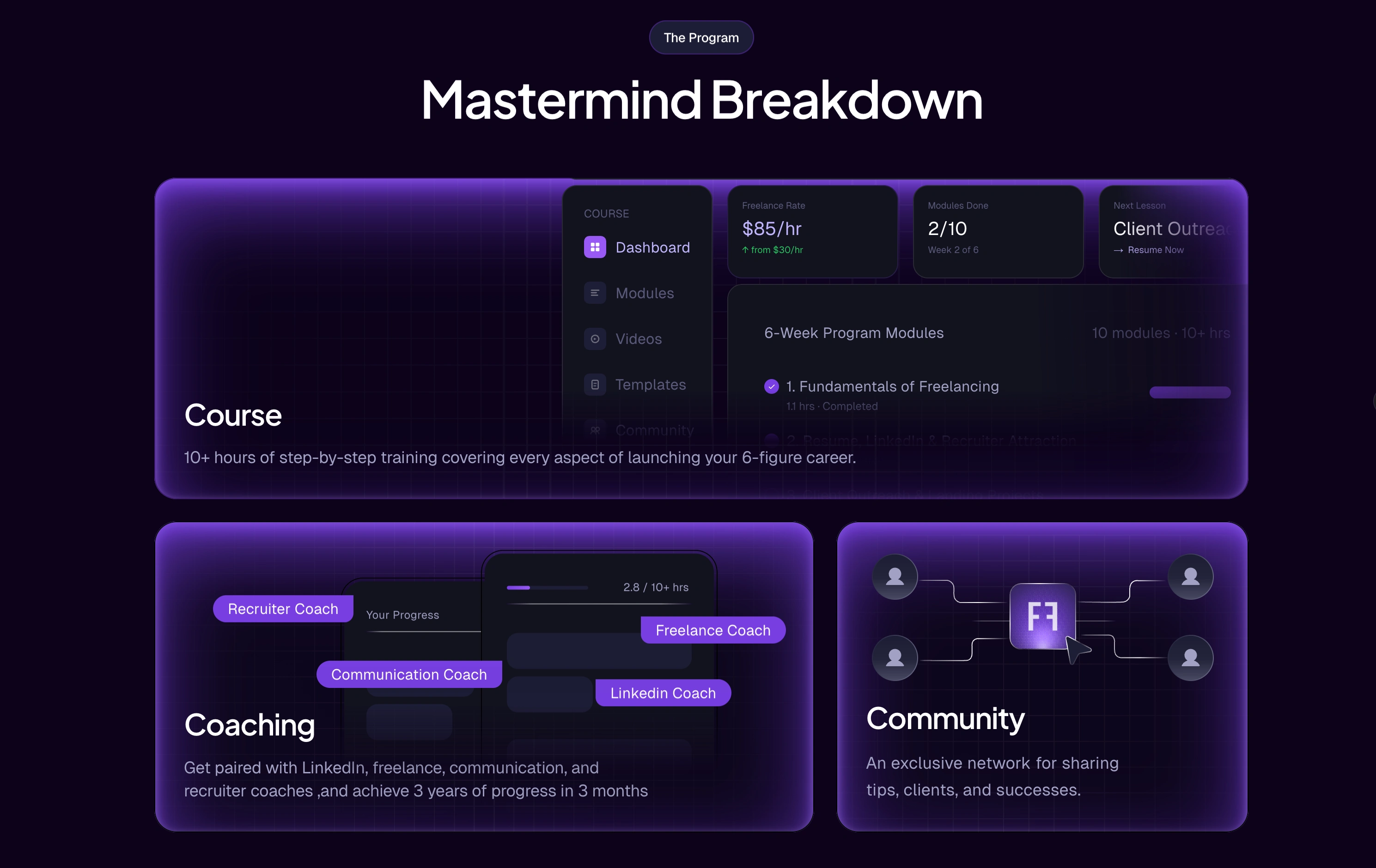
The Program Breakdown
This is where we made the product feel real. Instead of just listing features, we designed this section to look like a SaaS dashboard, because that's the aesthetic this audience trusts. You can see the course interface, the module structure, the coaching roles. It communicates "this is built" without having to say it out loud.
Course, coaching, and community each get their own visual treatment. It makes the scope of the program clear at a glance, which is exactly what you need when you're asking someone to book a call and potentially invest in something.
The CTA
The final section keeps it simple. One action, one message. We put it inside a glowing bordered card that feels like a natural endpoint to the page, not a last-ditch sales push. The copy is direct without being pushy, and the button has been consistent throughout the entire page so by the time they reach this point, clicking it feels like the obvious next step.
The whole page was designed with one goal: make it easy for the right person to say yes. Every section earns a little more trust, answers a few more objections, and moves them closer to that call. That's what good conversion design actually looks like.
Like this project
Posted Mar 22, 2026
Designed a high-converting landing page for Freedom Freelancing's coaching program
Likes
0
Views
7