Rooted in Tradition, Re-imagined for Tomorrow: A Rebrand
Cody Carter
Rooted in Tradition, Re-imagined for Tomorrow: A New Look for Healing Elements Ayurveda
Overview
Healing Elements Ayurveda (HEA) is a highly specialized Ayurvedic practice dedicated to integrating ancient wisdom with modern wellness. While the practice itself stood out for its deep expertise and personalized approach, its previous branding lacked the visual cohesion and refined identity needed to communicate that distinction effectively. The rebrand was driven by a need to elevate HEA’s presenceand ensure that its visual identity matched the authenticity, credibility, and transformative power of its services.
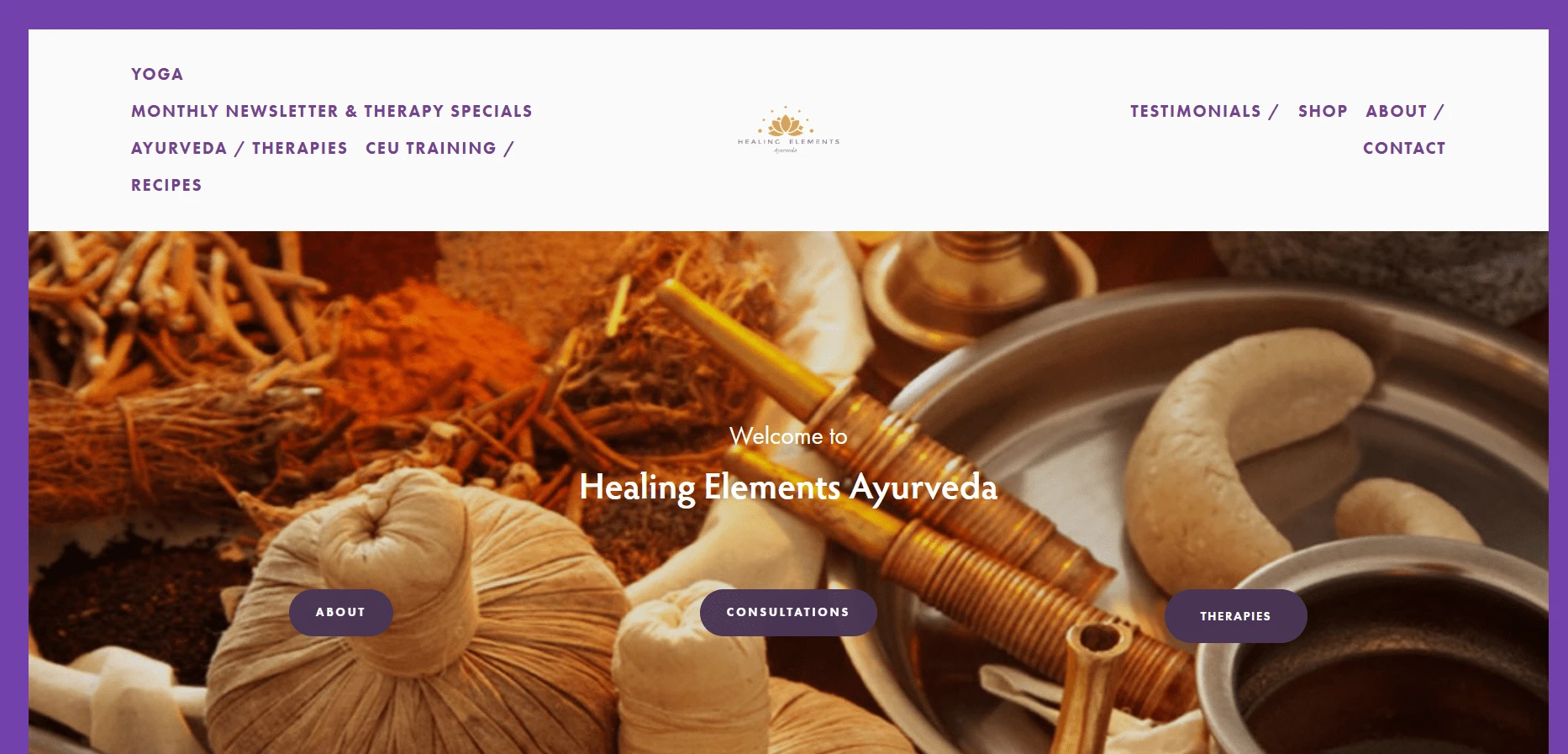
Here is the current website for Healing Elements Ayurveda. As you can see, the style is very "expected".
With a rare NAMA-certified doctor leading the practice, HEA required a brand identity that reinforced its authority in the field while remaining warm, approachable, and aligned with holistic healing principles. The challenge was to craft a branding system that not only resonated with existing clients but also attracted new audiences seeking a modern yet deeply rooted Ayurvedic experience.
Approach
The goal for the HEA rebrand was to create a cohesive and modern identity that reflects the practice’s deep Ayurvedic roots while maintaining accessibility for a contemporary audience. The project included the development of a new style guide, a completely redesigned logo, and an enhanced visual identity system. But before that, it was necessary to establish the "who" and "why" of the business to fully grasp how this rebrand should look.
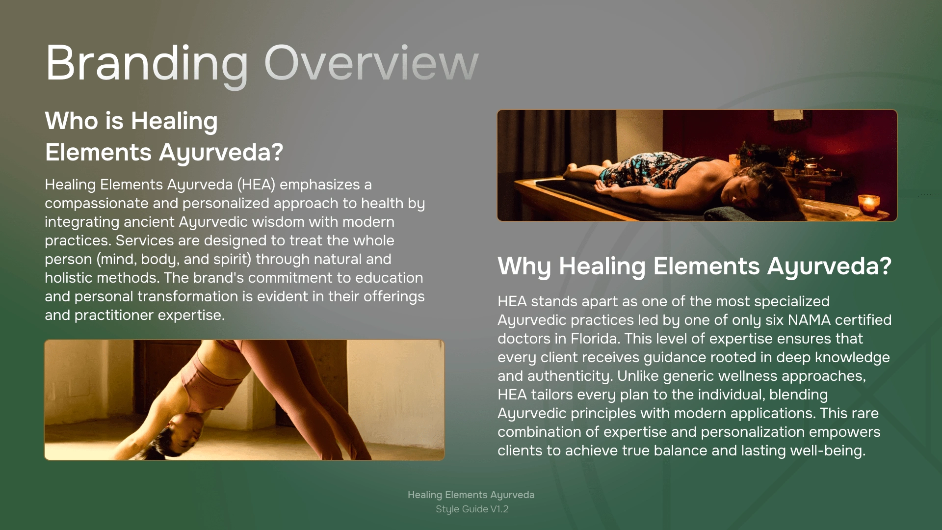
A slide from the style guide covering an overview of the business.
Brand Identity & Logo Concept
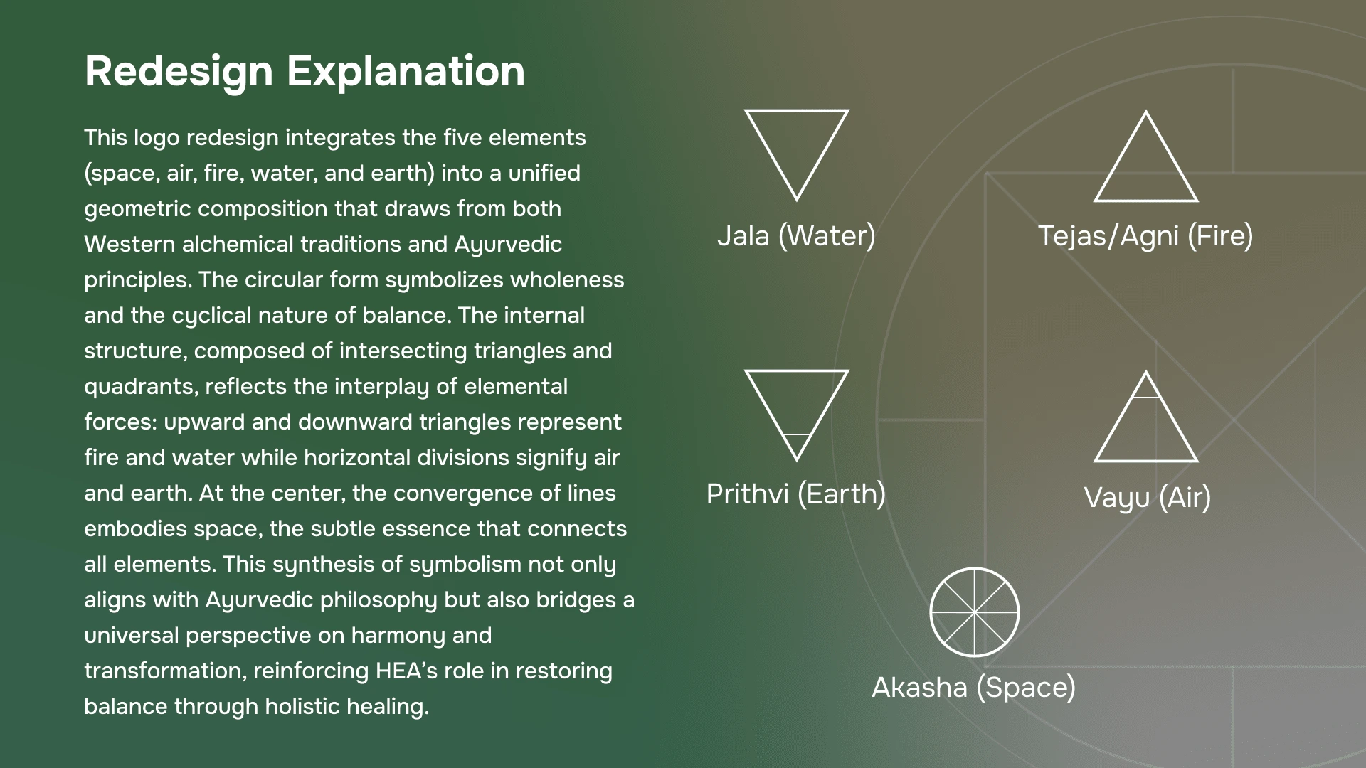
Here are the individual pieces that make up the entirely new logo.
The logo redesign was centered on integrating the five Ayurvedic elements (space, air, fire, water, and earth )into a unified geometric composition. The final logo embodies these elements through intersecting triangles and circular forms, symbolizing balance, transformation, and wholeness. This design approach aligns with HEA’s mission of restoring harmony through holistic healing.
A little hype...
Style Guide & Design System
A style guide was developed to align not only the client's expectations but also future creative endeavors. The style guide ensures consistency across all branding materials and digital platforms moving forward. Key elements include:
Color Palette: A carefully curated mix of earthy greens, warm ochre, and soft neutrals, evoking stability, nourishment, and clarity. These colors enhance the brand’s natural and organic feel while maintaining a refined modern touch.
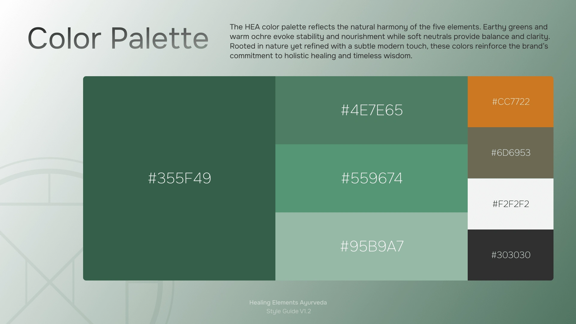
A little green here, a dash of muted colors there. Oh, and a little ochre to bring some spice.
Typography: The combination of Onest (primary font) and DM Sans (secondary font) ensures a clean, inviting, and professional appearance. Onest reflects calmness and simplicity, while DM Sans enhances readability and approachability.
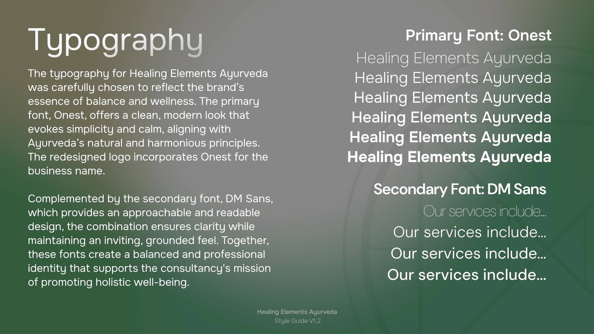
Primary typography: Onest ; Secondary Font: DM Sans - *chef's kiss*
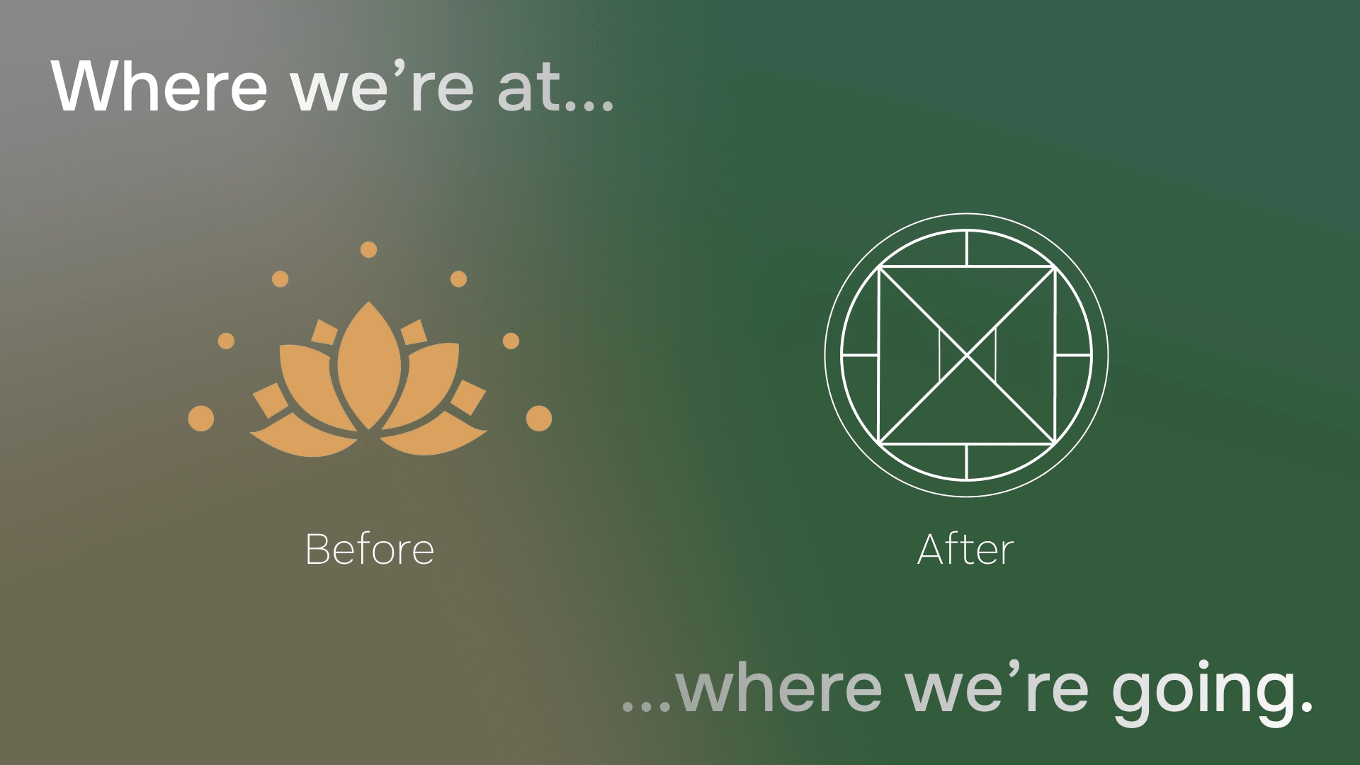
Logo Design: The logo is a modern yet timeless representation of Ayurvedic wisdom, blending Western influences with traditional Ayurvedic symbolism. The central convergence of lines represents Akasha (space), the element that connects all others. The client wanted to bring an extra bit of energy to this design and requested a golden (or in this case, ochre) outer ring that brings it all together. I think this request really brought it all together.
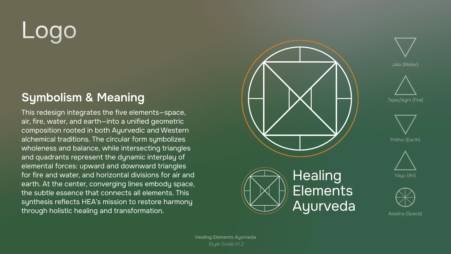
There is some meaning to all this!
(I was nervous to turn this concept in to the client, but to my surprise, this was exactly what their team was looking for. Gotta love when experimenting works out!)
Website Redesign Guidance: The updated digital presence focuses on clarity, warmth, and accessibility. The layout, typography, and organic color palette work together to create a calming and intuitive user experience. This is still a work in progress, but with the style guide and a clear visual direction, the rest of the build out should be very easy and appealing to all users.
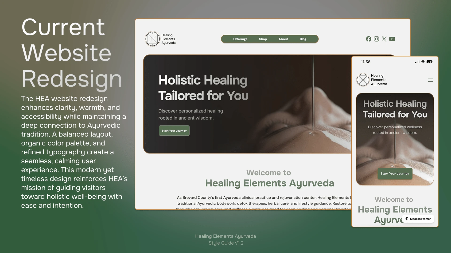
WIP: To be released soon...
Result
The rebrand successfully differentiates HEA from generic wellness brands by emphasizing expertise, personalization, and authenticity. With a NAMA-certified doctor leading the practice, the visual identity now effectively communicates HEA’s unique credibility and depth of knowledge while bringing a professional feel visually.
This rebranding effort ensures that Healing Elements Ayurveda presents a polished, professional, and cohesive brand experience across all touchpoints, from digital platforms to print materials.
I hope this design brings you joy as well!
Like this project
Posted Mar 25, 2025
Redesigned HEA’s brand with a new logo, style guide, and website vision, aligning its identity with Ayurvedic wisdom, expertise, and modern accessibility.
Likes
1
Views
9
Clients
Healing Elements Ayurveda