Loyal Fitness Studio Branding
Tiago Machado
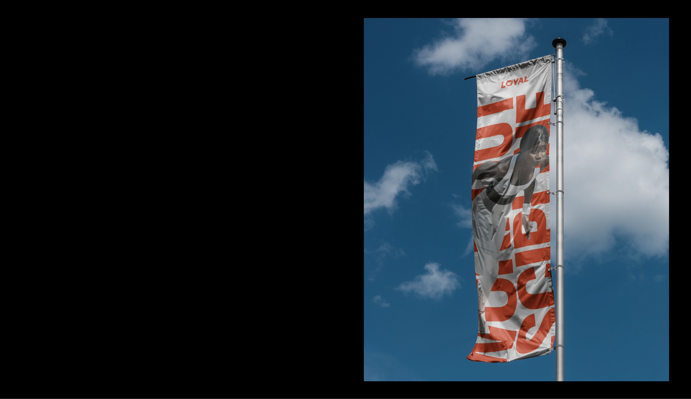
Brand Identity Project
Loyal Fitness Studio is a new studio that aims to help everyone become their better version.
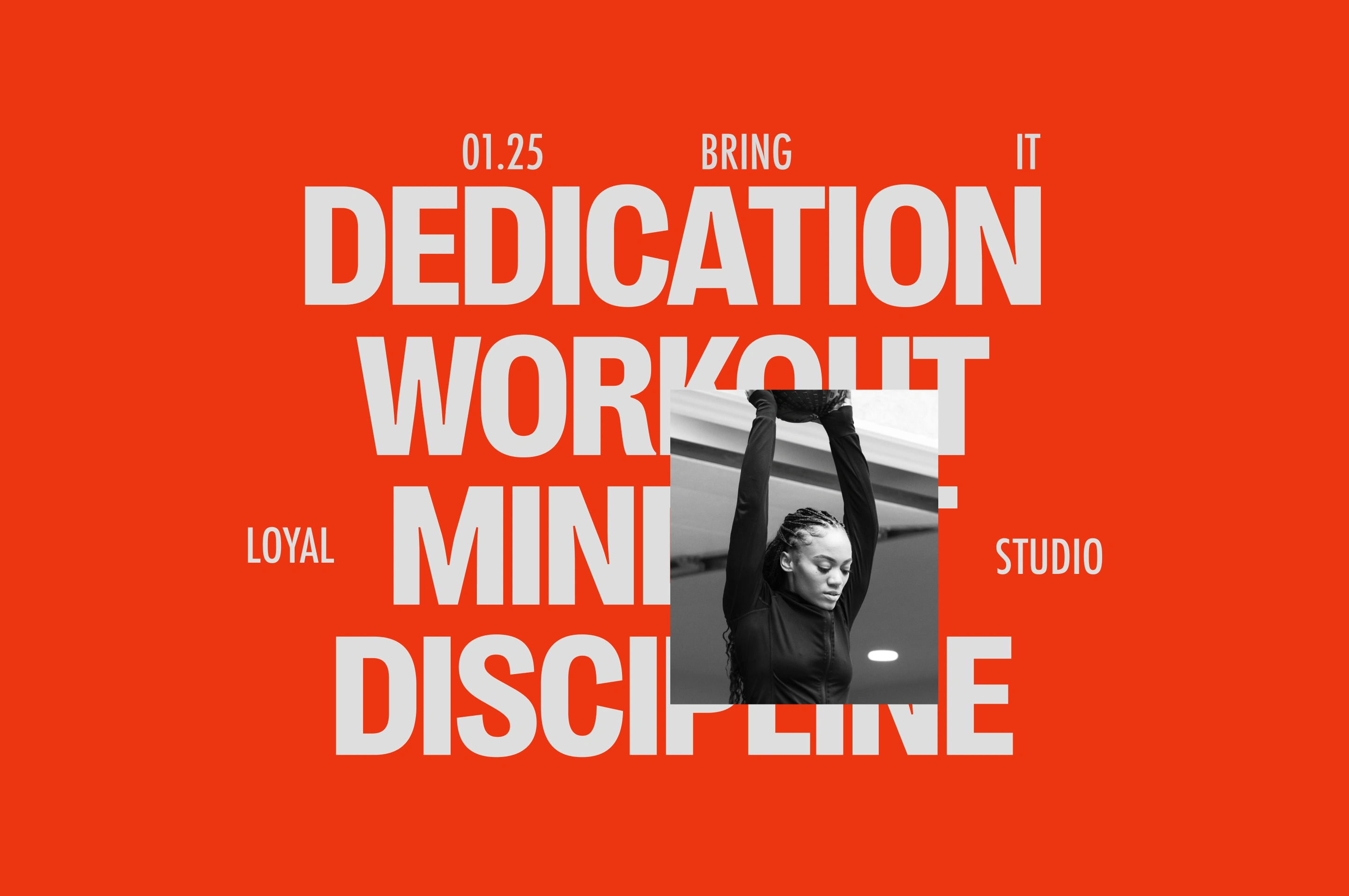
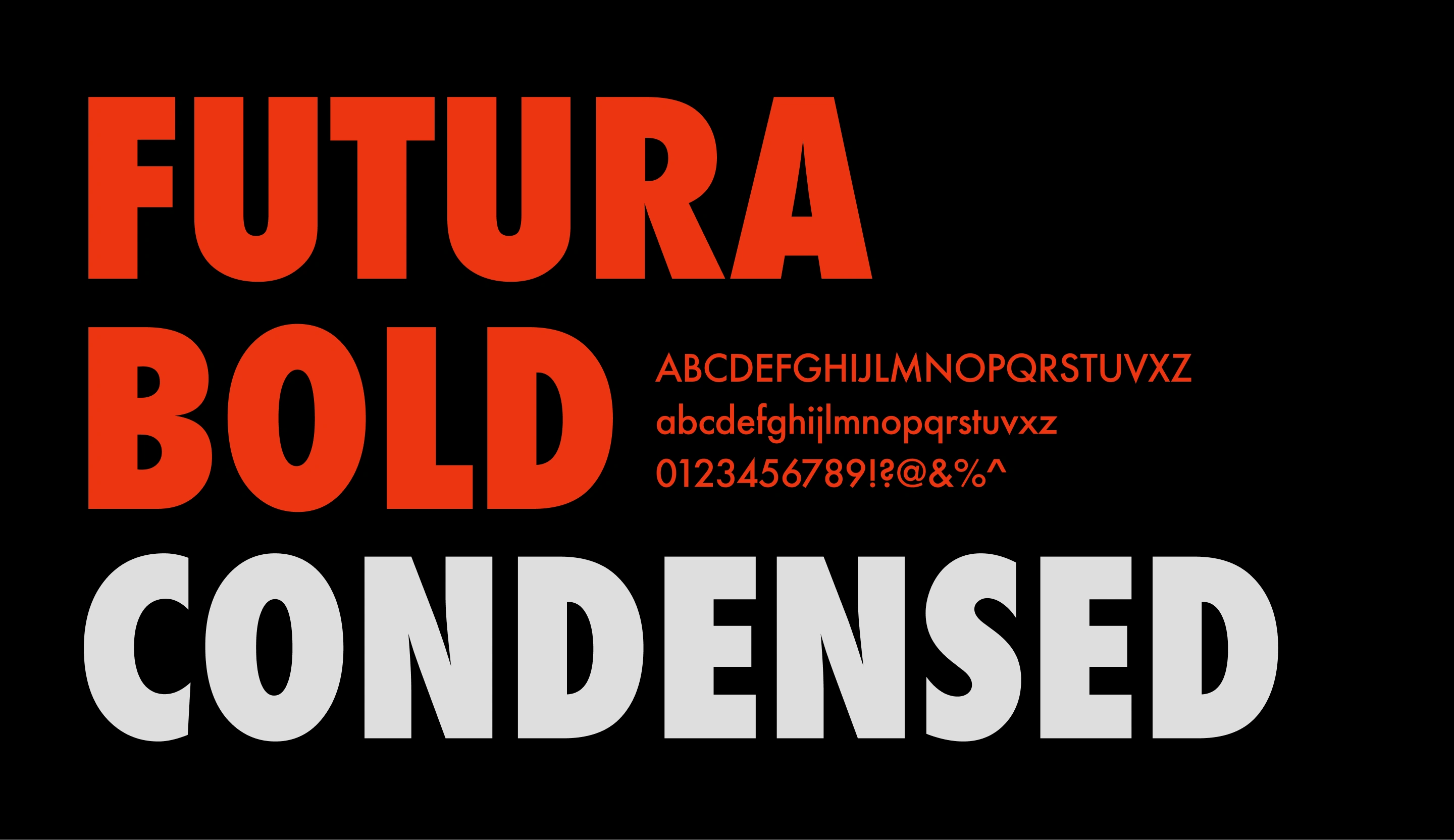
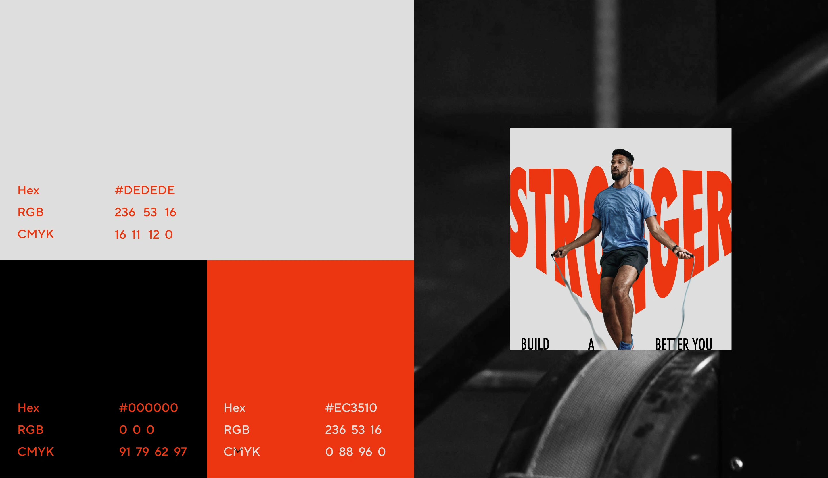
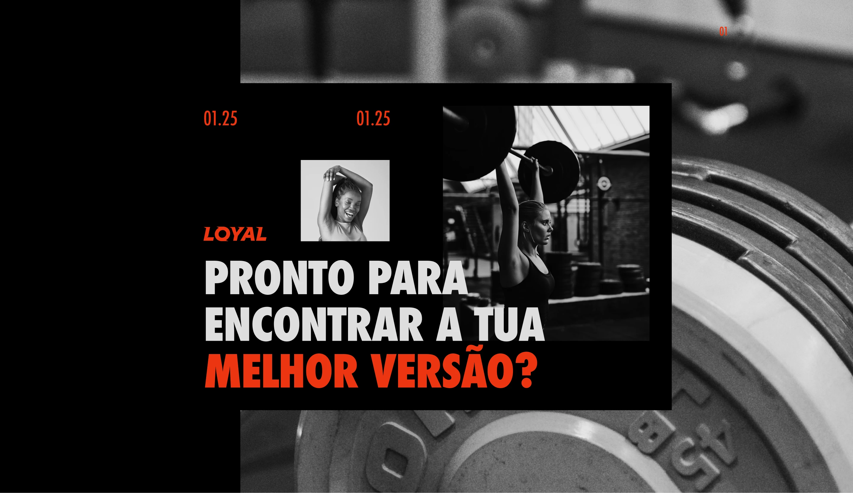
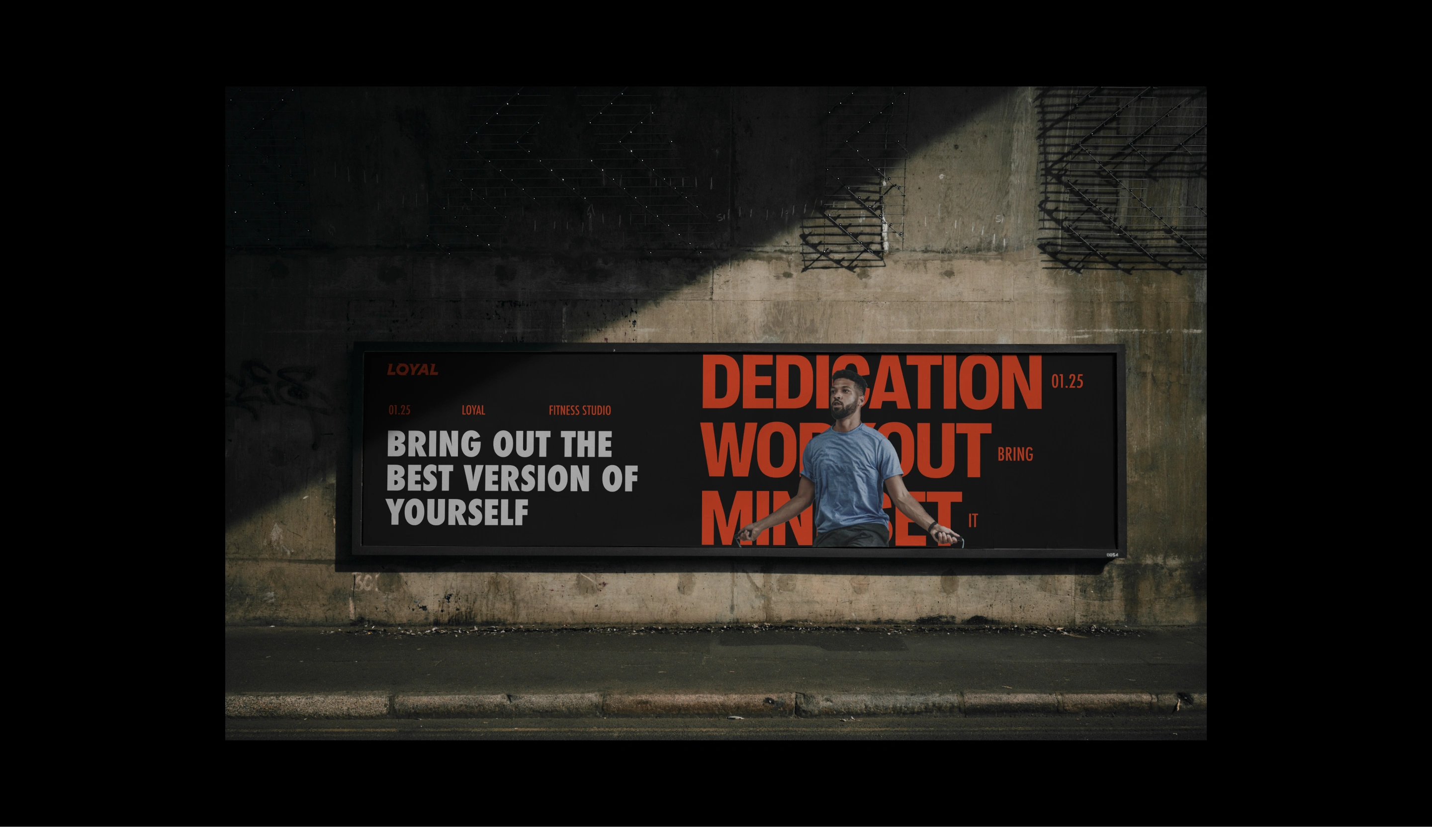
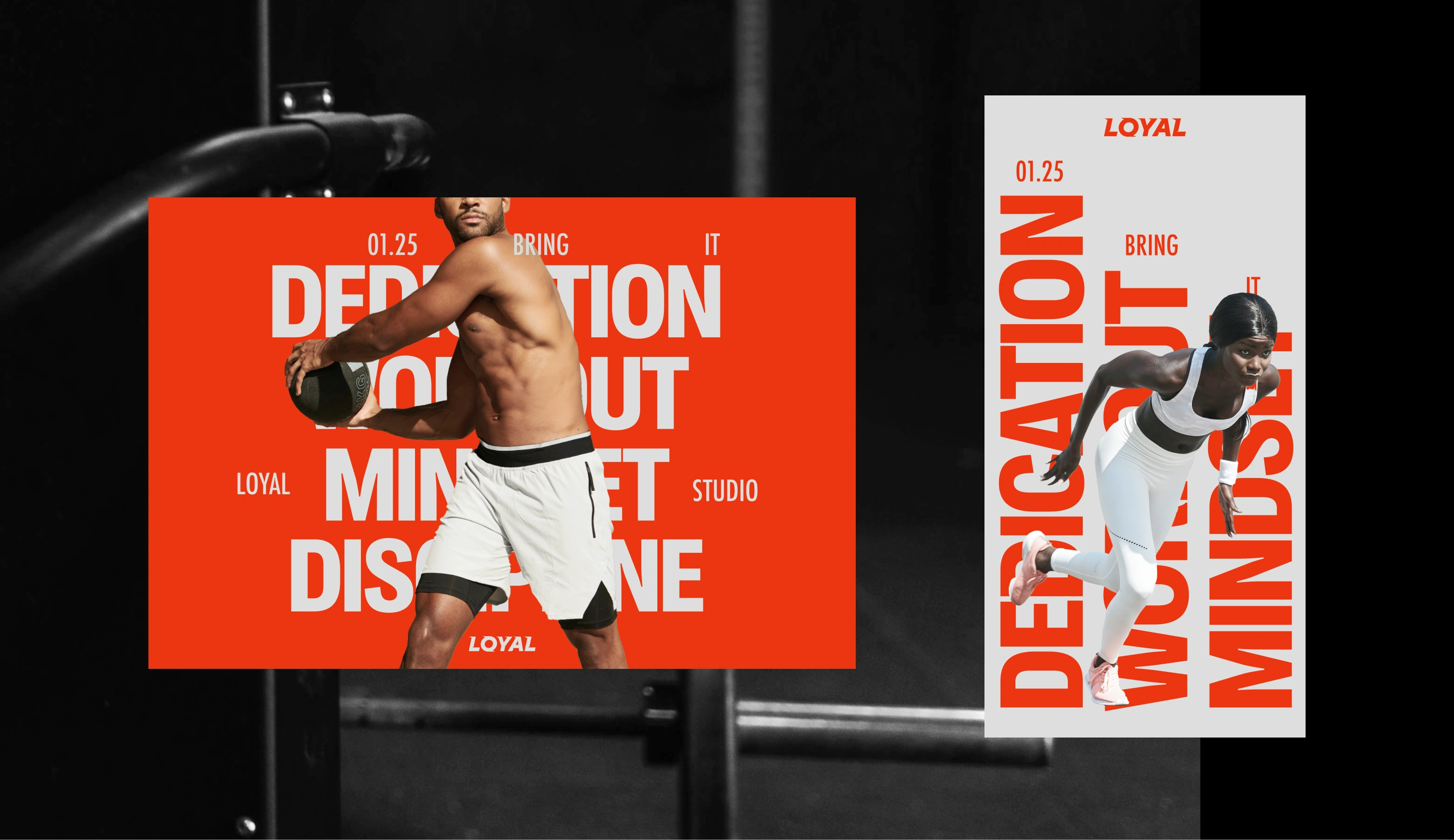
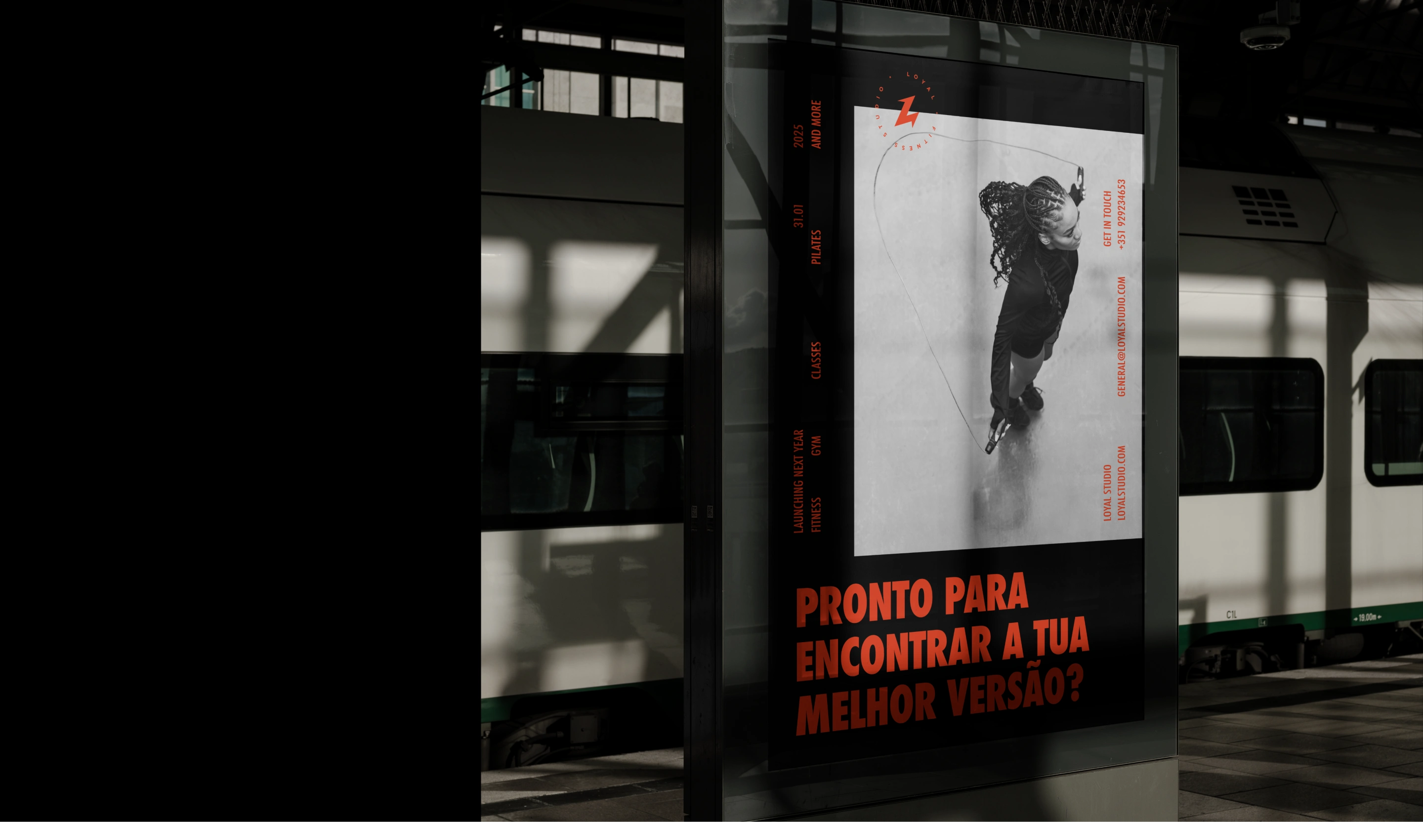
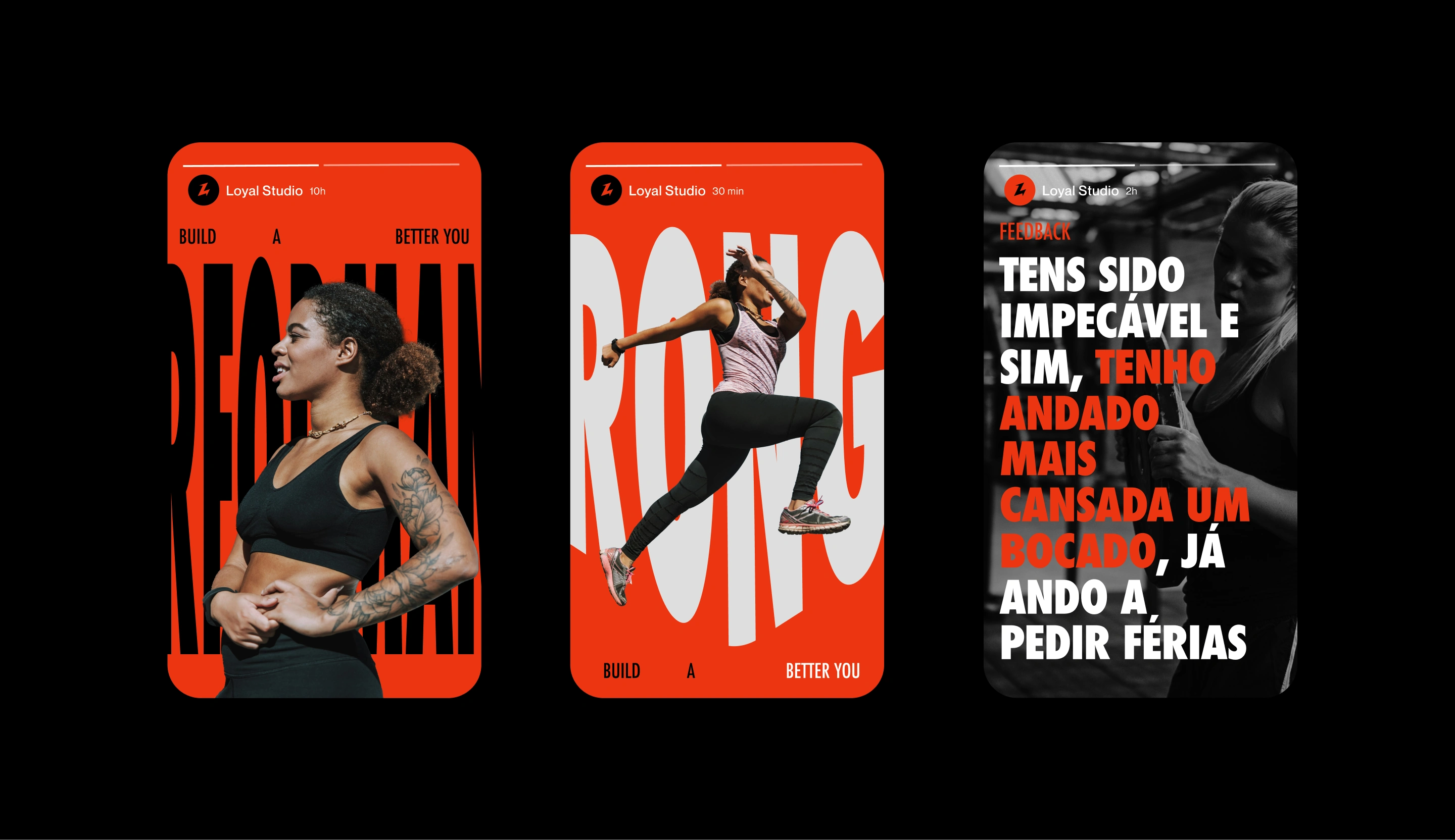
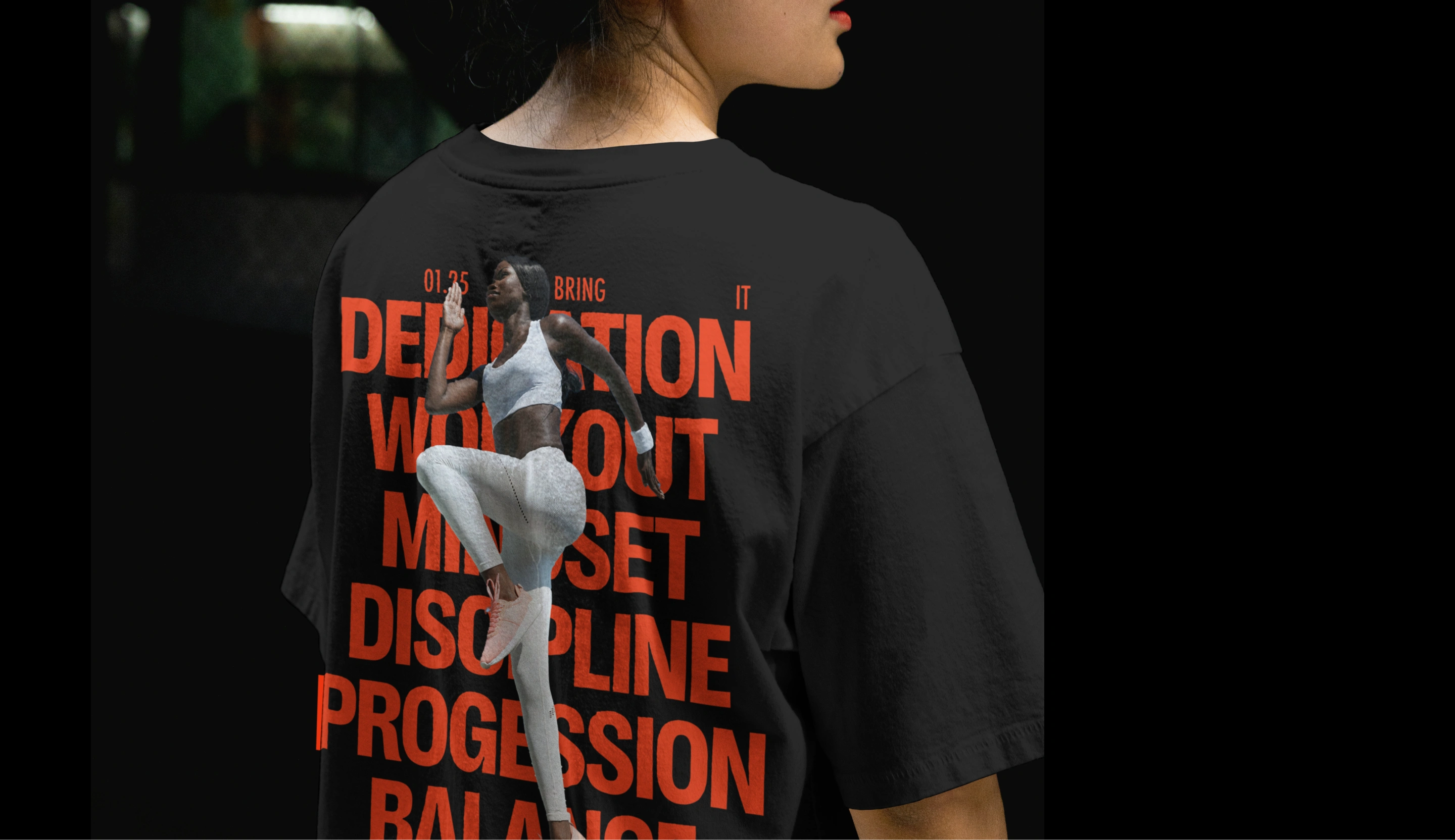
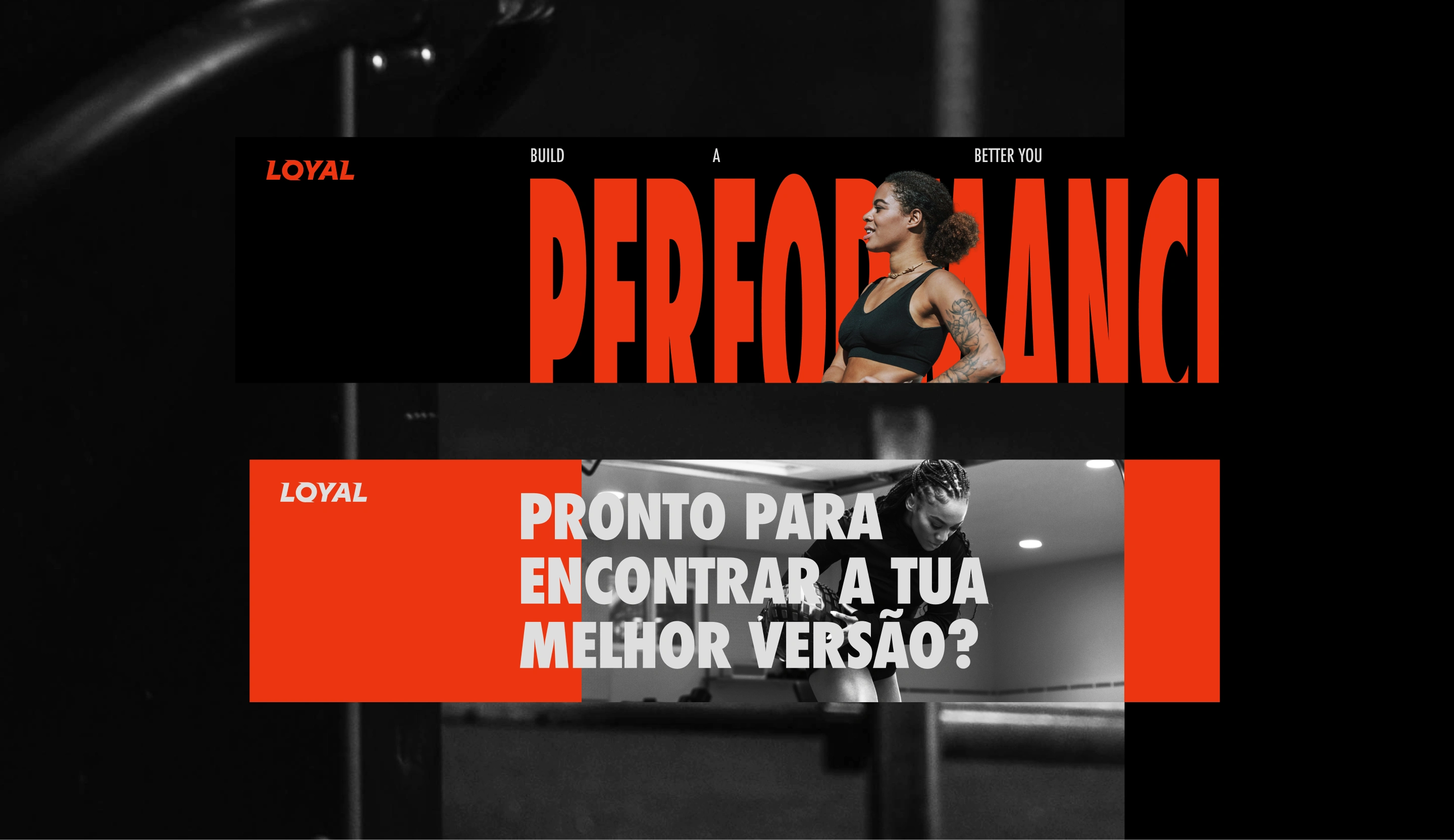
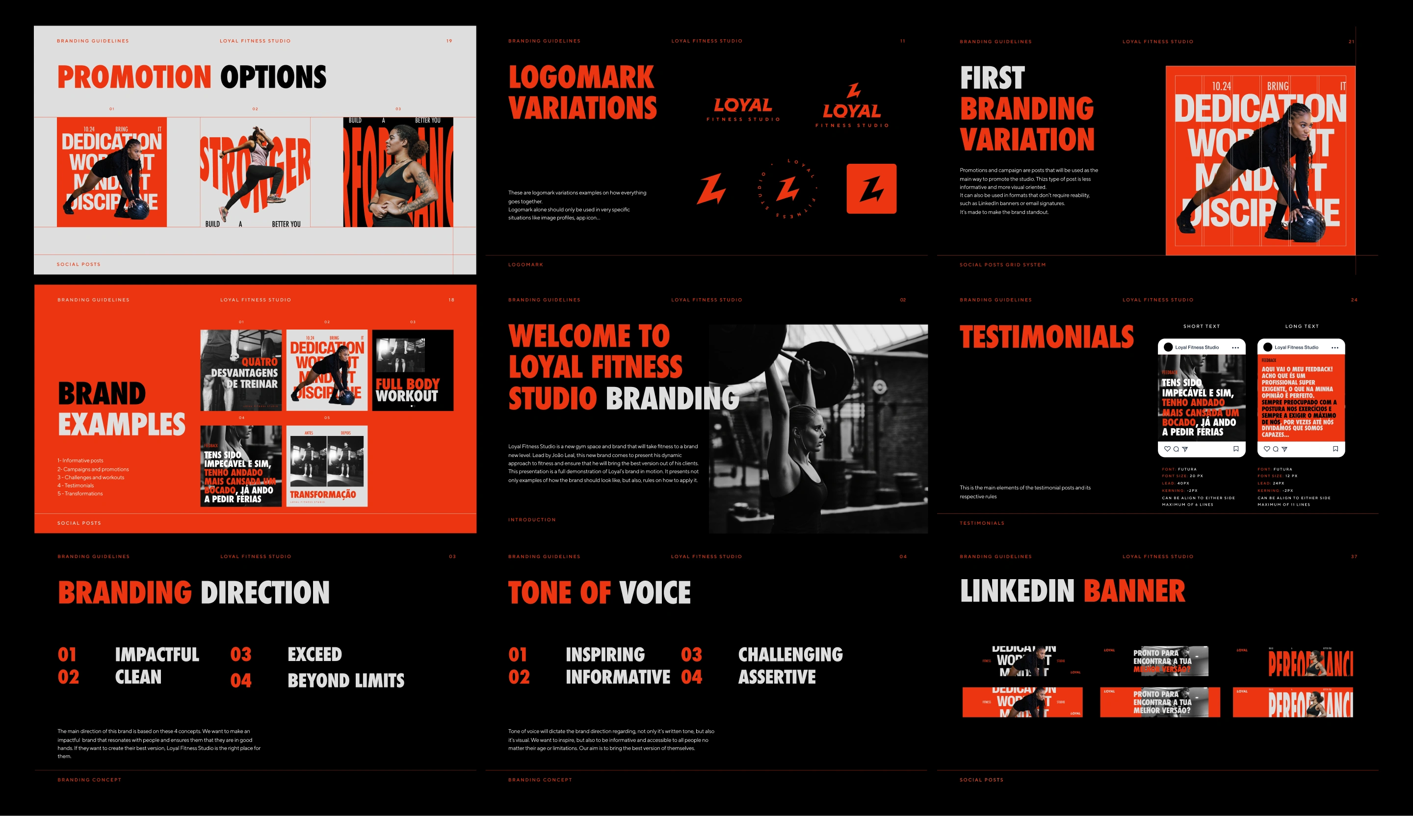
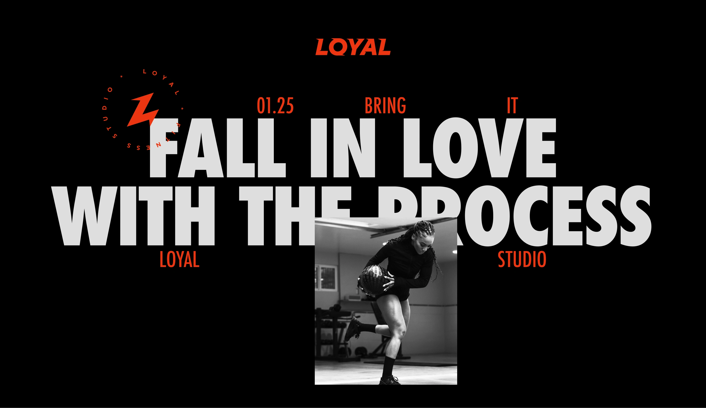
The branding aims to create a strong visual identity that reflects the studio’s professionalism and mission. It is designed primarily for web use, with flexible messaging to suit various contexts. We considered previous work, the brand’s communication goals, and the most effective ways to convey them. The visual system is built on balancing impactful visuals with clear information, ensuring both elements work together seamlessly.
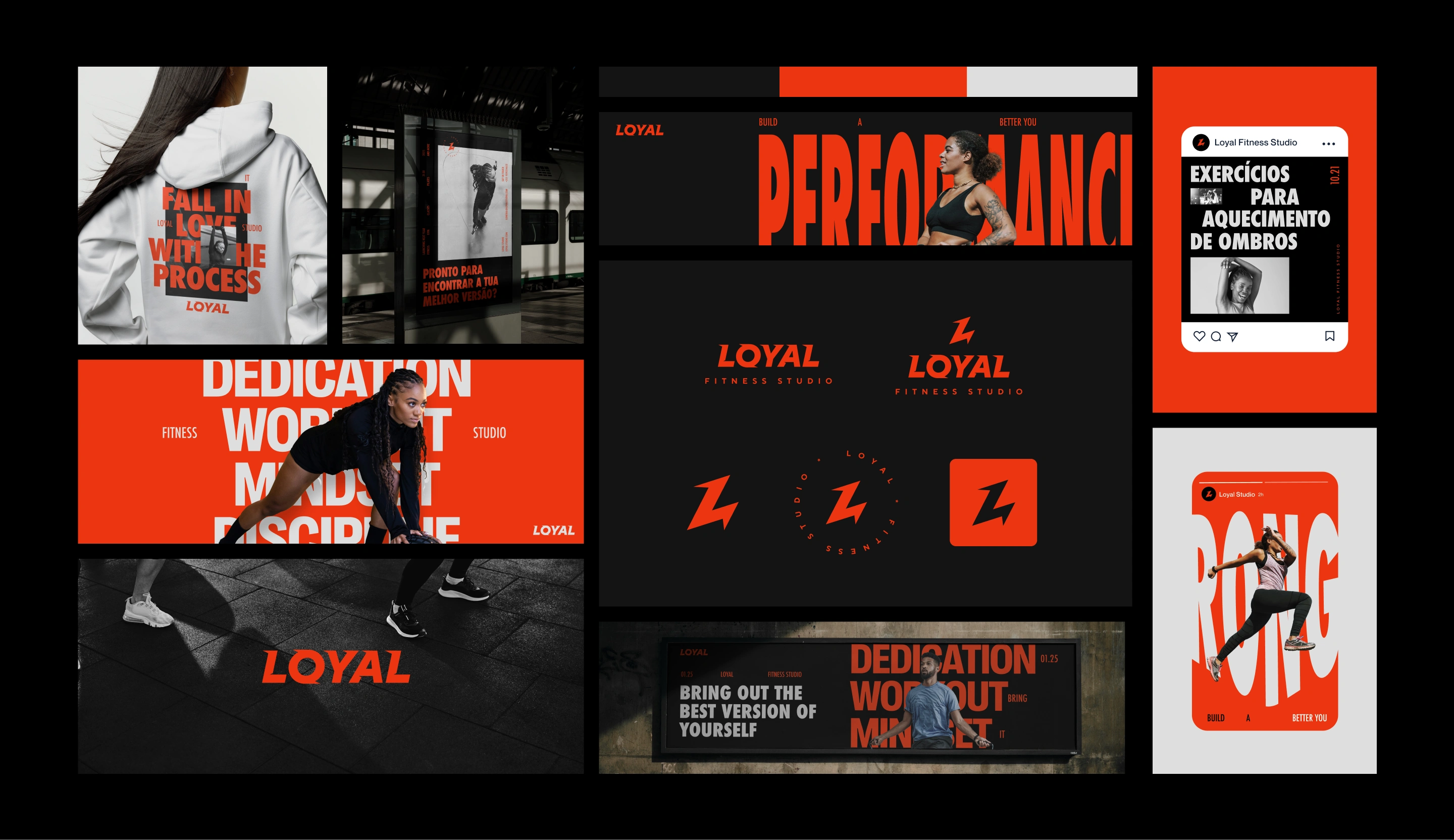
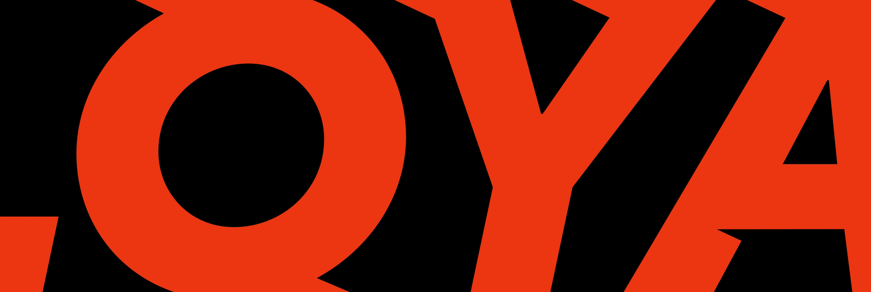
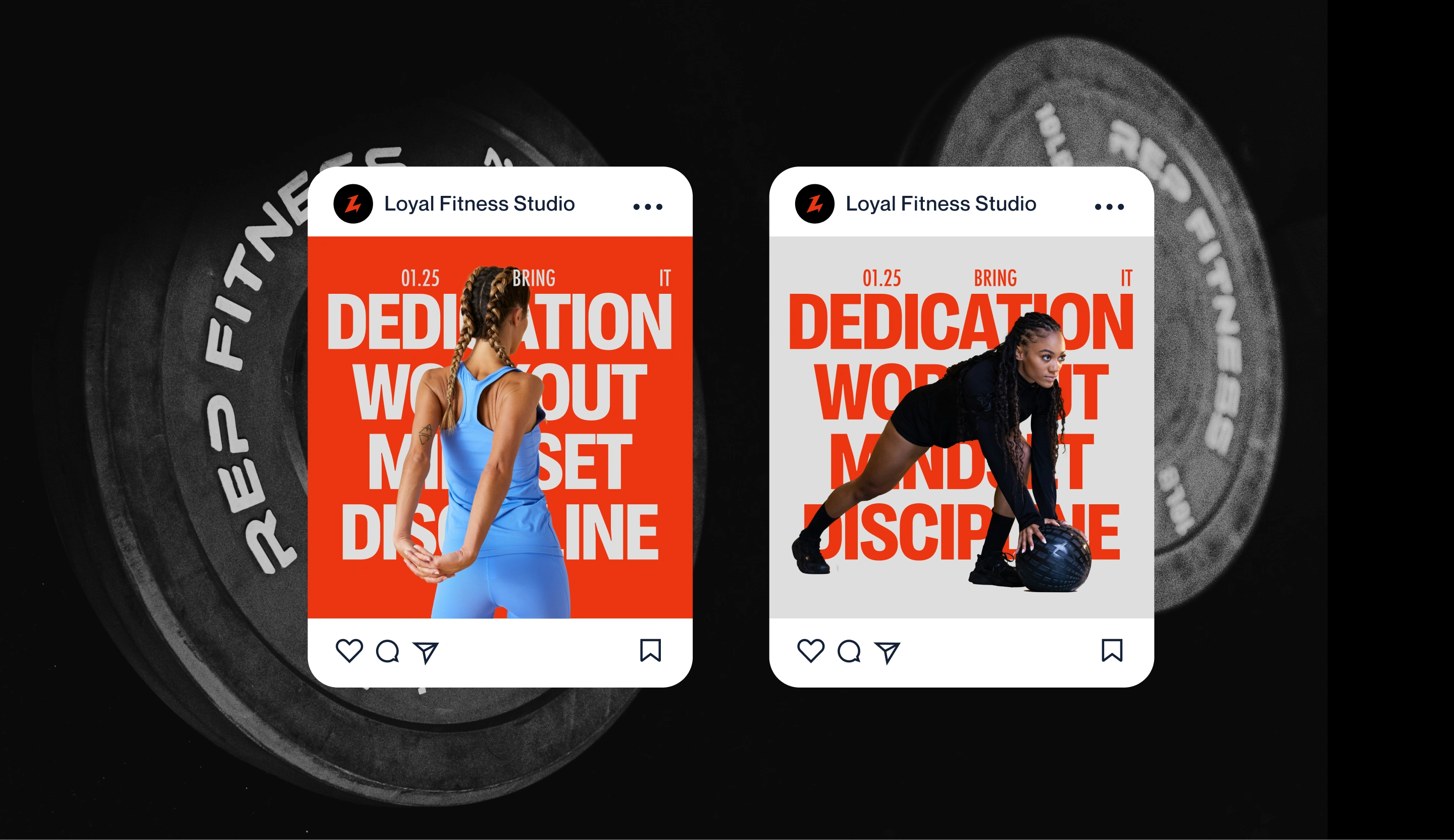
The logomark is the primary representation of Loyal’s Fitness Studio. It incorporates three elements: the letter L, a lightning bolt symbolizing energy, and an upward arrow indicating progression and evolution.
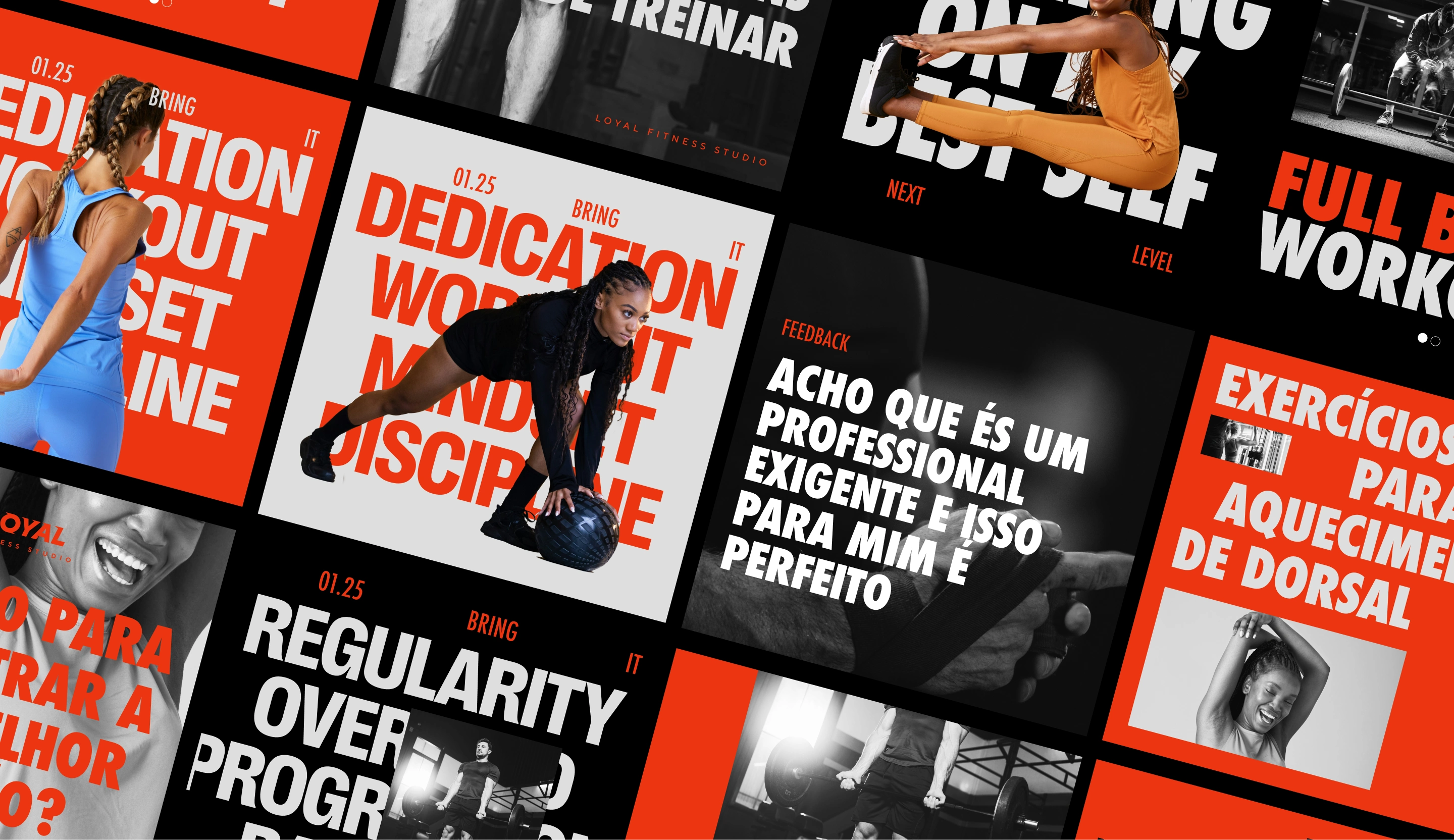
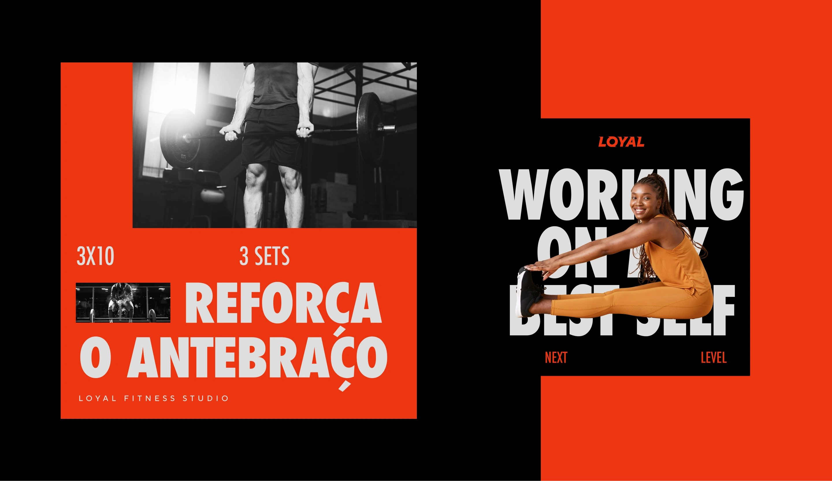
In terms of application, the brand communicates in 5 forms:
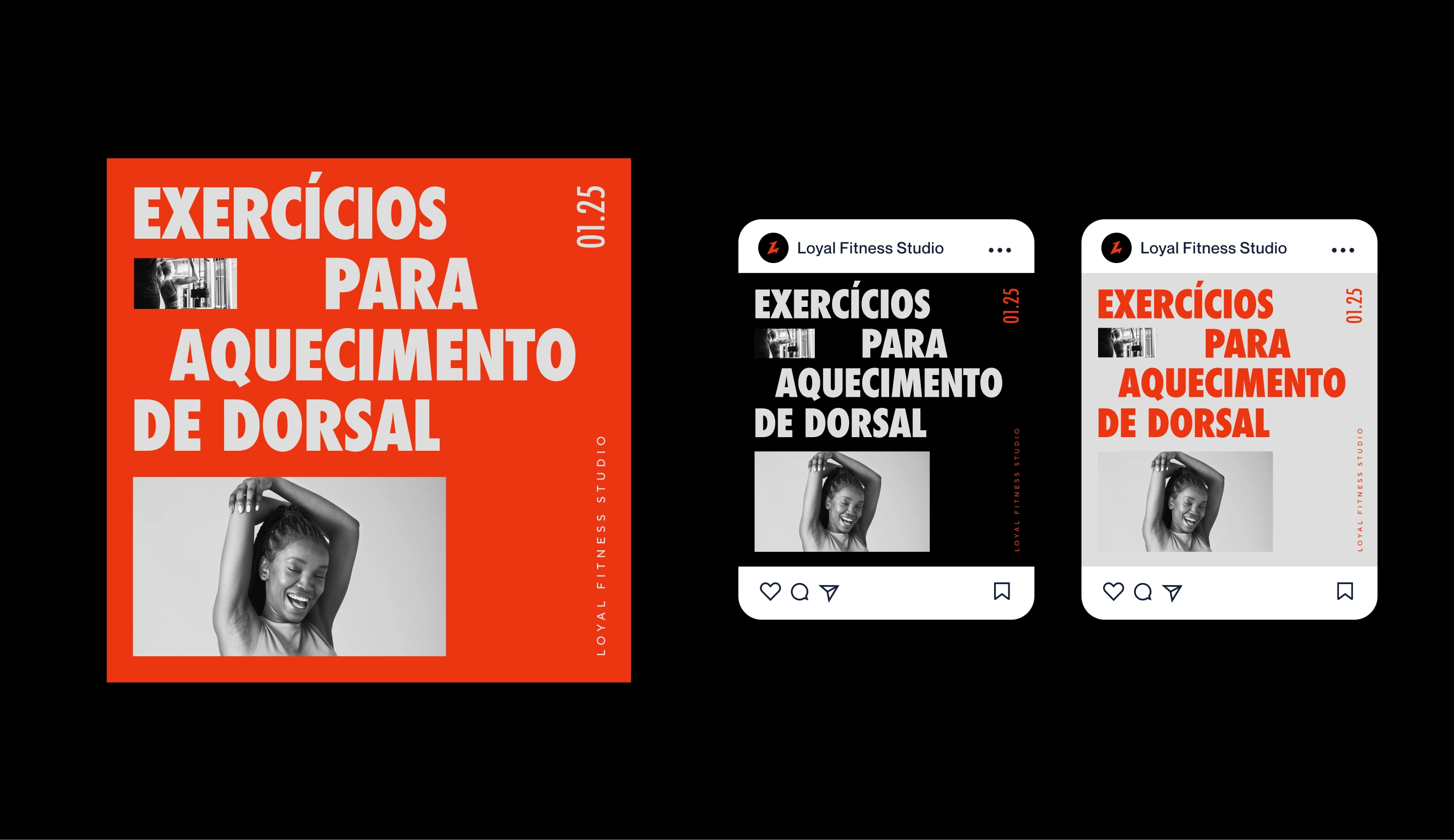
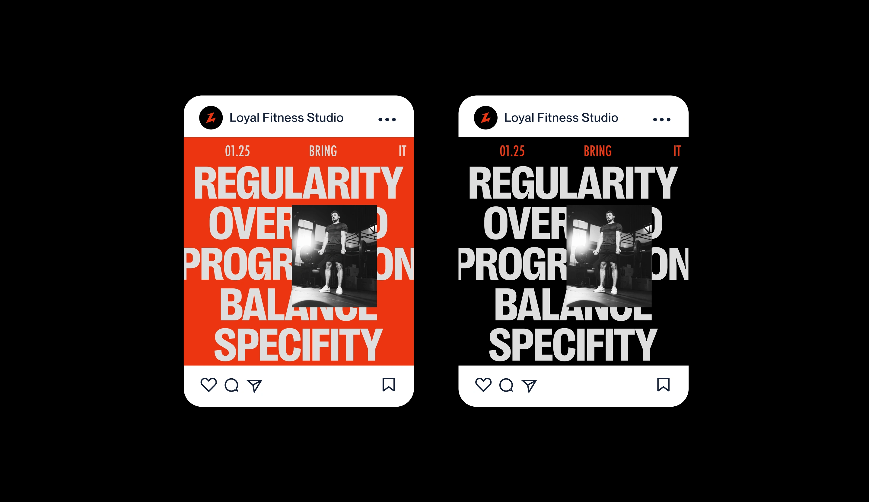
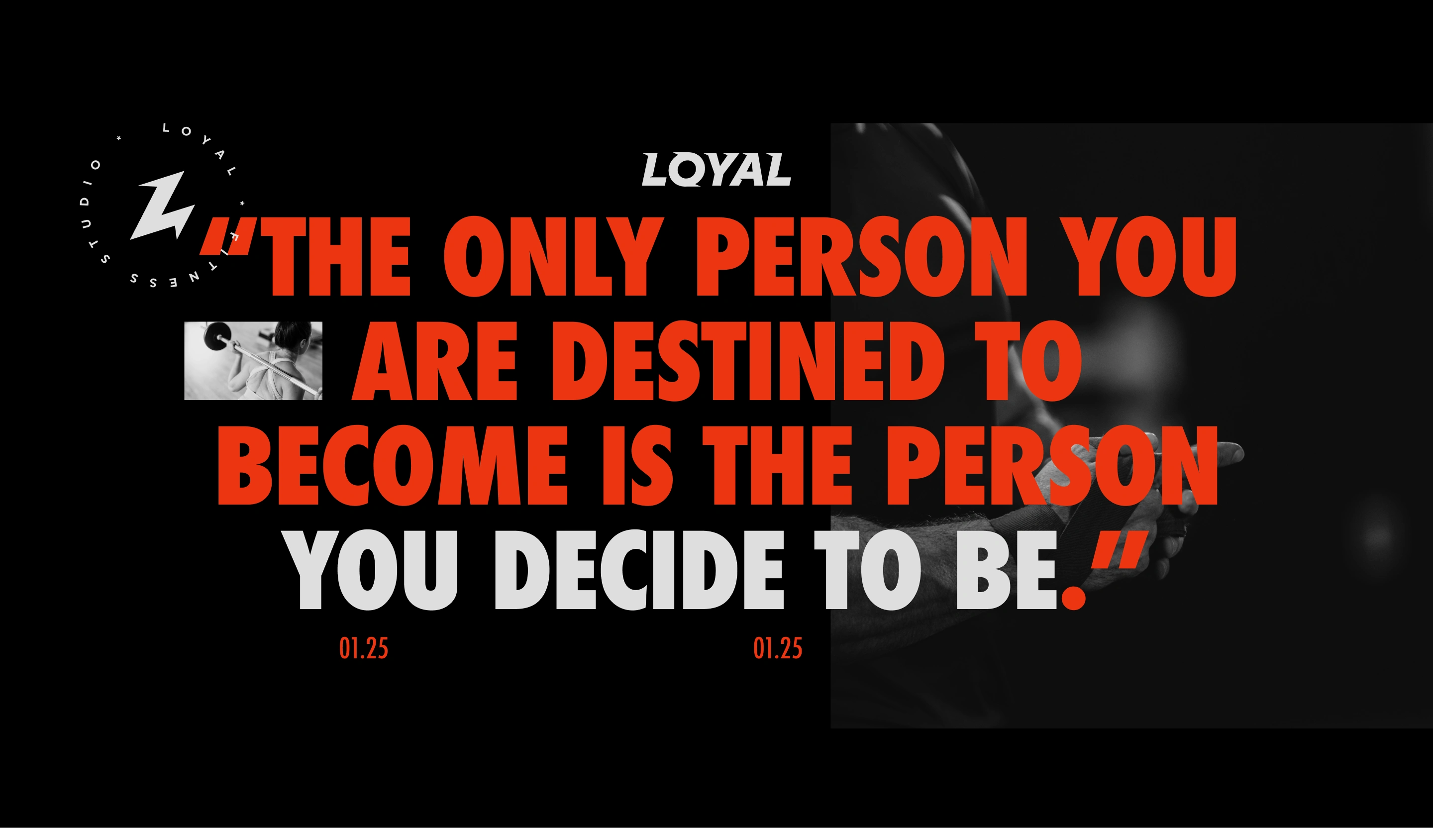
1- Informative posts
2- Campaigns and promotions
3- Challenges and workouts
4- Testimonials
5- Transformations
A grid system was developed to ensure consistent application across all channels and post formats. Combined with flexible typography and color options, this approach makes the brand versatile and adaptable.

Like this project
Posted Jan 27, 2025
Brand identity project for a personal fitness studio.
Likes
1
Views
30
Timeline
Jun 13, 2024 - Jul 15, 2024