Caffè Porto — Brand Identity & Packaging

Anastasia Kornilova


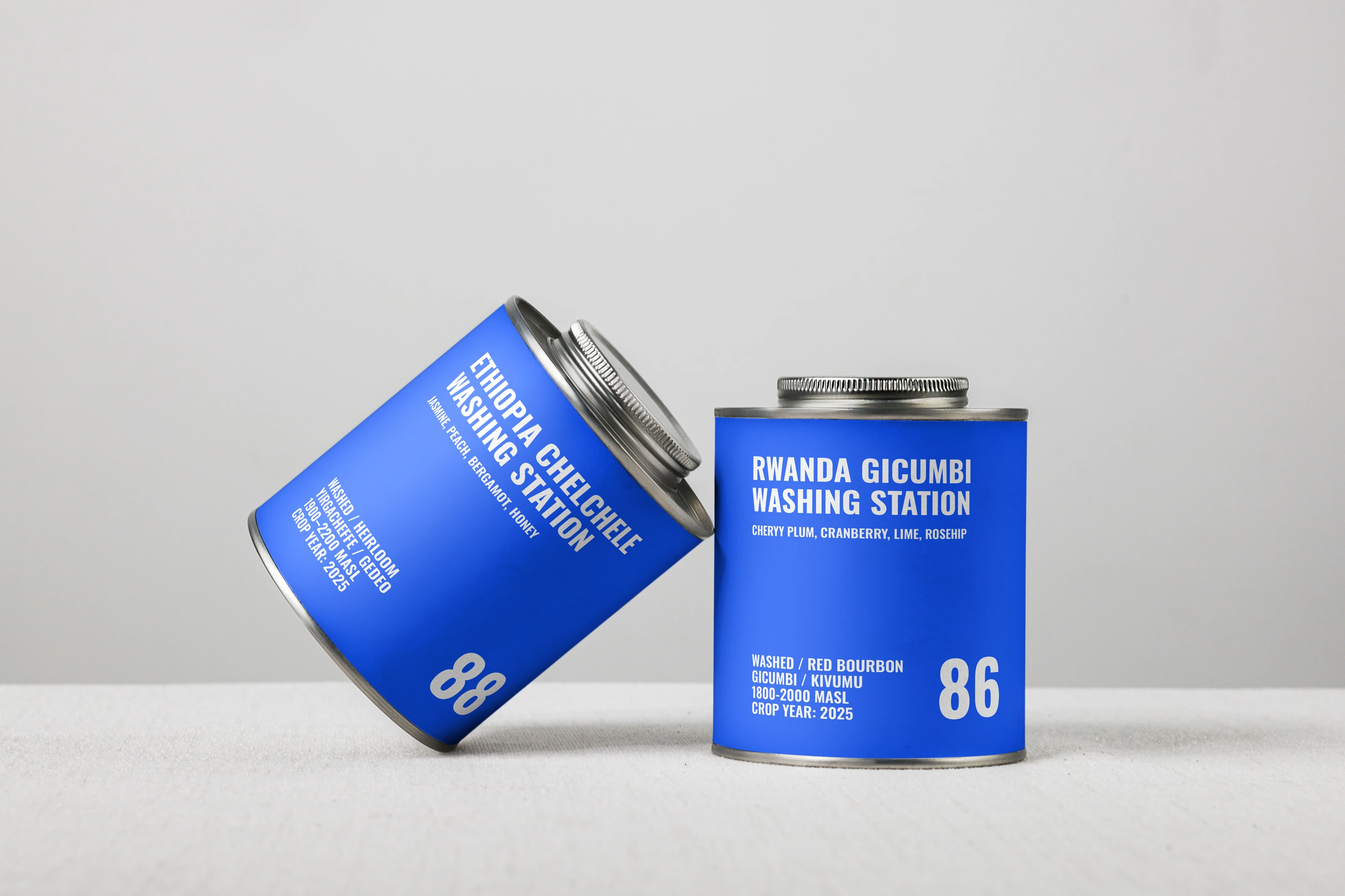
Caffè Porto coffee tin mockup
DESCRIPTION
Caffè Porto is a coffee shop and bakery in central Porto, Portugal. It serves exclusively its own roasted coffee, also available to buy, and bakes fresh pastries every morning using natural ingredients.
STRATEGY & IDEA
Made from scratch, down to the butter. The pastries use only butter churned in-house from rich cream sourced from the owners’ farm. Raspberry jam is made in the café’s kitchen from real berries. This care shapes a warm, confident identity built around a simple promise: “Good coffee. No rush.”
VISUAL IDENTITY
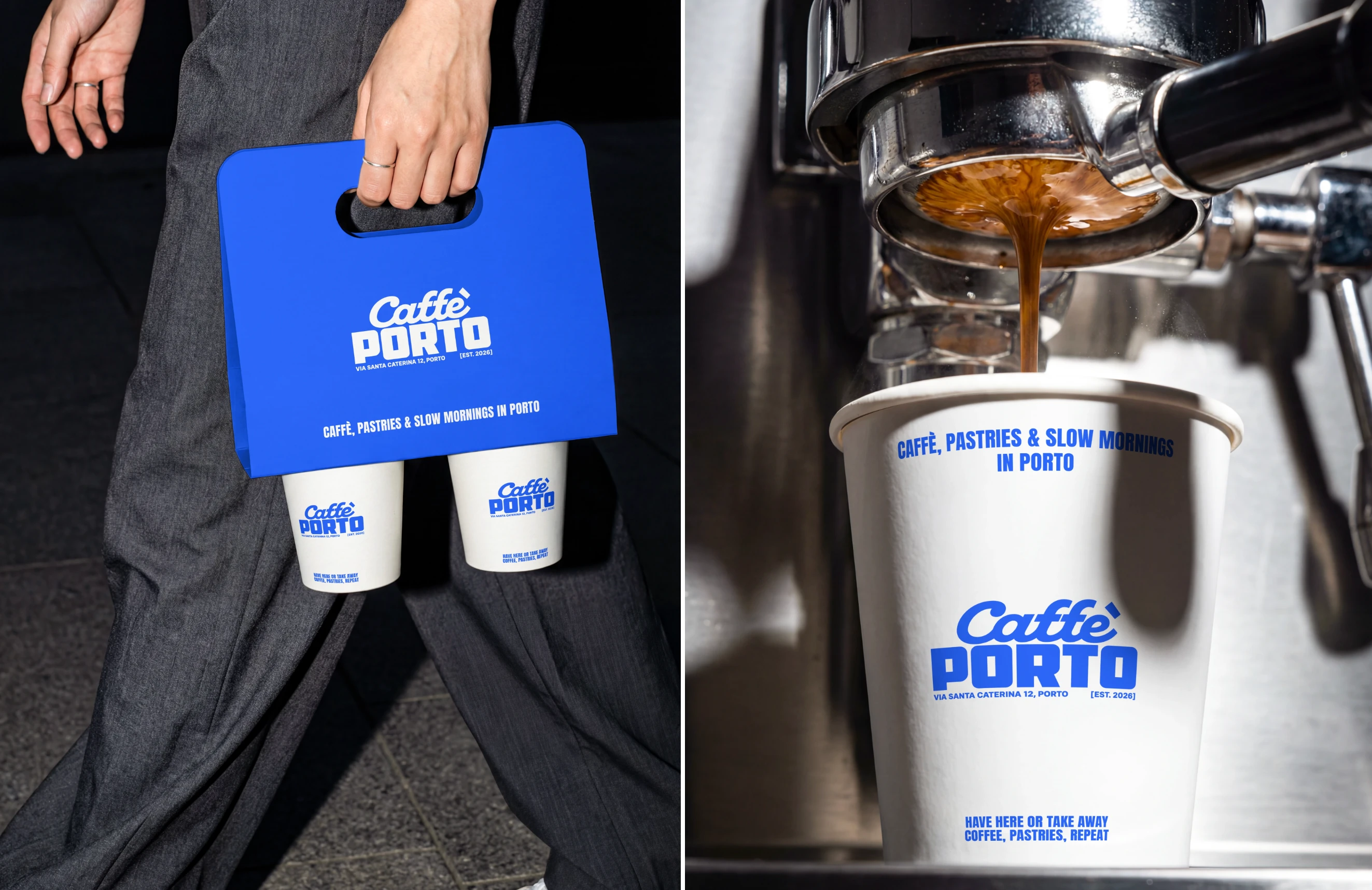
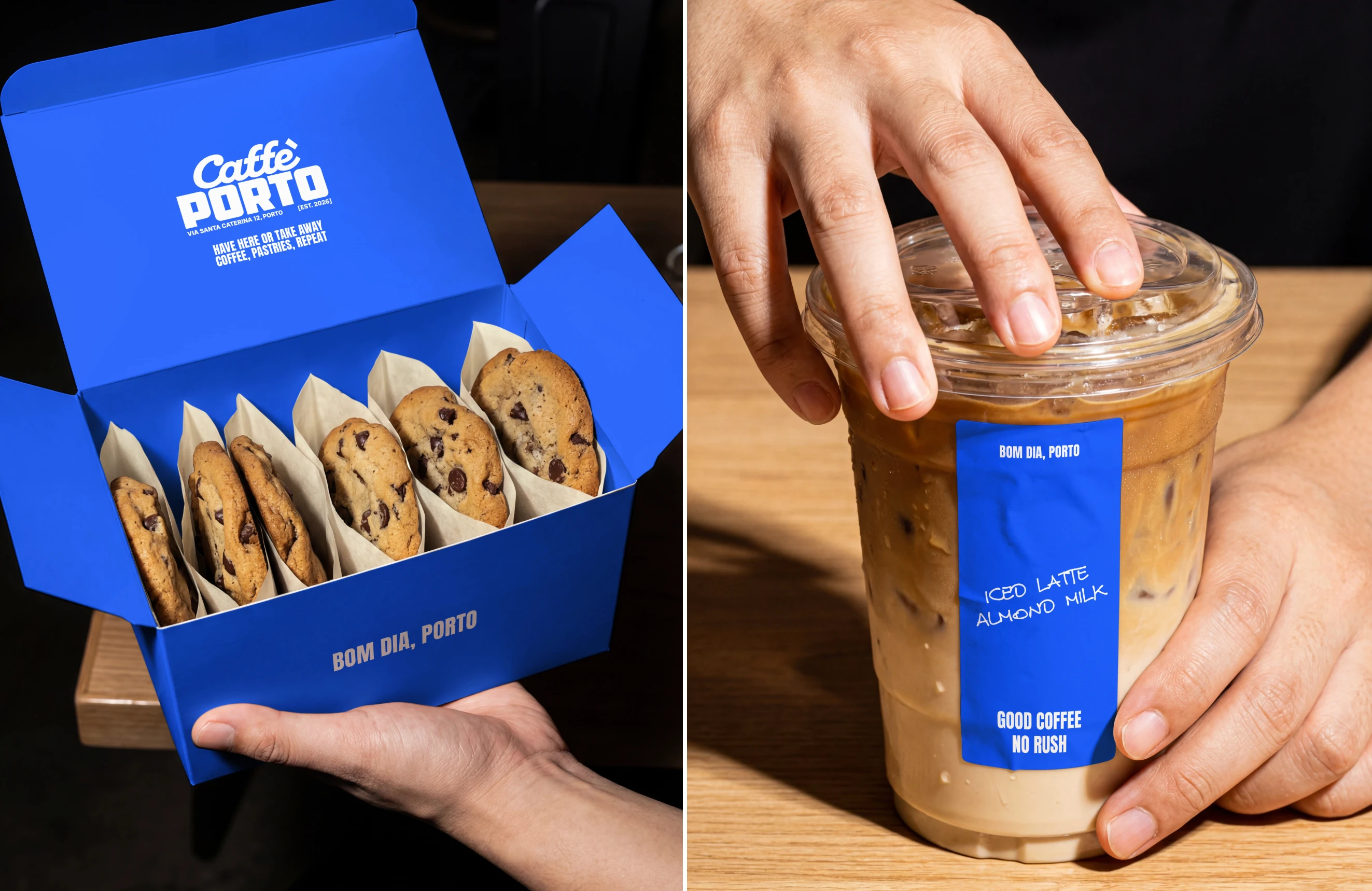
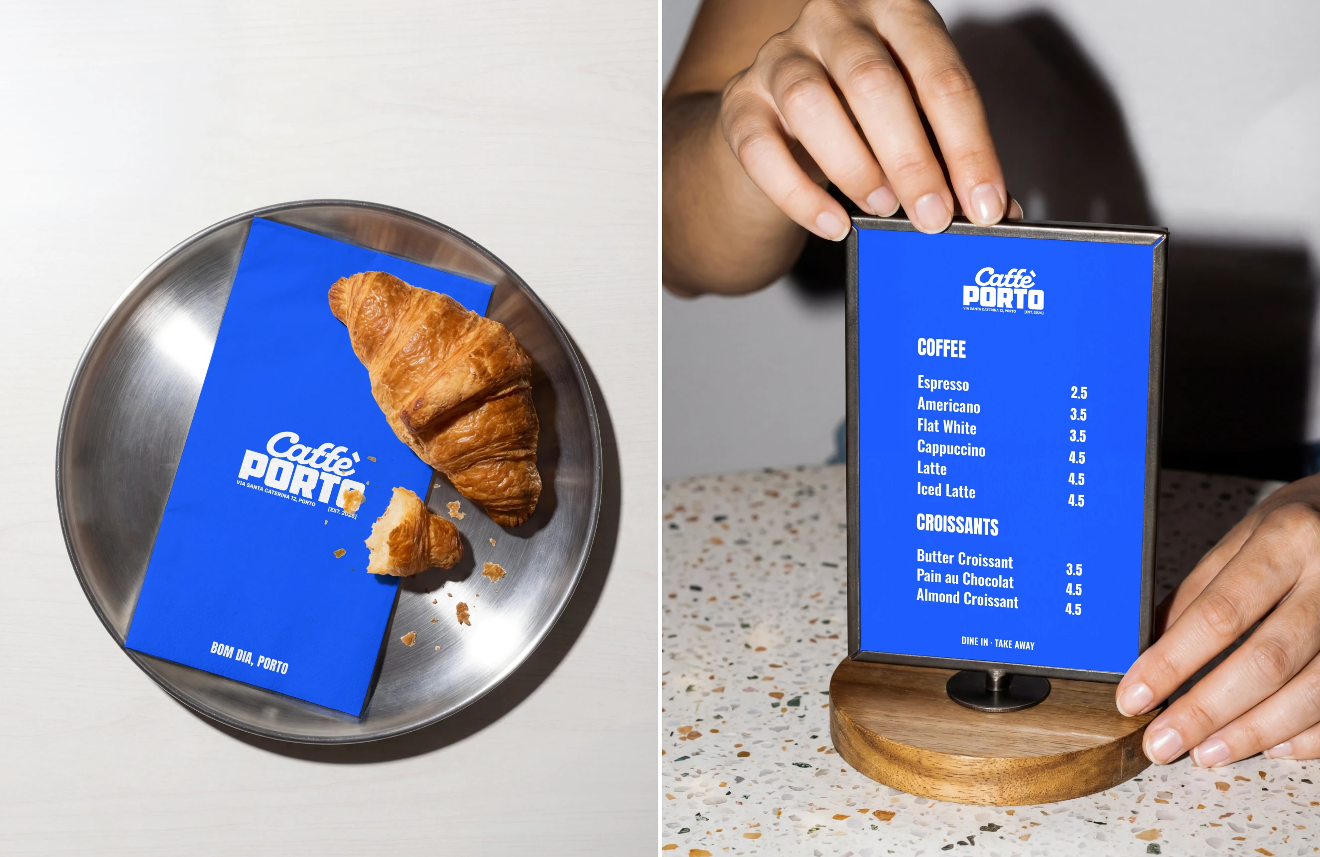
Vivid blue and white give Caffè Porto a clear, recognizable presence. The logo pairs flowing script with bold block lettering, balancing warmth and confidence. Condensed typography organizes menus and coffee labels, while handwritten details add a personal touch.
PACKAGING
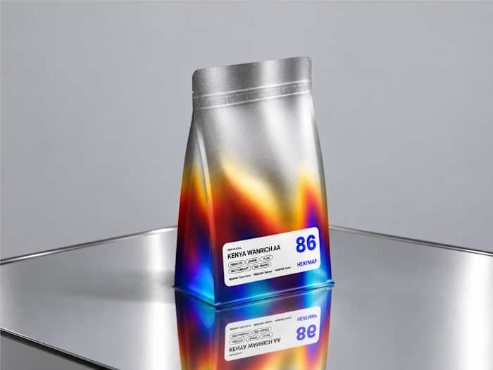
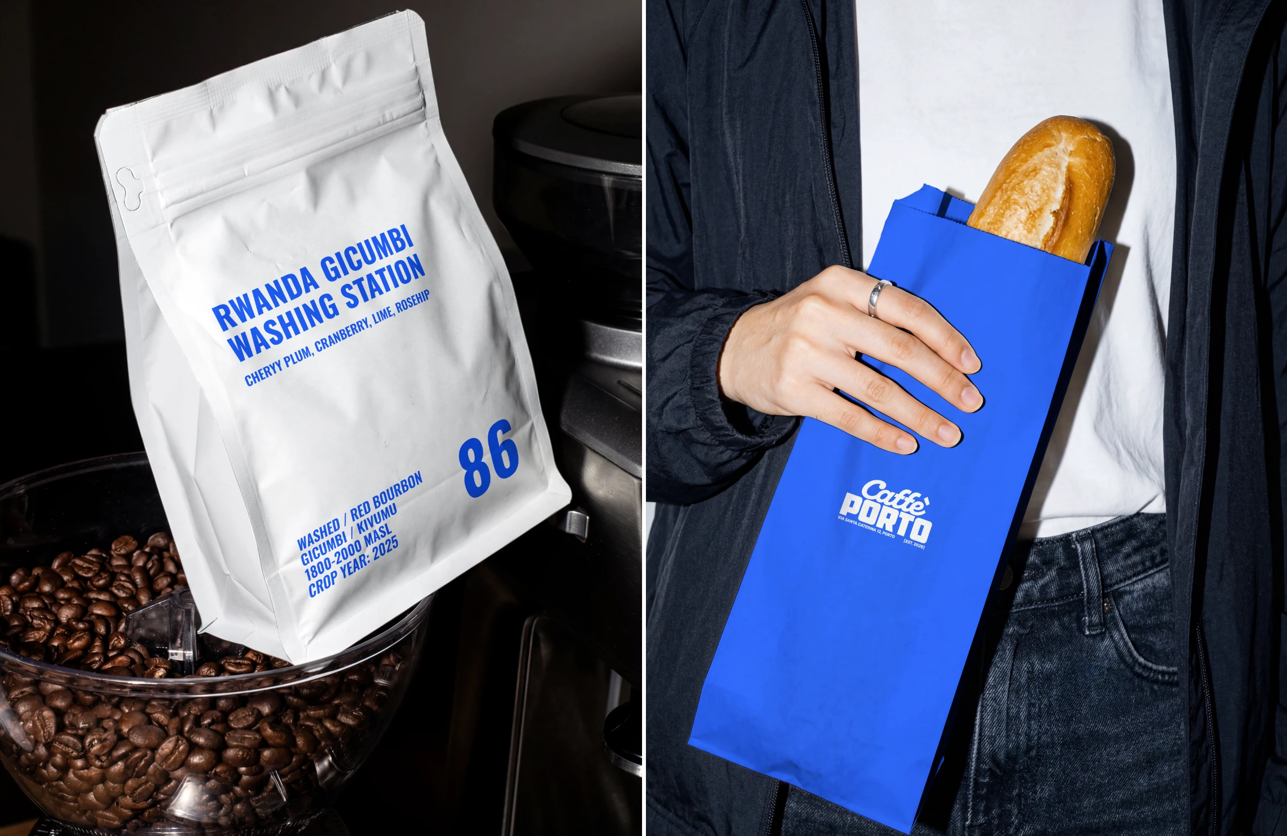
Bold blue and white connect coffee tins, bags, cups and bakery packaging. Clear origin and score information puts the coffee first, while expressive lettering brings the café’s personality to every takeaway.
Caffè Porto identity detail
Caffè Porto identity detail
Caffè Porto identity detail
Caffè Porto identity detail

Caffè Porto identity detail
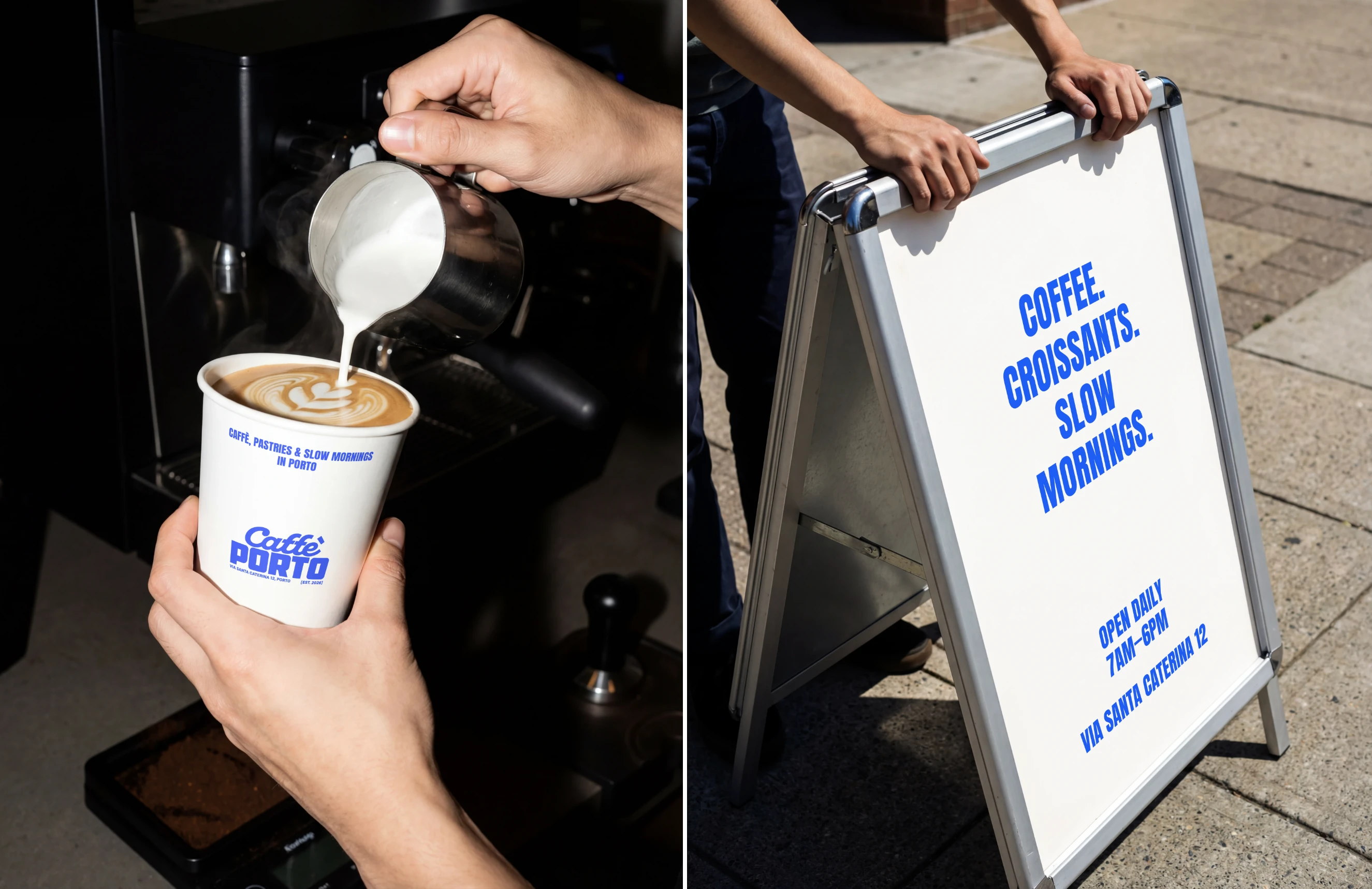
Caffè Porto identity detail
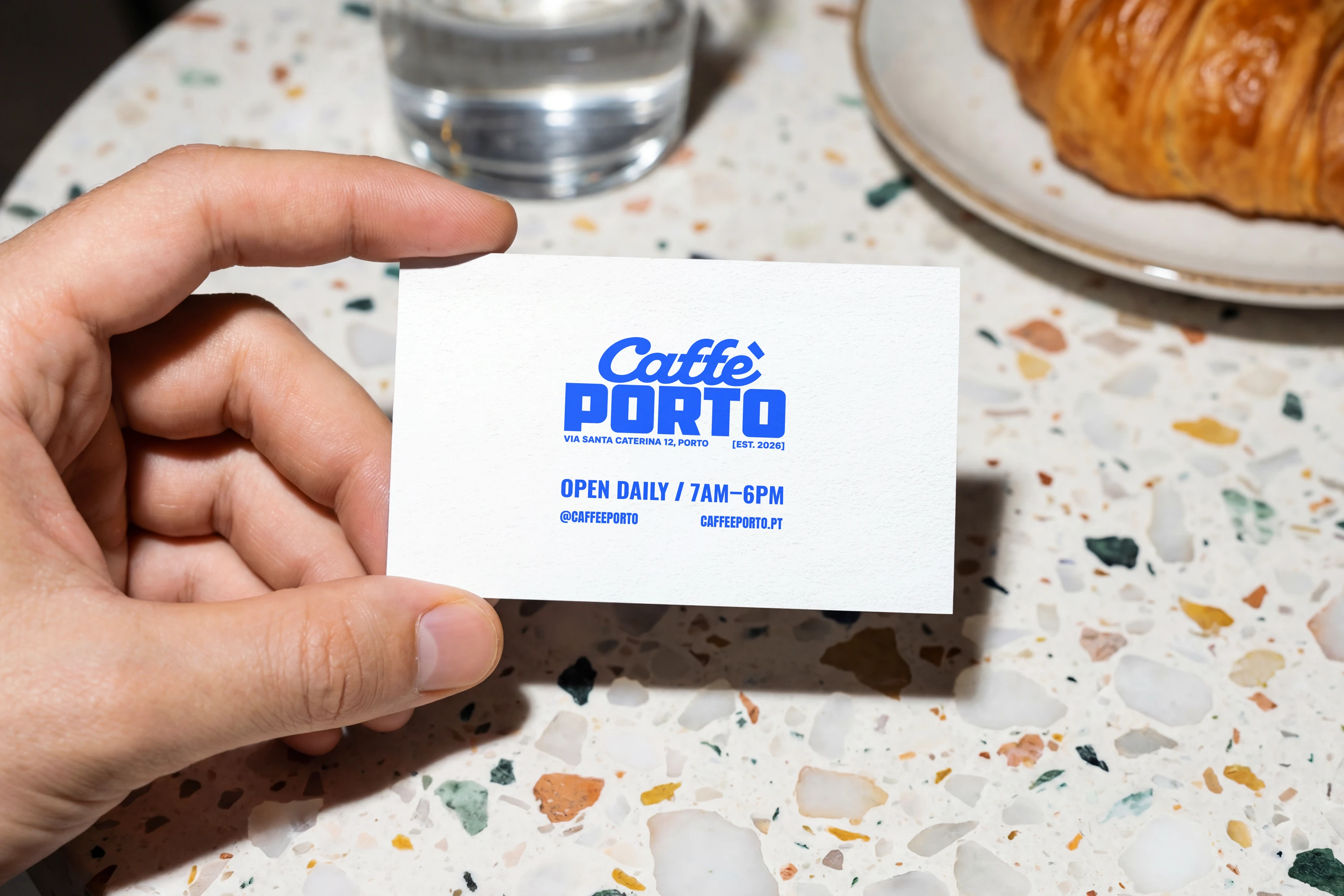
Caffè Porto business card mockup
Thank you for viewing!
For project inquiries and collaborations:
designerkornilova@gmail.com
Instagram
Like this project
Posted Sep 25, 2026
Brand identity and packaging for a coffee shop and bakery in central Porto.
Likes
1
Views
14
Timeline
Sep 7, 2026 - Sep 21, 2026