Neighbours | Real Estate Agency Branding & Social Media Design
Case
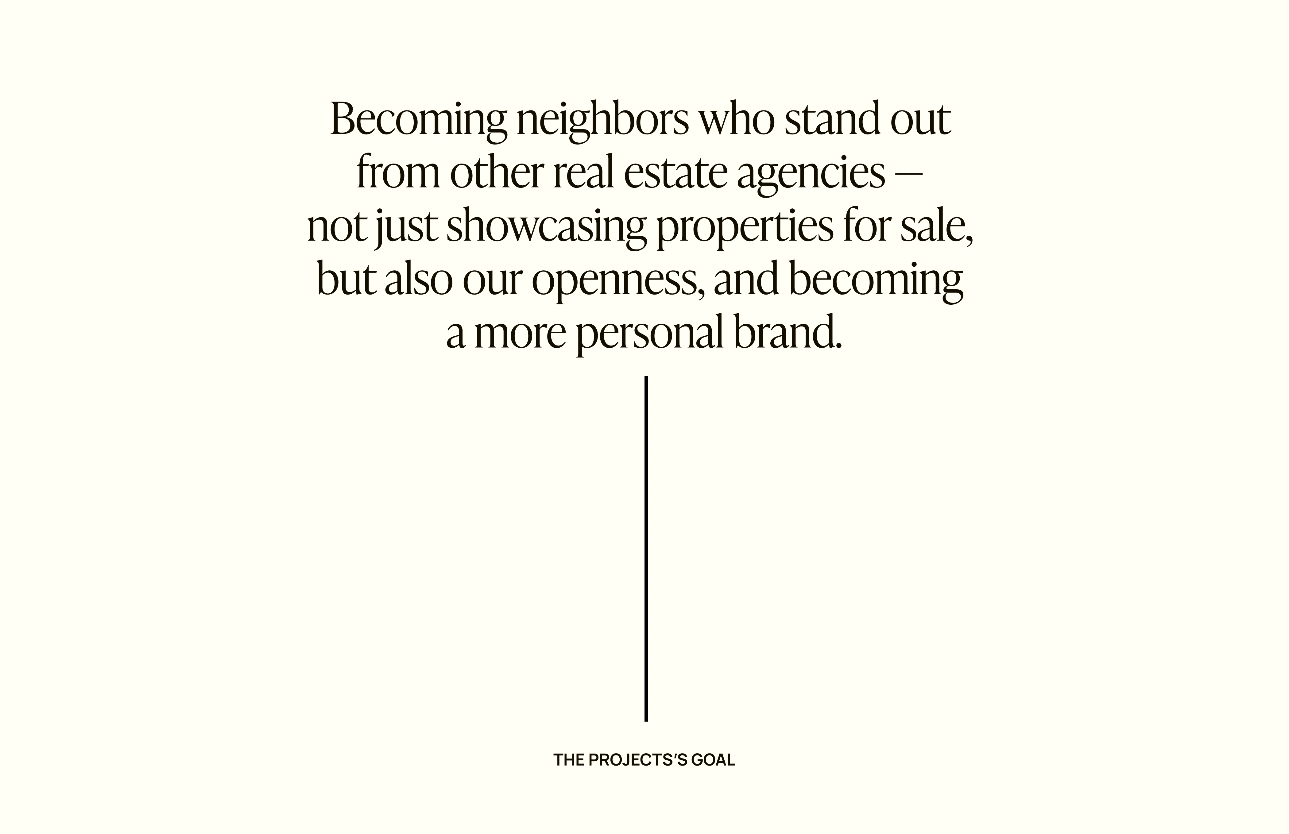
Neighbours is a luxury boutique real estate agency from Riga. The main value of the brand is people, communication, and building relationships with loyal customers, whose family assets they also manage. For the founder, it's a significant omission that people mostly don't know their neighbours, with whom they've lived for years behind the wall. The goal of the project was to become neighbours who stand out from other real estate agencies — not just to showcase properties for sale, but also to demonstrate openness and become a more personal brand. What also sets them apart is their clear and professional approach. Instead of just stating that a property is excellent based on personal opinion, they provide market analytics based on numbers: what is happening now, what can be expected, which properties might be undervalued and have potential, and which properties might be overvalued but possess unique qualities.
Solution
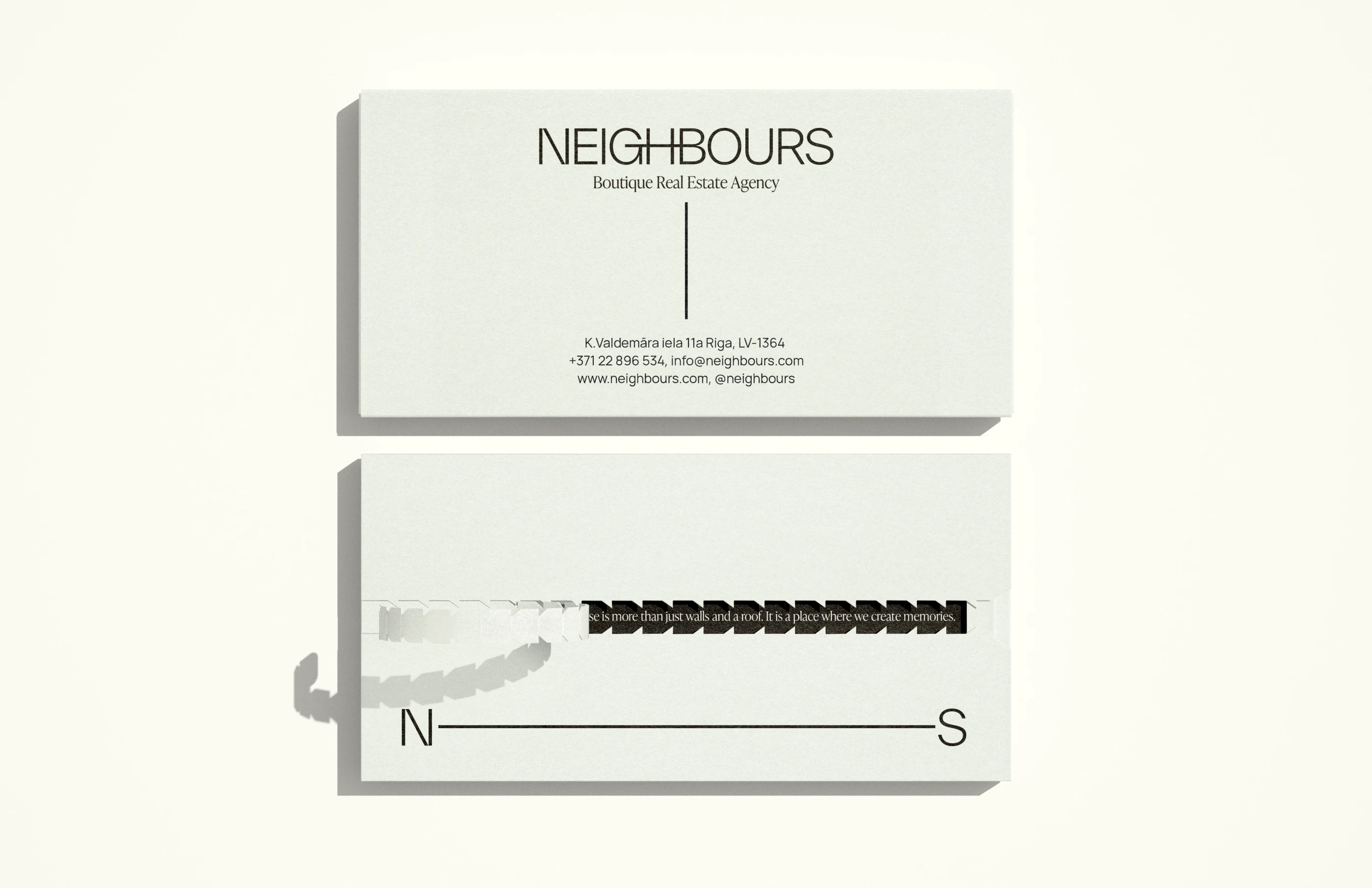
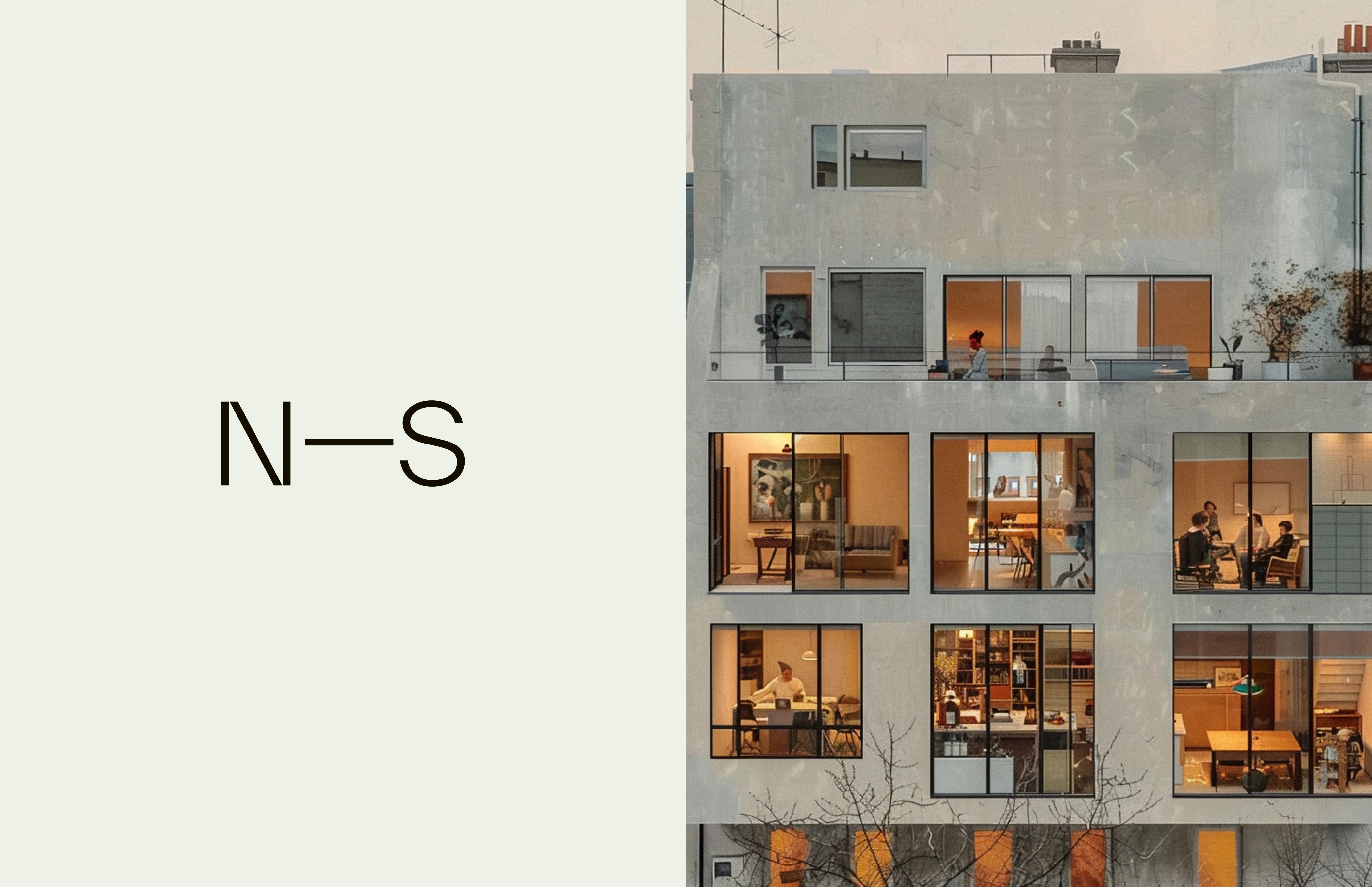
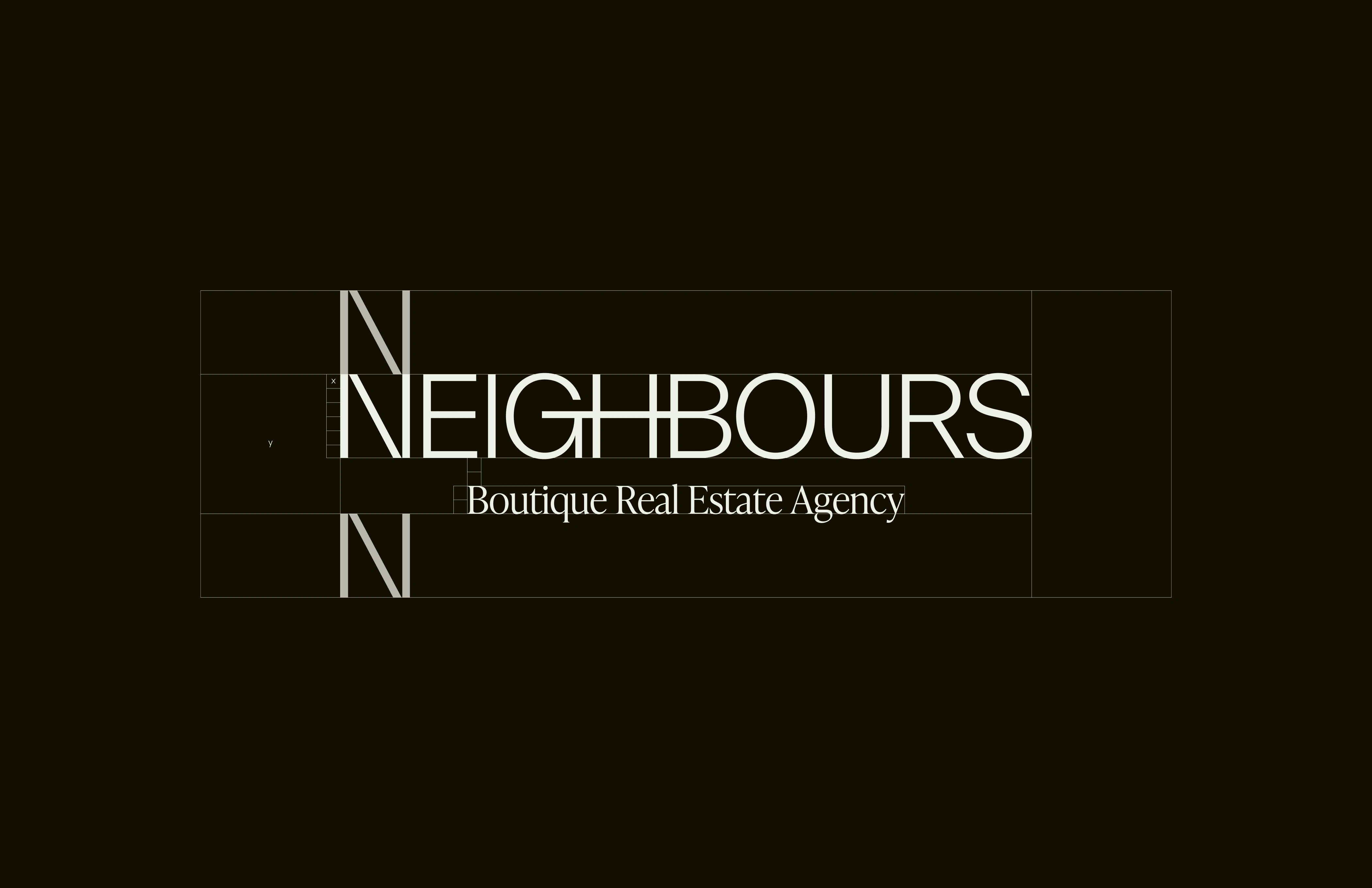
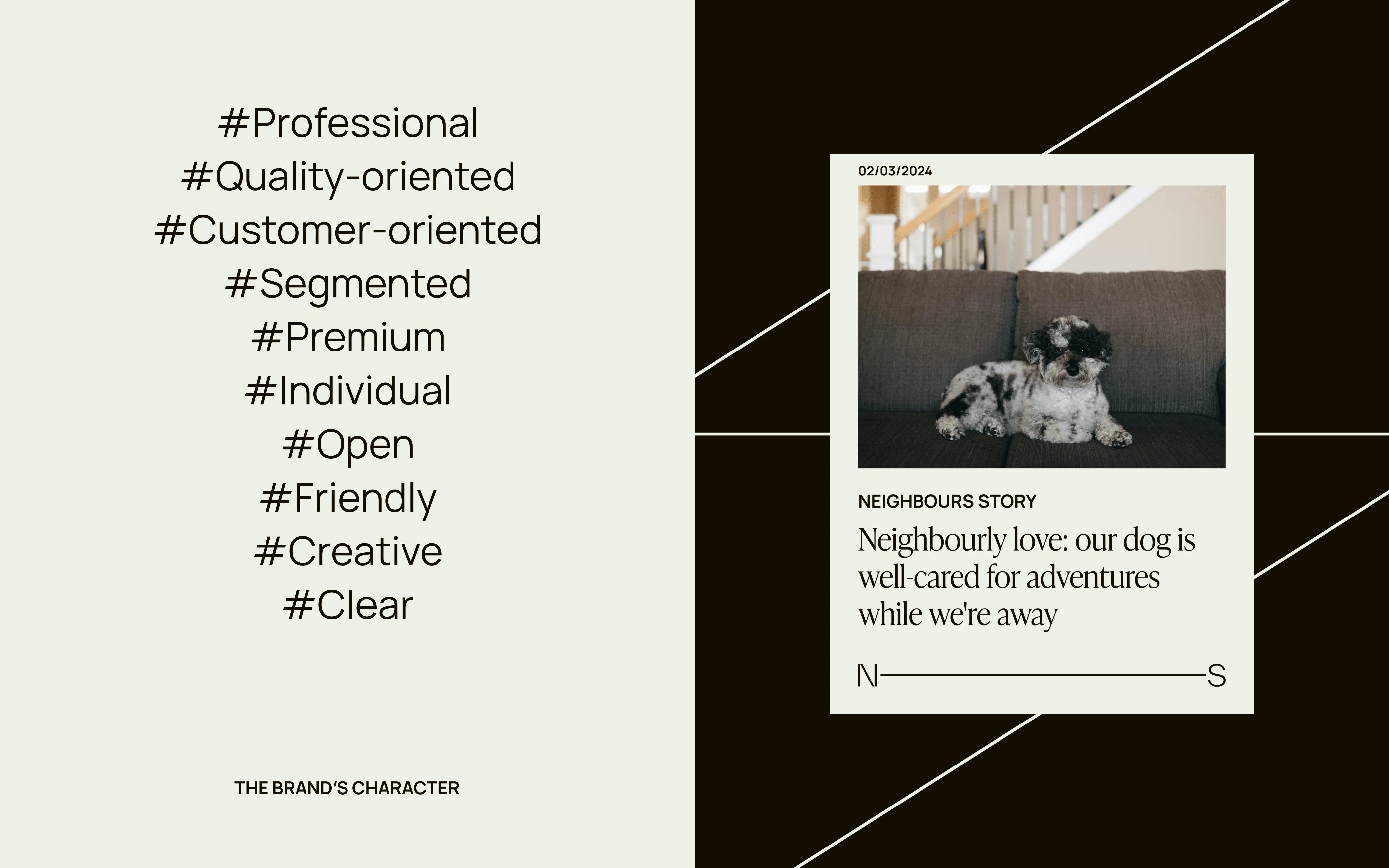
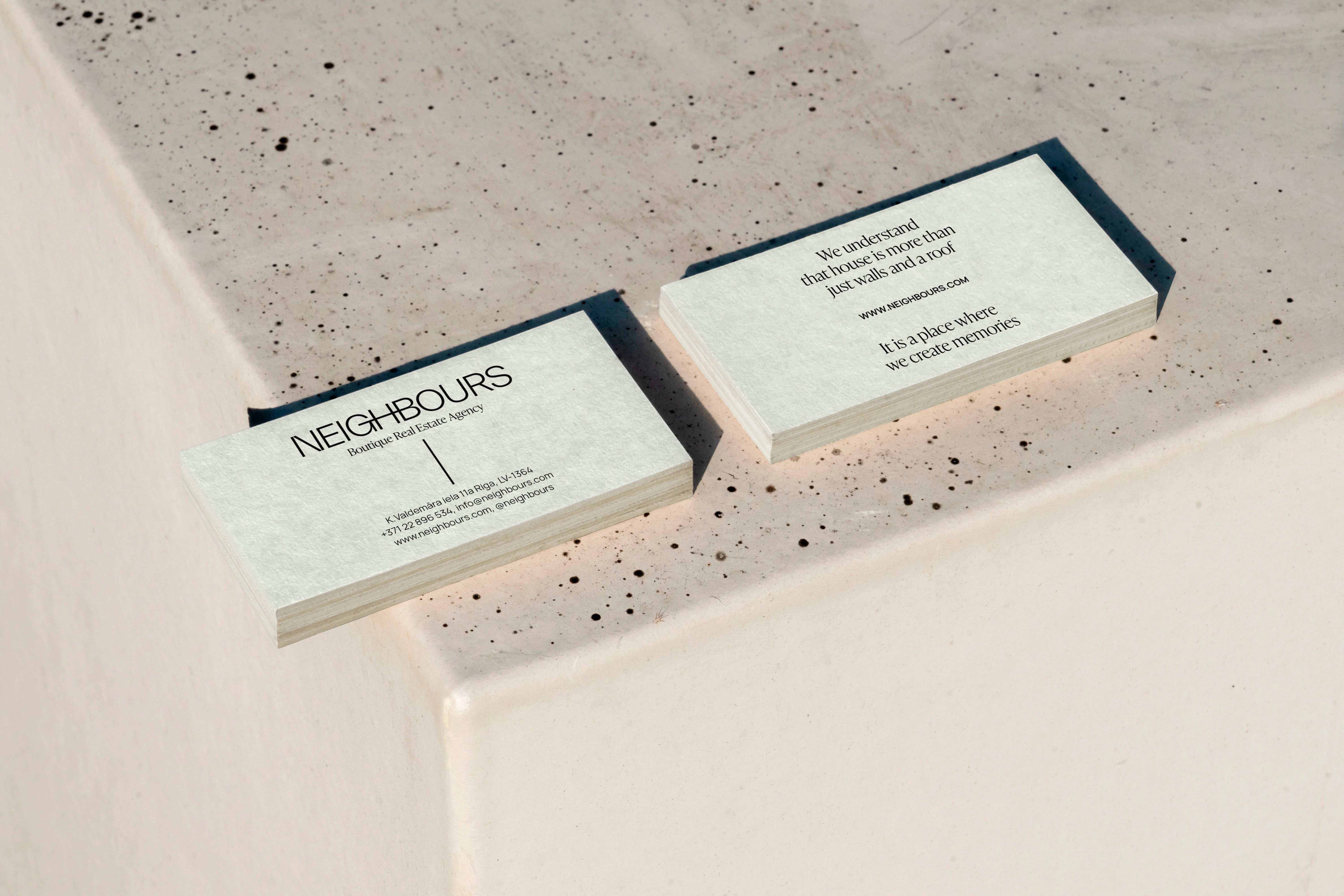
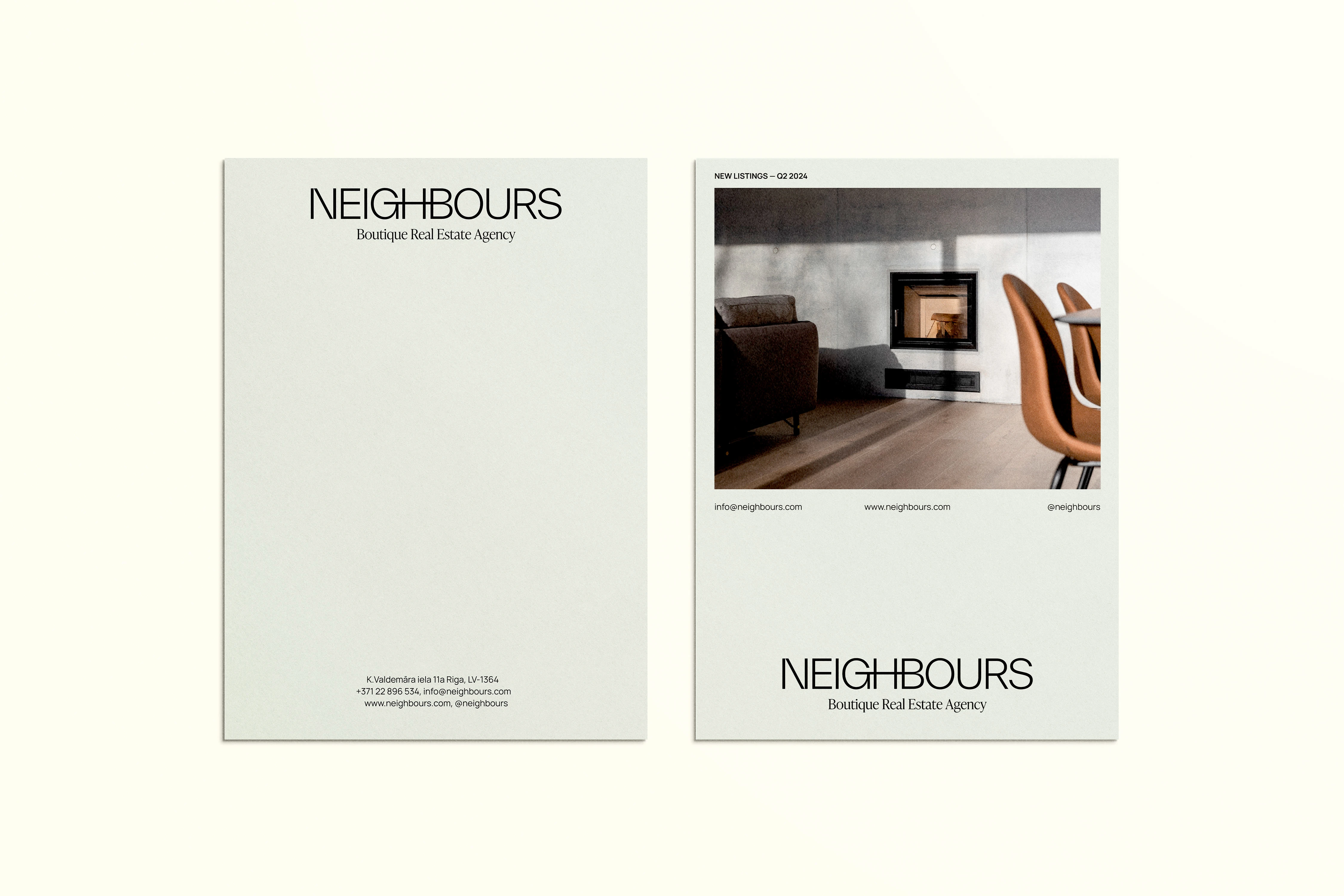
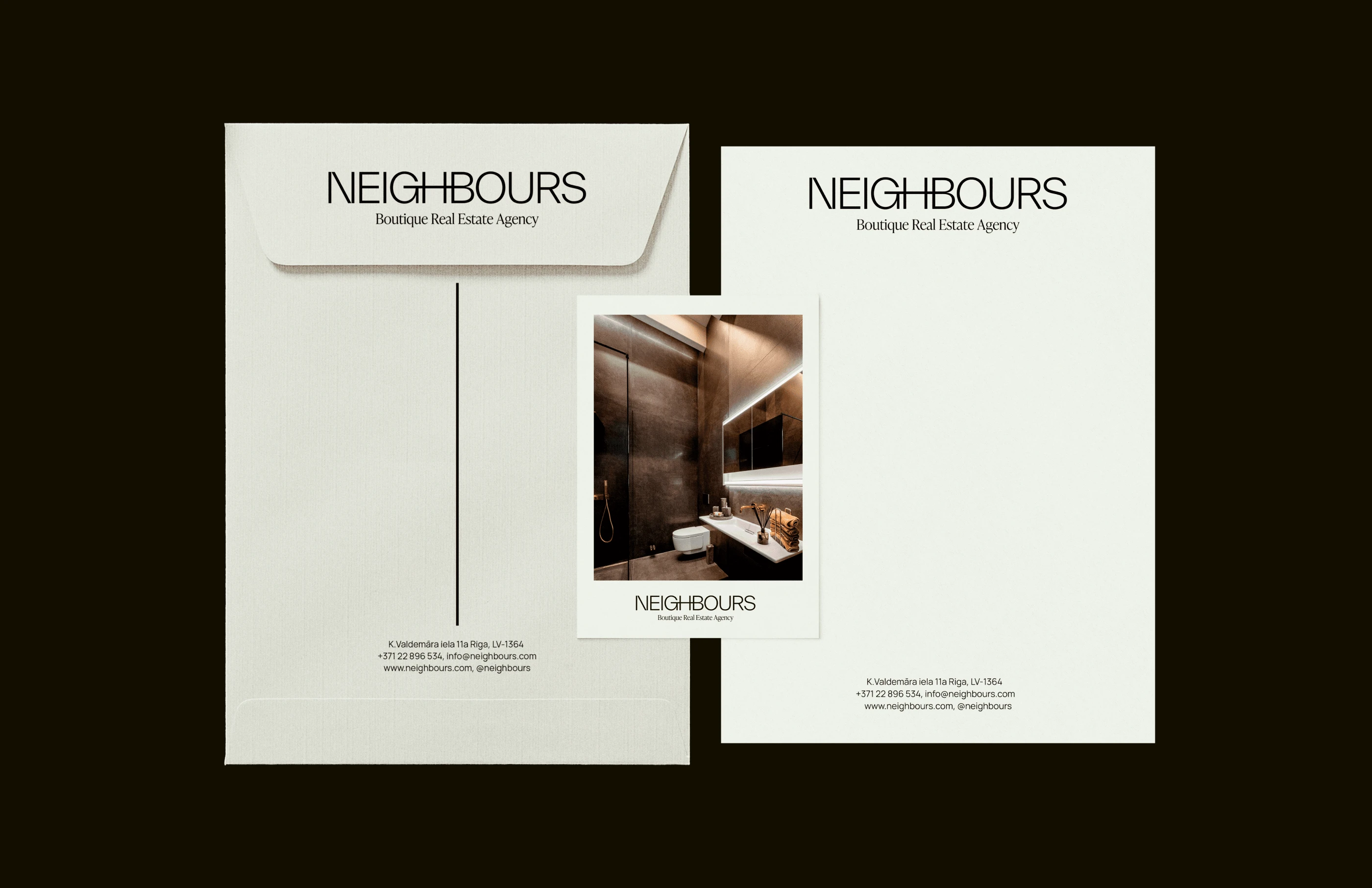
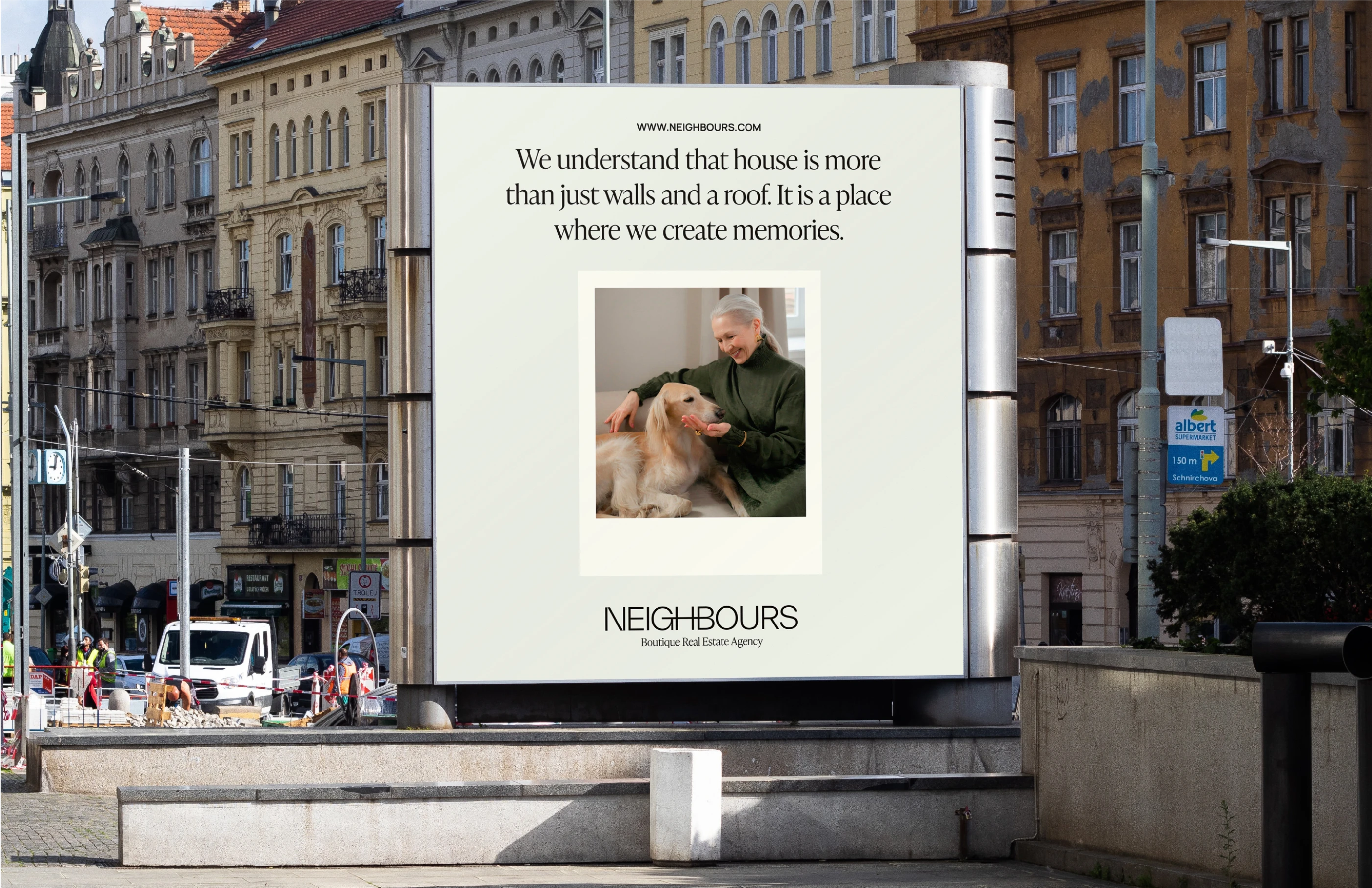
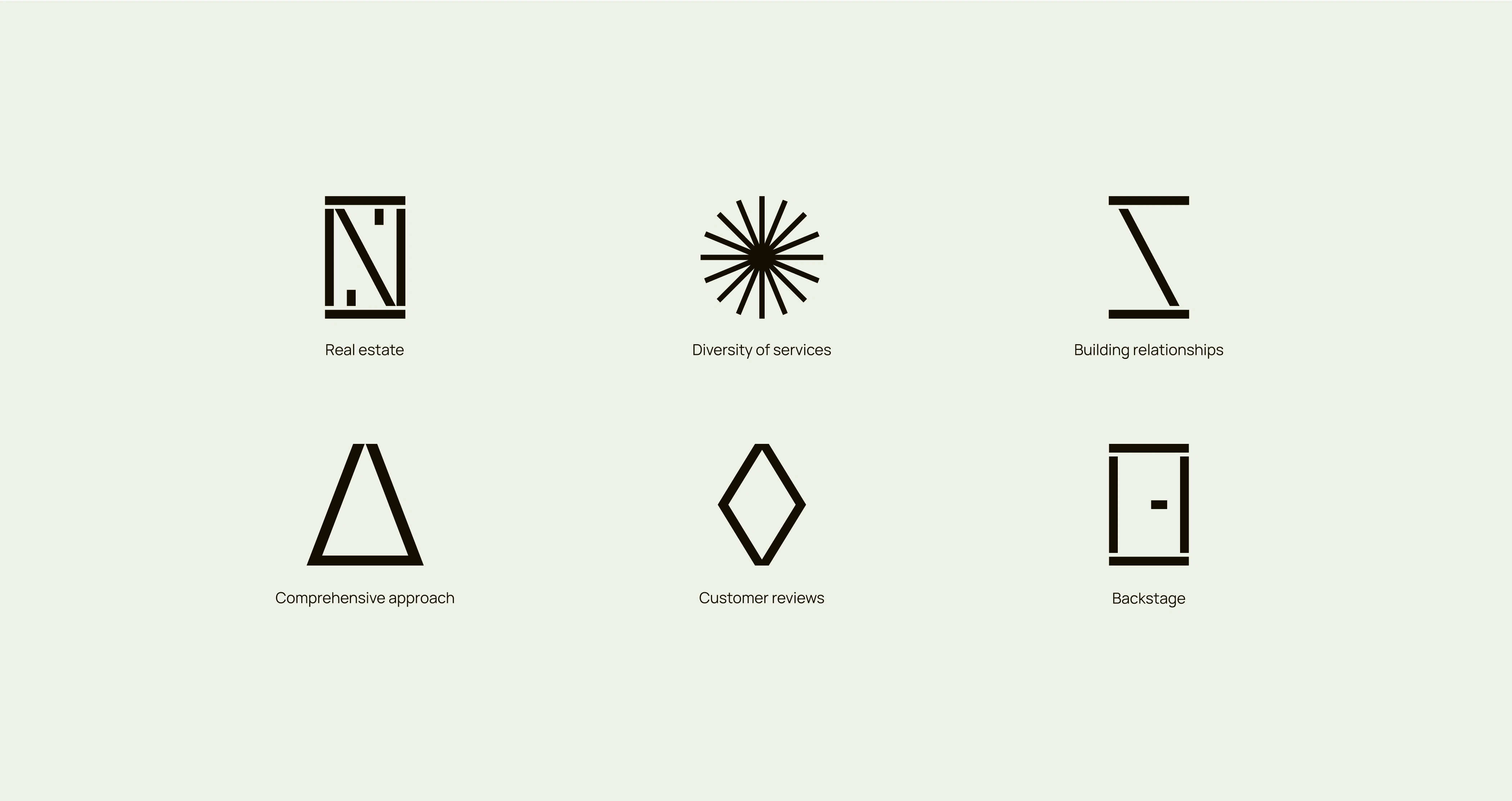
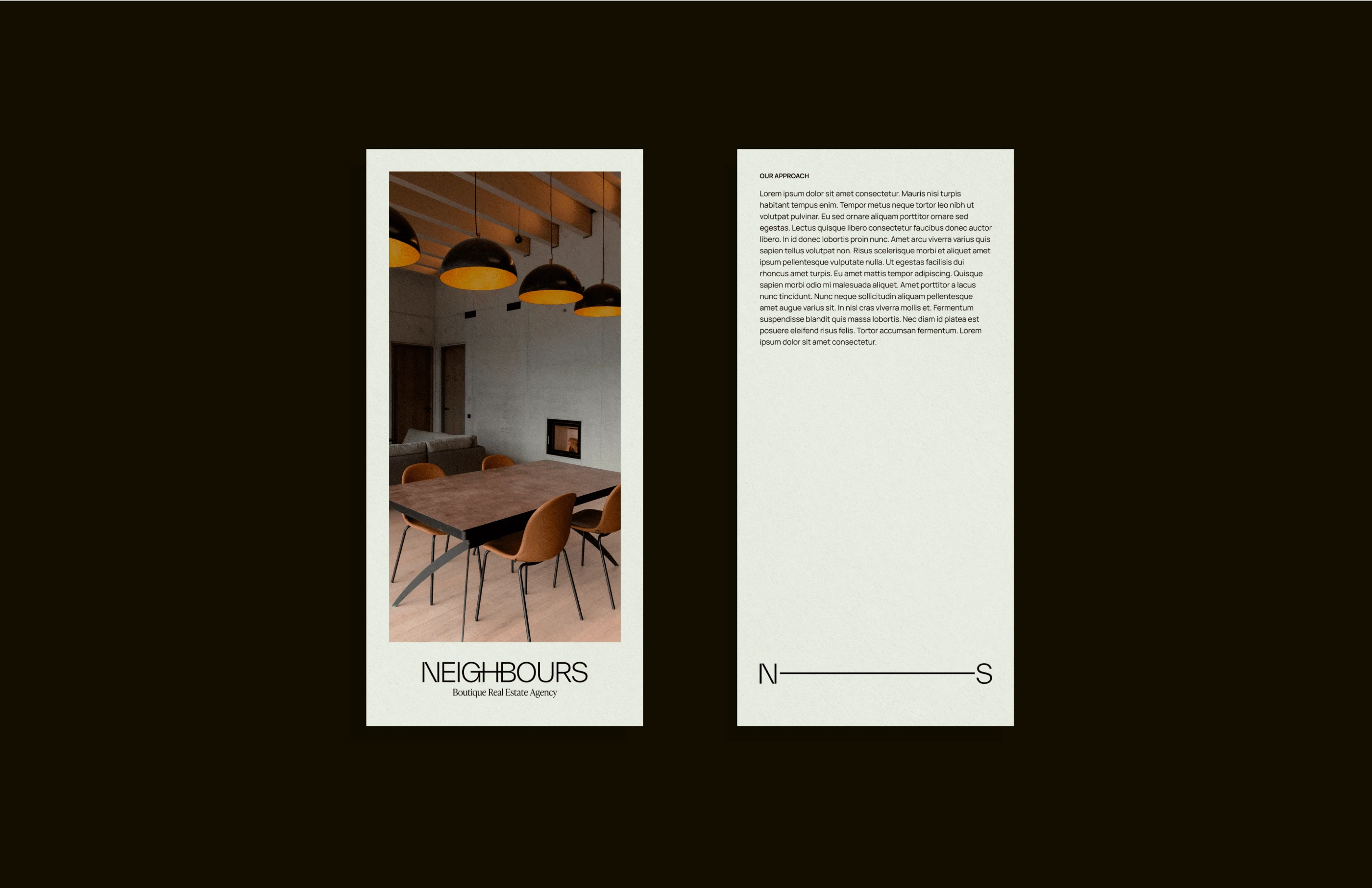
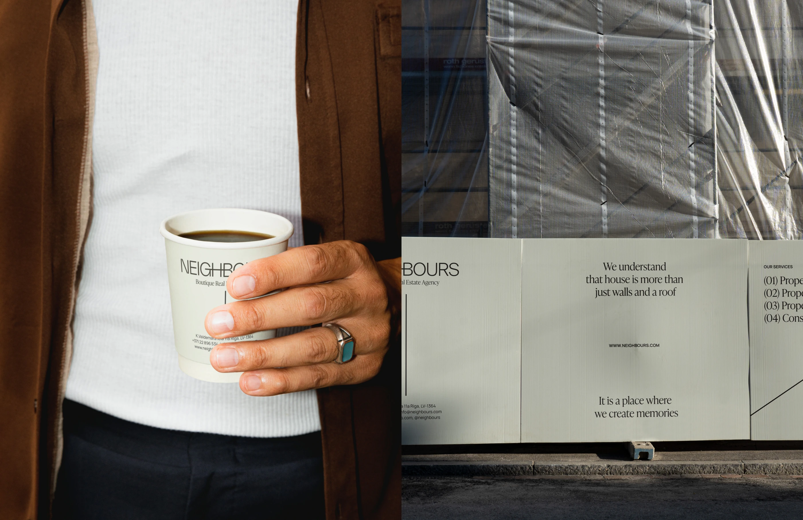
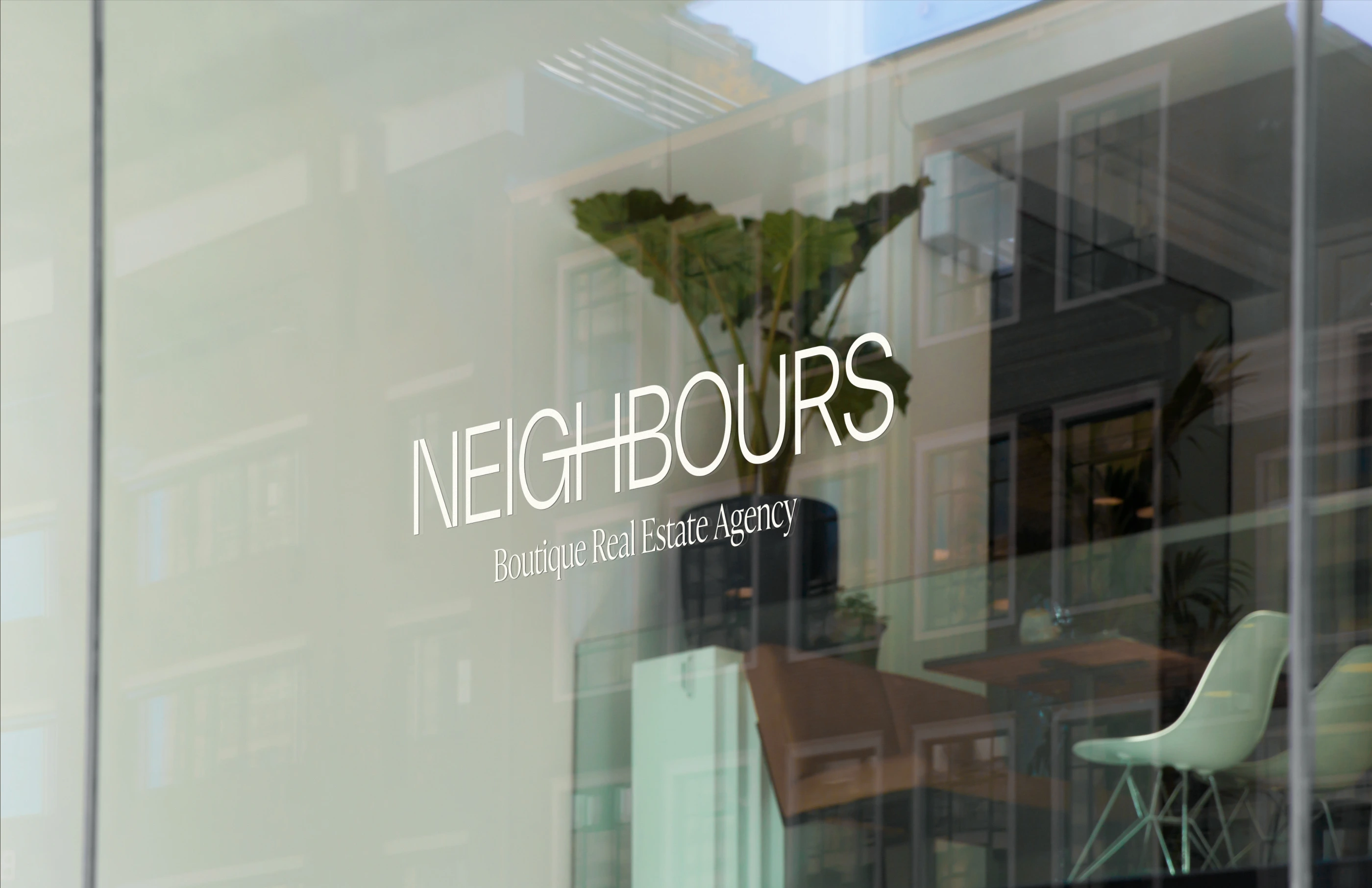
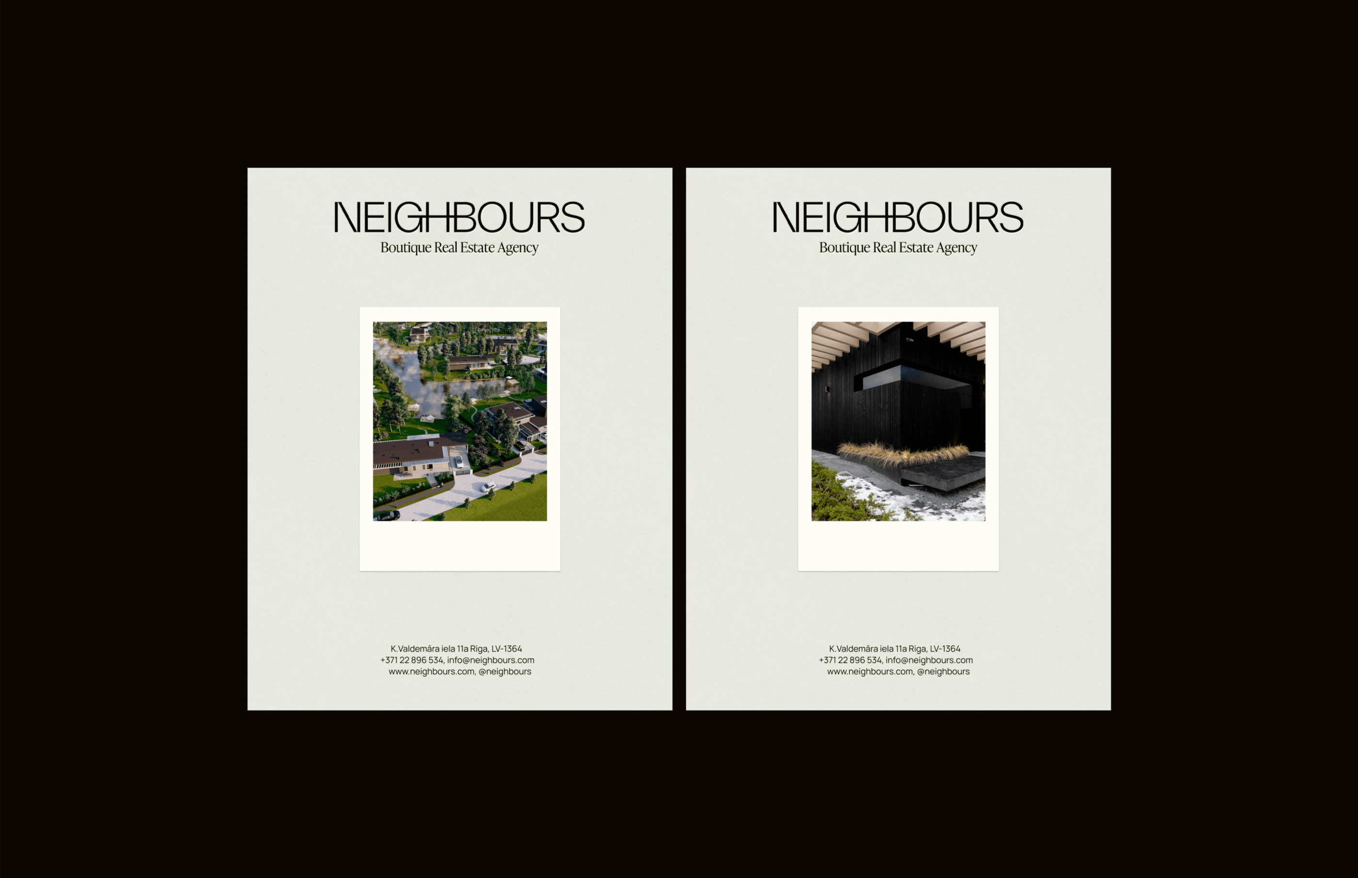
The resulting visual language seeks to convey the brand's philosophy regarding the connection and closeness of neighbours. The logo is designed in a simple, geometric font with rounded shapes to showcase the simplicity, friendliness, and openness of the brand. It serves as a starting point for the metaphor, with lines representing a connector that symbolises the closeness of neighbours and continues as the main graphical element throughout the entire visual identity. The color palette perfectly represents the brand’s character, premium sector, and brands’s unique value propositions of real estate, both in the city and in natural surroundings. The typography, consisting of geometric and simple sans-serif fonts paired with a serif font for headlines, reflects the essence of the brand — its analytical, and professional approach on one hand, and its premium, segmented, and individual approach on the other, demonstrating that Neighbours is an open, friendly brand that values relationships with people.
Like this project
Posted May 22, 2024
Branding & Social media design for a boutique real estate agency based in Riga, Latvia.
