HO·OM Visual & Sonic Identity Proposal

Dane Kowachek


HO·OM — A Visual & Sonic Identity Proposal for a Sound-Healing Practice
01 The overview
A visual world built around sound, energy, and emotional healing.
HO·OM is an emerging sound-healing practice developed in collaboration with OSD. Their mission is to connect people to healing through experimental sound journeys — blending ritual, modern wellness, and sonic exploration.
This project is a work in progress and represents the creative proposal for their identity, digital direction, and motion language. The goal was to create visuals that feel calming, sensory, and immersive, reflecting the emotional experience of a HO·OM session.
Industry: Wellness & Sound Healing
Role: Branding, UI/UX, Motion Design, Art Direction
Duration: 1 Month (ongoing work in progress)
Software: Figma, After Effects, Illustrator, Photoshop
Disclaimer: All placeholder imagery sourced from Death to Stock
02 — What HO·OM Needed & What I Proposed
The challenge
HO·OM needed an identity that could communicate an emotional, intangible experience — sound becoming sensation, healing becoming movement, and energy becoming visual. Their old materials didn’t express the feeling of a session, and the brand needed a clear way to show depth, warmth, and transformation.
The direction
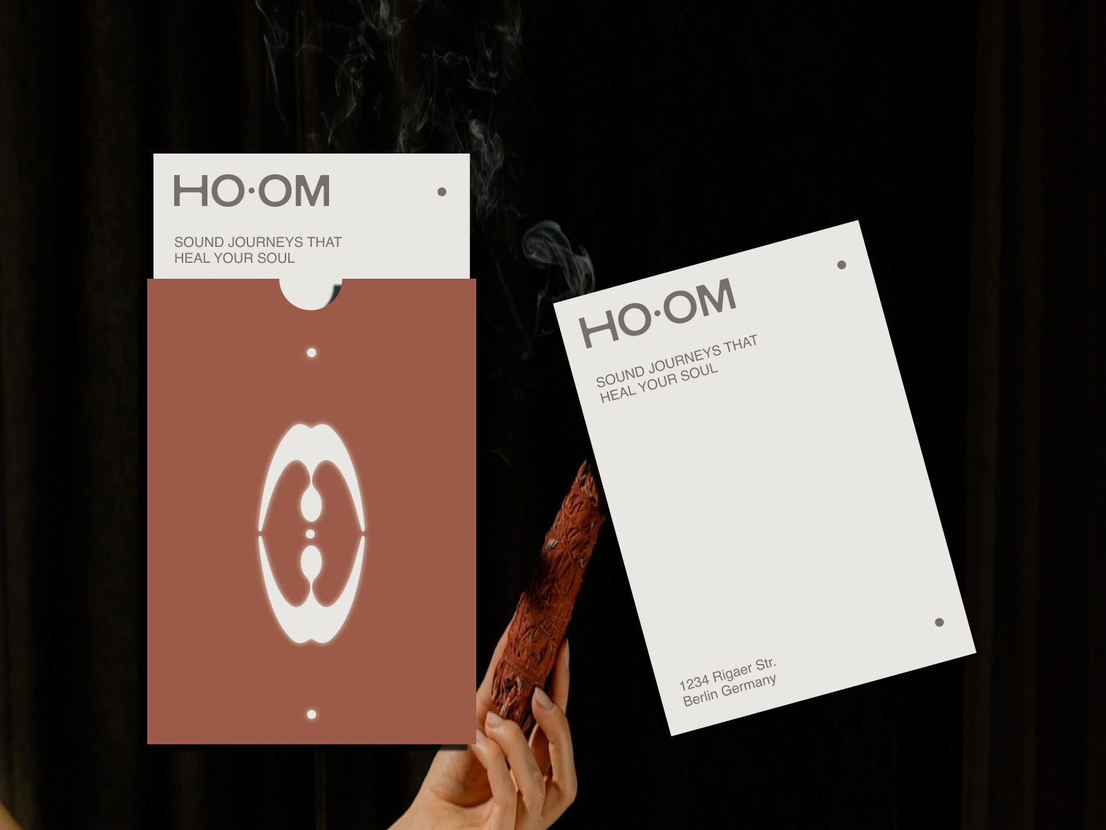
The concept revolves around the “OM” in HO·OM — the primordial sound of grounding, vibration, and unity.
The circle became the core motif:
a symbol of energy
the resonance of a sound wave
breath expanding and contracting
a visual anchor for the entire brand
This circle carries through into the landing page animation, social media visuals, and motion behaviors — always growing, softening, vibrating, and returning to center.
What we built
A minimal, emotionally-driven identity system guided by sound, breath, and energy
A circular motion language representing “OMMMMMM,” grounding, and resonance
Soft gradients and textures that feel warm, sensory, and meditative
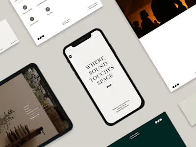
UI/UX direction for a landing page that introduces users to HO·OM’s world through subtle motion
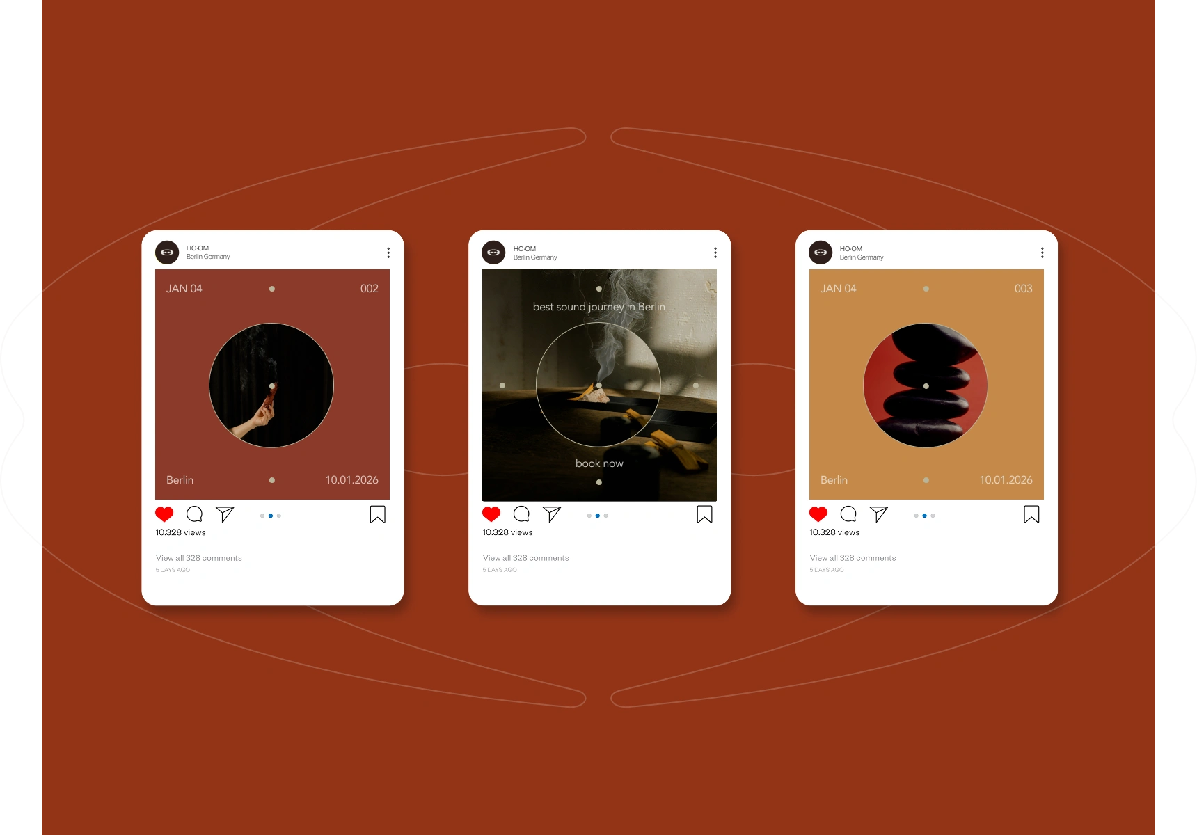
Animated social media content to help explain the practice and its benefits visually
03 — How I Worked
1. Understanding the essence of the brand
Because HO·OM is rooted in emotional states rather than products or services, the first step was understanding the feeling of the experience.
I explored:
the emotional journey a client goes through
how sound behaves physically (waves, resonance, vibration)
the symbolism of the circle in meditation practices
how wellness brands communicate softness without cliché
This shaped a direction that is spiritual, but modern; calm, but intentional.
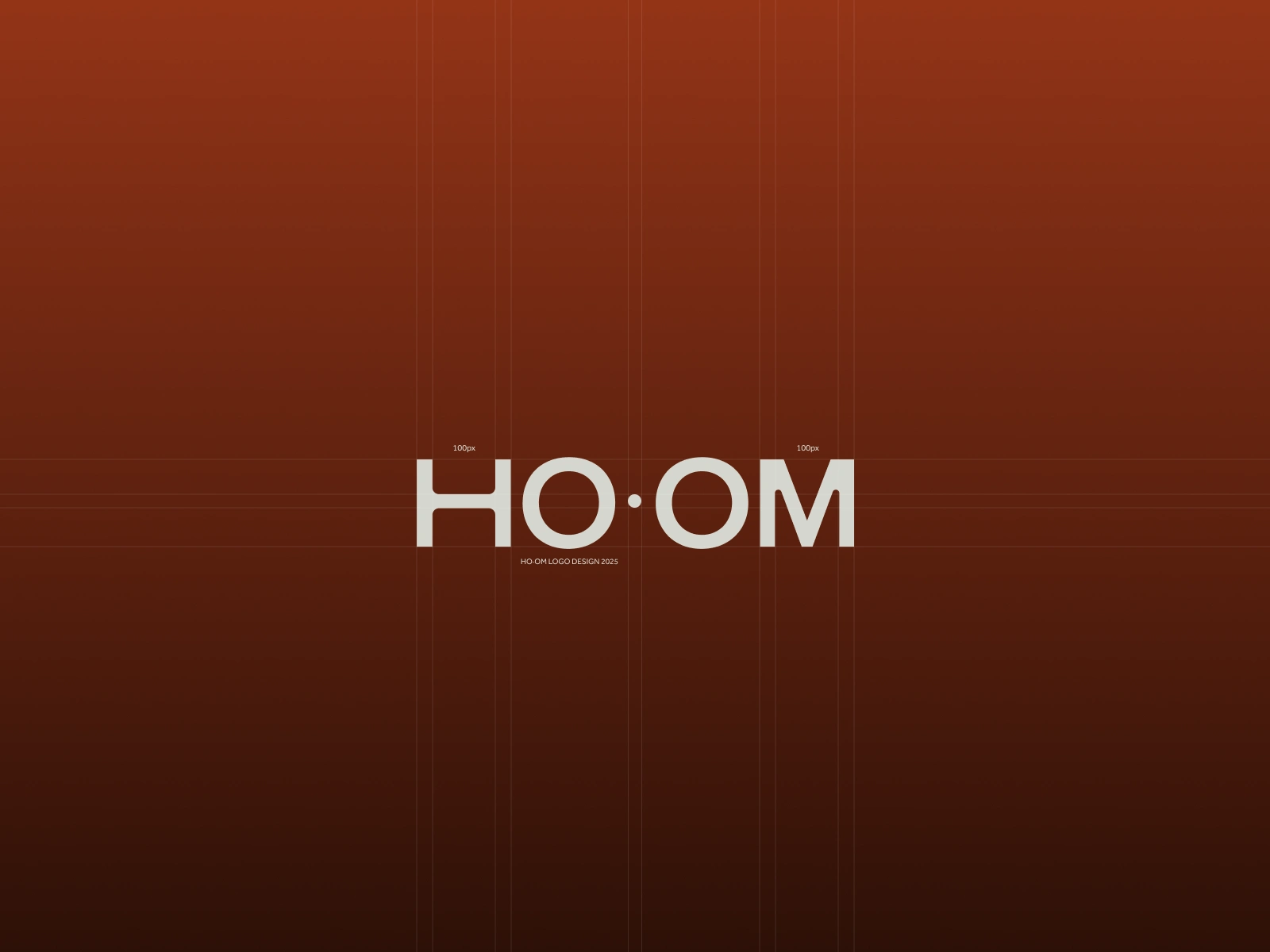
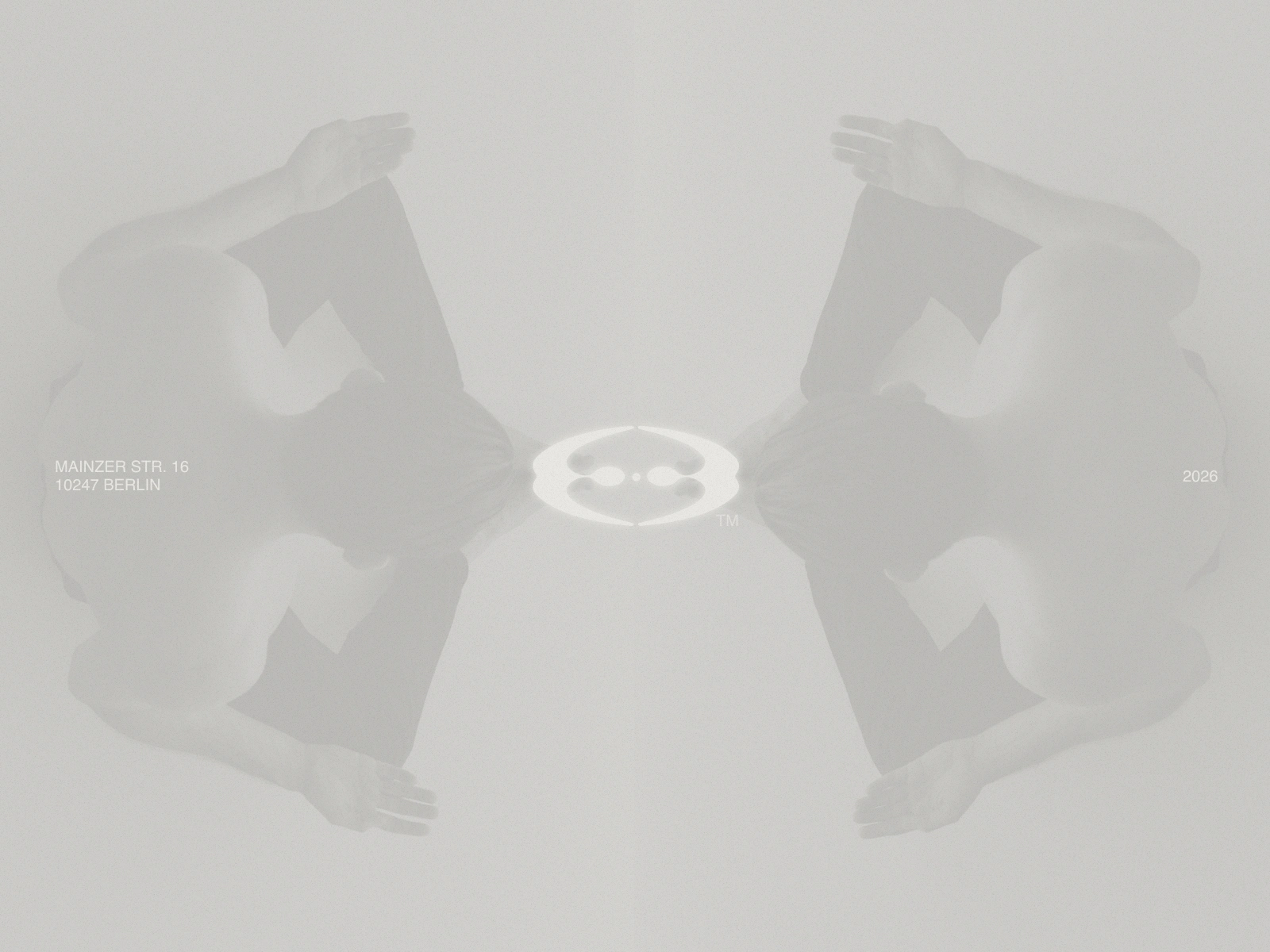
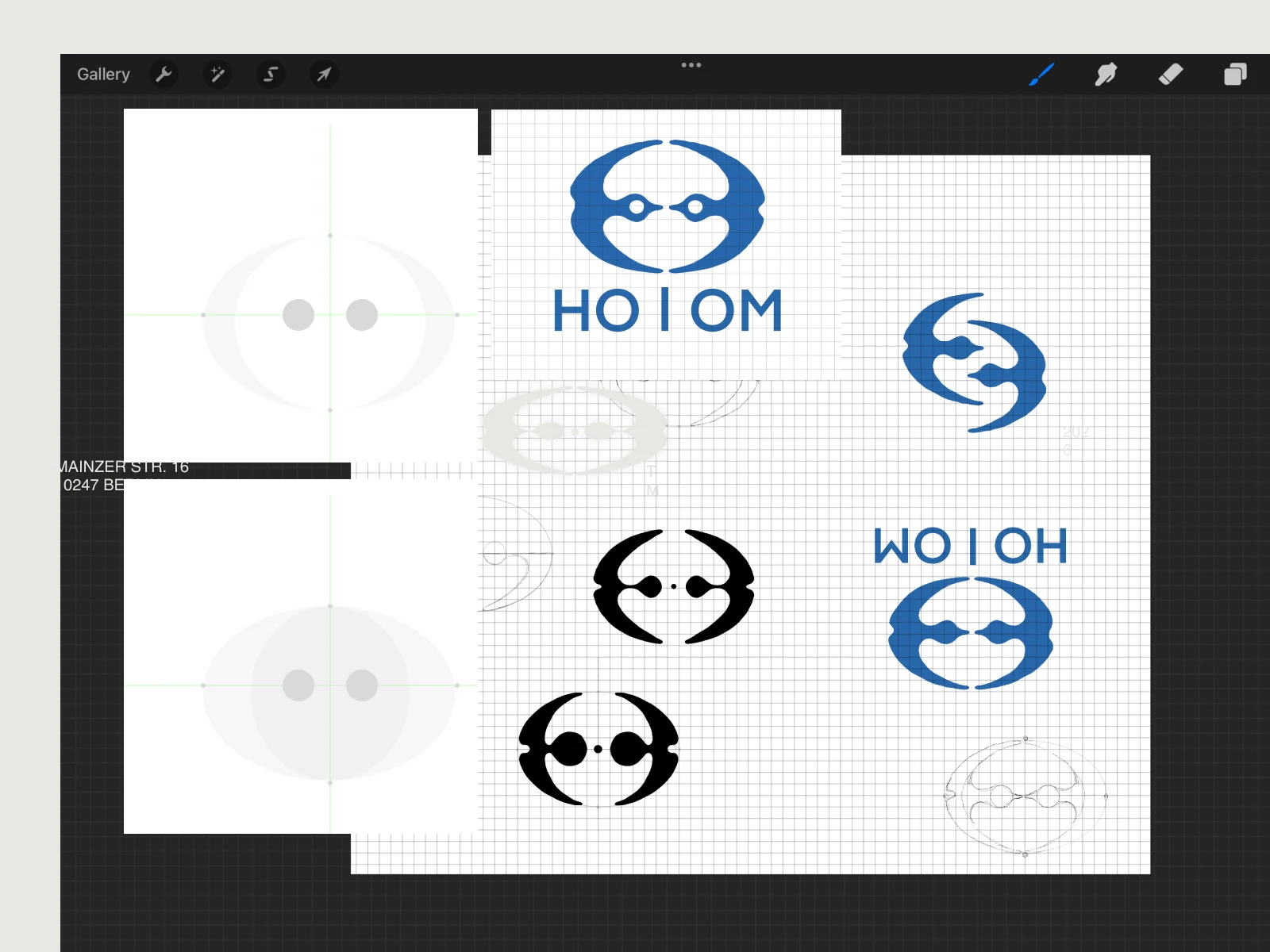
The logo: two figures, one energy center
The logo began as a quick sketch in Procreate, inspired by two people sitting in meditation. Their forms curve inward, meeting at a central circle — the shared point of energy and sound.
I refined the shapes in Illustrator to create a simple, symbolic mark that feels human, open, and connected.
Designing a system with purpose
Every design element connects to vibration, breath, and grounding.
The system includes:
Circular motifs inspired by the “OM” sound
Soft, expanding motion representing sound waves
Warm gradients and texture for emotional depth
Minimal typography to keep focus on the sensory visuals
A flexible layout for workshops, sessions, and educational content
The focus was on capturing how HO·OM feels, not just how it looks.
Portfolio - https://danekowachek.com
Like this project
Posted Nov 28, 2025
Created a visual and sonic identity for HO·OM, a sound-healing practice.
Likes
0
Views
4
Timeline
Nov 1, 2025 - Nov 14, 2025