Mental Health & Psychiatry Logo Design + Brand Identity

Sohil Obor


Psyhance Mental Health & Psychiatry Logo and Brand Identity
Overview
Psyhance is a private psychiatric practice focused on integrative psychiatry, providing personalized medication management and therapy with a more individual and thoughtful approach to mental healthcare.
Built around the tagline “Be Your Authentic Self,” the brand needed an identity that felt professional and trustworthy while also communicating something deeper: personal growth, individuality, wellbeing, and human connection.
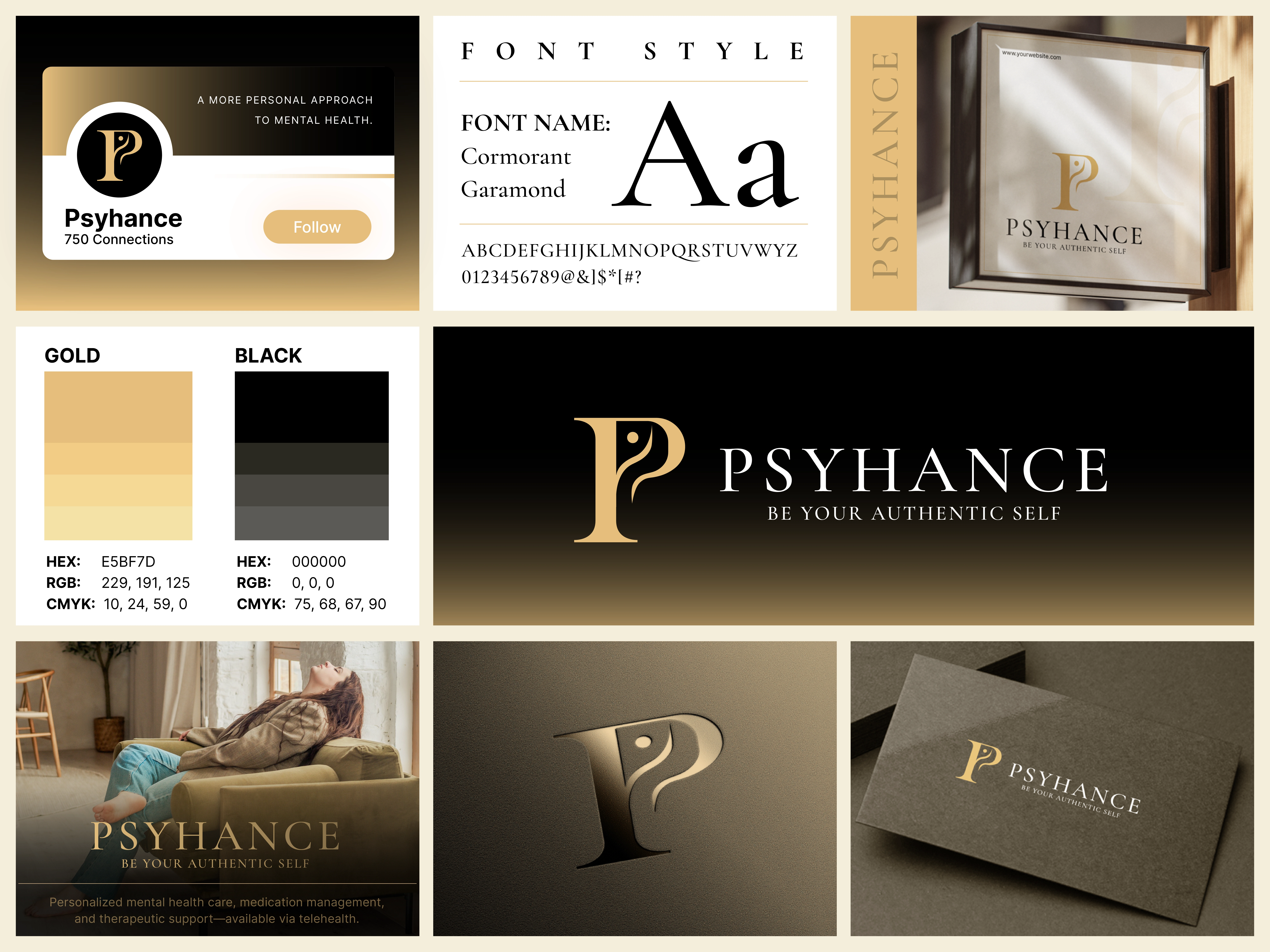
The result is an elegant visual identity centered around a custom P monogram with a subtle human profile integrated into the letterform.
The Challenge
Mental health branding requires a careful balance.
A psychiatric practice needs to communicate clinical credibility and professionalism, but an identity that feels too medical or institutional can create emotional distance.
For Psyhance, the objective was to develop a brand that felt:
Professional yet personal.
Premium yet approachable.
Clinical yet human.
Confident without feeling intimidating.
The identity also needed to differentiate the practice from conventional healthcare branding built around generic medical crosses, brains, hearts, or wellness icons.
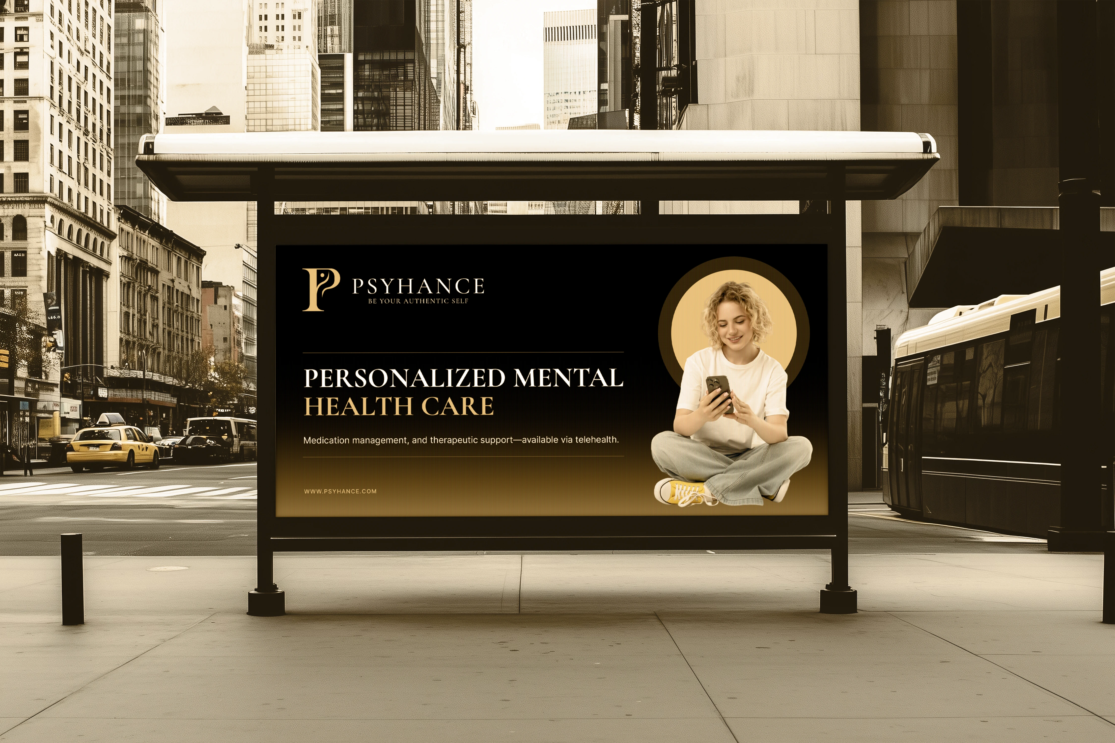
The Big Idea P + Person
The concept begins with the first letter of Psyhance, “P.”
Rather than treating it as a simple typographic monogram, I transformed the letter into a meaningful visual symbol by incorporating an abstract human face and figure within its negative space and structure.
The circular detail suggests the head, while the flowing form underneath creates the impression of a human profile.
Together, the elements communicate:
P → Psyhance
Human Profile → Individual & Personal Care
Flowing Form → Growth & Transformation
Unified Symbol → Mental Health + Human Connection
This creates a distinctive logo that connects directly to both the brand name and its purpose.
A More Personal Approach to Mental Health
✔ At the heart of Psyhance is the belief that mental healthcare should recognize the individual—not simply the diagnosis.
✔ That idea became an important part of the visual identity.
✔ The person integrated into the P monogram represents the individual at the center of care, while the surrounding letterform suggests support, guidance, and personal development.
✔ Rather than illustrating psychiatry literally, the symbol focuses on the person behind the treatment—supporting the brand's positioning around integrative and personalized psychiatric care.
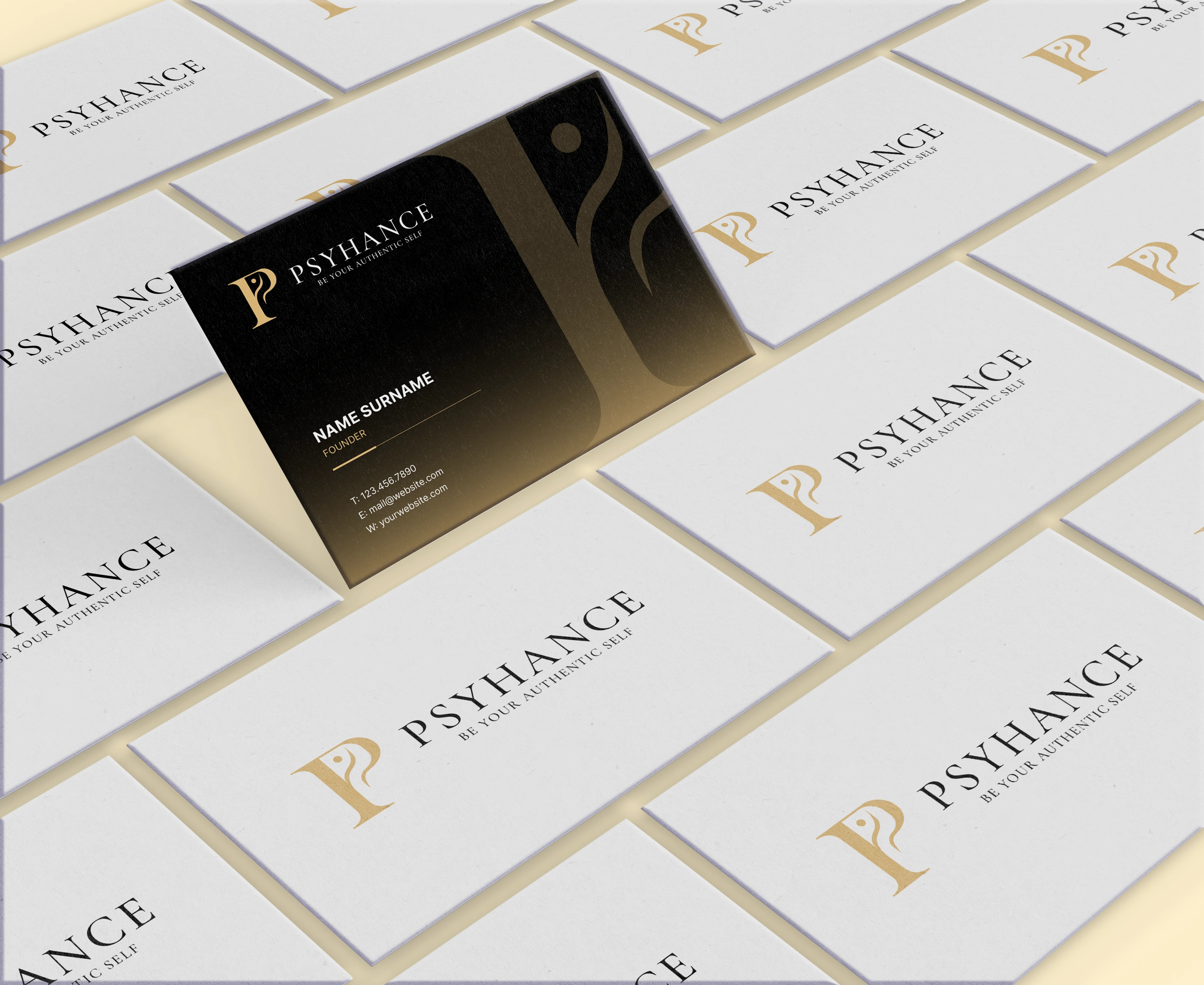
Connecting the Identity With “Be Your Authentic Self”
The tagline “Be Your Authentic Self” adds an important emotional dimension to the brand.
Psyhance isn't positioned simply around treatment. Its identity represents the journey toward greater self-understanding, confidence, balance, and authenticity.
This influenced the overall visual direction.
The human-centered monogram, sophisticated typography, and restrained color palette work together to create a brand that feels calm and established while still carrying a sense of individuality.
The result is an identity designed to visually reinforce Psyhance's promise: helping people move toward a healthier and more authentic version of themselves.
A Sophisticated Gold & Black Color Palette
The visual identity uses a carefully balanced gold and black palette.
Gold introduces warmth, optimism, confidence, and a premium quality, while black provides authority, stability, sophistication, and contrast.
Supporting neutral and lighter gold tones allow the identity to adapt across different backgrounds and applications without losing its recognizable character.
Together, the palette gives Psyhance a distinctive presence that moves away from the predictable blues and greens frequently associated with healthcare brands.
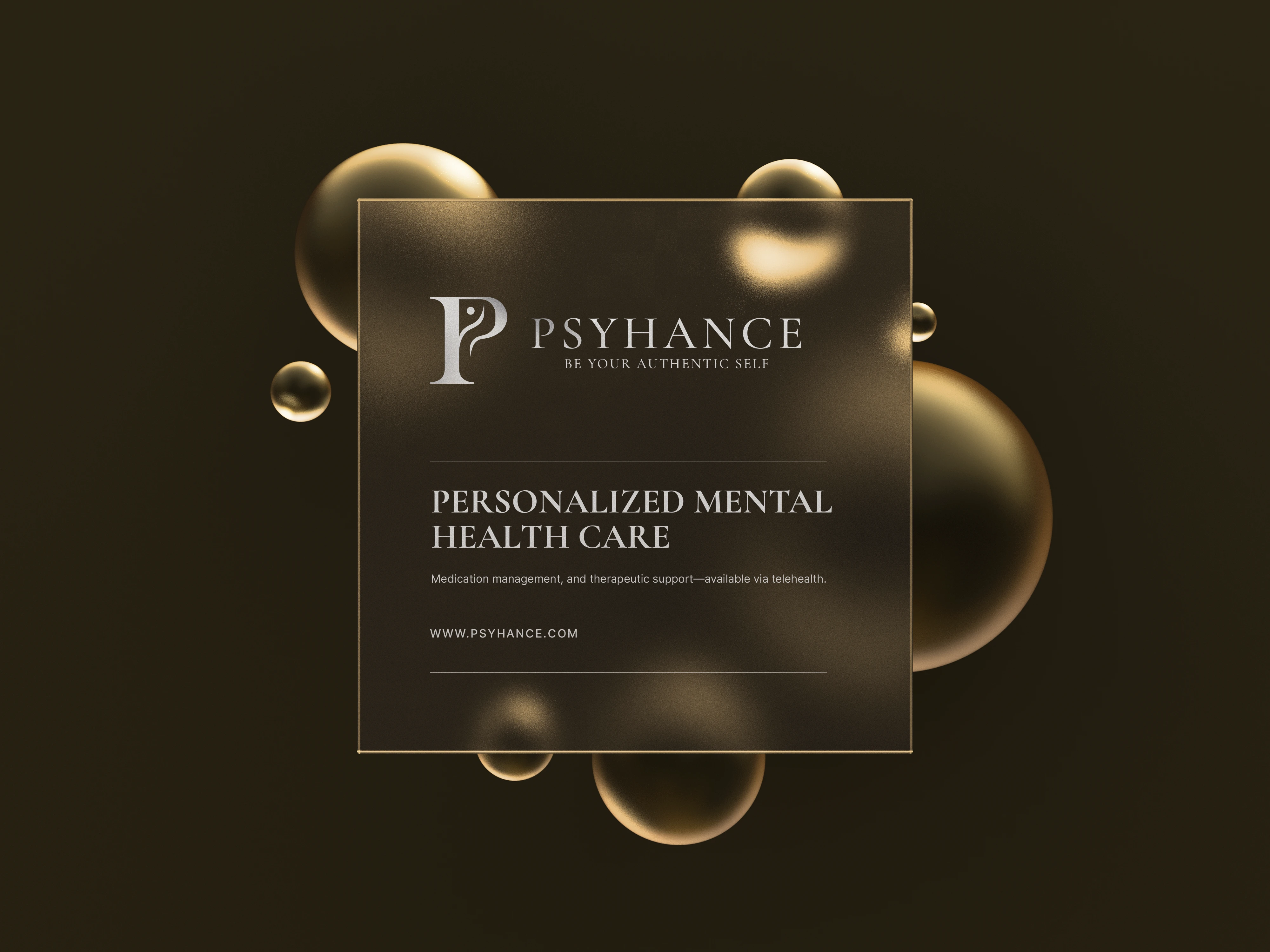
Typography Calm, Established & Refined
The identity uses Cormorant Garamond, an elegant serif typeface that complements the distinctive monogram.
Its refined letterforms give the Psyhance wordmark a sophisticated and established appearance while maintaining enough warmth to suit a patient-focused mental health practice.
The combination creates a deliberate contrast:
Modern Symbol + Classic Typography
Human Connection + Professional Credibility
Emotional Warmth + Clinical Confidence
Mental Healthcare Without the Clinical Clichés
One of the most important decisions was what not to include.
Instead of relying on obvious symbols such as brains, medical crosses, hearts, or generic wellness imagery, the Psyhance identity communicates mental healthcare through a more subtle and ownable visual concept.
By embedding the human figure directly within the P, the logo becomes specific to Psyhance rather than simply identifying the industry.
This gives the practice a recognizable brand asset that can build stronger visual recognition over time.
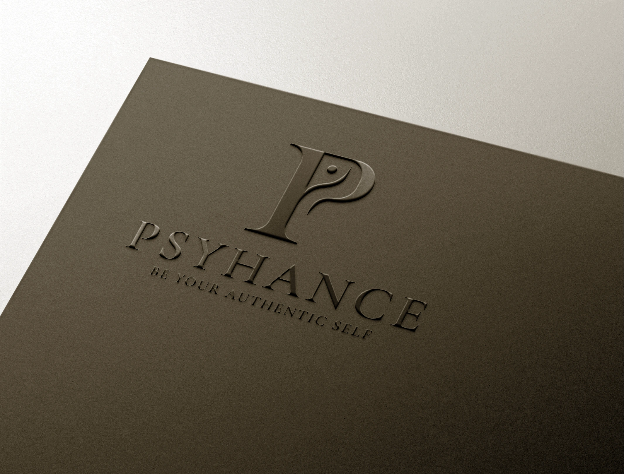
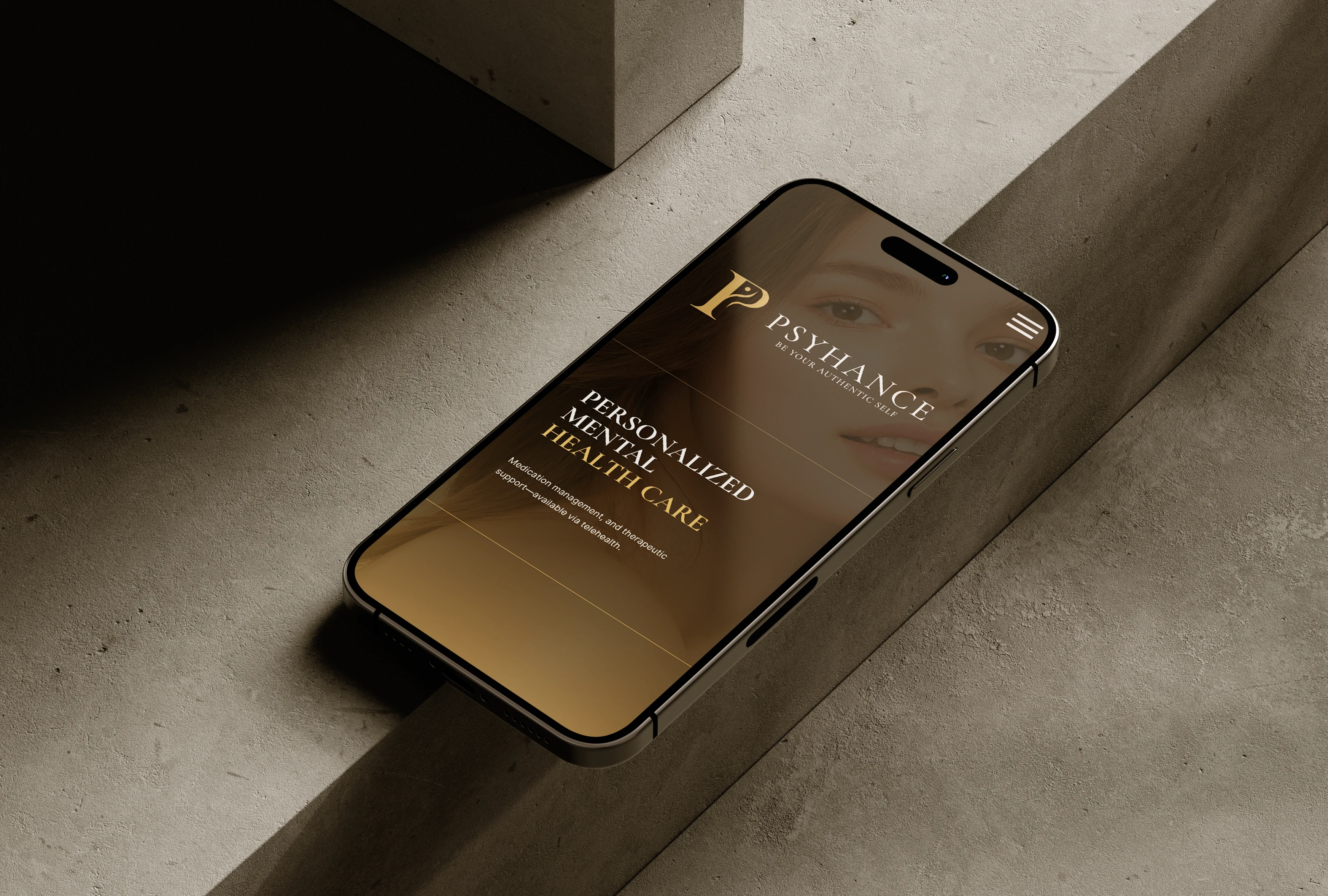
Designed for a Modern Psychiatric Practice
The identity was developed to remain consistent across both digital and physical patient touchpoints.
The complete Psyhance wordmark provides a sophisticated presence for the website, signage, stationery, and marketing materials, while the standalone P symbol can work effectively as a compact brand mark across social media, digital profiles, appointment platforms, and smaller applications.
The system can extend naturally across:
Website & Telehealth · Social Media · Practice Signage · Business Cards · Patient Materials · Digital Communications · Marketing Collateral
This flexibility helps Psyhance maintain a consistent and professional experience wherever patients interact with the practice.
The Result
The final Psyhance identity brings together mental health, individuality, professionalism, and personal transformation within a refined visual system.
The custom P monogram creates an immediate connection to the brand name, while the integrated human profile adds meaning and reinforces the practice's people-first philosophy.
Combined with sophisticated typography and a warm gold-and-black palette, the result is a premium yet approachable psychiatric brand identity designed to build recognition, trust, and emotional connection.
More Than a Psychiatry Logo An Identity About the Individual
Mental healthcare is ultimately about people, their experiences, challenges, growth, and individual journeys.
That philosophy became the foundation of the Psyhance identity.
The P represents Psyhance.
The person represents the individual.
The flowing form represents growth.
The tagline gives the identity its purpose.
Looking for a Premium Logo & Brand Identity?
I help technology, SaaS, AI, energy, industrial, and B2B companies turn complex ideas into clear, distinctive, and scalable visual identities. I help businesses turn complex ideas into clear, distinctive, and memorable visual identities.
If you're launching, repositioning, or evolving a technology, SaaS, energy, or B2B brand, I'd love to help shape its visual direction.
Visit my profile and message me directly to get started on your project.
Like this project
Posted Oct 6, 2026
Logo and brand identity for Psyhance, a private psychiatry practice focused on integrative mental healthcare, therapy, and personalized care.
Likes
0
Views
1
Timeline
Sep 16, 2026 - Sep 19, 2026
Clients
99designs