Occupational Healthcare Logo Design & Medical Brand Identity

Sohil Obor


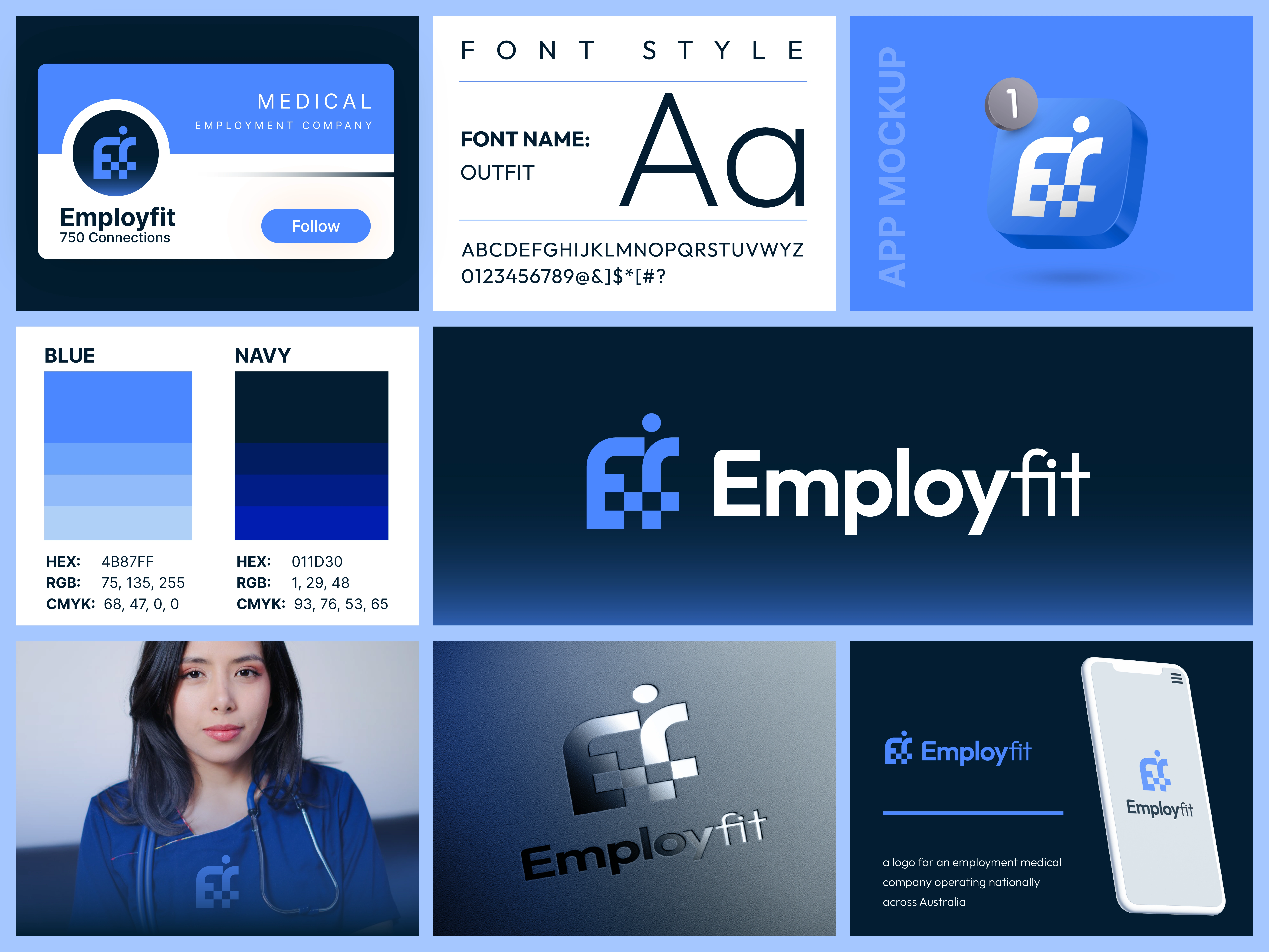
EF Medical Occupational & Employment Medical Logo Design
Overview: A Modern Identity Built Around People, Health & the Workplace
EF Medical is an occupational and employment medical services brand focused on workplace health, employee assessments, and supporting people throughout the employment process.
The goal was to create a professional medical logo and brand identity that communicated healthcare and trust while avoiding the predictable visual language often seen in the medical industry.
The solution brings together three meaningful ideas within one compact symbol: EF + Medical + People.
The Challenge
Healthcare and occupational medical brands need to communicate trust, professionalism, accuracy, and care immediately.
At the same time, EF Medical needed an identity that could stand apart from conventional healthcare logos built around standalone crosses, hearts, stethoscopes, or generic medical symbols.
The challenge was therefore to create something simple and recognizable, directly connected to the EF Medical name while subtly representing both healthcare and the people the business serves.
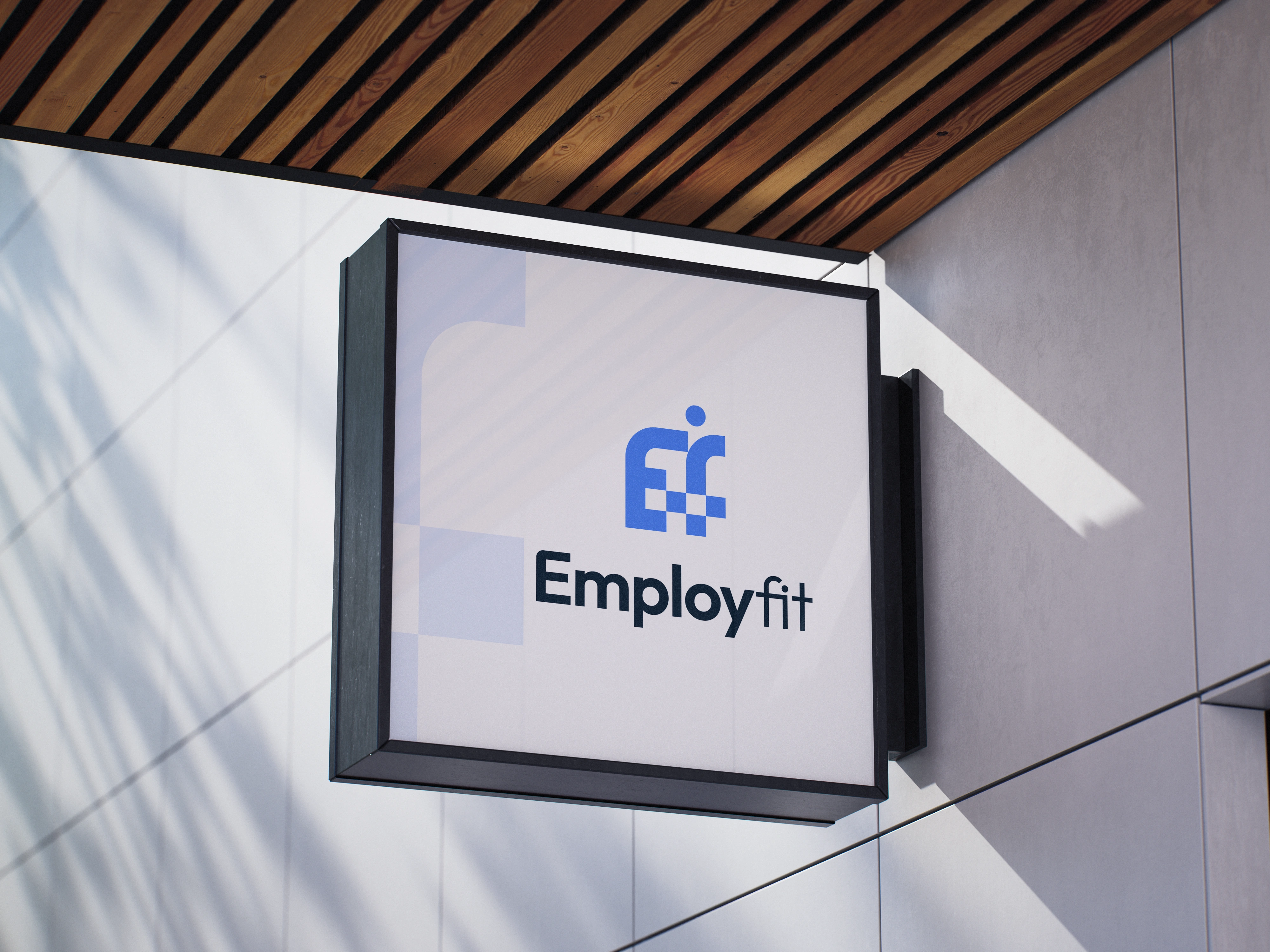
The Big Idea EF + Medical Cross + Person
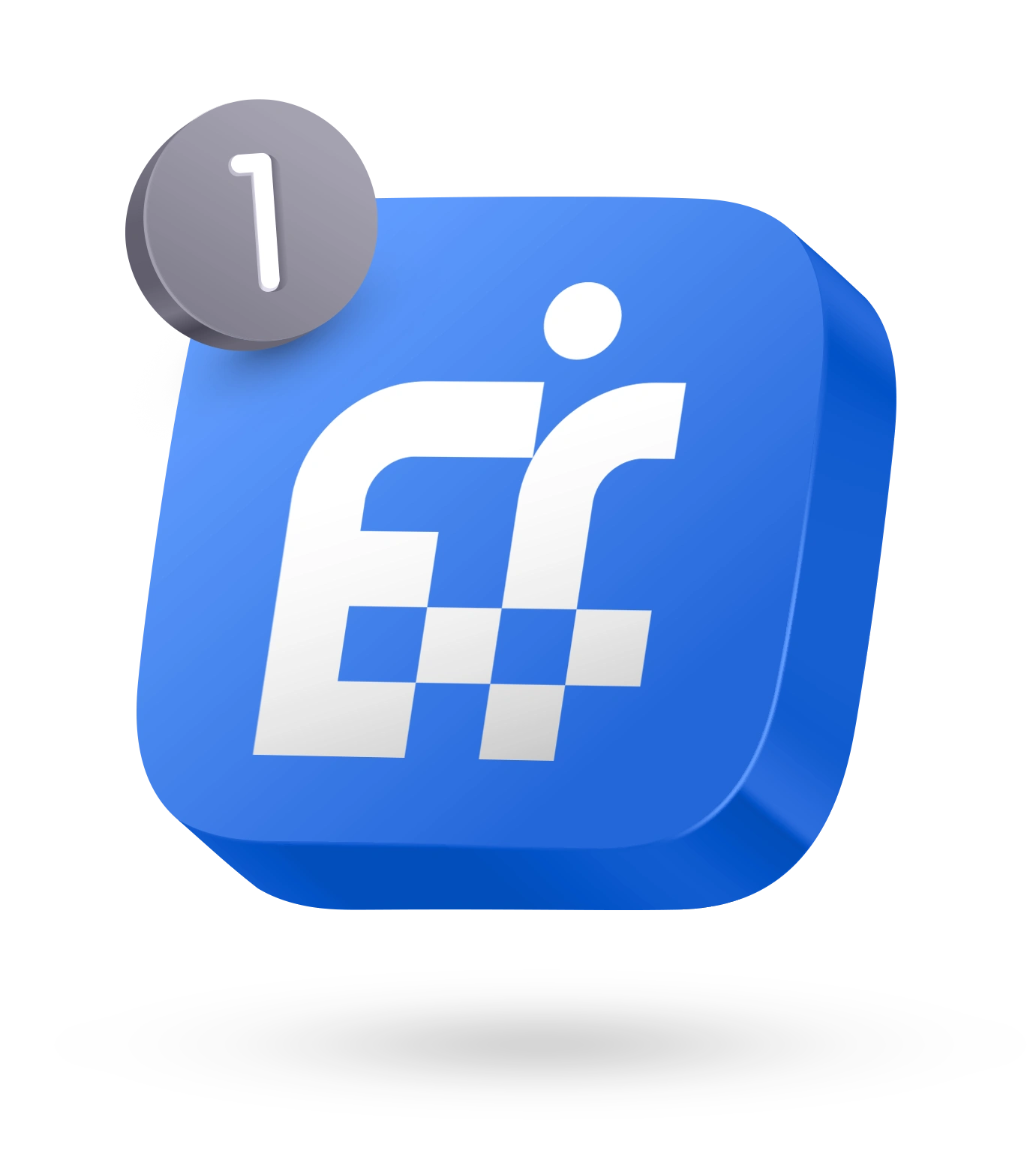
The logo was built around a custom combination of the letters “E” and “F,” transforming the brand initials into a distinctive and ownable symbol.
Rather than adding a separate healthcare icon, the medical plus sign is integrated directly into the letterform structure. This creates an immediate connection to the medical industry while keeping the overall mark clean, modern, and minimal.
A circular dot represents a person, introducing the human element at the heart of occupational healthcare.
Together, these elements create one unified idea:
E + F → EF Medical
Plus Sign → Healthcare & Medical Services
Circle → Person / Employee
Unified Symbol → People + Workplace Health
Putting People at the Center
Occupational medicine isn't only about assessments, reports, and workplace requirements — ultimately, it's about people.
That became an important part of the visual concept.
The circular element gives the geometric EF symbol a human presence, representing the employee or individual being assessed and supported. Its relationship with the medical cross reinforces the connection between people, health, and employment.
This subtle detail gives the identity meaning without making the logo overly literal or complicated.
Healthcare Without the Clichés
✔ One of the key design decisions was to avoid relying on an obvious standalone medical symbol.
✔ Instead, the healthcare reference becomes part of the logo's architecture.
✔ By integrating the plus sign within the EF monogram, the identity communicates the medical sector naturally while retaining a distinctive connection to the company name.
✔ This creates a logo that feels specifically designed for EF Medical, rather than a generic medical icon paired with typography.
A Clean, Professional Visual Language
The identity was designed with a modern and minimal approach suitable for both healthcare and corporate environments.
Strong geometric construction communicates structure, reliability, and professionalism, while the human element prevents the identity from feeling overly technical or clinical.
The result balances two sides of the brand:
Medical Precision + Human Care
Corporate Professionalism + Approachability
This makes the identity appropriate for communication with employees, employers, healthcare professionals, and corporate organizations.
The Result
The final EF Medical logo turns several meaningful ideas into one simple visual system.
Rather than treating the EF initials, medical cross, and human figure as separate elements, they work together as a single recognizable symbol.
The result is a modern occupational healthcare brand identity that communicates people, medicine, trust, professionalism, and workplace wellbeing while remaining distinctive and scalable.
More Than a Medical Symbol
The strongest healthcare identities don't need to explain everything literally.
For EF Medical, the concept was built by finding a meaningful connection between the company's name, industry, and audience.
EF creates the identity.
The plus sign represents healthcare.
The person represents who the brand exists to serve.
Together, they form a simple but purposeful identity designed for a modern occupational and employment medical brand.
Looking for a Premium Logo & Brand Identity?
I help technology, SaaS, AI, energy, industrial, and B2B companies turn complex ideas into clear, distinctive, and scalable visual identities. I help businesses turn complex ideas into clear, distinctive, and memorable visual identities.
If you're launching, repositioning, or evolving a technology, SaaS, energy, or B2B brand, I'd love to help shape its visual direction.
Visit my profile and message me directly to get started on your project.
Like this project
Posted Oct 5, 2026
Modern logo and brand identity for EF Medical, combining an EF monogram, medical cross, and human element for occupational healthcare services.
Likes
0
Views
1
Timeline
Sep 16, 2026 - Sep 21, 2026
Clients
99designs