'Barely There' Lip Balm
Barely There - Lip Balm Brand
Project Overview
Mission
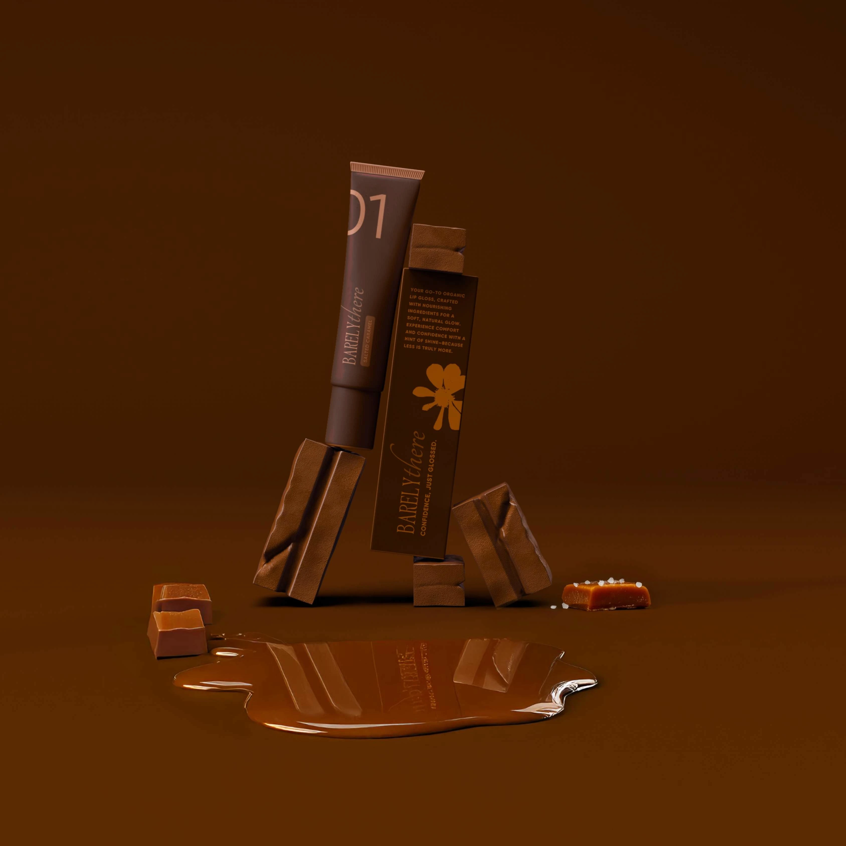
Redefine Barely There’s visual identity and packaging to reflect a sense of natural indulgence - positioning the lip balm as both a beauty essential and a self-care ritual.
Outcome
A cohesive, sensory-driven brand system that feels warm, modern, and tactile. The refreshed identity elevates the product experience while remaining approachable and scalable for future flavor extensions.
Deliverables
Brand & Visual Identity · Packaging Design · Brand Strategy · AI-Generated Product Visuals & Videos (Krea AI) · Creative Direction
Made with Krea AI | Best Experienced with Sound On
Concept
Barely There celebrates effortless beauty and quiet luxury - where comfort meets sophistication.
The brand identity channels softness and self-assured simplicity through tone, typography, and tactile detail.
Creative Approach
The design process began with research into natural beauty, self-care rituals, and minimal product branding. I explored typography and packaging layouts that conveyed simplicity, tactility, and timelessness. Early concepting focused on visual harmony - balancing purity with warmth through material, texture, and tone.
Every choice-from typography and color palette to packaging finish-was intentional, aiming to create a brand that feels premium yet approachable, and that enhances the daily ritual of lip care.
Visual Direction
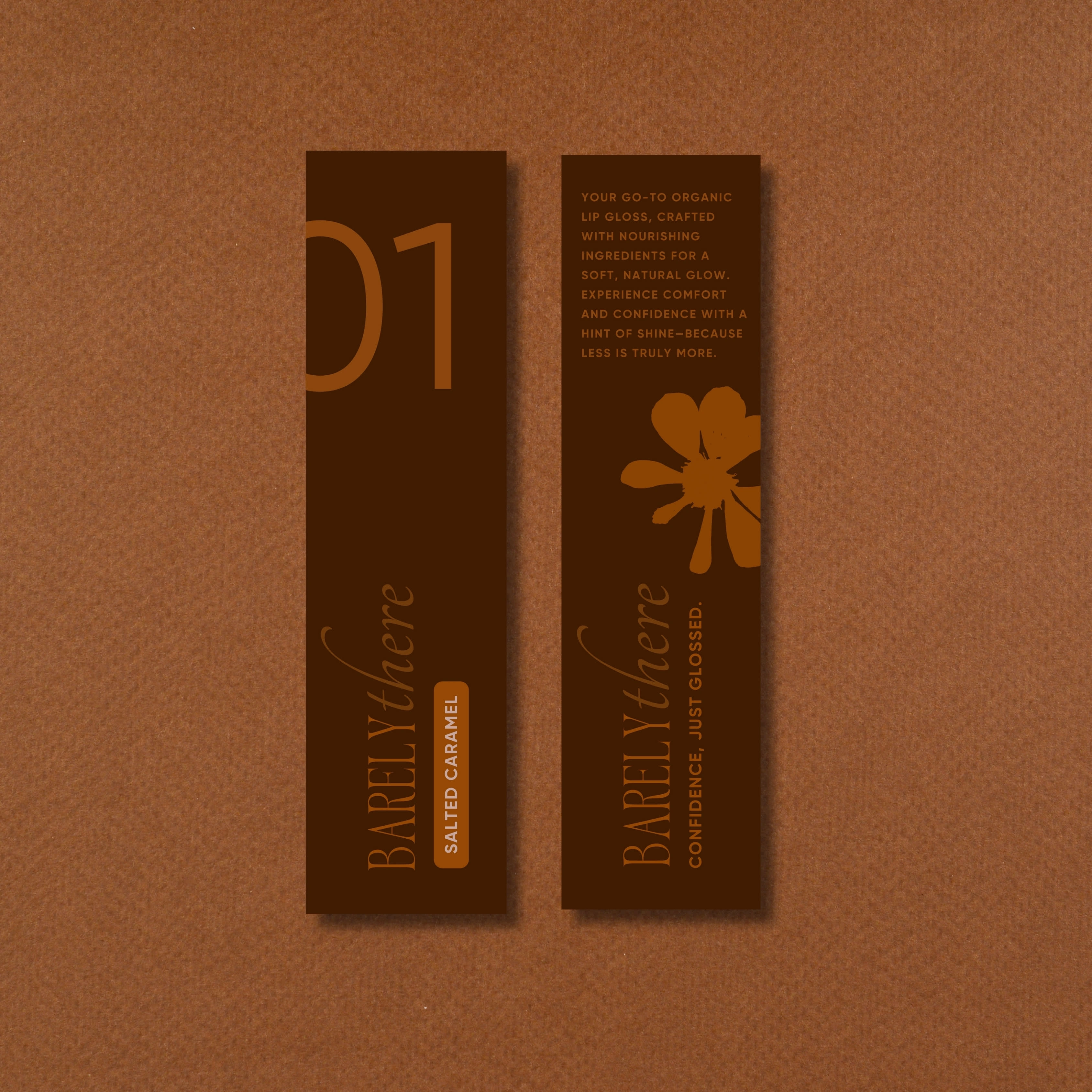
The identity embraces warmth, simplicity, and sophistication, drawing from the sensory richness of chocolate and caramel. Deep brown and amber tones ground the brand in organic comfort, while maintaining a refined, modern edge. This monochromatic palette creates a unified visual experience that mirrors the balm’s nourishing, pure essence.
Minimal typography introduces balance and air - offering visual clarity against the richness of the color story. Thoughtful lighting and composition highlight tactile contrasts: matte versus gloss, solid versus melt, texture versus smoothness. These details evoke both indulgence and restraint, capturing Barely There’s ethos of effortless beauty and quiet luxury.
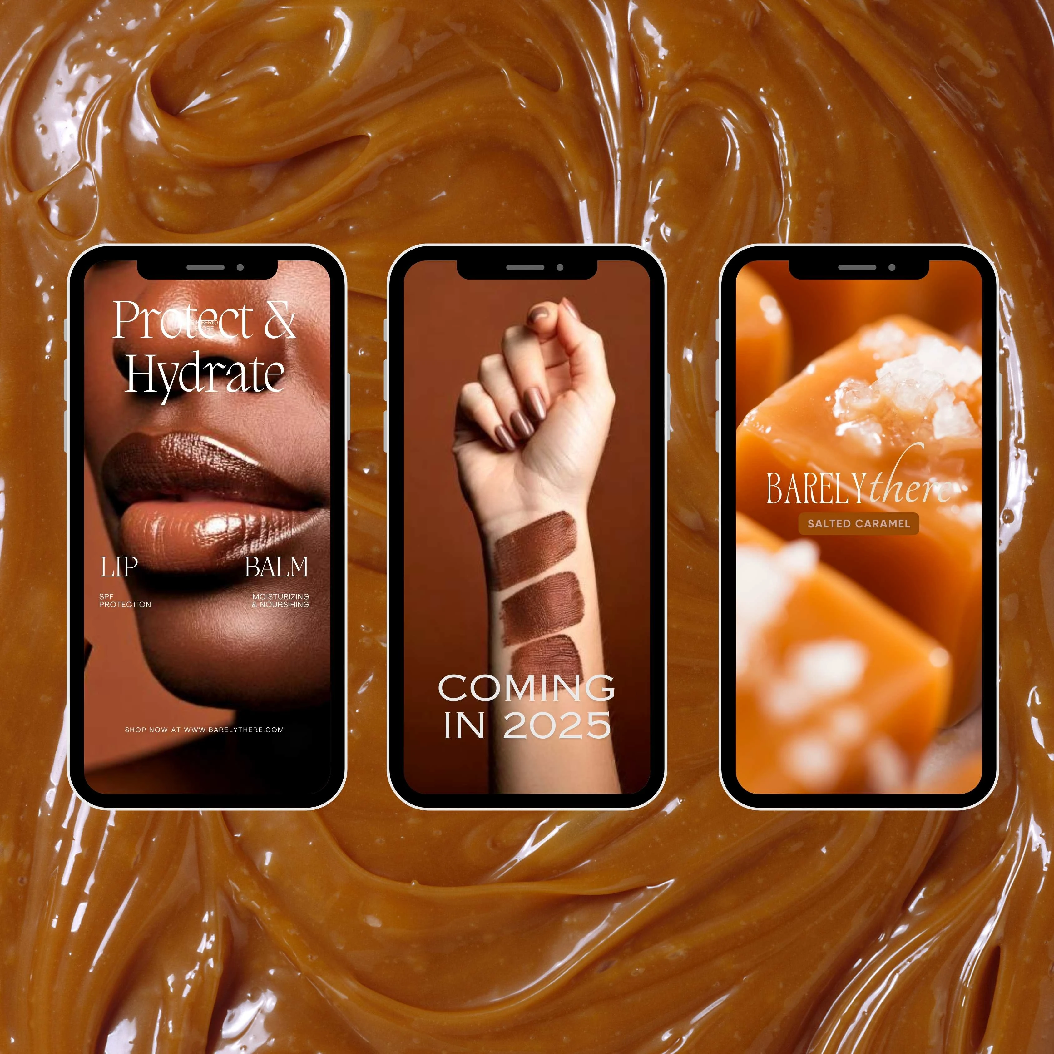
Supplemental imagery and video content, generated using Krea AI, expand the brand’s sensory narrative through soft lighting, organic textures, and subtle movement. Together, these elements form a scalable, timeless system - ready to evolve with new product stories while maintaining an unmistakable visual voice.
Product In Action
Social Media Design
Photography Direction
Made with Krea AI | Best Experienced with Sound On
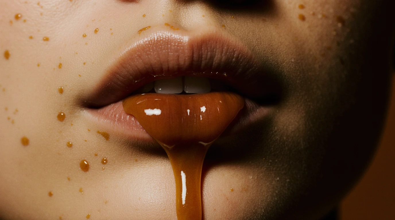
Made with Krea AI
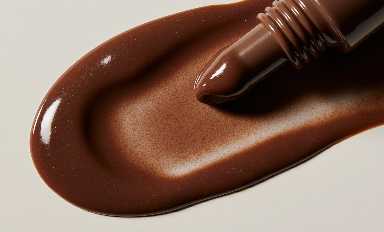
Made with Krea AI
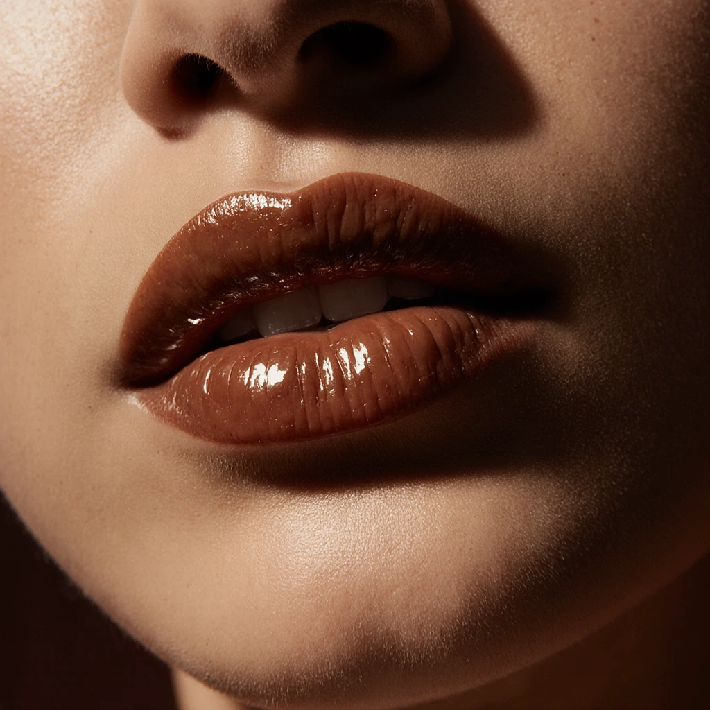
Made with Krea AI
Outcome
A modern, sensorial brand identity that bridges design precision with emotional depth - inviting users to slow down, savor, and celebrate the ritual of care.
Like this project
Posted Jan 29, 2025
Barely There is a bold minimalist lip balm brand debuting 'Salted Caramel', with brand strategy, visual identity, packaging, and AI-driven visuals.

