The Green Green - Matcha Brand
Monserrat Vazquez
The Green Green – Matcha Brand
Project Overview
Mission
The Green Green set out to redefine the matcha experience by making it fun, bold and out‑of‑the‑box. The goal was to design packaging that reflects matcha’s versatility and personality while staying visually captivating and approachable. Each tin was crafted to embody a unique “Matcha Mood,” offering customers a personal connection to their matcha rituals.
Outcome
A cohesive, mood-driven brand system that feels vibrant, approachable, and premium. The refreshed identity elevates the product experience while remaining flexible for new flavors or limited editions.
Deliverables
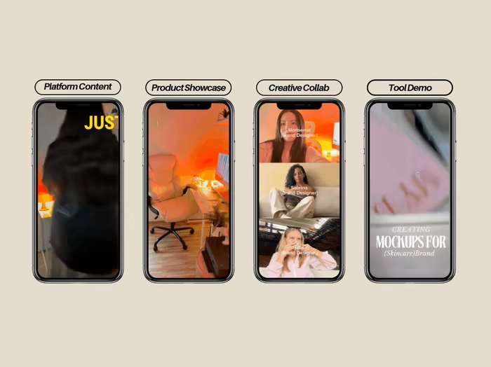
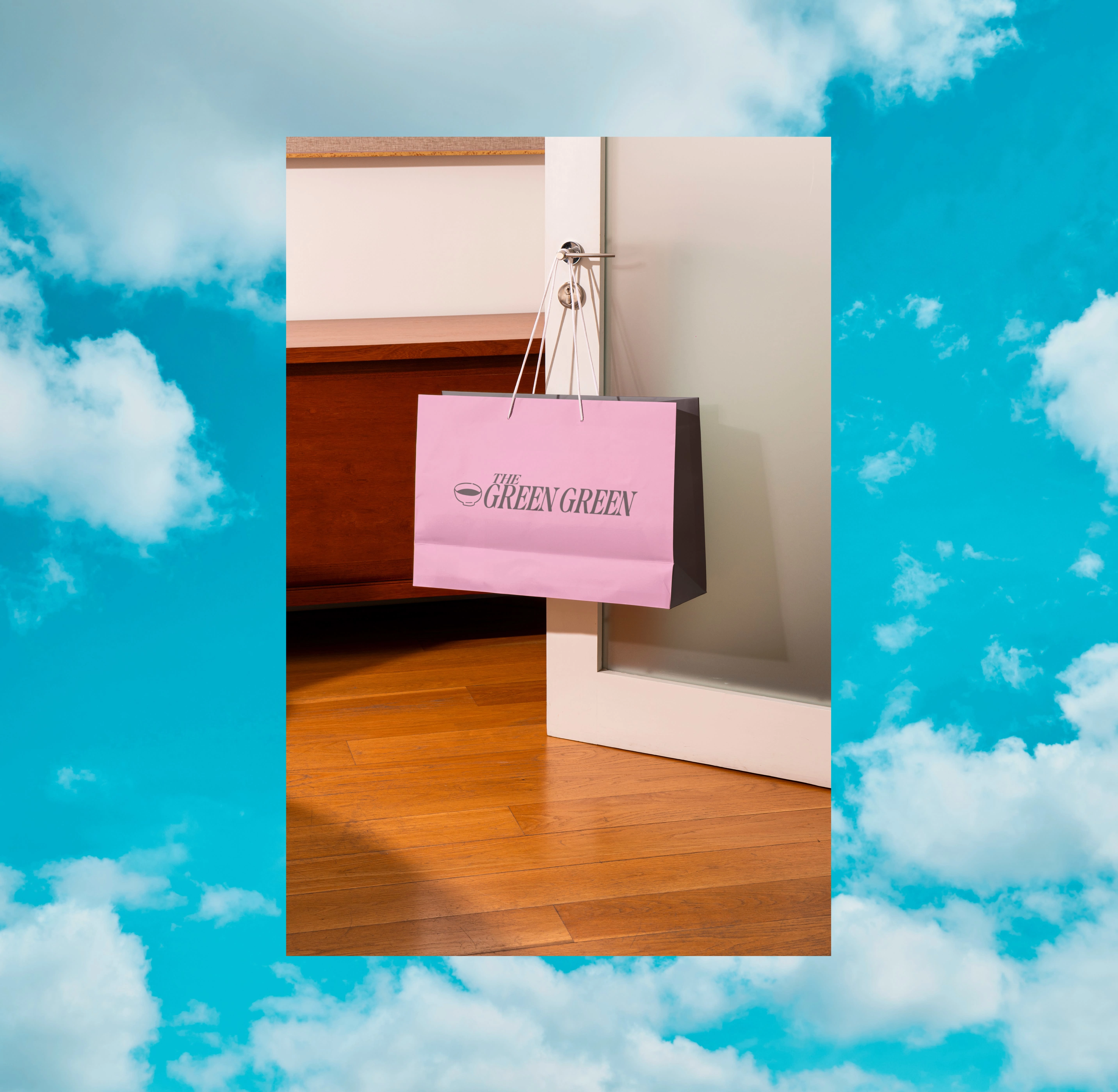
Brand & Visual Identity · Packaging Design · Brand Strategy · AI Product Photography & Videos (Krea AI) · Creative Direction
Logo Suite
Made with Krea AI | Best Experienced with Sound On
Concept
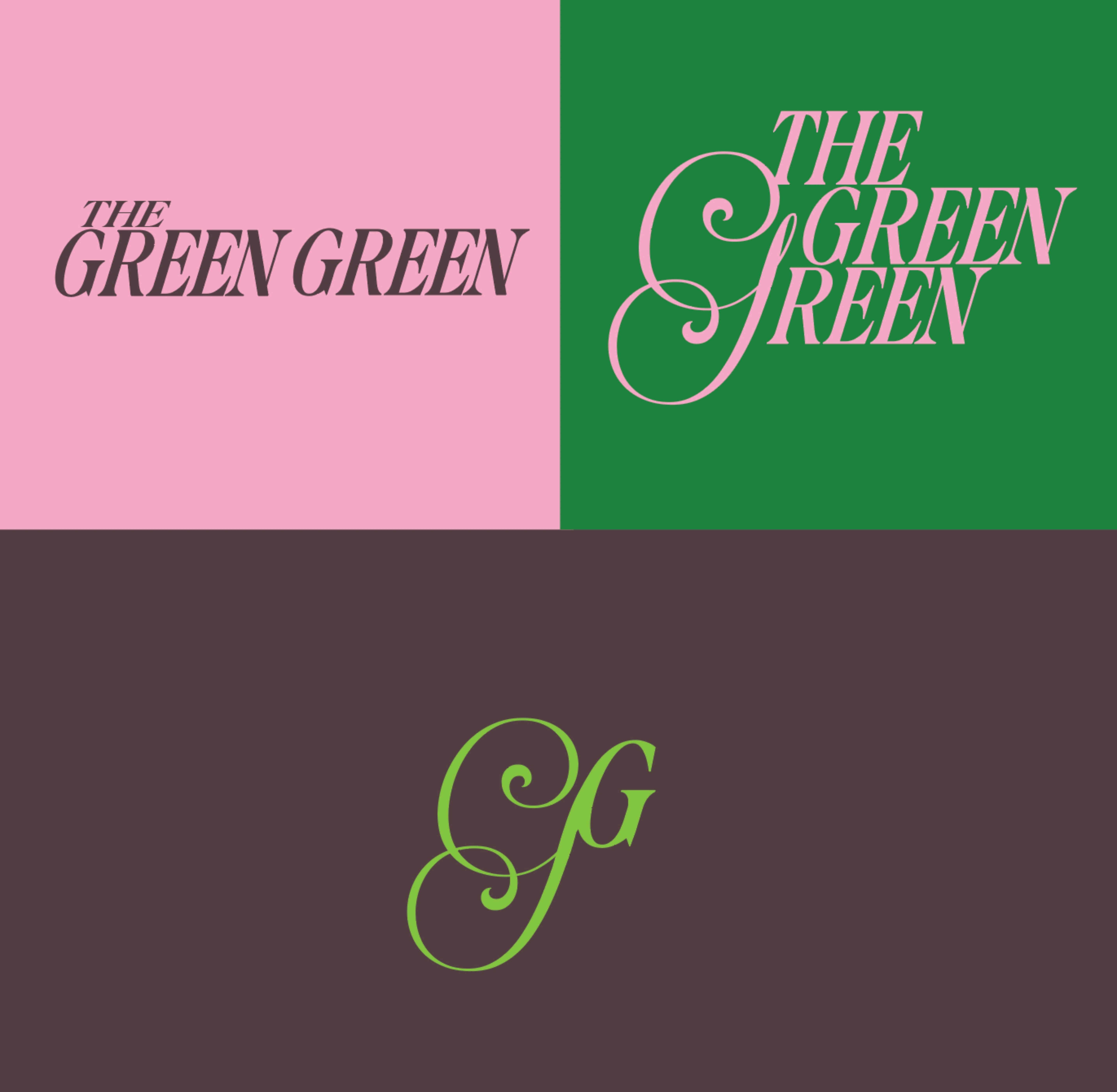
The Green Green celebrates matcha as a versatile, expressive ritual — where focus, creativity, and indulgence meet. The brand identity channels personality and energy through typography, color, and packaging design.
Creative Approach
The design process began with research into premium matcha packaging, modern lifestyle branding, and the emotional experiences associated with tea rituals.
Focused on creating distinct “Matcha Moods” - each tin reflecting a specific moment or vibe: calm, energized, or playful. Every design choice - from typography and monogram to color and finish - was intentional, aiming to craft a brand that feels premium yet inviting.
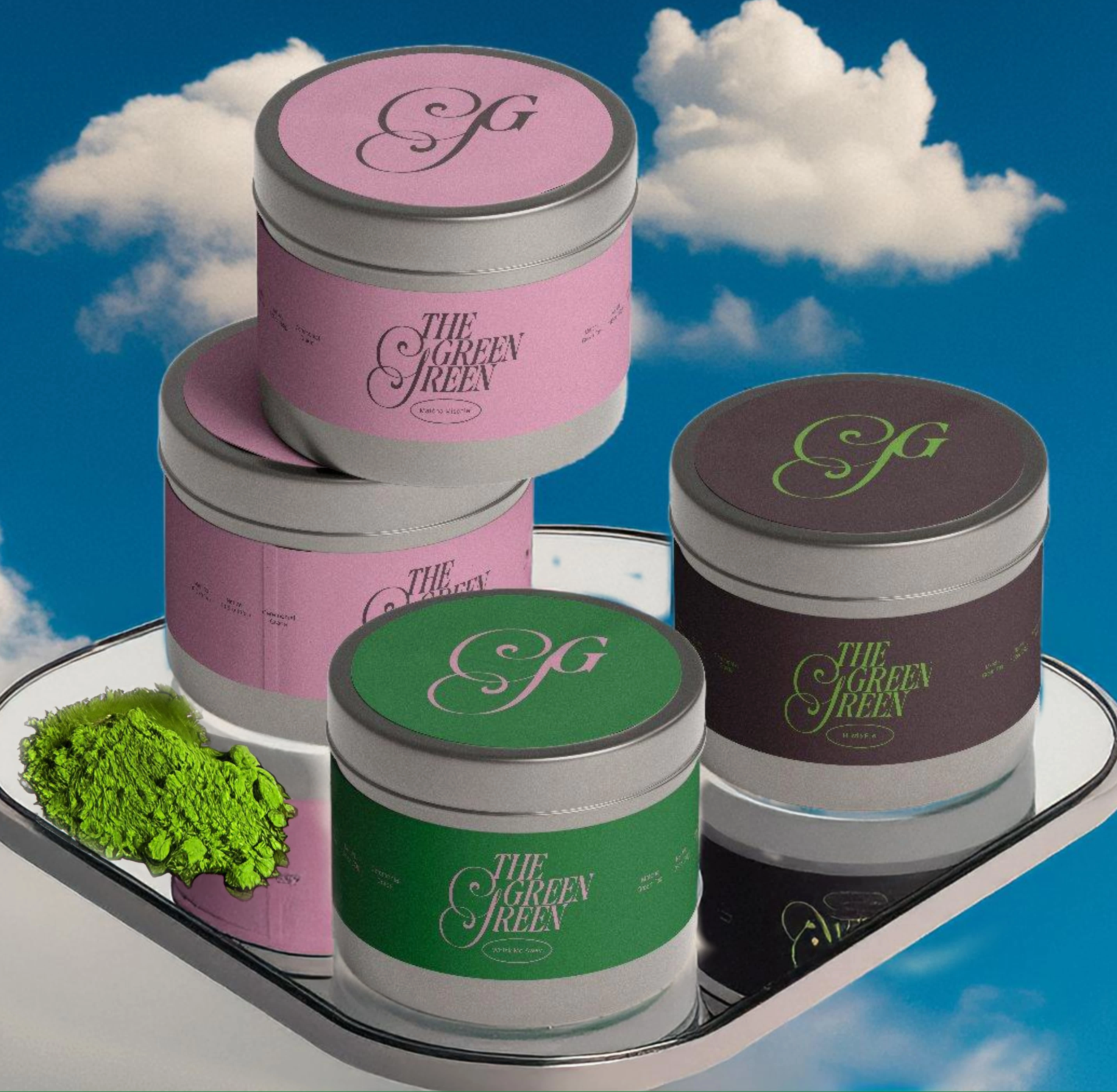
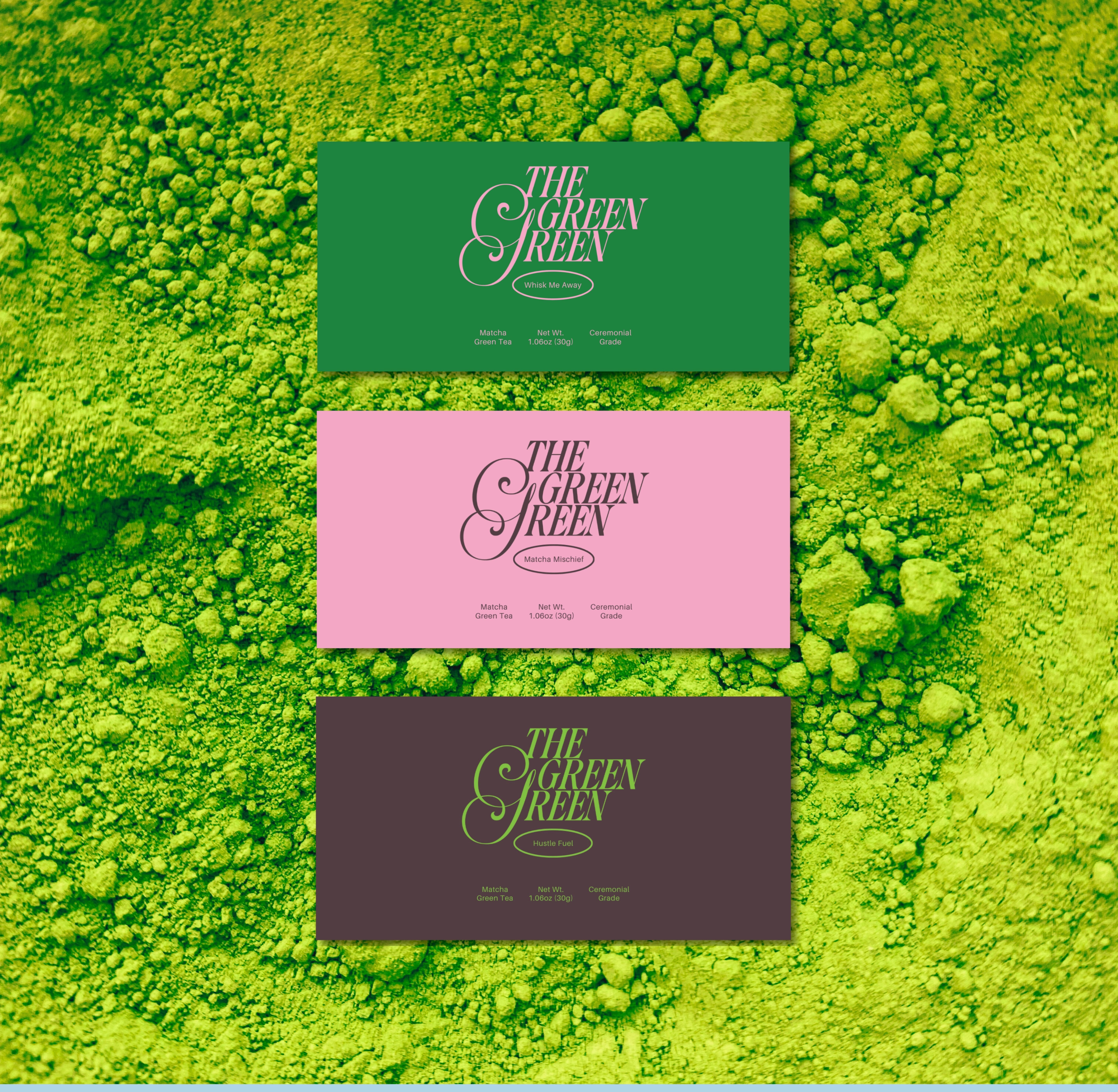
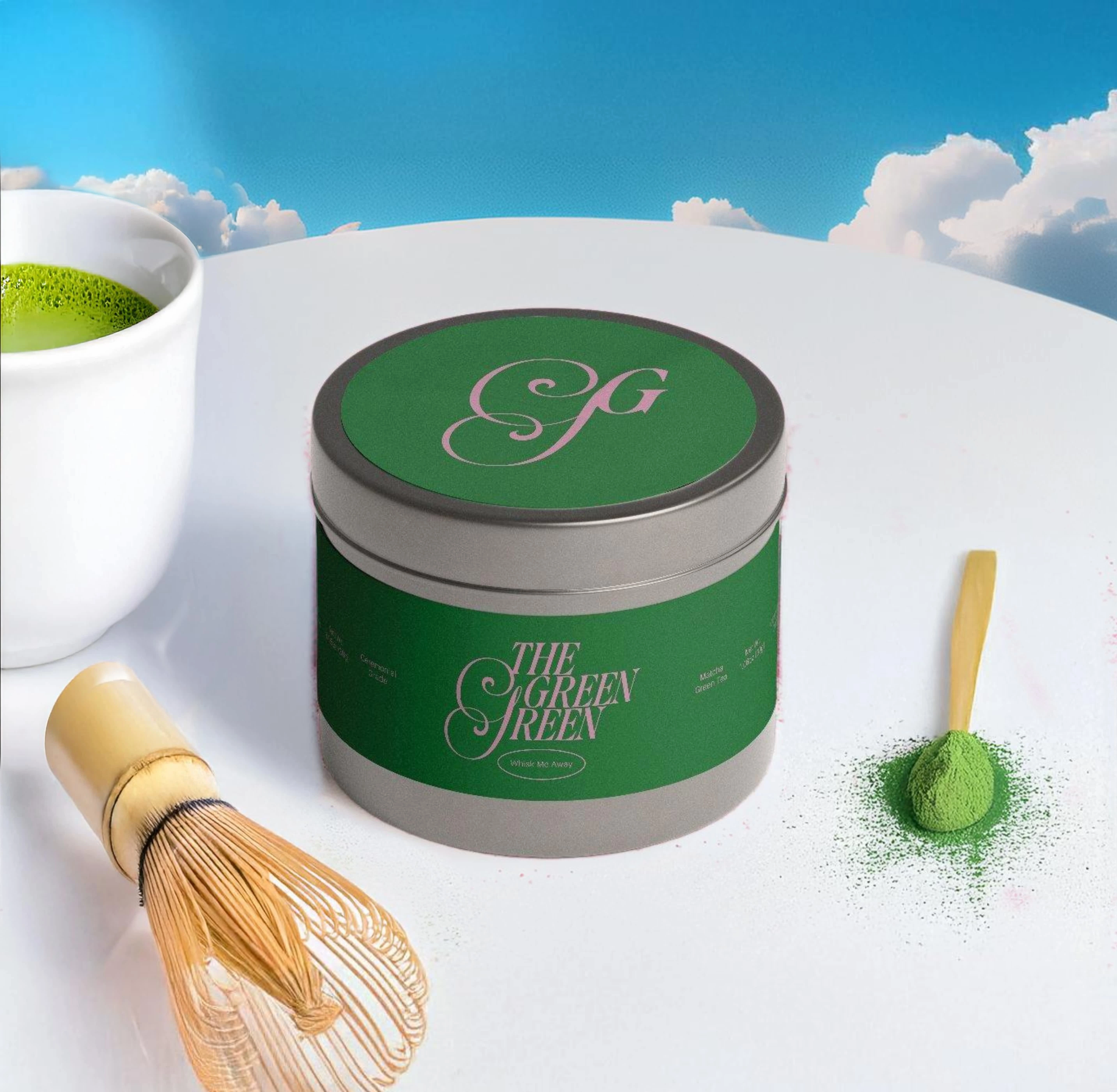
The final label designs feature three distinct tins, each with its own personality and vibrant color story:
Whisk Me Away 🌿: A rich green tin representing calm and sophistication, designed for ceremonial matcha moments. The deep green speaks to tranquility and balance, perfect for mindful rituals.
Hustle Fuel ⚡️: A dark brown tin with bold green accents for the go-getters. The grounded, energetic design mirrors the powerful caffeine boost matcha offers, making it ideal for focus and productivity.
Matcha Mischief 🥄: A playful pink tin encouraging creativity and fun. The design invites culinary experimentation, from matcha lattes to desserts, with a lighthearted and adventurous vibe.
Visual Direction
The identity embraces vibrancy, sophistication, and personality, drawing from the sensory richness of matcha. Three tins anchor the color story: deep green for calm, dark brown for energy, and soft pink for playful creativity. This palette creates a visually unified experience while allowing each mood to stand out.
Typography balances elegance and approachability with a serif logo and swirling monogram that convey craftsmanship and personality. Thoughtful composition and 3D visualization highlight the tins’ tactile qualities - matte versus gloss, smooth versus textured surfaces - reinforcing a sense of premium quality.
Tin product videos, generated using Krea AI, expand the brand’s sensory narrative, showcasing the tins in motion, highlighting texture, color, and packaging personality. These visual stories bring the brand to life, reinforcing its premium yet playful identity.
Made with Krea AI | Best Experienced with Sound On
Outcome
A bold, sensory-driven brand identity that blends visual playfulness with premium design - inviting users to explore matcha with energy, creativity, and confidence.
Award - Online Design Awards (Q4 2025)
Professional Nominee
B1 – Brand Identity
D5 – Packaging Design

Like this project
Posted Jan 12, 2025
Vibrant brand identity, strategy, and packaging design for The Green Green, a bold matcha brand, with tins crafted to reflect unique matcha moods.