Streamlining Product Design for Mobile App
Switch From A Desktop Site To A Mobile First Approach Webapp
A nice challenge, and a great experience closer to the project leaders.
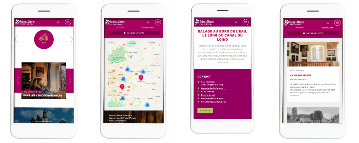
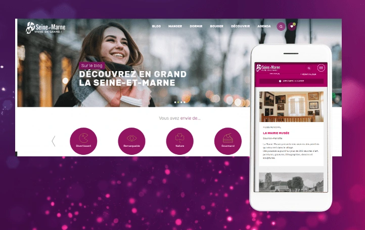
Seine-et-Marne is the world's leading tourist destination (yes, Disneyland Paris is there).I participated in the overhaul of all interfaces, and more particularly in a "mobile-first" approach.
Redesigning all the navigation of an institutional portal and transforming it into a tourist destination site, what a challenge!
THE BRIEF:
“Internet users only connect to our sites with their telephone (+90%), but our sites are not really responsive, and our content does not correspond to mobile use."
“We want to offer an immersive visit experience, by offering a large part to the visual."
THE PROBLEM:
A site in CMS (Drupal) with a very long and complicated development.
A lot of information available, but a content architecture to be completely reviewed.
Great content creation efforts, unfortunately not highlighted.
KEY FUNCTIONS:
Cartography (Open Street Maps),
Route calculation (Google Maps),
IS interfacing (Apidae),
Bookmarking tools,
Content criteria (inspirational engine),
Inclusive Design.
MY INTERVENTION: UX / UI / DATA
As part of this project, I reviewed all the interfaces, user paths, and key features (favorites, mapping, filters, search engines and affinity engines).
DELIVERABLES:
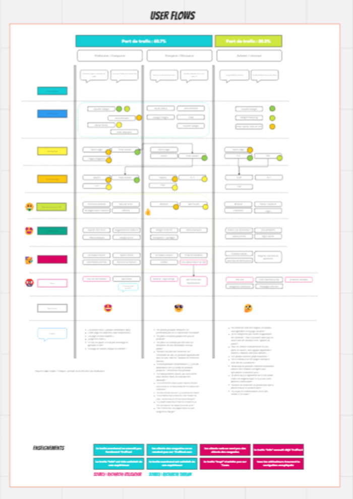
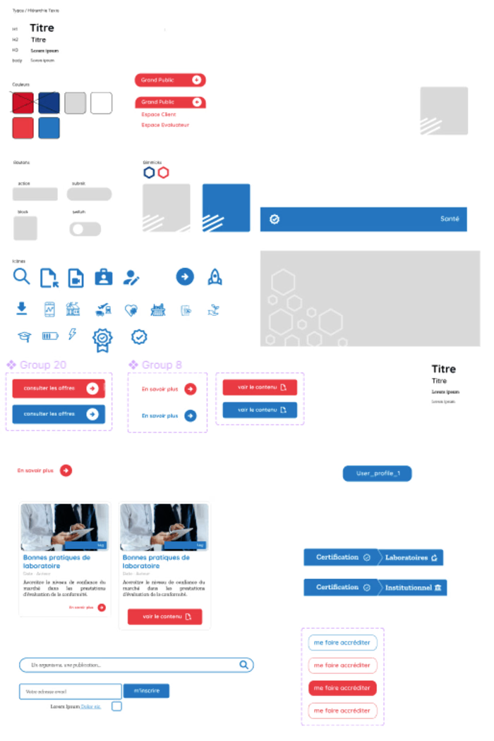
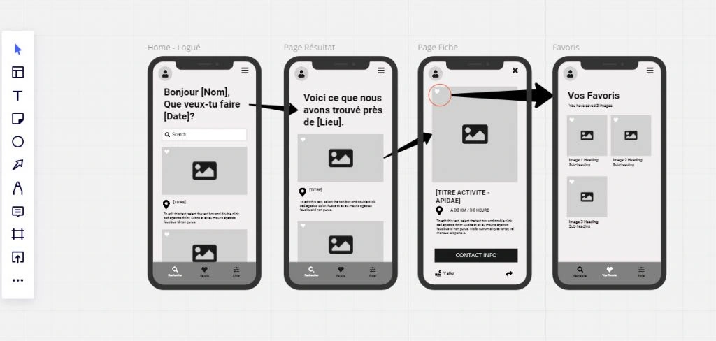
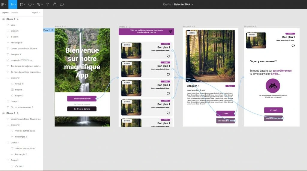
Personas, User Flows, Content Mapping, Mockups and Figma Prototypes for desktop and mobile versions.
Methodology.
Starting From Uses To Offer A Quality Service
Reconcile great diversity of content with a mobile-first approach? Easy !
Main Topics :
Ideation workshops
Focus groups
User Research
Field Research
Personas Definition
User Flows Design
Wireframing
HD Prototyping
Integration
CUSTOMER FEEDBACK :
“Switching to a mobile-first approach has allowed us to refocus on the essential: the service delivered to the visitor.
We had underestimated, in terms of overall user satisfaction, the importance of functions such as cartography and bookmarking.
»
Like this project
Posted Aug 18, 2023
Reimagined a Digital Product so that the key user goals are achieved, switching from a content heavy desktop website to a mobile first webapp.
Likes
0
Views
25
Clients
Région Ile-de-France

