Enhancing User Experience for a major French Gardening Brand
How we improved the Conversion Rate by 150%
Within 6 months

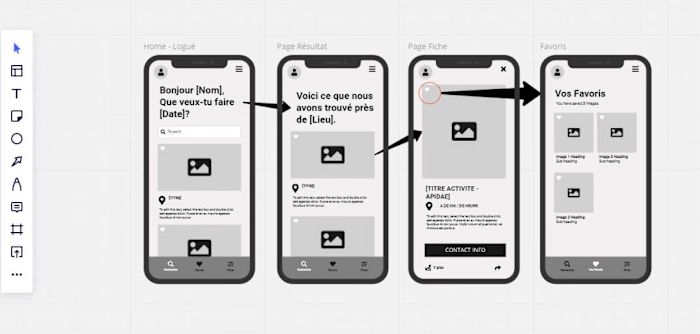
The wireframe structure of the new buybox
Actually, I won't spoil everything, and it's all very confidential, so if needed, feel free to send me a message and I'll gladly talk about this specific topic.
First things first. For this specific Company, the Covid crisis has been a huge moneymaker, thrusting overall digital revenue for what was a really Brick n Mortar retail model.
Then, as I took place is this new office, Business people were struggling at maintaining a high revenue as users were returning to normal life after the Covid crisis.
Indeed, CRO was not a priority here, business used to be excellent during the crisis, as people were forced home and buying from the web, no matter the overall UX. When you really need something, you don't care of the obstacles, right ?
Las, growth was downscaling and the objectives were high, so we had to do something.
Goddamn, what is wrong with this website ?
Conducting a first wide UX audit of the aforementioned, I noticed around 150 pain points in a "normal user journey", from search to payment. Several were quick wins, other were more of a struggle to get going, but yeah, there was a huge gap to cross.
Choosing the fights
In a rather large and complex environment, the deal was to clear a path so that the roadmap would not seem too expensive to the IT team.
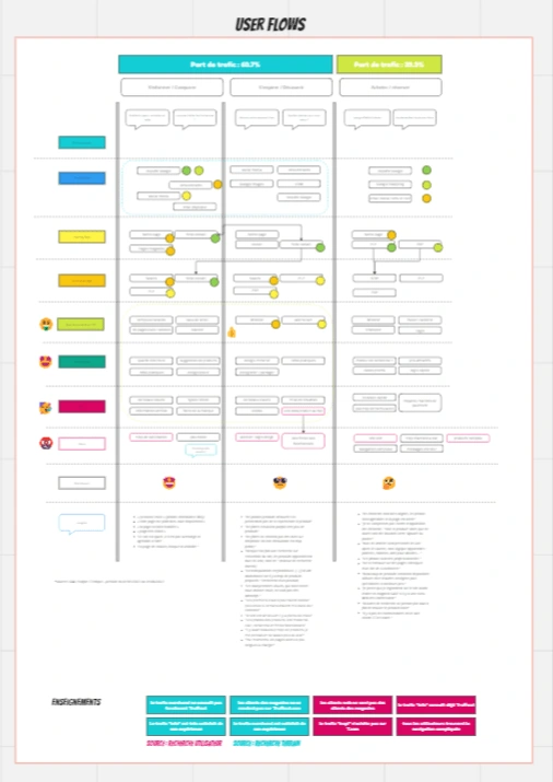
Some of the user flows we studied in order to improve global UX
Let's talk about onboarding
Users want to login fast and easy. Why bother with a long form ?
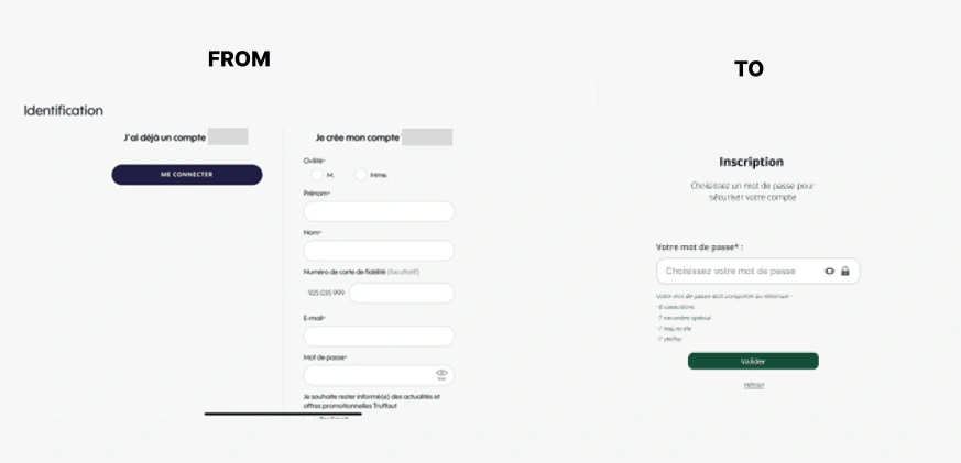
From 7 fields to 1 : +350% new users onboarded !
This rather simple trick has throttled new users'onboardings and account creations, some of them even considering the process "too fast" :)
Add to cart as a new wishlist
Users want to buy something right on the go ? Well, let them do so, from anywhere in the website !
The initial path was PLP > PDP > add to cart.
We placed "add to cart" CTAs wherever necessary to drive conversions. Et voilà ! +20% add to cart events.
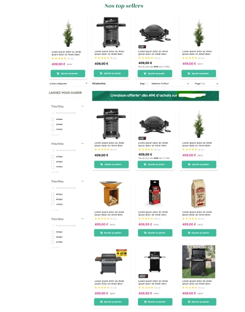
Clear CTAs let the users take any shortcut they want
But Also...
Social Login
Search XP rebuild
Emerch rules rebuild
Constant AB Testing
Constant UX Research (live and quanti / quali)
Like this project
Posted Aug 17, 2023
Revamped the user experience of an e-commerce platform by conducting extensive research to understand user behavior and preferences.
Likes
0
Views
20
Clients
Truffaut

