Revamping an Institutionnal Platform to provide a great UX.
When it comes to rich scientific content, UX is generally poor.
Did you ever consider browsing a knowledge database ? Don't.
Actually, it is really painful, and you may feel the users' suffering just by trying.
That's why Plan Net called me, so we could get this webapp working as intended, and users delighted.

Back to the web, 90's era
Let's begin with extensive Research

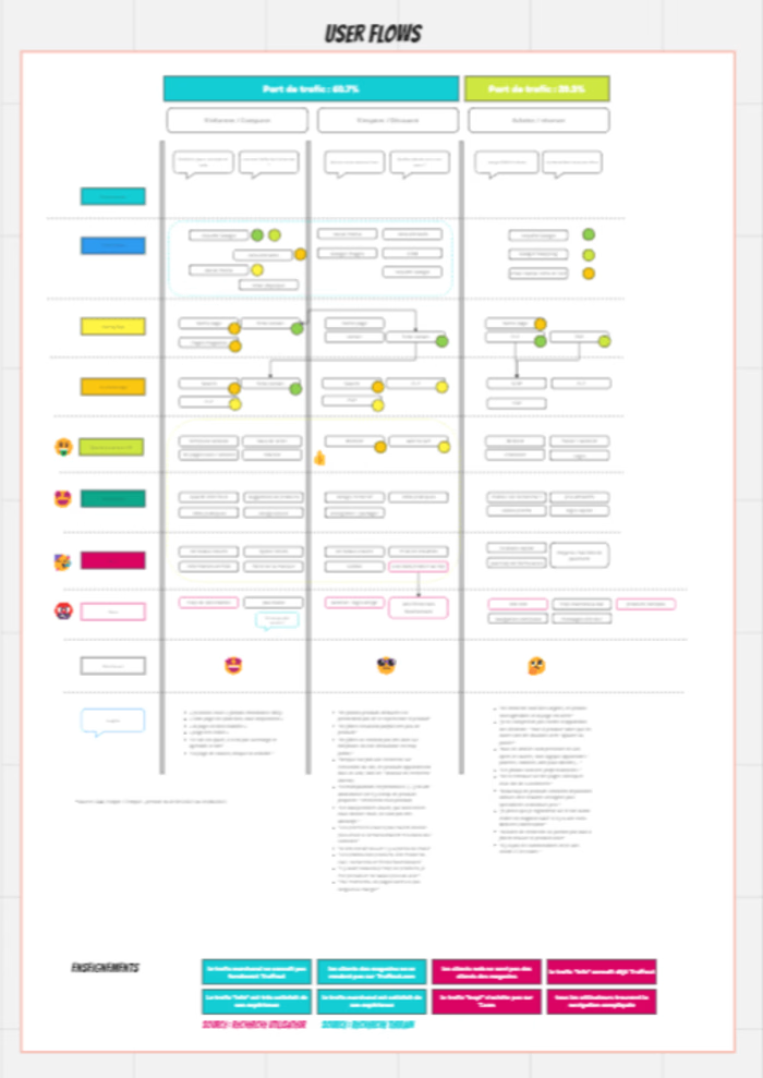
What are users actually doing on this website ? Fortunately, GTM was really well implemented, and I was able to design rather precise user journeys.
It seemed users weren't really going through the steps that were designed for them, and struggling at getting what they needed.
Some conversations with users further confirmed those impressions. The website was a chore to use, but due to its specific nature, users were forced to use this one and not another (precious content).
A dense yet simple UX Audit > Pain points !
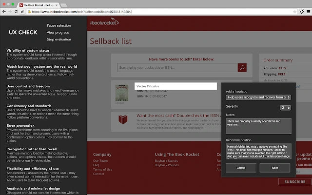
Using a tool of mine (UX Evaluation Chrome Extension), I produced a 60 pages report, in which all pains and gains were organized and prioritized.
Complex content ? Design System !
Users were actually lost, due to inconsistent design (from pages to elements to calls to external ressources), well things weren't looking good at all.
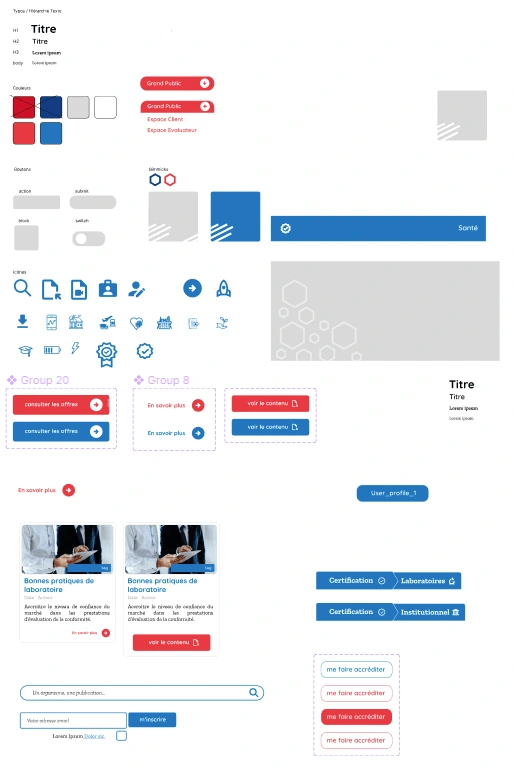
Plan Net suggested that we build a -light- Design System, inspired by the clients graphical history and specificities.
Keep it simple, and usable.
The results.
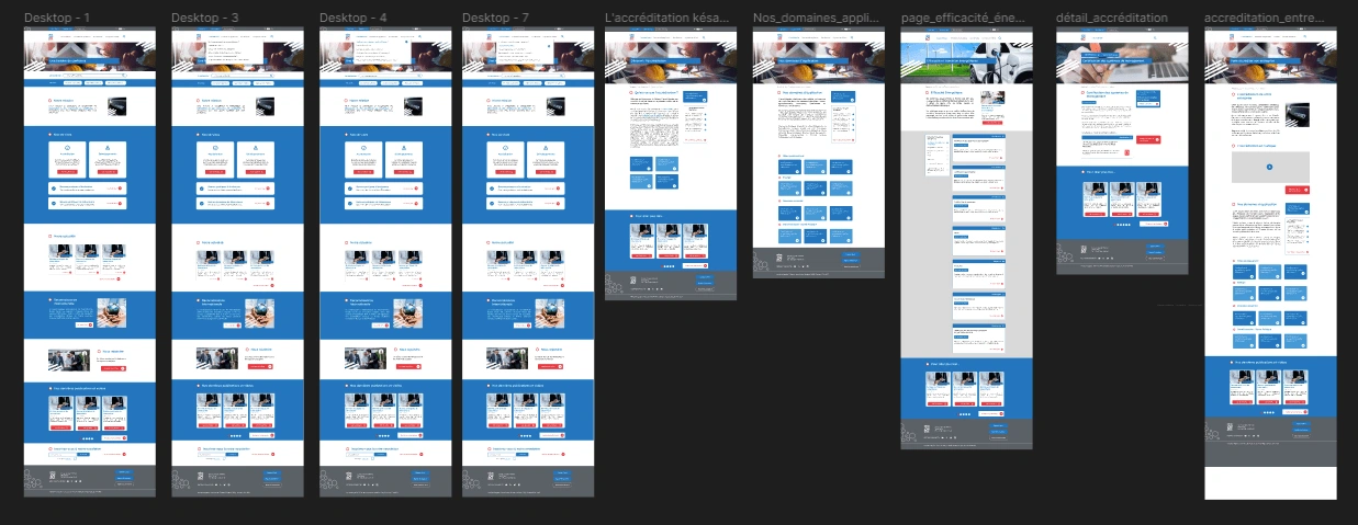
Simple color codes, clear CTAs, a focus on search and content
Rebuild Success !
Designing a simple and comprehensible system has had a strong effect on users. Stakholders were surprised by how accurate a simple Design System can be, and how user inconciously refer to code and habits they get from other systems, hence the trend of simplification of complex systems and reduction of the cognitive charge !
For more info on this project, please feel free to get in touch !
Like this project
Posted Aug 18, 2023
Designed an intuitive user interface for a web application by prioritizing end-users satisfaction over pixel perfect approaches.
Likes
0
Views
23
Clients
Plannet Marketing & Communication

