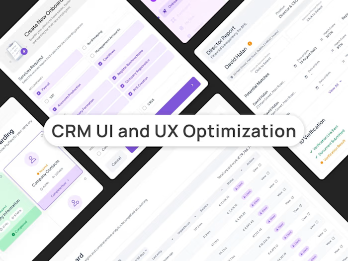
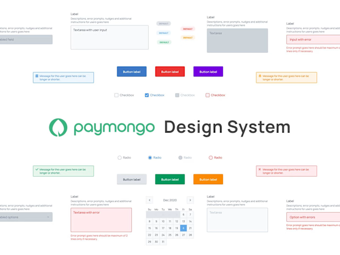
Design System for First Circle
As the Lead Product Designer at First Circle, I spearheaded the implementation of the design system in all customer facing UI of the company
Problem / Opportunity
Around May 2018, the design workload became challenging as roadmap targets / new features and software engineers grew in numbers. While 2 designers are working together, my co-designer eventually decided to leave after a few months. We were doing the typical approach that time where mock-ups are done using tools such as Sketch, Adobe XD and Figma. Being the remaining designer of the team, I have to find a way to streamline my process and be able to accommodate more design demand as usual, if I continue to follow the typical design process. This is when I decided to build a design system that will be used by the whole product and engineering team.
Note that this design system is responsive and accommodates both mobile and desktop users
Benefits of the design system (as documented)
We only have to maintain one source of truth (code) instead two design libraries (tool and code) for our design, to keep it consistent.
It helped us eliminate creating mock-ups using tools such as Sketch, Figma or Adobe XD and create design studies directly through code.
Enable non-designers to play around and create user interfaces
Engineers can focus solely on functionalities instead of perfecting and maintaining aesthetics and UI.
It’s faster to maintain and create components.
Impact upon completion and implementation
Upon stabilizing the design system (100% applied and tested), I was able to reduced the design time from 30-60% and reduced 99.9% of front-end layout and UI work for engineers as I handover coded pages so they can focus on functionalities instead. This also enabled me to work with 3 product teams composed of 3 product mangers and 14 software engineers.
Our design principles (as documented)
As we move forward in building our products, everyone should adhere to these design principles to ensure that we are always designing with purpose and intent
Empathetic, Efficient & Intuitive
Our designs should reflect how well we understand our users, their needs, their expectations, allowing them to accomplish anything they need to do within our products as fast and easy as possible.
Transparent
Our designs should be able to guide our users to complete their tasks and job thru meaningful content and actions. It should be accommodating enough to tell users what should happen, what is happening, what happened and why something didn’t happen.
Consistent
Our designs should reflect consistency not only on the visual properties of it such as colors, spacing, typography, etc. Consistency should also be applied in code and user experience. A button should always look, coded and behave the same way across our products regardless of it’s context.
Flexible
Our designs should be able to accommodate, scale and expand easily based on the demand. Our designs should be able to cover different scenarios without using shortcuts and or hacks.
Open-ended
Our designs should not create dead-ends for our user. Their user experience should be fluid, smooth and can be continued at any point of a process.
Harmonious
Our designs should be simple, straightforward and obvious. We don’t want to confuse our customer by showing unnecessary elements to them. This includes having the right amount of actions that users can take from where they are. It should not create chaos, only harmony.
Design System Library
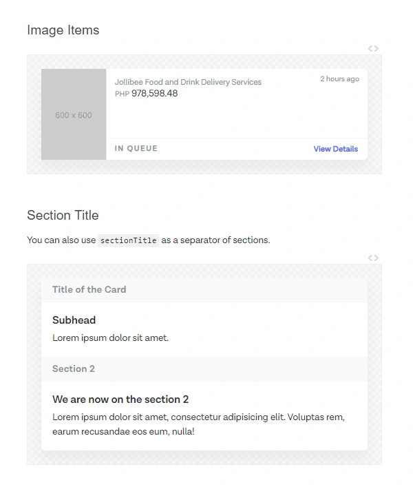
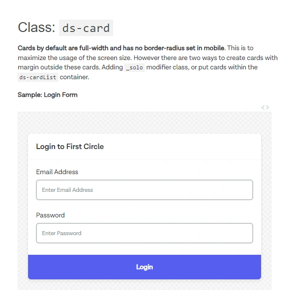
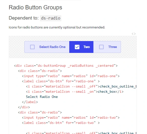
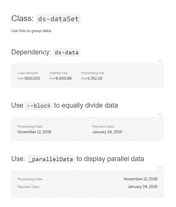
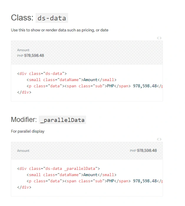
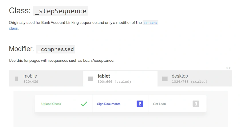
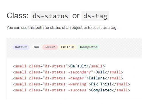
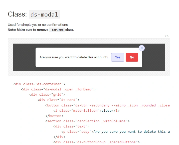
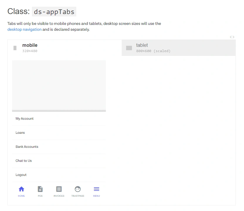
You can browse these components here. Please note that the quality of the image may be affected as these are screenshots from the actual web library and is not manipulated or was designed using tools such as Figma
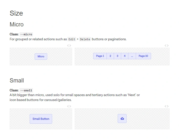
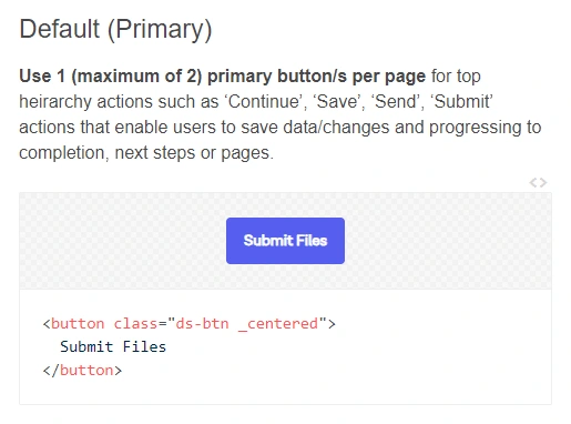
Buttons in different sizes
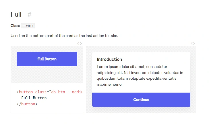
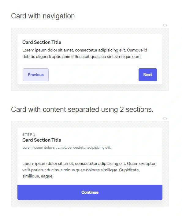
Full buttons for emphasizing action in pages o cards
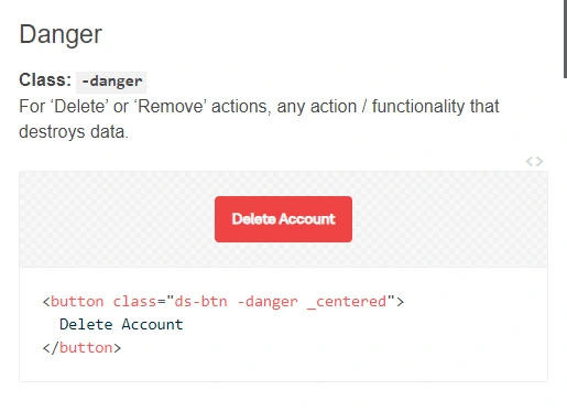
Danger button for unreversible actions such as deleting / destroying data
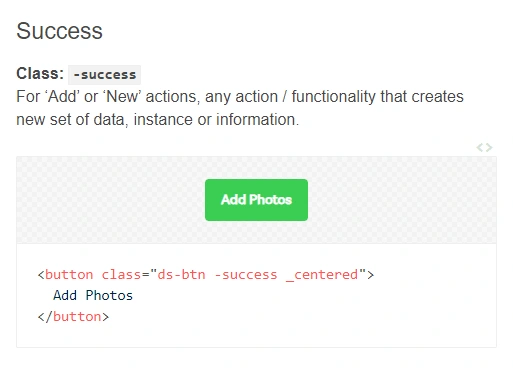
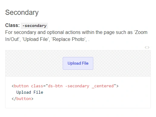
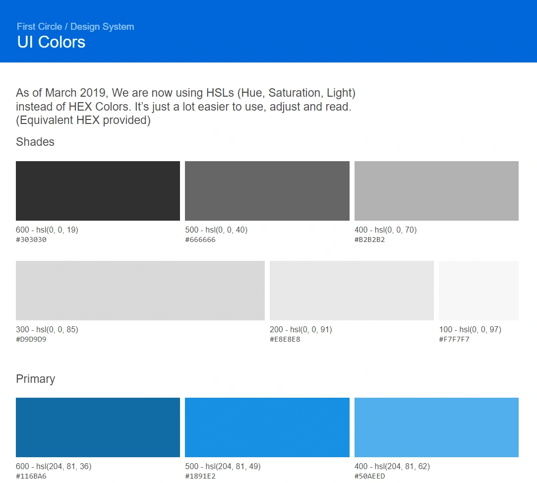
Our UI Colors including HEX and HSL for references
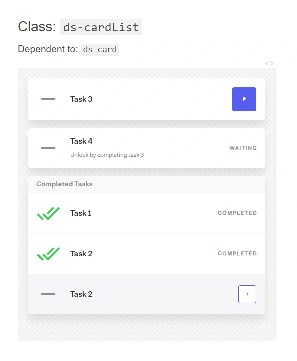
For task list such as onboarding
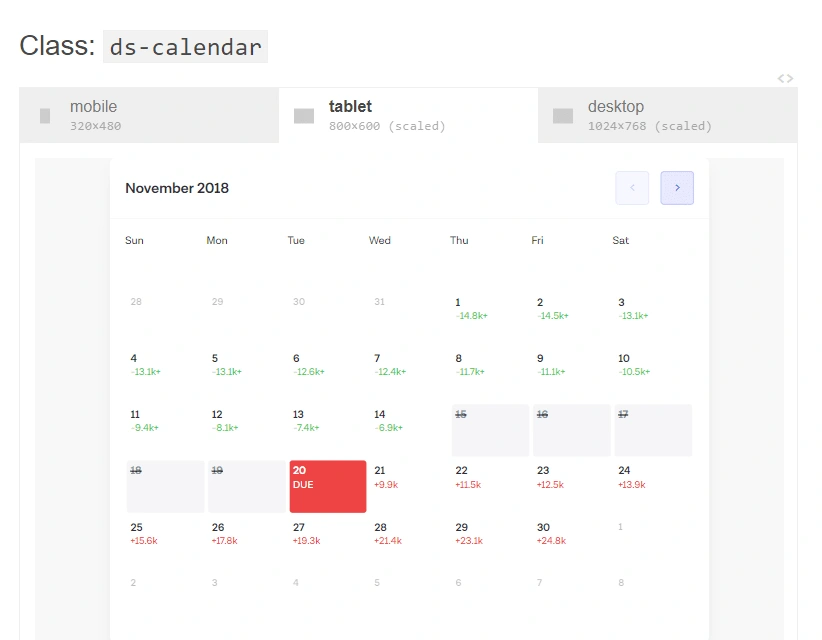
Calendar component that shows how much they have to pay if they pay loans early and the interest as they miss their due dates
Like this project
Posted Apr 14, 2024
A design system I built from scratch using html (pug), css (stylus) and a little bit of javascript that enabled me to serve 3 product teams as a sole designer

