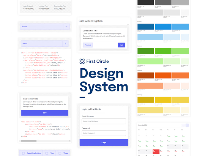
PayMongo SEEDS (Design System)
As the first fulltime designer of PayMongo (2020), I spearheaded the work and created the first versions of the design system of the company which is still being use today. I used Figma as my primary tool and had worked closely with engineers to implement each component with accuracy in Storyblok.
I applied the popular methodology of Atomic Design System making it easier to maintain and scale as the design system and the design team grows.
The name SEEDS stands for Scalable, Efficient and Elegant Design System.
Note that this version of design system is before "Variants" was launched. If you're already familiar with it, you may notice that it wasn't using any variant yet.
Form elements
As a SaaS company. Our users in PayMongo uses forms on a regular basis as they use our services. With consistent UI across the system, it'll help create a subtle psychological impact to our users that our system is reliable and secured, given that we are a payment processing company, this is a critical aspect of designing the UI.
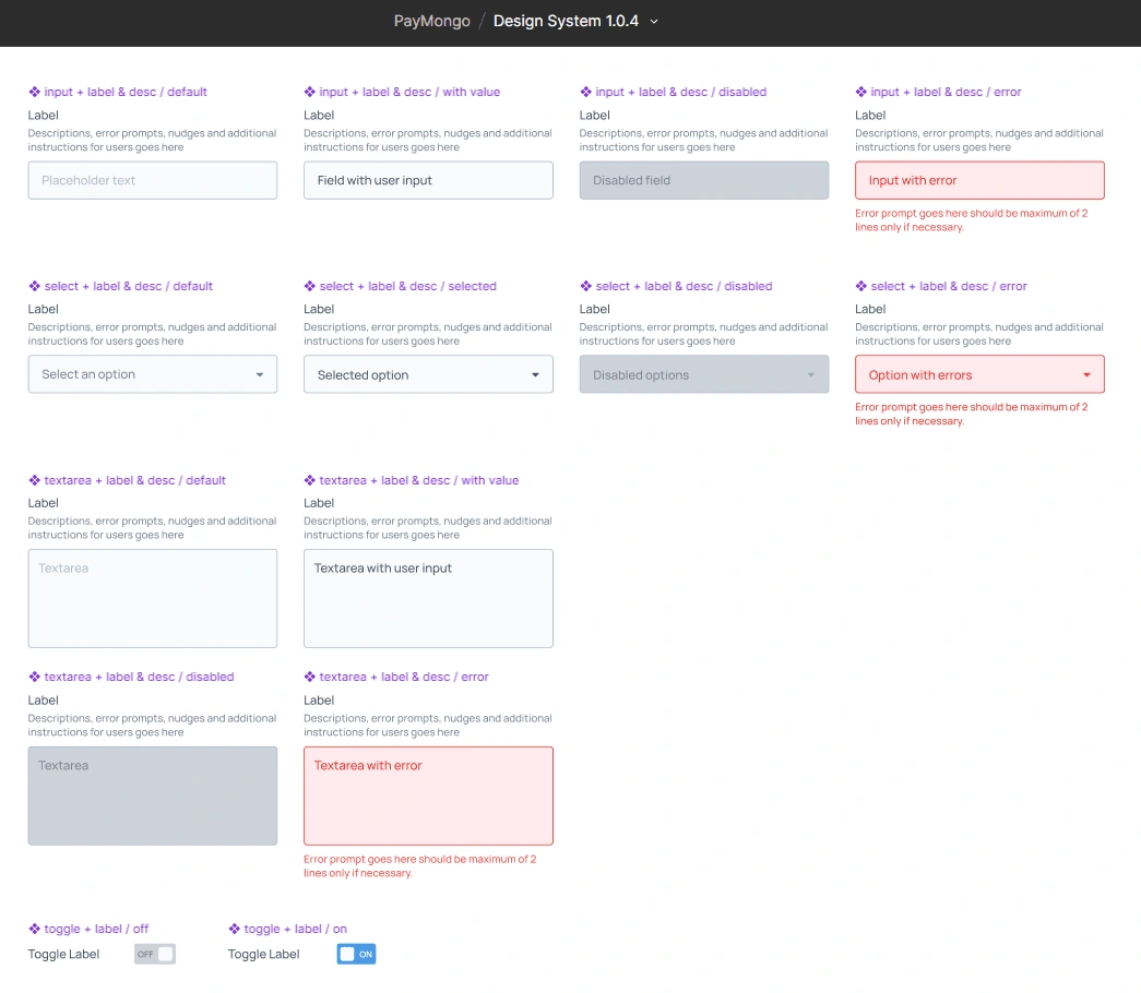
Input and text area elements with labels, descriptions in different states including disabled and errors
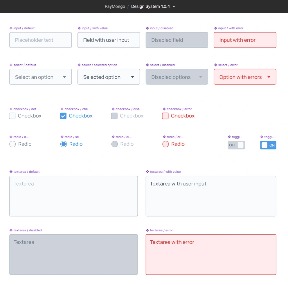
Individual form elements including Checkboxes, Radio Buttons and Toggles
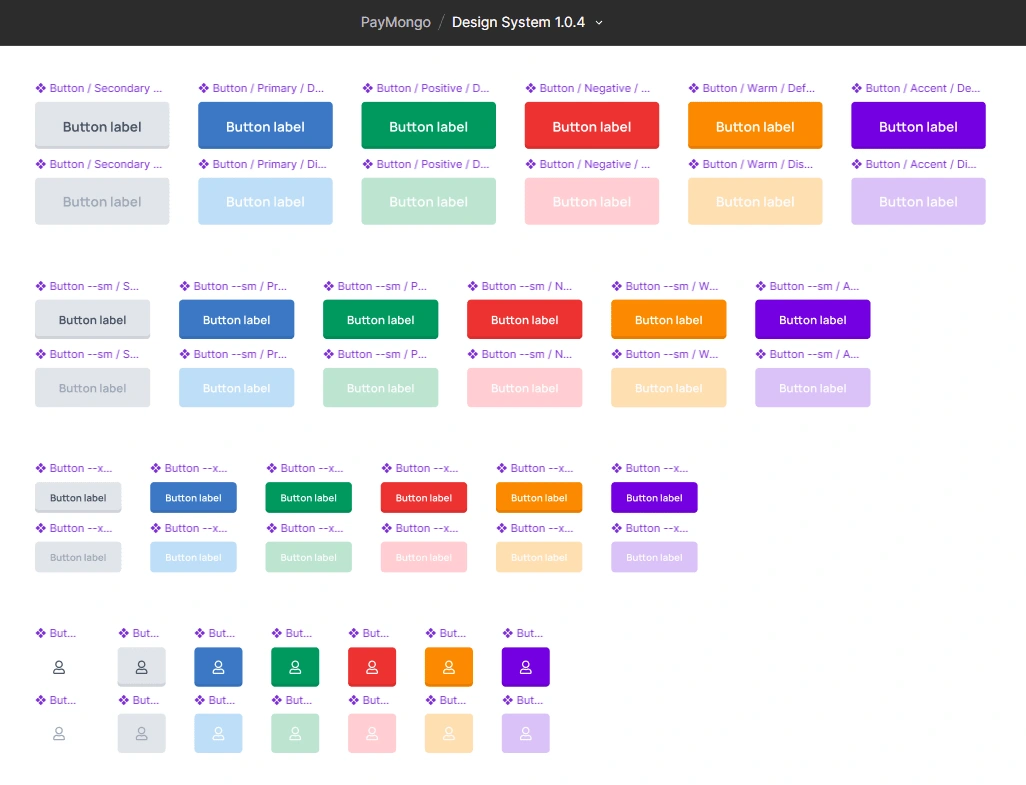
Buttons in different sizes, colors and variants
Message toasts
We use message toasts to send an immediate feedback to users based on their actions without disrupting the UX flow. We use five different variants based on the scenario.
Blue are used to inform with an on-going action. It's possible that the user already completed the action needed from them, but still needs verification on our side. To subtly managed their expectations, we don't use a green toast as it is still being processed.
Red are used for errors. Errors are either due to incomplete requirements from the user or a system error has occurred.
Green are for success and completed actions.
Orange are for pending actions that is blocking us or the system to complete a certain task or request.
Gray are used to share non-critical information.
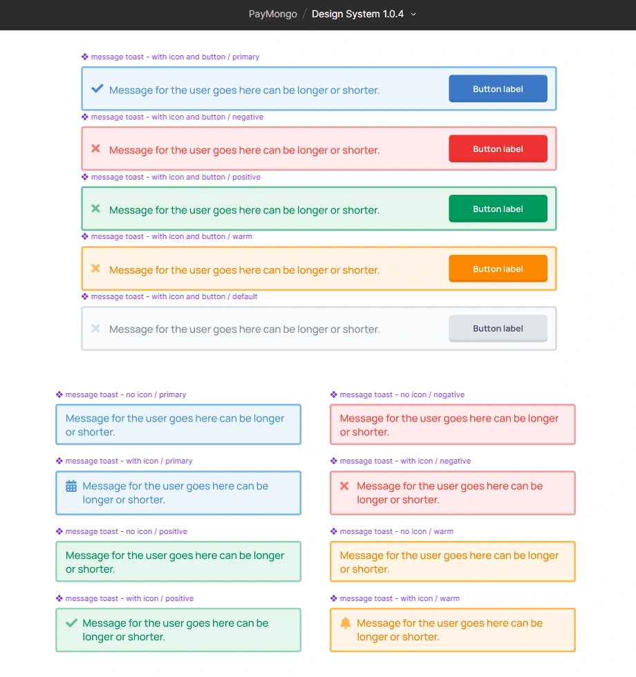
The message toast in different states and uses
Applied Design System in UI (Samples)
Here are some of the designed screens using the design system.
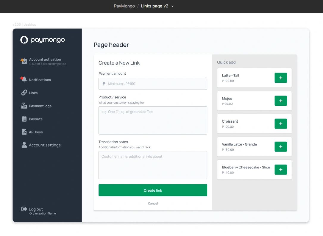
Proposed design for V2 of Links Page where users can quickly create custom payment links for their customers
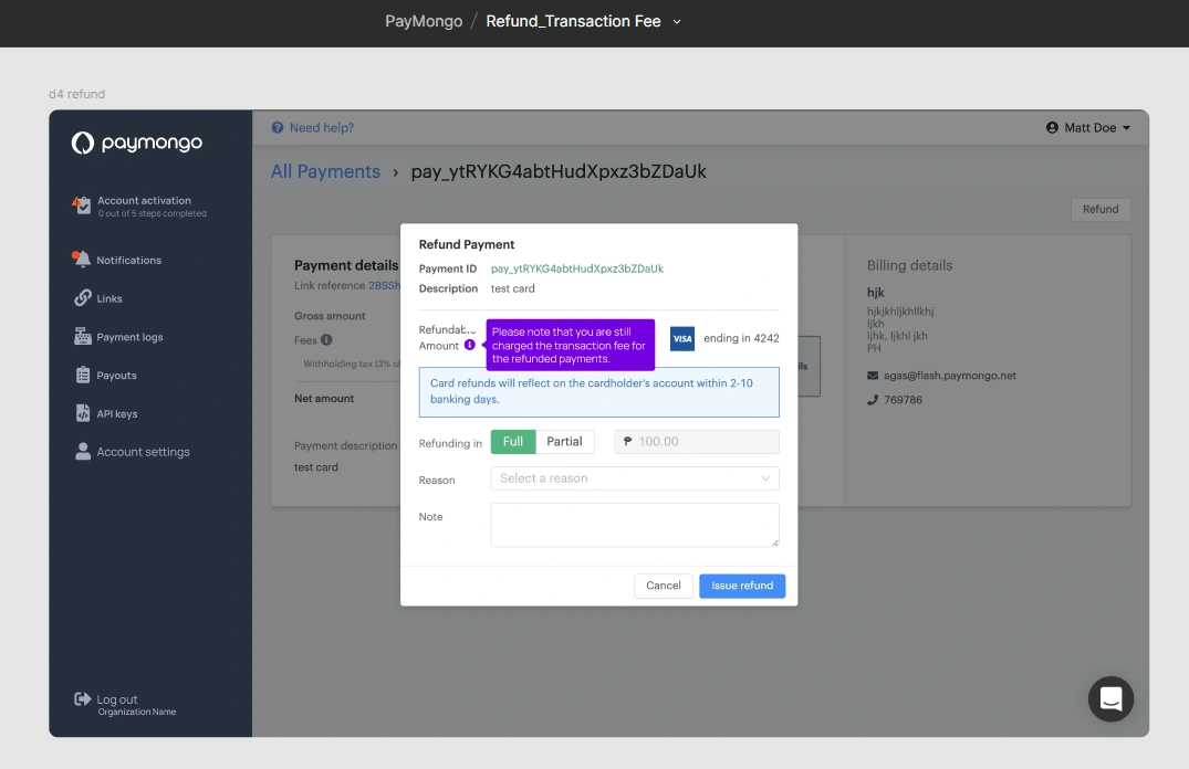
Refund page showing the transaction fee tool tip
Like this project
Posted Jul 10, 2024
Created the foundation of the design system for a SaaS (Payment processing) YCombinator (YC19) funded startup in the Philippines

