Fello 3.0 Design System: Scalable Design Foundation
Sourav Maity
Fello 3.0 Design System – Scalable Design Foundation for a High-Growth Real Estate Platform
A comprehensive design system built to unify product teams, streamline multi-platform experiences, and accelerate product delivery.
01. Overview
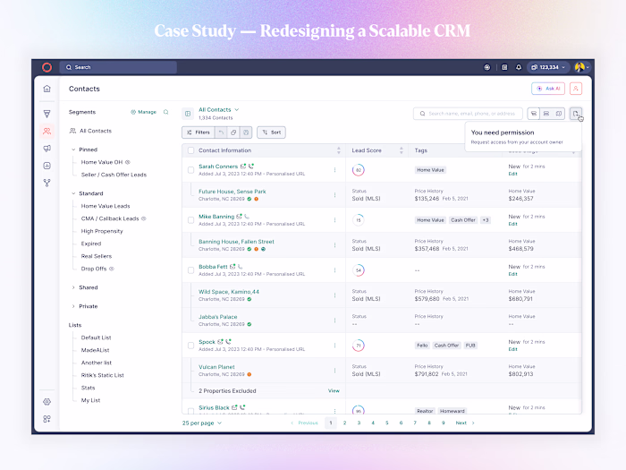
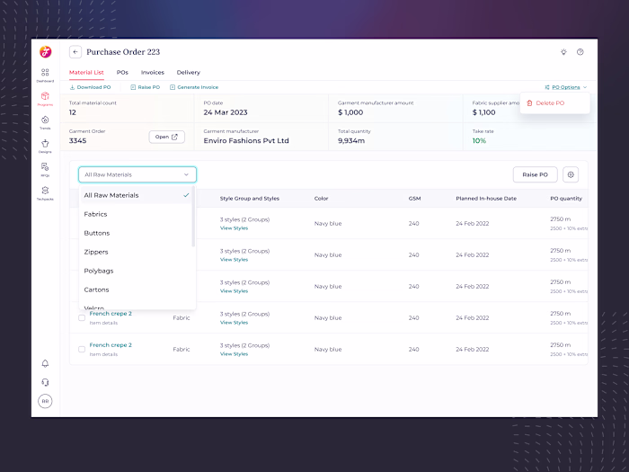
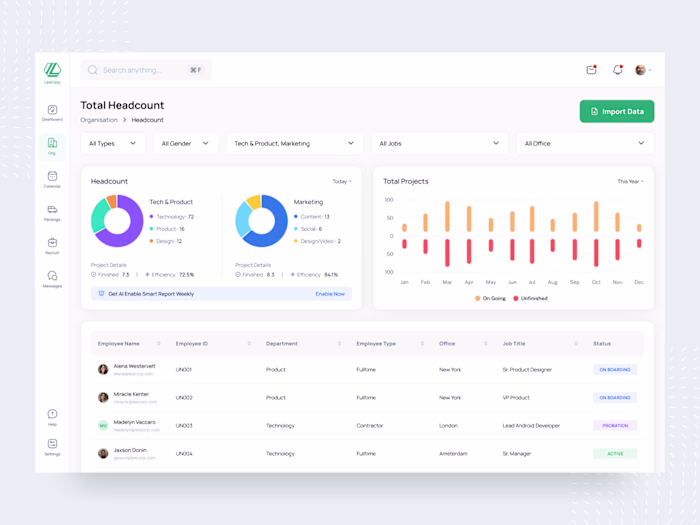
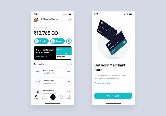
As Fello expanded rapidly across new product verticals—CRM, marketing tools, analytics dashboards, mobile apps—the UI became inconsistent, difficult to maintain, and time-consuming to scale.
To support the company’s growth, I led the end-to-end redesign of Fello 3.0, a unified, token-driven design system built to be scalable, adaptable, and developer-friendly.
My Role:
Design System Lead
UI Architecture & Token Strategy
Component Design + Documentation
Cross-functional collaboration with PMs & Engineering
Impact:
60% faster design-to-dev handoff
40% reduction in UI inconsistencies
Introduced full theming (Light & Dark)
200+ reusable components + 400+ tokens
System now powers: CRM, Marketing, Reports, Mobile App & Internal Tools
02. The Challenge
Before Fello 3.0, every team built screens independently. This created:
Fragmented visual styles
Duplicate components across files
Undefined spacing, radius, or color logic
High engineering dependency
Slow onboarding for new designers
We needed a central unified system that could scale across all platforms while being extremely easy for designers and developers to adopt.
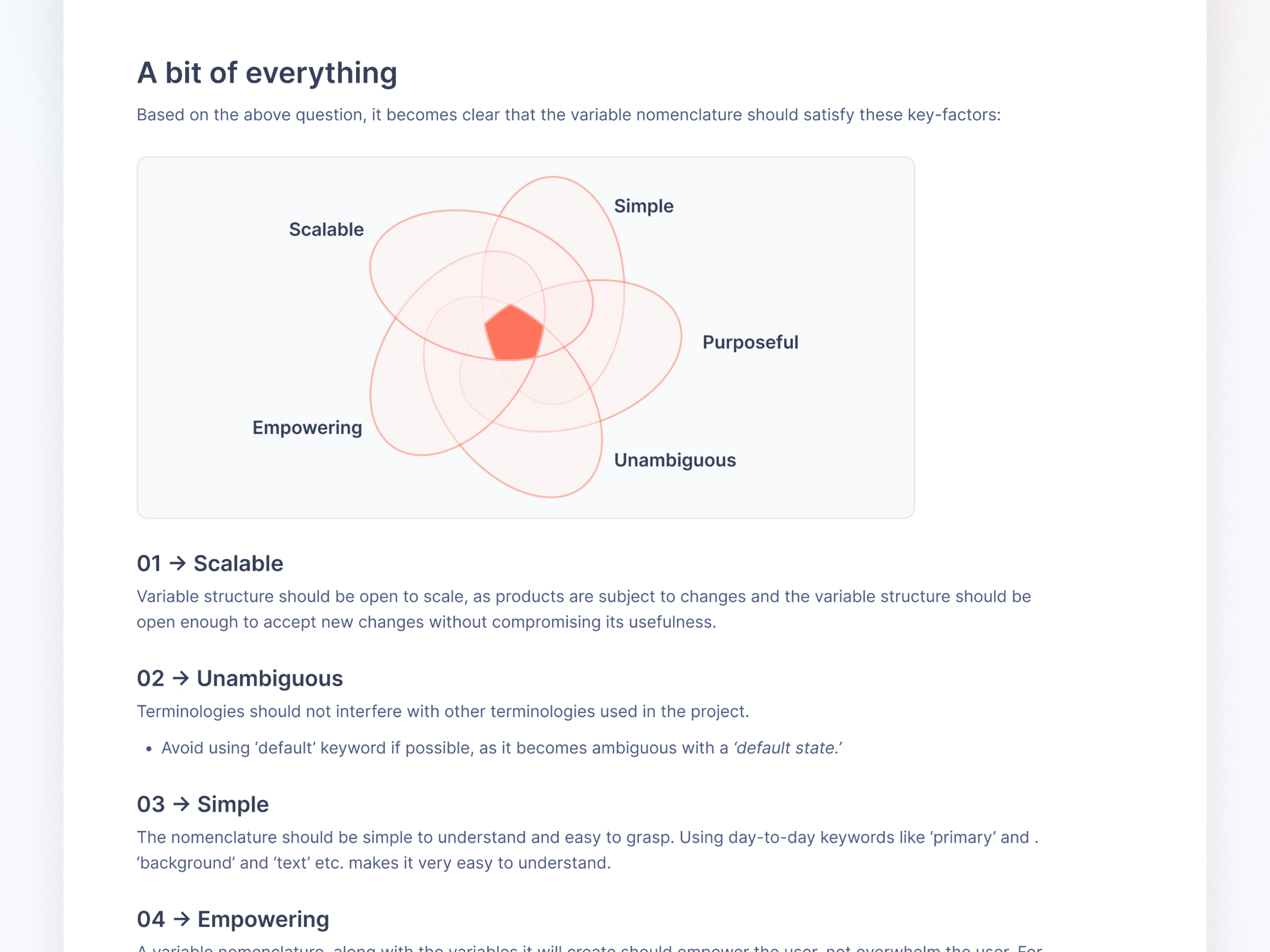
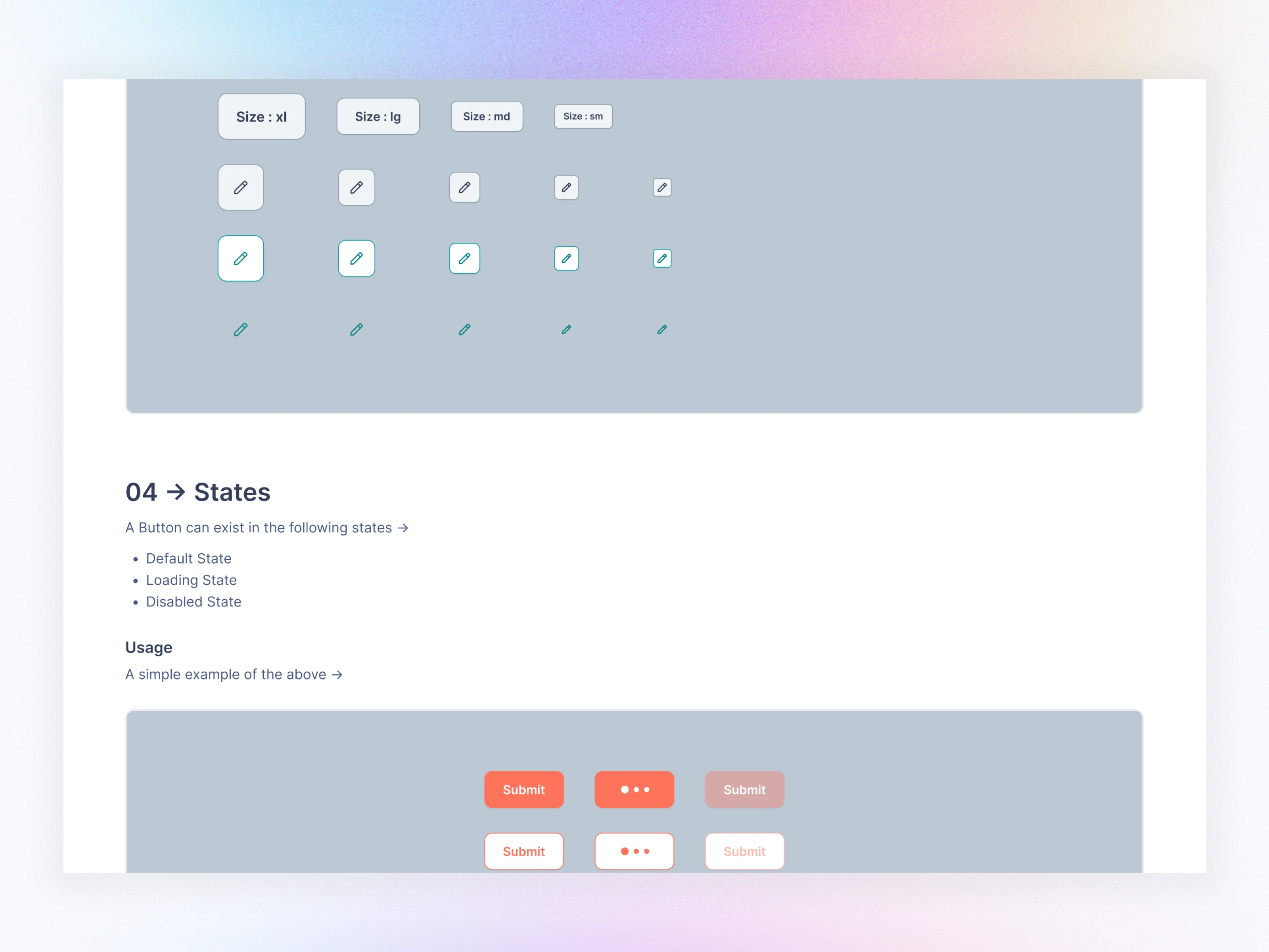
03. Design System Goals
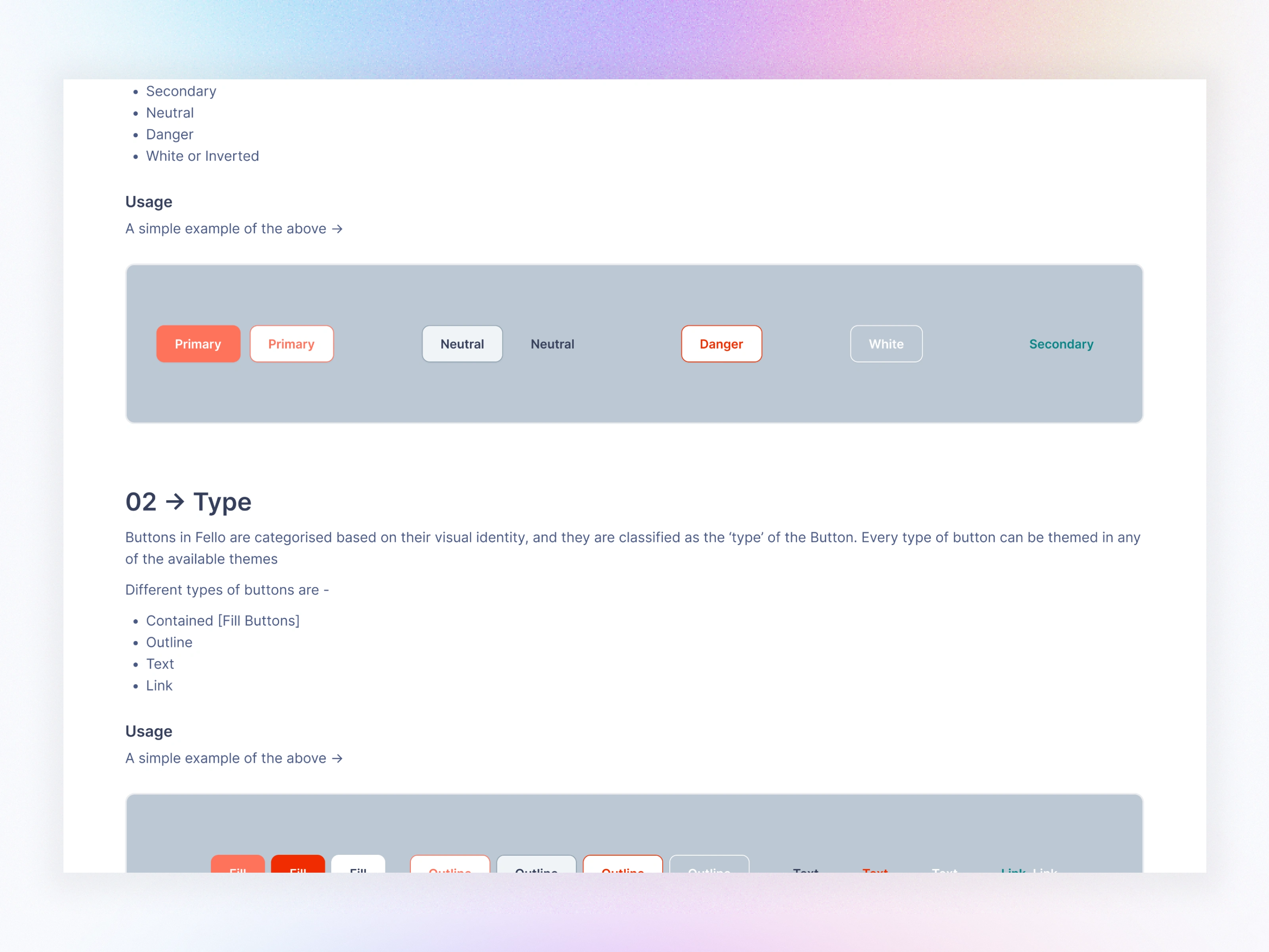
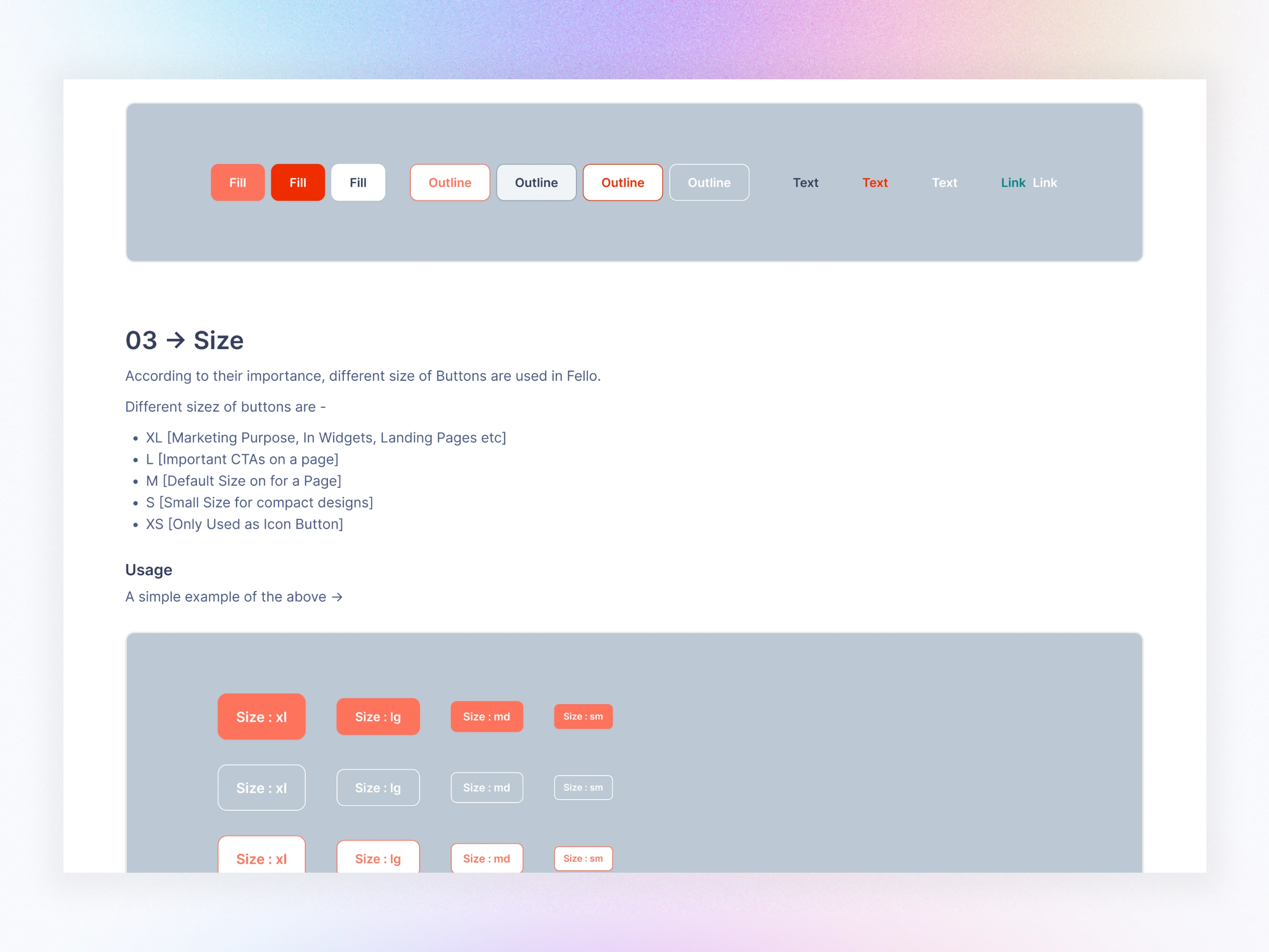
Scalable - Expandable variable and token structure that supports future products without breaking existing UI.
Consistent - Strict rules for spacing, color, typography, states, and layout.
Theme-ready - Light/Dark mode toggle using variable modes.
Developer-friendly - Predictable naming, semantic tokens, and clear docs.
Fast to use - Components built with auto-layout, variants, and responsive rules.
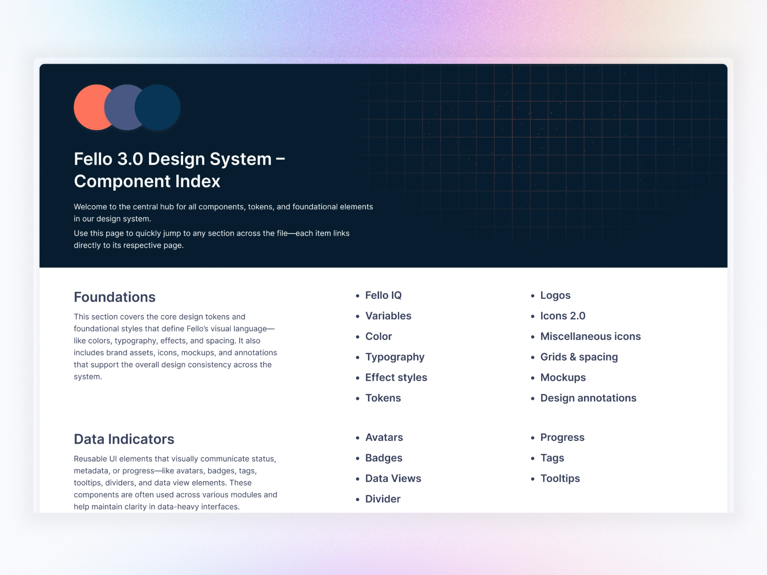
Component Index
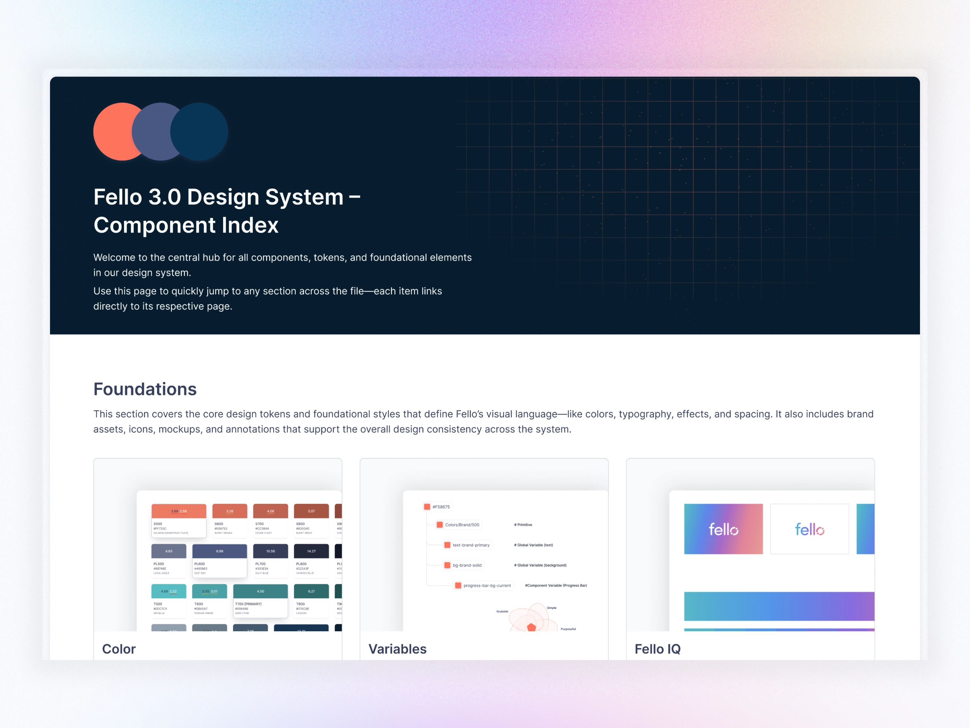
Component Index
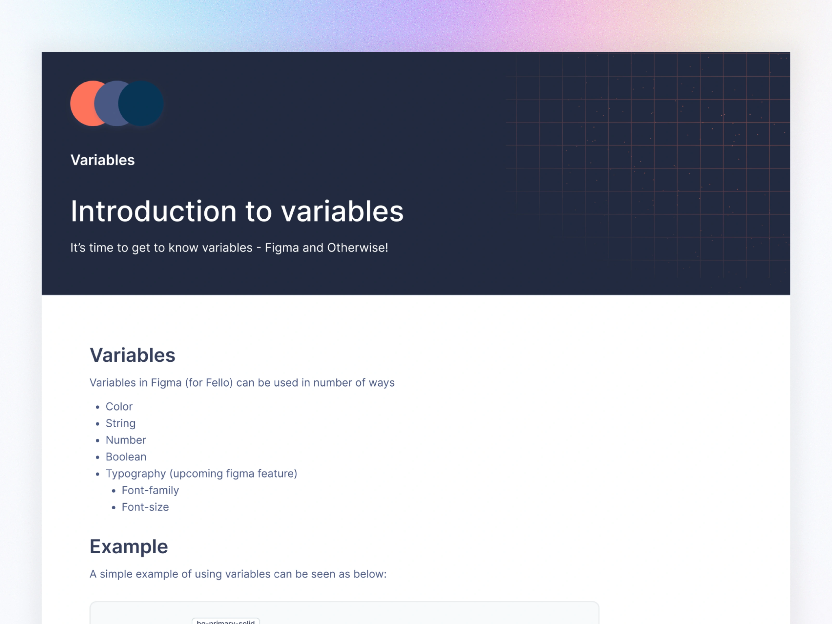
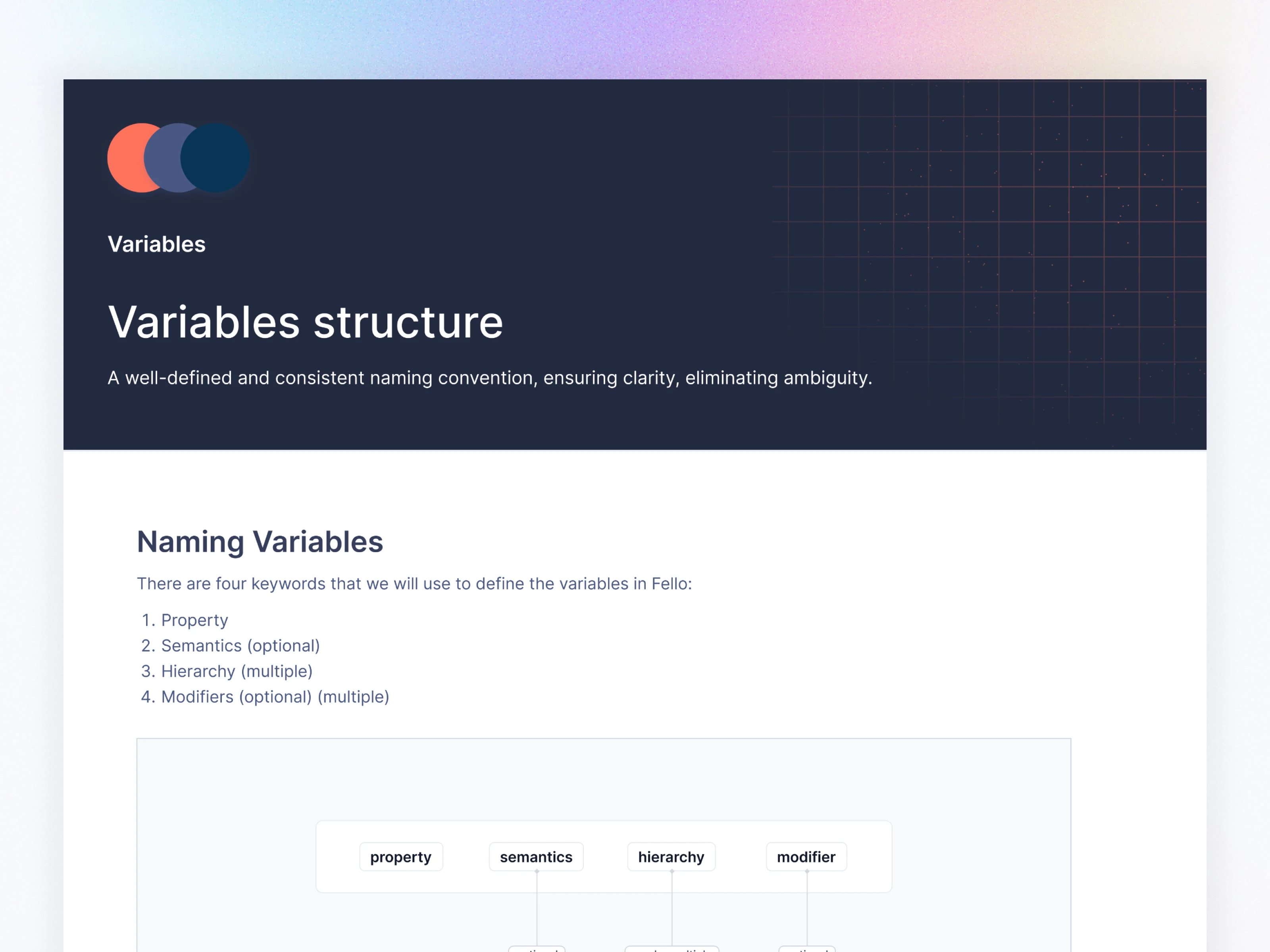
04. Variable System (The Heart of Fello 3.0)
Why Variables?
Figma Variables allowed us to control:
Color
Spacing
Typography
Radius
Component states
Themes
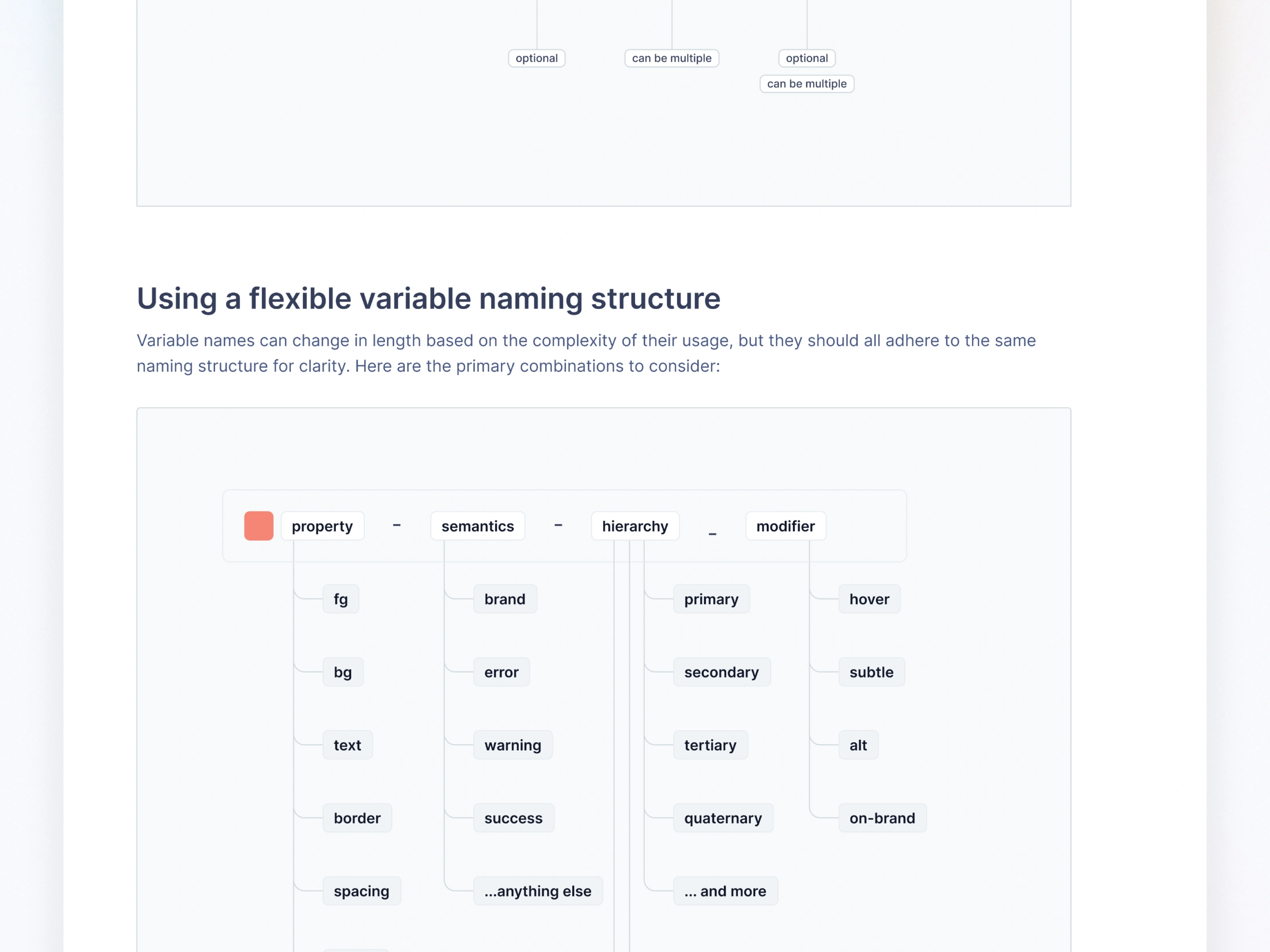
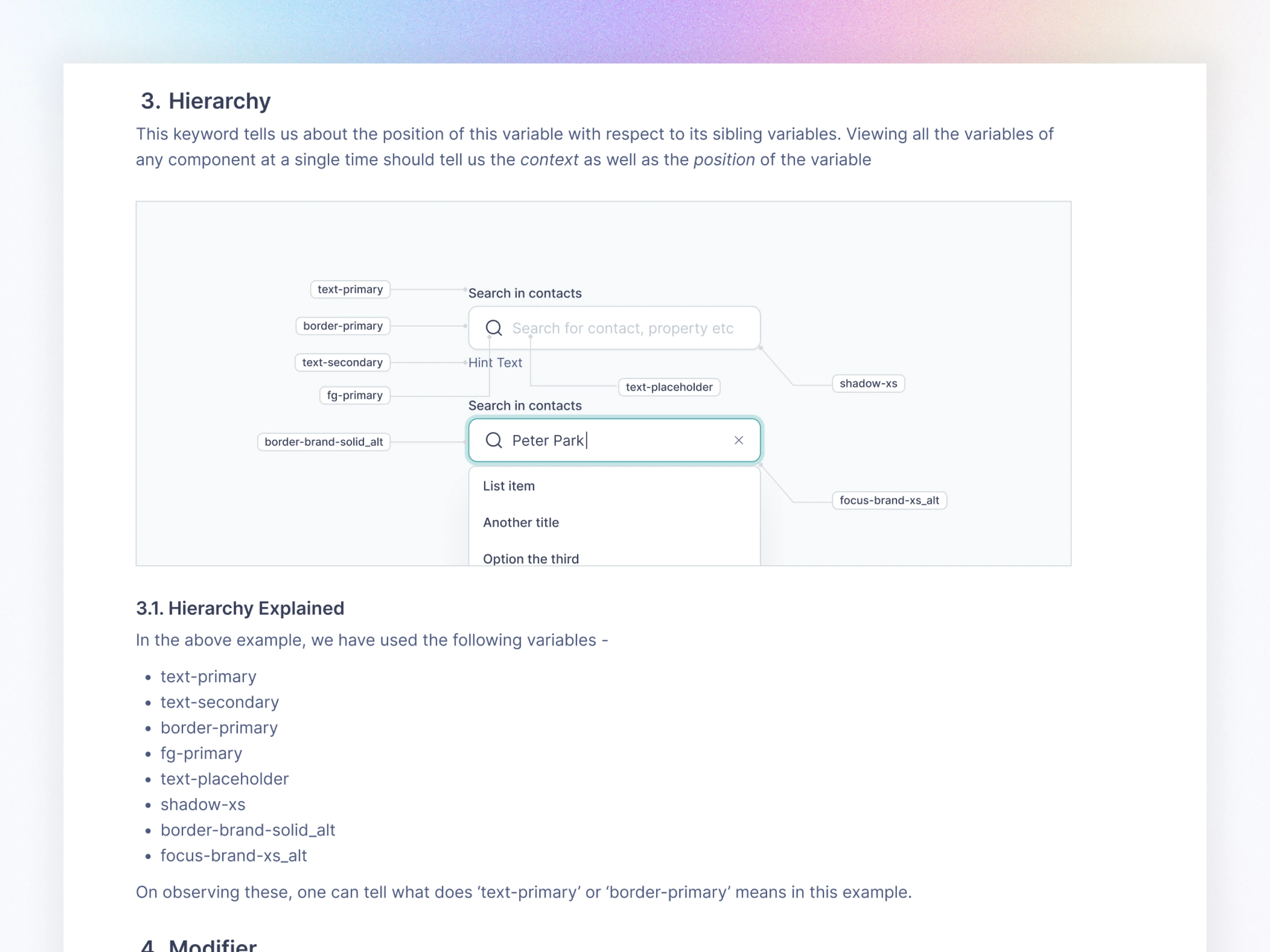
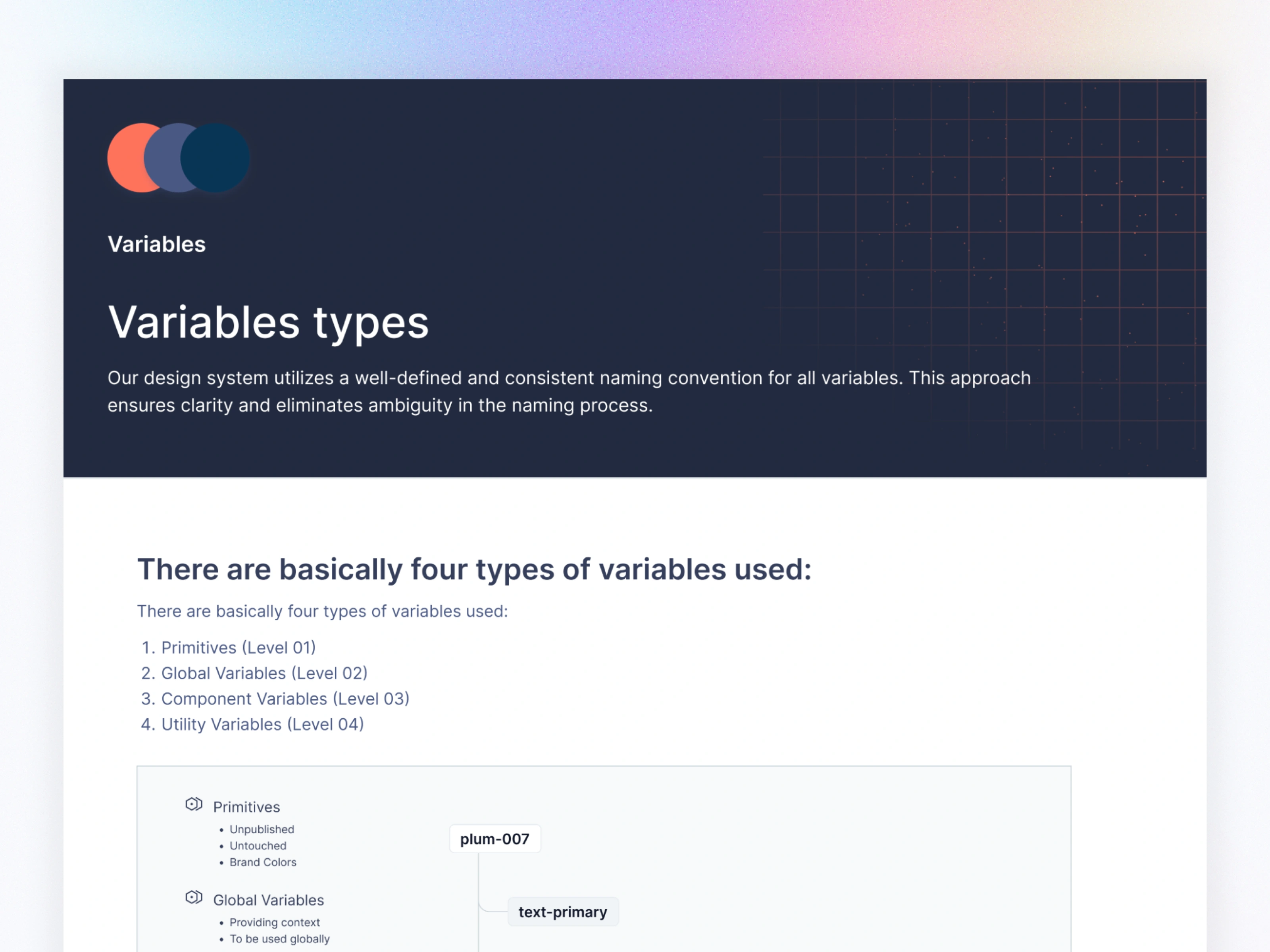
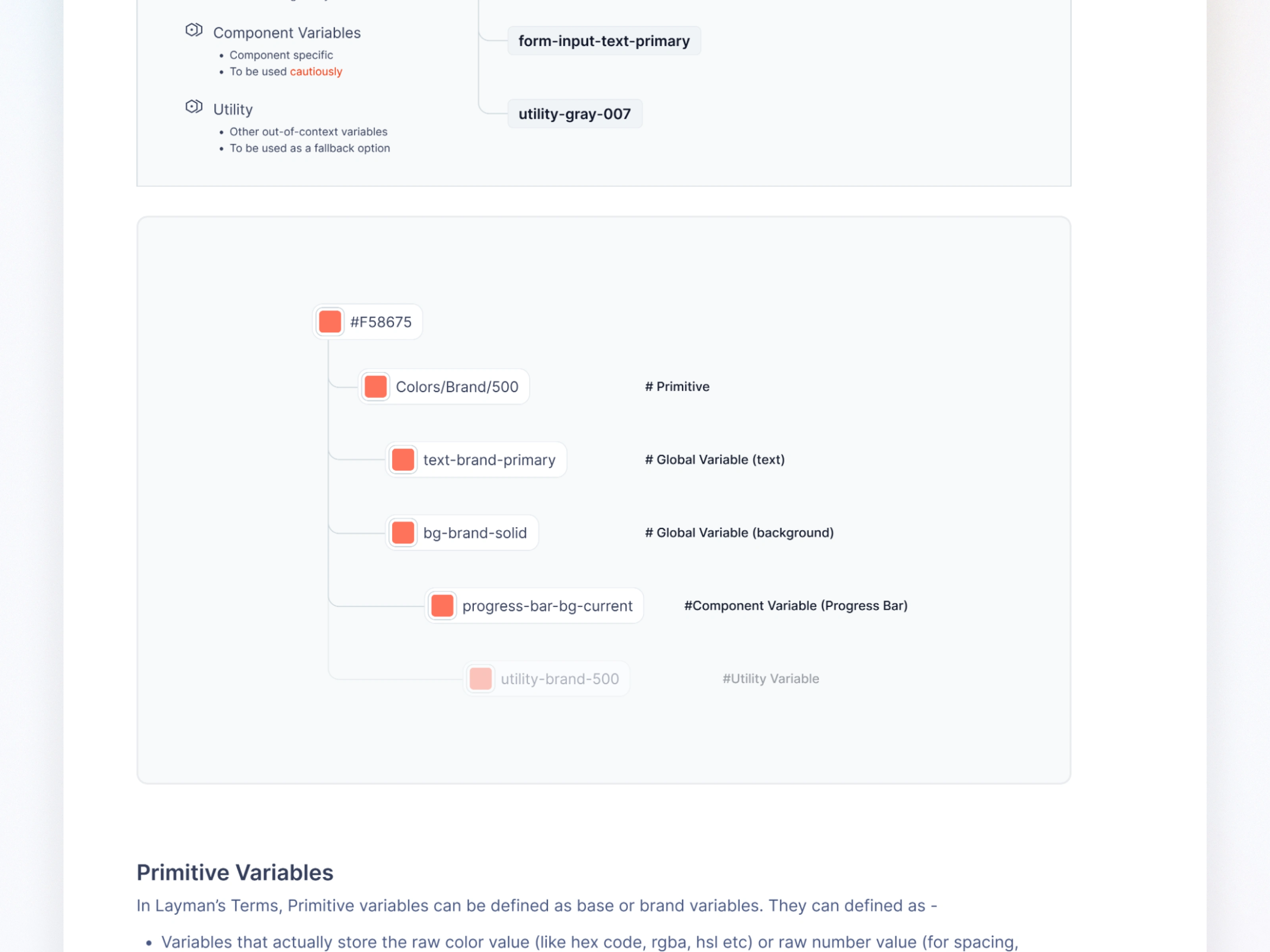
I designed a 4-level variable hierarchy:
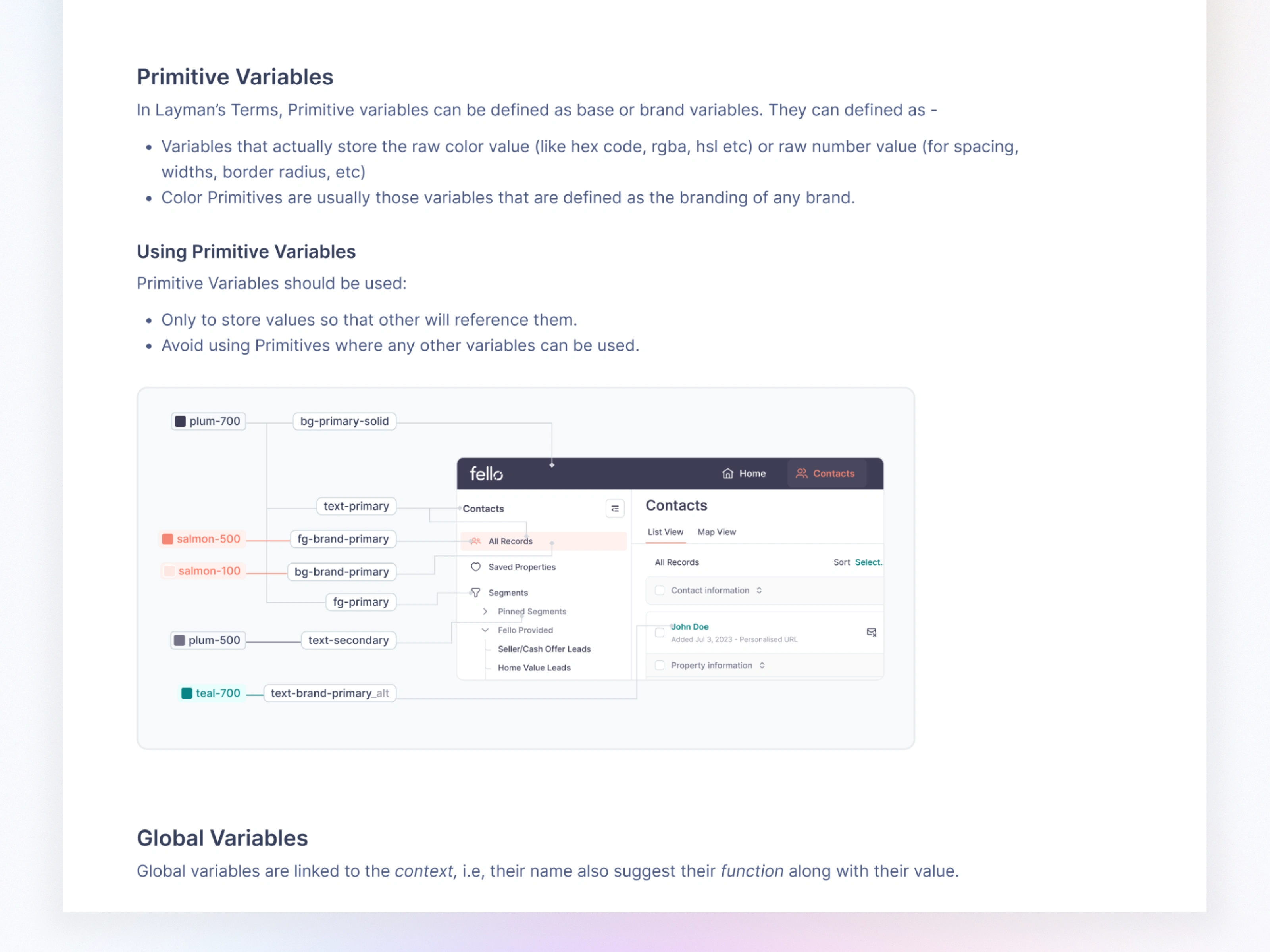
Primitive Variables (Level 01)
Global Variables (Level 02)
Component Variables (Level 03)
Utility Variables (Level 04)
This kept the system scalable—even with 1000+ components.
05. Foundation Setup
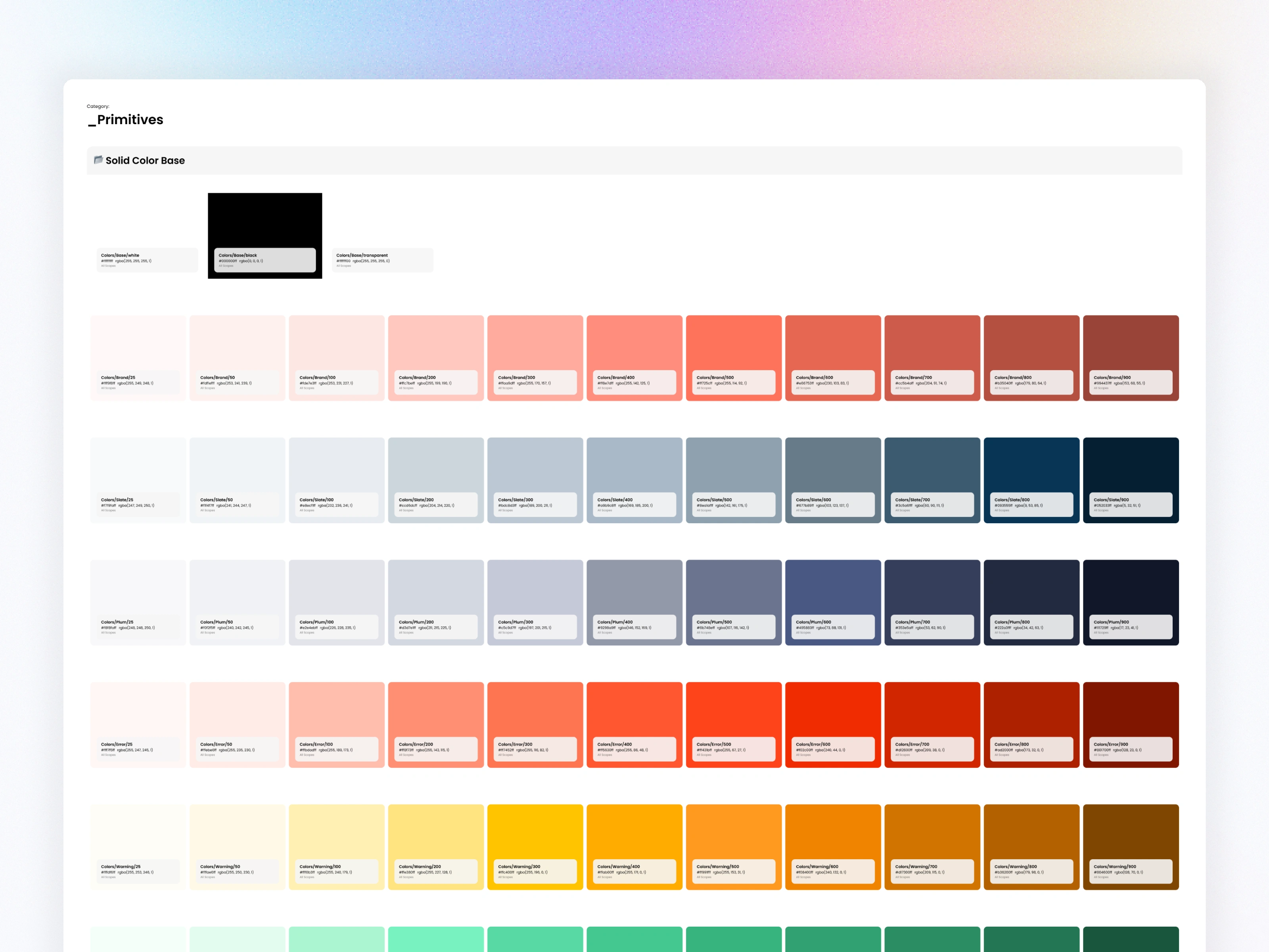
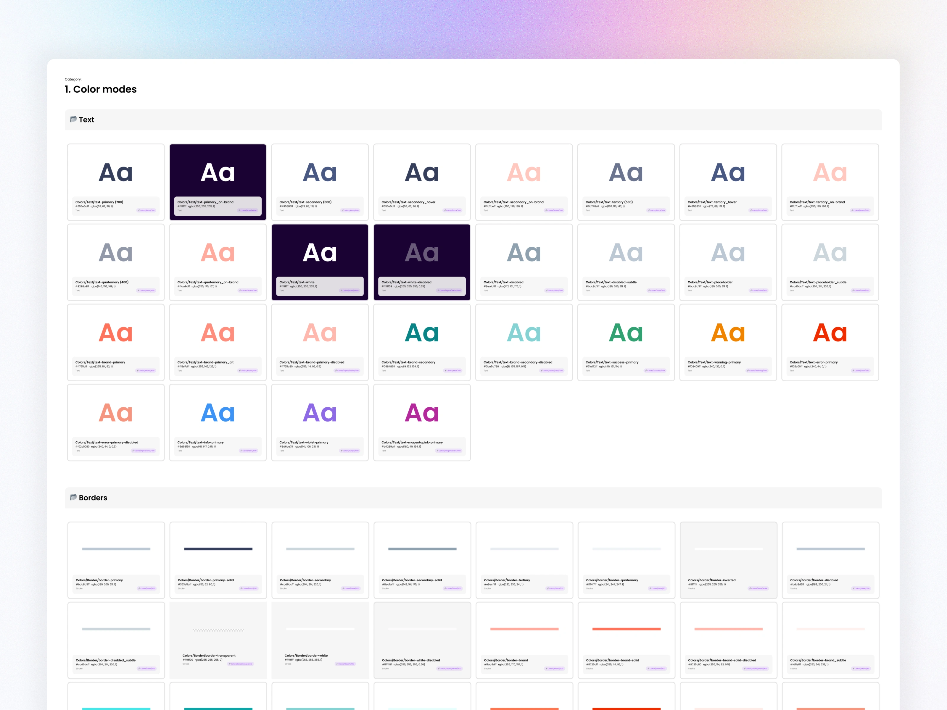
5.1 Color Tokens
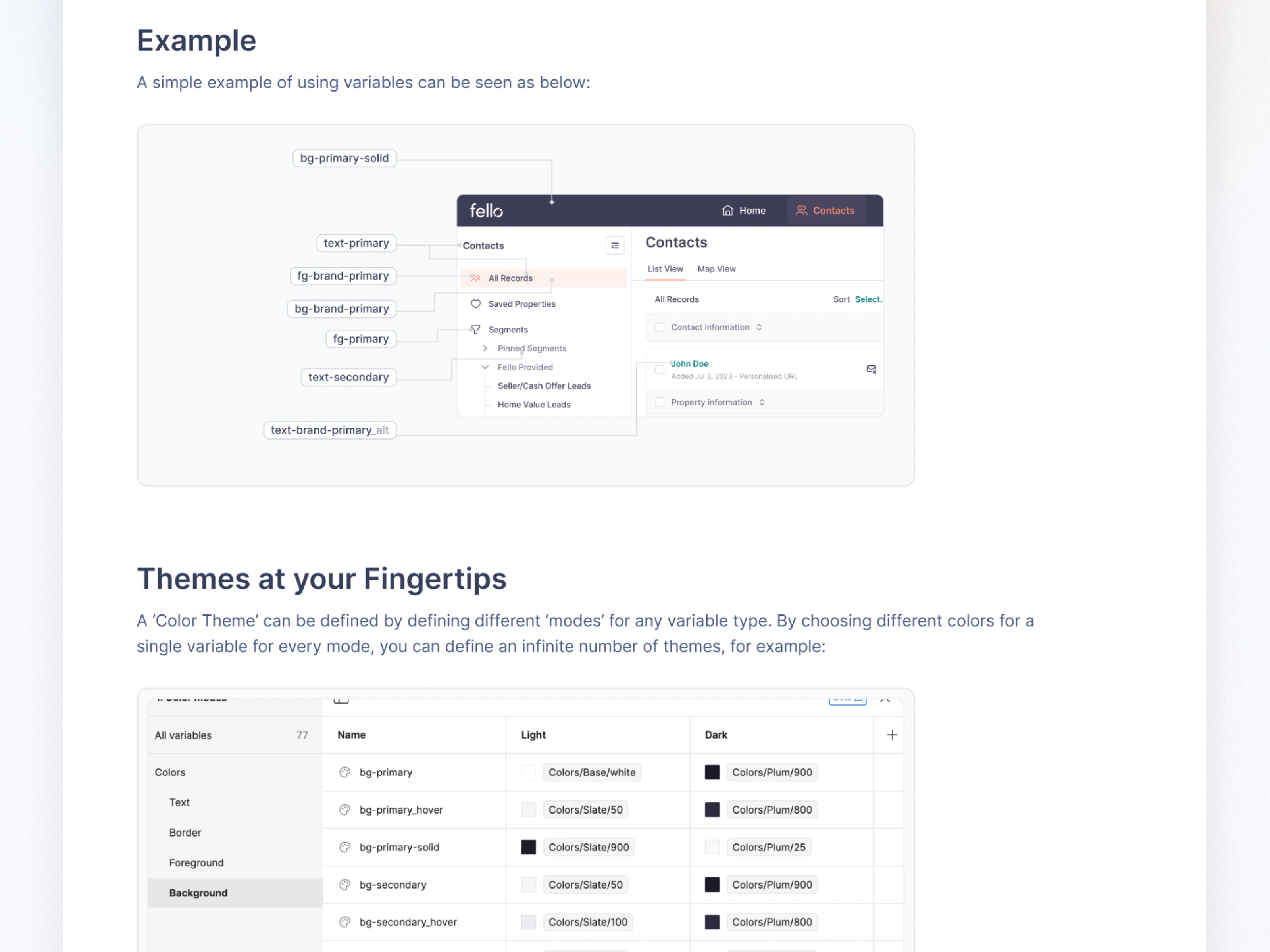
I built a structured color system using Primitive → Global → Component tokens, ensuring clarity and scalability:
Primitive tokens: raw color values (e.g., Colors/Plum/900)
Global tokens: semantic usage (e.g.,
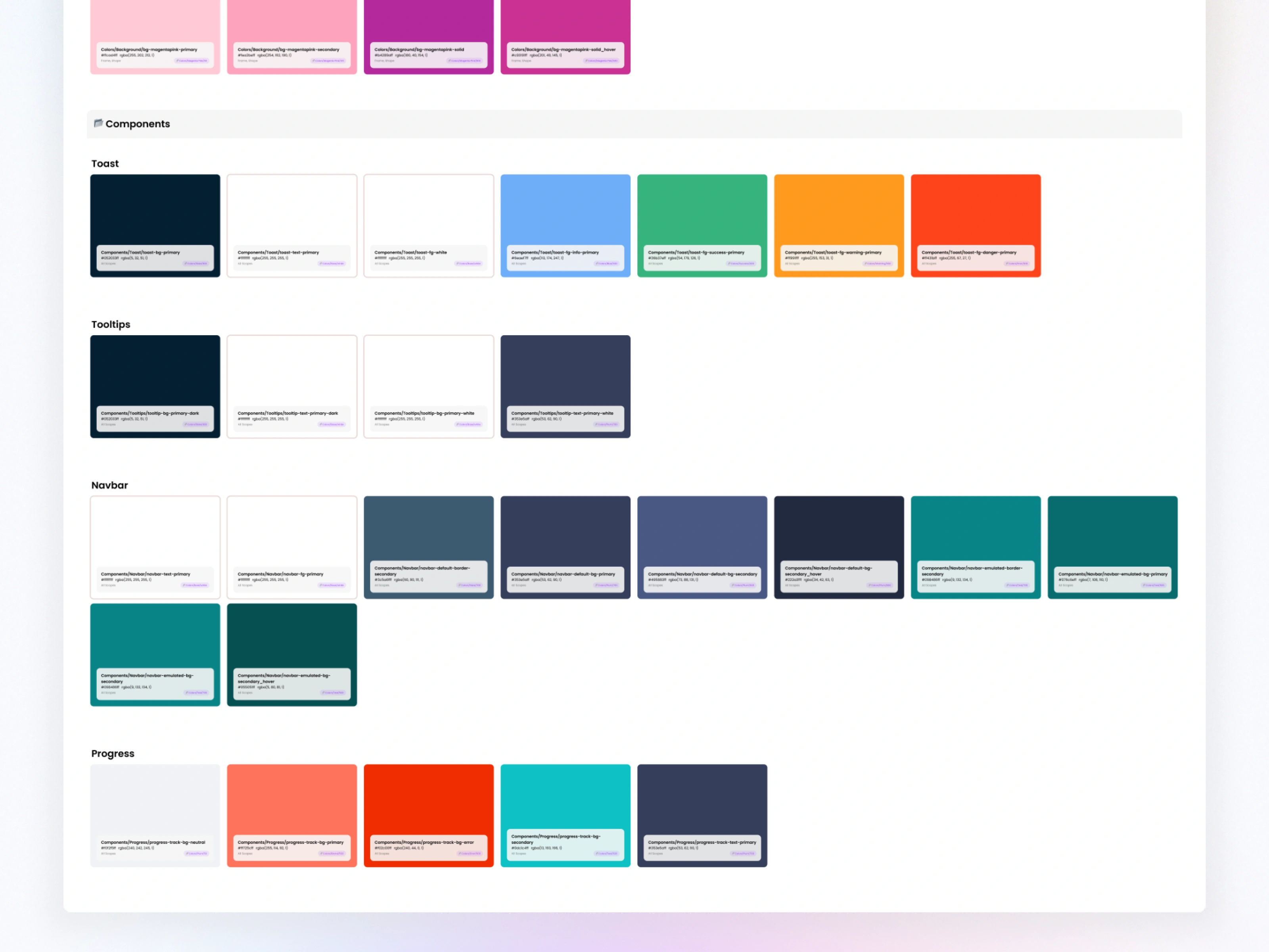
bg-primary, text-secondary)Component tokens: special cases (e.g., badge-success-bg, form-border-focus)
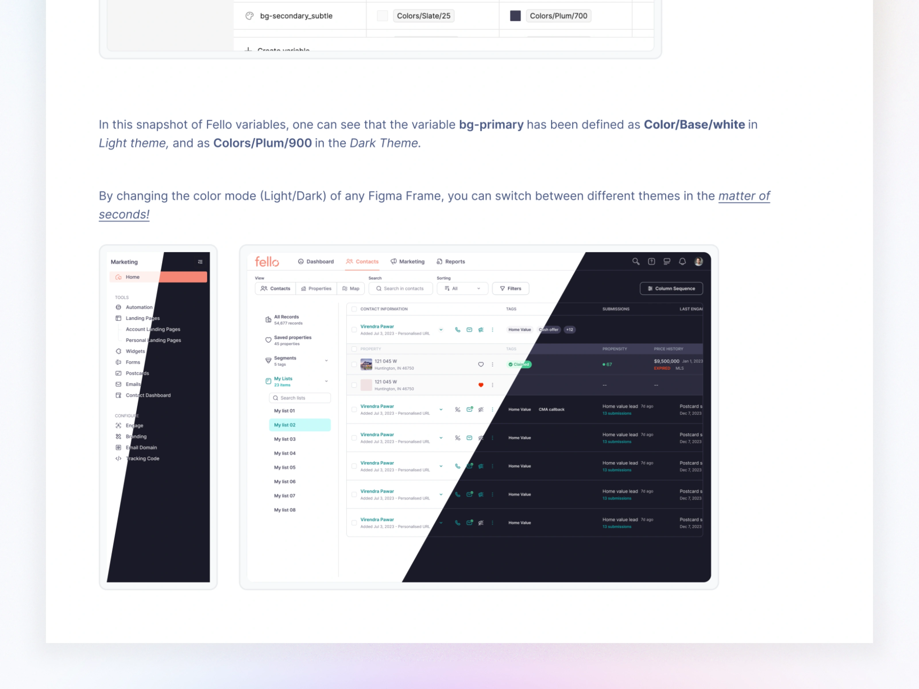
This allowed global theme switching in seconds—visible across the entire product.

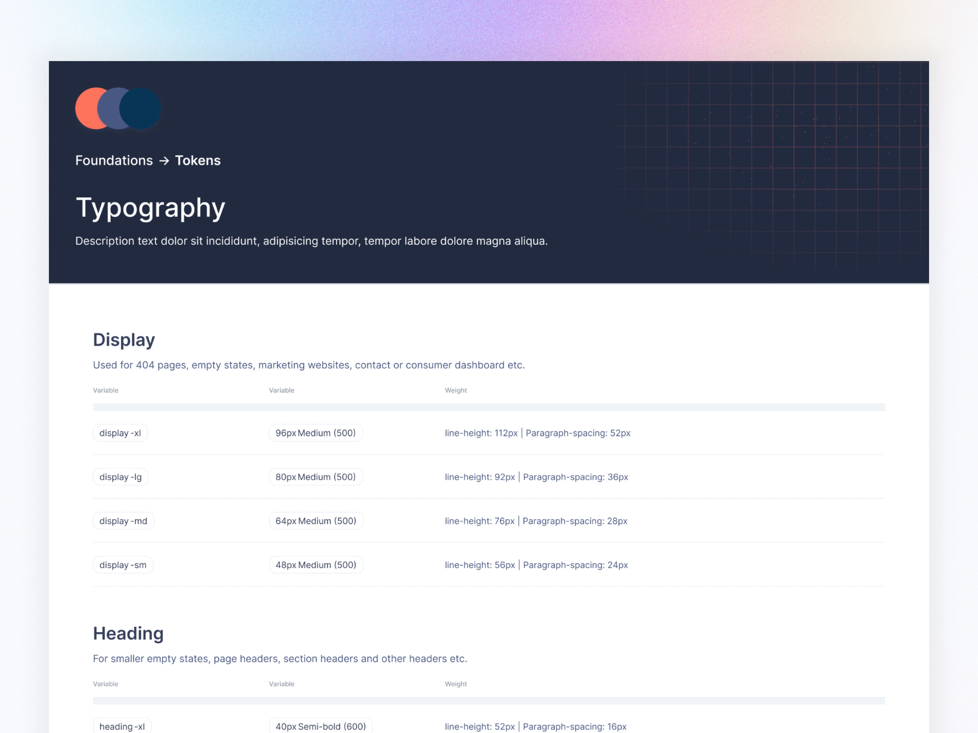
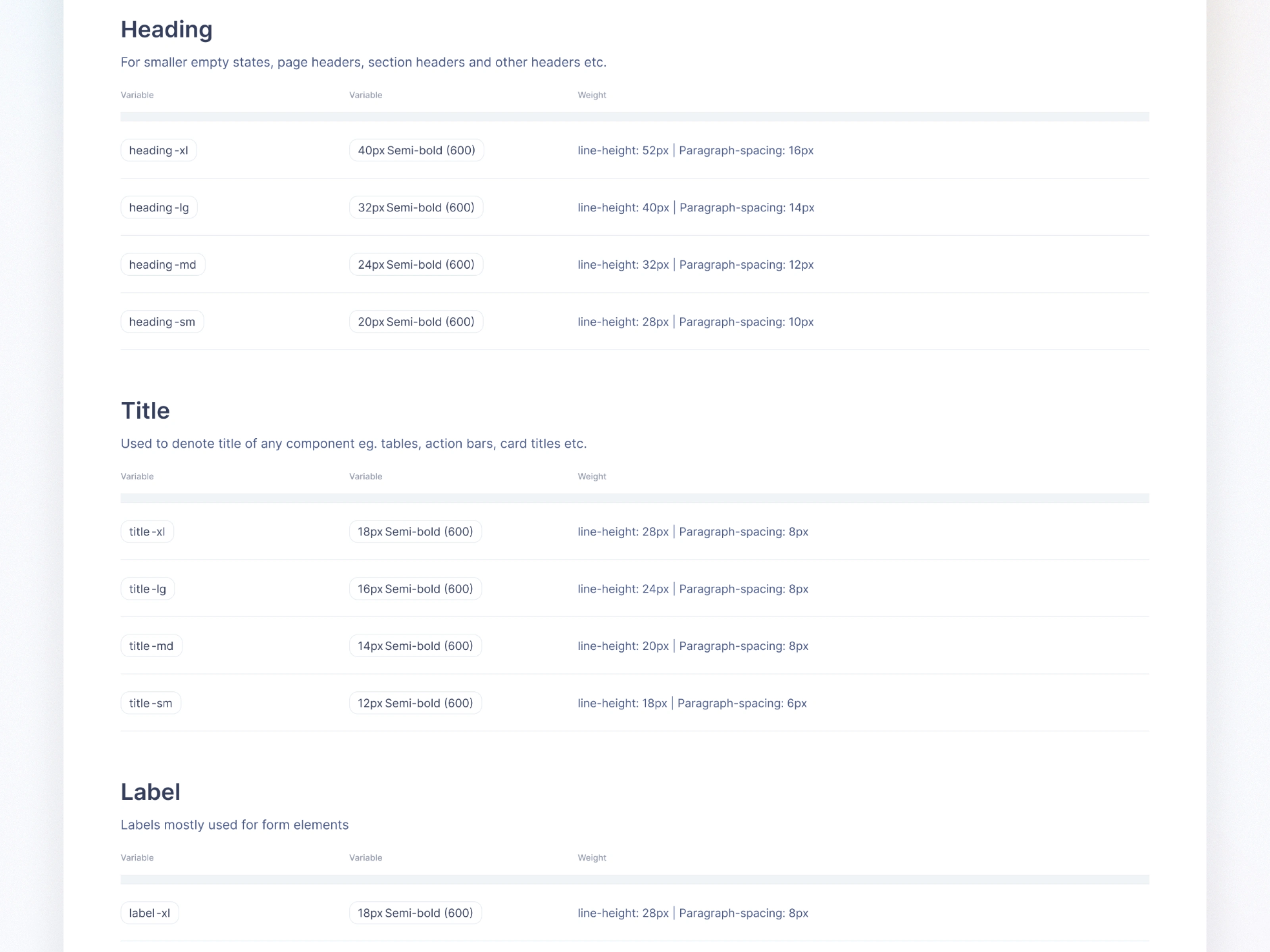
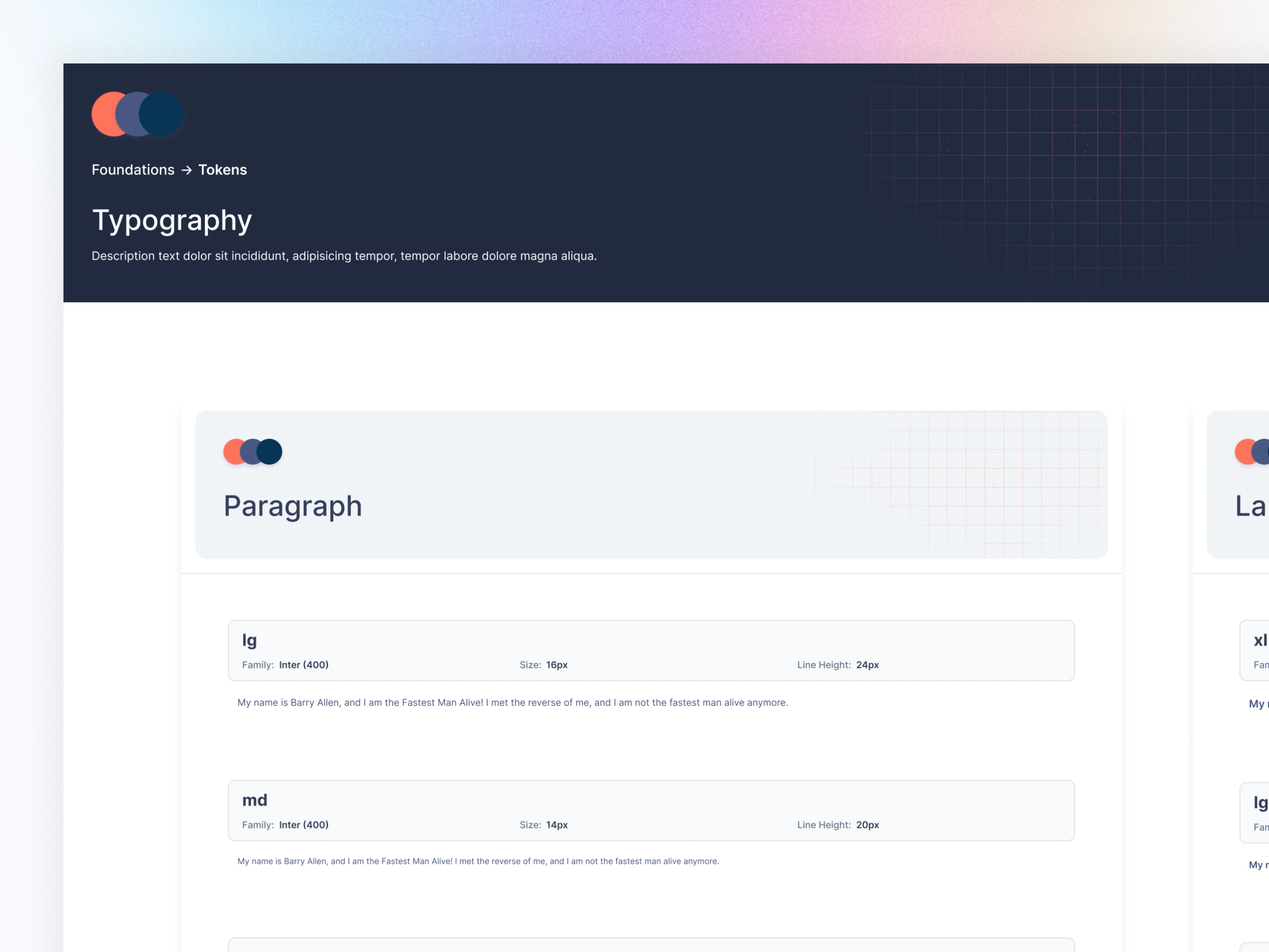
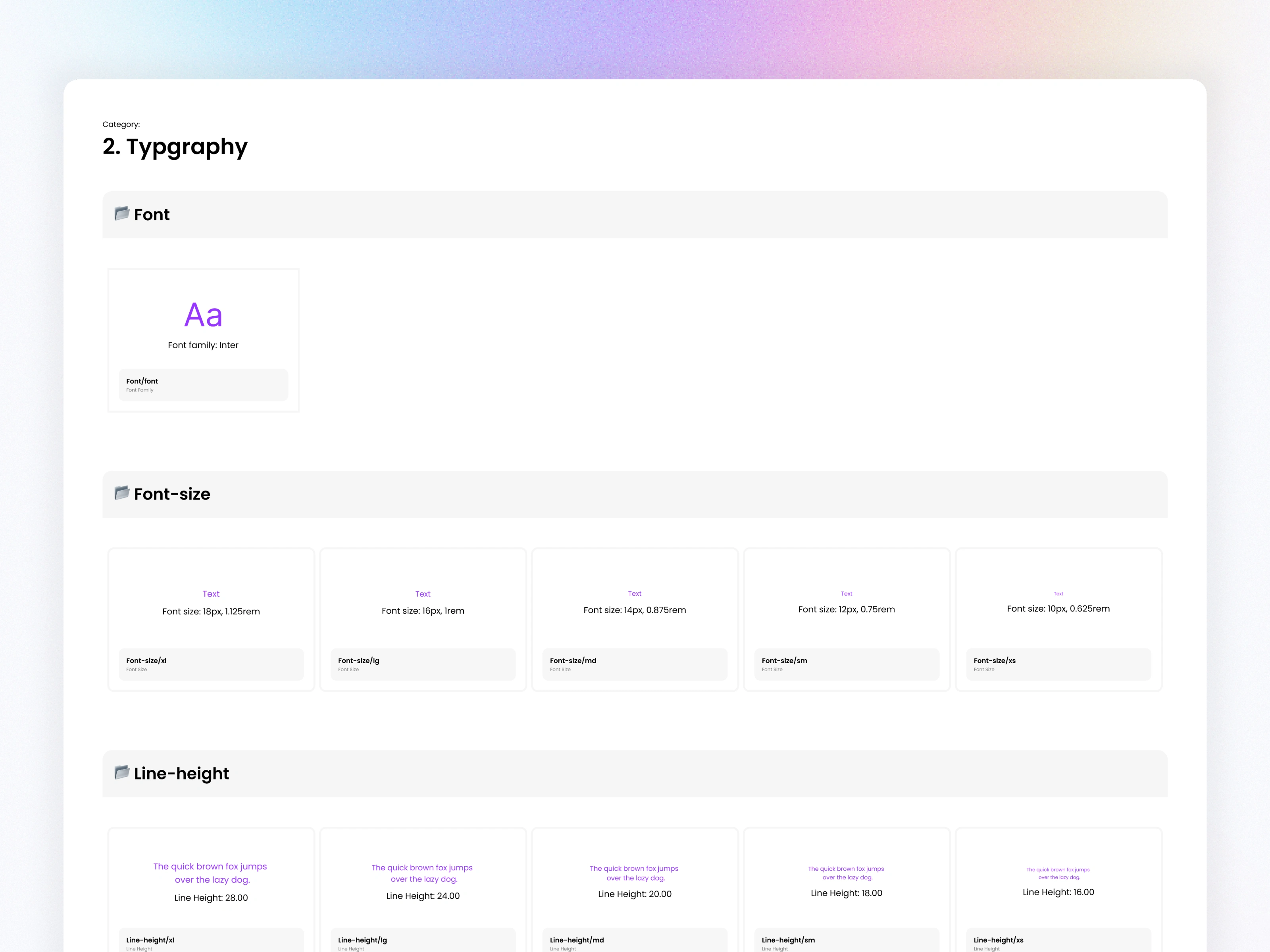
4.2 Typography Scale
Defined a clear hierarchy across 6 categories:
Display
Heading
Title
Label
Caption
Paragraph
Each token includes font size, weight, line height, and paragraph spacing—making the entire system predictable.
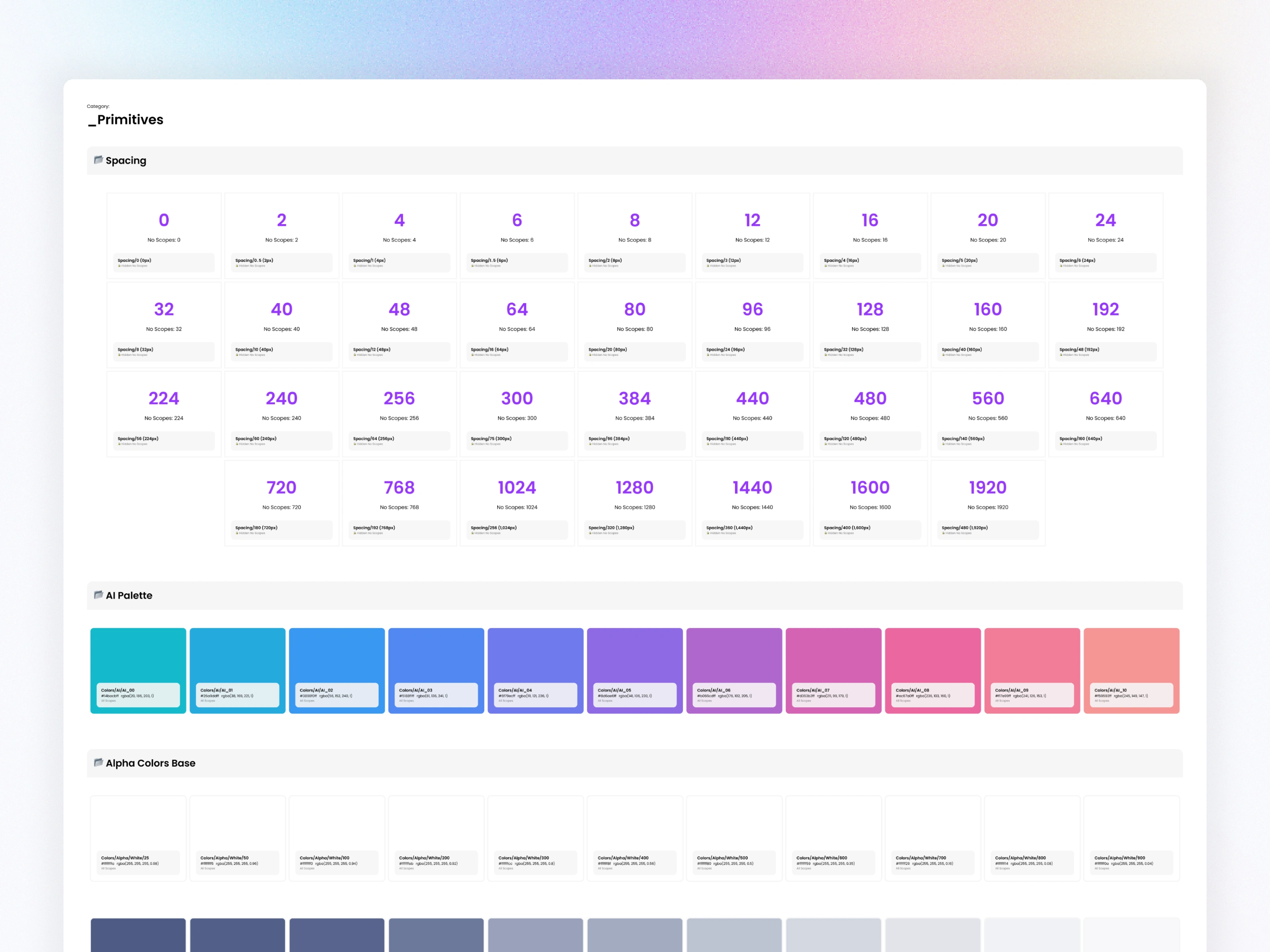
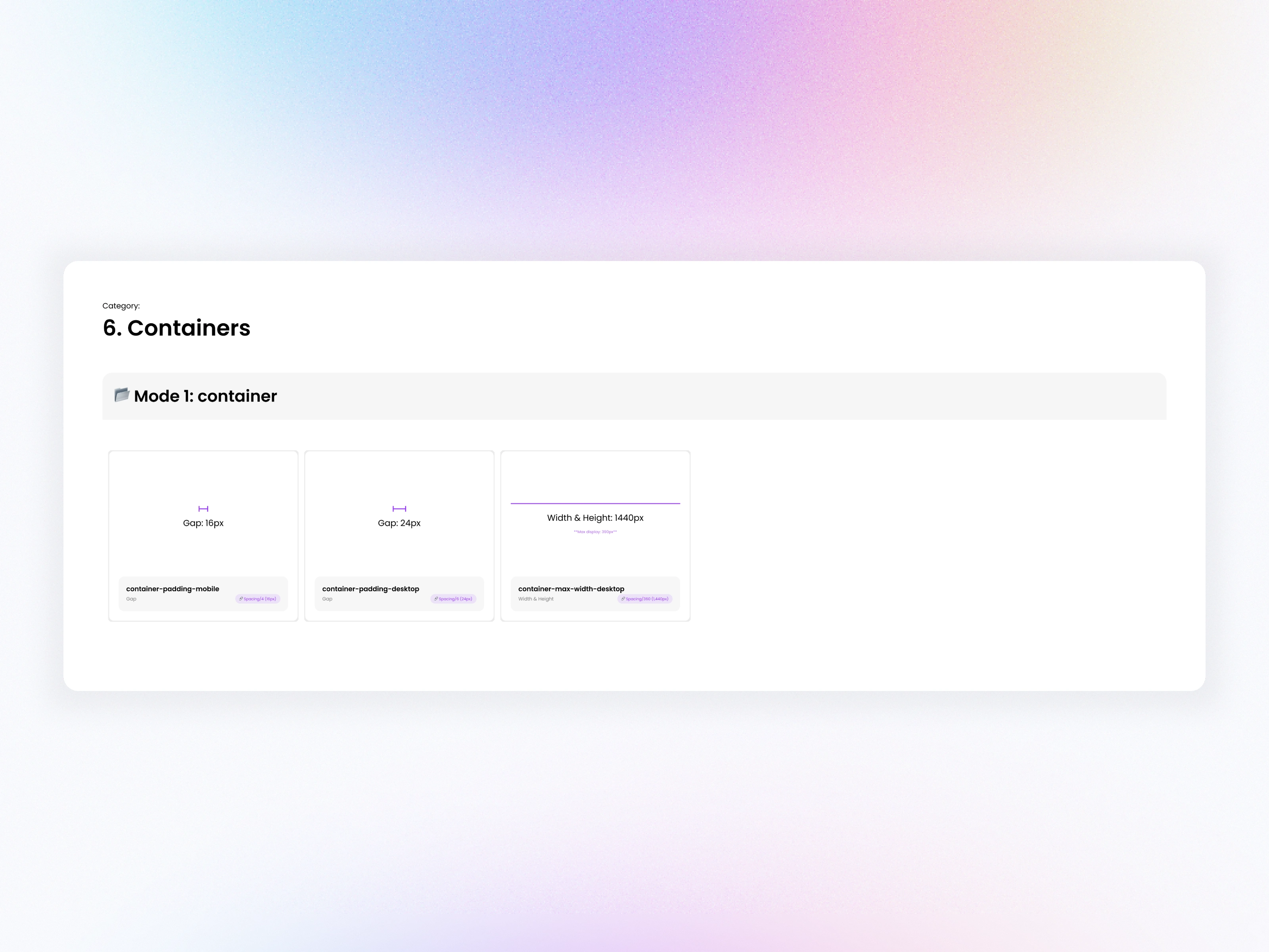
4.3 Spacing System
Created a 14-step spacing scale (0px–160px) with consistent gaps used across components, layouts, and responsive grids.
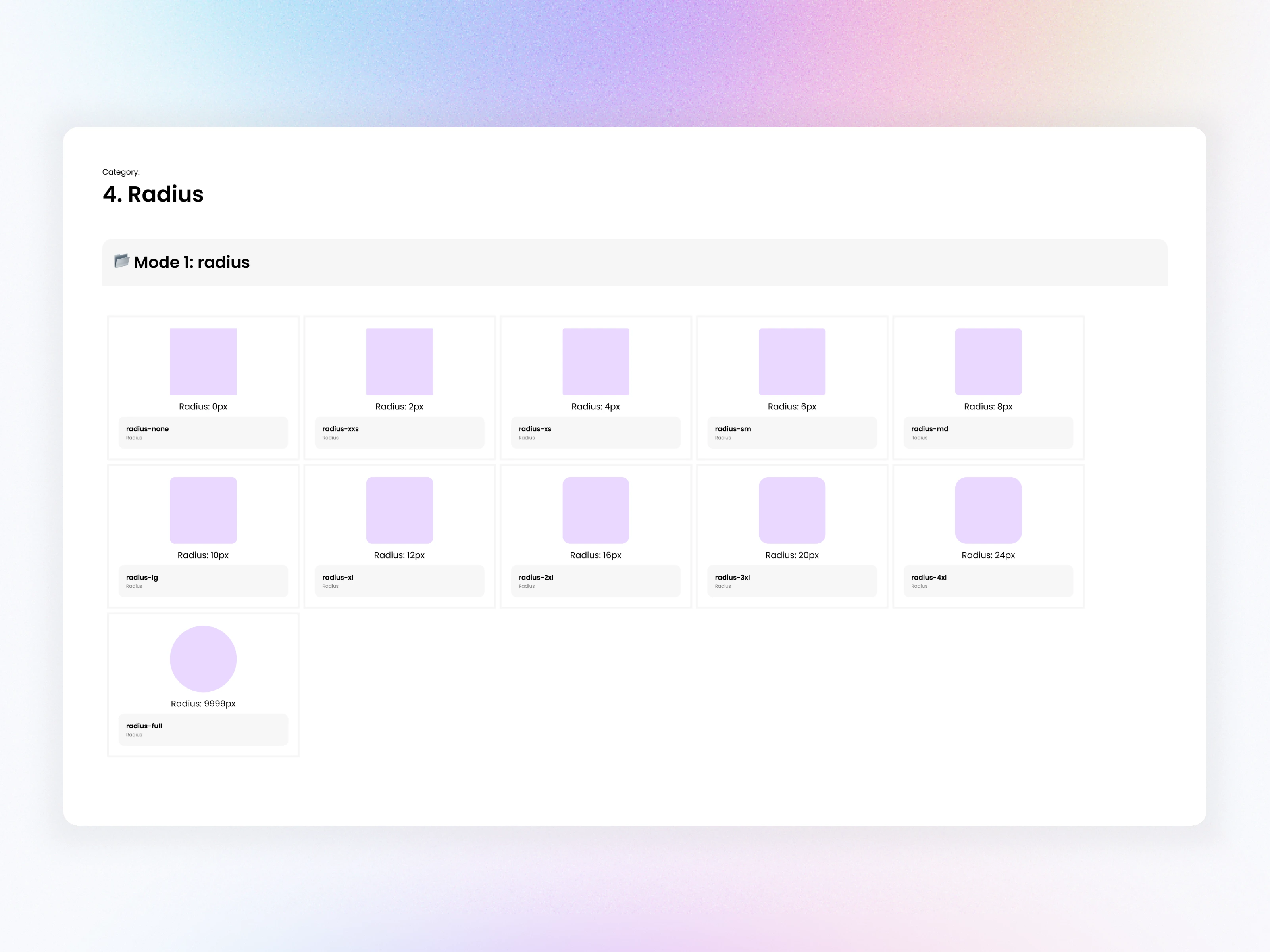
4.4 Radius Tokens
Defined radius tokens from 0px → 9999px to maintain consistency across buttons, cards, popups, tables, etc.
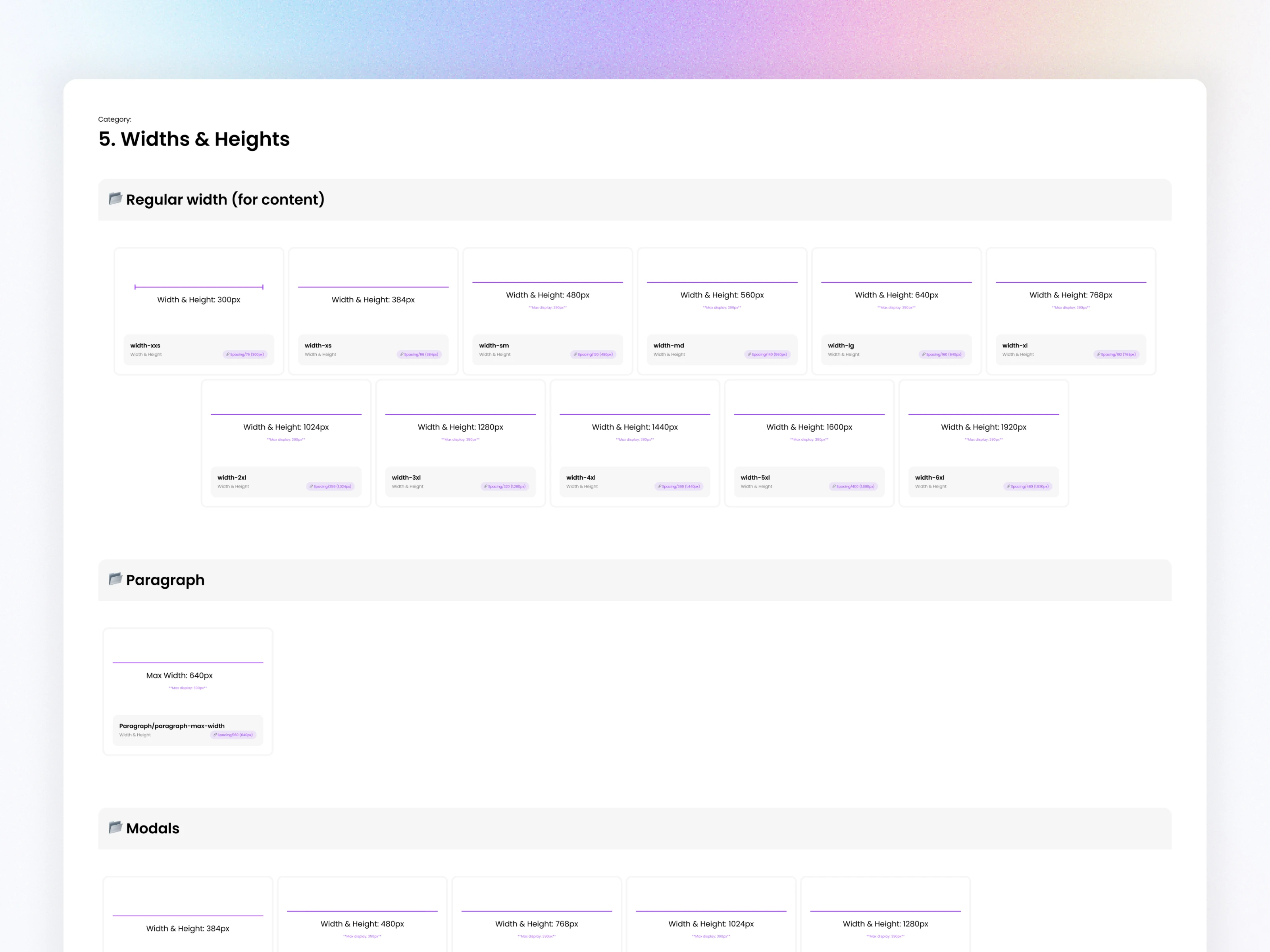
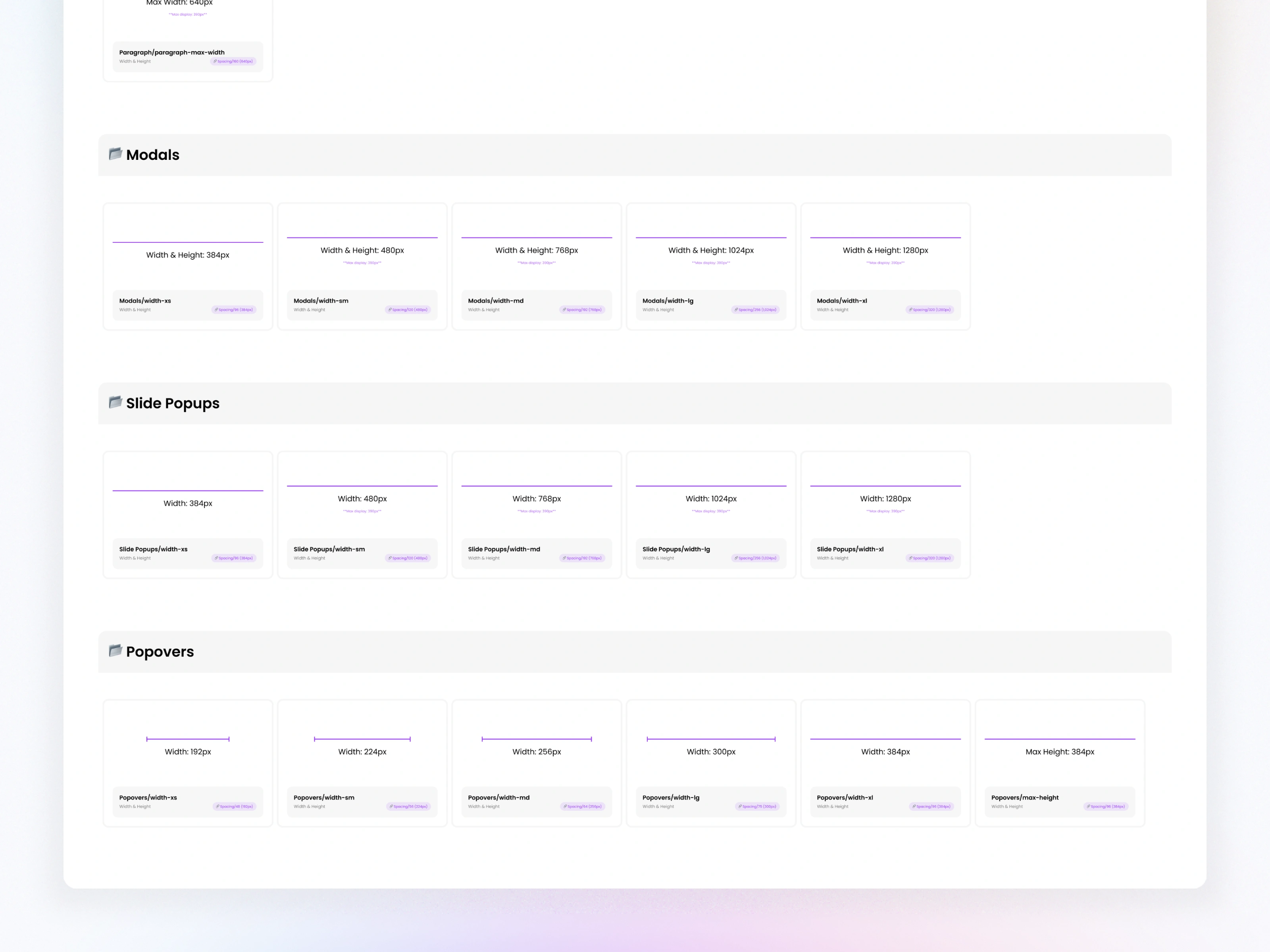
4.5 Size Tokens (Widths & Heights)
Established standardized widths for modals, slide-ups, popovers, content areas, and table sections.

05. Component Architecture
The system includes 200+ components across multiple categories:
Form Elements
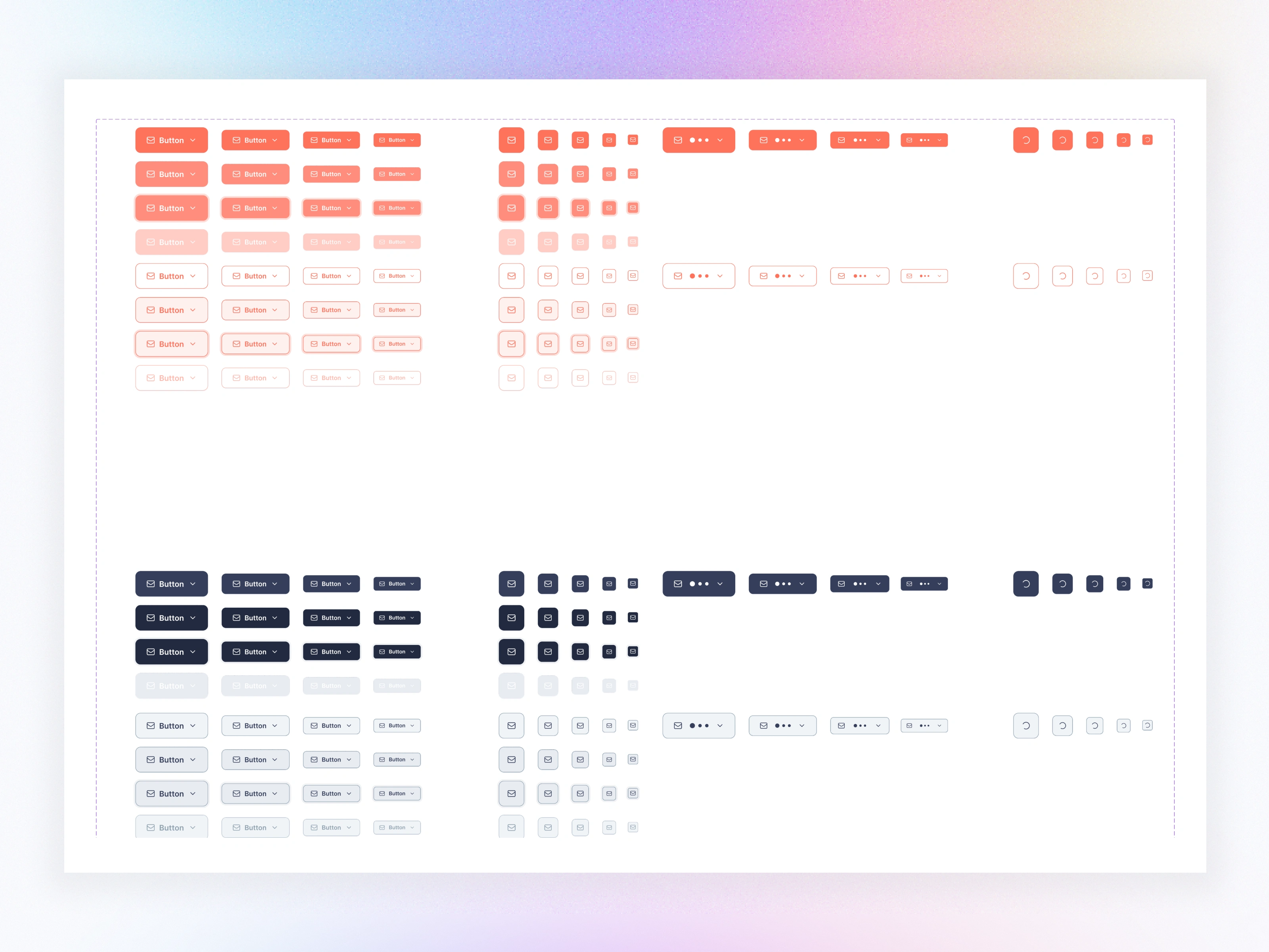
Buttons
Inputs, Selects, Search
Sliders, Toggles
Rich Text Editor
Tag Chips
Button Groups
Checkbox & Radio Sets
Data & Status Indicators
Avatars
Badges
Tags
Data Views
Progress Indicators
Dividers
Data Groups
Cards
Accordions
Context Menu
Data Apps
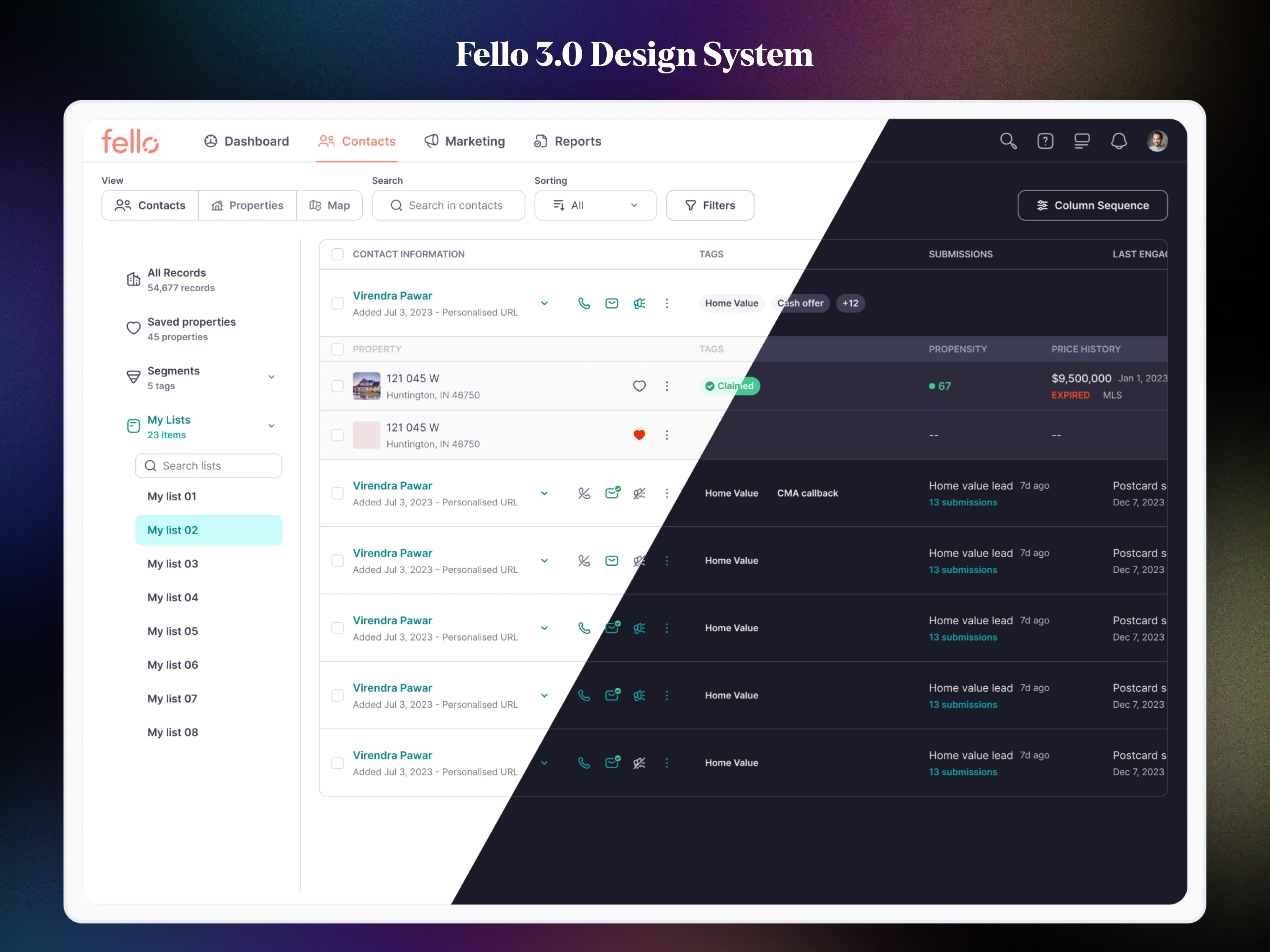
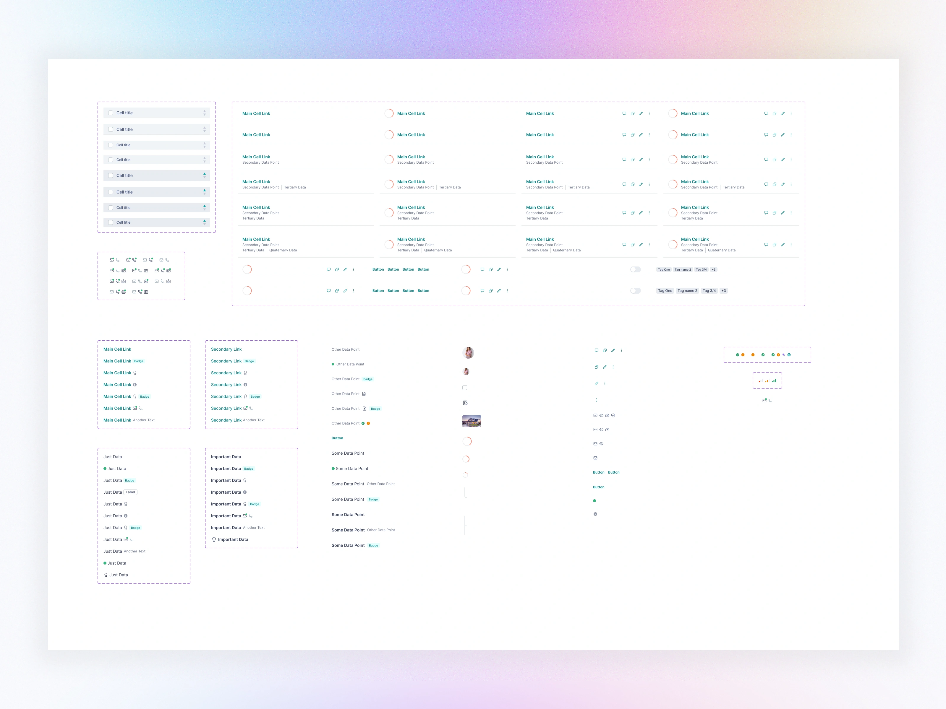
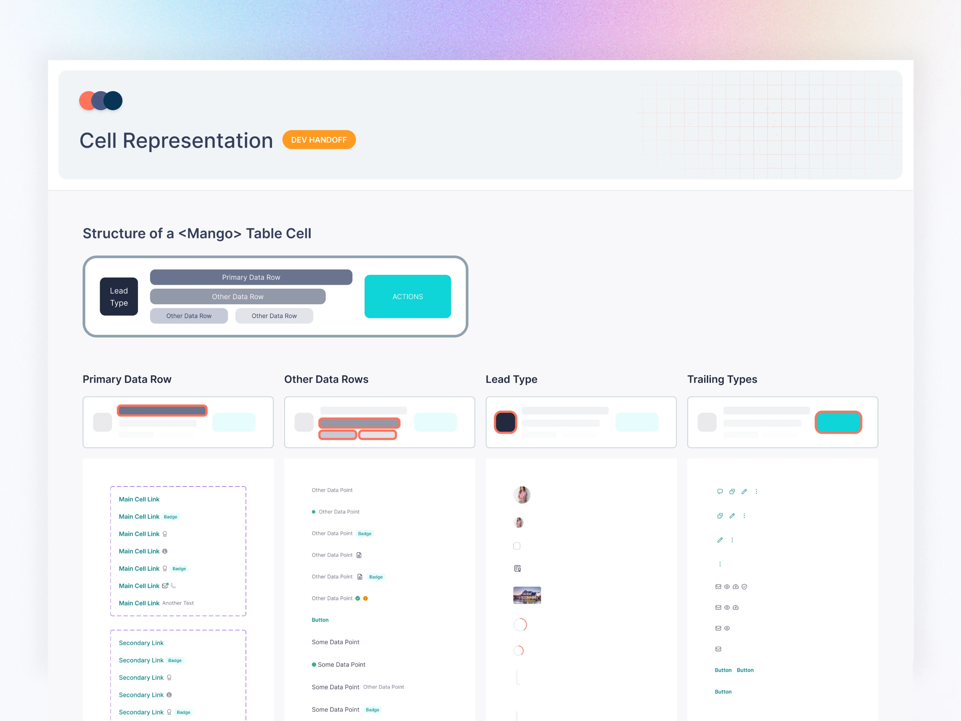
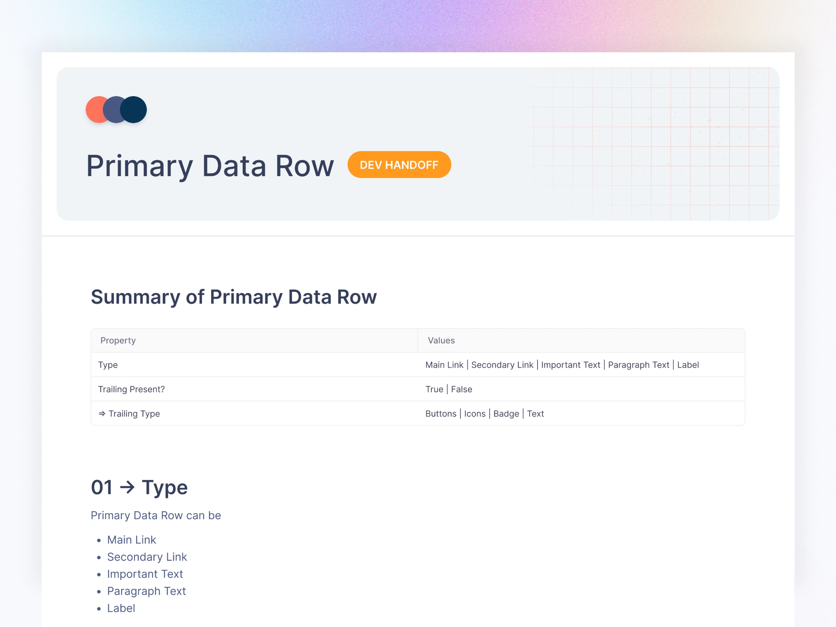
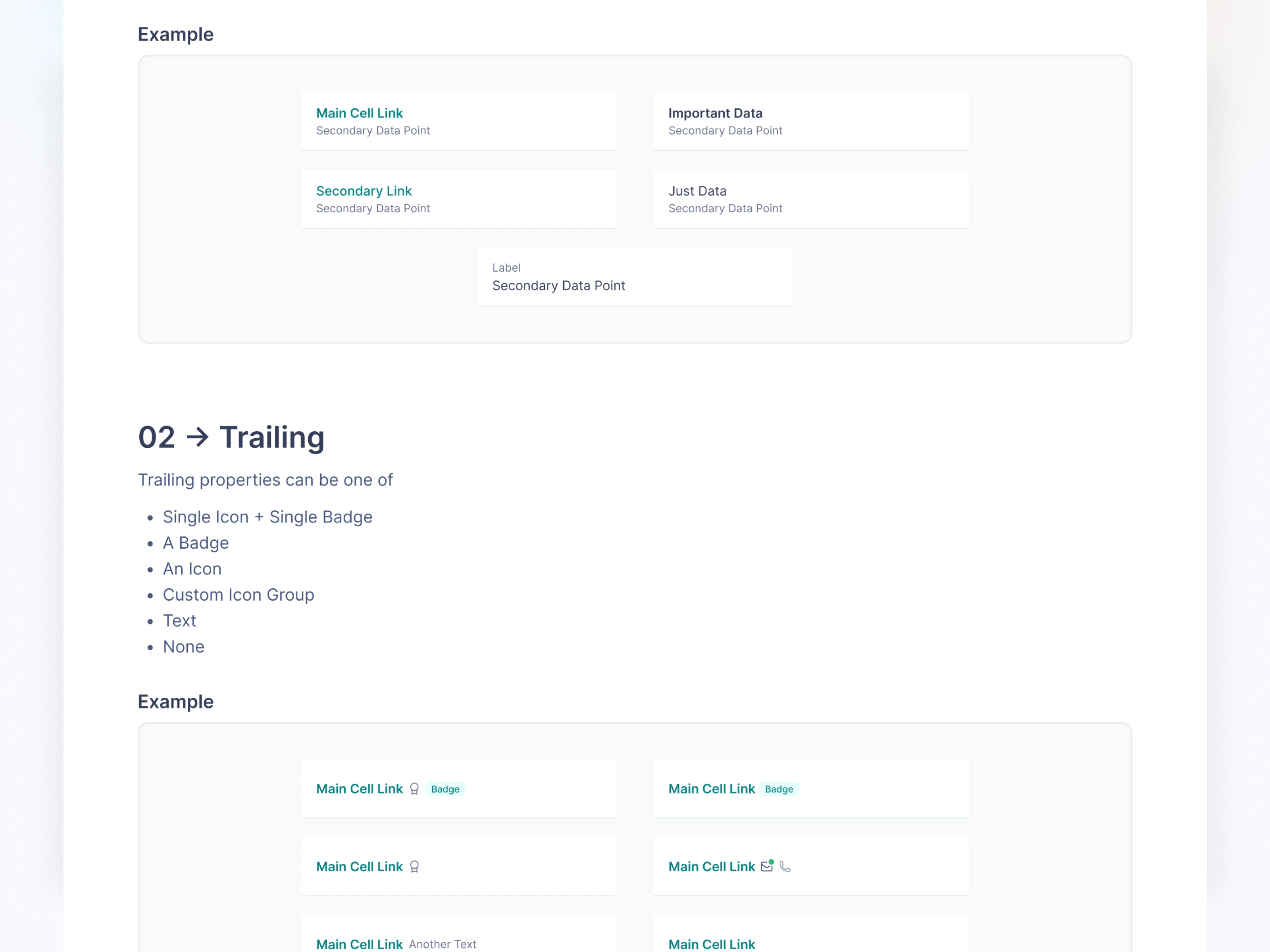
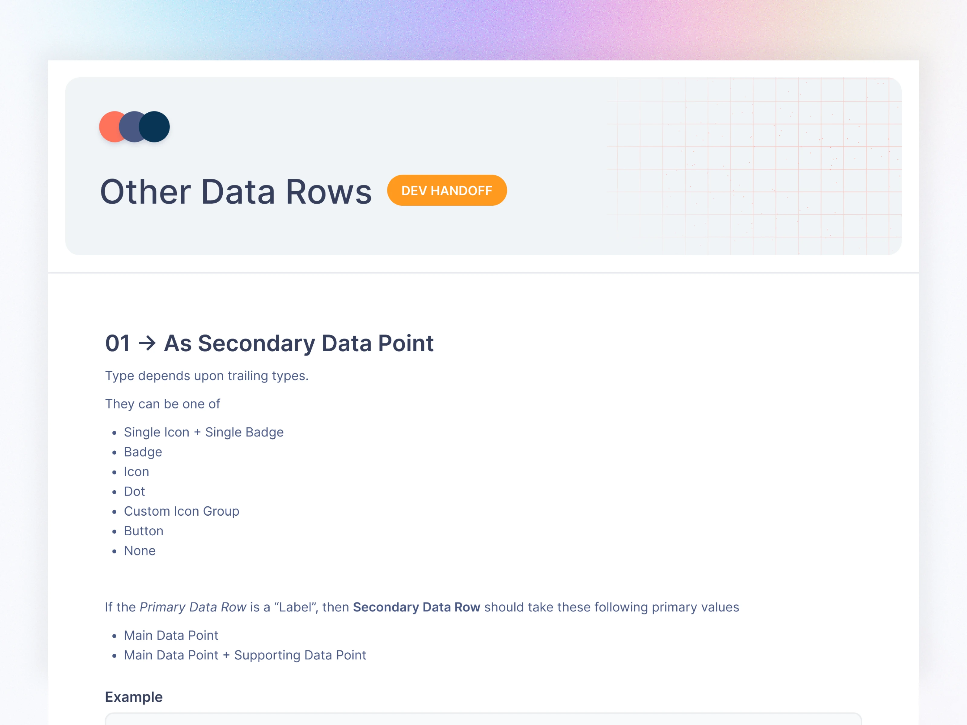
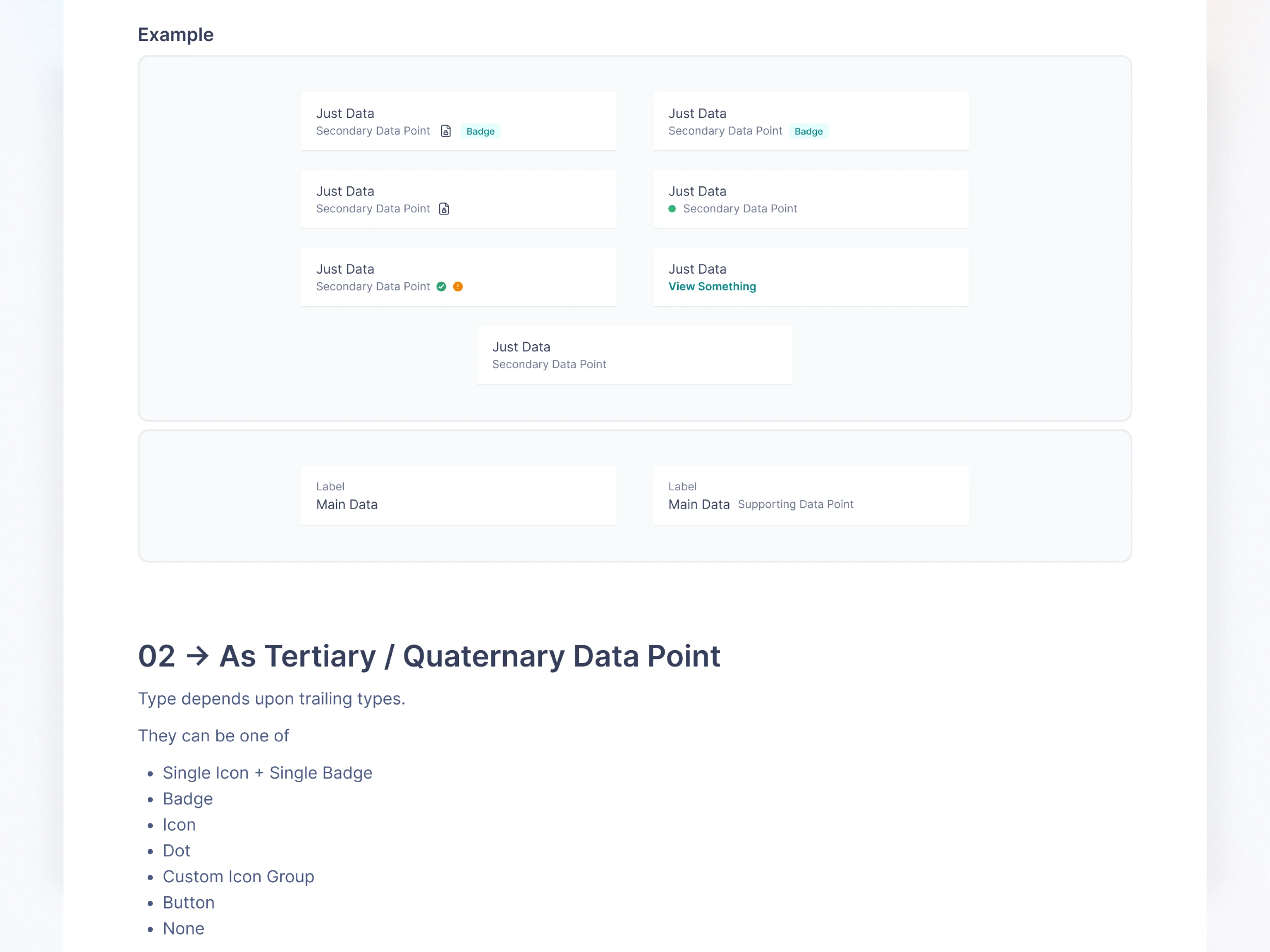
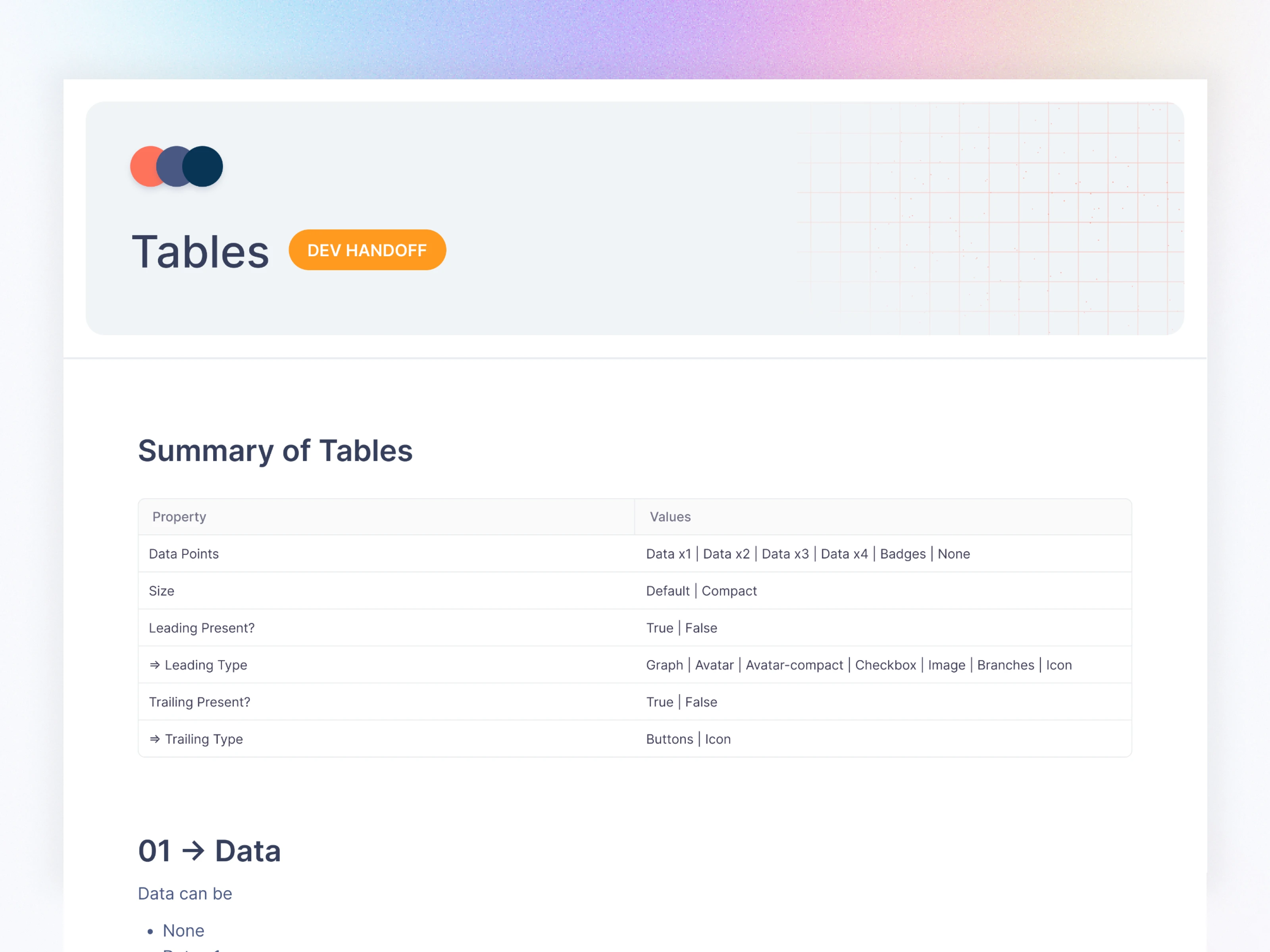
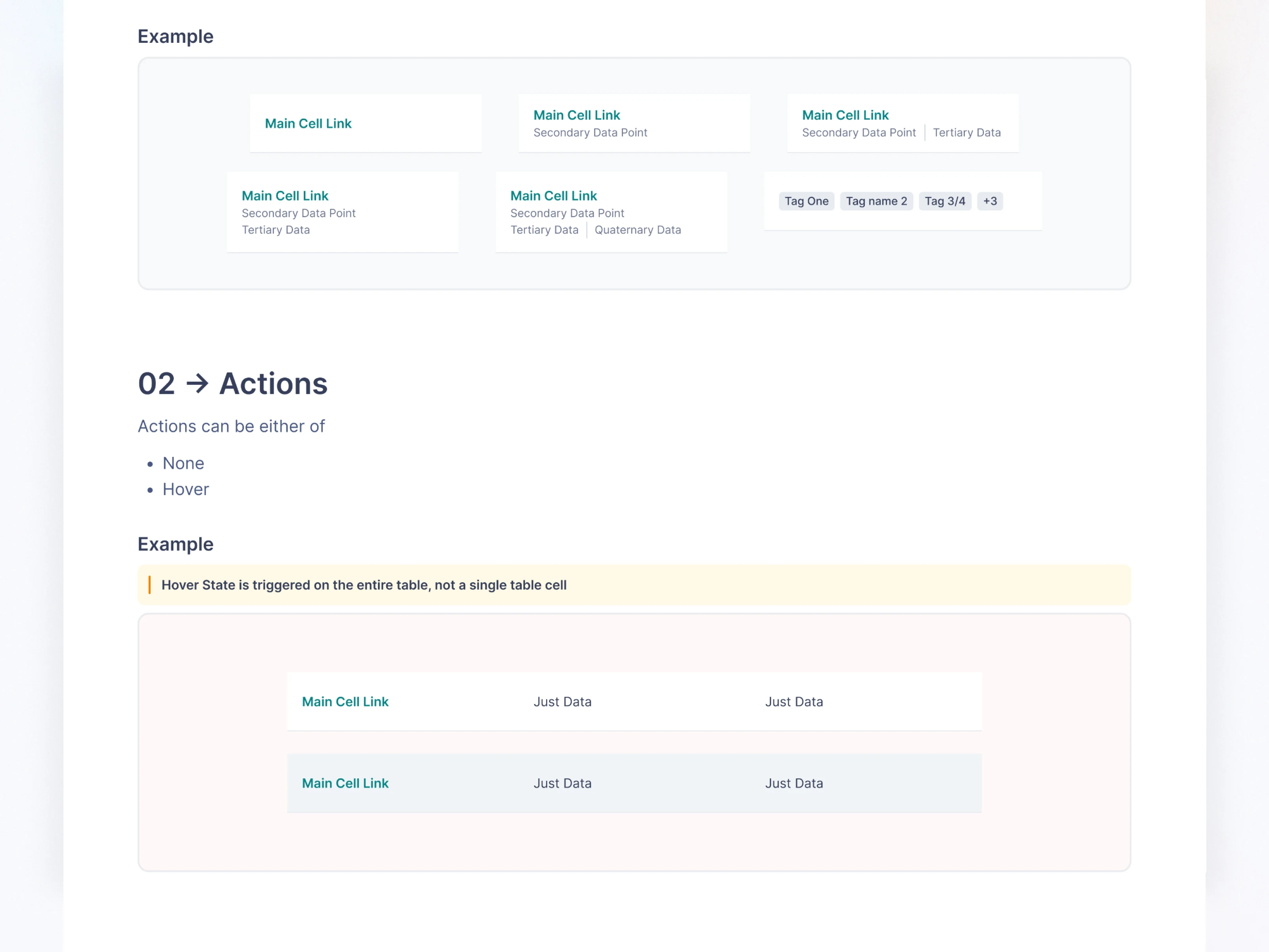
Tables (one of the most complex builds)
Empty States
Code Snippets
Headers & Navigation
App Bar
Page Header
Section Header
Navigation (Side panel, Bottom Nav, Breadcrumbs)
Inputs & Utility Components
Calendar
File Upload
Filters
Metrics
Charts
Overlays
Modals
Slide Popups
Bottom Sheets
Popovers
Floating Footers
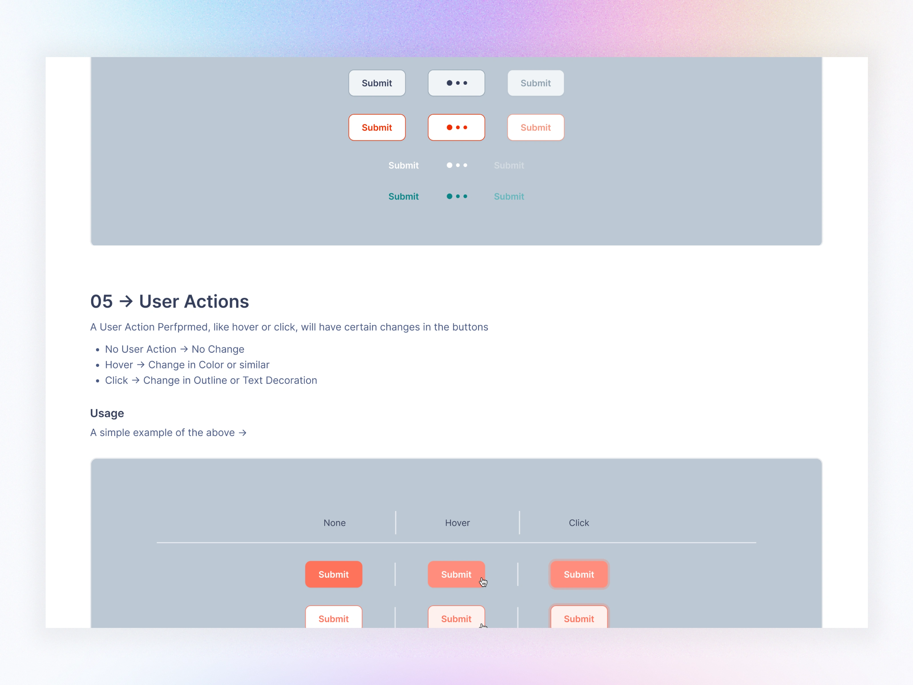
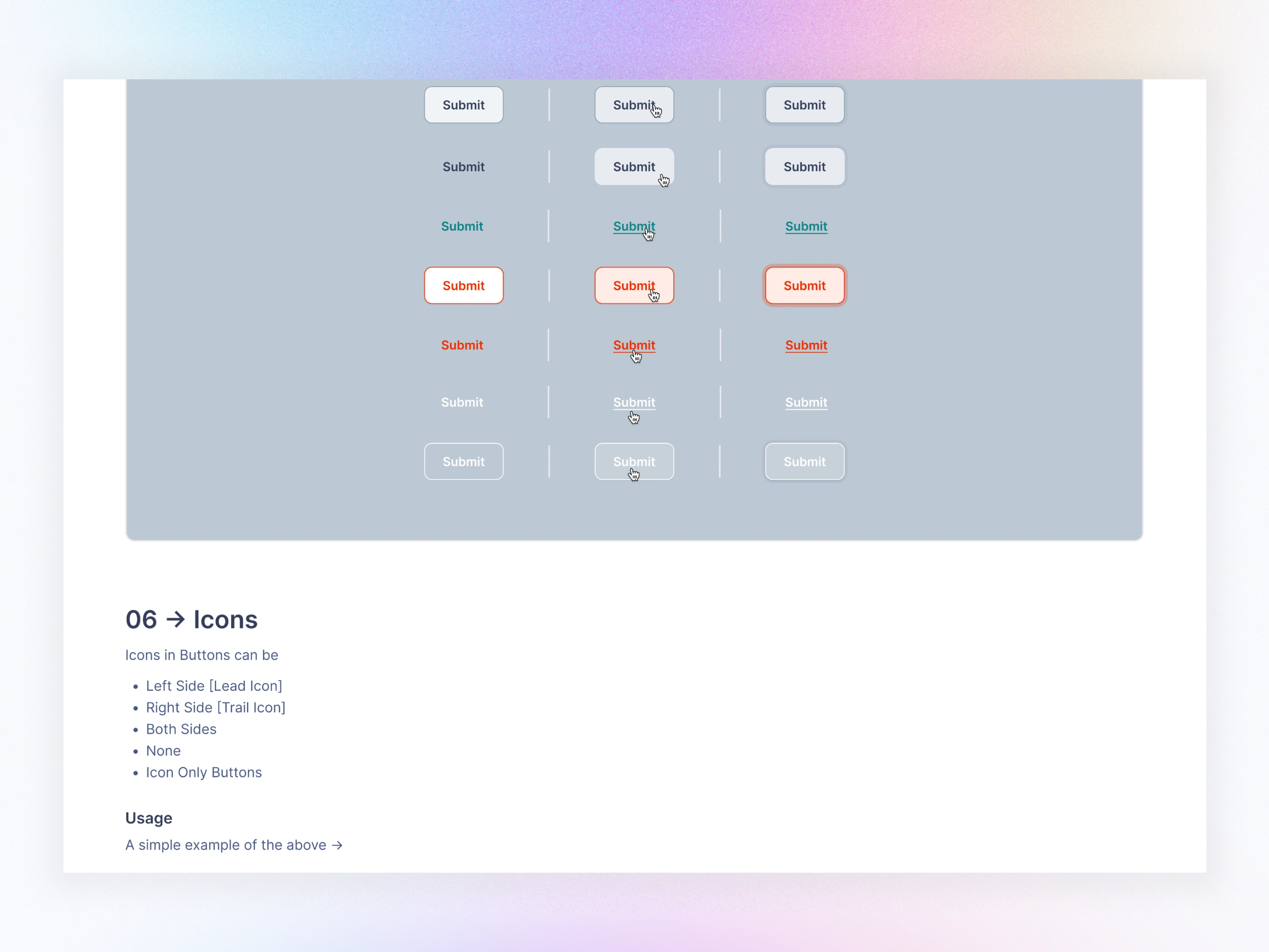
All components were built with:
✔ Auto-layout
✔ Responsive constraints
✔ Theming support
✔ Variants (sizes, states, types)
✔ Zero-dependency logic
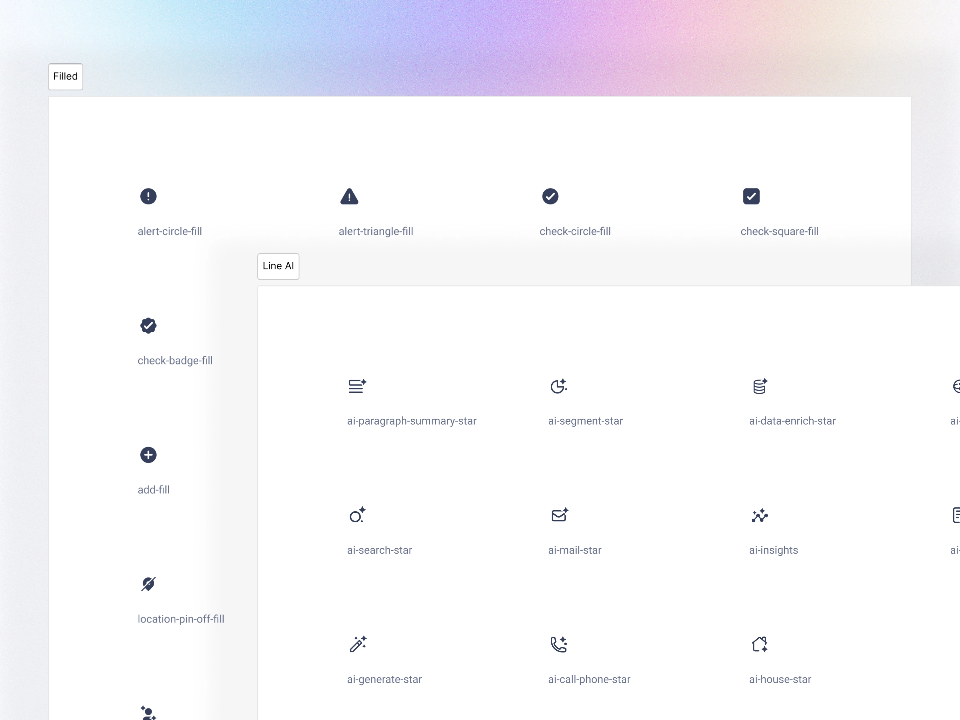
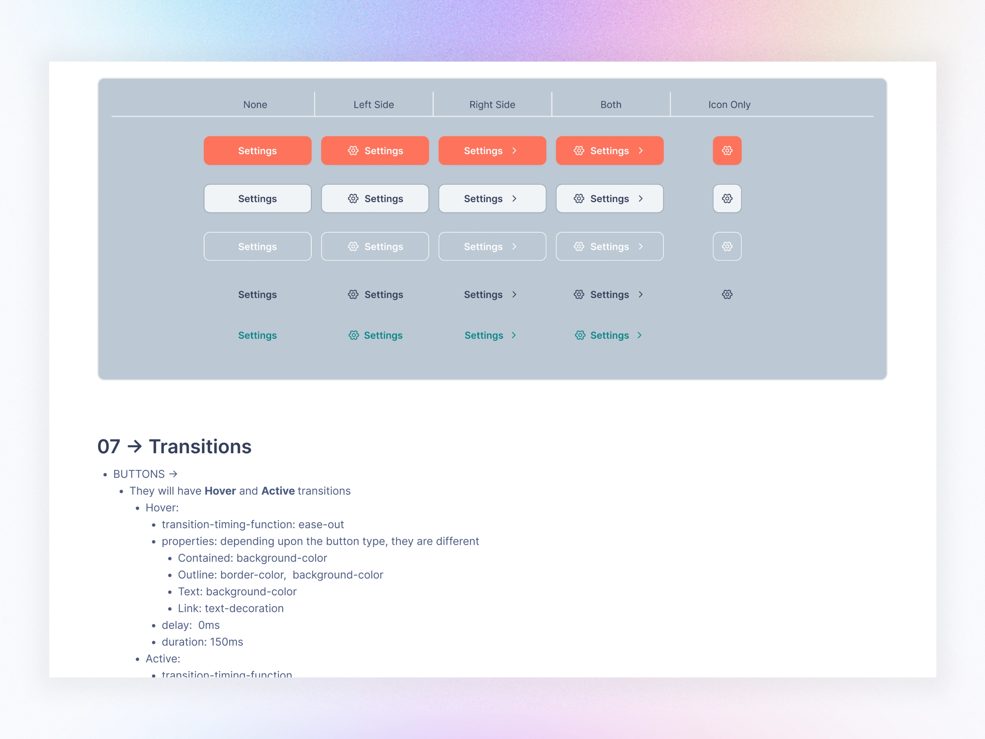
Icons
Shared Component - Buttons
Application Component - Tables
Theme Modes
Created two full themes:
Light Theme
Dark Theme
Switching themes updates:
Backgrounds
Borders
Text
Shadows
Tokens within all components
The entire CRM flips theme in seconds.
07. Documentation
I created a documentation hub covering:
Foundations
Data Indicators
Form Elements
Navigation
Data Groups
Overlays
Inputs
Notification
Dashboards
Progress Indicators
Code Snippets
Component Variants
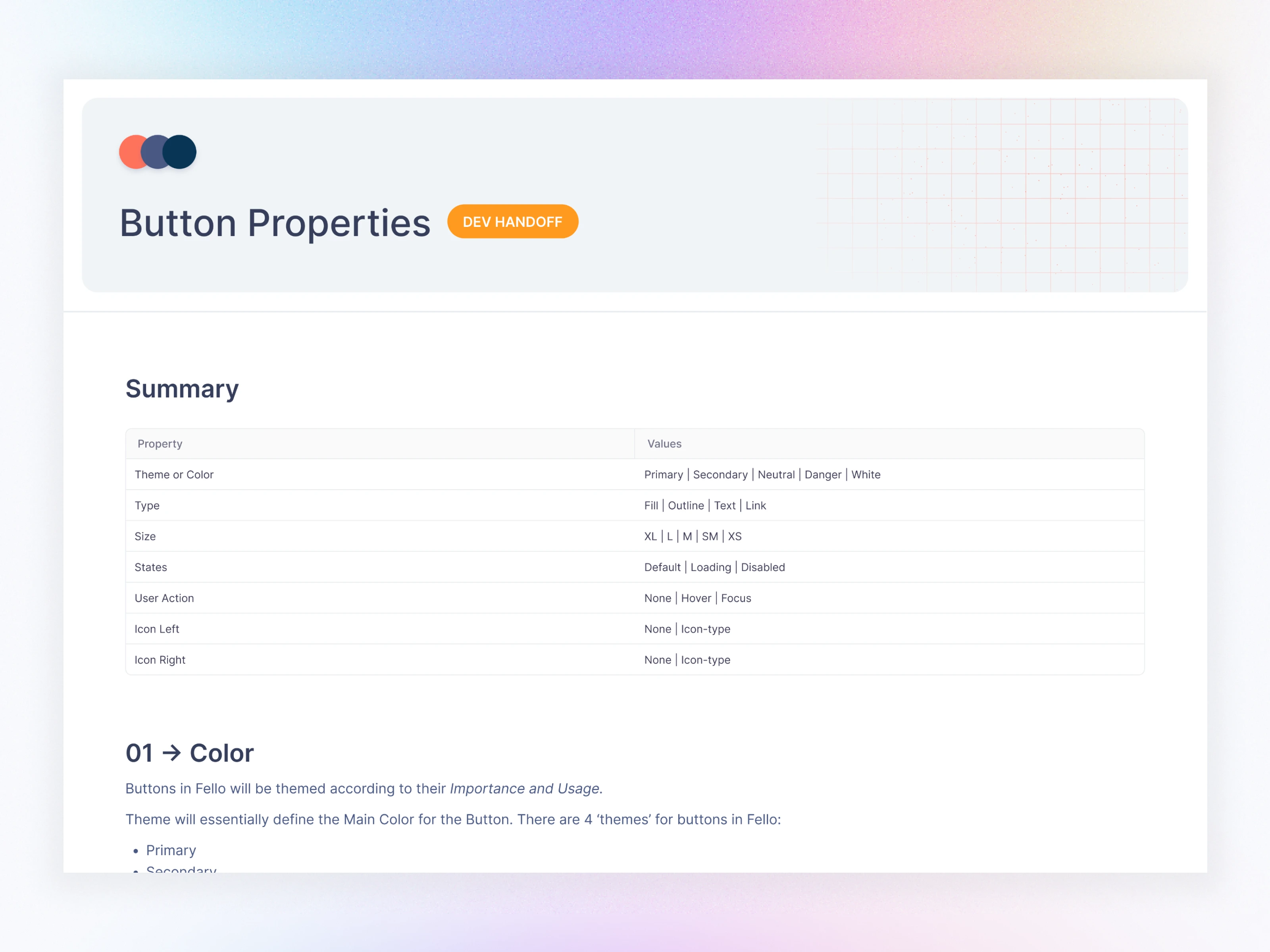
Usage Guidelines
Do/Don’t examples
Each component page includes:
Anatomy
Variants
UX guidelines
Interaction specs
Accessibility rules
08. Impact & Results
Product Outcomes
CRM redesign became 50% faster
Mobile & Web share the same token structure
Engineering involvement in UI fixes dropped significantly
Unified brand experience across all verticals
Team Outcomes
New designers onboard in under 1 hour
Developers rely on tokens instead of custom CSS
Cross-team collaboration improved immediately
Reduced visual & interaction inconsistencies
09. What I Learned
A scalable system requires more structure than components
Naming conventions are critical for future maintenance
Documentation must be simple enough to reduce dependency
Theme management should be built from Day 1
Teams adopt systems faster when design & dev vocabulary match
10. Closing Notes
Fello 3.0 became more than a design system—it’s the design language of the company, powering every experience from CRM to marketing to mobile apps.
This system continues to evolve, supporting new modules effortlessly thanks to an intentionally scalable foundation.
Like this project
Posted Nov 24, 2025
Built Fello 3.0, a scalable, token-driven design system that unified CRM, marketing, and analytics products—improving consistency and speeding delivery.