Life sciences wordmark, deck and site package

Vincent L. Anderson

A demo built for a specific brief. Not client work: the material shown is placeholder content.
I designed a rebranding package for a fictional life-sciences company using exactly the brief's design elements: slate blue #3E536E, dark maroon #370B17 and wine #6E162E, with Lora for headlines and Manrope for body text. The logo pairs a monoline icon with a new wordmark drawn in its style: the wordmark's stroke equals the icon's stroke at lockup size, terminals and joins are round, and the O sits on the icon's inner ring radius; horizontal, stacked and icon lockups come as 12 SVG files and 3 vector PDFs. The investor deck has 16 slides as an editable PowerPoint file whose theme carries the palette and both fonts, with the logo as editable vector geometry on each slide, and three source-to-redesign comparisons. A home page design for a Squarespace template and its Site Styles settings (fonts, the five-color palette and buttons) use the same values. Every palette pairing is measured for contrast, and the schedule gives each deliverable two revision rounds within 18 working days, finishing by October 31.
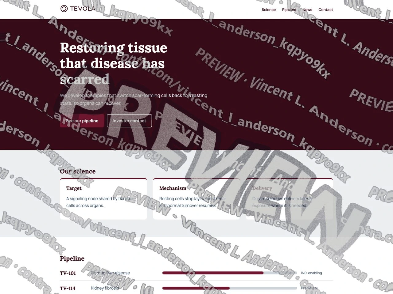
Website home page in the palette, Lora and Manrope
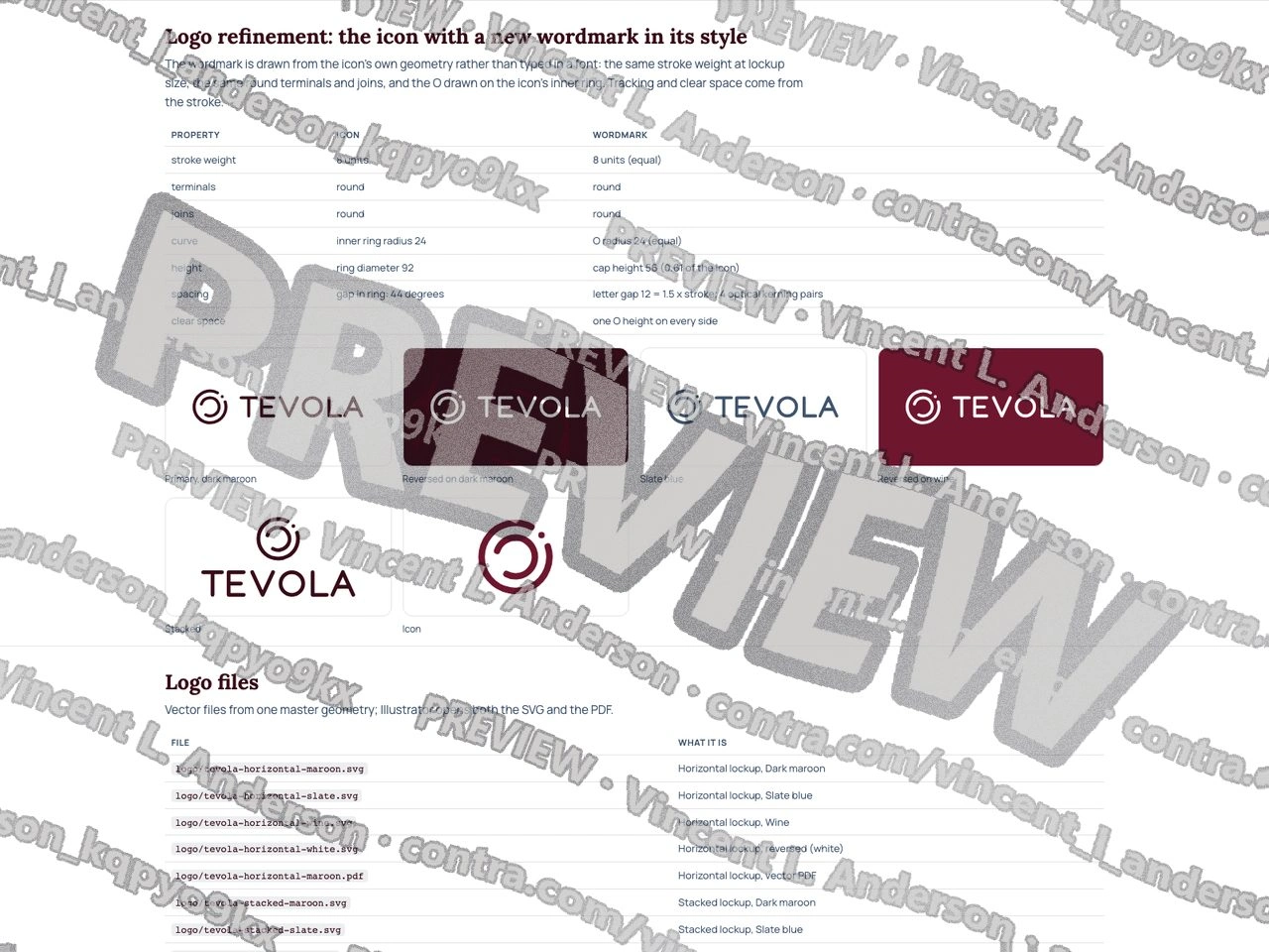
Icon and new wordmark, lockups and logo files
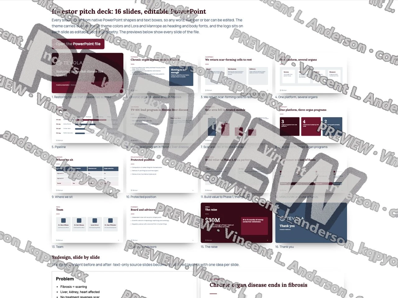
16-slide investor deck, editable PowerPoint
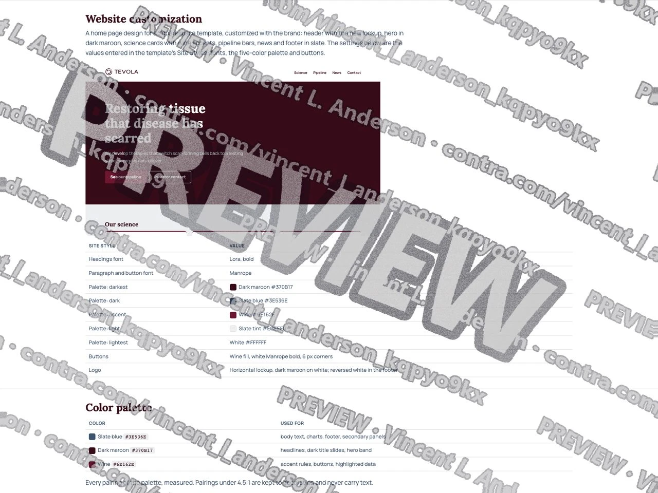
Squarespace Site Styles settings
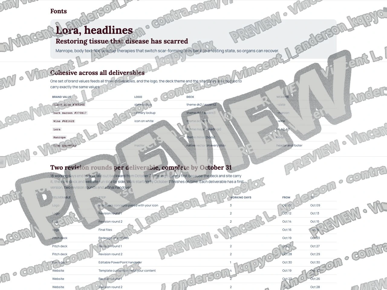
Fonts and color palette
Like this project
Posted Sep 23, 2026
I designed a rebranding package for a sample life-sciences company in the brief's slate blue, dark maroon and wine, with Lora for headlines and Manrope for body text.
Likes
0
Views
1