Swim training app flows and design system

Vincent L. Anderson

A demo built for a specific brief. Not client work: the material shown is placeholder content.
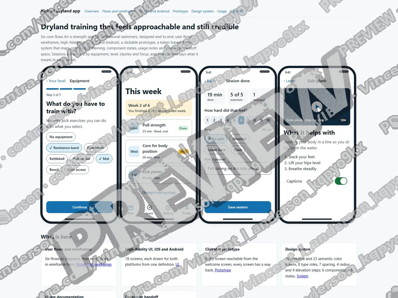
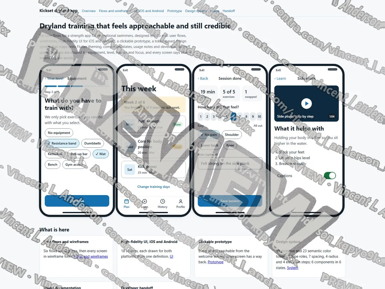
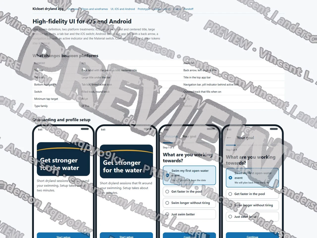
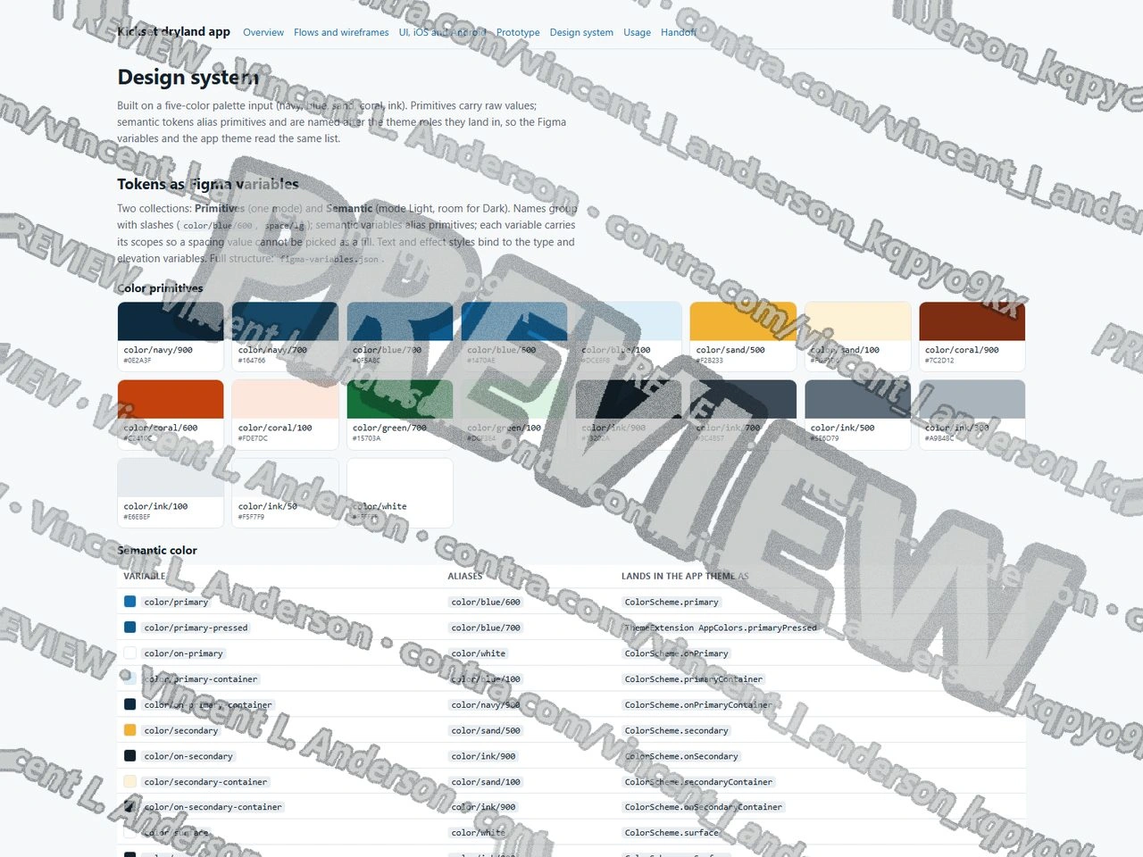
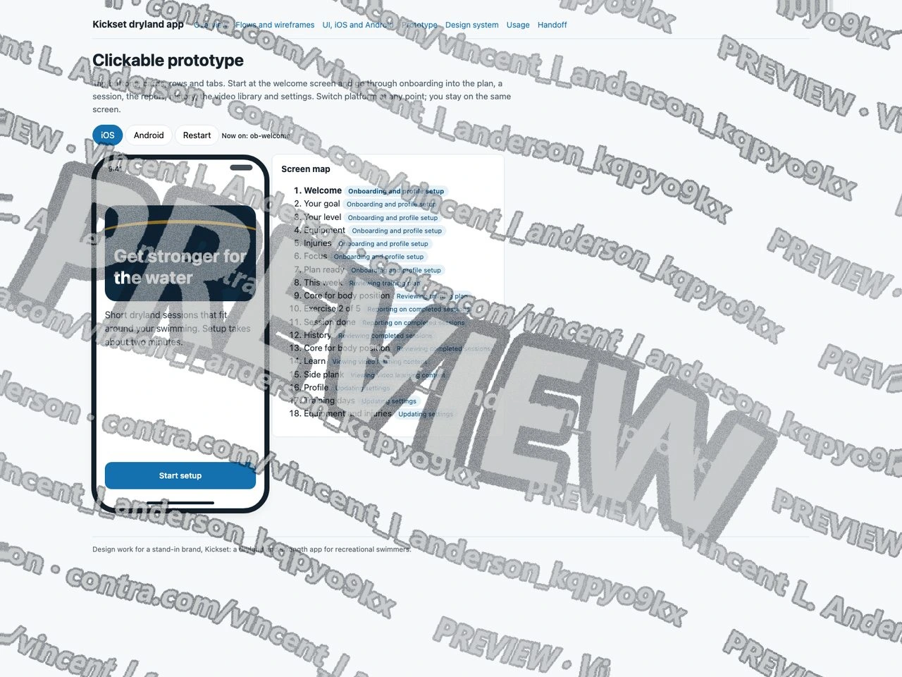
I designed a fictional dryland and strength app for recreational swimmers. It covers the six core flows named in the posting (onboarding and profile setup, reviewing the training plan, reporting and reviewing completed sessions, video learning, settings) across 18 screens, each drawn for iOS and Android from one screen definition, shown as user-flow diagrams, wireframes, high-fidelity UI and a clickable prototype. The design system has 19 primitive and 23 semantic color tokens structured as Figma variable collections with aliases and scopes, 8 type roles, 7 spacing steps, 4 radius steps and 4 elevation steps, and a role-by-role map onto Flutter theming. All 18 text pairings meet 4.5:1. Six components are shown in the default, pressed, disabled, error, empty and loading states, with a reason wherever a state cannot occur. Usage notes, handoff specs for two screens, the audit method and a two-phase plan complete it. Every link works, every screen is reachable, the app copy is free of coaching jargon, and every app style uses a token rather than a literal color.
Swim training app flows and design system 1
Swim training app flows and design system 2
Swim training app flows and design system 3
Swim training app flows and design system 4
Like this project
Posted Sep 23, 2026
I designed a product design demo for a stand-in dryland and strength app for recreational swimmers.