Sapra Media: Brand Identity, Custom Typeface and Website

Heydar Hedayati


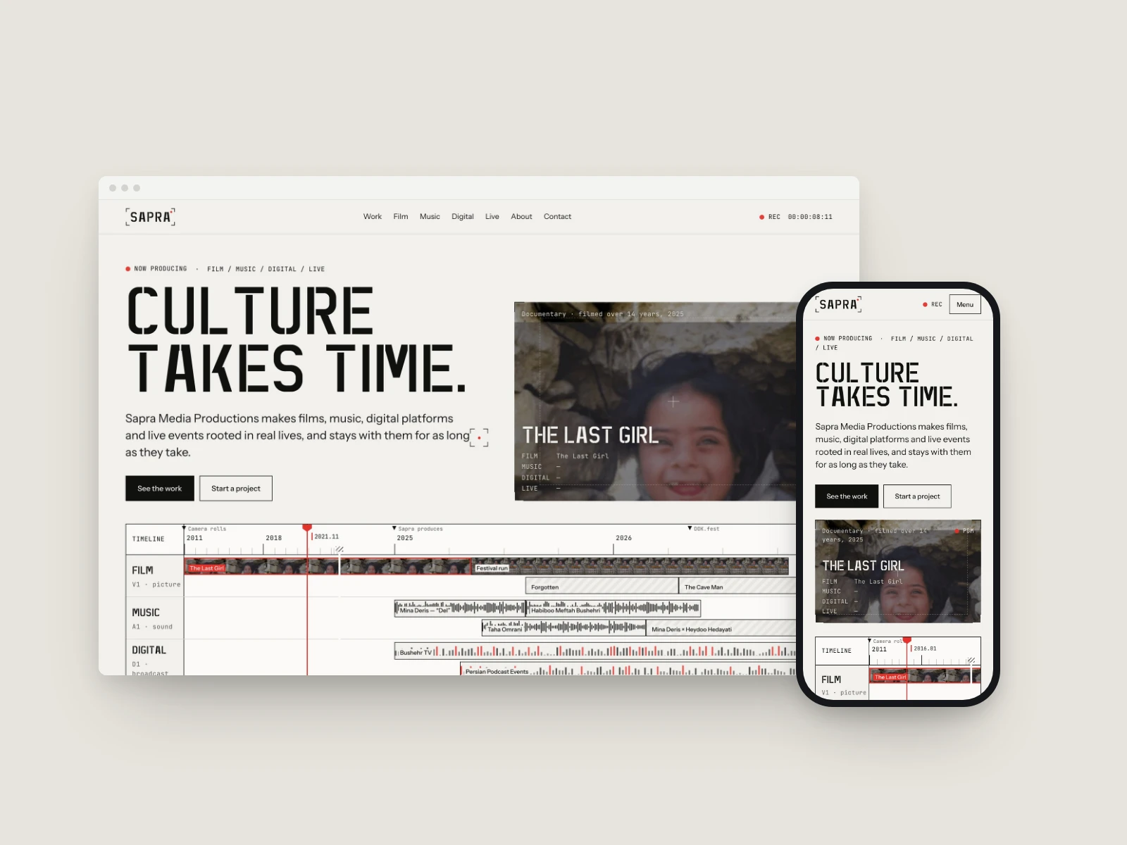
A brand identity, a custom stencil typeface and a hand-built website for Sapra Media Productions, a studio that makes films, music, digital platforms and live events. Live at sapra.io.
The problem
Sapra ran on a rented WordPress template: broken characters on every page, placeholder copy, stock photography and a logo cut from a screenshot. It said the opposite of what the company does, careful long-term work with artists.
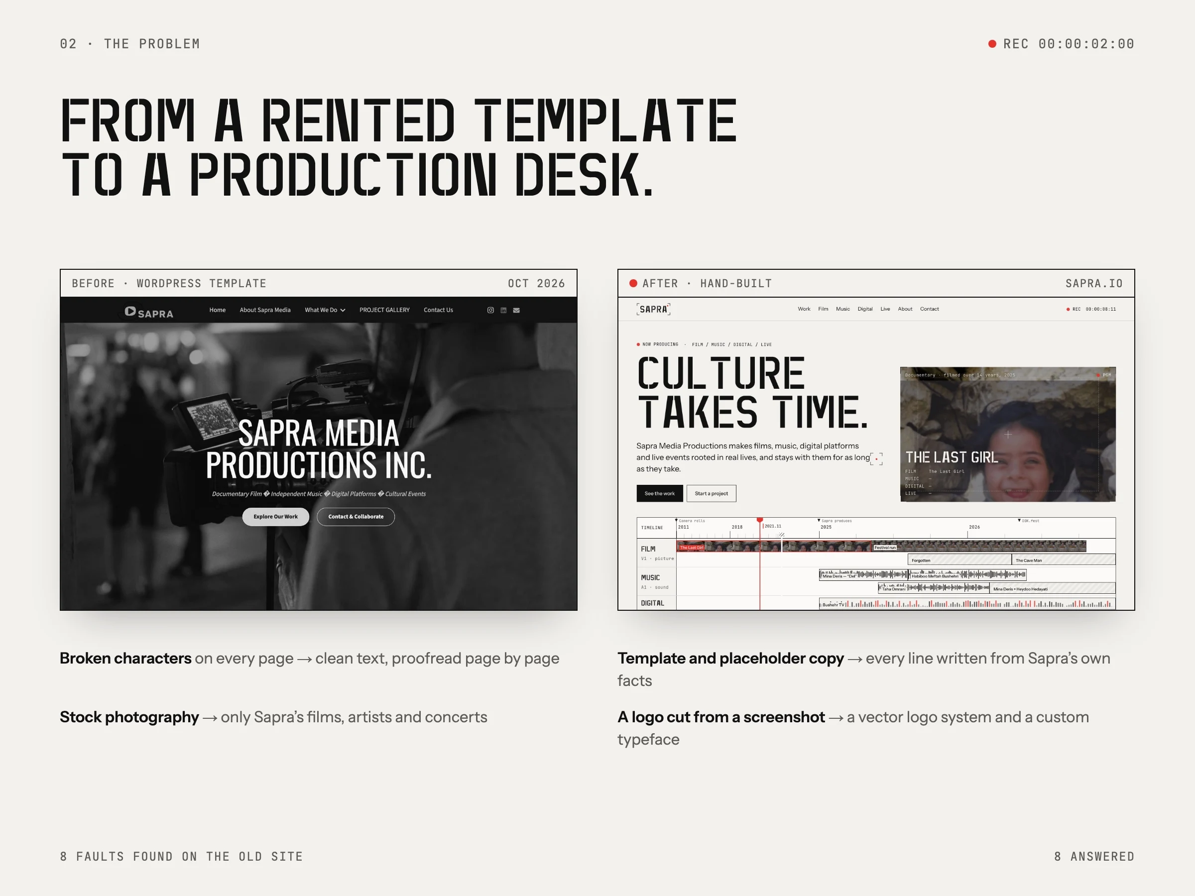
We listed eight faults on the old site and answered every one: clean, proofread text, only Sapra's own films, artists and concerts, a vector logo system and a typeface of its own.
The idea
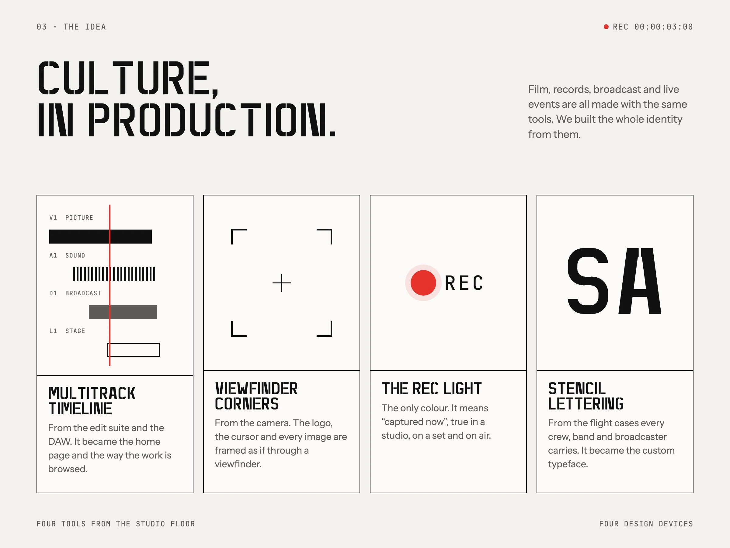
Culture, in production. Films, records, broadcasts and live events are made with the same tools, so the identity is built from them: the multitrack timeline, the viewfinder corners of a camera, the red recording light and the stencil lettering on flight cases.
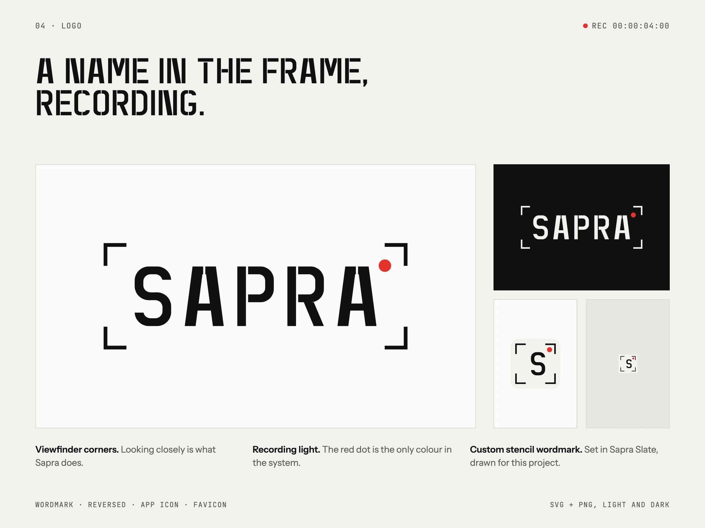
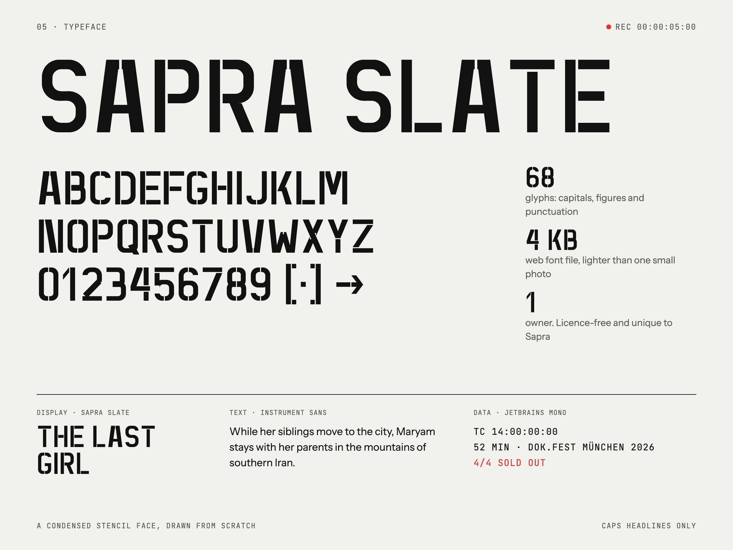
Sapra Slate, the custom typeface, has 68 glyphs and weighs 4 KB as a web font. The palette is paper, ink and one red light, used only where something is live, recording or chosen.
The site
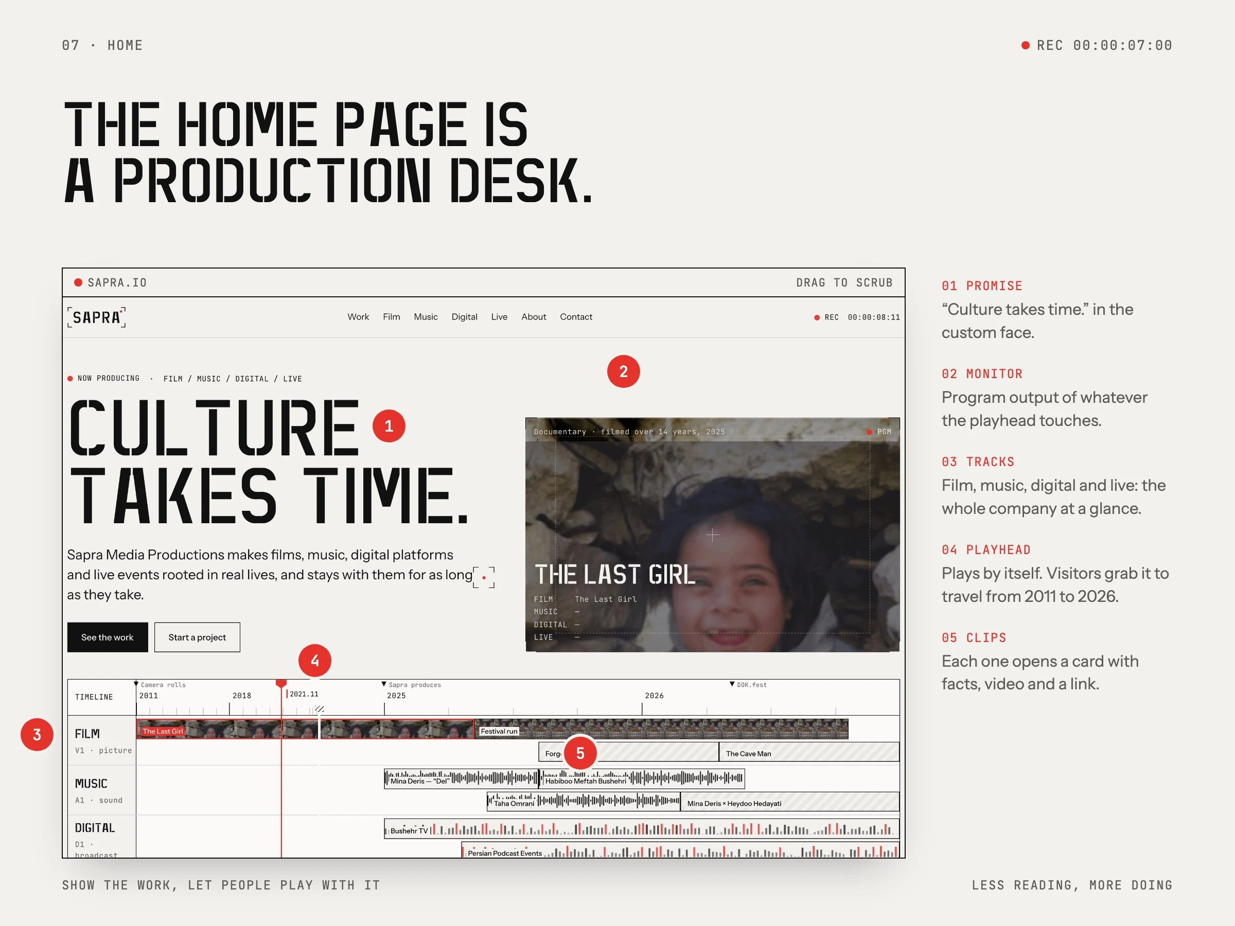
The home page is a production desk. A timeline runs from 2011 to 2026 with tracks for film, music, digital and live work, and visitors drag the playhead to travel through it.
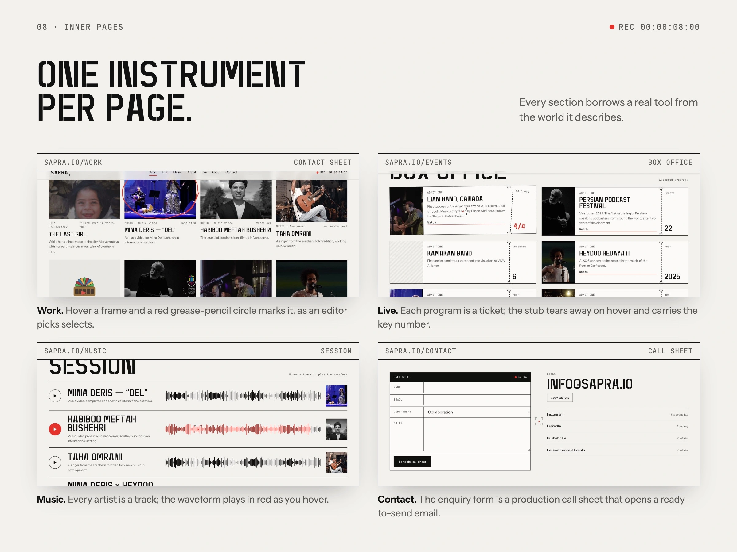
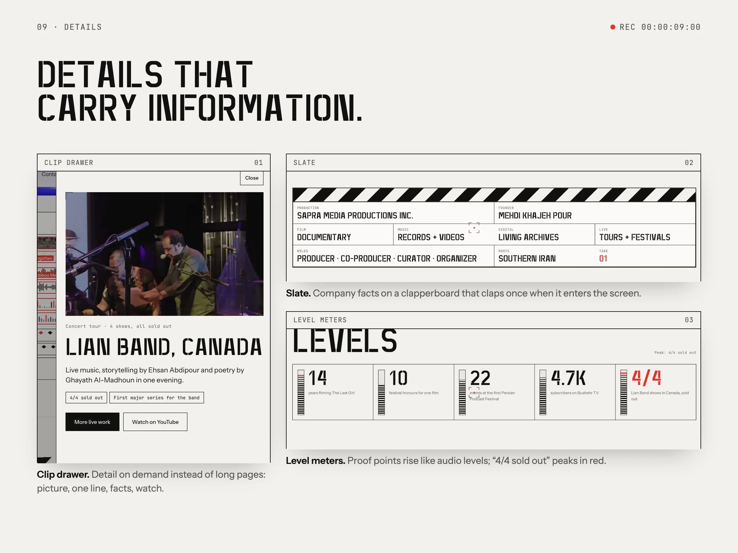
Each inner page borrows one instrument: a contact sheet for the work, tickets for live events, a mixing session for music and a call sheet for the enquiry form. A private content panel with passwordless sign-in lets the team add projects and news without touching the design.
Built to last
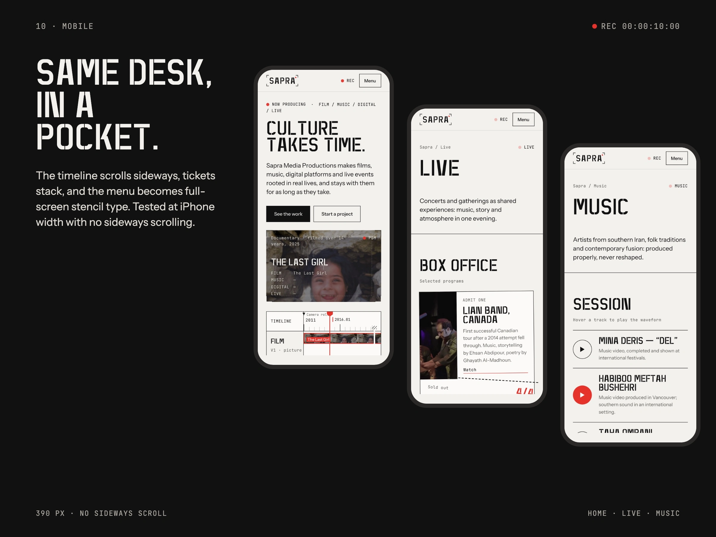
Nine pages, zero console errors, no third-party scripts, 16.7:1 contrast for body text and no sideways scrolling at 390 px. Measured at launch, October 2026.
Like this project
Posted Nov 2, 2026
Identity, a custom stencil typeface and a hand-built website with a content panel for a film, music and live-events studio.
Likes
0
Views
0
Timeline
Oct 2, 2026 - Oct 28, 2026