UPS Redesign and Information Architecture Modernization
Serena Sabuda
INFORMATION ARCHITECTURE - MODERNIZATION - CONTRAINTS NAVIGATION
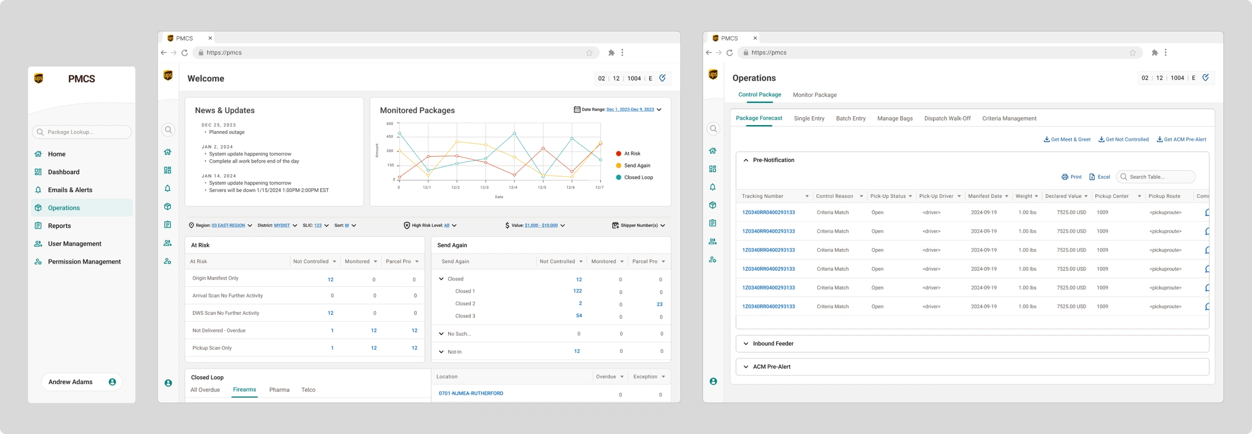
PMCS is a mission-critical tool used by a wide range of UPS operations roles. When I inherited it, it looked and functioned like it was still running on 90s-era web tech. The business wanted modernization; I recognized it needed more than visual polish. The system had grown into a maze of pages, inconsistent components, and buried critical actions. I became the sole designer responsible for not just redesigning screens, but rethinking how the system worked.
New Dashboard Homepage
Announcements & news surfaced (previously buried)
At-risk & important packages prioritized visually
New data visualization line chart (why this chart? what decisions did you make?)
Clear navigation to critical actions
Reduced “time to awareness” for operational issues
Restructuring the Information Architecture
One of the first things I noticed when digging into the existing navigation was that it was organized around a system concept rather than a user task. The core of the application, Control and Monitor, each lived as entirely separate branches in the sidebar, and within each, many pages were duplicated. If you needed to switch between a controlled and monitored package, you had to back out and navigate several levels deep again.
The redesign reoriented the navigation around what the user is tasked with, while also saving UPS money by having to maintain less pages.
Instead of Control vs. Monitor, the top level became Operations — with Control and Monitor as tabs the user can switch between directly within the page. Pages that exist in both contexts were flagged as shared so users immediately understand they're looking at the same data source and don't need to navigate elsewhere to find the other version of the same thing. This flattened the architecture, eliminated redundancy, and made the relationship between Control and Monitor feel intentional rather than accidental.
What this accomplished:
Reduced page count while maintaining clarity
Created logical grouping aligned with real workflows
Moved from sprawling legacy menus → streamlined, intuitive navigation
Reduced user confusion and improved orientation
Significantly improved usability and visual clarity
System now aligned with internal design system → lower development costs
Product teams and developers validated the IA restructuring as a major improvement
Created a foundation the team will use for future funded development
Like this project
Posted May 5, 2026
Main Product Designer - responsible for IA, interaction design, prototyping and cross-functional alignment