Tropina | Visual Brand Identity Design
Lisette D. Brown
✦ Tropina | Brand Identity Design — Case Study
Client: Conceptual
Industry: Food & Beverage
Scope: Brand Identity, Packaging, Product Mockups, Copywriting
Tagline: Inspired by the Islands
01 — Project Goal
To develop a full brand identity for Tropina, a coconut water brand rooted in simplicity, refreshment, and island inspiration. The objective was to create a minimal, modern visual system that would reflect the purity of the product while standing out on shelves and digital platforms.
02 — What I Wanted to Achieve
Capture the natural, hydrating quality of the coconut water through design
Build a complete brand suite (logo, color palette, packaging, icons, website, etc.)
Create a cohesive, memorable identity that resonates with health-conscious consumers and modern minimalists
03 — Creative Challenges
Translating flavour into form: How do you visually represent something that’s simple, clear, and pure without making the brand feel too plain or forgettable?
Standing out in a saturated wellness space: Tropina needed a voice and look that didn’t rely too heavily on cliché tropical visuals.
Balance of visual restraint and personality: Ensuring the branding was minimal but not clinical or boring.
04 — Design Solutions
Logo Design: A clean coconut-circle with a curved line mimicking a wave, coconut split, and a subtle smile finished with a wind-swept palm leaf detail.
Color Palette: A gentle gradient of seafoam green, coconut white, palm green, and sandy beige to evoke refreshment and warmth.
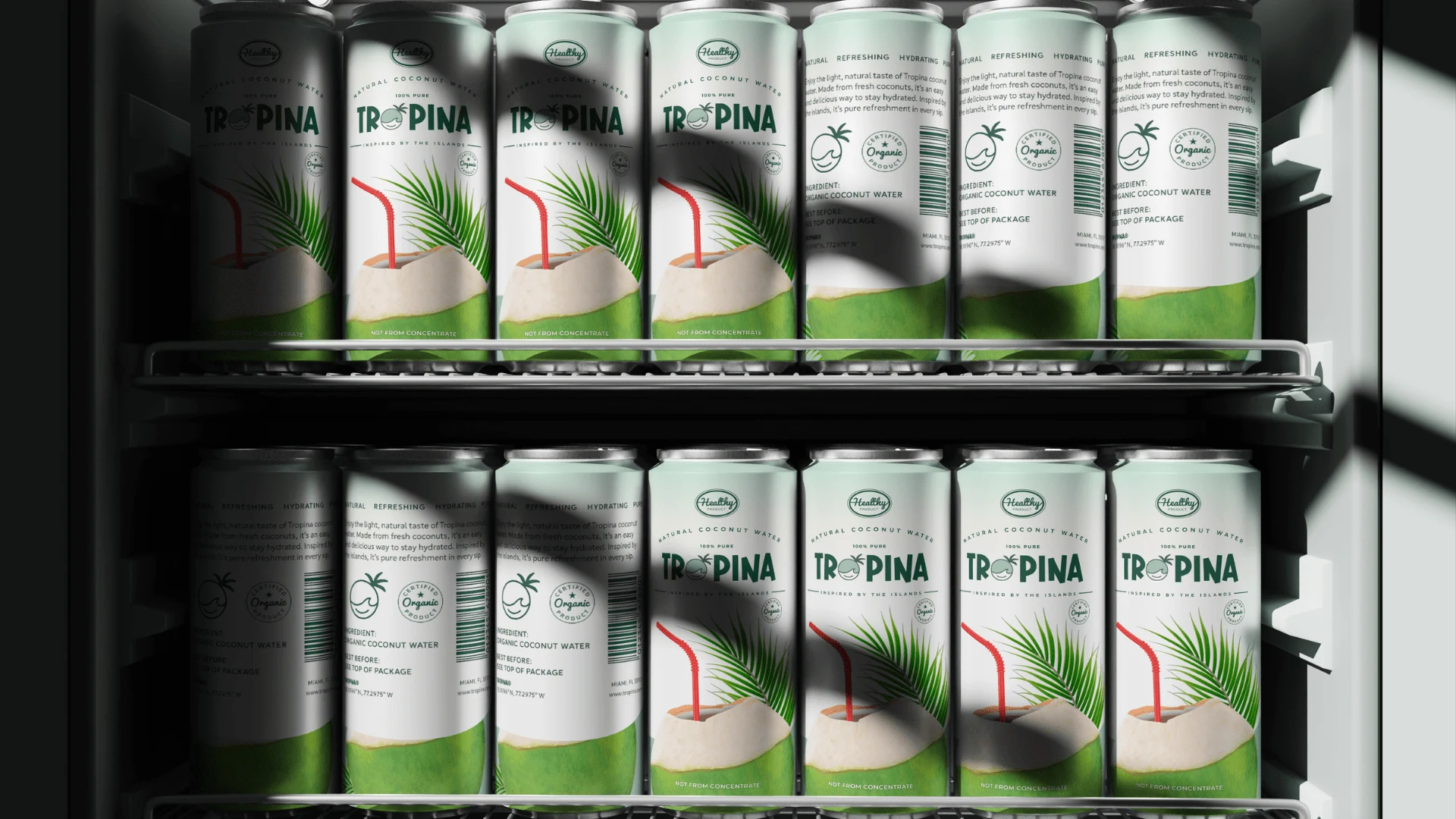
Packaging: Clean can and carton mockups using minimalist illustration, clear messaging, and playful nods to island life.
Website & Social: A simple homepage concept and full social toolkit to help communicate the product’s personality across digital touchpoints.
Icon Set & Dielines: Custom vector Stickers and conceptual dieline layout.
Instagram Reel Video:
05 — What I Learned
Minimalism needs meaning: Stripping things back only works when what remains is intentional.
Symbolism can elevate simplicity: A curve can be more than a line, it can be a wave, a smile, a feeling.
Storytelling is design: Every design decision was a chance to reinforce Tropina’s brand voice: calm, clean, and connected to nature.
Ready to bring clarity to your own brand?
Whether you need a confident logo or a full identity system, Brandingby𝓔𝓵 helps startups and small businesses show up with consistency and confidence.
Like this project
Posted Apr 16, 2025
Tropina’s visual identity blends refreshment, movement, and simplicity, minimal design inspired by the islands, made to feel pure, modern, and natural.