How I Design in Figma – My Process & Approach
Milan Gohil
Things i do After design Discussions
Designing isn’t just about making things look good; it’s about making them work well while looking good. Over the past four years, I’ve developed a structured approach to design that ensures consistency, clarity, and a great user experience. Here’s how I do it
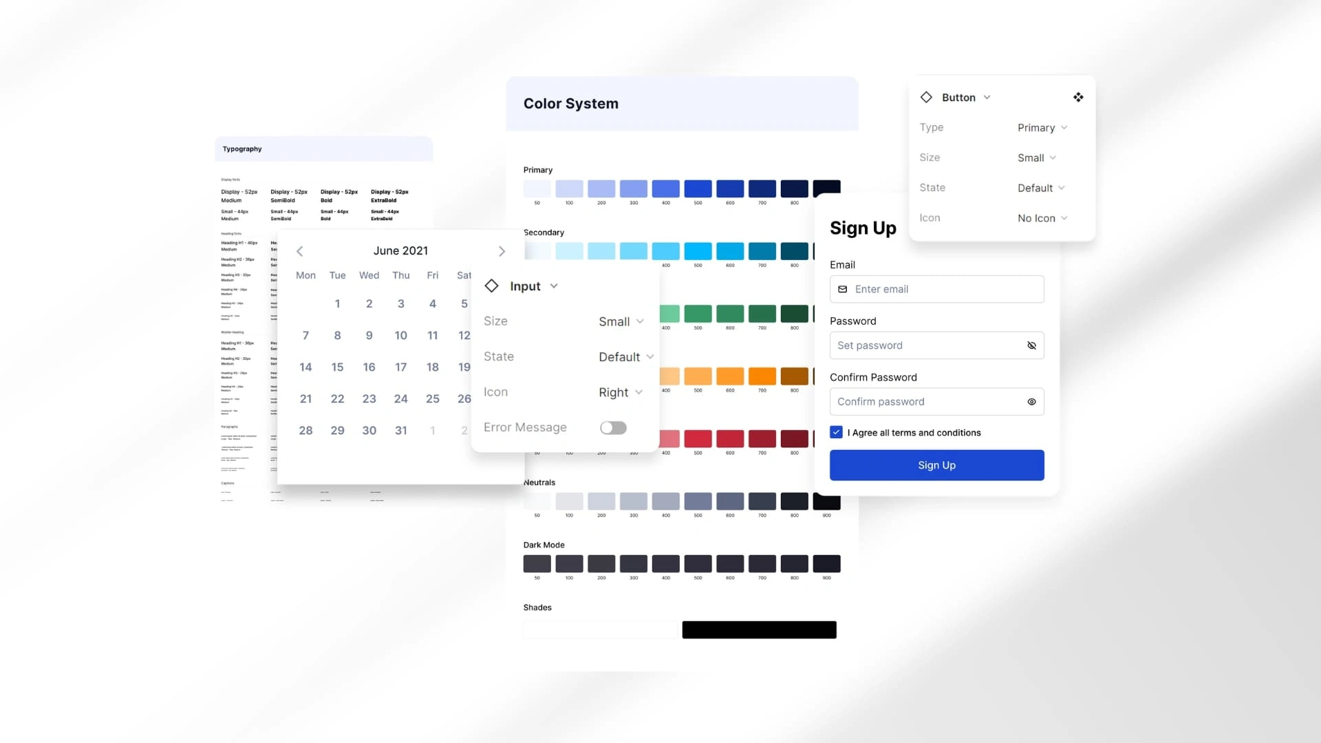
1. Color Typography
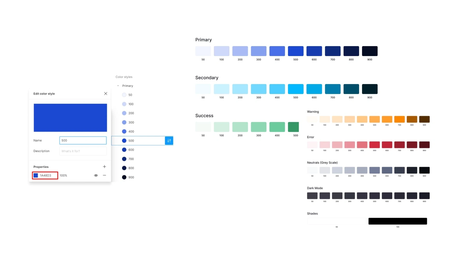
Color typography
Choosing colors isn’t as simple as picking something that "looks nice." The right colors create the right mood, contrast, and readability
🔹 Color combinations: I create palettes that match the brand’s voice while maintaining a clear visual hierarchy
🔹 Accessibility: I ensure colors have proper contrast so that text remains readable for all users
🔹 Consistency: Once I define a color scheme, it gets applied across buttons, backgrounds, text, and icons for a good design experience
2. Text Typography
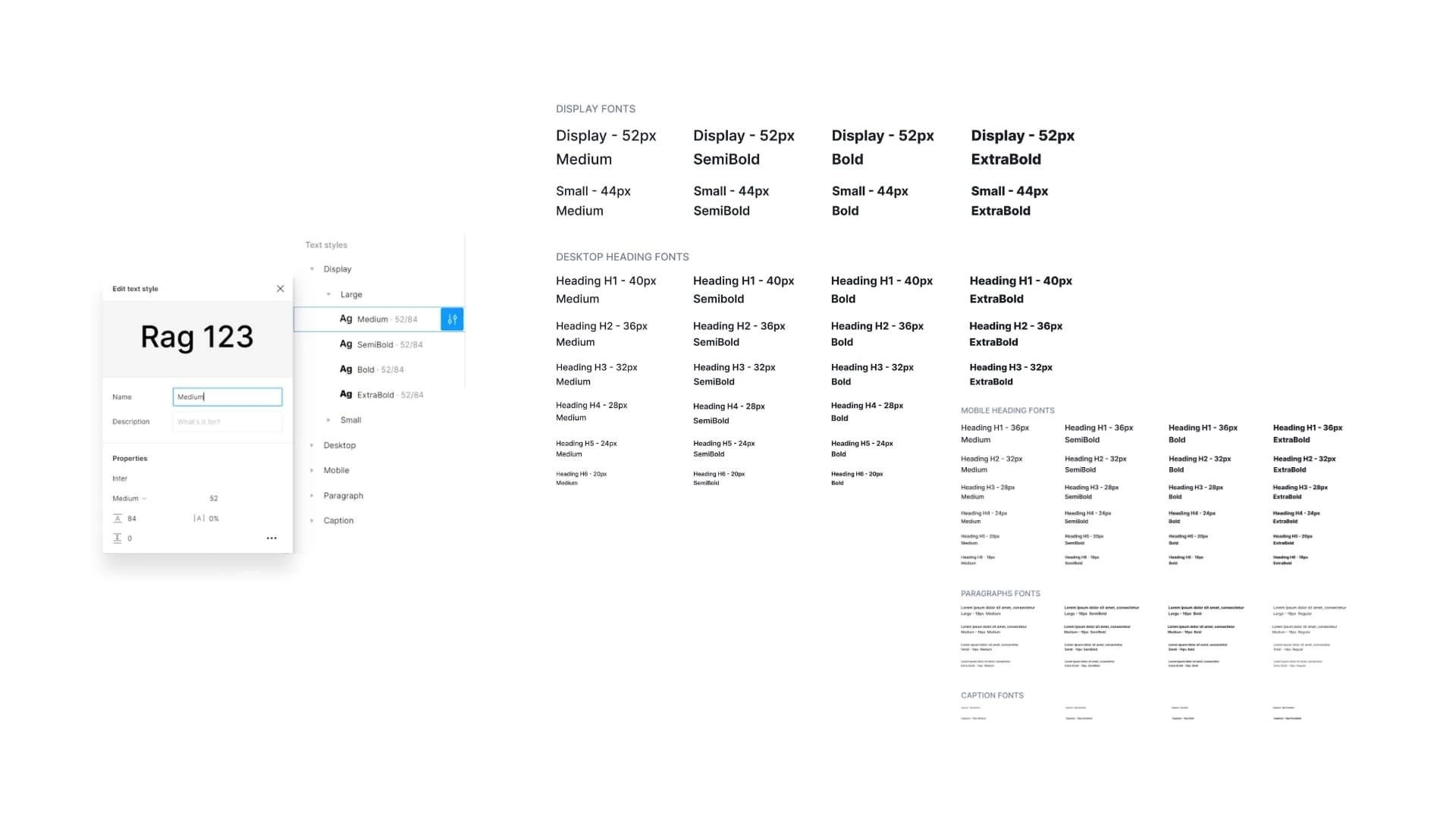
Text Typograpy
Typography is the backbone of design. A good font selection makes content easy to read and gives the design a distinct character
🔹 Font selection: I choose fonts based on the brand’s identity—modern, playful, professional, or bold
🔹 Size and spacing: Text should be readable on all screen sizes. I structure headings, subheadings, and body text properly
🔹 Alignment & hierarchy: I define how headlines, paragraphs, and buttons interact to create a natural reading flow
3. UI Components: Buttons, Forms, Alerts, & More
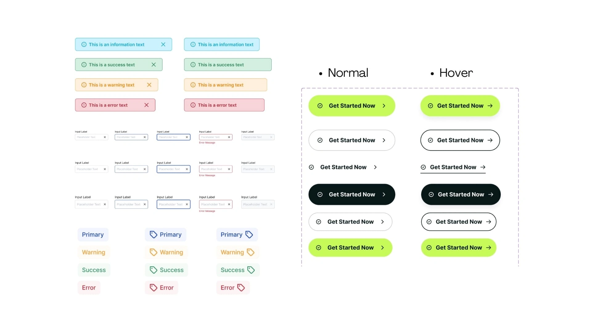
Warning, buttons, textboxes, notifications
Before jumping into full-page designs, I start by designing reusable UI components like buttons, alerts, text boxes, and notifications. This ensures consistency and efficiency
🔹 Button styles: primary, secondary, disabled, hover effects—all defined from the start.
🔹 Forms & inputs: well-structured input fields with clear labels and error messages
🔹 Notifications & alerts: Inform users without being annoying
🔹 Scalability: Since these components are pre-defined, they can be used across different screens without inconsistencies
4. Custom Icons: Small Details, Big Impact
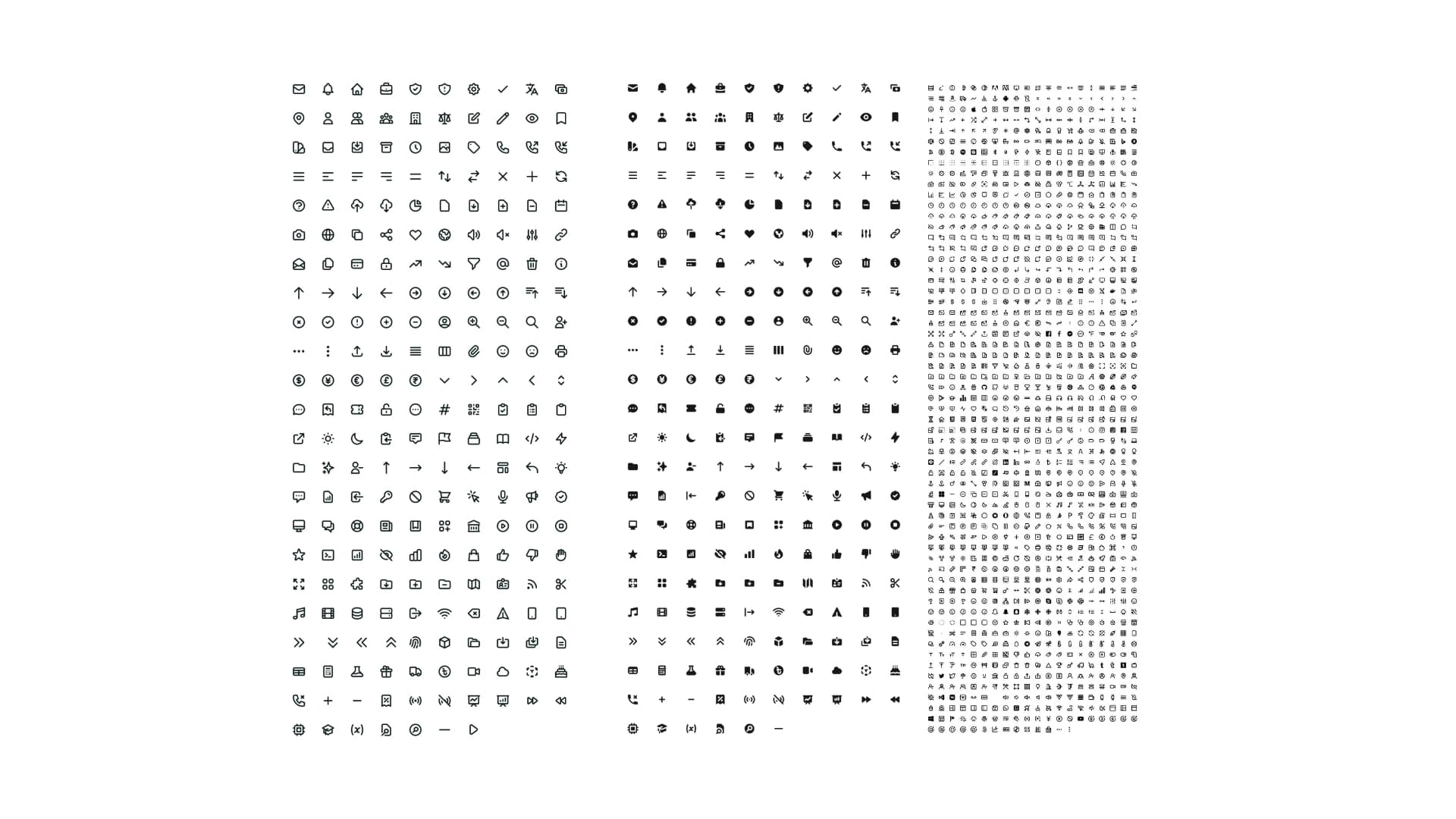
Custom design Icons
Icons play a big role in UI design. They guide users visually and help make the interface cleaner and more intuitive
🔹 Hand-crafted icons: Instead of using generic icons, I create custom ones that match the brand’s personality
🔹 Different styles: I experiment with line, solid, filled, and outlined styles to find what works best
🔹 Scalability: Each icon is designed to look sharp at different sizes—whether it’s for a mobile app or a web dashboard
5. Custom Graphics: Making UI Speak to Users
Custom graphics
Sometimes, text and icons aren’t enough. That’s where custom illustrations and graphics come in
🔹 Visual storytelling: Instead of using stock images, I create graphics that fit the brand’s tone
🔹 Section-based graphics: Each section of a website or app might need unique visuals—hero banners, empty states, onboarding illustrations, etc
🔹 Cohesiveness: Everything blends seamlessly with the typography and color scheme
6. Motion Graphics: Bringing Designs to Life
Motion graphics from recent project
A little movement can go a long way in improving the user experience. I use motion graphics to make interactions feel more natural
🔹 Micro-interactions: hover effects, button clicks, and loading animations that feel smooth and intuitive
🔹 Page transitions: easy screen changes that make navigation feel effortless
🔹 Brand animation: Custom logo or icon animations that add a professional touch
It guides user attention and enhances usability
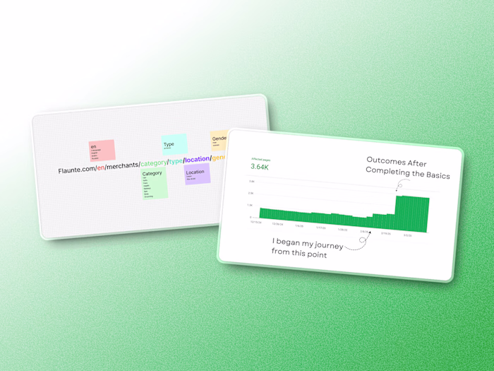
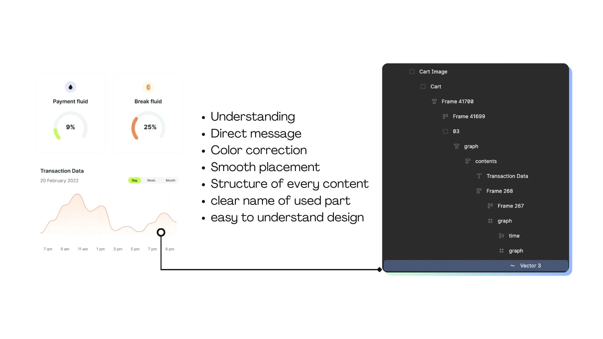
7. Structuring UI
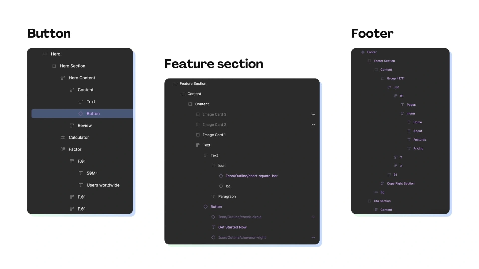
figma design structure of feature section, footer and hero section
Good design starts with good structure. If a design file is messy, it leads to problems when developers (or no-code implimentation) start working on it. That’s why I ensure:
🔹 Proper layer naming: Every element has a clear name so don’t have to guess
🔹 Section-wise organization: headers, footers, feature sections—each is properly grouped
🔹 Auto-layout & constraints: Designs adjust smoothly for different screen sizes.
A well-structured Figma file saves time and makes collaboration easier
8. Beyond the Basics: The Details That Matter
Design details
There’s a lot more that goes into great design. Some of the things I always consider:
✅ Popups & Modals: Smooth and non-intrusive
✅ Calendars & Date Pickers: Easy to use and visually appealing
✅ Dark Mode Support: Keeping UI flexible for different user preferences
✅ Mobile responsiveness: ensuring everything works on different screen sizes
✅ User Testing & Iteration: Getting feedback and refining designs for better usability
Every design choice should serve a purpose—not just look good but also improve the user experience
Final words from me
This is how I approach design in Figma. It’s not just about visuals—it’s about functionality, clarity, and consistency. Whether it’s typography, icons, motion graphics, or structure, I focus on making designs that are not only aesthetically pleasing but also practical
If you’re exploring design or working with a designer, these are some key things to keep in mind. A great UI isn’t just built—it’s thoughtfully crafted
I never ask anyone to choose me; choose best fit in your imagination and be grateful to have them. 🪴
Like this project
Posted Mar 11, 2025
I craft experiences that function, flow, and feel right. Every color, font, and icon serves a purpose, enhancing clarity, consistency, and usability.
Likes
2
Views
29